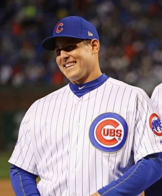
After a rain delay, the Cubs finally had their home opener last night. As you can see above, the gold trim on their championship uniforms was pretty subtle, at least from a distance. You can see it a little better in this close-up, but it’s still surprisingly low-key:
It didn’t look much better on TV. Of course, the effect was somewhat more pronounced on the back:
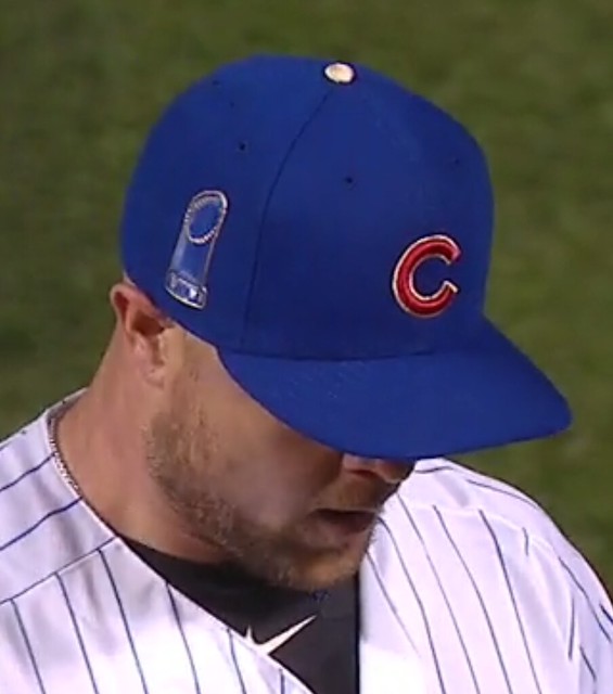
Aw, wasn’t it nice of the New Era folks to put their annoying logo in gold? Meanwhile, the Cubbies had the Commissioner’s Trophy on the other side of the cap:
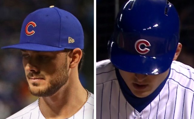
And speaking of headwear, I was wondering if they’d have a gold-trimmed helmet logo to match the cap logo. Nope:
The Cubs will wear this uniform again tomorrow night, when they’ll be receiving their World Series rings. Meanwhile, last night they raised their championship banner:
Designer of the #Twolves new logo describes the visual representations and the colors that describe not only the team, but the state of MN. pic.twitter.com/tiSX7Imr0C
— Timberwolves (@Timberwolves) April 10, 2017
Bedtime story: The Timberwolves will unveil their new logo during halftime of tonight’s home game against the Thunder (although the usually dependable Conrad Burry says it will look like this). In the video shown above, the logo’s designer, Rodney Richardson of the Mississippi-based firm Rare Design ”” the same firm that designed the current looks for the Pelicans, Hornets, Kings, Hawks, and Grizzlies — discusses his thoughts about the team’s new colors. In less than two minutes, he manages three mentions of “story” or “stories,” two mentions of “a sense of place,” and one straight face.
The whole thing plays out like a Saturday Night Live parody of brand design (seriously, watch the video and imagine how it would go over on SNL — people would definitely laugh), only there’s no need for SNL to do that because brand design presentations have become their own self-parody.
“Storytelling” nonsense aside, I look forward to seeing the new logo. As for the new uniforms, they’ll presumably follow after the season, when the Adidas-to-Nike changeover takes place.
ESPN reminder: In case you missed it yesterday, I had an exclusive on how the Braves are about to debut MLB’s first hydro dipped batting helmet with a carbon fiber pattern. Check it out here.
Merch reminder: Also from yesterday, the Uni Watch social media avatar (shown at right), designed by the great Larry Torrez, is now available on a variety of shirts, sweatshirts, coffee mugs, tote bags, and stickers. They’re all available here.
Raffle reminder: I’m currently raffling off a free varsity-style satin jacket from Stewart & Strauss. Full details here.
Collector’s Corner
By Brinke Guthrie
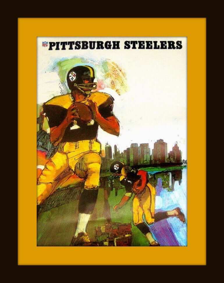
Our featured item each week is always chosen on the basis of how punchy the artwork is. There were several items in the running this week, but when I came across this classic 1960s Steelers poster artwork, I knew we had a winner. See how complex the editorial process is?
Now for the rest of this week’s picks:
• Ricky Bell of the Bucs is the featured player on this 1977 PRO! game program. (Always loved how they had the exclamation point on there.) The unique thing here, of course, is that they chose to shoot the photo sans facemask. When was the last time you saw that?
• Look how intricate the artwork is on this 1960s Yankees pennant!
• We’ve featured these posters before, but it’s worth higlighting them again, because the sleek artwork on this 1970s Boston Bruins poster is simply unmatched.
• Interesting minimalist take on Cowboys legend Roger Staubach on this 11″ x 17″ print.
• This 1960s Cincinnati Reds glass was sponsored by Tresler Comet, an old Cincinnati gas station chain. I distinctly recall the TV commercials for their car washes, too. A guy in a bronze 260Z (weren’t they all bronze?) pulls out of the car wash and he says to himself, “My friends think I’m crazy, but I think a clean car drives better.” Amazing how you recall things like that.
• The color registration is just a bit off on this 1975 NY Giants coffee mug.
• Here’s the classic Miami Dolphins logo, in crochet form.
• Falcons fans, don’t miss this 1970s heavyweight enameled medallion.
• We’ve all seen these poses of football players that show up on promotional items from time to time, from cardboard signs to light switch plates and blankets. Here’s an LA Rams Sunbeam Bread card from 1976, and I’d swear I’ve never seen that punter pose before. There he is, in his blue and yellow glory. This same eBay seller has several other teams available, too.
Uni Watch movie review: If you’re into typography, or printing, or machinery, or knowing how things are made, or just good storytelling, you’ll want to see Linotype: The Film, a 2012 documentary that I saw a few days ago. The trailer is above, and the movie is available for streaming on Amazon for $4. Worth every penny. Uni Watch’s highest recommendation!
The Ticker
By Mike Chamernik

Baseball News: The Mariners wore hats with 40th anniversary patches for their home opener last night. The anniversary sleeve patches will be worn the rest of the year, but the cap patches were just for last night (from Tim Dunn). … Last week, Rajai Davis wore white Trusox as sanitaries, but he’s now back to gold. Maybe it’s a home/away thing (from Hans Hassell). … Salvador Perez has been wearing the WBC logo on his Royals catching helmet. He wore a team Venezuela helmet in the WBC (from Charles Noerenberg). … The Salt Lake Bees and Albuquerque Isotopes wore Gulls and Dukes throwbacks the other night (from John Ewanowski). … The Hartford Yard Goats will retire No. 21 in honor of Roberto Clemente. The move is made to connect with Hartford’s sizable Puerto Rican community. … The Yankees have made some renovations and additions to Yankee Stadium to enhance social media experiences for fans (from Phil). … The Toledo Mud Hens will wear Boba Fett jerseys for Star Wars Night on May 27. … The San Francisco-based Anchor Brewing Company is selling another Giants-themed lager. The packaging for Los Gigantes has a Day of the Dead theme (from John Muir). … In the late 1980s, the Milwaukee Police Department produced Brewers trading cards where players gave kids advice about avoiding drugs, staying in school, participating in sports, and crossing the street and being a responsible baby sitter (good stuff, from Aaron Szopinski). … This color wheel graphic shows all the shades used in Minor League baseball logos (from Benjamin Hill). … Adidas released a new baseball cleat and turf trainer to honor Jackie Robinson. The shoes’ bronze color is meant to represent both the bricks of Ebbets Field and Robinson’s hall of fame plaque. … If novelist Kevin Guilfoile is to be believed, players on a Little League team named themselves the Illuminati (from Alex). … This piece argues that baseball stadiums and their unique designs have helped to increase the popularity of the sport. … The Cubs have filed for the trademark to the “That’s Cub,” a motto that has gained popularity with the team over the last few years. … The Akron RubberDucks wore 1997 Aeros throwbacks, with their standard caps, yesterday (from @CLERallyChicken). … Mets P Noah Syndergaard had his hair in a ponytail during his off day last night. He even pitched with his hair up during Spring Training. … Phillies C Cameron Rupp had some long and loose shinguard straps last night. They flapped around as he moved about (from Paul). … Nats OF Bryce Harper broke his belt during a head-first slide last night. The game was briefly delayed while a new one was brought out to him. … The Charleston RiverDogs scolded the Augusta GreenJackets for using an outdated Charleston logo in a social media post (from Matt Campbell).

NFL News: The Draft caps for the Browns, Cowboys, Steelers, Seahawks and Patriots have been revealed. … “The Ravens unexpectedly resigned Ladarius Webb, setting off an interesting chain reaction of number changes,” reports Andrew Cosentino. “Webb retained No. 21, Tony Jefferson switched from 21 to 23, and Tavon Young switched from 23 to 25.” Additionally, No. 25 went unworn last year to honor Tray Walker, who died in March 2016 after a dirt bike accident. … New 49ers RB Tim Hightower is refusing to wear No. 21, which was worn by Frank Gore before he left for the Colts two years ago (from Brinke). … Players, coaches, and members of the front office with the Rams were given T-shirts with a new team motto on them. … No photos, but a Reddit user says that he has seen the Lions new uniforms and offers a thorough description. The Lions will officially unveil their new set Thursday (from Justin Cliburn). … A new trading card shows Calvin Johnson in a Nike jersey but has a Reebok jersey swatch embedded in it (from Joe Gemma).
College Football News: Here’s a look at a Schutt F7 helmet (the new helmet that Paul wrote about a few months ago) with a Clemson design treatment. In this case, the striping tape wasn’t cut as it passed across the plates, although some equipment managers might choose to cut it, like most of them do with the Riddell SpeedFlex helmet (from Phil).

Hockey News: A New York City creamery is selling a Rangers-themed ice cream for the team’s playoff push. It has a cheesecake, peanut butter cups, fudge brownies, and red and blue M&Ms (from Mary Bakija). … Here are 8-bit logos for each playoff team.

NBA News: Recently retired Dallas Cowboys QB Tony Romo will be a Maverick tonight. He’ll be in full uniform on the bench during tonight’s game against the Nuggets, and he will take part in pregame warmups. … Kyrie Irving flung his jersey into the stands the other night and someone famous caught it. That’s Lamorne Morris from New Girl.

College Hoops News: Patrick Ewing wore socks with upside-down Nike logos on the cover of an old Georgetown program. Looks like he turned down his socks, creating the upside-down effect. While looking for additional Ewing photos, I noticed that the Hoyas used to have some really large nameplates (from Pete Richardson).

Soccer News: Louisville City FC unveiled its new third kit (from Josh Hinton). … The Washington Spirit of the NWSL didn’t have an ad on their jerseys during this past weekend’s preseason finale (from John Muir). … New 100th-anniversary shirt for Rosenborg. “Doubt they had a giant ad 100 years ago, though,” says Ed Å»elaski.
Gold Cubs jersey very classy. What happened to the round World Series champ patch that was out there?
You stated that the New Era logo was in gold. I didn’t zoom in to see, but is the MLB logo in gold? That would be neat. It would probably look like the NBA’s 50th anniversary gold Logoman from Kobe’s first season.
Yes, MLB logo on cap was gold:
link
MLB logo on jersey was also gold:
link
But MLB logo on pants was regular red/white/blue, because they wore their regular pinstriped pants, not new championship pants.
Of course they didn’t wear special championship pants; they don’t sell pants as merch, so there’s no need to have special pants because you can’t make money by selling replicas.
Sweet! Thanks for the links. Did all MLB teams change the MLB logo on the jersey to Chromaflex this season? Are these gold MLB logos plastic or fabric?
Chromaflex changeover was last season. I assume the gold is as well, but not positive.
“Players, coaches, and members of the front office with the Rams were given T-shirts with a new team motto on them. ”
That’s Ram.
The specialist on the Rams card isn’t a punter; he’s a right-footed placekicker. The holder isn’t shown. The hint is that his right hand is down and left ankle is turned. Punters extend their ankles on the follow through; placekickers keep their kicking-side arm in for balance.
I think it is a punter. If the card is from 1970 that means (likely) 1969 art/photo was used for the graphic. Still not too many soccer style kicker in the league at that point. You can tell he’s soccer style kicker by his right foot (toe pointed not 90 degrees to shin).
It also looks to me like his head is looking more at his foot rather than at the ground (the difference between punters and kickers at/after the point of contact).
The arm issue may come into play if he (semi-unorthodoxically) drops the ball with his left hand rather than his right.
Punter.
Punter. If he’s a soccer style kicker the left arm wouldn’t be forward, and if he’s a straight-on kicker his right foot would be at a right angle instead of extended like that.
And even soccer style kickers tend to have their foot a a right angle.
link
link
I don’t know if anyone saw yesterday, but during pre-game introductions, the Yankees training staff were wearing some really nice looking Yankee jackets. It had a classic feel with the interlocking NY on the chest and the primary logo on the left sleeve.
Found it
link
This should be the official team jacket.
Oh, that’s nice. Before the 1990s, the Yankees wore something link in the dugout.
Joe Torre had the jackets changed to the script when he took over as manager, presumably link.
At some point, in the late 80s or early 90s, the jacket lost the top hat logo on the sleeve. They switched to the “Joe Torre script” jackets for the ’96 postseason.
Those varsity jackets are sweet, but, man, something about satin jackets just screams baseball to me.
Poofreading: The show is just “New Girl” (no “The” at the beginning).
I misspelled “proofreading.” Sweet irony.
Fixed.
If you scroll down to the bottom of the article about the renovations at Yankee Stadium, you’ll see the catcher on the photo-op playing card is left-handed.
link
– Most likely taken from this kinda famous 1969 Topps card of Larry Haney with the image reversed.
link
I get the face cutout, but the mitt??!!?
I found it odd that the Cubs raised a 2016 NL Champions banner last night alongside their 3 World Series banners.
What about their other 16 NL Championships? Seems strange just to recognize the most recent one. Is there any particular reason for that?
If they fail to win the pennant this season, will they take it down next spring? Or if they win the 2017 pennant, will they replace the 2016 banner or add another one to the same pole?
From my perspective as a Cubs fan, I would say the reasoning for incorporating the 2016 pennant alongside the 2016 World Series pennant is due to the historicity of the moment. It intersected well with the 100th anniversary of Wrigley Field and the end of the World Series drought.
To your other question, I’m not entirely sure what they will do with the 2016 banner if they happen to win it again this year. I’d like to see them keep it alongside the World Series banner, but only time will tell.
That makes sense. Thanks for the reply!
16? Cubs have made 11 total World Series appearances.
Yes, the Cubs claim a total of 17 NL pennants. Although they won their first 6 as the Chicago White Stockings before the World Series existed. So 11 in the modern era I suppose. But 17 total.
The Cubbies ceremony last night was about the future as much as it was honoring the past. What you saw last night is how they are gonna raise future (if any) World Series Banners.
As for past Pennants, that is an excellent question.
Noice show –
and my small link to the Ceremonies that continue manana.
Will Bill Murray get a ring?
This link describes the meaning of all of the flags flying at Wrigley Field as of 2015. I am guessing that with any future NL Pennants, the newest one will be flown at Center Field and the previous one would join the flags flying at the top of the roof, and additional poles would be added to Center Field for new World Series titles.
link
Yeesh…if that description is accurate, those new Lions uniforms sound like absolute garbage.
What the heck is Nike’s deal with putting wordmarks in weird places?
I don’t understand it either. They seem to be under the impression that every jersey needs a wordmark, as they’re present on almost jersey. The Browns treatment is far and away the worst (and thusly identified by countless media outlets), so I find it surprising they seem to have stricken the Lions with the same atrocity. Also, kudos to Nike for figuring out how to ruin their throwback jerseys.
Agree. And how hard would it have been to say whether they have a proper block font or something stupid? I can over look a lot of silliness if the numbers are proper.
. . . also it’s now becoming common to put words on pants. I get it. People don’t read as much now as they did twelve decades ago. That’s just not a reasonable response.
Forgive me if this is something I should already know, but for the raffle, what should the entry email contain?
All I need is your name.
Thanks Paul
Hey paul, would you know of a site where I can buy single pairs of baseball stirrups?
Lots of them on eBay.
I love that gold squatchee on the Cubs’ cap. Have the other WS winning teams been doing that? It has that awesome 1996 Astros vibe.
Regarding the Brewers baseball cards, they were distributed by police agencies throughout Wisconsin for several years into the early ’90s. There were also similar Packers sets around the same time.
Growing up, whenever my friends and I saw a police car, we’d chase it down for the newest cards, which were released weekly two at a time.
Thirty or so years later, I still have a few. Unfortunately, they were larger than standard baseball cards, so they didn’t fit into card-collecting albums.
More than just the 1990s – the program link. There’s a really good summary link.
I attended the game in 1982 where they gave out complete sets to kids, and for years afterward we would ask MPD officers for them in the summer.
Nice. Now who remembers the Gardner’s bread cards of the 1980s?
I’ve never noticed this but the Cubs logo on their jerseys look really bad with that TM on them. I hate it when teams put the trademark logo (or whatever it’s called) on their official logo on uniforms. It looks awful.
And yeah, the Lions uniforms sound like a terrible repeat of the Browns. Putting a wordmark on the pants again especially. Then again, I am a bit skeptical of that report since it states that the color rush is the throwback.
Sorry the R, not TM. Having either still looks bad.
I hate it when teams put the trademark logo (or whatever it’s called) on their official logo on uniforms. It looks awful.
How many teams even do it besides the Cubs? I’m not aware of any, at least on the pro level.
I feel the same way about the ® or the ™ on the Pepsi (and any other product) logos.
link
I know I’ve seen the Longhorns do it in college (though maybe I’m thinking of the retail jersey)…. it definitely used to be more of a thing before Nike, Under Armor, and Adidas were the “big 3” in uniform making.
That T-Wolves video is practically unwatchable. It goes to show the tremendous amount of bullshit permeating the sports design industry (I know… preaching to the choir here). Note to Creative Directors: When it comes to what you tell the general public, you don’t need a damn story for everything – particularly for something like a glorified logo refresh.
To the average fan, something like “The new logo and colors are based on the team’s history and everyone thought it looked cool” would resonate much better than “… the vibrancy of the Northern Lights… this frozen North mentality” horseshit that really just means “We looked at the old logos and tweaked the colors to make them look contemporary.” But everyone’s gotta justify their positions and salaries and keep up with the Joneses.
Mind you, I don’t blame the folks at Rare Design. They’re just doing what they have to do to survive in a world of ridiculousness. It’s just that the whole deal is an industry-wide stupid-storm full of ludicrous adjectives, hollow emotion and lots and lots of someone else’s money. It’d be great if agencies would quit blowing smoke up our collective ass and be honest like in the movie “Crazy People*.”
Sorry… I hopped up on the soapbox and the words fell out of my head.
* link
^^^What he said.
Sounds like neither of you understand the value of symbolism and that the task of the designers in this case is not just to create something that looks cool but rather to establish a visual identity for the team and tie it into the community.
Frankly, you sound like two non-artists criticizing art, which would be like me criticizing the engineering of race cars. I could probably look at a few examples and discern which ones are better than others but I couldn’t look at a single engine and say if it’s going to run well or not. And the jargon used by the experts who built the engine is going to sound funny to me. Because I don’t understand it.
Dan, trust me: The “symbolism” will sound good at the press conference and then nobody will remember it.
This is bullshit of the highest order. If you want to buy in, that’s your prerogative. But don’t try to tell the rest of us that we’re not allowed to critique it.
You’re certainly allowed to express your opinion, I was just pointing out that you assumed from the start that the thought process behind the design was “bullshit”.
I mean, there is a reason that some designs fail and others become popular.
You’re certainly allowed to express your opinion, I was just pointing out that you assumed from the start that the thought process behind the design was “bullshit”.
1) I assumed nothing. I was simply responding to the video they put out, which was/is indeed bullshit.
2) You were not “pointing out” something. Let’s go back to what you said: “[W]hen firms are hired in part to create symbolism it’s not fair to mock them for doing what they were asked to do.” That’s breathtaking statement. It basically says, “If one idiot hires another idiot to do something idiotic, you can’t blame them.” I strongly disagree. It also assumes that I’m opposed to design firms engaging in symbolism per se. That’s not the case at all — I’m fully aware that symbolism is part of the design process. But there are good ways to do it and bad ways to do it. Nonsense “storytelling” as a substitute for substance is, you know, a bad way.
I mean, there is a reason that some designs fail and others become popular.
Indeed. But I assure you there is nothing in that video that will have any bearing on whether this particular design succeeds or fails.
says the butt-hurt artist.
The article about stadium design was a nice primer for anyone that hasn’t thought about it over the years, but being a stadium-and-arena-architecture geek, it didn’t go in depth enough. One quarrel I had with it (and I’m loathe to write a dissenting comment on a blog that’s over two years old) was the idea that HOK/Populous had ANYTHING to do with the retro-style ballparks on their own. Can’t remember the name of the book, but there was a terrific book written about the development of Camden Yards. Essentially, it was a Yale architecture student that saved the warehouse (HOK was going to knock the whole thing down), and Janet Marie Smith (now of the Dodgers) that changed the entire design from contemporary to retro.
Oh, and Sportslogos.net has the lowdown on this year’s special (ugh…) MLB uniforms for Mother’s Day, Memorial Day, etc.
link{wt-static_graphic}{pt-home}{al-a1spot}{ct-mothers_day}
Same line up as last year. New hats at least.
I feel like Paul might shut down the site tomorrow to prevent having to cover these.
I for one didn’t find anything wrong the Rare Design video…I mean, assuming the Timberwolves paid a shit-ton of money to these guys to come up with a new visual identity you’d expect them to put some thought into it. Otherwise, just save your money and have a talented local college art student draw up a couple of cool wolf designs and pick a couple of colors that you subjectively think look cool.
And Paul, I know that you’re more interested in aesthetics than symbolism but when firms are hired in part to create symbolism it’s not fair to mock them for doing what they were asked to do.
I mean, assuming the Timberwolves paid a shit-ton of money to these guys to come up with a new visual identity you’d expect them to put some thought into it.
Sure. But it takes literally ZERO thought to create that video! It’s just stringing together a bunch of clichés! Total bullshit.
when firms are hired in part to create symbolism it’s not fair to mock them for doing what they were asked to do.
Actually, when people willingly participate in a bullshit system, it’s completely fair to mock them for doing that, and I’ll continue to do it when I see it front of me. And that video is Exhibit A.
Gotta love the story, the sense of place, the contrasts of vibrancy but it’s the COLOR that’s most important. Color is what ties this renewed logo all together! You just can’t over estimate the power of COLOR!! Repeat “color” like a mantra and maybe you can hypnotize the long suffering fans into believing that there is a light at the end of the tunnel. “Color” makes this corporate spew somehow easier to digest. Color justifies the big bucks some exec was given to make some tweaks to the logo that is the brand of the story for the franchise that plays in the court of the great and powerful Oz! Spin it again for me O ye great & magical poobah of colorful storytelling…
^^^ What he said.
Time permitting, I’ll look further for a better photo of the 1951 Detroit Red Wings with the patch but for there is this undated photo from an online article about Ted Linsday with what I believe is likely the patch:
link
another okay photo – this of Sid Abel:
link
photo in Montreal Gazette April 2, 1951 (just to right):
link