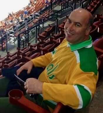
I recently had an ESPN piece about how Alex Ovechkin was about to become the first NHL player to wear custom-painted skates. A few hours after that story was posted, I received an email from a filmmaker named Mark Greczmiel (that’s him at right), who pointed out that while Ovechkin’s skates might be the first to feature custom-painted artwork, the fabled California Golden Seals routinely painted their skates for several seasons — first green and gold, and then, more infamously, white.
Greczmiel, it turns out, grew up rooting for the Seals and recently wrote, directed, and narrated a documentary about them, called The California Golden Seals Story. You can see the trailer above, and Greczmiel recently let me check out the whole thing. It’s sensational — I can unreservedly recommend it to any and all Uni Watch readers. If you’re a history-minded hockey fan, so much the better, but even non-NHL fans will enjoy this one. (You can purchase it or rent it on iTunes.)
The film is crammed with uni-related goodness. Here are some highlights (for most photos, you can click to enlarge):
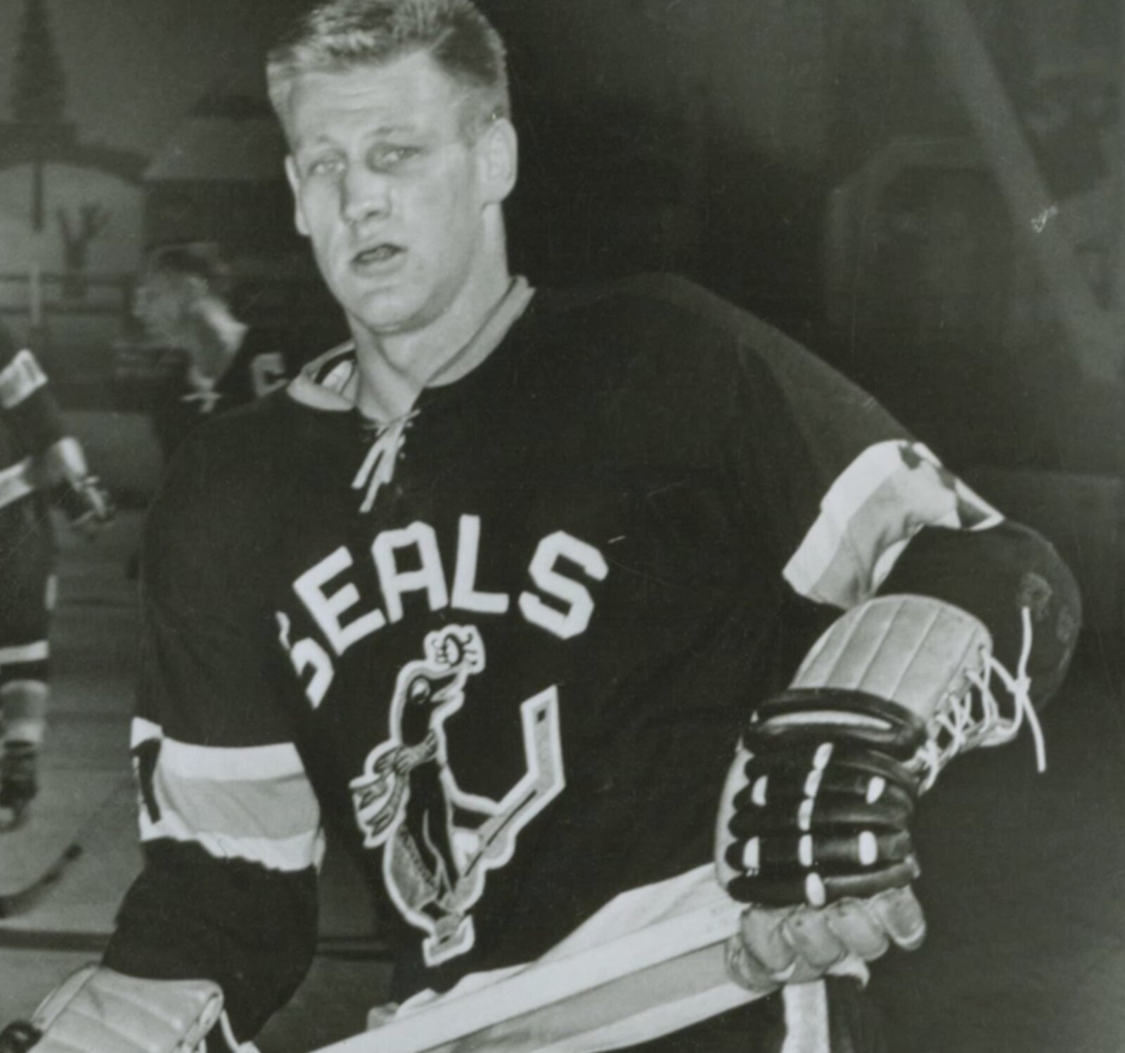
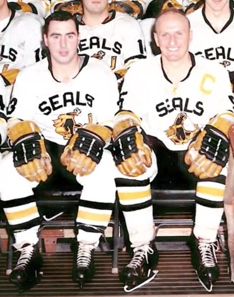
• The Seals were originally a minor league team, and they had pretty cool uniforms in those days. Dig:
• An early Seals player — I’m pretty sure it was Tony Featherstone — wore a helmet with what appeared to a be a slice cut out of the crown area:
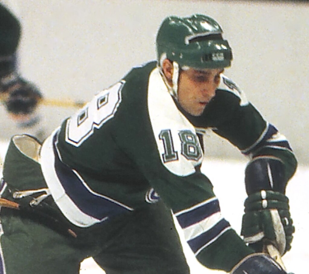
I found a photo of Featherstone wearing a similar piece of headgear later in his career with the North Stars. Anyone know what that was about?
• When Charlie Finley wanted to purchase the Seals in 1970, his primary rival was a guy whose family had helped to popularize televised roller derby, so the movie includes some great shots of roller derby uniforms. These are actually the best-looking unis in the film.
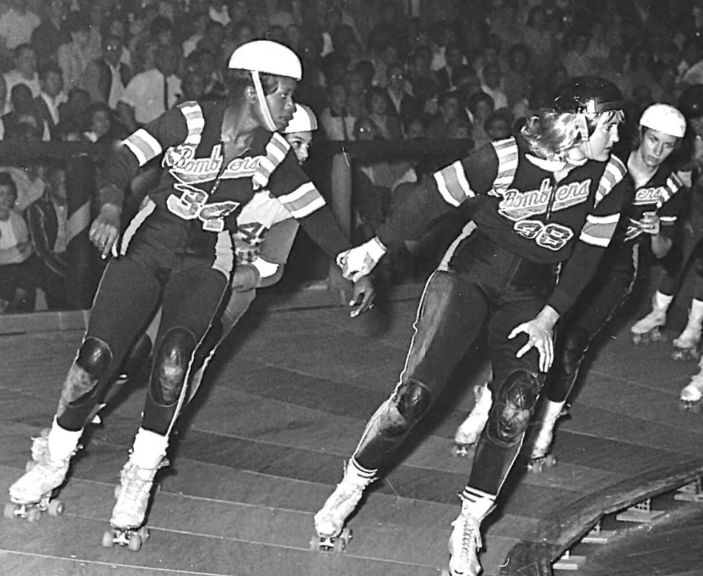
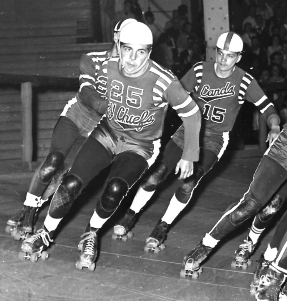
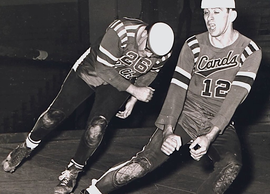
• There’s a great shot from Finley’s introductory press conference, where he held up a mock-up of himself in what he envisioned as the Seals’ new uniforms:
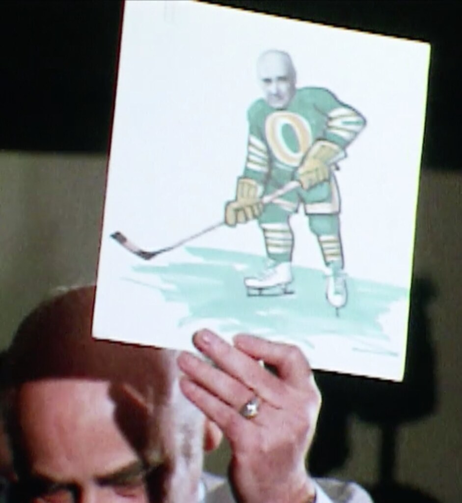
• Although the mock-up shows white skates, the Seals initially wore green/gold skates during Finley’s reign. I think they looked pretty sharp:
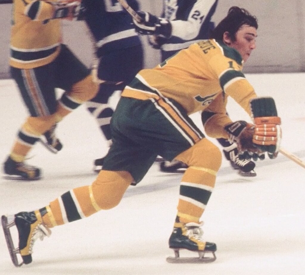
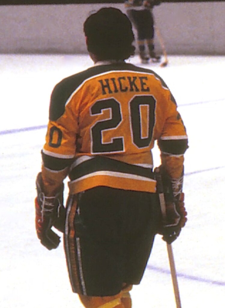
• Finley was also among the first NHL owners to give his players NOBs, in 1970 (the Rangers also introduced them that same year), but only at home. Rival owners insisted that the team go NNOB on the road, so as not to threaten their scorecard sales. (This is the part where I have to mention the Maple Leafs.)
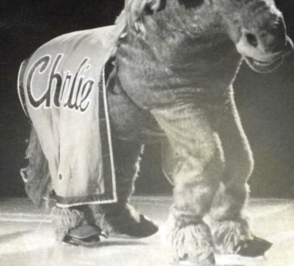
• I knew Finley had famously given the A’s a mule mascot, which he named after himself. But I didn’t realize that the Seals had a pantomime version of the mule — on skates!
• As for the white skates, there’s lots of chatter about how the players hated them, how opposing fans said they looked like women’s figure skates, how the multiple coats of paint supposedly made them heavier, and so on. In retrospect, it’s odd that an NHL team couldn’t simply get a skate manufacturer to supply white skates, instead of having the black ones painted white, but relationships with equipment vendors were different back then.
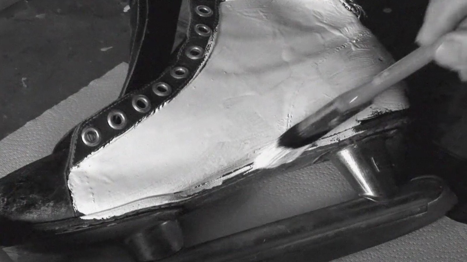
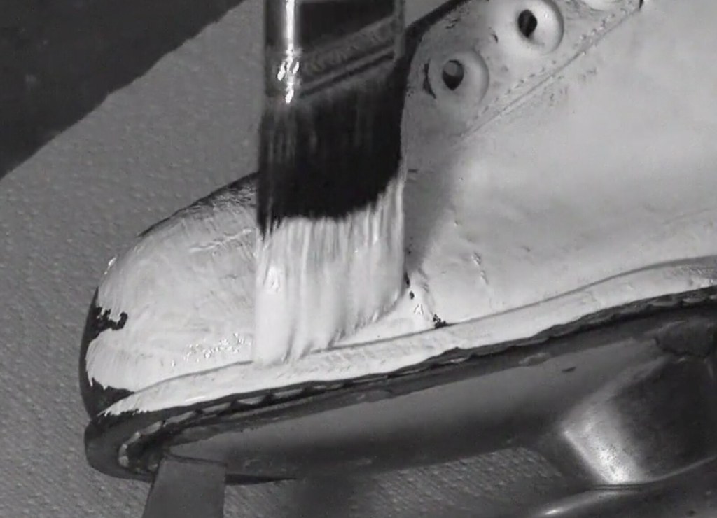
The white skates would invariably get scuffed up during games, and the trainers were under strict orders from Finley to do touch-up paint jobs in between periods. Jeez.
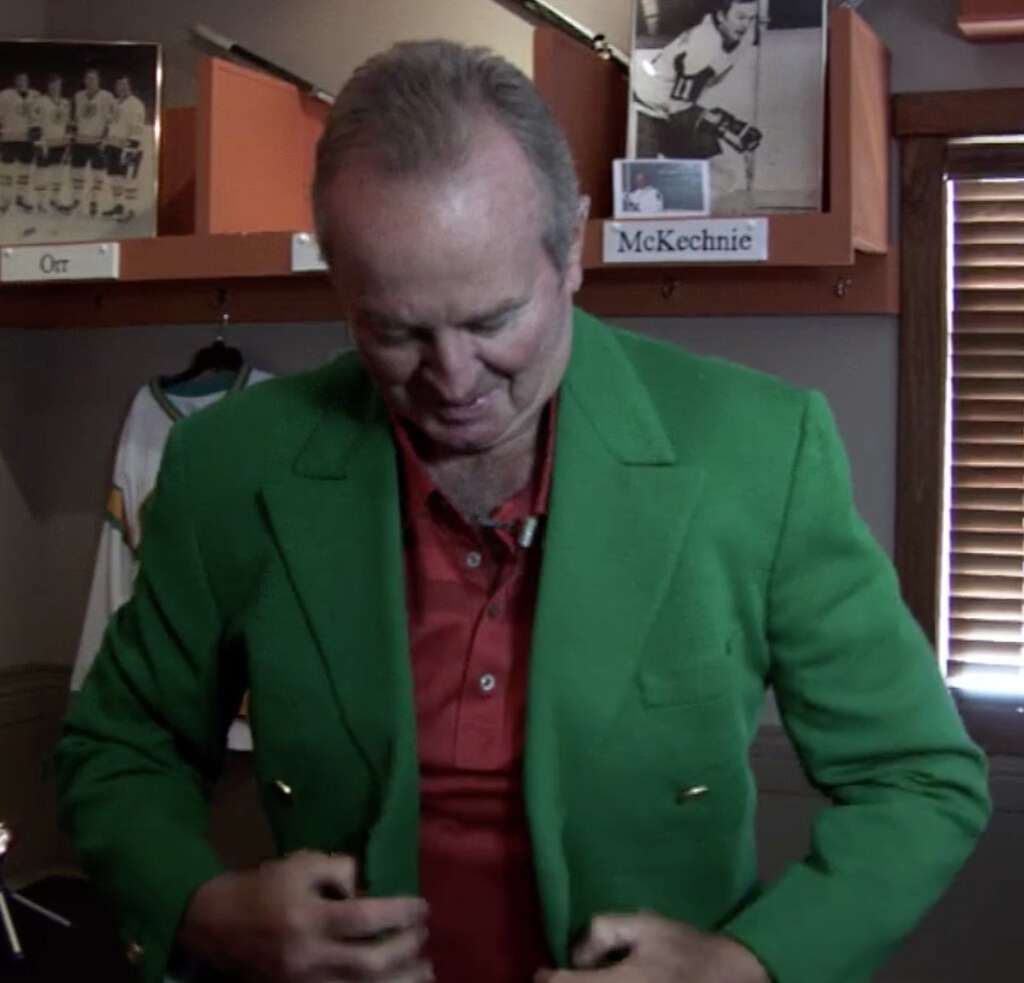
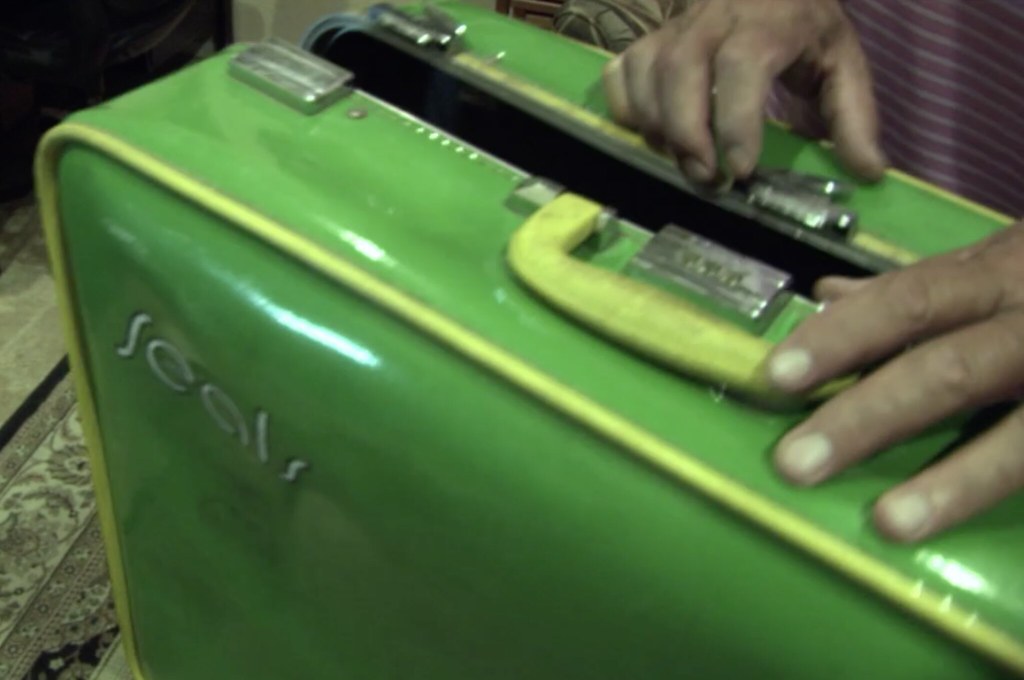
• Finley also insisted that his players wear kelly green blazers while traveling, and that they pack their clothing in green/gold Seals suitcases.
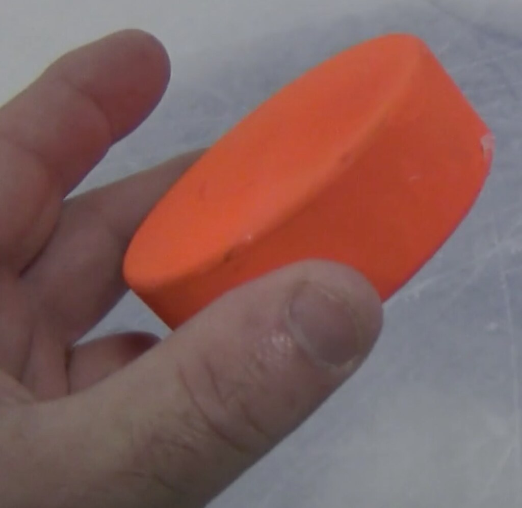
• One more note about Finley: You may know that he once tried to get MLB to change to orange baseballs. But did you know he also tried to introduce orange pucks to the NHL? It’s true.
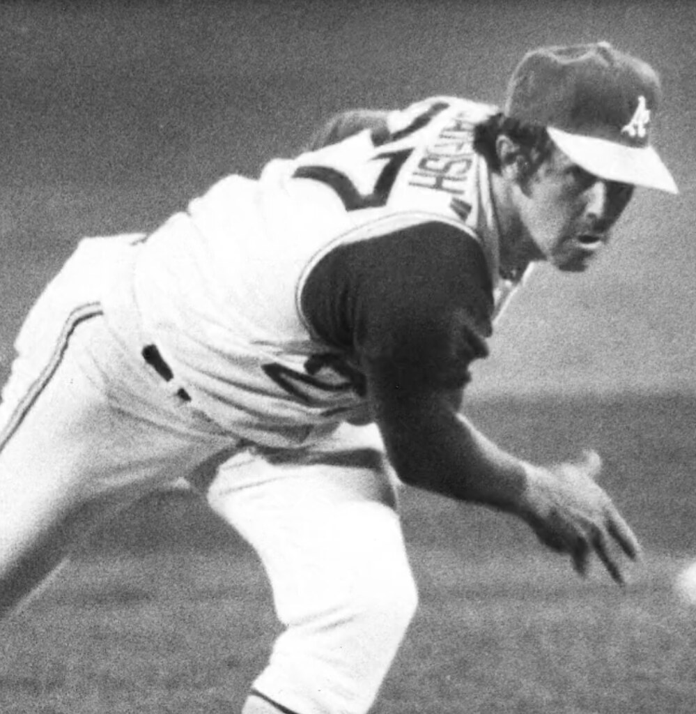
• Oh, and since the movie has so much chatter about Finley and the A’s, it includes a great shot of Catfish Hunter’s nickNOB, complete with the quotation marks.
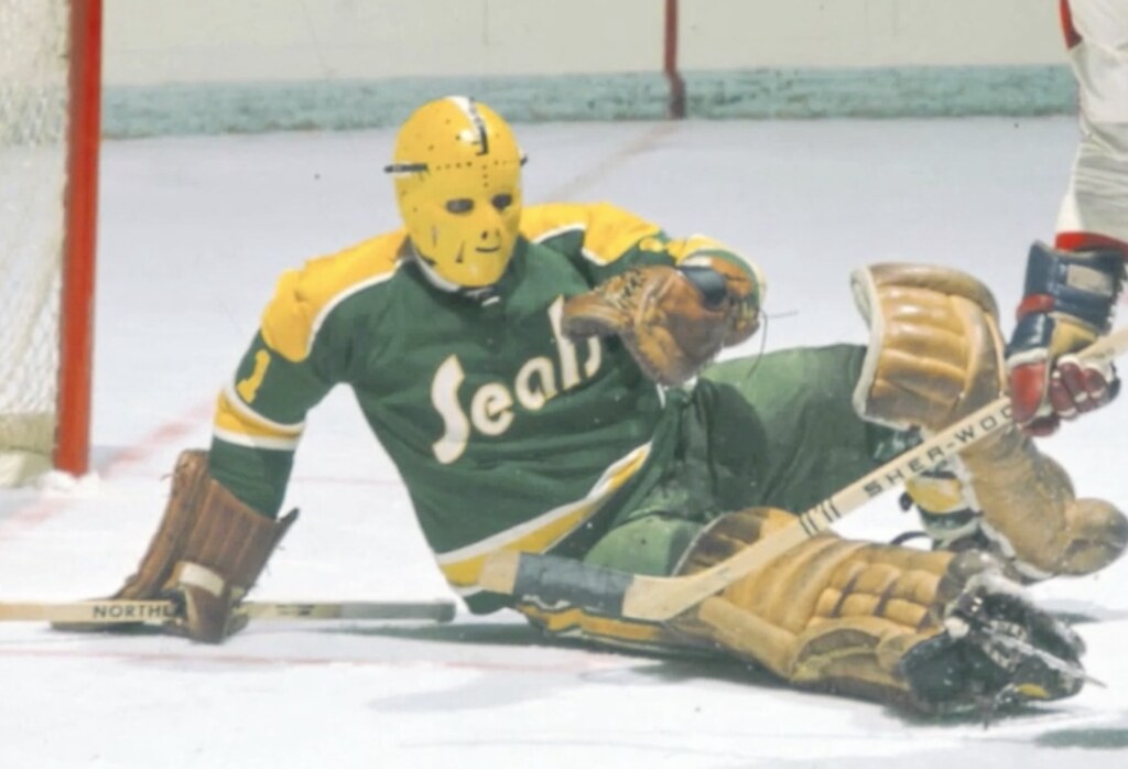
• The movie has lots of cool-looking goalie masks, including backup Seals goalie Gary Smith’s gold mask, which must surely have been one of the first colored masks in the league, right?
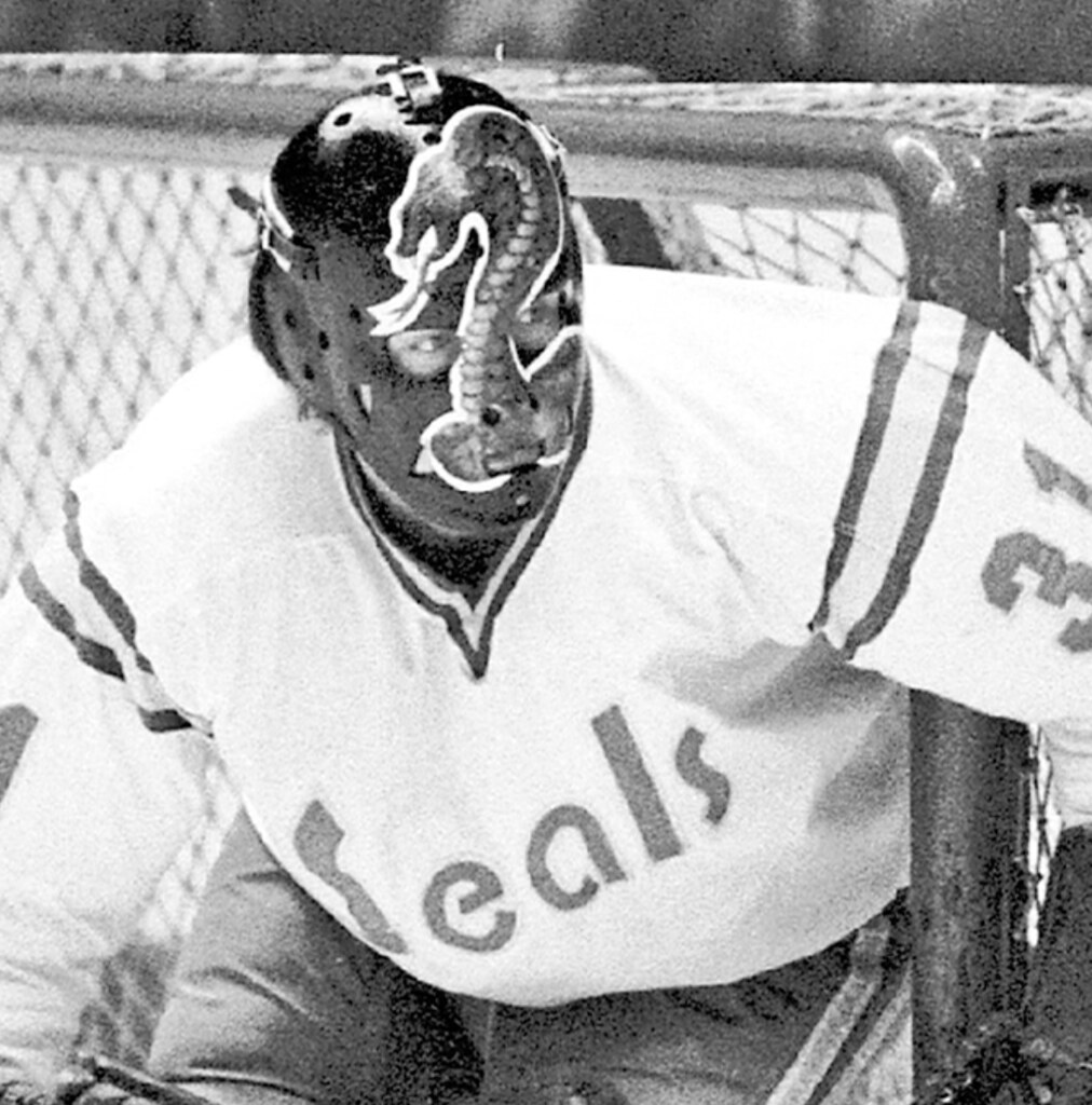
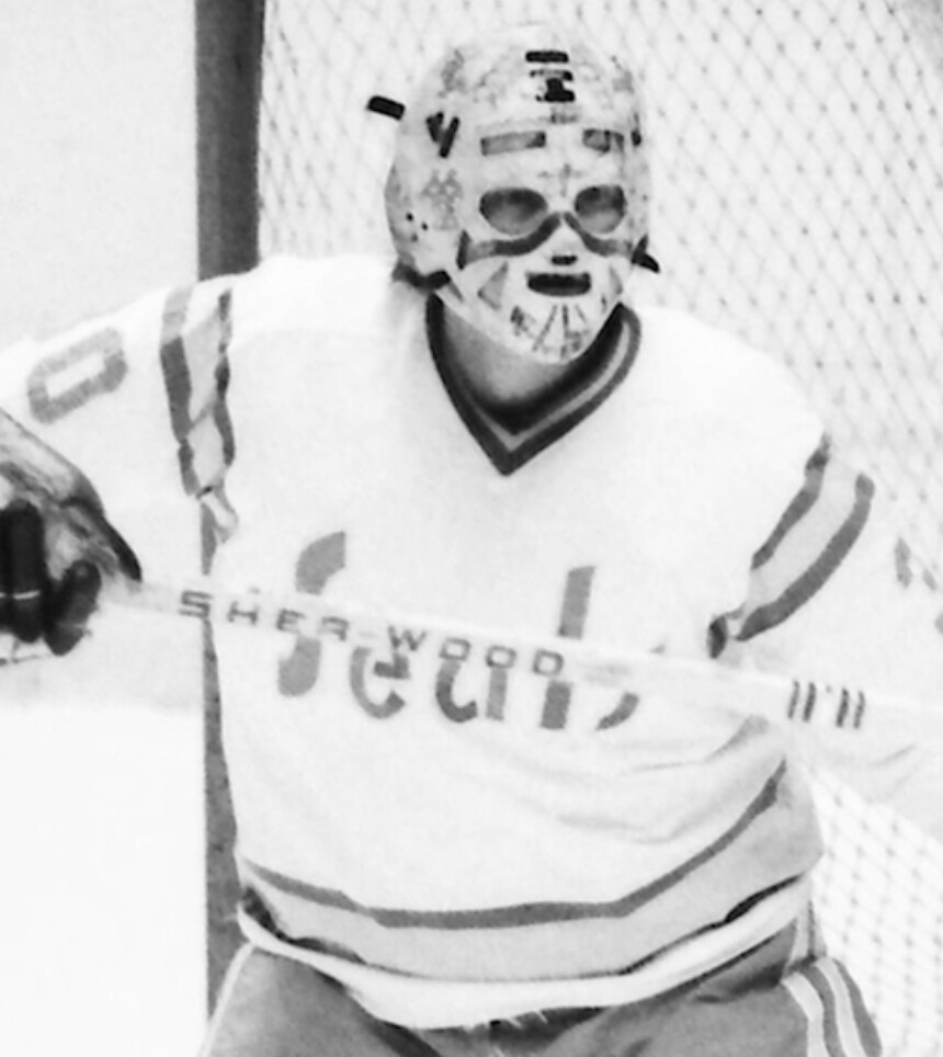
• A later Seals goalie, Gary Simmons, had two notable masks: One with a cobra (that was his nickname) and one with a Native American war paint motif.
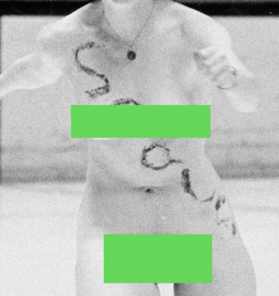
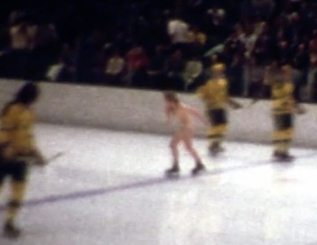
• At one point the Seals were so desperate for attention that their promotions staff hired a streaker to skate across the ice nude with “Seals” painted on her body. The film shows this, briefly. Unfortunately, there’s no mention of whether Greczmiel tried to locate the woman to discuss her fleeting moment of fame.
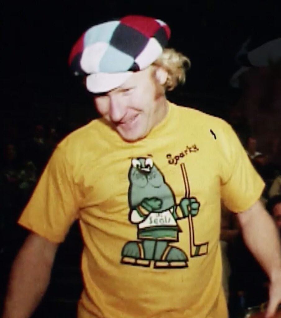
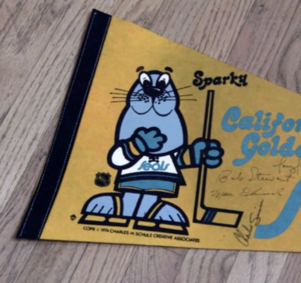
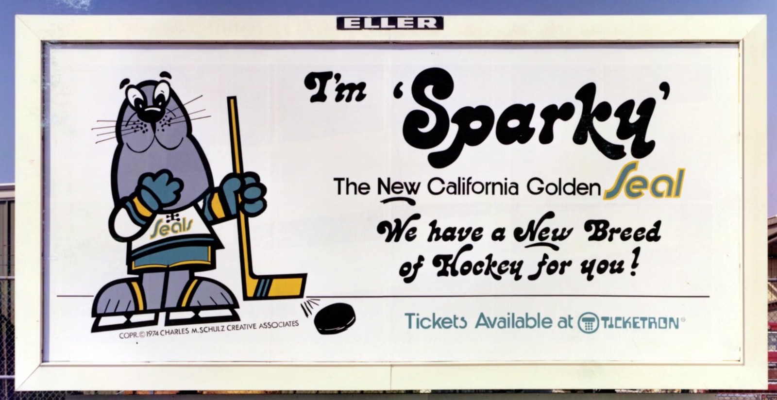
• I’d forgotten that Peanuts cartoonist Charles Schulz, who was a big hockey fan, created a Seals mascot, named Sparky (which was also Schultz’s own nickname). There are some good shots of Sparky on T-shirts, billboards, pennants, and so on.
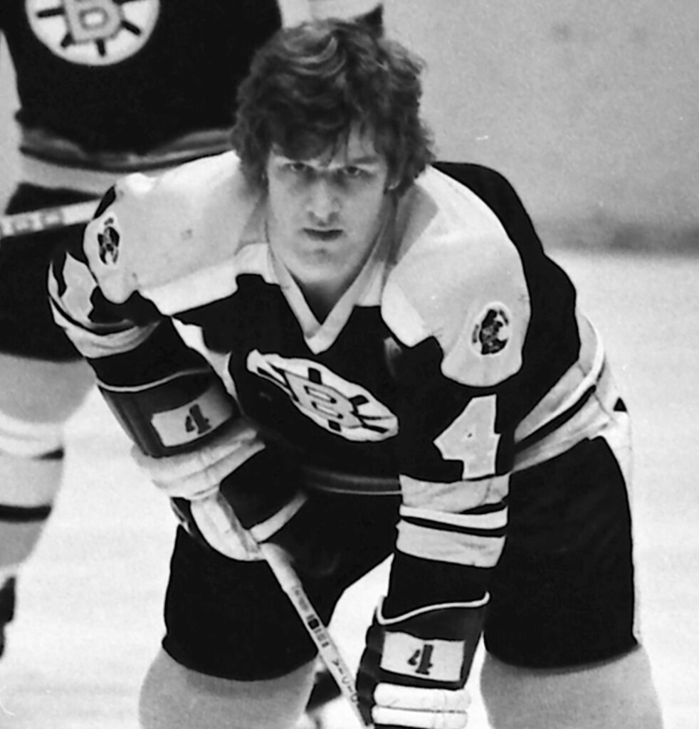
• One non-Seals uni note: I knew the Bruins wore a 50th-anniversary shoulder patch in 1973-74, but I didn’t realize they wore it on both shoulders until I saw this shot of Bobby Orr toward the end of the film:
That’s a good sampling. Aside from all the visuals, there’s a ton of great info, storytelling, and so on. A very nice job.
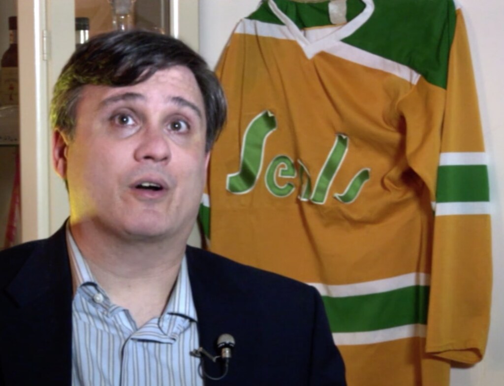
One final note: For most of the talking-head interviews that take place in the movie, Greczmiel made sure to have a Seals jersey hanging in the background. One of the interviews was with sportswriter Brad Kurtzberg, and some of the lettering on the jersey behind him was peeling off — an apt (if presumably unintentional) metaphor for the Seals’ low-budget operation.
Once again, the film is available for purchase or rental here.
NEXT-TO-LAST CALL for Larry’s shirt: Today is the next-to-last day to order our latest limited-edition T-shirt in the Uni Watch Artist’s Series, which was designed by the great Larry Torrez (aka Eltee of DC). In the spirit of his Meatscots caricature series, he’s imagined a fictitious Japanese baseball team called the Kyoto Yakitori, whose mascot is a baseball-playing samurai with a sword that serves as a baseball bat and as a yakitori chicken kebab skewer (click to enlarge):
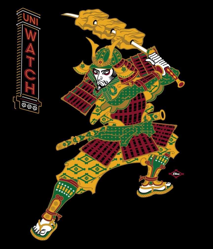
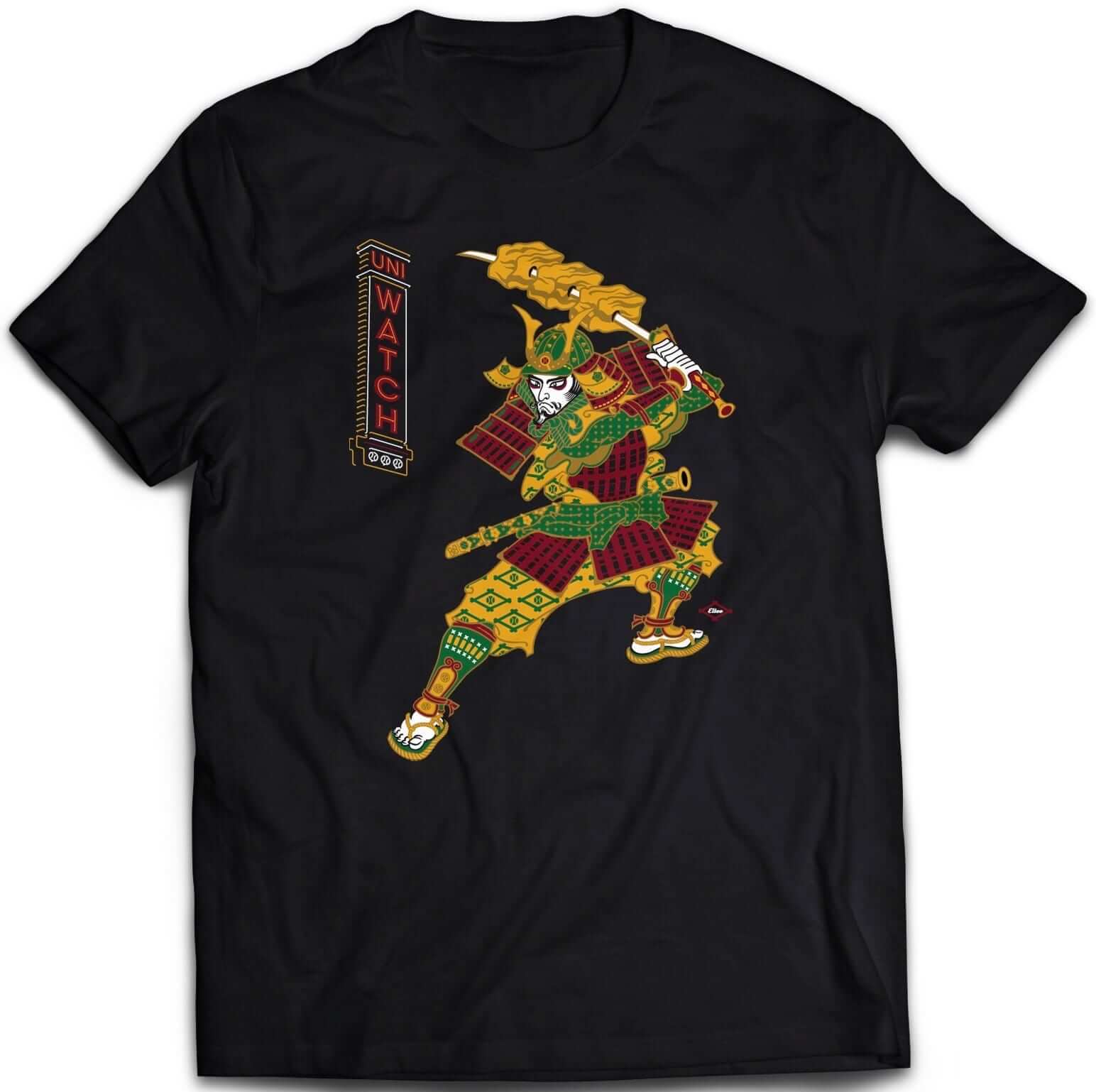
It’s available in three different black short-sleeve options (two of which come in sizes up to 5XL) and one long-sleeve option (up to 5XL). plus I’ve also made the design available as a sticker.
Some of you have also asked why I’m okay with this design if I have issues with Native American-based sports designs. That’s a perfectly valid question, and I’ve created a separate page to address it. Look here.
The shirt is available here through this Thursday, April 6. My thanks, as always, for your consideration.
Contest reminder: I’m running a new ESPN design challenge to redesign the Raiders for their move to Las Vegas. Full details here.
The Ticker
By Alex Hider

Baseball News: Yesterday marked the on-field debut for the White Sox’s new matte batting helmets with 3D logos. … Looks like Yankees’ base coaches are wearing glossy helmets even when on the road, while batters wear matte helmets (from Dylan Goforth). … Miguel Cabrera’s helmet logo may have been a bit off-center yesterday (from BJ). … Brewers outfielder Eric Thames wore a shirt featuring the Milwaukee skyline during a pre-game workout yesterday. … Can’t wait for these Astros tequila sunrise socks to make their on-field debut (from Spring Sweatsuit). … Orioles manager Buck Showalter got away with wearing a cap without a New Era logo on Monday (from Zach Spencer and Brian M.). … Here’s what Reds minor leaguers wore for the team’s Future’s game on Saturday (from Kub). … The Las Vegas 51s are wearing a “35 Seasons in Las Vegas” patch this year (from James Beattie). … The Salem Red Sox are wearing a patch commemorating 50 years in the Carolina League this season (from Clark Ruhland). … Creighton’s jerseys have overlapping Gs on both sides of the placket, so at times their jerseys read CREIGGHTON (from David Westfall). … Longtime reader/contributor Jimmy Lonetti guest-wrote a Uni Watch entry about his glove repair business back in 2013. Now he has a new project: wallets made from vintage glove leather. … Here’s a nice human interest piece about another guy who has a side business repairing gloves (from Ilana Hardesty). … Here’s a new line of shirts celebrating signature ballpark food from a few big league cities (from Derek Linn). … Clinton LumberKings manager Pat Shine is wearing No. 16 this season in memory of Jose Fernández (from Zach). … The Rangers will not issue uniform No. 69, even if a player requests it (from Brinke). … A’s OF Rajai Davis has been wearing stirrups with white sannies, instead of Oakland’s traditional gold (from Johnny Bartlett). … The new MLB socks are designed to be worn with the team logos facing outward, as seen here with these new Brewers socks. But Cardinals reliever Brett Cecil wore his socks on the wrong feet last night, resulting in the logos facing inward (from Brian White and John Luther). … When Under Armour takes over the MLB uniform contract from Majestic in 2020, they’ll keep using the same Pennsylvania factory that Majestic has been using (from Joe).

NFL News: If these retail jerseys are any sign, it looks like the Cowboys will be updating their jersey template (from Texas Bacon). … Teams of students at SUNY Fashion Institute of Technology entered their best NFL-related designs for a contest. Voters can choose their favorites, and the winning team is awarded $5,000 (from Joseph Bailey). … Ryan G. found a pack of football cards featuring Bills lineman Cordy Glenn wearing No. 00. He normally wears No. 77.
College Football News: It’s weird to see former LSU coach Les Miles in a Nebraska hat. His son just signed with the Huskers. At least he stuck with white (from Colin Tierney). … Looks like Iowa State is teasing all-gray uniforms. It’s not clear if these are new or the same ones they wore last season (from Jeff Jensen). … John Canterbury found these classic Big Ten (and Southern Illinois) posters at his grandparents’ house.

Hockey News: The Wild wore North Stars jerseys during pregame warm-ups yesterday, and Zach Parise wore his father’s old North Stars gloves and helmet (from Hockey Feels). … Bruins draft pick Jakob Forsbacka-Karlsson has just joined the team. By Jeff Israel’s count, if he makes his debut with a full hyphenated NOB, he’ll have the longest nameplate in NHL history. … The Predators wore jerseys with their social media handles for warm-ups last night. … The Penguins have special tags sewn in their jerseys for their annual final home game “Shirt Off Your Back” tradition. Each year, every Penguin gives their jersey away to 29 random fans in attendance (from Jerry Wolper). … The Norfolk Admirals of the ECHL are set for a makeover (from Jason Rhodes).

NBA News: Color-on-color last night in Indianapolis between the Pacers and Raptors (from Jarrod Campbell). … Here’s a great photography collection of basketball hoops from around the country . … Good story about Raptors equipment manager Paul Elliott, who’s had to do his job with a torn Achilles tendon (from Mark).

College Hoops News: Couple of post-championship Tar Heels notes from James Gilbert: North Carolina’s student newspaper, The Daily Tar Heel, used an old version of the interlocking “NC” logo, discontinued in 2015. He also sent along this blog post about the T-shirt printed after the Heels’ first championship in 1957. … A Reddit user drew every single NCAA D-I basketball logo in MS Paint.

Soccer News: Manchester City is letting its fans vote on next season’s number font (from Donovan Shartswell). … In a related item, the Mexican team Pachuca’s number font is based on the team’s crest, which looks really weird on the field (from @Barsotta and Gabe Ramirez).

Grab Bag: This podcast episode features a conversation with noted designer Michael Bierut, and features a good conversation on logo design (from Rex Henry). … Want to get a Coke at the Masters? Well, you might get one ”” or it could be a Pepsi, or some other cola, because the soda machines at Augusta aren’t branded (from Robert Hayes). … Carlton FC of the Australian Football League has new “blueout” jerseys (from Scott Nuzum). … WWE Raw was in Orlando this week, so wrestler Enzo Amore wore a Magic-themed singlet for his match (from David Firestone). … Today, people are encouraged to wear orange to raise awareness for roadway worker safety (from James Gilbert). … There’s a company out there that makes reggae-themed jerseys, including one based on the Astros’ tequila sunrise design and another based on the Nets’ Dr. J-era design. Lots more here (from Nathan Samuel).
Those Cowboys jersey tweaks are minor and none for the better: the white sleeve stripe got narrower, the shade of blue got farther afield from the blue used on the helmet and pants and the Nike logo moved.
The biggest thing that I noticed was no more flywire collar, which could eliminate the blue color bleed issues they’ve had in recent years.
Was the blue-bleed issue a problem in 2016?
I know it was a big issue in 2015, but I don’t recall it showing up last season.
You know, after a scanning through some 2016 photos, it looks like it was fixed last year.
Ah, thought so!
Nonetheless, scrapping the flywire/Nikelace/etc. is still a win, even if there’s no blue-bleed issue.
It’s interesting to me that they are updating the throwback jersey. I wonder if they plan to wear it and paint or wrap the helmets or something? Or maybe Nike is just phasing out the older templates for retail in favor of the new one and the throwback is the big seller? I’ve kind of given up hope that the Cowboys will ever “fix” their uniforms (use navy blue consistently and make those green pants silver) but then again, I guess the inconsistencies have kind of grown on me. I just wish they would wear the blue jerseys more, maybe do half the home games in blue and the other half white. That is the most beautiful uniform in football IMO. I also wish they would wear the color rush jerseys with at least navy socks, if not the navy socks and silver pants they wear with the blue jerseys for a season as their primary.
I will say I absolutely LOVE that all of the Cowboys jerseys are different from one another and aren’t just the same jersey with the colors flipped. Hell, they don’t wear the same anything in any of their uniform sets. The pants, socks, etc., are all different with all 4 uni sets.
I don’t think the different designs of the Cowboys’ uniforms are the issue, so much as it is the fact that their preferred uniform, the white one, has those maddening color inconsistencies compared to the other sets.
It’s the only set with royal blue in it. It’s the only one with greenish silver pants. It’s the only one to incorporate black trim (on the sleeve stripes).
Typo: Charles Schultz is SCHULZ. It matters to those who loved Peanuts and saw his name in each strip.
It matters even if you don’t care about Peanuts, because it’s important to spell things correctly! Now fixed.
Is that “Krazy George” Henderson in the Sparky t-shirt? I know he did some cheering in the Oakland area during his manic career. link
Yes, that’s who it is. He makes several appearances in the movie.
Went to lots of San Jose Earthquakes games as a kid and enjoyed Krazy George’s antics. Seeing him on the freeway after one of the games driving a beat up old Toyota put things in perspective.
A thorough image search brought me to this gem for bobble head lovers. link
I idolized Krazy George growing up in San Jose and was constantly surprised how he was at seemingly every game I attended. It was like there had to be more than one of him. Dude was insane, hilarious, and genuine.
Glad to see they got the North Stars logo right on those 1967 throwbacks! When they were first announced, the Wild showed jerseys with the dropshadowed N that wasn’t used until 1975.
Looks like they still used the Wild number font, though, based on the shape of the 1s on Parise’s jersey.
The Seals were one of the first to start putting NOB in the NHL in 1970. However, not the among the very first.
The New York Americans wore NOB in 1926-27. Only did it for one season, then the practice disappeared for decades.
link
I rented the Seals movie the day that it was released a couple of months ago. It was indeed fantastic and well worth the price!
“… the soda machines at Augusta aren’t branded.” Are you freakin’ kidding me? How ri-damn-diculous is that?
Why exactly is it ridiculous?
I’m not necessarily disagreeing with you. I’d just like to understand your reasoning.
People are certainly partial to their preferred flavors, but I could see a bigger issue with the diet sodas because they actually use different sweeteners – Pepsi uses sucralose in their primary diet version while Coke uses aspartame, and some people report side effects like headaches from one but not the other.
Practical considerations aside – I love the “no frills” look of the dispensers.
I’ve got no problem with them not branding them, but can you at least tell me what flavor the “Sports Drink” is?
It’s Sports-flavored, of course. *rimshot*
Yeah, they could be a little more descriptive on that one, at least.
The drink fountain shown in the picture is not consumer-facing. At the Masters, the drinks are pre-poured and placed on a counter by a concessions worker, so the whole process can move quickly. That’s why it doesn’t matter that the names aren’t particularly descriptive.
The sports drink is blue, if memory serves.
By the way, the beer isn’t branded either. Domestic, Light, and Import.
A friend of mines Dad had a Yankee connection. When my mitt broke he had the Yankees guy fix it for me. I thought it was interesting that I was told to use shaving cream, not oil on the glove. He said to do that cause oil makes the mitts to heavy.
I played baseball with an ex-Yankees farmhand and he told me the same thing. Use shaving cream, not the oils. He used Gillette Foamy, not the gels you see nowadays.
Yup…I used foamy too! Not nearly good enough to play with a Yankee farmhand though.
Those F.I.T. designs for the NFL are inspiring; reminds me of the good old days when I would doodle team-related souvenirs in a series. I like the use of patterns derived from team insignias.
Not only did Zach Parise wear his dad JP’s vintage equipment, but Martin Hanzal–normally #19 in the Wild scorecard–wore #91 for his North Stars warmup sweater. #19 is a North Stars retired number for inaugural team member Bill Masterton (RIP), the namesake of the Masterton Memorial Trophy.
BTW- My shirt came in the mail yesterday. The design looks awesome and it is very well done. Thanks
Hyphenated names in the NHL tend to get cut more often than not. For every Ryan Nugent-Hopkins who keeps his whole name, I’ve seen Pierre-Luc Létourneau-Leblond, Magnus Paajarvi-Svensson, and Mats Zuccarello-Aasen all get their names cut. Not sure of the logic. Special exception for a Canadian raised #1 draft pick?
I took a look for some articles on this, because it interested me. Mats Zuccarello chose to shorten his name; he’s played with the full name on the back before, but in 2010, said he prefers it this way. PL3 just never thought to ask; people used Leblond and he rolled with it. Last year, the Syracuse Crunch made him a nameplate with his full name on it, and that apparently was the first time he considered that it was something that a team might do. MPS goes back and forth, but decided to go with his mother’s maiden name because it was cumbersome to have both. (Interestingly, his brother uses their father’s last name.)
Interesting. Thanks for sharing!
I think Forsbacka Karlsson is technically not hyphenated, just a double last name (e.g. David Lloyd George, Ralph Vaughan Williams).
Also, playing at Boston University he was generally called “JFK” by the radio broadcasters, and I suspect, given the city he’ll be playing in, that may continue with the Bruins.
Uh-oh, apostrophe catastrophe. It’s the Masters, not the Master’s.
Fixed.
The CCM helmet that Tony Featherstone is wearing was pretty standard back in the day. The size of the gap depended on the adjustment of the two-piece helmet. It is not a cutout, but a gap between the two pieces. It wasn’t until the next iteration of the CCM helmet (we used to call it the “Henderson Helmet” after Paul Henderson, one of the first players to wear that model), that the gap was removed and the two pieces of the helmet overlapped.
I thought the same thing regarding tbe CCM helmet. I wore one like that in my youth hockey days. It does look like he did cut extra out of the top part of the helmet. The inner white foam lining appears to be showing more than it should.
I know this is off topic, but all the info about the Seals brings back memories of a game I went to as a 9 yr old kid at MSG when the current Garden first opened. Mind you, I have no photographic evidence of this but the Rangers were hosting the LA Kings and I remember this like it was yesterday. The Kings wore their purple road uni’s but instead of the crown logo, they wore the word mark “KINGS” diagonally a la the Rangers style in gold block lettering. Can’t seem to find any evidence of this except for what I remember. I have “googled” this to no avail. Anyone out there either remember this or have newspaper clippings, etc?
Nothing personal, Steve, but I’d be stunned if your recollection is correct. I’d definitely need to see photographic evidence.
wow…. what year approximately was this?
-Jet
Regarding Featherstone’s helmet, I believe that was a CCM brand. I had one just like it. It was a standard helmet at the time, with that space in the front.
Here’s Seals player #20 Charlie Burns with a unique style helmet (in yellow):
link
Here he is pictured with the helmet on his Topps trading card way way back in 1958…
link
Here he is with the Bruins:
link
Charlie Burns had a severe head injury as a Junior player and had a plate in his head. In order to continue playing he had to wear a specially padded helmet throughout his career.
Interesting that in the second Gary Simmons photo he is holding a regular stick not a goalie stick. Maybe he lost his and grabbed a teammates. Just an observation.
Or is it another player in front of him?
All the pics I’ve ever seen of Cobra Simmons, he’s using a Northland goalie stick. I think it was as you said, he lost his stick and a teammate handed him his…
-Jet
They have orange pucks now but they are meant for strength training and are about twice as heavy as a standard puck. Sort of like a batting doughnut I guess. USA Hockey also produces blue pucks that are lighter for pee-wee & mites games. They’re super bouncy too
Couple of notes on the Seals.
The Seals must set a record for name changes within a 10-year span?
1. California Seals
2. Oakland Seals
3. Bay Area Seals
4. California Golden Seals… then…
finally…
the Cleveland Barons…
I don’t think they were ever officially called the “Bay Area Seals”. They might have announced the name but I don’t think they ever used it.
Also:
6. Minnesota North Stars
7. San Jose Sharks
I know that the Sharks are not direct descendants of the Seals, but for all practical purposes it was an undoing of the North Stars – Barons merger.
I don’t count the North Stars (and by extension, the Sharks) because while the Barons and North Stars organizations merged, the franchises did not; the Stars’ franchise continued, while the Seals/Barons franchise came to an end in 1978.
I disagree with you on that.
I’m not too hung up on the “franchise” versus the organization. For all I know the “North Stars” franchise technically ended at the same time as the Barons and a new franchise was granted to Minnesota. I just don’t know.
If we went by the “franchise” test, I don’t know how you’d deal with Ottawa, Buffalo and St. Louis (all of whom have franchises newer than their founding dates).
Anyway.. its a good discussion, thanks.
Hockey blog in Canada, below, indicates the San Francisco Seals
See James Steever link
The Snoopy’s Senior Hockey Tournament, in Santa Rosa, that Charles Schulz started is still going on each July.
My dad who will be a month short of 80 years of age is sending a couple teams down there this summer. He, health permitting, is planning to play in the oldest age group (70+).
The rink has a video on You Tube of the first four decades of Peanuts related souvenir mugs of the tournament. (there is also a time-lapse video of the ice surface getting redone in 2015)
link
Proofreading:
“When Charlie Finley wanted to purchase the Seals in 1970, his primary rival was a guy whose family had helped to popularized televised roller derby”
– Should be “popularize”
Fixed.
I really dig those baseball glove wallets. If only I hadn’t bought myself a new wallet three weeks ago……
They are pretty sweet. Too bad on you just made a new purchase. Keep me in mind.
Cool poster on the California Golden Seals topic:
link
Now that’s a cool Canucks branded hockey helmet.
link
2-color helmet!
-Jet
I have seen photos of that helmet in action. It is actually a tri-colour. There is a green stripe on the top.
While on the subject of colored skates, lest we no forget the WHA New York Golden Blades, who’s skates were… white…
Andre Lacroix wearing the white boots… w/golden blades…
link
… the team started the season wearing white skates with gold-colored blades.
…and don’t forget the Golden Blades had FIVE players who also played for the Seals in the Finley era!! (Norm Ferguson, Harry Howell, Mike Laughton, Bobby Sheehan, Gary Kurt)
They got to wear colored/white skates on two different teams!!!
-Jet
Having been one of the financial supporters of the Seals’ documentary’s production, thank you Paul for the review. A few comments:
Leo Seltzer, who you mentioned as a “guy whose family had helped to popularized televised roller derby,” is a little more than that. His father Leo INVENTED Roller Derby and Jerry ran the operation until it ceased business in 1973. He then went on to found BASS Tickets, a predecessor to Ticketmaster.
As noted in a previous comment, that is indeed “Krazy” George Henderson rocking the Sparky t-shirt. For those who do not know, George is the reputed inventor of The Wave, although I can’t hold that against him too much. :-) His career as a professional cheerleader started out with the Seals and the NASL’s San Jose Earthquakes.
Regarding Charles Schulz, his nickname was indeed given to the cartoon seal he created for use in the team’s last years. He lived in the Santa Rosa, CA area for the last 40 or so years of his life, before it was overrun by precious wine snobs. (My family has lived there since the Gold Rush.) My ex-brother-in-law’s family was his neighbors for the last 30 or so years of his life. In fact the first time I met him, I was about 7 years old, and my step-father almost ran him over jaywalking. My dad had to slam on the brakes, and he yelled out the window, “SPARKY! WATCH THE HELL YOU’RE GOING!! I ALMOST HIT YOU!,” and he came over and talked to my Dad for a couple of minutes. He built an ice rink (still there, in fact my son plays hockey there) so he could play, next to his studio and the site of his museum (well worth a visit if you are in the area). He used to hang out at the bookstore where I shopped and at the coffee shop at his rink where people would bother him to draw picture of one of the Peanuts characters. I always hated that. It just always struck me as being very rude.
The one interview I wish Mark was able to get was Tom Hanks, who sold hot dogs at Seals games (as well as A’s and (T)Raiders games) when he was in high school. Yes, I can actually say that I have bought hot dogs from a multiple Oscar (Meyer) wiener….er….winner.
Back in the 70’s I clipped two Peanuts comics out of the newspaper because they included a reference to the Seals. One had a pennant on the wall that read “SEALS”; another had them playing hockey and one of the kids had “SEALS” across his shirt…
-Jet
The Seals also featured a skate color pattern with a natural leather and dark green color scheme.
link
This item comes directly from the personal collection of Hall of Fame Trainer, Ken “Doc” Fleger.
I really think what you’re seeing here is the tannin in the brown leather of the skates leaking out into the white paint. The Seals never had skates with a natural leather look. The reason you’re not seeing it on the toes is because typically the toe was made of a different type of material (although still leather) than the sides which were more flexible and could take some neatsfoot oil to soften it. Now that I think of it, it could very well be neatsfoot oil soaking out into the white paint. As a teen I always oiled up my goalie leg pads and catching glove/blocker with neatsfoot oil…
-Jet
Those pictures of white paint being applied to black skates answers my question of did the white skates come out of the factory that way. Don’t understand why, the yellow/green and green/yellow skates were dyed leather.. CCM & Bauer made women’s figure skates with white dyed leather. Maybe they didn’t agree with Charlie Finley, and refused to make them.
In the 70’s, you could buy goalie skates that were already white. The goalie skates in that era had a hard plastic overlay atop the leather boot. They were normally black plastic over a black boot, that’s what I owned. A few years after I bought mine, skates with a white plastic overlay atop a black boot came on the market. Gilles Meloche on the Seals used them, as did Bernie Parent on the Flyers and a few other goalies that I can’t recall right now… but as you can see they weren’t confined to only the Seals…
-Jet
Pittsburgh Penguins and St. Louis Blues also wore colored skates in the early ’70’s:
link
link
link
link
Excellent, I was going to post this too. I wish there was some way to track how many games these two teams actually wore the colored skates because it definitely wasn’t for the entire season. I think in both cases it was a brief experiment for a few games. A guy on Ebay a few years back was selling a great pic of the two teams playing against each other, both with the colored skates!
-Jet
The pictures are evidence of the colored skates, but the skate-in-puck item is not. That is a bottle opener that was sold in multiple team colors. I have the one for the Rangers, and the skate is red and blue. We know that the Rangers never wore colored skates. (Can’t attach a photo because I’m out of town.)
I took this photo of a basketball hoop in Wakefield, RI in February 2015. There was also about a -40 windchill.
link
Love the Seals on Uni Watch today….I saw my first NHL games there in 69-70 and have loved their history…a short history but a great story..!
Last night, the D-Backs wore their home alternate uniforms and it appears that their high cuffed players had non-stance socks
Forgot to link the link
As the biggest Seals fan in the NY area back in the 70’s, you can imagine I am in my heyday lately. I was also a financial backer of the documentary, and it’s pure “gold” for a guy like me to see some of this newly-found footage. Bad enough fans in the Bay Area never got to see their own team on local TV, imagine what it was like for a guy like me 3,000 miles away to get ANY info on the team! The newspapers always had the boxscores a day late on games from the west coast. There’s also a book coming out later this year (the second one about the Seals) and there’s a short anecdote about me in there.
-Jet
Quick question, on the Raiders contest, do you have to redesign the logo? Or just uniforms?
All of that is spelled out in ESPN piece that I linked to.
Here are the two fonts the Manchester City fans get to choose from: link
My goodness, this is astonishing. I like to think I know quite a bit about Charles M. Schulz, my favorite cartoonist of all time…but I NEVER knew about Sparky the Seal!
I actually read an article somewhere recently about this project, while researching for a strip I just finished about the Seals’ white skates…but I didn’t realize it’d been completed. Super anxious to watch this.
Thanks for the story on the Seals documentary. I too contributed to the production of the movie and have watched it a few times now. Recommended viewing for all hockey history fans.
So there’s a lot of Seals stuff out there, and Mark did an absolutely amazing job in putting this film together. I’d be remiss in not pointing people to link back on May 21, 2015 where he talked about the work that went into the film.
As for some crazy Seals news…
Finley actually bought the team white skates link. It turns out that the skates weren’t actually painted in later years, but were coloured using shoe polish as Terry Murray explains. Musselman also explains how the team chose the green-and-yellow colour scheme.
Here’s a picture of link.
Here’s link, his work and legacy in California, and why he never tried to buy into owning the hockey club.
The Seals are the answer to a trivia question as they were the link in 1974-75, their first road win in team history. If you know your hockey history, the Caps went 1-39-0 on the road that year.
A lot of link.
Bill Masterton, whose succumbed to an on-ice head injury, suffered said injury against the Seals on January 13, 1968 when Seals defensemen Larry Cahan and Ron Harris knocked him down, causing his head to hit the ice.
Here’s the link showing off the new duds to be worn by the expansion Seals.
Baseball isn’t the only sport with groupies who cross the lines. link.