Click to enlarge
If you’re even a casual fan of 1980s punk rock, you’re probably familiar with the artwork of Raymond Pettibon, the brother of Black Flag guitarist and SST Records founder Greg Ginn. Among other things, Pettibon designed Black Flag’s now-iconic “four bars” logo, and he also did the artwork for tons of Black Flag record covers and gig posters, along with album artwork for other bands.
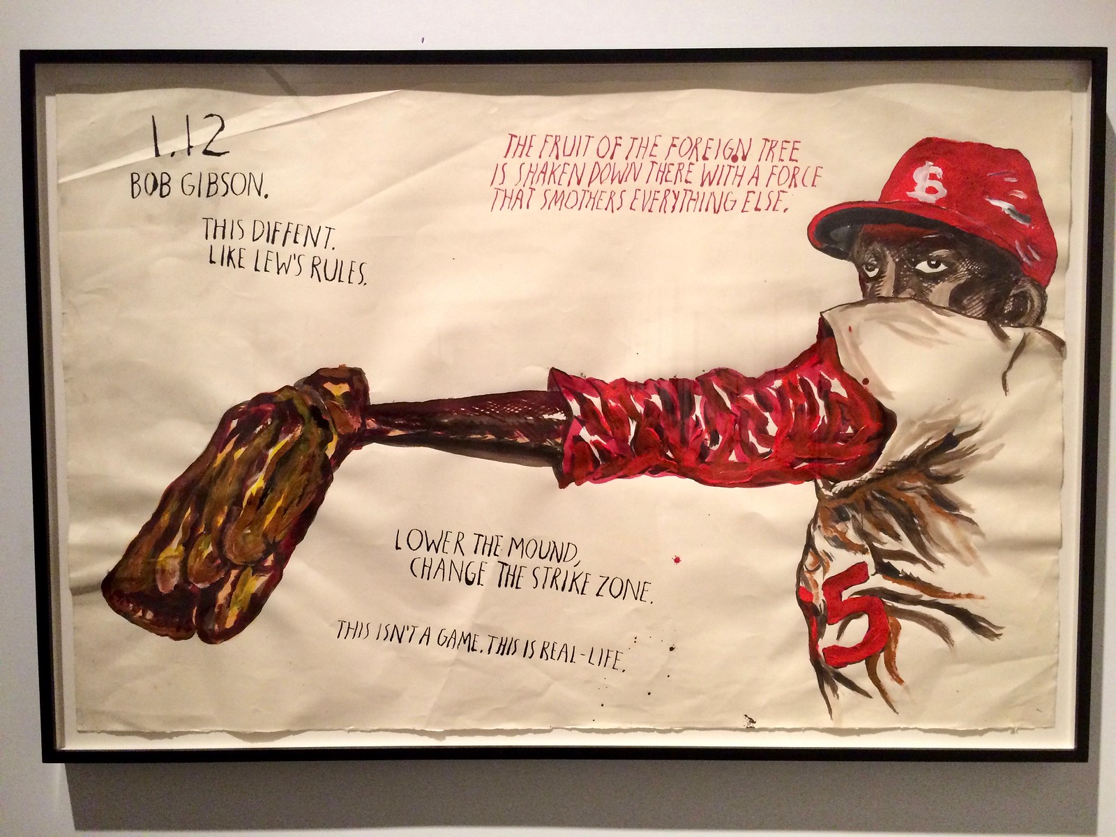
Somewhere along the way, Pettibon left punk rock behind and improbably became a Very Big Deal in the art world. He’s now the subject of a massive retrospective exhibition at the New Museum here in NYC, which I checked out over the weekend. The show, which extends over three floors of the museum, features over 800 pieces, most of which are grouped by theme. One of those themes is baseball — turns out Pettibon is a big fan. (A few years ago he was commissioned to do a big baseball-themed piece for the High Line in Manhattan.)
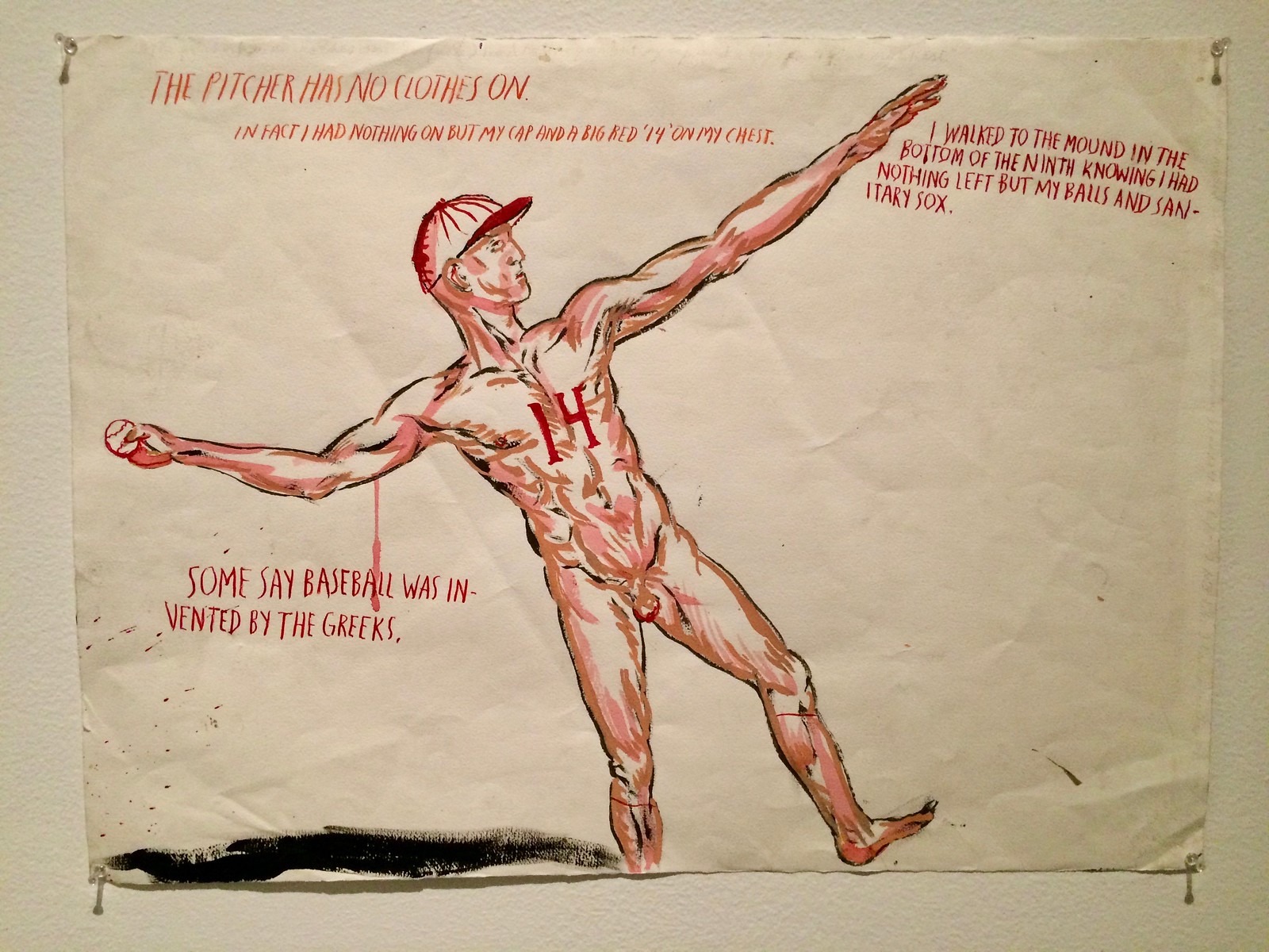
The Bob Gibson piece shown above was my favorite of the baseball pieces in the New Museum show, but there were lots of others, most of them excellent. This next one is somewhat uni-related, or at least it references sanitary socks (click to enlarge):
Want to see more? I took photos of all of the baseball-related pieces and gathered them into this slideshow (if you can’t see the slideshow below, click here):
As for the rest of the exhibition, it showcases Pettibon’s excellent knack for creating social commentary by skewering cultural totemic figures (Superman, Elvis, the Marlboro Man, Mickey Mouse, various presidents, Gumby, etc.), and his longstanding fascination with sex, guns, war, and surfing, among other tropes. I’m pretty sure every single piece included text, which makes the exhibit somewhat exhausting. You can’t just look at the images; you have to read and process the messaging. Pretty great stuff, though — highly recommended for anyone in or visiting NYC between now and April 9.
Here are some additional pics I took (this set includes the baseball pieces shown above, sorry for the duplications; if you can’t see the slideshow below, click here):
Click to enlarge
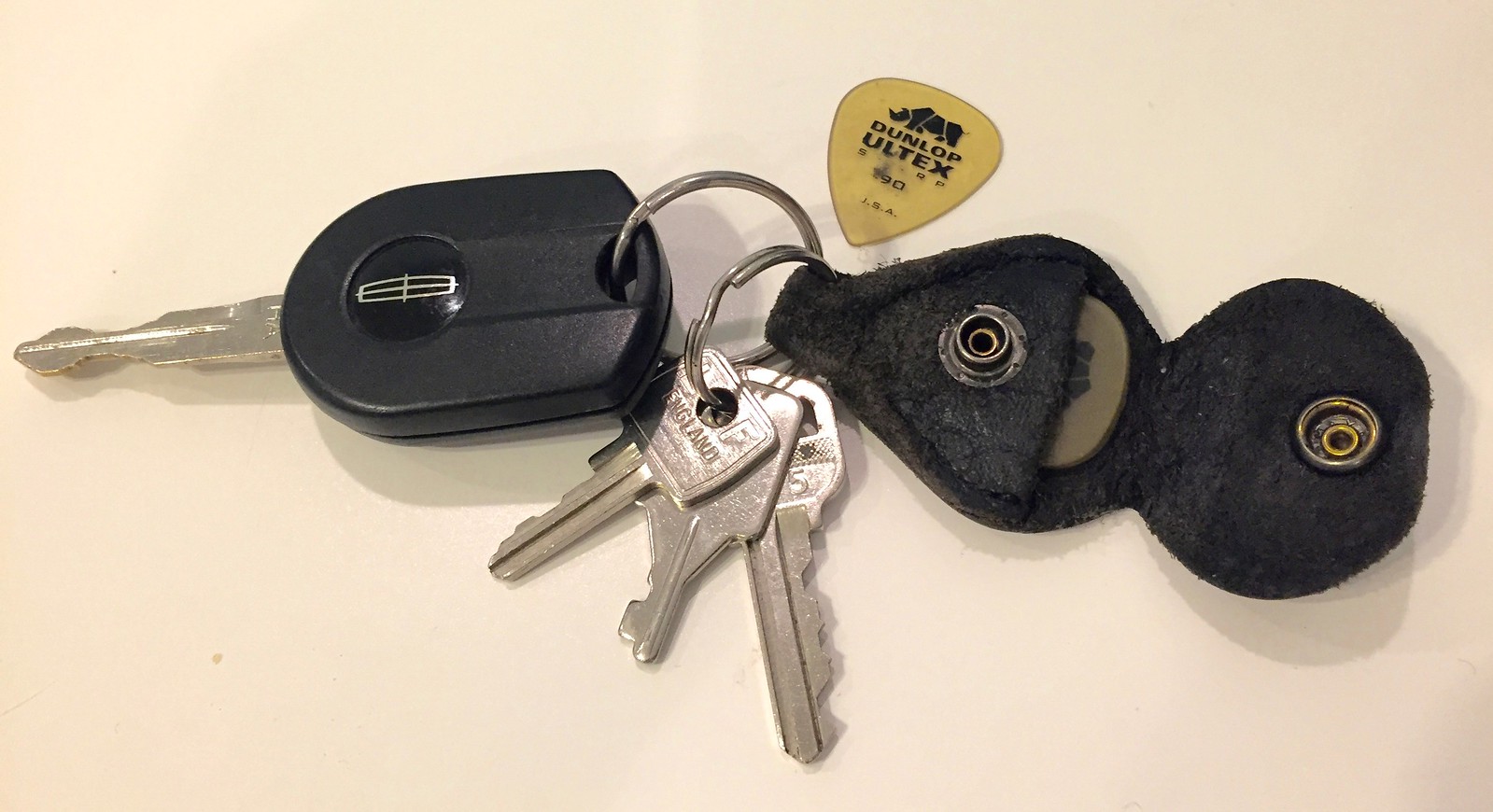
KRC update: The latest installment of Key Ring Chronicles is about a guitar pick holder. Check it out here.
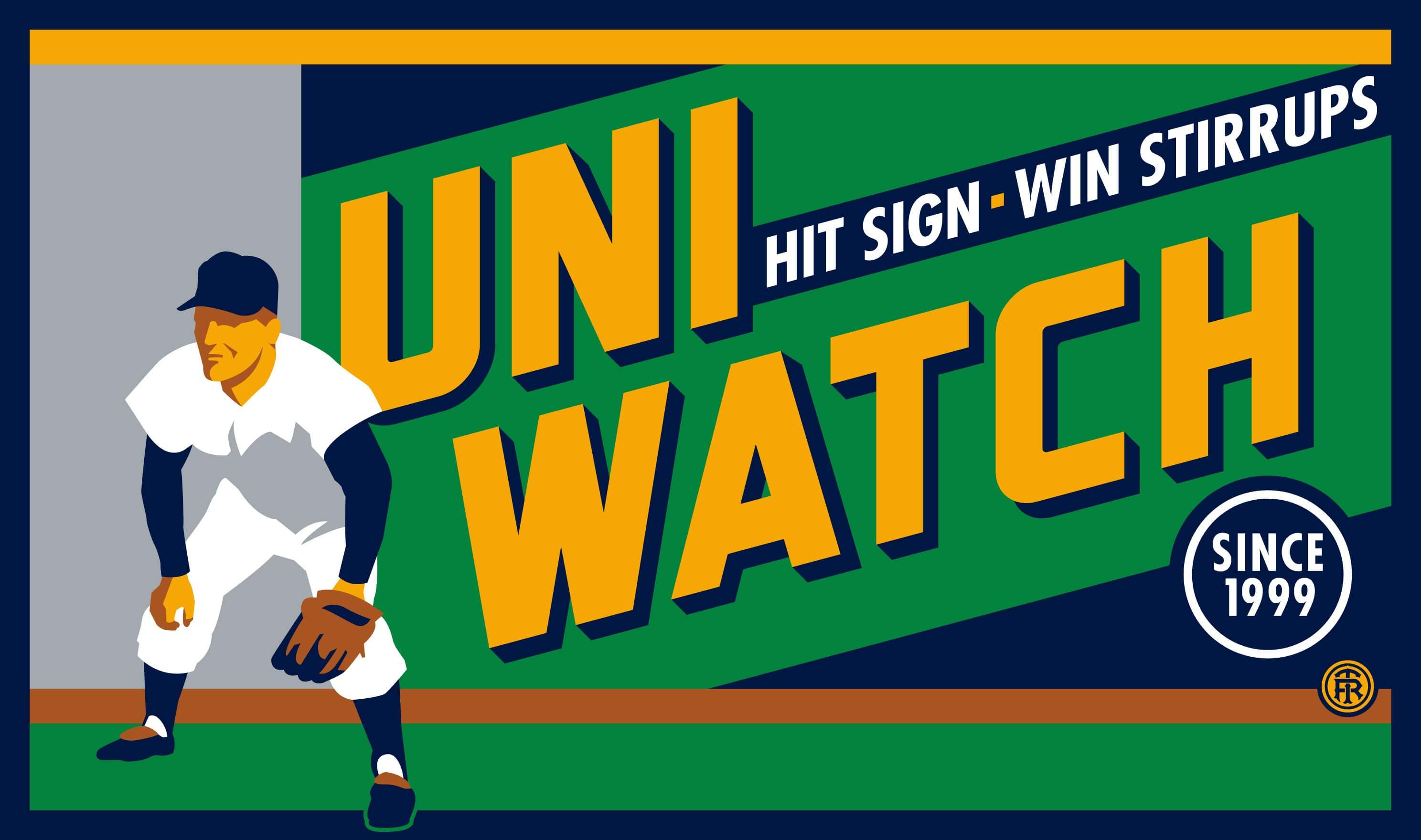
T-shirt reminder: In case you missed it last week, our latest T-shirt, designed by the great Todd Radom, is now available. Check it out (click to enlarge):
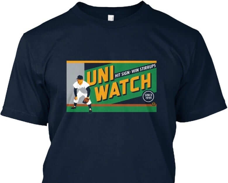
The design takes inspiration from the old Abe Stark sign at Ebbets Field, which read, “Hit Sign, Win Suit.” Please note that we’re using the shirt fabric color to fill in the dark portions of the design — the outfielder’s cap, sleeves, stirrups, and shoes, and the dark parts of the sign behind him. We think it looks best on Teespring’s dark navy shirt, which is the version shown above. But you can also order the shirt in black (yes, go ahead and make all your BFBS jokes), in which case the design will look like this:
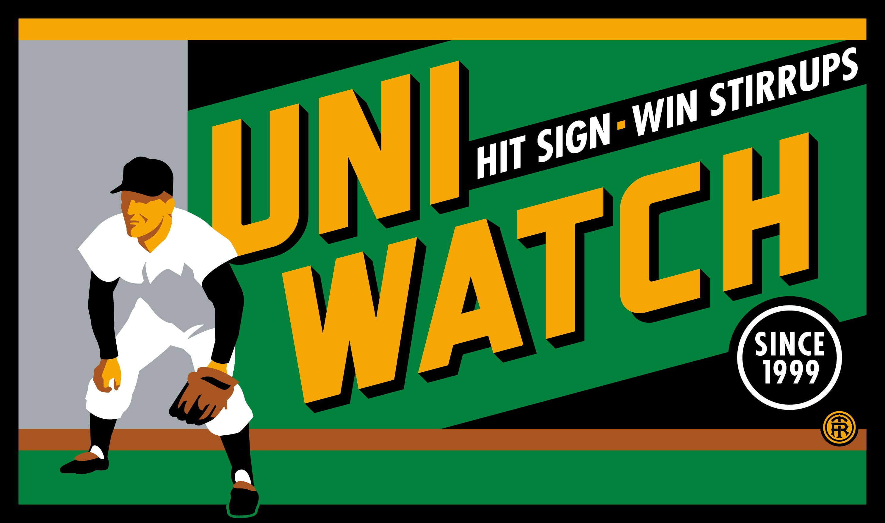
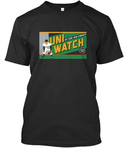
There’s also an American Apparel short-sleeved version and a long-sleeved version, both of which come in a slightly lighter shade of navy. You’ll be able to see all of this on the ordering page. Just make sure you choose the shirt and color you like best.
The shirt is available here through this Friday, March 3. My thanks, as always, for your consideration.
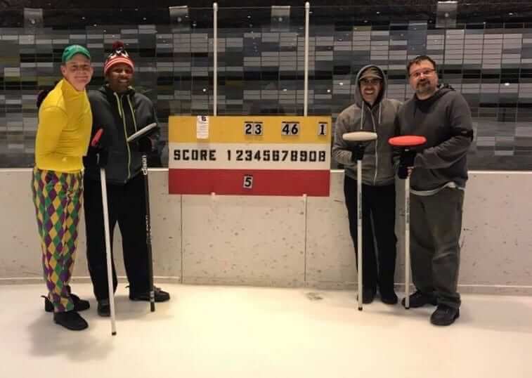
Curling update: After more than a month away from the ice, I made a cameo appearance at curling last night, rejoining my old team for a satisfying 8-3 victory. As you can see, Phil broke out the Mardi Gras pants for the occasion (and holy shit did he curl well last night — great job, skip!).
Uni Watch movie recommendation: Most of the movies released early in the calendar year tend to suck. January and February are basically the dumping ground for studios to unload their stinkers, because they know everyone’s gonna be busy with the Oscar-nominated movies.
But every now and then there’s a really good early-season movie, and there happens to be one right now: Get Out, which I saw a few nights ago. As you’ve probably heard, it’s a horror movie with race-commentary overtones, or maybe it’s the other way around. Either way, it’s really good — smart, clever, and creepy in more ways than one. No uni-related content, unfortunately, but hey, you can’t have everything. Don’t miss. Here’s the trailer.
The Ticker
By Alex Hider

Baseball News: The Blue Jays’ Spring Training caps and jerseys are different shades of blue (from Josh Kail). … Speaking of the Jays: Ouch. Now, that’s a jersey typo. Might fly in Montreal, but definitely not in Toronto. … A poll reveals that most Cardinals fans (mistakenly) believe the team should wear navy caps on the road (from Nathan Ahle). … Looks like Javyz Baez was wearing Jason Heyward’s wristband yesterday. Baez wears No. 9 (from Joe Ringham). … Lots of retro logos on this jersey up for sale on eBay (from Robert Hayes). … William Howard Taft has officially retired from the Nationals’ Racing Presidents (from Tommy). … Check out this awesome Brewers Sausage Race-inspired soda display in Milwaukee (from Nicole Haase). … The Binghamton Rumble Ponies will be wearing Twilight Zone jerseys on July 7. Good move by Rod Serling’s hometown team (from Tweeds Tweets). … Mississippi State wore white-on-white pullovers yesterday (from Chase Tettleton). … Slick new cream homes for Utah (from Trent Kanphus). … Ole Miss wore their gorgeous powder blues for the second straight Sunday (from Brad Logan). … Nice striped stirrups for UNLV (from Jeffrey Seals). … TCU wore throwbacks yesterday against Arizona State, which went gold over gray (from Kurt Crowley). … New unis for Amherst Steele High School in Ohio (from Matt Roz). … Here’s something surprising: A 1961 photo from Angels spring training camp — their inaugural season — that shows players wearing caps without the telltale halo (from from BSmile, cap spot by Steve Tilders).

Hockey News: The Chicago Tribune is still using the Sabres’ Buffaslug logo (from Jake Taco). … Brian Delpozo recently got this Islanders jersey as a gift ”” a jersey the Isles haven’t worn since 2010. Brian says his girlfriend bought it new on clearance from a Lids store on Staten Island that is set to close. “It dawned on me then that these jerseys have probably been moving from store to store since at least the 2010 season if not longer, most likely backlogging orders,” he says.

NBA News: The Nuggets and Grizzlies went color-on-color last night (from Hit the Glass). … So did the Pistons and Celtics (from Pepperoni). … But those games were just runners up. The Pels and Thunder took home the award for the best looking color-on-color game of the evening (from Matty). … Kevin Spradlin points out that the ESPN app uses new logos and old color schemes for a number of NBA teams. … The 2003-04 Pistons championship banner doesn’t use an era-appropriate logo. Two years after their championship, the Pistons moved away from their horse-head logo to the more traditional look they have today.

College Hoops News: Michigan State wore their Michigan Agricultural College unis against Wisconsin yesterday. … Louisville broke out throwbacks against Syracuse yesterday (from Mark Ament). … Rough-looking dark grey-on-green game between George Washington and George Mason yesterday (from Gregory Koch). … Xavier wore their “Runnin’ Muskie” throwbacks against Butler. … Nebraska wore their alternate red jerseys yesterday (from Nick Knihnisky”). Illinois wore grey in that game, making it color-on-color (from David Westfall). … Houston wore white on the road against Memphis, which went BFBS. Memphis also gave away school-branded earbuds to the first 5,000 students …Columbia wore baby blue at home on Saturday, with Penn wearing white on road. Turns out wearing color at home on Saturday is a common Ivy League thing (from James Ketterner). … Not much color in this color-on-color matchup between Oregon and Stanford from Saturday (from Andrew Cosentino).

Soccer News: Toronto FC has unveiled its kits for 2017. … New kits for Grand Rapids FC of the National Premier Soccer League (from John Chapman). … It appears Southampton’s keeper had an off-center NOB yesterday in their match against Manchester United (from Bryant). … 1967 throwbacks on tap for Queens Park Rangers. “Commemorative throwbacks are not something we see much of here in the UK,” notes @the_boot_room.

Grab Bag: Oscars uni-watching: Several nominees and attendees at last night’s Academy Awards event wore blue ACLU ribbons. Blue is the color of the longtime civil rights organization’s logo. … NASCAR driver Brennan Poole wore a replica of the helmet Luke Skywalker wore in Star Wars: A New Hope during the Xfinity Series race at Daytona yesterday (from Phil). … The Baltimore Brigade of the Arena Football League will wear these sweet-lookin’ lids during their inaugural season (from Cesar). … The Saskatchewan Rush of the National Lacrosse League wore superhero jerseys on Saturday for charity. More on that here (from Wade Heidt). … The Refinery Hotel in New York is taking a vote to determine the uniforms for the wait staff of its rooftop bar. Vote here (from Tommy). … Lots going on in this logo for Dr. Phillips High School in Orlando, Florida (from Dustin Semore). … Looks like Dartmouth lacrosse player Mike Richardson used a stencil to create a cross in his eye black for a recent game (from Tris Wykes).
Happy birthday to longtime Uni Watch pal/supporter (and now Uni Watch T-shirt designer) Todd Radom. Enjoy your day, Todd!
Typo: it should be Binghamton, not Binghampton
Shame on me, a SUNY-Binghamton grad, for missing that when editing Alex’s Ticker. Now fixed.
That’s Arizona State, not Minnesota.
Fixed.
The Pistons’ original 2004 championship banner link. They’ve replaced it since (probably around the time they changed the retired jersey banners), but even then they shied away from the horsehead logo.
The horse head logo was rarely seen by 2004. This interim logo was used as a primary before the current logo was adopted: link
While that may be true for the primary horse head logo, it’s not exactly true. They wore this alternate version of the horse head logo on the shorts until 2006.
link
The Flag! One of my first live gigs was seeing them @ Devonshire Downs in the San Fernando Valley, one of their first shows with Rollins as vocalist. Those were the days!
The Baltimore Brigade …will wear these sweet-lookin’ lids …
I can’t tell if you/someone really likes these, or are being facetious.
They ALMOST got the decals to line up in the back.
After seeing the helmet, in conjunction with the logo and the uniforms, I see it clearer now. They can’t really deny it. The Brigade have basically adopted a modern-day version of the USFL Breakers identity.
Of course the helmet is similar. So are the colours. Similar as well is the uniform combination of white helmet and silver pants worn with the dark jersey.
Dr. Phillips HS is right down the road from me. Yes, that is a horrible logo. fortunately their football helmet logo is much simpler and cleaner.
link
Not sure why some kids have a number on the front of their helmet and others don’t. ???
link
link
Are we sure about that Pistons logo? They seem to have something very similar to the logo on the banner at center court during the 2004 NBA Finals.
Their logo at center court was similar, but it did not have Detroit on the logo. Also, the coloring of the basketball was gradient, not solid red
link was the logo at center court at the time. And, as I noted earlier (see above), the original 2004 banner just had the wordmark (much like the current Eastern Conference banners).
I do have to wonder if they’ll be changing their banners again when they move into the new downtown arena next season. Also wondering what the Red Wings will do with theirs, seeing as they accumulated a lot of banners over the last 30 years (specifically, their division and conference titles, President’s Trophies, and division and conference playoff titles).
The ESPN app and ESPN.com are also still using Vegas gold for the Penguins. And while they do have the correct version of the logo up, the Vegas gold logo still shows up in places, as seen link (screencap link, in case by some miracle ESPN updates the colors in the next day or so).
It is interesting that they used era appropriate logos for the ’89 and ’90 championship banners, but the banners for the Eastern Conference championships for those two season use the current workmark
Mario Lemieux’s holding a fantasy camp this week, and today they’re using the Stadium Series rink at Heinz Field. The most uni-notable thing is that they’re using the classic 1980s Wales and Campbell Conference NHL All-Star Game jerseys, albeit Edge-ified: the sweater has the curved hemline, the piping down the sleeves is thinner than the originals, the nameplates cut into the piping on the back (should be just slightly lower) and there’s a Reebox on the back beneath the collar breaking up the shoulder yoke, although it’s blank, as the sweaters feature the CCM logo at the bottom right.
Plenty of pictures can be found on the Mario Lemieux Foundation’s link.
Probably should’ve done this in my post above, but… for comparison, link (note that the picture is of the rather large Oilers contingent in that game).
I like that they wore their team gloves for the ASG, a neat little identifier.
I’d still also rather see a bunch of deserving players from one team at the ASG, than try to squeeze in one guy from every team.
It’s interesting that Glen Sather (the coach) is wearing a matching All Star jacket (somewhat varsity style) for the picture.
Lots of retro logos on this jersey up for sale on eBay (from Robert Hayes).
I don’t know what’s weirder: the fact that such a jersey exists, or that four teams (Tigers, Yankees, Mariners, Giants) aren’t represented. And yes, that jersey isn’t a one-off; there’s another one in a different size being auctioned off, and it has the same logo placement, with the same four missing teams.
Wow, that George Washington vs George Mason “color-on-color” is a perfect example why contrast is the more important aspect of this. It’s hard enough for most to see the difference with this game, but colorblind fans and players are really screwed. The first time we realized our daughter had a color deficiency was when she thought dark green stands at a high school track meet were black.
Rumble Ponies Vs. Yard Goats. Is that the all-time worst team nickname matchup ever? I hope the combined cringe-inducing inanity produces some kind of cosmic black hole vortex at the stadium that night and we never hear of those names again. Maybe that’s why it is Twilight Zone Night.
They should just call it Brandiose Night and get it over with.
No, that would be when the Sacramento River Cats (the acme of terrible 1990s-2000s nicknaming) play the New Orleans Baby Cakes (the ne-plus-ultra of dreadful 2010s mascotery). It would also be worse because that’s a Triple-A matchup. Single-A and Double-A teams like the Yard Goats are allowed to be a bit silly, but Triple-A is just barely not the big leagues and so there’s no excuse for bush-league branding.
Baby Cakes is definitely the worst name. To me, the expression “babycakes” (regardless of how it’s parsed) has absolutely nothing to do with king cake (which, admittedly, I’d never heard of prior to the announcement of the Zephyrs changing their name).
Particularly when so many good nicknames go unused. (Spirits, anybody? Or Meteors? How about my standby, the Thunderbolts?) Mind you, it didn’t stop me from wishing for the Northwest Southeast Catdogs.
That Sausage Race soda display is one of the most wonderful things I’ve ever seen. Thank you for sharing it Nicole!!
I always get a kick out of soda displays, I don’t know why
But how do they get those hats to defy gravity??
Glad to see Cardinals fans have common sense and good fashion sense in recognizing that navy blue caps should be worn all the time on the road.
Just because a few people voted on a twitter poll doesn’t mean “most” Cardinals fans have the bad taste to pick blue for road caps. I lobbied the Cardinals for years to switch to red on the road. I’m glad they finally listened to me a few years ago. I wish they’d wear them all the time, even against red-cap teams. Blue is not a Cardinal color–red is.
The policy they now use is the perfect policy. Fans of both hats ought to be satisfied.
I wish they would go with the navy cap as their primary cap for all games. I’ve always preferred it over the red one.
Wow, Ray Pettibon on UniWatch. I would have never expected that!
Maybe Keith Morris will make and appearance sometime too..
You’re the first person to comment on the lede, so it appears that nobody else cares (which can only mean that Martin Hick hasn’t yet visited the site today). Too bad.
Don’t confuse “doesn’t comment” with “doesn’t care.” Sometimes, silence can mean that you’ve given people something new to think about, and they’re thinking about it. At least that’s the case for me. I found the lede fascinating, but “huh, very interesting” is about all I have to say about it at the moment, and that’s a very not-interesting thing to say.
Fair point, Scott.
Were you not familiar with Pettibon? If so, I’m glad to have brought him to your attention!
Well, speaking for myself, Paul, thank you for bringing him to my attention.
I was thinking about Pettibon recently because he got a write up in the New Yorker. (Which would have blown the mind of 1980s me.) They talked about him having a lively twitter account, too.
Exactly. I’m an admirer, but couldn’t think of any way to further the discussion.
Paul – the lede was interesting and I did learn something new today. Was quite familiar with the Black Flag artwork as a fan of the band, but I had no idea of Pettibon becoming big in the art world since then.
Just chiming in to say I enjoy ledes (or any other content on the site) that touch on music, art, culture, NY experience (specifically BK/Park Slope), and any other non-uni content that makes its way into the post or comments. I don’t generally miss my previous life in NY but I enjoy reading about that world as seen through Paul’s lens…
Thank you!
So that’s the original use of the ‘case’ I have for emergency pay phone quarters attached to my key chain.
Picked it up at a thrift store and never knew it was a guitar pick holder.
If the Binghamton team wanted to do up Twilight Zone right, shouldn’t their jerseys say link
Love that Toronto FC soccer jersey! Pure class. Found all the rest of the new MLS shirts on that site @ link.
The Jays used the dark blue for their ST hats last year too. The jersey is in their primary brighter blue; the hat in the darker navy used in their logo. While I’m all for them incorporating a little more navy into their uni program, this is definitely *not* the way to do it. By not having a little light blue anywhere on the hat, nor any significant dark blue anywhere on the jersey or pants, the parts don’t integrate & simply look mismatched. (It’s kinda the same issue I have with the NY Giants having no blue in their white jerseys, just red.) Add in the odd decision to render the maple leaf in navy, to outline the navy in a double-line that is not their classic trademark double-line but a random thick-thin combo, plus the general Canada-pandering of a maple leaf logo at all, and you have my least-favourite Jays hat ever. Worse than Black Jays. Worse than Grey Jays. Worse than the old T-bird. Thank goodness it’ll be gone again when the games start counting.