Click to slightly enlarge
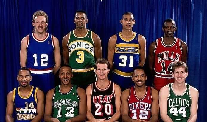
Yesterday’s Ticker had an item about Craig Hodges competing in the 1993 NBA Three Point Shootout while wearing a generic NBA jersey, because he was a free agent at the time. But he’s not the only player to have worn a non-team jersey in the Shootout. Check at the player at top-left in the photo shown above, which shows the Shootout contestants from 1989.
That player was Rimas Kurtinaitis, a Lithuanian who was one of the best European players of the 1980s and also played on the Soviet national team. The NBA invited him to compete in the 1989 Three Point Shootout, and he remains the only non-NBA player ever to participate in the event.
Kurtinaitis’s blank jersey has been Ticker-mentioned on the site in the past (most recently last summer), but I thought it would be good to take a closer look today, because the whole situation was pretty unusual. Like, it’s nice that the NBA extended an invitation to Kurtinaitis, but couldn’t they have given him a better jersey? If they didn’t want to give him a something with “NBA” across the chest, why not let him wear his European team uniform? Granted, that would have been weird, but having him participate in the contest was weird to begin with.
The other players didn’t quite know what to make of Kurtinaitis. According to this article, Charles Barkley, then with the Sixers, offered to take him to a strip joint. Karl Malone didn’t want a non-NBA player participating: “If he comes over and wins, a lot of guys are going to be teed off. You can’t just arbitrarily throw a guy in there from anywhere.” Malone’s teammate John Stockton added, “It’s nothing against the fact that he’s a Soviet. It’s just that he’s not in this league. If you have an NBA event, you’ve got to have NBA players.”
Turns out the NBA guys had nothing to worry about. Kurtinaitis performed poorly, scoring only nine points and finishing last. Blame it on the uni, I say. Here’s some footage of him during the Shootout:
Kurtinaitis now coaches in Lithuania. He looks a little different than he did in 1989.
(Big thanks to reader Ben Zoss for reminding me about this one.)
”¨”¨Collector’s Corner
By Brinke Guthrie
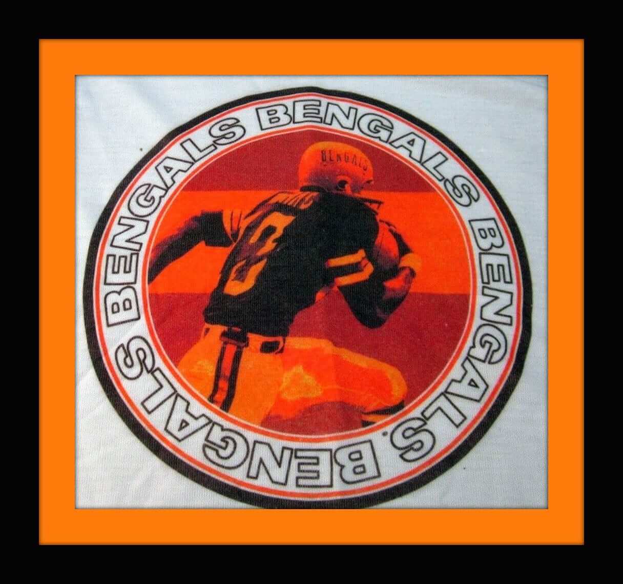
I didn’t miss much Bengals stuff from 1972 through 1999 or so, especially in the earlier years. So when I saw this T-shirt, it definitely caught my eye. The Bengals had a cool numerical roster in 1972 — they had a player wearing each number from 10 through 20 — so I can’t quite tell who this is on the shirt, although I think it’s Speedy Thomas. Whoever it is, it’s a great-looking design.
”¨Now for the rest of this week’s picks:
• This is a sales piece for retailers, for an early-1970s NFL Zippo lighter. A profit of $15 is guaranteed to put you into the NFL Hall of Flame!
• This 1970s ABA Indiana Pacers wall clock looks like it’s in good shape, but I’m not sure why the outside case is green rather than blue.
• Packers fans will dig these 1970s “N.F.L. Officially Licensed Receiver’s Gloves.”
• From gloves to wristbands we go: Just wear ’em, baby — an unopened package of 1970s Ray-duhz wristbands. One size, all-purpose!
• This 1970s-1980s Atlanta Falcons button has that kind of generic artwork on it, as if they made the same button for every team using artwork.
• Dodgers fans, how about a set of 1970s Dodgers Cheer Bears.
• Guess they ran out of room for the facemask on this 1960s Packers button.
• For your next formal event, sport this 1970s NFL tie bar and cufflinks set.
• Here’s a promo O.J. T-shirt from Spot-Bilt cleats.
• Staying with promo items, McDonald’s issued this Milwaukee Brewers baseball in the 1970s, part of their McDonaldland All-Star Lineup.
In living color: I had previously shared the audio from our recent Mets uniform panel at the 2017 Queens Baseball Convention, but now I have the video to share with you (see above).
I chaired the panel, which consisted of uniform designer/researcher Todd Radom; Mets stitcher Russ Gompers; Mets uniform number expert Jon Springer; game-worn jersey expert Nick DiSalvo; and our own Phil Hecken. It was a great time, and plenty informative to boot. Enjoy.
RSS update: Several of you have mentioned that the site’s RSS feed seems to have gone on the fritz. I’ve asked webmaster John Ekdahl to look into this and hope to have it resolved shortly. Thanks for bringing it to my attention, and doubleplusthanks for your patience.
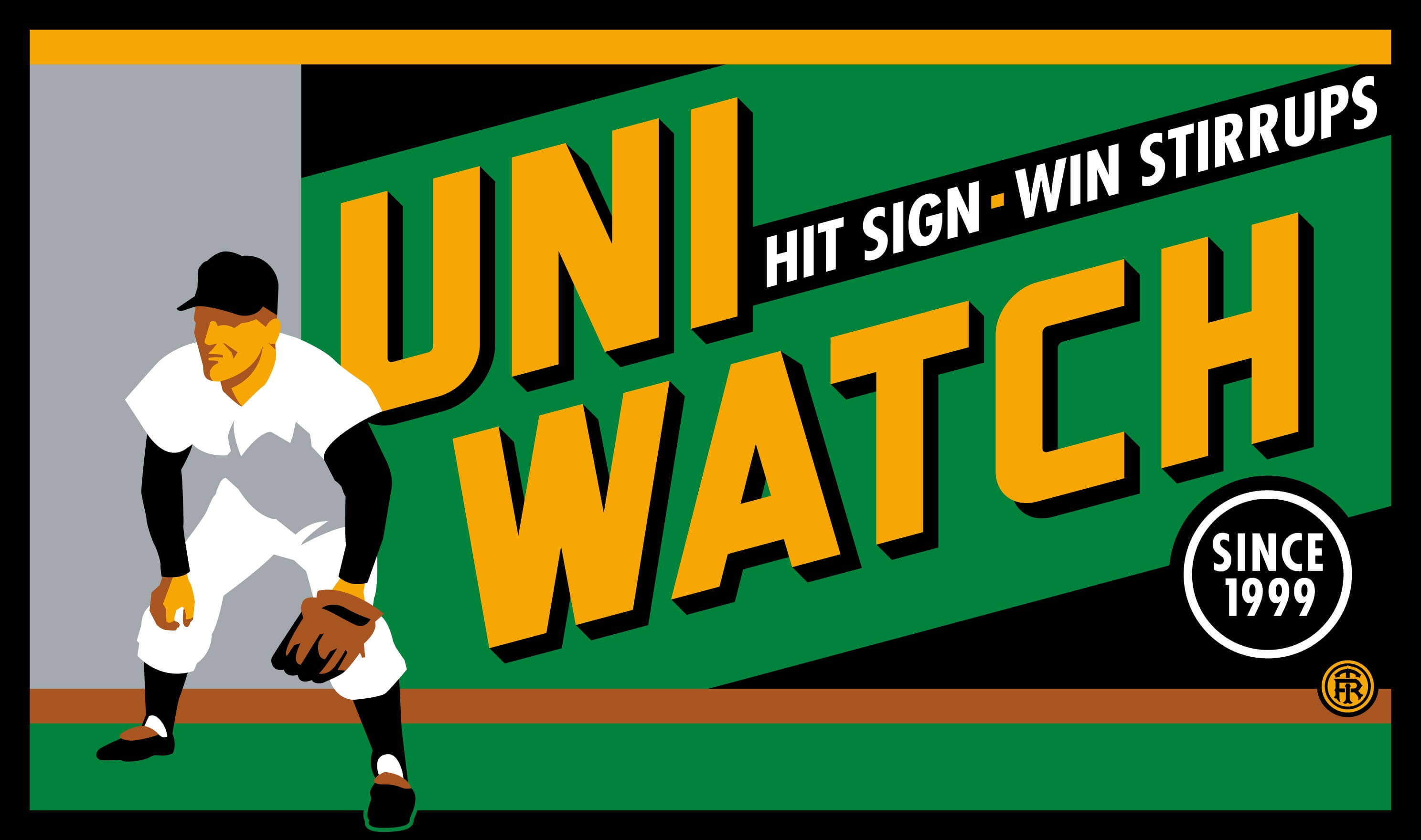
T-shirt reminder: Our latest T-shirt, designed by the great Todd Radom, is now available. Check it out (click to enlarge):
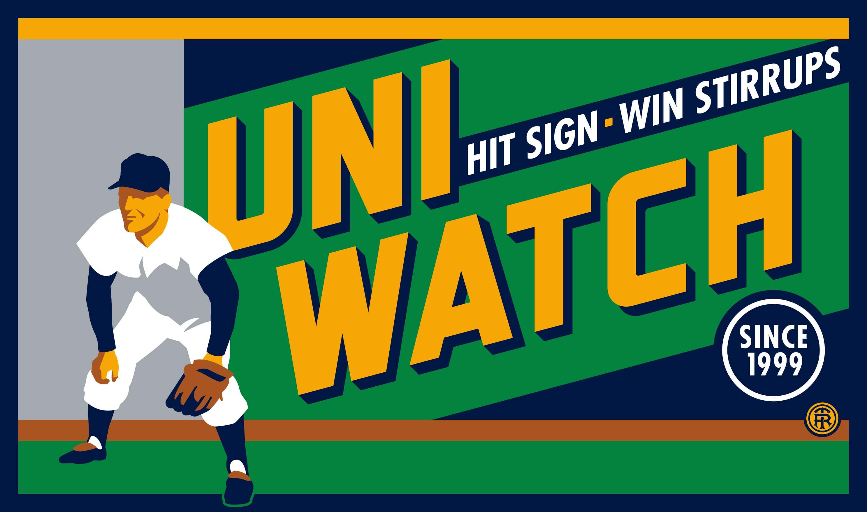
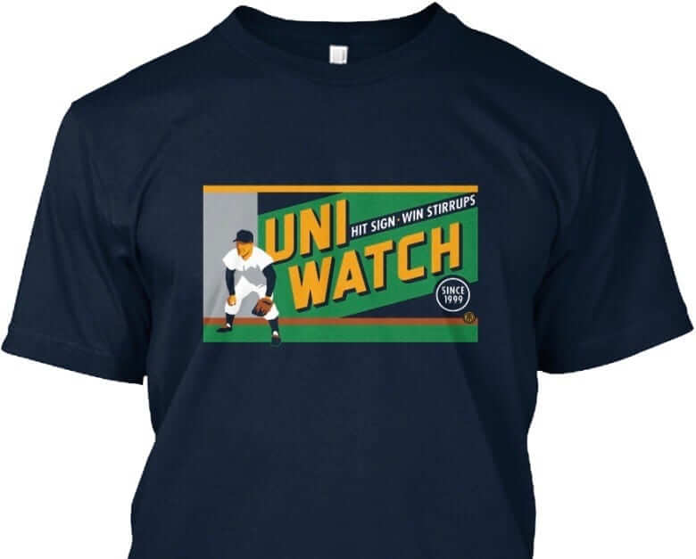
Pretty good, right? The design takes inspiration from the old Abe Stark sign at Ebbets Field, which read, “Hit Sign, Win Suit.”
Please note that we’re using the shirt fabric color to fill in the dark portions of the design — the outfielder’s cap, sleeves, stirrups, and shoes, and also the dark part of the sign behind him. We think it looks best on Teespring’s dark navy shirt, which is the version shown above. But you can also order the shirt in black (yes, go ahead and make all your BFBS jokes), in which case the design will look like this:
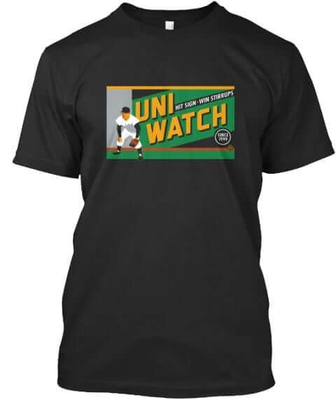
There’s also an American Apparel short-sleeved version and a long-sleeved version, both of which come in a slightly lighter shade of navy. You’ll be able to see all of this on the ordering page. Just make sure you choose the shirt and color you like best.
The shirt is available here through next Friday, March 3. My thanks, as always, for your consideration.
The Ticker
By Alex Hider

Baseball News: In case you haven’t seen it yet, the Braves are using a Spring Training-specific batting helmet logo. They’ll go back to their script “A” logo when the regular season starts (from Glen Macklin). … Do you have a Travis Shaw rookie card? Turns out that’s not actually him (thanks, Mike). … Astros P Lance McCullers will honor Jose Fernandez by using the late pitcher’s glove model this season (from Mike). … New number for Red Sox OF Jackie Bradley Jr. ”” No. 19, the number he wore in college (from Alex Smolokoff). … New Friday alts for the Nashville Sounds. … The Peoria Chiefs are letting fans pick the style for the team’s Jimmy Buffett jerseys (from Michael). … Rutgers gets it ”” even if some players are wearing their stirrups backwards (from Todd and John). … South Carolina went all-black with chrome decals last night. … Throwbacks last night, including long-sleeved jerseys, for Nicholls State. Some additional pics here (from Chris Mycoskie).

NFL News: Here’s a nice shot of former Raiders QB Kenny Stabler taking a snap with his chinstrap unbuckled. We can add him to the list of players who’ve gone either unbuckled or strapless (From Thomas Moore).

Hockey News: The Maple Leafs will wear these slick St. Pats throwbacks on the day after St. Paddy’s day. … Flyers G Michal Neuvirth’s mask for the Stadium Series game is ready to go (from Kevin Kurz). … Gotta love the stripes on this USA Hockey poster (from Pro Football Journal).

NBA News: Boogie Cousins will wear No. 0 for the New Orleans Pelicans (thanks Mike). … Speaking of, Matt LaWell did some good research about teams that have had both a No. 0 and a No. 00 on their roster. … Buddy Hield will wear No. 24 with the Kings.

College Hoops News: Look good, feel good: This story points out that Pitt is 3-0 in football and basketball when they wear royal and yellow throwbacks, and suggests there is a grassroots movement in town to get the athletic department to return to the old colors (from JW). … Color-on-gray last night between St. John’s and Marquette (from Mitchell General).

Soccer News: Here’s what Minnesota United will be wearing this season (from Rhys McManus). … Free advertising: This Wilson sign includes a UC Irvine wearing nothing but Adidas (from Jonathon Sluss). … FC Laussane, a team in the Swiss Super League, is allowing fans to pick the kit the team will wear next (from Chris Corbaz). … New kits for Fossil Ridge High School (Colo.) girls soccer (from Marc Gustafson).

Grab Bag: This is what happens when you put a GoPro on a curling stone (from Liz Zabel). … Couple of racing notes from David Firestone: Driver Kenny Wallace wore a St. Louis Cardinals helmet during a recent dirt track race. Also, NASCAR recently released a “Family Album” book, similar to the NFL Treasures book Paul discussed yesterday. … Good-looking color-on-color rugby match between the United States and Canada (from Eric Bangeman). … U of Albany’s lacrosse goalie was wearing a different-colored helmet than the rest of his team the other day (from Dan Murtaugh). … Good story on how Columbus College of Art and Design selected its new mascot (from Jason Hillyer). … This feature story about Jordan Speith offers insight into his involvement into the creation of his new signature shoe. … Here’s a cool story that details the evolution of the spacesuit through the years ”” including the new design, released yesterday (from Brinke). … This artist makes Native American art out of Everlast heavy bags (from Rob Walker). … Chicago native Chance the Rapper struck a Michael Jordan pose in a promotional poster after winning his first Grammy (from Charles Noerenberg).
While I prefer use of city name to state name, the beige-clad MLS team is Minnesota United rather than Minneapolis United.
Fixed.
I can’t believe you haven’t listed the mother of all unbuckled chinstraps: Jim O’Brien kicking the winning FG in Super Bowl V link
No way that Pacers clock is ABA era, that era logo was a hand palming a ball inside the “P”. That logo looks like the one used from 91-05. No idea about the greeen, but if you’re going to make stuff up for the ad, might as well sell something fake to go along with it
Seems like the Braves aren’t using the pullover either, or is that supposed to be just for regular season BP?
That “GoPro on a curling stone” clip is WAY too short!
“Hit sign. Win stirrups.” That’s the best haha
i might not comment much anymore, but bahst, mingus, and cornmother am i a u-w geek. buh.
the mets are not even on my radar as an actual team that plays a game that i would watch on a bet. but for some reason i watched the video to the point where skip and brownbag fed the meter, came back again, and there was a horrifying call for the blue squatchee. blue?! que?! orange is an improvement, live with that fact.
i think i have a problem snorting uniform stitches. is there a self-help group?
Ladies and gentlemen, the return of Robert “Moose” Marshall!!
The world is a better place when he posts comments here on the site. Let’s encourage him to do more of that!
In Collector’s Corner I see that handsome Atlanta Falcons “button” but it got me wondering why some people call it that. Isn’t it a pin? I’ve also heard badges, but button seems such a specifically Other Thing than a pinned-on item. I suppose it’s simply colloquial.
The official term is pinback. But button is far more common. When searching for treasures on eBay, you best include a “button” search. Pins typically is used for the smaller lapel type.
Buttons.
link
The NBA invited (Rimas Kurtinaitis) to compete in the 1989 Three Point Shootout, and he remains the only non-NBA player ever to participate in the event.
I somehow never knew, or forgot, this. Interesting that John Stockton called him (then) a “Soviet” but as a fellow from one of the Baltic republics Kurtainitis likely would hasten to point out the difference.
He played on the Soviet national team, so I think that’s what Stockton was referring to.
Ooh, I did not know that.
Still fascinating how someone from behind the Iron Curtain but not the Soviet Union would have to consider balancing his ambition and talent with other forces back then.
Mitchell and Ness made a no-NOB Jordan #12 jersey. I wonder if they’ll ever make a Rimas jersey available for purchase…
More on the Toronto St. Pats unis from link andlink.
While I like the uniform for the most part, I really don’t like the numbers. Specifically, I don’t like how link. It would’ve looked so much better if they’d done the numbers in white with an extra-thick green outline.
The Real Sports Apparel pic of the back looks odd.
If that’s how they are going to look, they should have instead put the number rectangles right against each other without having the green showing between the numbers.
Zippo lighter ad on Collector’s Corner reflects my favorite era for NFL helmets:
Oilers – Silver
Patriots – Pat Patriot
Eagles – White with green wings
Buffalo – Standing Bison…not running
Rams – Correct colors
It would be perfect if only the Washington team helmet was burgundy with spear.
My sentiments exactly….a simpler and lost era of uni ness!
Any reason the NBA logo is on the right side of the Heat’s uniform in that pic when every other team is on the left?
For years the Heat had the NBA logo on the other side because the team and the league thought the flame coming off the last letter would be too close to the logo. They eventually changed it and put it on the same side as all the other teams, and then of course the NBA logo moved to the back of the jersey.
Ditto for the Hawks (1986-1992). I think there were others.
In the article, “Uni Watch History Lesson: When Rimas Kurtinaitis Wore a Plain Jersey in the 1989 Three Point Shootout”, you did not list the names of the other participants in the three point shootout. You have the picture of all the participants, but there are several players I don’t recognize. For instance, No. 20 of the Heat and No. 12 of the Sixers. Thank you. -Scott
The players are all named in this caption:
link
And Hodges (far right, second row) would go on to wear a generic jersey himself, four years later, as stated.
Is it just me or do the uniforms in that 1989 photo shoot blow away the NBA uniforms of today? Man those are sweet across the board.
Would agree with that. To quote Randy in the earlier comments, a simpler and lost era of uni ness, for the NBA in this instance. No questionable t-shirt jerseys that are abundant today.
Loved the original Heat uniforms compared to those of today, with the orange trim in place of the yellow. Big fan of those Sonics and Pacers uniforms.
Chicago, Dallas, Denver, Seattle in the Eastern Conference. Yeah, makes sense.
The university is U AT Albany, not U OF Albany. It’s officially the State University of New York at Albany.
I still call it SUNY-Albany.
Story behind the Red Wings sticker on Paul McCartney’s acoustic guitar (the one he used when he wrote ‘Yesterday’) and the time he added a Penguins sticker to it:
link