Click to enlarge
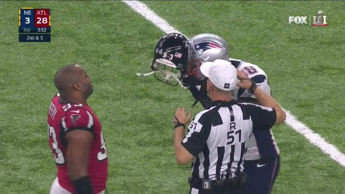
Weird scene in the third quarter of last night’s Super Bowl, as Falcons defensive end Dwight Freeney and Patriots tight end Martellus Bennett somehow got their facemasks interlocked. Here’s how it looked in real time:
So far this is my favorite #SuperBowl highlight. (cc: @UniWatch @PhilHecken) pic.twitter.com/gI2liABlEt
— Damon Hirschensohn (@nevadapackfan) February 6, 2017
In other notes from the final game of the NFL season:
• Pats quarterback Tom Brady was wearing a hand-warmer pouch (although it was rotated toward his backside), an odd accessory to be using at a warm-weather site with the roof closed:
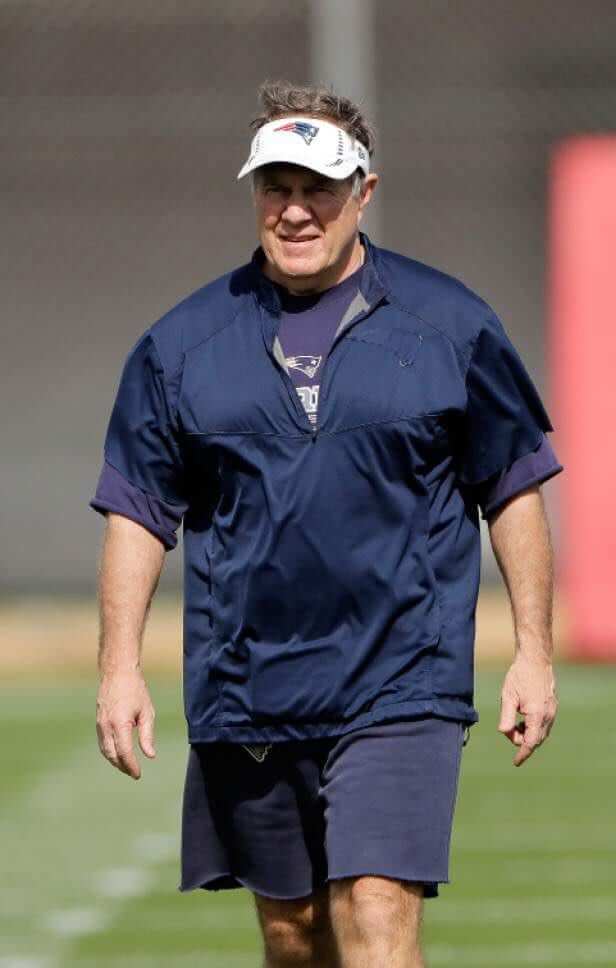
• In another odd development, Pats coach Bill Belichick wore a completely blank pullover — no Pats logo or lettering, no Nike logo creep, no Super Bowl logo:
As you can see there, Belichick did wear Nike track pants. He did wear a Pats sweatshirt during pregame warm-ups, but not during the game.
Several people told me his game pullover was actually inside-out, but that’s not right. For starters, the zipper pull on his collar was on the right side, which wouldn’t be the case if the garment had been inside-out. During the postgame press conference, where the lighting was different, it became much more apparent that the pullover had previously had a Patriots logo, which had apparently been removed:
Turns out he had worn this same pullover, with the telltale stitching where Flying Elvis had been removed, during practices last week:

Lots of people asked me if Belichick was trying to stick it to the league for some reason. I have no idea, but I’ll ask around. Lots of people also asked if he’ll be fined. I honestly don’t care, so I won’t ask around about that, sorry.
• Speaking of missing logos, Brady appeared to be breathing Ethier during the postgame activities:
• And speaking of Brady, he believes that the jersey he wore during the game was stolen. (Update: It actually wasn’t stolen. The equipment staff moved it.)
• Neither team wore captaincy patches. I didn’t have time to check on how often that’s happened in the “C” patch era. Perhaps Jay Braiman, our resident Super Bowl number-cruncher, can check on that and report back to us.
• In an odd move, the NFL promoted the game’s livestream on NFL Mobile by showing the Falcons wearing white Reebok-era uniforms.
Watch #SB51 LIVE on NFL Mobile.
Only with Verizon: https://t.co/UdSxtWadoy pic.twitter.com/RRSKqsHZG3
— NFL (@NFL) February 5, 2017
• While this isn’t a Super Bowl thing per se, it appears that the Pats recently made an adjustment to their helmet logo decals:
@UniWatch small change, but it looks like the patriot face on the helmet decals went from silver to clear sometime after Oct pic.twitter.com/NsGUSlzJro
— Pro Line Designs (@prolinedesigns) February 6, 2017
And that’s a wrap. Congrats to the Patriots and their fans. How long until pitchers and catchers?
(My thanks to Grady Bing, Kenneth Fields, Joe Gemma, and Timmy Shannon for their contributions.)
So this happened: I’ll let this one speak for itself.

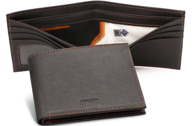
New advertiser shout-out: As you may have noticed in the right-hand sidebar, the folks at Tokens & Icons are advertising their leather wallets, which are lined with swatches from authenticated game-used jerseys. I mentioned these in my annual holiday gift guide two months ago and also gave away one of the wallets in our 2016 year-end raffle (where it was the most-requested item on people’s raffle wish lists), so I’m really happy to them advertised on the site. They’re available for most MLB, NFL, and NHL teams, and also for several major colleges (scroll down a bit a mouse over the wallet photos to find the “Collegiate” selection on this page). I hope you’ll consider them for your shopping needs. Thanks.

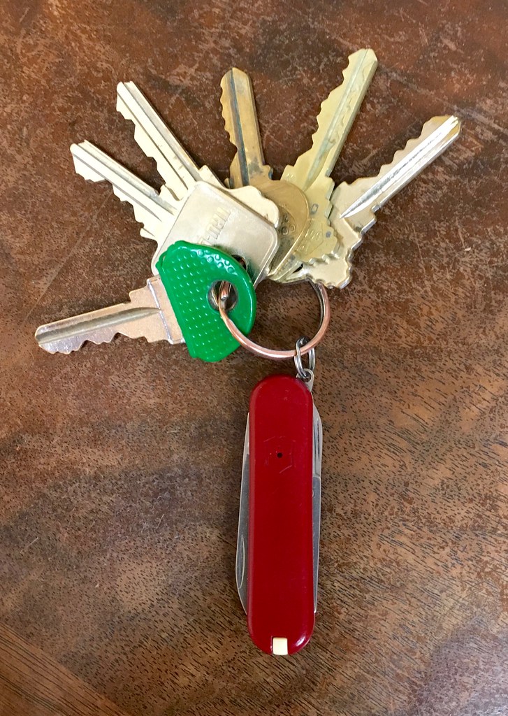
KRC update: The latest installment of Key Ring Chronicles is about a Swiss army knife. Check it out here.
The Ticker
By Alex Hider


Hockey News: The Caps wore white at home yesterday against the Kings. That’s the second straight game that the Kings have worn black on the road (from Nas.) … The Pittsburgh Blackhawks? Or Chicago Penguins? (From The J Factor). … Good workaround by the makers of this Kris Letang candy bar, who used what looks like the Pirates’ ’90s wordmark instead of a Penguins logo (from David Shucosky). … This cool time-lapse video shows Bridgestone Arena moving from Preds hockey to Arenacross motorsports.
NBA News: All of these are from Zach Loesl: GThe Raptors and Nets went color-on-color in Brooklyn yesterday. … The Thunder and Trail Blazers also went color-on-color. … The Nuggets and Spurs went color on “color” on Saturday. … Grizzlies coach David Fizdale wore a memorial pin for former National Basketball Coaches Association executive director Michael H. Goldberg. … Not sure if we’ve seen advertising on this part of the scorers’ table before. … Finally, has anyone noticed how Madison Square Garden’s backboard posts are super skinny?

College Hoops News: Hakeem Olajuwon wore Nos. 34 and 35 while playing in college at Houston. Anyone know why he switched? (From Bubbi Lucas.) … Wake Forest and Georgia Tech went color on color on Saturday (from James Gilbert). … Color-on-color matchup between the Penn State and Northwestern women ”” with the Wildcats in pink (from Travis Clemens).

Grab Bag: WWE designed football helmets for some of its biggest superstars (from Yancy Yeater). … There’s a meme circulating on social media that features strange Atlanta Falcons uniforms. … Air Force lacrosse is taking a page out of the football team’s book and wearing “Sharktooth” helmets this season (from Jared Buccola). … Looks like there are some inconsistencies on Egypt men’s national team’s‘s kit (from Donald Wine II). … Here’s the logo for the eight-team Australian Football League women’s competition, which started this weekend (from Graham Clayton).
That WWE helmet thing is old, i think you had it back in Sept ’16 if memory serves me right.
But I’m grateful to see it again. That Rowdy Roddy Piper helmet is one of my favorite things ever.
Speaking of WWE, as they seem to do with all major sports championships in the past few years, they are giving the Patriots a championship belt.
link
But it looks like the little side plates were placed on the wrong sides, the logo is not facing forward on both sides like it would on a helmet. Its odd from a uniwatch perspective that they would go through the trouble of creating the plates with reversed logos but screw them on backwards.
Regarding Hakeem Olajuwon’s different numbers, prior to the 90’s it was very common for the home and away jerseys to have different numbers…usually a 1 digit difference. I have no idea why…but I’m guessing there’s some archaic reason that probably made sense at the time.
We’ve discussed this before. By having teams wear even numbers at home and odd numbers on the road, there was no question about who #25 was. That’s useful for officials identifying players. As time went on, associating players with a single number became more important; the rise of television may have been a factor. By the time Hakeem got to Houston, the two sets of numbers had become rare.
All of this. Plus, since digits 6 through 9 are illegal in NCAA basketball because the ref can’t do those one handed, you see how 34 and 35 are a unit together.
Re: Hakeem’s number discrepancy – Houston used even numbers at home, odd on the road. I think this was fairly common with college teams back in the day.
my dad carried a Swiss Army knife with him everyday. I have a couple and should carry mine with me if only as a reminder of him. He always said “carry a knife, save a life.”
also, I always referred to them as a “pen knife”
Ditto. My dad had the same version as in the article (with the toothpick and tiny tweezers. Got used all the time.
My and his carrying of knives ended with September 11 as well. Too many checkpoints.
If the Raptors and Nets could go red on black why couldn’t the Caps wear red against the Kings’ black?
I’ve carried a Wenger Traveler for many years. The perfect pocket knife in my opinion. Why Wenger? I prefer their style of scissors – they use a lever to control the cutting action while Victorinox utilizes a spring instead. The Wenger is a better design.
I have a Leatherman one I got as a groomsman’s gift that I really like. The scissors operate much like their larger models with pliers.
I thought it was strange that the official locker room shirts and sweatshirts were from NFL Pro Line, rather than Nike. Does anyone know if Nike lost some kind of deal there?
Pro Line has been making them since at least Super Bowl XLIX. I still have the tags on my Pats champions shirt from that game.
It’s very strange because I have the same “We are all Patriots” shirt from XLIX with Nike branding, but this year’s shirt from the on-field celebration appears to only be available through NFLShop, Fanatics, and the Patriots Pro Shop. Everywhere else has non on-field variants.
They are made on spot by local screenprinters. Usually they don’t use a name brand per say, I guess it’s a quantity/cost thing.
Watched SB LI on tv. Thought the SB logo on the field looked a little faded compared to the NFL logo.
The nfl logo looked like it was new turf, probably easier to do that then paint over the Texas logo. The super bowl logo was painted on the regular turf. Also that why the Endzone logos looked faded as well and the paint did not look dried. On white’s td run he fell into Atlanta’s Enzo be and his jersey was covered in red.
The field paint looked a lot more faded after the halftime show. I guess all that foot traffic wore it off.
I noticed the end zones and some of players covered in heavy stains as well – crazy that they wouldn’t have made sure the paint was dry before play started.
Cutler is great name for a guy who always has a knife. I always have a small SAK on my keys and a larger one on my person.
FYI Victornox and Wenger (even though they’re now the same company) both produce TSA compliant models that feature some of the more useful doodads without a knife blade. I’m still not sure I’d trust TSA to not confiscate them though.
Before someone corrects me on this I’ll do it myself. Starting in 2013 all SAKs are being branded as Victotinox. However, many of the Wenger designs are still being used and simply rebranded. So for those who prefer them, they’re Wenger knives in all but name.
Brady DID have the NFL shield on his helmet. I think there was speculation earlier in the week if would or wouldn’t.
There wasn’t really any speculation. I simply mentioned in my Super Bowl column on ESPN that the logo had been missing during training camp and preseason, and mused that it would be funny if it were missing in the Super Bowl (which, obviously, was not going to happen).
Looking at the pictures of yesterday’s game and previous game photos, Tom Brady seems to be one of the most visually busy/accessorized players in the NFL.
Eye black
Under sleeves
Knee braces
Hand warmer
Towel
Stripped socks
Play card wrist band
Glove on non-throwing hand (not yesterday)
Colored face mask
Brady’s striped socks and colored facemask are not accessories. They’re part of the New England uniform and are worn by every player on the team.
Eric Dickerson was the king of accessories.
That’s why I included the “visually busy” part of the description. Every time I see him on camera I think there’s just a lot going on with him visually.
And I forgot to mention the spatting on his cleats too.
Let me start off by admitting my Uni Watch time has been cut into the last couple years with a little more hype on the Cubs bandwagon … apologies to Paul, as I used to provide a whole lot more site hits than I used to.
I did feel like I had to come here to ask about the Super Bowl logo. I searched the site, and was shocked not to find any discussion on this year’s logo (not that it wasn’t there, but that I simply couldn’t find it). My questions is:
What’s with the deviated course from the “standardized” SB logo that we’ve been trained to deal with? You went from the same logo (with a different roman numeral) for five years … then you changed it up for the big 5-0 (changing the color, font, and placement), but then this year, you not only left the number “up top”, went back to silver, but then added a red highlight, but also changed the font to look more like the NFL shield font? The current “split” LI may carry over to LII, but LIII might look a bit weird.
I don’t know the answer to this, but I truly hope that they will try to mix up the design of the Super Bowl logo every year. This year was different in how it was presented, and added color. That is a good thing. If they keep the trophy in the middle, fine. But please keep the logo itself somewhat fresh. Logos for 45-49 all look the same, and that is embarrassing for the visual identity of the game. I think the league is realizing that.
Proofreading: “collar was onthe right side”
Fixed.
I didn’t pause the game to get a screen shot, but sometime in the 3rd quarter the camera zoomed in on Patriots defensive coordinator Matt Patricia. Patricia held his play card up to cover his mouth as most coordinators do and I noticed that he had a 48-star American flag on his play card. This is instantly noticable because on the 48-star flag the stars are aligned instead of offset like the link.
It looks like this has been the case link.
Someone else mentioned this to me during the game but couldn’t get a screen shot. Fascinating!
I messed up my HTML for the 48 start link: link
link
Article on supply & demand, and Mass Customization, in producing NFL jerseys. Feels like this has been covered previously on UW, but some different sources perhaps.
Was in the Friday’s Ticker.
It’s time for the Nets to do a rebranding. These black jeresys are horrible. They play in the Barclay Center, use that Barclay blue.
Troll?
My favourite uni-moment in the big game had to be James White and his incredible undershirt
link
Yeah, there were a couple of times we got to see the megastretch.
The Kings played in Philadelphia the day prior, with the Flyers wearing the white anniversary jerseys. The Caps chose to wear white so Los Angeles wouldn’t have to travel with two sets of uniforms. I’m not sure if that’s a courtesy or an NHL rule. But since the Caps had a white alternate recently I’m sure they wouldn’t mind.
ESPN is now reporting that the Texas Rangers are on the case to find Tom Brady’s missing jersey. Seems as if it has not been found yet.
One more note on the odd-even college basketball numbers that a number of people have already identified. When I was the radio announcer for the then-SUNY Binghamton Colonials in 1974-6, alma mater of the esteemed Mr. Lukas, we had different numbers on the home and road uniforms. Of course, that was because we couldn’t afford matching uniforms, not due to any system. In fact, the home uniforms had no school name on the front at all, just numbers. The road uniforms were newer and said Binghamton.
I had to google why some knives are called pen knives.
Regarding Super Bowl captaincy patches, the era started with XLII, and this Super Bowl (LI) was the second time that neither team wore captain patches. The first time was XLVII Ravens vs. 49ers.
Thank you!
Team wearing white wins again
Yes, I can’t believe no one mentioned the white jerseys until now. I read that for at least 20 plays in the 3rd quarter, the Pats had less than a 1% chance of winning the game. That incredibly unlikely comeback makes the white jersey luck more strange than ever.
The Broncos are the only team to really make a point out of wearing white in the SB. I know the ’05-’06 Steelers chose white also, but the white jersey trend hadn’t really started by then. Ironically the Steelers are the only SB team to lose in white since the ’03-’04 Panthers.
RE: MSG backboard
Did they remove the “Spalding” wording from the bottom left border of the backboards or has it been gone for a while now?
So you’ll mention that the NFL mobile app was using Reebok era uniforms to promote the game, and say it’s an ‘odd move’.
However, a few days ago when a couple of us mentioned that you had posted outdated uniforms for the game during a lede (old Pats wordmark, Reebok uni for the Falcoms), you downplayed it like it was no big deal.
Which is it? No big deal or an odd thing to do? They’re still the same templates, right?
1) The NFL photo also shows the Falcons in white, which is odd because they wore red for the game.
2) It’s one thing for me to use a Reebok-era photo. It’s another for the NFL to do so, given that their corporate partner is now Nike, not Reebok.