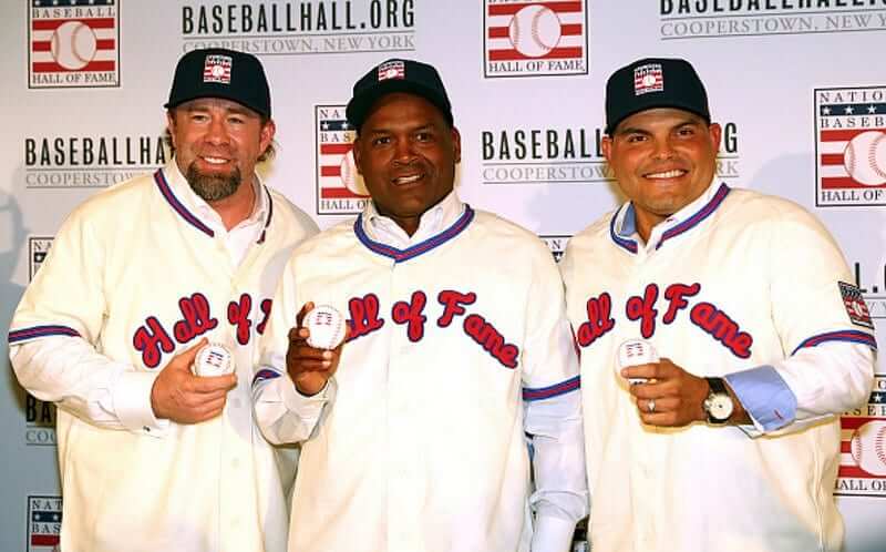
By now we know the routine: Each January there’s a new class of Baseball Hall of Fame inductees. And that means each January, like clockwork, we have to see the new inductees wearing those miserable Hall of Fame jerseys. That was the case yesterday in Manhattan, where Jeff Bagwell, Tim Raines, and Ivan Rodriguez appeared at a press conference (see above).
Does anyone like these jerseys? Seriously, anyone? They look like a cross between Little League rejects and something you’d see marked down 70% at a tourist trap gift shop. They have no visual connection to the Hall of Fame’s logo, or to anything else I can determine. Frankly, I think having middle-aged men wear jerseys over their street clothes is silly to begin with, but these particular jerseys make the spectacle a lot worse. The whole thing is an embarrassment.
Each year around this time I think, “No way are they gonna keep that design next year. They’ll definitely have something new by then.” But then it never happens. I’ve finally accepted the reality that they have no intention to change the design.
So it’s up to us to change it for them. That’s my challenge to all you concept designers out there: Please, for the good of the game and the greater good of the uni-verse, redesign the Baseball Hall of Fame’s jersey. Send me your designs by the end of next week, which should be more than enough time to come up with something good. You can’t possibly do worse than what they’re using now.
I have friends who work at the Hall. I’ve never discussed the Hall’s jersey with them, because I don’t want to put them on the spot regarding their employer (although I assume they find the design as cringe-worthy as I do), and I didn’t tell them I’d be writing about this today. But I promise to send them the best entries I receive from you folks. Get crackin’.
Update: Phil reminds me that he tackled this same issue two years ago, and presented some possible new designs. But I think we can do better. Get crackin’!
Meanwhile, over at the mall: As you know, I don’t usually care about the retail/merch side of things. Still, there are some interesting developments on that front, at least in the NBA. Earlier this week there was the news that lower-priced NBA replica jerseys will no longer be sold at brick-and-mortar stores starting next season. And now it appears that that’s not the only squeeze being put on retail shops.
I heard yesterday from a guy I’ve known for years. He runs a decent-sized sporting goods shop, and he recently received a letter from Nike, informing him that he will not be permitted to carry Nike’s NBA product starting next fall. The letter, which he showed me, included the following:
Compared to current distribution, we are dramatically reducing the number of retailers that will carry NBA licensed products produced by Nike. Unfortunately, under this distribution model we have determined that we will not allocate Nike NBA products to your account.
“I just attended the Sports Licensing and Tailgate Show in Las Vegas,” said my sporting goods source, “and every retailer I spoke to said they received the same letter. We think there are only about 100 or so retailers who will be carrying NBA from Nike. Even some of the larger accounts were shut out. This business is getting more difficult every day with Fanatics throwing their weight around and just bullying these companies into exclusive deals. It’s a shame, too, because Nike used to be one of the best and easiest companies to work with.”
I don’t buy any of this stuff, so none of this makes a difference in my life. But it might in some of yours. Assess as you see fit.
ESPN reminder: In case you missed it yesterday, my latest ESPN column is about the new Schutt F7 football helmet, which is shaping up as the next major leap in helmet evolution. Check it out here.

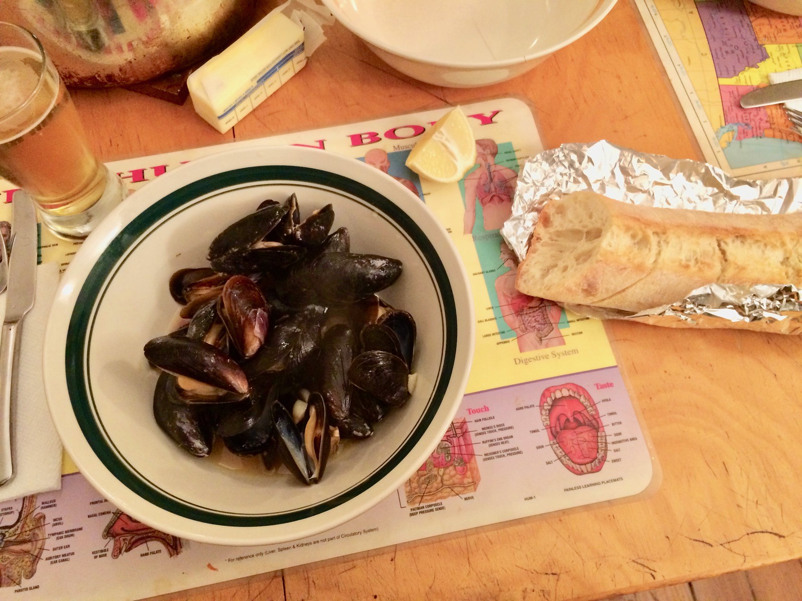
Culinary Corner: I’ve always loved mussels. They’re delicious, hearty, and fun to eat. But for some reason I never got in the habit of making them at home. Which is nuts, because mussels are easy to cook and ridiculously inexpensive. Like, you almost can’t afford not to buy them.
So a few months ago I decided to work mussels into my dinner routine. The Tugboat Captain and I have enjoyed mussels four times since then, most recently two nights ago. Here’s how we did it.
1. I went to my local fishmonger and bought three pounds of mussels. Most sources seem to think one pound per person is enough, but I figure it can’t hurt to get a bit more, especially since mussels are nearly free. The three pounds cost me $9. (Or to put it another way, the protein for this meal — which ended up feeding two people and according to many sources would actually be enough to feed three people — cost less than a decent steak for one.)
2. Most folks say you should debeard the mussels before cooking, and a few people also recommend letting them soak in a mixture of water and either corn starch or flour, which supposedly gets rid of any sand and grit inside the shells. But both of those issues appear to be more applicable to wild mussels. Most mussels today are farmed, and the ones I’ve been buying have had no beards and no grit. So all I’ve been doing is putting the mussels in a colander, giving them a good rinse with tap water, and going through them to discard any that are broken or open. After doing that the other night, here’s what I had (for all of these, you can click to enlarge):

3. While I was dealing with the mussels, the captain chopped up some onion, sliced up some garlic, and diced some green chili pepper (which you can see just barely peeking out under the garlic):

4. In a big pot over medium-high heat, we melted some butter (how much? I dunno — maybe a coupla-ish tablespoons) and used it to sauté the onion, garlic, and pepper until soft and fragrant — just a minute or two.

5. Then we poured a can of beer into the pot and raised the heat to high. (You could also use white wine, red wine, stock, or just about anything.)

6. Once the beer came to a boil, we added the mussels and then covered the pot.

7. After about three or four minutes (sorry, this was not a high-precision operation, and that’s one of the nice things about mussels — they’re very forgiving), we peeked in the pot and found that the shells had opened, which meant they were done.

8. We squeezed about half a lemon into the pot, stirred everything with a big spoon to distribute the broth, and served the mussels with some bread (for sopping, don’tcha know). There were enough mussels for each of us to have three helpings. Easy, inexpensive, delicious — a win-win-win!
The Ticker
By Paul

’Skins Watch: In a case argued before the Supreme Court this week, most of the justices appeared to be willing to extend trademark protection to derogatory terms. If they rule that way, that would restore trademark privileges for the ’Skins.

Baseball News: The Mets’ now-discontinued snow white pants are being used at Mets fantasy camp (good spot, Phil). … Marlins Park is being transformed into a racetrack (from Phil). … New softball uniforms for Elon University. … Here are some photos of newly elected Hall of Famers Ivan Rodriguez and Tim Raines wearing uniforms we don’t usually associate with them during minor league rehab assignments. … Some Dodgers players — wearing Dodgers T-shirts and trucker-style Dodgers caps — appeared on a 1985 episode of the TV show Body Language (from Jeff Wilk).

NFL News: Remember KFC’s recent ad campaign featuring KFC-styled football uniforms? Popeye’s is doing something similar, and their campaign feature Hall of Famer Jerry Rice wearing a Popeye’s football helmet with a chicken-bone facemask (thanks, Mike). … If the Raiders move to Las Vegas, perhaps they could make some small adjustments to the Chargers’ now-mothballed “LA” logo. Meanwhile, some folks are speculating whether the Raiders should change their name if they move, which seems like a pointless exercise — no way are they gonna change. In fact, maintaining their name while “sailing” from Oakland to L.A., then back to Oakland, and then to Vegas just reinforces their pirate-like identity.

Hockey News: The Devils will apparently be wearing their green-trimmed throwaback uniforms on Jan. 26 (from Megan Brown). … Here’s the story of why former Rangers great Rod Gilbert wore No. 7 (from Seth Horowitz). … Some Detroit Tigers players were wearing Red Wings jerseys the other day. … An update to the NHL 17 video game includes new uniforms (from Andrew Kosek).

NBA News: The Wizards wore their stars/stripes alternates two nights ago (from Richard Green). … A Toronto Raptors hockey jersey? Sure, why not. … Zachary Loesl notes that Dejounte Murray of the spurs always has the wasitband of his shorts rolled down.

Soccer News: Third kits for Juventus, Bayern Munich, Real Madrid, and Manchester United have all leaked (from Christos Daglis). … Here’s an interview with the guy who designed the new Juventus logo (from Lawrence Benedetto). … Target is now a major MLS partner and will be the shirt sponsor advertiser with the league’s new Minnesota United FC franchise. Further info here. … New uniforms for Independiente del Valle (from Trevor Williams). … A pro soccer player in Guam proposed to his girlfriend during a goal celebration. After scoring on a bicycle kick, he took off his jersey, which showed off the “Marry me?” shirt he was wearing underneath. “The official gave him a yellow card,” says our own Mike Chamernik. … Tottenham Hotspur’s new kit may have leaked (from John Muir).

Grab Bag: Here’s a really great project devoted to San Diego-area sheriff’s badges, police patches, and so on. Very nice stuff. … Nice article and photo gallery about a 70-year-old Cleveland bowling alley. I’ll have to check that out the next time I’m out that way (from James Mason). … In a related item, my friend Chris Erikson pointed me toward this listing for an old-school bowling alley up in the Catskills that’s available for sale. Tempting! … The International Cricket Council has issued new helmet rules for international matches. … New logo for the tech company Mozilla. … Golfer Phil Mickelson is wearing a logo of himself, based on his famous Masters jump (from Kyle Key).
The “Phil Mickelson is wearing a logo of himself” link goes to a “not found” page, it looks like the URL was cut off…
Fixed. Here’s the proper URL, so you don’t have to scroll back up to the Ticker:
link
I love that Human Body placemat, perfect for dinner time!
HOF jerseys are a knock-off of the Phillies’ cream alts right down to the font which I don’t care for in any itteration of their uniform sets.
link
Huh — it *is* the Phillies’ font (or at least a variation on it)! I hadn’t realized that, presumably because the spacing and proportions are all different. Thicker blue outlining, too. Look at the negative space: The Phils’ version is very open, with lots of of the jersey’s background tone showing through. Hall’s version has most of that negative space filled in.
In any case, still a terrible jersey. Let’s redesign it.
Given that the HOF jersey predates the Phillies cream alt, it would be more accurate to say that the Phillies wear knock-offs of the Cooperstown induction jerseys.
As to Paul’s question, I like the HOF jerseys. Every single “fault” mentioned about them hereabouts each year is usually held up by the critic, including by our host, as a virtuous feature when discussing other baseball jerseys. They could be better, sure, but they can only be better in ways that most of us here would regard as cold, overbranded, even cynical design. Anything that doesn’t involve the Brandiosification of the jersey will be merely different, not better, if judged by consistent standards. Well, keeping the jerseys exactly as-is but changing the script to not match that of any existing team, that would be an improvement. But the current jersey’s critics would probably hate the resulting jersey just as much.
“Given that the HOF jersey predates the Phillies cream alt, it would be more accurate to say that the Phillies wear knock-offs of the Cooperstown induction jerseys.”
Except that the Phillies’ alternates are based on their late-1940s uniforms.
It doesn’t matter if the Raiders change their name or not.
“The Las Vegas (anything)” sounds like an area team at best.
Are they going with “Las” because I remember the hockey team saying nobody in Vegas says “Las”, so they may be Vegas Raiders
. . . or Nevada Raiders or, maybe just maybe, simply Raiders
Would pair well with the Vegas Golden Knights, no?
Next up? Vegas Grizzlies (NBA)? Vegas Athletics (MLB)?
They would never do it, but Sin City Raiders would be unique and totally fit the team’s image.
Those HOF jerseys are embarrassing.
This is just as good.
link
I find it very hard to believe that you were embarrassed by these jerseys before you read this post today.
And I’m very confused what the baby’s onesie has to do with anything.
Proofreading:
On mussels, step #2: “mixture of water and either corn starch” … or?
Last baseball ticker item: TV show.
Final soccer ticker item: Tottenham’s new kit.
Grab bag: International Cricket Council.
All fixed.
The Raiders should be the Silver Knights
I don’t mind the HOF jerseys. The cream color looks good against the red, the script writing looks old fashioned and awesome. Is it chain-stitched? If it is I may have to completely disagree with you and call them a gem.
I love to take the mussels and the broth and pour the whole thing over pasta.
Bingo…
Throw those mussels over a plate of pasta that has garlic, parsley, olive oil & Parmesan cheese in it and viola!
Lee
A dry cider also works
Just french fries away from moules frites. Then your really talking!
I may have to try that mussels recipe myself. Figured they’d be expensive. Who knew?
Aren’t the Hall of Fame Jerseys made by Ebbets Field Flannels? At least they were back in 2014. I wonder if they designed them or worked off a HoF requested design.
They are made by Mitchell and Ness. I remember when they first made them and had the first few in the store in the early 90’s. At some point the HOF adopted them for their new inductees. I do not believe they were designed for this purpose. It is just something that happened over time.
link
They were certainly initially designed and made by M&N. maybe after the Adidas acquisition Ebbetts got the rights.
I was going to say that they look just like an EFF jersey. Call me cynical, but if this was a team’s throwback jersey or something else, I would have put my money on it being a Uni Watch fave.
” maintaining their name while “sailing” for Oakland to L.A. to Oakland to Vegas just reinforces their pirate-like identity ”
Brilliant!
Brilliant! And true! And the really successful pirates of the Golden Age of piracy didn’t just hijack ships; they plundered and extorted coastal towns as well. Just as the Raiders have repeatedly done to cities up and down the West Coast for public subsidies. The move inland to exact lucre from Las Vegas is reminiscent of Henry Morgan’s 1671 overland march to capture Panama City.
Besides, Raiders is just a good name for a Vegas team. If only the new NHL franchise would drop the adjective, Las Vegas would have two well-named local teams.
I find the whole “The hockey team can’t be just the Knights because of London’s OHL team” to be a bit silly, especially since that league has the Kitchener Rangers, whose identity remains derived from the New York Rangers even now, decades after the NHL club divested its stake in the team.
And staying with the Major Juniors, did the Lethbridge Hurricanes of the WHL object when the Hartford Whalers relocated and renamed themselves the Carolina Hurricanes? Conversely, did the New York Islanders object to the QMJHL’s PEI Rocket renaming themselves the Charlottetown Islanders?
Think of it this way: to the relatively minor OHL or one of its teams, it’s probably not that big of a deal if they can’t obtain a trademark to sell their merchandise in the U.S. Conversely, to the top tier NHL and the Golden Knights, it’s probably a much biger deal to not be able to obtain a trademark to sell their merchandise in Canada.
I hope they stay in Oakland, but I have to admit, Vegas Raiders has a nice ring to it.
Those Tottenham Hotspurs leaked jerseys seem suspect. The team name under the badge is a giveaway to me – it’s counter to what the team has done in the past few years, and it looks really sloppy. Then again, I’ve been wrong about a lot of stuff lately, so….
Phil, can we get a bigger story about that retail/merch side of things? I know that’s not exactly your area of interest, but you certainly have more connections in the industry than most, if not all, of us do, and this seems to be the way that the industry is going in general, with MLB’s new deal involving Fanatics, and I’m curious as to what else this friend of yours has to say about “Fanatics throwing their weight around and just bullying these companies into exclusive deals,” and what this means for the future of the industry.
Has anyone else noticed that the hall of fame jerseys look like the Phillies cream alternate? That’s what I think of every time I see them.
*points up to earlier comments*
“…photos of newly elected Hall of Famers Ivan Rodriguez and Tim Raines wearing uniforms we don’t usually associate with them during minor league rehab assignments.”
To provide some more detail, I believe that the photo of Raines was not during a minor league rehab assignment as a player. That was when he was the batting coach for the Harrisburg Senators 5 years after his retirement.
Here’s a radical idea that’ll never happen… make each player’s HOF jersey in the font/design of the team he played for.
wouldn’t that depend on what hat they are wearing in their plaque? That usually isn’t determined until later, so for the introduction of each year’s class, that will not yet have been identified.
Even more radical concept: How about we stop making middle-aged men wear jerseys over their street clothes and just let them dress like, you know, grown-ups?
Amen, Brother Paul.
Given that baseball is the only sport that has its coaches/managers wear the team uniform, jerseys for Hall of Fame members doesn’t seem that far off.
Otherwise, they could class it up like every other sport and give them a jacket with an HOF crest on the pocket.
for the actual inauguration, they get to wear whatever they want (usually a suit and tie, I imagine). I see nothing wrong with a quick photo-op like this. Really isn’t that big of a deal to me, which is kind of why the design in general really doesn’t bother me. It is worn maybe for 10 minutes before the player can take it off and do what he wants with it.
also, I agree with Rex. Middle-aged men wear uniforms in baseball all season, so what makes this any different?
Middle-aged men wear uniforms in baseball all season, so what makes this any different?
A partial list of ways in which it is different:
1. Managers and coaches do not wear jerseys over their street clothes.
2. Managers and coaches tuck in their jerseys.
3. Managers and coaches appear on the field, along with all the uniform-clad players.
4. Managers and coaches are employed by the team whose uniform they wear.
Shall I go on?
Instead of them having them wear a jersey over their street clothes, have a jacket instead?
perhaps a varsity style jacket?
I like Will S’ suggestion of the varsity jacket.
I’d agree, a jacket would be great for this! Maybe a blazer?
Hell, if we’re talking jackets, an old school satin warm up jacket would be pretty sweet
Hey Paul, why don’t you design a HOF jersey if they suck so much and you can do better?
Sounds like a redesign contest
I never said I could do better. I’m not a designer and have never claimed to be one.
But I know shit when I see it, and the jersey they’re using is shit.
You probably don’t know how to pave a road, but you know when you’re driving on a bad road. You probably don’t know how to make a movie, but you know a bad movie when you’re watching one.
And so on.
Well said, Paul.
Always love the Culinary Corner. Keep them coming!
Amen to that.
Those Hall of Fame jerseys look like a sloppy DIY iron-on job with flat script cut into three pieces and rotated.
That’s dumb on Nike’s part to limit NBA jersey sales. All this will do is make people buy knock off jerseys from China.
The BBHOF jerseys are ill-suited to their purpose. They should go with a jacket. A jacket naturally goes over a shirt, such as the NFL HOF yellow jackets, or even the Masters green jacket.
If they insisted on this type of BBHOF item, design a dugout-style baseball jacket.
The inductees don’t wear these uniforms on induction day, unlike the silly yellow jacket that the NFLers have to wear for theirs.
Thank you for that. I get that the NFL wants something exclusive to the Hall, but those gold jackets look tacky as all get out.
I don’t post much here though I stop by at least twice a day. Culinary Corner over the years has become, for me, my favorite sub toon of the site. Keep up the good work Paul, bon appetite.
Based on info from NHL 2K17 video game, looks like the Penguins will be wearing yellow helmets for the outdoor game.
Wouldn’t be a treat if they wore the yellow helmets for some games with the white road uniforms later this year?
Yes!
Making the inductees wear HoF jerseys doesn’t work. Let them wear sports jackets, maybe a hat from their respective teams. And am I the only one who looks at them and says, “Man they look really out of shape”? The HoF jerseys aren’t helping in there, either.
“And am I the only one who looks at them and says, ‘Man they look really out of shape’”?
In that respect, making them wear uniforms serves to remind us how long it has been since they stopped playing. At least, in the Naismith Basketball Hall of Fame, they only give HoF uniforms to the newly-named members, not making them wear them.
Paul, I love reading your Culinary Corner entries, especially when trying to plan a Friday night meal. Have you considered compiling them all in an easy-to-access location (maybe in its own drop-down option at the top of the page, or a link in the F.A.Q.s)?
Maybe Paul out to publish a cookbook!
If you check over on the right sidebar, there’s a “Categories” drop-down menu where you can choose “Culinary Corner.” Or, here’s a direct link:
link
Not sure if all of them are there, but it’s at least a start.
Actually, I stopped tagging the Culinary Corners a long time ago. Since they’re buried in the middle of the entry, I figured nobody would want to go hunting thru the tagged entries. Sorry about that.
I appreciate all the kind words about Culinary Corner, though — thank you!
And by “out,” I meant “ought.” Don’t know if that was an autocorrect or what.
so these jerseys are not made for retail as far as I can tell. What is their history? How long has the HOF had this “tradition”?
Good question. Earliest I could find was 1998. Some kind of patch/maker’s mark on the right sleeve, seems to be white, and no arching.
link
The other thing that’s been bugging me about the HOF jerseys… They continue to be made of wool flannel with felt lettering, and the players that have recently been inducted played mostly in the polyester double-knit era. If we’re going to give them jerseys, maybe give them something more representative of their era?
It looks like they didn’t add the Centennial patch to all of the uniforms in NHL 17. Possibly because it would’ve been a massive amount of work for the sake of something that wouldn’t even be legible most of the time? But it’s still an interesting decision to me.