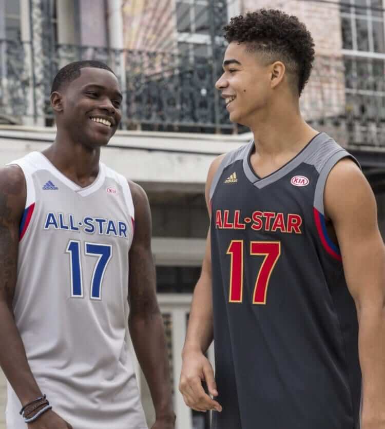
Click to enlarge
The NBA All-Star Game will be played in New Orleans on Feb. 19, and yesterday we finally got our first look at the uniforms. Ugh, black vs. grey — a complete snooze. We all know the game was relocated to New Orleans from Charlotte as a boycott response to North Carolina’s “bathroom law,” so they probably had to scrap the Charlotte-based unis they’d been preparing and then scramble to create a pair of replacement designs. Still, couldn’t they have done better than this? They look like practice or rec league jerseys, or like something a kid would create with teambuilder software. Not a good one for Adidas to go out on.
The grey design is for the East and black is for the West. It’s interesting that both jerseys have “All-Star” on the chest, instead of the standard “East” and “West” designations. Then again, the 2015 designs had no lettering on the chest, so anything goes.
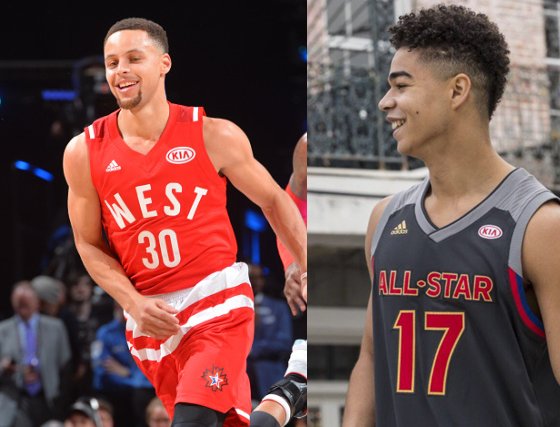
Also worth noting: For the second straight year, the jerseys will carry a Kia advertising patch. Looks like it might be a bit smaller this time around, though:
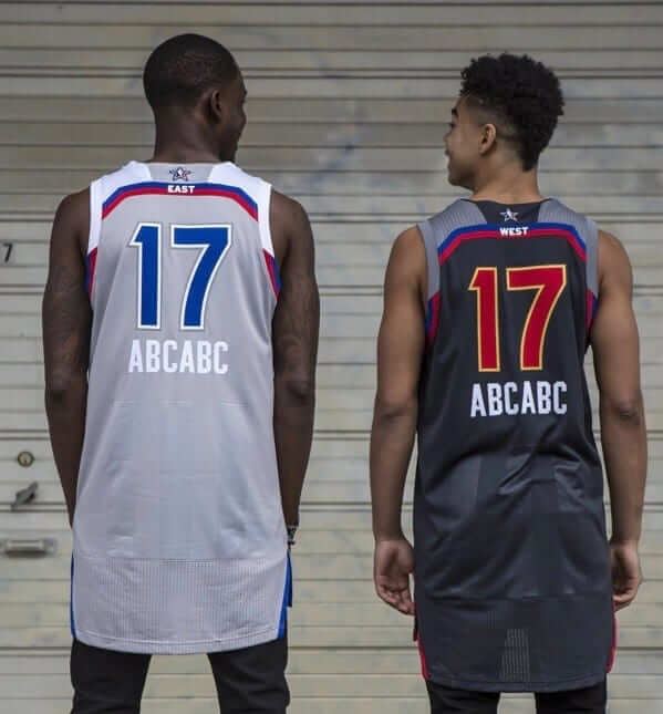
Here’s the rear view, which has the uniforms’ lone gimmicky element: drop-down NOBs.
Interestingly, the jerseys actually showed up in video game leaks back in September. At the time, I thought the designs were so generic that I figured they were just placeholders. Turns out they were the real deal.
(My thanks to Travis Lane for the side-by-side Kia patch comparison.)
Click to enlarge
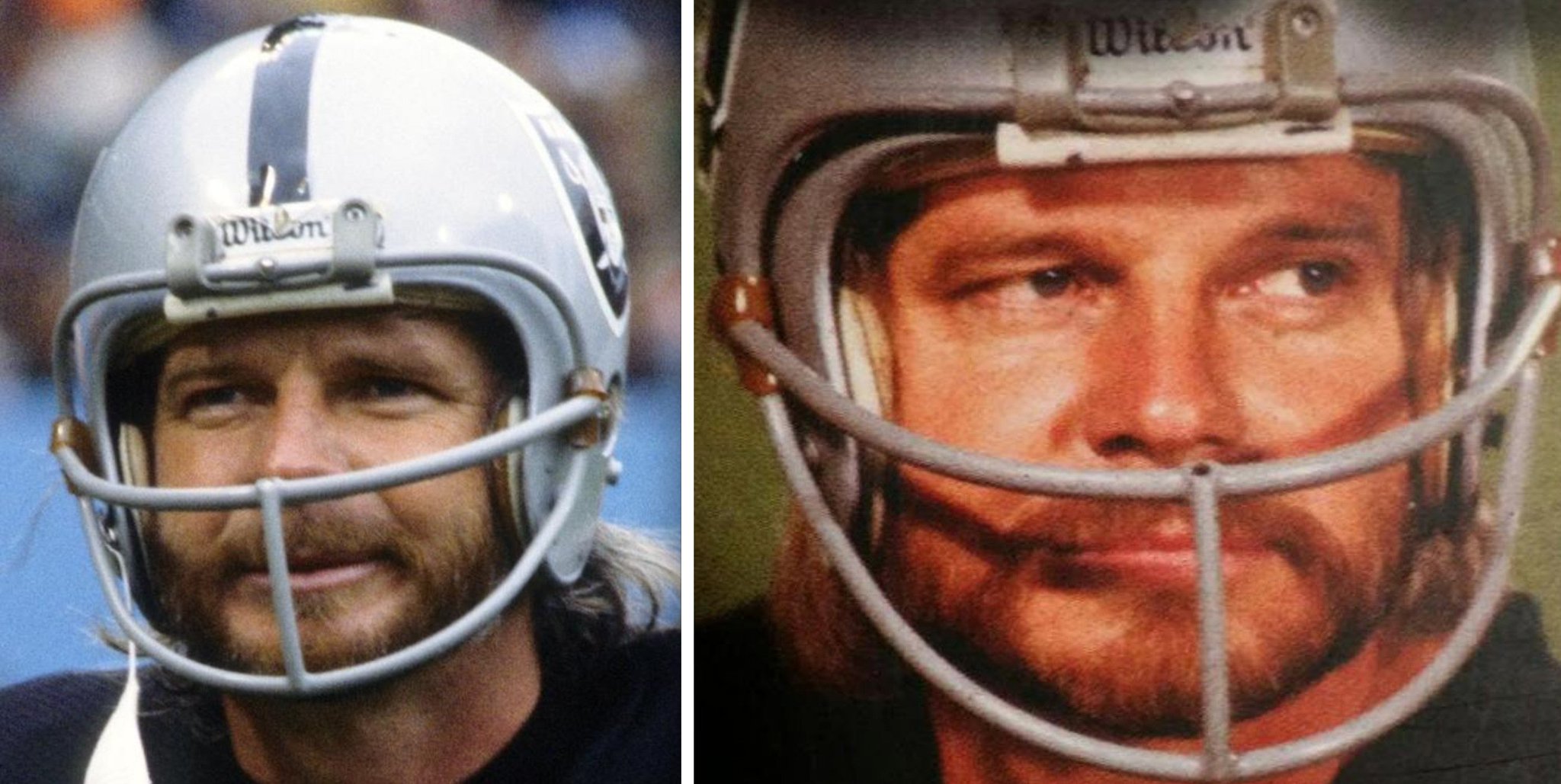
Friday Flashback: With the Raiders back in the playoffs tomorrow — their first postseason appearance since Super Bowl XXXVII in 2003 — my latest Friday Flashback piece over on ESPN takes a look at some quirks and eccentricities in Raiders uniform history (including Kenny Stabler’s facemask, which had the scars from where the center vertical bar had been sawed off and removed, as shown above). Check it out here.
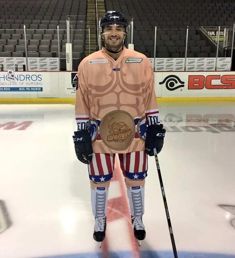
Click to enlarge
Yo, Adrian: The Toledo Walleye will be wearing this boxing-themed uniform for “Rocky Tribute Night” tomorrow. Pretty ridiculous, but anything’s better than trotting out yet another Star Wars uniform, right? And mimicking the old Everlast-branded gloves cuffs on the sleeves is a nice touch. But it might’ve been better if they’d depicted black boxing boots, instead of white, on the socks. That way, the boots would merge with the skates.
In case you’re wondering: All players on the Walleye roster are white. Probably for the best in this case.
Raffle reminder: I’m currently raffling off a custom-painted baseball bat from the Pillbox Bat Company. Details here.
The Ticker
By Paul

’Skins Watch: A high school in upstate New York has declined a set of throwback uniforms that had been donated by school alumnus because the throwbacks featured the color scheme that the school had used when its teams were called the Redskins. The named was changed to Red Storm in 2001. Key quote, from the school district superintendent: “Wearing a throwback jersey acknowledging our Redskin past does not support the district’s effort to be an innovative, forward-thinking entity, demonstrating respect for the rights of others. We made the right decision to honor those who played under this nickname, but to leave this relic of a nickname in the past. We don’t want to revisit this controversy. Declining the donation is an opportunity to reconfirm our commitment to move forward” (from Jude Seymour). … A new agreement between the state of Michigan and the Nottawaseppi Huron Band of the Potawatomi may help provide funds to underwrite the costs incurred by schools that want stop using Native American team names (thanks, Phil).

Baseball News: Back in 1989, Sports Illustrated asked various fashion designers to for their ideas on how to redesign baseball uniforms, with predictably laughable results (from BSmile). … The Down East Wood Ducks, a Single-A Rangers affiliate in the Carolina League, will unveil their new logo next Wednesday. I look forward to the inevitable Brandiose snarling-animal look (from Greg Gebhardt). … Several Adidas-outfitted schools have new throwbacks this year, including Miami, Arizona State, Nebraska, NC State, and Louisville. Look here, here, and here (from JC Crawford, Cory Lavalette, and @fiverse). … Latest college team to go with 3D helmet logos: Washington State. … In 1968, the Braves added pinstripes to their home uniform. But according to a short wire service item from January of that year, they were also planning to go with pinstripes on the road. I wonder if there’s a pinstriped road prototype floating around somewhere (from newspaper researcher extraordinaire Jerry Wolper).

NFL News: A newly elected district attorney in Texas was sworn in while wearing a Cowboys jersey (from Tommy Turner). … Here’s a 1977 photo of Oilers’ LB Robert Brazile with “Dr. Doom” written on his arm pad (from Bill Kellick).

Hockey News: Stars C Radek Faksa’s new gloves have his name misspelled (from Cory Head). … Those 1966 Blues prototypes that we’ve written about from time to time will finally be making their on-ice debut later this month, although not for a game. They’ll be worn this weekend for a skills competition. Now they just need to bring back the trumpet prototype! (From Tim Holdener.) … Centennial patch placement update: The Blues are wearing the patch on their upper sleeve stripe. We also got our first look at how the patch will be worn on the following jerseys: Predators white, Sharks black, Kings black, Wild white, Hurricanes white, Blackhawks red, Blue Jackets white, and Capitals throwbacks. … The Bruins have added a “15” memorial patch for Milt Schmidt (from Jeff Israel). … You can get a ridiculous amount of NHL historical info in this handy enormous infographic (from Jeff Bryniarski). … Army had an outdoor game at Fenway Park last night, with new jerseys for the occasion (from Tony Fatula). … Firefighter-appreciation jerseys on Jan. 15 for the Manitoba Moose (from @Jay_Pea_R). … Very interesting 1968 article about whether helmets should be mandatory in the NHL (great find by Jerry Wolper). … Also from Jerry: Here’s a shot of goaltending great Terry Sawchuk in the 1968 NHL All-Star Game.

Basketball News: Bucks G Giannis Antetokounmpo frequently wears “Never Give Up” wristbands (from Zachary Loesl). … Here’s a good view of the NBA uniform guidelines that are posted in each team’s locker room (from Douglas Ford). … The USC Song Girls still have the Rose Bowl roses on their sweaters (from Grant Young).

Soccer News: Oooh, check out the wavy stripes used on the Cherno More 2009-10 away jersey (from Trevor Williams). … Also from Trevor: “I just assumed the New York Cosmos were named after the astronomical term. I didn’t know until a recent BBC podcast that the name is short for Cosmopolitan and takes inspiration from the Mets.” There’s more on that here. … The great designer and illustrator Stanley Chow has created a new project about soccer kits — really good stuff (from Iain Landon).

Grab Bag: There’s a surprisingly popular sport at Orthodox Jewish yeshivas in New York City: floor hockey. … The Museum of Modern Art in NYC will have a program of short comedic films about sports training on Jan. 14. Should feature lots of old uniforms and athletic apparel (from my pal Karen McBurnie). … The next big player in the outerwear market is shaping up to be Amazon (from Tommy Turner). … Here’s a brief cultural history of various types of non-sports uniforms (from my ESPN colleague Kevin Ota). … In the wake of that Kentucky high school backing off from its plan to call its teams the Stallions, Kentucky.com has some suggestions for other area schools that might want to consider name changes (from Josh Claywell). … The U.S. Army’s new grooming and appearance regulations will allow observant Sikh and Muslim soldiers to wear turbans, beards, and hijabs. … A controversial strain of genetically modified apples have a new logo. … National Park Service officials say fears that the agency will soon start displaying corporate advertising logos at NPS properties are unfounded. Let’s hope they’re right. … Did you know pro surfers wear jerseys? They do! … Texas is considering a “bathroom law” similar to North Carolina’s, which could have implications for the various high-profile sporting events held in the state.
I still can’t get over how much those All-star jerseys look like something toddlers wear. My lil’ All-star.
I nearly just spit out my coffee. Well said, sir. -C.
As usual, I agree with Chris. Well said, indeed.
That NHL infographic reads like a NYC subway map
Proofreading:
tagging problem with first ‘here’ in “here, here, and here”
“Terry Sawchuck” is actually ‘Sawchuk’.
Fixed.
The first and third “here” seem to link to the same thing (the ASU tweet).
On the morning of the last NBA All-Star Game in New Orleans, I woke up from dreaming I was chosen to play in the game, representing the Knicks. But it wasn’t until I tuned in to the game that I found out what the teams were wearing. I was startled by the sleeved uniforms; they were fine, but they just made the game look like what it really was: a glorified practice session.
This year’s uniforms don’t stand out to me in any way.
Black vs. grey is fairly dreary and drab for an all-star game.
oddly enough most of the people on rather be grey vs white for the MLB All Star game
Floor Hockey sounds cool. My cousins and I once took our uncles golf clubs and moved all the living room furniture to play hockey…really bad for the shins
A high school in upstate New York has declined a set of throwback uniforms that had been donated by school alumnus because the throwbacks featured the color scheme that the school had used when its teams were called the Redskins.
It looks like the would-be benefactor failed to vet his contribution with the school superintendent. Under that circumstance the district has no obligation to accept the largesse. If you generously donate 144 crates of kale/lima bean casserole to me, I have a right to decline it.
If you generously donate 144 crates of kale/lima bean casserole to me, I have a right to decline it.
I might even decline it, as they say, with extreme prejudice.
Unfortunately, the follow on might be that alumnus not donating anything to that school, be it throwback jerseys with the old color scheme, lima beans, or cash.
The gist is that any alumni gift seems to come with strings attached; let us not forget Ralph Engelstad Arena. The agenda of the benefactor can taint (heeheehee) the offering. I can’t fault the superintendent for showing a spine, no matter how disposed I am toward the “Redskins” identity.
The Friday Flashback is up:
link
The USC Cheerleader Sweater is the greatest invention of all time.
I totally agree.
So what if the Rose Bowl roses are still on their sweaters. It’s been what…four days? Most of us still have a Christmas tree and decorations that have not been removed.
So what if the Rose Bowl roses are still on their sweaters. It’s been what…four days?
I didn’t say there was anything wrong with the roses still being there. I simply noted that they’re there and explained why.
I have friends who are a couple and have allowed a passive aggressive battle over whose job it is to take down the Christmas decorations morph into them being up for the past four years. You can’t make this stuff up.
Black vs. gray? Looks more like light gray vs. dark gray to me.
I Think the Superintendent is being a little uber-sensitive with these throwbacks. They don’t say “Redskins”, who cares about the colors? And it’s sad that the team wearing them had no say. Bummer.
who cares about the colors?
The school district does. Because it’s a clear reminder of the old name and the controversy over same. Better for all concerned if they don’t revisit that. Smart move by the superintendent.
I just hope this woman didn’t bite the hand that fed her. Donations from alumni in small communities is huge for high schools that have limited budgets. Plus, the article really didn’t mention the community at large being offended or upset, just her. Now if the word R****** was emblazoned on the throwbacks, well that’s just idiotic. I just hope the guy doesn’t get chastised in that town for doing something nice because of a border on the letters & numbers.
The Saranac Lake school board approved the donation in December on the condition that the uniforms meet school specifications.
That was pretty dumb on their part, they should have specifically asked the guy what he had in mind. I don’t think he was lying when he said he had no idea what the specs were. The school board should have made a point to say something if it was that big a deal.
I just hope this woman didn’t bite the hand that fed her. … I just hope the guy doesn’t get chastised in that town for doing something nice…
You just hope this, you just hope that…. Instead of speculating on potential worst-case outcomes, let’s chalk it up to a miscommunication on move on.
Seems like a bureaucrat trying to cover his ass and save himself the potential headache. Which, of course, is his prerogative. But I can’t imagine a reasonable person finding those unis objectionable. You really have to be looking for something to get upset about.
That having been said, though, I agree with Walter in that the donor should have checked with the school district first. That’s just common sense.
I hate the jerseys, but, damn, I LOVE those Rocky hockey shorts. And the Rocky fanfare is PERFECT for a puck drop. ;)
Oops. I misgendered the Superintendent. My bad.
Sorry Paul, didn’t mean to stir the pot lol :)
I always seem to when these ‘Skins stories pop up.
The Raiders, Cowboys, Steelers and Packers are the most iconic NFL uniforms, IMO.
The Raiders, Cowboys, Steelers and Packers are the most iconic NFL uniforms, IMO.
There you go, stirring the pot again!!
;)
Didn’t have time to send this in yesterday but Davidson and George Washington went color on color last night.
link
The last line about the hockey/boxing uni’s punctuates the point of their stupidity.
Why do teams even go there?
I’d like to think that if they had any black players, they’d give them a dark skinned version of the uniform. After all, Apollo Creed wore those trunks first.
Excellent answer sir! Or even Clubber Lang! Although his trunks were boring blue.
What a coincidence, Robert Brazile. I just DIYed a hoodie with “MF DOOM” on the sleeve.
Would love to see that Braves pinstripe roadie. A salesman jersey must be floating out there.
The sub NOB kind of works well on basketball jerseys. Nike should consider it for their “track” style jerseys.
“I just assumed the New York Cosmos were named after the astronomical term. I didn’t know until a recent BBC podcast that the name is short for Cosmopolitan and takes inspiration from the Mets.” There’s more on that here.
Ah, the old “phony Name-the-Team-Contest”. Classics never get old.
The BBC Podcast is link – good stuff. I had heard that the owners wanted to name them the “Blues”, but didn’t know that another part of the ownership group preferred “Lovers”.
I remember (or misremember) the Galaxy got their name because they were going to the West Coast version of the Cosmos, but I couldn’t find a reference. Instead I found this: “Why Galaxy? Villanueva was asked. ‘We’re the city of the stars,’ he said.” link
Please, St. Louis, do not outfit the Blues in the helmet prototype.
Love your SI article on the Raiders. For their white jersey, I prefer the 1970 silver number with thin black outline to their usual black numbers. Reminds me a little of the Saints Color Rush jersey this year, with the gold numbers, which the Saints should go with full time. I wonder if the Raiders will make any tweeks if they move to Las Vegas. Doubt it, but Nevada is the “Silver State”.
SI? ESPN!
Blasphemy!
I also prefer the silver numbers, but I don’t think they’ll ever go back to them as a permanent change. Everyone complains too much about “legibility”. I can read ’em just fine, but apparently no one else can.
What is aesthetically preferable is often at cross purposes with what is more functional. I like that they keep making stabs at the silver-numbered shirt; it shows where their heart is.
If that Toledo Walleye uni isn’t motivation to get out of the minors and make to the NHL, I don’t know what is……
That’s the the thinking behind every minor league team (in any sport) that introduces a ridiculous uniform, logo, mascot,… Every player’s hope is to get out of the “undercard” and make it into “main event” status.
“Back in 1989, Sports Illustrated asked various fashion designers to for their ideas on how to redesign baseball uniforms”
Did they ask George Costanza?
Additionally, I thought that the swords on the first Raiders shield protruded beyond the edges of the shield. However, I cannot find any actual game/team photos that show that.
????
This GUD blog entry from 2013 shows a correction where it is acknowledged that the swords did not protrude outside of the shield on the 1963 helmets.
link
There are lots of mock-up or custom helmets out there with the logo decal showing the protruding swords but nothing that was ever worn on the field, apparently.
Does anyone else remember Kenny Stabler with a small smiley face sticker on the front of his Raider helmet? It was rather iconic at the time, but I have not been able to find a picture of it anywhere.
here you go
link
Ty!
I forgot about that sticker but do recall that he cut the sleeves of his jersey in a particular way that is difficult to describe (wish I could find a picture).
the allstar uniforms are crap but using a couple of models who look like high school kids from the Sears catalog makes them looke even meeker and shittier.
#AdidasFail
Question: Why do you blame the models on Adidas, and not on the NBA?
You can take the army jersey and use it for the vegas golden knights and it would look great.
Paul: great job on the Raiders’ piece. Who knew that there was such a subtle change as to remove the “glare” from the logo’s helmet? Uni-watching at its best.
Didn’t Louisville wear those throwbacks last season?