Click to enlarge
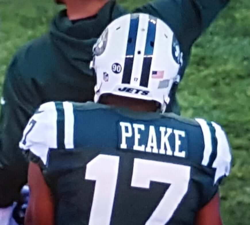
The Jets can’t seem to do anything right, a state of affairs that was nicely symbolized by wide receiver Charone Peake’s laughably off-center nameplate in yesterday’s game against the Bills. It almost looks like nameplate had once had a first initial that was later removed, although I’m not aware of anyone else named Peake having played for the Jets.
Peake is a rookie, so the photographic record on him is not particularly deep. I was able to find only one rear-view photo of him in a green jersey, from a preseason game back in August. His nameplate back then was fine:
There are several rear-view shots of him in a white jersey, none of which show anything amiss with his nameplate, so yesterday’s glitch was apparently a one-time thing. Weird.
In other news from the final Sunday of the regular season:
• The Bengals went mono-black.
• The Titans went mono-blue.
• The Dolphins went mono-aqua — woof.
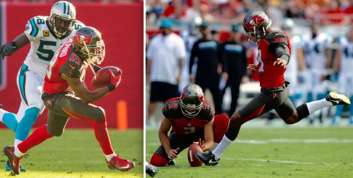
• The Bucs wore red-topped socks — except for kicker Roberto Aguayo, who wore black-topped socks (click to enlarge):
• At least one of the end zones in Tennessee looked a bit off. Anyone know what that was about?
• Boys with toys: Broncos cornerback Aqib Talib tore the gold necklace off of Raiders wideout Michael Crabtree’s neck.
Aqib Talib been listening to a lot of Run The Jewels this week https://t.co/1qoXUH6wVO
— Barstool Sports (@barstooltweetss) January 1, 2017
• Vikings wide receiver Cordarelle Patterson wore socks featuring himself:
• At U.S. Bank Stadium in Minnesota, the Vikings/Bears game was briefly upstaged when protesters hung a banner urging stadium sponsor advertiser U.S. Bank to divest from the Dakota Access Pipeline (further details here). One of the protesters was wearing a Brett Favre Vikings jersey.
• Only one team wore white at home: the Rams.
• Here’s a list of players who protested during the national anthem.
Sorry, didn’t have time to compile postgame jersey swaps this time around. Enjoy the rest of your long New Year’s weekend.
(My thanks to all contributors, including Chris Herman, Tony Shiffman, and our own Mike Chamerinik.)
Click to enlarge
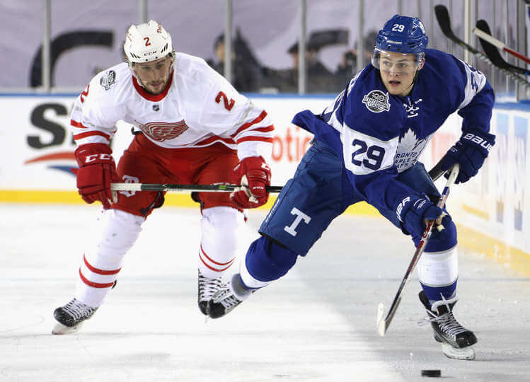
Let’s do it again in 2117: The NHL’s Centennial was held yesterday. Uniform-wise, I thought it was largely a wash — both teams looked okay, but I thought both uni designs had major flaws (the Wings’ unnecessary silver trim, that big honking “T” on the Leafs’ pants, etc.). Also, many fans complained that the shade of blue used for Toronto’s pants didn’t match the blue used for the jersey and socks. Lots of additional photos — like, more than 500 of them — here.
Today: the Winter Classic — weather permitting.

Click to enlarge
Curling update: Another week, another win, as we scored five in the first end and then coasted to a 9-2 victory. This one didn’t count in our league standings (a lot of people were out of town for the holidays, so this week’s games didn’t count), but we still played really well. In fact, this was probably the best I’ve ever curled — the rocks were doing pretty much everything I told them to do. Very satisfying!
The Ticker
By Paul

Baseball News: New 20th-season logo for the Fresno Grizzlies. … Here’s a quiz on Cubs logos through the ages. “The playlist provides links to similar quizzes for the Yankees, Phillies, Angels, and Washington football,” says Dustin Semore. … Youngstown State used to have a vest with a penguin chest patch.
College Football News: The Tampa police force will have special badges for the College Football Playoff championship game. The badges include the CFP logo, which frankly seems pretty messed up to me. Police officers are public servants, and their uniforms should never include commercial logos or other forms of advertising (from James Gilbert).

Hockey News: UMass-Lowell goalies have some interesting backplate designs. Garrett Metcalf is 6’3″ is nicknamed “Giraffe,” so his backplate shows a giraffe facing a barrage of pucks, while Tyler Wall hails from Leamington, Ontario, home to a major tomato processing plant, so his backplate features a tomato (from Tris Wykes). … Wayne Gretzky played less than a season with the Blues, but he showed up yesterday for the Winter Classic alumni game. “It was cool seeing him in the throwback Blues uniform, which he did not wear during his time with the team,” says Wade Heidt. … Also from Wade: Toronto participants in the Centennial Classic alumni game wore a current Leafs uni with a centennial logo, and Lanny McDonald wore a helmet similar to his old Northland model. … The Carolina Hurricanes’ emergency goalie is their equipment manager, Jorge Alves, who got into Saturday night’s game. His mask design, which he painted himself, features his fellow equipment staffers, including the guy who sews the lettering onto the jerseys (big thanks to Elena Elms). … The WHL’s Seattle Thunderbirds and Portland Winterhawks went color vs. color on New Year’s Eve (Wade Heidt again). … All NHL teams are adding the league’s centennial logo as a right-sleeve patch. Here’s how it’s been worn by the Penguins, Ducks, Flyers, and Caps, and here’s where various teams are wearing it relative to their sleeve numbers (from Moe Khan and Wes Smith). … Gotta love this completely awesome photo from the Maple Leafs’ 1928 training camp (great find by Marc Viquez). … The Senators are now wearing an anniversary patch.
Dolphins uniforms are a mess. They should go back to their throwback uniforms and logo that they have worn this season which are clean, crisp, and classic. This comes from a Steelers fan.
^ THIS.
Agreed!
I agree 100%. The Dolphin throwbacks are iconic. The new unis are a horrible downgrade; and don’t get me started on the idiotic fonts that all these updated versions are unfortunately going with.
Ditto X4. Time to bring back the classic Dolphins unis full time.
The Music City Bowl was played in Nashville. What is in the Titans end zones was an attempt to cover over the paint from the bowl game.
The Titans should have used a navy background in the end zone, I know the Eagles started using a black background in their endzone for this reason.
The Titans logo… they painted over “nashville” text from the Music City Bowl. That’s why it looks bad.
I saw a similar thing at the Fort Worth Bowl… the logo and sponsor logos didn’t really cover the TCU and Big 12 logos.
Proofreading:
“Broncos cornerback Aqib Talib the gold necklace”
“postgame jerseys swaps”
“here’s where various teams are wearing it 1928 training camp” tagging problem?
And Happy New Year, everybody.
All fixed.
Other errors:
“Vikings wide receiver Corradelle Patterson wore socks featuring himself:” should be Cordarelle
“It almost looks like nameplate had one once a first initial that was later removed,” possibly should be “nameplate once had a first initial”
Yikes! Can you guess who was busy with New Year’s and curling activities yesterday?
Fixed.
“The big honking ‘T'” on the Leafs’ breezers yesterday were a nod to the Toronto Blueshirts, the original NHL team in T.O.
The fact that it may have a historical pedigree doesn’t change the fact that it was a big honking T that looked ridiculous.
Agree to disagree Paul. I kind of liked it.
Granted, it looked ridiculous. But I do think the tie to history could have justified a better-designed breezer logo. If this were the Florida Panthers, for example, the best-designed big logo on the breezer would still be ridiculous. But since it’s the Leafs, and there’s a tie to history, a well-designed breezer logo could have worked. The historical connection is necessary, but not sufficient, to make a big ol’ breezer logo work.
I really dislike breezer logos. They are unnecessary, and all they do is clutter the visual of the uniform. Truth be told, the only reason they exist is to “authenticate” a team’s third most important logo by making it a part of the uniform, theoretically justifying its appearance on other pieces of merchandise. Blah.
It is near impossible to match the shade of socks and jerseys to pants in hockey. Same with helmets. How is this just being brought up as a mistake? Both teams had silver on the uniforms, it was part of the centennial. The Leafs white stripes were outlined in silver as well. Both teams looked fantastic for teams who switched it up from their traditional look. If you think that was a below average looking hockey game, you are crazy.
I think the breezer ‘T’ looks fine in a vacuum, even at that size. The thing I hate is how it has the same footprint and concept as the red wings breezer retro ‘D’. Teams should have their own unique designs, not intentionally sharing design elements.
Very weird to see Wayne Gretzky show up at a Blues alumni game, don’t know if they were having a tough time finding players or not. Including the playoffs, Gretzky played in just 31 games with the Blues that season, and was so eager to escape St. Louis, he took less money and a shorter deal to play for the New York Rangers.
I imagine it has something to do with his wife being born and raised in the St. Louis area.
Also, his “eagerness to escape” was due primarily, if not solely, to Mike Keenan.
He’s well liked in town regardless of the length of his tenure. His wife is from nearby and he’s always spoken well of the city.
Plus if you can get Wayne Gretzky to play in your alumni game, you get Wayne Gretzky to play in your alumni game.
It seems like everyone who has played for one of the city’s teams loved St. Louis.
Wayne Gretzky is well-liked everywhere.
Noon Winter Classic gametime in St. Louis, weather supposed to be pushing 50 degrees and rainy. Might as well just have it in Tampa where it’s supposed to be 75.
The outdoor temperature won’t be the problem; NHL arenas are kept in the 50s, and the collective body heat of the crowd raises the temperature to the 60s. The problem would be if it rains; that would make the ice uneven, and unsafe to play on.
Since Gretzky is an NHL ambassador or such now, having him at the Winter classic makes sense, even if he didnt aply there very long.
Martin Brodeur played 7 total appearances for the Blues, yet he was one of their goalies. I know he works in the front office there now, but still a little ridiculous, I guess Vincent Riendeau was busy.
Loved that Lanny McDonald wore his original Northlands lid that was clearly painted blue. Gretzky wore a stocking cap instead of the Jofa. Most alumni chose to wear a late model helmet. I find helmet choice one of the more interesting topics during the alumni games. Should they wear their original helmets or should CCM or Bauer make throwback versions to bring back the iconic looks?
All this talk of old hockey helmets makes me wish I kept my youth helmets (and gloves, of defunct companies and designs)from the 1980s. I had one of those egghead helmets and heard all about it. We called it the Potvin helmet though.
My guess is he did the Butch Goring thing and wrapped a white helmet in blue tape. Has a really matte finish.
Maybe white, maybe red, since his last stop was in Calgary.
Interesting that he wore a helmet this time, when he played in the 2011 Heritage Classic Alumni Game in Calgary he wore a toque.
link
I don’t have a picture but Borje Salming wore his original helmet from his last season with the leafs at the alumni game. Additionally, he had his own brand of hockey gloves that him as well as his line mates (Darryl Sittler included) wore. A few others wore them too.
Curious, will Bucs kicker Robert Aguayo be fined for wearing the wrong colored socks, and how much?
I don’t know the answer to those questions.
Counter-question: Why do you care? I don’t mean that in a derogatory way — I’m just genuinely curious as to why you (and many other people) care about these types of fines. The fines don’t interest me at all. The money amounts to pocket change for the players, and it all just seems like silly corporate theater to me.
I’m not saying I’m right and you’re wrong. I’m just trying to understand the appeal of this type of information.
“Pocket change” players spend weekly that that amounts to more than most, if not all, of us make in a year.
I consider uni violation fines pretty fucking frivolous expense choices by players. Considering how many pro athletes go bankrupt after their playing days are over, I would be interested to see how many normal people’s salaries they forfeit due to sock choices, hoodies under unis, or hideously coloured shoes over the course of a career.
“Pocket change” players spend weekly that that amounts to more than most, if not all, of us make in a year.
Yes, I know. But it’s still pocket change to them. That’s the point. Fining someone $10K when he makes $6 million a year is pretty much meaningless. The players clearly don’t give a shhttp://www.uni-watch.com/wp-admin/edit-comments.php#comments-formit (that’s why they keep violating the uniform code in various ways), so why should we?
Considering how many pro athletes go bankrupt after their playing days are over…
Just how many pro athletes actually go bankrupt? Some, yes. But I suspect the actual number is extremely small. If you have hard numbers rather than scattered anecdotes, I’d be interested in hearing them.
I suppose that a fine (or lack thereof) would have an effect on players’ future uniform decisions, so there’s some useful information there.
I suppose that a fine (or lack thereof) would have an effect on players’ future uniform decisions, so there’s some useful information there.
It’s pretty obvious that it has no effect whatsoever. The players violate the uniform code repeatedly and at will.
Don’t care, just curious what the rule is. Haha, I don’t know what a fine costs? Also don’t know what this kicker makes? I have thought that a shoe contract could easily cover fines that a player could get if they wear the “wrong” shoes.
What’s so terrible about the Dolphins in mono-aqua? I think they should have stripes on the socks, or use orange or navy socks… but how is that any worse than any of the other mono-color uniforms in the league? In that picture, the Patriots’ extra-wide jersey side panels look far worse.
The white helmet does not help. I’m not quite a fan of the Seahawks’ all-navy look, but their navy helmet does give it a truer monochromatic look.
I recall that when this set was introduced, the Dolphins said that they were sort of going with white as the primary team color. That no longer seems to be their mindset; they’d be wearing white pants in that case.
When the Dolphins go all aqua, they need to wear the striped socks like they did when they went all aqua back in the early 2000’s.
They may have kept wearing the aqua pants because they were playing well in them. You know how superstitions go . . .
When the Dolphins go all aqua, they need to wear the striped socks like they did when they went all aqua back in the early 2000’s.
They may have kept wearing the aqua pants because they were playing well in them. You know how superstitions can go . . .
I agree with you, The Jeff.
Hopefully we’re done with the player protest section. It’s old.
…and it has nothing to do with unis.
As we’ve discussed before, it has plenty to do with the visual culture of the game, because it’s different from the usual visual culture of the anthem that had been established over many decades. That’s why it gets covered here, and why it will continue to be covered as long as it’s still an ongoing thing.
There are lots of things here that are a lot older. As with most other aspects of the site, you’re welcome to scroll past the parts you don’t care for.
Will the Tampa police actually be wearing those badges during the game? Or were they just presented as a commemorative piece for those who will be working the game? I like the idea of police and other first responders getting something like that for working big events, but don’t think it should replace their actual badge on the uniform.
Nice battle of the sleeve stripes at the Outback Bowl: Florida v Iowa.
Also: WHite facemasks v. black facemasks.
It looks to me like Lanny McDonald wore the same helmet in the 2014 Winter Classic alumni game in Ann Arbour.
link
link
He went toque during the alumni game in Calgary in 2011.
link
That backplace art on the hockey goalie appears to be Melman from the Madagascar films. Yes, i have small children.
The Tampa Bay police department has every right to be proud of their involvement protecting and serving during a college football national championship game, but why do they feel compelled to wear a souvenir for the event on their chest as if it were some faux military medal? I’m glad Uni Watch points out news like this and voices disapproval. Logo creep, advertising, and general lack of decorum is becoming the norm across the board. It defies the notion of a uniform!
To those hating on Uni Watch coverage of sports protests: Uni Watch understands the visual component of sports is culturally significant. Sports in general is not isolated from culture at large. Whether you like it or not, culture is politics and vice versa.
Uni Watch has always projected sports through a critical lens. Fortunately for you, sports uniforms have become so popular you can find your fill elsewhere if you only care about the logos and colors. But if you are a devoted Uni Watch follower, you know logos and colors mean nothing if they don’t tell a compelling story. BFBS was just the start to a wave that Uni Watch must have anticipated and thank goodness there is a voice of reason to dissect the madness.
I don’t know if anybody else cares but I really don’t like the placement of the NHL’s 100th anniversary patches. I’d much rather see it worn on the right chest, as the 75th anniversary patch was, at least with most teams, rather than on the sleeve.
The blue of the Leafs shorts NEVER matches the blue on their jersey/socks and it’s always annoying to me