Click to enlarge
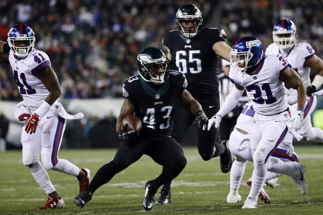
The Giants wore their Thursday-night throwbacks last night. I’ll leave it for others to debate last night’s “Giants” helmet mark vs. their usual “ny” mark (I like both of them), but I’ve been saying for many years that the Jints’ white jerseys should be trimmed in blue, not red, so it was nice to see them going back to that, if only for one game.
The game featured several uni-notable bits, all of which were helpfully spelled out for us in the following tweets:
@PhilHecken Good detailing with the letter fonts on the Giants jerseys tonight. Look at each J, especially. pic.twitter.com/B2O4ydaHES
— Funhouse (@SportsFunhouse) December 23, 2016
Wow the #Giants even had the proper throwback numeral font for the back of their helmets @UniWatch pic.twitter.com/It4RXZfuSS
— Joe Giza (@JoeGiza) December 23, 2016
@PhilHecken @UniWatch interesting that Giants captains have 2 different color patches for color rush. 4+ years in blue. Others have red. pic.twitter.com/iIw9lGLVdZ
— JJ Sledge (@doublejphotoLA) December 23, 2016
@PhilHecken …and @UniWatch #NYGvsPHI pic.twitter.com/f4N3poJWJg
— Curtis Galvin (@CurtisGalvin) December 23, 2016
Eli Manning wearing @Nike cleats tonight that include grass taken from his high school football field. #GiantsPride pic.twitter.com/F9z9mhkpUN
— New York Giants (@Giants) December 22, 2016
Meanwhile: A blog I’d never heard of before, called Pro Sports Rundown, posted a piece about how the Giants ended up wearing white last night. Here’s the key info:
Nike presented a red jersey and pants combination for its initial pitch to the Giants brass. … John Mara, president, CEO, and co-owner of the Giants, said: “This meeting is over. We are not going with this.” The feeling simply was that the color red was not indicative of the iconic Giants “look” that has stood the test of time.
[…]
The second jersey and pants combination that Nike presented to the Giants was a blue combination. … Mara’s thought process was that “[the Giants] can suffer through this one game” if they spun it as an ode to “Big Blue” and the “Big Blue Wrecking Crew.”
[…]
After signing off on this look, after a couple of months, John Mara developed a case of cold feet at the very last minute, right before the permission forms were due to Nike. Mara told [equipment director Joe] Skiba: “I can’t do it.” At this point, Skiba’s imminent fear was that the Giants were going to be “the only one out of 32 teams not [participating in Color Rush].” Mara explained to Skiba that he did not want this completely blue Color Rush uniform, worn for one night, to damage the organization’s iconic, timeless look.
So then they came up with white as a last-minute solution. The real story here is how Giants team ownership finds the Color Rash program as ridiculous as so many of us do.
(Special thanks to Mark Gonillo for pointing me toward the Giants/Mara story.)
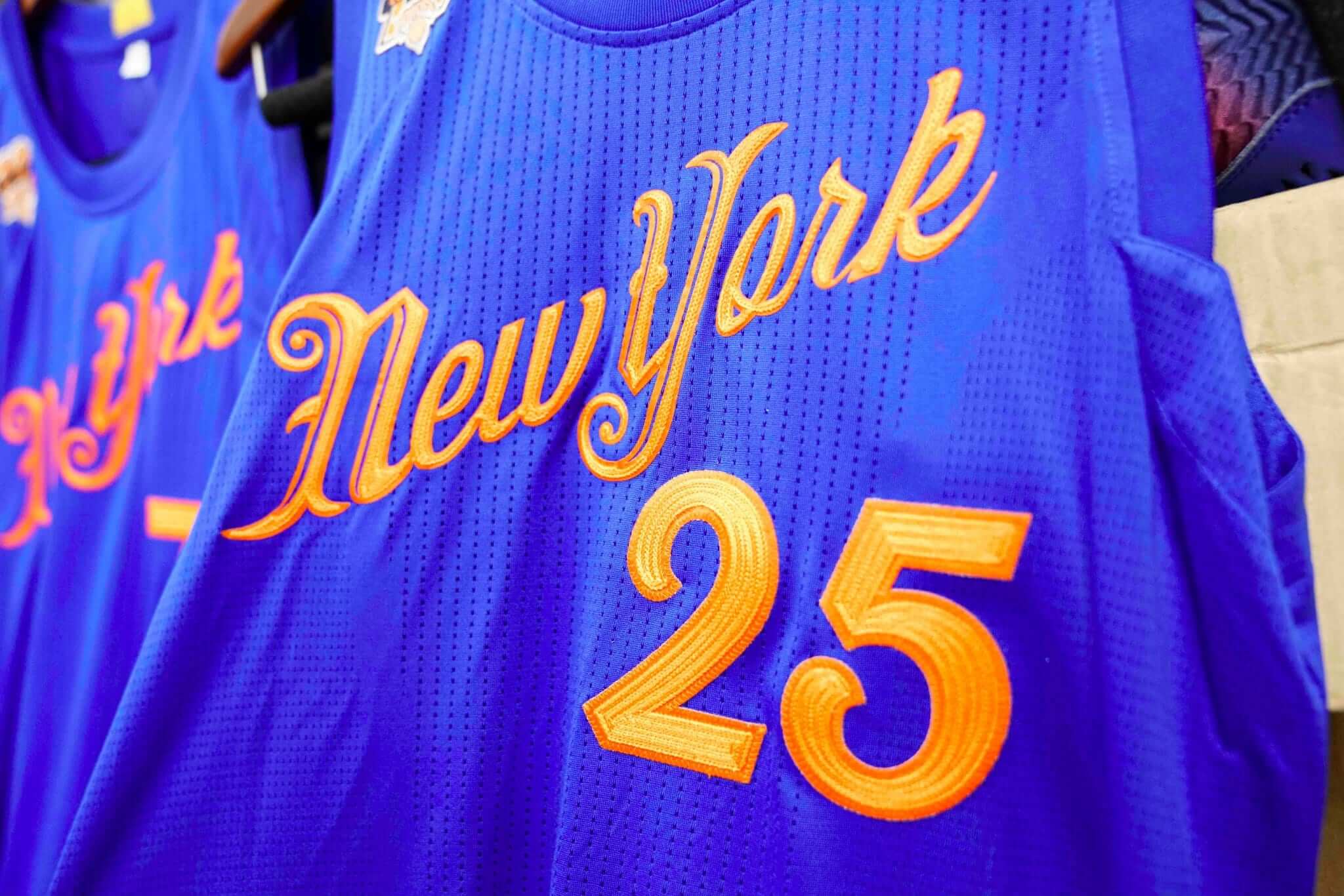
Click to enlarge
Friday Flashback: What you see above is the jersey that the Knicks will be wearing on Christmas Day. Look at all that texture! Very nice.
I’ve written an ESPN piece that ranks all of the previous Christmas uniforms. Check it out here.
(My thanks to Phil for the Knicks photo.)
LAST CALL for “Collect ’em all” proof: If you collected all six of this year’s Uni Watch T-Shirt Club designs, you qualify for the year-end prize — a patch based on the jock tag graphic that appeared on this year’s shirts. In order to claim your prize, you must send me proof that you purchased all six shirts by the end of today. The proof can be photos of the shirts and/or screen shots of your “Thank you for your order” emails from Teespring and Represent. Send your proof to me here. Thanks.
The Ticker
By Paul

’Skins Watch: The school board in Belding, Mich., has voted to stop calling its teams the Redskins. As an aside, if you look at the photo accompanying that story, you’ll see that the school uses an interesting two-color treatment of the Michigan-style winged helmet design, which looks pretty good (from @Rovitz).

Baseball News: The Columbia Fireflies have released the logo for the 2017 South Atlantic League All-Star Game. The design bucks the recent trend by using a hyphen, instead of a star, for “All-Star” (from Andrew Shain). … Broadcaster Todd Kalas is moving from the Rays to the Astros, which prompted his colleague Dewayne Staats to post a tremendous picture of Kalas wearing a ’Stros shooting-star uni when he was a little boy (from James Poisso).

NFL News: Giants WR Odell Beckham Jr. says he was fined $18,000 for wearing Craig Sager tribute cleats last Sunday (thanks, Phil). … Another player who’s been fined this week for wearing custom cleats: Washington WR DeSean Jackson. Seems like the bigger problem was his unauthorized black socks (Phil again). … Joe Bailey spotted these NFL player figurine water bottles at a Wegmans east of Rochester, N.Y. Here are some more of them. Among the notable aspects, from Joe: “Cowboys in blue; Bills helmet striping on back of helmet is incorrect; Saints’ and Ravens’ sleeves missing their team logos; and Seahawks’ helmet decoration doesn’t extend to back of helmet.” … Tomorrow’s installment of ESPN’s NFL Countdown will include a report on how Cardinals running back David Johnson hand-delivers mail-ordered NFL jerseys to the doorsteps of unsuspecting fans. … Good story on how Panthers RB Jonathan Stewart’s facemask came off during Monday night’s game against Washington. … The Bills, who went mono-blue last Sunday, will do so again tomorrow. What a mistake (from Kenny Saidah).
College Football News: We’ve reached the point where high school players are announcing what their college jersey numbers will be (blame Phil). … Columbus Blue Jackets player Zach Werenski wore a Michigan winged helmet jacket and tie last night (from Kevin Pedigo). … Here’s Virginia Tech’s jersey patch for the Queen City Bowl (from Andrew Cosentino).

Hockey News: Sabres G Anders Nilsson had to switch to a plain white mask after his regular mask was fractured by a shot (from @bonesj0nes). … Reprinted from yesterday’s comments: Flyers G Steve Mason now has gold-accented pads to wear with the team’s 50th-anniversary jersey. … I had this in the college football section, but it’s worth repeating here: Blue Jackets D Zach Werenski wore a University of Michigan winged football helmet jacket and tie last night (from Kevin Pedigo). … Speaking of the Blue Jackets, the NOBs on their pregame warm-up jerseys tonight will feature Twitter handles and hashtags, part of their Social Media Night promotion (from Ben Teaford).

College Hoops News: Arkansas-Pine Bluff was using inconsistent NOB fonts last night. Not sure which version is the one aberration and which one was being worn by all the other players.

Soccer News: Due to a kit clash, players on the Romanian team Timisoara had to wear plain white jerseys with the numbers inscribed with Sharpies. Reminds me of that Virginia Tech football game from 2007 (from Trevor Williams).

Grab Bag: Just what the world’s been waiting for: Tiffany-branded police barricades. … Good article on how people are increasingly fed up with brand logos on apparel and are taking matters into their own hands by removing the logos. A New Era cap is used as the splash photo, although not mentioned in the article (from J.Walker). … A search of a North Carolina murder suspect’s car turned up a bunch of stolen police uniforms. … NASCAR’s premier series has a new name and logo. … The great Tom Junod, one of the best magazine writers of the past generation, recently moved from Esquire to ESPN. He’s written a faaaaascinating piece about participation trophies. I don’t agree with all of it, but I enjoyed reading all of it. It’s long, and it earns every word. There are so many parts I want to quote, but I’ll stick to the part where Junod mentions to his 13-year-old daughter that some people don’t like participation trophies. Her response: “Oh, that’s because they don’t want losers to ever think they can win. That’s because they don’t want the fat kids to think that they can get a trophy.” Highly recommended.

Holiday schedule: Phil has tomorrow off, Alex has Sunday off, Mike has Monday off, and I’m going to be out and about for most of those three days, all of which means it will likely be a quiet holiday weekend here on the site. I’ll have fresh content each day (including the results of the year-end raffle, which will be posted on Sunday), but it’ll be on the light side. Thanks in advance for understanding.
As for me: Tomorrow afternoon I’ll be in the radio studio for my buddy Rex’s WFMU show, Fool’s Paradise, which will run from 1-3pm (available at 91.1FM and streaming online). It’s his annual holiday show, which will feature a party in the studio while Rex spins our kind of Christmas tunes. My friends Jon and Karen always bring a new holiday-themed cocktail for the occasion — this year’s edition is called a Claus Reviver — so I’m usually feeling pretty good by the time Rex hands me a mic and asks me to talk about the year in uniforms.
After the radio show, the Tugboat Captain and I will be heading to a “Feast of the Seven Fishes” party in New Jersey. Never been to one of those before, but I do love fisheseseses, so I’m excited.
On Sunday afternoon we’ll be getting together with some friends for a classic Jewish Christmas — Chinatown and a movie — followed by a trip to my friend Garth’s annual holiday bash, which always features a massive pernil (slow-roasted pork shoulder). And on Monday we’ll be going back to New Jersey for a friend’s birthday party.
I have to bring lots of snacks, appetizers, and desserts to those various parties, so I’ll be cooking for most of today. However you’re spending today and the rest of the holiday weekend, I hope it’s a good time. If you’re traveling, travel safe. And if you’re working over these next few days, please accept my thanks for keeping the world spinning while the rest of us get to have fun.
Proofreading:
“Sabres G Anders Nillson” Nilsson
The tagging in the Romanian soccer item is broken
Fixed.
The Giants were a nice one game throwback… I say this because after seeing it in action, I will always be on the side of the current white jerseys with only red trim… it’s a unique look that only a few teams do/did that puts it into the “beautiful” catagory: UCLA… no light blue on the helmet anywhere, Chargers powder blue throwback, no light blue on the helmet…. I like how things are kept separate like that. Plus, it was a glaring reminder how much the Giants jerseys looked like the Bills for a while there… nothing unique about that. What was strange for me was after all these years without seeing that uniform, right away I was transported back when I’d see certain numbers: Perkins’ 28 made me picture Rodney Hampton, Becka ms 13 was Jennings, Manning 10 was Brad Van Pelt… wild.
I kind of agree. I was expecting to flip over the 1980’s Jints’ uniform; it didn’t happen. Unfortunately, it’s characterless. When the design was settled upon in the late ’70s, it sucked the air out of a slightly giddier uniform. Plus, that Giants wordmark on the helmet was first and foremost a compromise. If they were to change, I’d rather they went with the look of the John Mendenhall era.
I like the red on the Giants’ white jerseys, too. I get that in theory it probably shouldn’t work, but I think it does.
I agree 100%! Sometimes not being uniform is what makes a uniform great. The blue helmet, white and red jersey, and gray pants looks awesome on the field and screams Giants. As you said, it’s unique to the Giants. The color-rush uni was very nice, but nothing stands out about it. It could be the Giants, could be the Bills.
My 0.02, John Mara is the best owner in NY. It was nice to see those jerseys I felt like I was a little kid again. I was never a a fan of the “GIANTS” helmet. The costume was missing blue socks. Back to regular unis NYD!!
I always thought the 80s-era Giants uniforms were some of the best sets in the league and I hope they consider going back to them. Especially now that they can better match the color of the helmet to the rest of the uniform.
“The feeling simply was that the color red was not indicative of the iconic Giants “look” that has stood the test of time. Skiba compares it to that of the New York Yankees, Montreal Canadiens, and the Los Angeles Dodgers”
Kudos to the Giants for not letting Nike run the asylum, but here’s the thing: the Giants have had many uniform changes over the years. They’ve worn red jerseys in the old days. They wore red alternate jerseys as recently as 2007. Heck, they wore blue pants in the mid-to-late ’70s. They’ve only been wearing the current blue set since 2000 (even if it’s a throwback), and the current white jerseys since 2005.
So, I’m sorry, Mara can pretend the Giants have some sort of “timeless, iconic look”, but the reality is that the Giants have tinkered and fiddled with their uniforms more than a club that has a “timeless, iconic look.” And the idea that the Giants’ uniforms (current or otherwise) are in the same untouched class as the Yankees, Canadiens or the Dodgers is laughable. If the Giants go another 40 years without making a change (already doubtful considering they dumped the gray pants at home THIS YEAR), then maybe we can consider them “iconic.”
Rich,
First off, Happy Holidays.
Second. How many teams of sport miracle-up iconic winning looks on day one and stay with them, forever. Take a moment and think about that. While we’re waiting ask yourself this, how long did it take to create the “iconic” Yankee look that we know and loathe today? (hint: decades)
The answer: It is still going ON. Oh yes, and they’re not done yet. Why? because as any dyed in the wool (homage to the iconic way the industry colors textiles) resident of the Uni-verse knows that there are FLAWS, flaws I tells ya, galore in it’s execution. How about logos that do not match on the same jersey/hat combo? Same for the Tigres of Detroit! What in the wide world of sports is going on here?
What is going on is that corporate ‘Murrica takes a measured approach to change so as not to kill the golden goose that is big time professional sports like MLB and college football. The go-slo method is based on the understanding that the goal is to make a BRAND iconic (the whole bidness ops package that includes logos, the sweet chocolatey covering of identity branding) and therefore more memorable to the consumer, or rather more iconic as you had stated.
See you were right all along iconically speaking. That is a tough act to do by the way.
The Gigantes have an iconic look BECAUSE they spent the past 50 years tinkering with it to make it so. Or as close to iconic as they could, and they are not done yet. It is also true that teams that get it right suddenly go LEFT and in some peeps opinion, lose their brand worthiness? The Cleveland Browns had it all once, iconic uniforms and a winning tradition – then they fell to such a level today that it is laughable to consider that they once were the gold standard for iconic tradition.
What is the moral of this story? Well let me see…
It takes PRACTICE to create a “timeless iconic look”.
Teams try to get it right and stay current to the constantly changing whims of fickle consumers like us. Also to pump up the marketing volume cuz money isn’t going to print itself. Results are mixed from very good – Jets and Mets to purdy bad Tampa Bay number fonts, really man just awful. Teams will keep changing, dare I say it, tweaking their uni-sets till they get it right. Hint – this will never stop.
It takes PERSPECTIVE to create a “timeless iconic look”.
This is the whole “eye of the beholder” thing. With perspective you can see the big Uni-picture, that if you don’t keep your brand relevant and up to date, you risk losing market share, or as we say it – that stadium isn’t gonna pay for itself Mr. Mara unless you got the state of NY to build it for you-uh, no wait. Never mind.
Problem is that there are many factors involved in keeping the ship of sport afloat, and that owners can only control or manipulate a few of them. Team liveries are one of them they can meddle with, so they do with mixed results as you have pointed out.
It takes TIME to create a “timeless iconic look”.
This multi-headed hydra of brand awareness, not to be confused with multi-level marketing which is even more evil, is not an exact science to be sure. It is based on the goal of creating imagery that is indeed iconic, yet this is only a part of the whole BRANDING experience. It is more than the logo on the hats and slick unis on the field.
The CUBBIES are champs today not because they have consistently kept there unis for the most part brand centric. They are champs because management decided that they too, should become iconic in the way they went about their business. A ground up approach whose results speak for themselves. Time will tell if they become truly iconic.
typo:
Another player who’s been fined this week for wearing sustom cleats…
Fixed.
I like both the present road uniform and the throwback from last night for the Giants. Both look good in my opinion. Each has its pluses over the other in certain aspects. Tough to choose. Would be ideal to bring this throwback in as a regular 3rd. Could wear the white throwback at home as the 3rd.
Though the Giants looked good, not a fan of the Eagles in mono-black. The Eagles could take the advice of the Giants of last night and bring back their 1980s look. I know many of us feel the same way. Hopefully, the Eagles listen, get the message, and bring back the kelly green soon (silver pants would be nice too). They are a candidate for a uniform overhaul.
I also agree with Paul on the mono-blue for the Bills. Why 2 weeks in a row? Why at all? This is pro football. Wear the blue jersey over the white pants.
Agreed the Giants’ current jersey set looks great. The original gray pants with the blue red blue classic striping looked the best with the current blue jerseys, and would look best with white as well. Imagine those color Rush whites from last night paired with gray pants for contrast … would look phenomenal as an alt.
Regarding helmet color matching the jerseys, I prefer a darker helmet that doesn’t match like the Rams and Giants in the 80s. Am I alone here? Picture the Broncos going with their Orange Color Rush Jersey from this season over white pants with royal blue and orange striped socks, and the navy helmet from this years Color Rush game as well. Doesn’t need to match … would look great. Contrast is still underrated.
Rich is right. The Giants 80s-90s “classic” look lasted for about 20-22 years. Sure the won 2 Super Bowls wearing it, but they’ve won 2 Supers Bowls in the current set and went to 3 total wearing it! They’ve had more success with the “ny” look than the “GIANTS” look. The 80s looks aren’t the Bears, Packers, Raiders who have real “untouchable” looks.
I love the Color Rush concept, but they need to stick with color-on-color for it to really work. My biggest issue with it this year is how often we get one team in all-white on Thursday. I mean, last night was a Color Rush game, while the teams were literally playing in black and white- I don’t know if that’s quite the definition of situational irony, but it’s got to be close.
Yeah, the NFL shouldn’t have given teams the veto option. The Giants should’ve worn blue, whether they wanted to or not.
Wow. So you think teams shouldn’t get to have a say in what they wear on Thursday nights?
Should that also be extended to Sundays? Should we just let Nike decide what everyone wears?
Generally, I think the teams should be able to wear whatever they want. But if you’re going to force the Color Rush promotion on the teams and make them all wear a mono-colored uniform regardless (instead of, you know, letting a team just not do it and wear their normal uniform), then yes, you dictate what color each team wears. Otherwise, as we’ve seen, you get garbage like Oakland and Green Bay in mono-white.
That doesn’t mean I want to see it extended to the rest of the games.
I kind of agree with The Jeff this time.
IF you’re going to mandate something like Color Rash, then mandate it.
Otherwise, don’t say anything, and let teams wear color v color if they want.
But if you going to make a big announcement, and dictate the terms, well then that’s that, make the teams stick to the terms.
Because the NFL (as usual) just makes it up along the way and changing rules willy-nilly, they end up looking foolish, and we end up with a ‘program’ that is frankly a complete mess that has come to define “color Rash”.
Now if I was running things, there would be no Color Rash (or Thursday night football game[except opening night & thanksgiving] for that matter), so we wouldn’t have gone through all of this to begin with.
But for some reason, the NFL doesn’t ask what I would do.
Lee
Lee
The real issue isn’t that they moved the goalposts, as you’re suggesting.
The issue is that the whole thing wasn’t thought out very clearly. They didn’t anticipate that colorblindness would be an issue; they didn’t anticipate that insufficient contrast would be an issue; they didn’t anticipate that some of the Thurs-night scheduling would result in color matchups that didn’t work. *That’s* why lots of teams ended up wearing white — not because they gave teams too much discretion, but because they didn’t do their homework and realize the implications of what they were trying to set up.
Of course, if it had all played out as they had originally intended, it still would’ve been a bullshit gimmick with cringe-inducing name….
Remember the initial word that we heard about this in the summer of 2015? At that time we didn’t realize they’d be wearing mono-colored uniforms on Thurs nights — we just thought the games would be color vs. color (with the regular unis). That would’ve been sooooo much better. Go color/color when you can, but don’t force it or build an embarrassing marketing scheme around it. If only.
‘The issue is that the whole thing wasn’t thought out very clearly’, thus the moving of the goalposts. Both facts are true.
As I said when it became the shit-show that Color Rash was going to be, “This is exactly what I expected… a decent idea that when run through the NFL wringer becomes a pointless & laughable mess, as usual”.
Agreed, just have teams do color v color when appropriate, otherwise just keep you’re mouth closed.
Lee
The classic Giants unis WAY better than the current ones. Bring back the classic unis. Restore GIANTS logo on the helmet. Get rid of all of the ugly dirty looking gray. White jerseys should have blue letters/numbers not red.
Is there a rule that would prevent prevent New York from wearing the helmet decals they wore last night for the rest of the year?
I like both but just curious.
Probably they might be counted as throwbacks, which are limited throughout the year.
However, I think it would be cool if the left side spelled NY and the rights said had the Giants wordmark, but not sure if both sides of the helmet need to be the same
I was about to make the same suggestion about having NY on one side and GIANTS on the other.
I’m not sure if the league would approve this, however the Steelers’ helmets are not the same on both sides, either. But this design may have been grandfathered in.
I’m not sure if that’s actually the case. I think the rules are only specific to jerseys. Alternate/throwback jerseys can be worn twice (plus the color rush jersey which isn’t counted). Beyond that… they can’t use different colored helmets because of the bullshit one-shell rule, but that doesn’t apply because it’s the same helmet. I think theoretically they could put whatever decals they want on the helmet each week.
No, there are no alternate helmets allowed in the NFL (except throwbacks and, now, Thursday nights).
I definitely prefer the look the G-men had last night over their regular uniforms, which are too plain, and that “ny” mark which just screams “badly dated” to me.
Zach Werenski may be a Michigan alum, but that’s a risky proposition, wearing that suit right in the middle of what any Wolverine would consider the unholy land.
Rob S, Sam T, JP : I’m with you 100%! The Giants looked GREAT last night and that’s how they should always look. “GIANTS” in that distinctive, bold font; white facemasks really pop against the blue helmets; blue letters/numbers highlighted by red; don’t need the numbers on the front of the helmets – too busy, leave that one to the Steelers; the straightforward collar,sleeve and pants stripes were just right.
I’ve hated the unis since they regressed in 2000, and I can only hope enough people connected to the team decide it’s time to modernize (ironically returning to the 80’s & 90’s) the uniforms. It’s not a radical change – you keep the key elements with blue as the main color and red as a highlight – but you leave the mid-60’s nostalgia and the drab grey behind. I’ve never been a fan of the lowercase ‘ny’ logo but if some in ownership want to keep it around, keep it on the jerseys below the collar like they had it last night – – There’s your nod to the past.
Mr. Mara, Mr. Tisch: The way your team was outfitted last night is the way they should look every week!
The school board in Belding, Mich., has voted to stop calling its teams the Redskins.
Splendid! They should adopt the name of the local tribe, and seek their blessing.
They should adopt the name of the local tribe, and seek their blessing.
Perhaps not in that order, eh?
Perhaps… or perhaps they could be the Hawkeyes, the Deerslayers or the Pathfinders. I don’t know if that would require approval from the estate of James Fenimore Cooper.
Too bad Eli played …..well like Eli, and not like Phil Simms while wearing those awesome looking uniforms last night….
The worst 10 win team in NFL history.
Today’s ESPN piece is up:
link
That Michigan high school’s two-tone helmet looks like someone plastered a giant fake mustache onto the shell. I … don’t think that’s what they were getting at.
So, if Nike originally wanted to put them in all red, then all blue, color v color match-ups are on the table for Thursday nights, then.
Granted, I haven’t been paying super-close attention, but it seems to me like quite a few teams have taken the all-white option. And white v black doesn’t seem very Color Rush-y, you know? Say what you will about Seattle’s unis last week, but they bought in to Nike’s concept. So if other teams aren’t as thrilled about it, and at least one team is going to wear an option that not exactly visually jarring on a weekly basis, what’s the point?
Side note: did Nike originally have the Giants in red when they knew they were playing in Philly on this particular Thursday? And was Nike having similar conversations with the Eagles’ brass to encourage them to wear green because, colorblind people be damned, it’s Christmas?
If you’re saying that the whole program is a clusterfuck and that it should therefore be scrapped, allow me to be the first to agree.
And get rid of the Thursday games, while they’re at it.
I don’t think the Giants old set wasn’t all that great to me, but the current uniform is trash. The home uniform looks like dingy and dirty. The faded blue compared to the blue of the helmet, and the dingy Gray pants. And I cant stand that the road jersey and home Jersey look nothing alike
I thought in 1994 the Giants had the best throwback uniform, they looked so sharp and clean. The helmet was a nice color dark blue and the jerseys were even the old durene material, I believe they were made by Cosby that season? I wish they had that look again
If you’re saying that the whole program is a clusterfuck and that it should therefore be scrapped, allow me to be the first to agree.
I’d say do the same thing with the NBA Christmas font BS. That’s pandering to a degree.
Agreed, mostly. But at least Christmas is a real holiday — special uniforms for a special occasion (or at least that’s the idea).
Thursday night is just, you know, Thursday night. There’s nothing special about it unless/until you build a ridiculous marketing promotion around it that *pretends* it’s special.
My only problem with the Giants look yesterday is that it looked to close to the Bills uniform.
No thoughts on the Idaho-Colorado State game last night? Colorado State seemed to have more or less school color uniforms but Idaho abandoned their own colors for the “primer gray” look. They played well but looked less so.
Somehow — and god only knows how this happened — the Potato Bowl wasn’t on my radar.
Somehow – and god only knows how this happened – the Potato Bowl wasn’t on my radar.
#COTD nominee right here :-)
At this point, Skiba’s imminent fear was that the Giants were going to be “the only one out of 32 teams not [participating in Color Rush].”
Why would her fear that?? He should have been relived, and potentially proud.
Once again, this proves that its not Nike ruining football uniforms, its the teams LETTING Nike ruin the football uniforms.
By all indications Mara could have simply said “Not doing it”, and there would not have been any Color Rash uniform.
This makes me respect the people in charge of the NFL just a little bit less.
Lee
The most important takeaway here is the one that Paul emphasised: the Giants (and not the clothing company) have the final say over what they wear.
Keep this in mind when you see other uniform atrocities that are supposedly imposed by a clothing company. In fact, the teams agreed to it. (Or, in the case of the Giants in the story above and the Yankees with respect to the Rawlings and Majestic sleeve logos, did not agree to it.)
As we have seen in the recent announcement of Major League Baseball’s deal with Under Armour, these people sometimes forget who works for whom.
Mara’s reaction to the Color Rush is interesting. I do wonder what the outcome would have been if the whites hadn’t been decided in.
Like I said in the comments yesterday, I loved the Giants look last night. As a non-Giants fan observer, those 100% should be there road uniforms. Just so much better (and quite frankly more Giants) than their current set of whites.
I wonder how Mara felt about the one year 1975 Studio 54 looking NY disco logo on the helmets? I could take blue on blue before those helmets, even for one season they were kind of tacky.
At 64 I admit my views are colored by a big dose of nostalgia. While I was a Colts guy I grew up watching the Giants with my Dad who was a very devoted fan. I liked last nights look as a one-off but I much prefer their ‘classic’ look and that includes the red numbered whites and the beautiful ‘ny’ helmet logo.