Click to enlarge
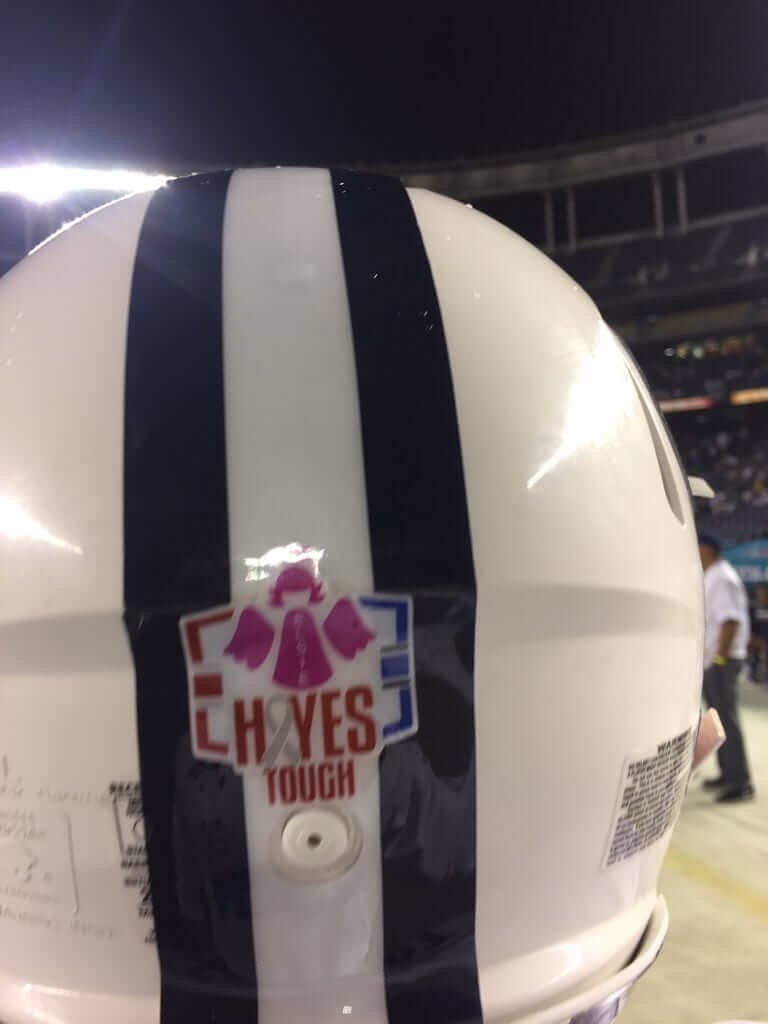
The college football community in Utah has been hit by two tragedies in recent weeks. First came the death of Elsie Mahe, the three-year-old daughter of BYU running backs coach Reno Mahe. That was followed by the death of Hayes Tate, the 20-month-old son of former Utah safety Steve Tate. In last night’s Poinsettia Bowl, BYU wore a helmet decal memorializing both children, featuring elements in both schools’ team colors. Utah will wear the same decal for its bowl game next Wednesday. Interesting to see the two schools collaborating this way.
BYU also had the Mahe family run onto the field prior to last night’s game with a pink flag signed by every team member. Additional info here.

Click to enlarge
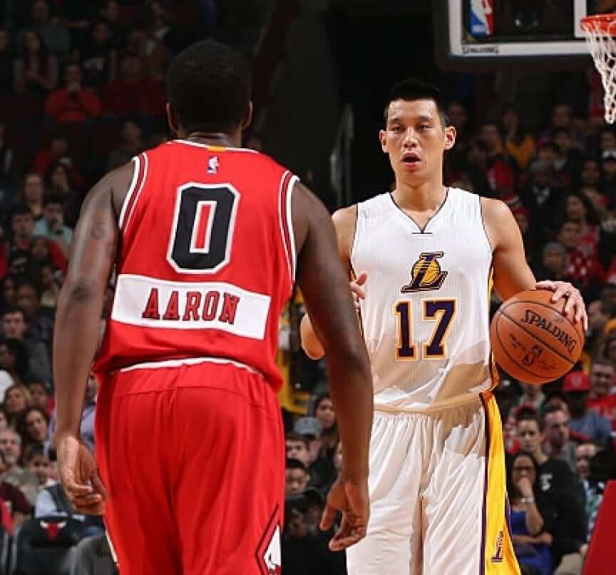
Non-Friday Flashback: With the NBA slated to wear new Christmas uniforms in a few days, I’ve done an ESPN piece in which I’ve ranked the uniforms previously worn on Christmas Day (including the 2014 set, shown above, which had first-name NOBs positioned below the players’ numbers). Link coming soon. Check that, it’s been bumped to tomorrow.
Important T-Shirt Club reminder: If you collected all six of this year’s Uni Watch T-Shirt Club designs, you qualify for the year-end prize — a patch based on the jock tag graphic that appeared on this year’s shirts. In order to claim your prize, you must send me proof that you purchased all six shirts by the end of this week. The proof can be photos of the shirts or screen shots of your “Thank you for your order” emails from Teespring and Represent. Send your proof to me here. Thanks.

Creamer Awards: SportsLogos.net poobah Chris Creamer recently assembled a panel of judges — myself included — to vote on the best and worst logos of 2016 (including the Great Lakes Loons secondary logo, shown at right). You can check out the results here.
The Ticker
By Mike Chamernik

Baseball News: Jazz great Louis Armstrong was a Brooklyn Dodgers fan but later supported the Mets (from Michael Clary). … Designer Todd Radom talked about minor league logos, the design business, and his personal backstory in a recent interview (from Jason Hillyer). … Maryland will have 3D batting helmet logos next season (from Bryan Duklewski). … Recently retired Cubs catcher David Ross wore a Santa cap with an adjustable strap. I’ve never seen that style before. Maybe it’s a novelty hat. … Braves SS Dansby Swanson is changing uni numbers, from 2 to 7 (from Daniel Donell).

NFL News: Packers WR Davante Adams says he shredded his gloves after he dropped two touchdown passes last weekend. … Seahawks DE Michael Bennett wore a Christmas sweater that shows his signature sack dance. … Those play-call wristbands that quarterbacks use were created in the 1960s. Turns out that astronaut James Lovell had a booklet attached to his left glove during the Apollo 13 mission (from Steven R Marks). … At Cowboys training camps in the early 1990s, rookies dressed in the traditional blue pants while veterans wore white. Now the veterans wear colored pants and the rookies wear white (from Kenny Kaplan).
College Football News: Eight Vanderbilt players will wear SEC Graduate patches for the Independence Bowl. They all completed their undergraduate degrees during the fall semester (from Max Herz). … A writer named Utah’s all-black uniform and Pitt’s blue-and-gold script throwbacks as two of the best alternate unis this year (from Phil). … Oklahoma wore jackets with a reversed OU logo during a 1976 game against Nebraska (from Greg Mays). … “I know back in the ’60s and ’70s, certain stadiums lettered the end zones for the visiting teams,” says Kenny Kaplan. “In 1969, NC State not only lettered one of the end zones for Penn State, but even painted it in white and blue.”

Hockey News: Spartak, a Moscow-based club, will wear retro jerseys for a 70th-birthday game against Lokomotiv (from Aaron Scholder). … The Ducks’ Joseph Cramarossa has been missing his helmet numbers recently. He wears No. 74 (from Mike Engle).

NBA News: The Pelicans and Thunder went color-vs.-color last night. … The Cavaliers brought back their bright orange throwbacks this season. The team adopted the colors in 1983 as a way of distancing themselves from former owner Ted Stepien (from Mary Lynn Delfino).

College Hoops News: A player on Fairfield has some freaky tattoos on his arms. … Dartmouth gave out Christmas sweater T-shirts at a women’s game this month (from Tris Wykes). … Boise State coach Leon Rice split his pants last night (from Kenny Ocker).

Grab Bag: Instead of the traditional tech gift that Apple employees usually receive at Christmas, workers this year got brand-promoting T-shirts instead.

Click to enlarge

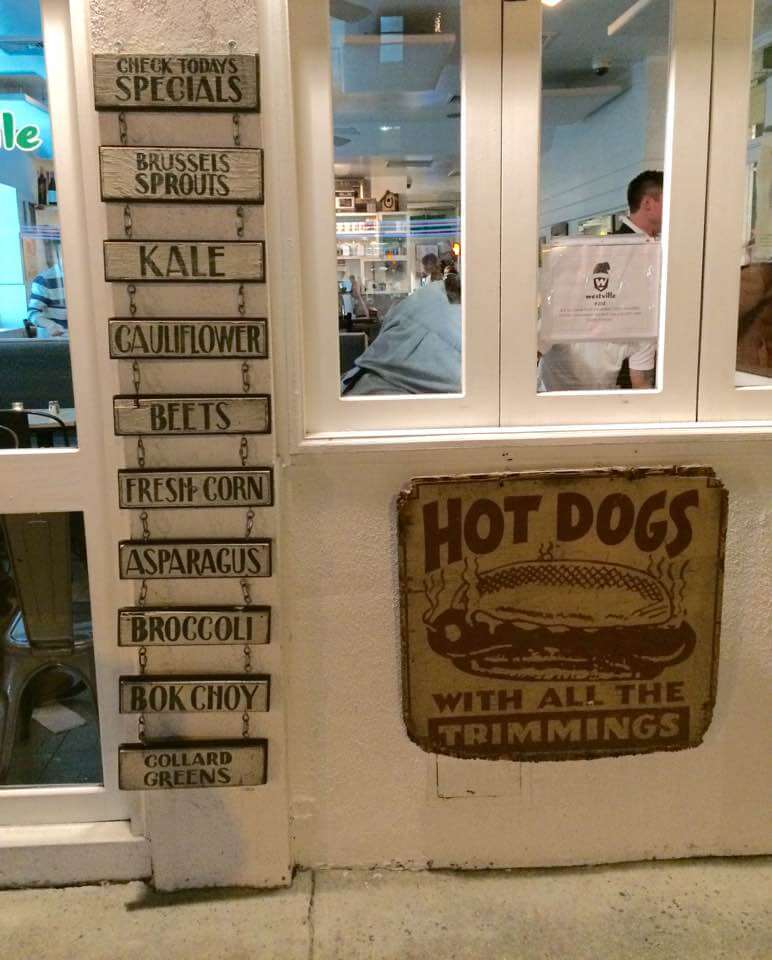
What Paul did last night: Went out last night to see the always awesome Gowanus All-Stars. As I walked to the subway after their set, I passed an eatery with the signage shown above. Never has the choice between Column A and Column B been so stark.
No ticker? The Chris Creamer thing cuts off??
Refresh the page.
Does anyone else feel that the recent sloganizing of cancer related deaths (Hayes Tough, Sager Strong, etc.) is inappropriate given the circumstances? I suppose in the end it’s a uniform memorial like any other, but for some reason, it doesn’t feel like one when it becomes a slogan.
usually they are “slogans” or mantras used by the person or family while they are ill to help them deal/cope with their sickness
Have we ever contemplated the vetting process to determine whether the death of somebody is deemed too peripheral/
insufficiently tragic for a uniform memorial? Not to be too callous, but uniforms at times look like roadside memorials with soggy stuffed animals and wilted flowers. True, it’s an emotional game played by emotional men, but cramming too much current events into the details of the game detracts from the game itself.
THIS!
comment of the day to Walter!
AH,
I agree with Mr. Crespo – and since he so clearly stated what this is (or should be) all about.
As for the other actors in this play (farce? tragedy?).
BIG SPORTS RECOGNIZE CANCER IS BAD?
Wow, I think I am gonna have a heart attack (heart association awareness!} over that one.
Since PR in the world of Me Me Media is the coin of the realm, using awareness programs are optically neutral, ( because Cancer, in one way or another, touches all of us) corporations presume that they are on the right side of an issue (unlike CONCUSSION DEATHS but they are working on it dammit!) that is safe and of absolutely no risk to them to the hearts (nother heart association plug) and minds of the consumers –
Brazillionaires hate RISK more than Paul hates purple.
I mean “spreading awareness,” is not exactly stepping up with $ for treatment of victims, or research – I know that that big time sports each have an entire schematorium, I mean charity arm for that,
But now we are aware – so there’s that.
p.s.
I meant to attach this link of an article by Jamie Bendola from the PuffinHuff Post.
link
for some reason the Great Lake Loons logo reminds me of Uncle Eddie from Christmas Vacation
One of his quotes could actually be applied to Uni Watch… “It’s the gift that keeps on giving.”
looking at the results i noticed the one for the “ORLANDO WAVES”.. can we talk about how bad of a name that is for a team that is in the middle of Florida and that would have to drive at least an hour or more to get to the ocean.
Fits right in with Pittsburgh Pirates (unless they’re cruising the Allegheny looking for treasure), LA Lakers (are there any lakes in LA), Utah Jazz (do they play jazz music in UT), etc.
the Pirates with with alliteration and Lakers and Jazz pull their names from previous locations.. the Waves have none of that
The Pirates pulled their name from stealing players as well.
Unless they meant “waves [hello]” (or goodbye) ;)
I live in Orlando and have never even heard of the Waves until now, and I tend to think I stay up on current local events, these guys have not marketed well.
As for geographic relevance to team names, I think most team names have little to no relation to their geography. That said, I tend to think of most of Florida as more marine oriented state, where no matter where you put the marine oriented team name it’s still roughly relevant. School names run the gamut down here, from the Dolphins in a very inland school, to a school a stones throw from the beach who are the Mustangs.
One more odd team name however was about 10 years ago when minor league hockey returned to Orlando, the team was named the Seals. There was some complaining over the fact that seals don’t exist within nearly 1000 miles of Orlando. I concurred on this.
Orlando Waves is as bad as San Jose Sharks, in terms of appropriateness between city & nickname, and for a team where its the original name.
Lee
I thought Orlando Waves was the fake pro team on “Coach.”
Louis Armstrong was born in, and grew up in New Orleans. He moved to Queens when he was 42.
Did you mean Cowboys rookies used to wear traditional silver (or blueish-green silver) pants? Says blue above.
Umm…. OK. But, what does one have to do with the other? Is the implication here that NASA got the idea from the NFL?
I believe all of the Apollo astronauts used these; at least those who actually walked (or, in the case of 13, planned to walk) on the lunar surface.
BTW, at what museum was that photo of Lovell’s glove taken? I know the Apollo 13 command module is in Kansas; is the glove (and other items) there as well?
If you can’t see what one has to do with the other maybe you should go lie down or something. Similar applications of a reference sheet between the sports world and something else – in this case astronautics – that is worn as part of clothing.
Check this link for further info —
link
No need to be a douche.
I don’t think that every accessorization that occurs in the sports world that also occurs in some non-sports world needs to be pointed out in the Ticker, just for the same of pointing out that it happens in both worlds.
How’s this for a Ticker item: “Some NFL players have worn link with their link. It turns out, link also wear glasses with their helmets.”
The fact that a similar thing occurs in two different places, by itself, is not news. Nor is it all that interesting, unless they’re connected somehow.
Both of you: Stop the name-calling. I don’t care who started it, I don’t care who escalated it — I just want it to stop. Now.
The reader thought that the QB wristbands might have been influenced by the NASA gloves. I found that the QB wristbands predate Apollo 13, though. I don’t know if one design was adopted from the other. Maybe, but probably not.
The main takeaway is that QBs and astronauts have used cheat sheets on their wrists for 50 years.
See, I don’t think it’s accurate to say that “astronauts have used cheat sheets on their wrists for 50 years.”
Assuming one could rightly call the Apollo procedures manual, flight plan or checklist a “cheat sheet,” the wrist-mounted version shown in the photo of Lovell’s glove was only used by Apollo astronauts during EVA on the lunar surface (again, on all such missions, not just 13). They were not, to my awareness and knowledge, used on Skylab, the Space Shuttle, or the International Space Station. The last lunar landing was in 1972. Hence it’s not true that astronauts have used them for 50 years; in fact they have not used them in 44 years.
Matte’s wristband from 1965, again to my knowledge and understanding, was a one-off. I don’t recall seeing these whilst growing up watching football in the ’80s. I don’t know when they became quasi-standard equipment in the NFL. And I don’t know that the Apollo equipment was, or was not, inspired by Shula’s innovation.
I’m going to stay out of the fray, but simply note that I submitted the glove and plaque photos to UniWatch. I took them at the Adler Planetarium in Chicago this past weekend. I had assumed that the QB wrist playbook was a real-world sports application of a NASA invention, so thought it would be cool to share with this audience. Editors at UW set me straight with the Tom Matte reference.
Here’s an article discussing what other Lovell items are at the planetarium.
link
Thanks for the info, and for sharing the photo. I’ll have to get to Chicago to see this; maybe next year when the Mets are at Wrigley. As you may have surmised I’m a HUGE fan of the space program, and Apollo 13 in particular.
I suppose it’s possible that the wrist-mounted booklet used on the Apollo lunar suits was inspired by Shula’s/Matte’s wristband, but I’ve never heard or read that it was. Given that NASA never used it in any other application (Skylab, STS, ISS), and it didn’t really become ubiquitous in the NFL until decades after Apollo 17, I would doubt that there’s any connection.
Have you ever had a story on teams with the most color changes. Cleveland Cavs must be close to the top. Their first wine & gold was more a cardinal or crimson and yellow. Then orange & royal. Then black, light blue, and orange. Then a few variations of wine and gold. And now they also have navy as part of their wine and gold.
I’d guess it was the Padres.
That’s obviously the Denver Nuggets, who at some point have had every color including red, orange, yellow, green, blue, purple, black, white, sky blue, and metallic gold in their uniforms.
Wait, that’s cheatin’. They at one time had a whole rainbow on their uniform.
Nobody said anything about team primary colors or base colors.
One vote for the Canucks.
One for the Astros.
Seems like the Diamondbacks also have a difficult time sticking to one color scheme.
Although the White Sox have been color-stable for 26 years now, that wasn’t always the case. They changed colors willy-nilly back in the day!
OMG the White Sox is Batman!
link
Canucks definitely up there when comes to number of colours. I count that the Canucks have worn 11 different variations of colours as part of their uniforms since 1970 (not counting the Millionaires throwback uniform either):
Royal blue, kelly green, black, orange, yellow (2 different shades), salmon red, navy blue, deep red, silver, sky blue.
How about the NBA Hawks? Going back to their days as the Tri-Cities Blackhawks, they’ve been red & white, then moved to Milwaukee and changed to royal, light blue & white, then to St. Louis with blue, red & white, then onto Atlanta, where they’ve had 6 different colour schemes in the last 45 years – red, blue & white; royal, lime green & white; red, gold & white (with black later added; navy, red & white and finally red, black & neon green.
The Cavs are the only other NBA team who come close, with 6 different schemes. RickAZ actually missed one out, the deep burgandy & metallic gold they wore for a few seasons in the early 80s.
The Creamer Awards link is some of the best red meat I’ll consume on these holidays.
Agreed! But major demerits for not referring to the “award” as a Creamy and the Creamys.
Creamys or Creamies?
Cream Pies. Mmm, cream pies…
Due to where the line breaks, it looks like you said, “Michael Bennett wore a Christmas sweater that shows his signature sack”, which is a very different sweater.
Idea for a Friday Flashback: Forgive me if this has been done before, but have you considered a column about the coarse-meshed NFL (and USFL) jerseys of the late ’70s and ’80s? I particularly remember the Philadelphia Eagles uniforms being hard on the eyes.
“Michael Bennett wore [a] sweater that shows his signature sack dance.”
You spelled idiotic wrong.
Despite the story stating his “dance” is an homage to Rick Rude, I bet it’s more likely a take on Hingle McCringleberry’s TD dance.
agree. Rick Rude was a rotation of the hips, not a thrust like Bennett is doing. Totally McCringleberry.
I will personally pay your ambulance bill if you say that to his face.
Howzabout unoriginal?
I thought the Internet was a safe space to say insulting things about big, violent men.
“Idiotic” is still appropriate if it gets you and your team a 15-yard penalty–which it did.
In the ticker, it’s Dansby, not Darby.
Fixed.
Utah’s all-back uniform? Does this mean NOBOF (name on back on front), or just like a cape or something?
*black*. Fixed.
Unless Utah had Kris Kross-inspired unis, that would be sweet.
Steve Mason of the Philadelphia Flyers now has gold-accented pads when the Flyers wear their 50th anniversary jerseys
link
Why is it that every single alternate white jersey the Cowboys come up with (throwback, color rush, practice…) are all better than the one they actually wear normally?
I wholeheartedly agree.
The Todd Radom article does a good job of preparing you for the Creamer awards.
The Cavaliers brought back their bright orange throwbacks this season. The team adopted the colors in 1983 as a way of distancing themselves from former owner Ted Stepien (from Mary Lynn Delfino).
Pretty sure the jersey pictured in that link is a knockoff.
Anybody else notice that Americans as whole seem to have become obsessed with “memorializing” deceased people? Over-memorializing seems to me to have a rather depressing effect on society…I mean, if part of watching sports is to escape from the rigors of real life, do we really need to be reminded every time they show a close-up of a player’s helmet that something horrible happened to somebody?
I mean, to we really need constant, non-stop reminders of the temporary nature of life? How does this help anything?
I don’t think there’s anything wrong with acknowledging “the temporary nature of life.”
I agree, however, that public memorials have gotten out of hand. Just another facet of our “look at me” culture.
Loons getting some love!
While looking at the Bulls-Lakers Christmas picture, I wondered if the number on the back of that Bulls jersey is larger than those on their regular uniforms.
Can’t put my finger on it, but the Giants white throwbacks are not as exciting as I hoped…possibly a combination of things. The numbers seems too thick and not tall enough.The sleeve stripes look stupid on everyone except Manning and the kickers…all white socks do not help either.