[Editor’s Note: Today we have a guest entry by Tim Merkley, who’s going to tell us about his completely wonderful DIY project. Most of the photos can be clicked to enlarge. Enjoy. ”” PL]
By Tim Merkley
Back in 1998, my wife, who’s very craft-y, was making homemade Christmas ornaments by cutting out small pieces of cardboard in the shape of a mitten (3.75″ x 2.5″, or 9.5 x 6 cm) and then adorning them with glued-on pieces of felt in Christmas-themed colors, patterns, and designs. A clothespin glued onto the back enabled the ornaments to be clipped onto branches of our Christmas tree.
I decided to take a crack at it. As a longtime fan of hockey uniforms, I thought it would be fun to make an ornament with based on a Toronto Maple Leafs sweater — a blue leaf on a white background. The result was crude but (I thought) successful, so I made a Montreal Canadiens mitten the next year, ten more the year after that, and since then it’s been a Christmas tradition to get out the box of felt in December and make more “sweater mittens.” Over the years I’ve honed my technique, adding more care and precision to the cutting and replicating each hockey sweater as closely as possible, matching not only the crest but the hem striping and shoulder yokes as well.
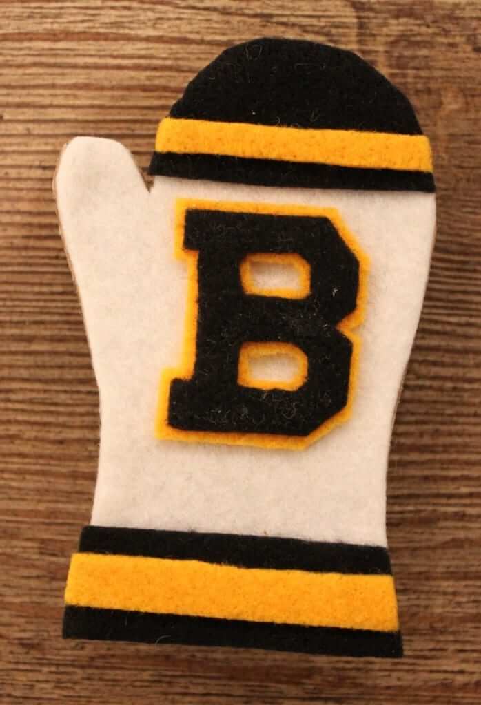
Around 2003, I came up with an idea: The mittens all had a blank area on the back next to the clothespin — how difficult would it be to get that space autographed by a hockey player who had actually worn the sweater that the mitten’s design was based on? For example, here’s a mitten based on the Boston Bruins’ 1935-36 uniform (the oldest design in my collection):
On the back is an autograph from Ray Getliffe, who played left wing on that Bruins team (and is now, unfortunately, deceased):
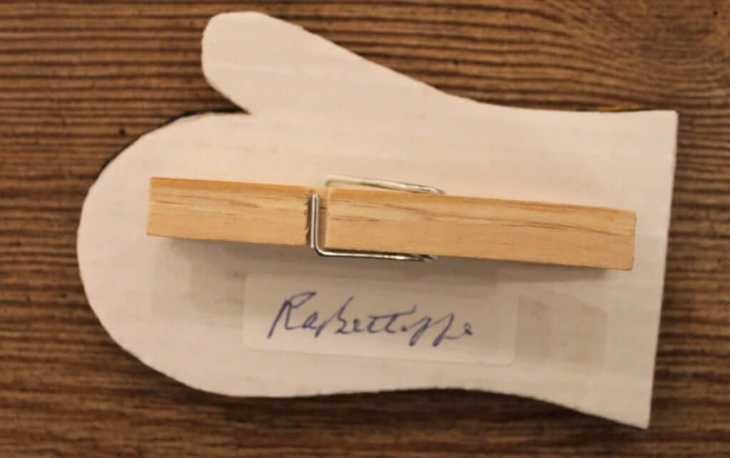
As you can see, the signature is on a little white sticker. I put the stickers on the back of the mittens to better define the space where the player is expected to sign (to ensure there will still be room to add the clothespin), and to also provide a clean background for the signature.
I began attending autograph signings to get the ornaments signed, but that became prohibitively expensive. I soon found that the best way to go is mailing blank pieces of mitten-shaped cardboard to the players. The players autograph the cardboard mittens and mail them back to me, and then I can add the proper sweater design on the front. It’s exciting to come home and find letters from all over the world (I’ve received them from 20 different countries), each containing a new autograph — and it’s free! An added bonus is that the players often include handwritten notes, cards, and photos along with their autographs.
Over the past 18 years, I’ve made over two hundred of these mittens, each autographed by an appropriate player. My collection has expanded to include all-star sweaters, the WHA, minor league and junior hockey teams, and teams from the Olympics and the Canada Cup:
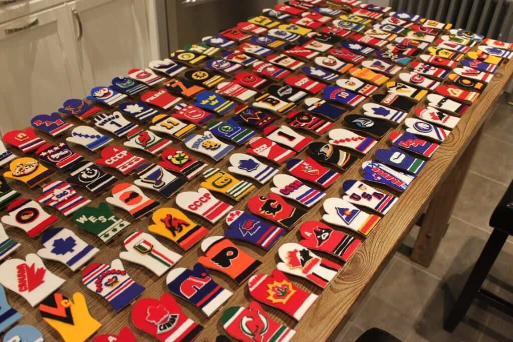
The autographs on the back come from players who range from current NHLers (Carey Price, Alex Ovechkin) and Hall of Famers (Jean Beliveau, Bobby Hull) to career minor leaguers and obscure Finnish goalies from the 1976 Canada Cup. One of my favorites is this mitten based on the sweater worn by the 1960 Japanese Olympic team, which is autographed on the back by Shoichi Tomita, who played goalie on that team and signed his name in Japanese characters:
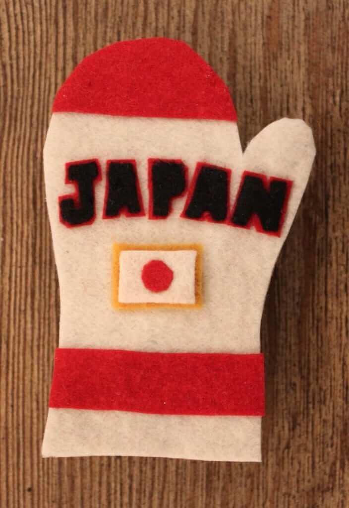
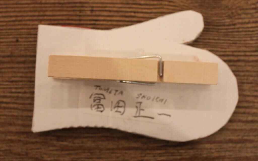
In some cases, the mittens represent the sweater a player wore in a particular season or tournament. But sometimes they represent a single game or historical landmark, such as Paul Henderson’s Team Canada sweater from Sept. 28, 1972, when he scored the Summit Series-winning goal, or the Bruins sweater worn by Willie O’Ree on Jan. 18, 1958, when he broke the NHL’s color barrier. Here’s a look at that one:
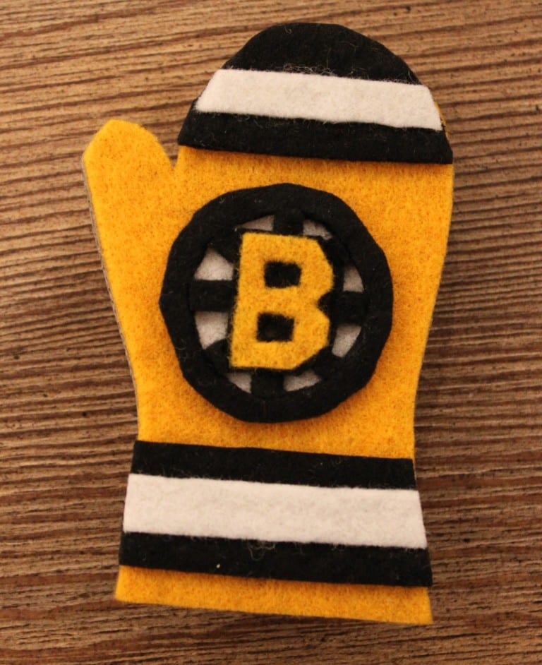
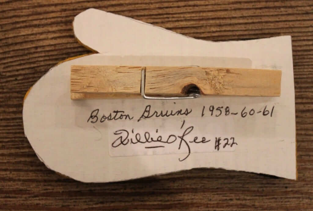
Unlike some of the other DIY projects featured on Uni Watch (such as Wafflebored’s impressive projects), the mittens themselves aren’t particularly complicated or labor-intensive to make. Most of the effort comes beforehand, in obtaining the autographs and researching the sweater designs. Thankfully, NHL and WHA sweater history is easily accessible (NHLuniforms.com and WHAuniforms.com have been invaluable resources), but tracking down the designs from older international tournaments can be a challenge. I’ve spent countless hours conducting Google image searches for uniform details such as which color shoulder striping was used on the West German sweaters in the 1956 Olympics.
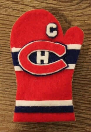
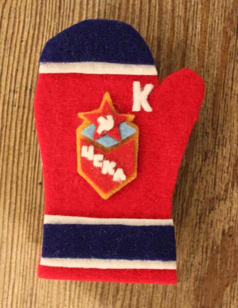
Once I’ve chosen which mitten to make, I think out the design. In most cases, this is straightforward enough — crest + hem striping + shoulder yoke (if applicable). If the player was a captain or alternate captain, I try to incorporate his captaincy designation into the design as well:
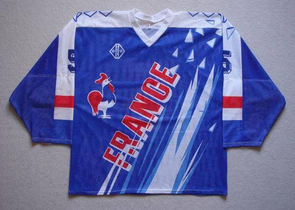
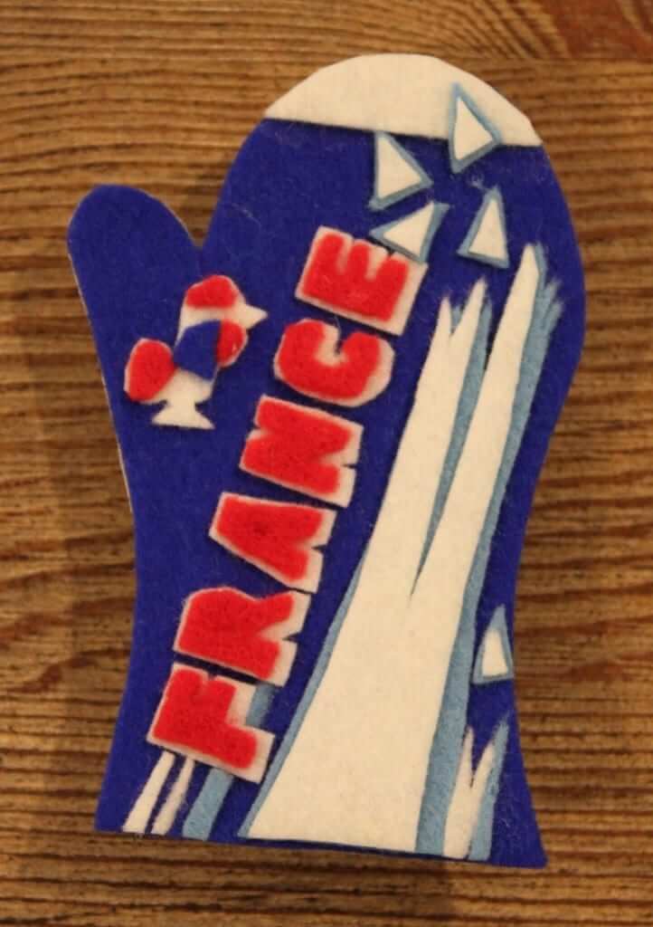
But sometimes the designs are much more complex, such as the one for this 1992 French Olympic sweater:
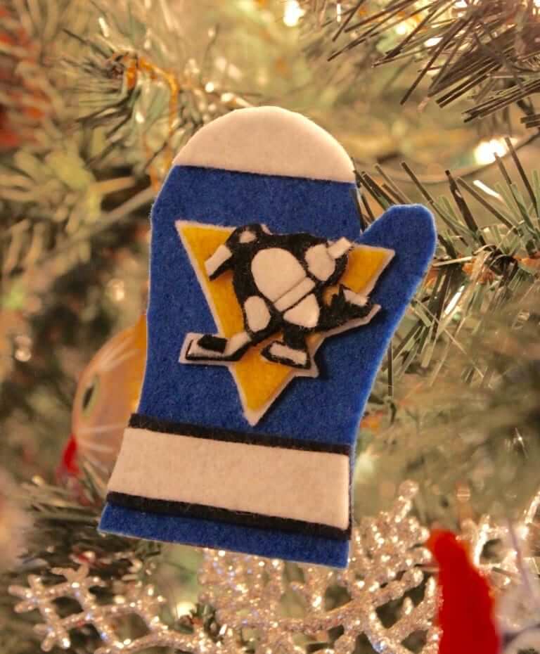
To show you my working process, let’s look at the 1973-74 Pittsburgh Penguins road jersey worn by goaltender Andy Brown. Brown was a journeyman goalkeeper who played 62 NHL games for the Red Wings and Penguins in the early 1970s. His final NHL game in Atlanta on April 7, 1974, was notable for a reason that might be interesting to Uni Watch readers: It was the last time an NHL goalie played without a mask.
I begin by gathering the appropriate felt colors and the blank piece of mitten-shaped cardboard with the autograph on the back. If necessary, I also print up a copy of the logo to use as a guide:
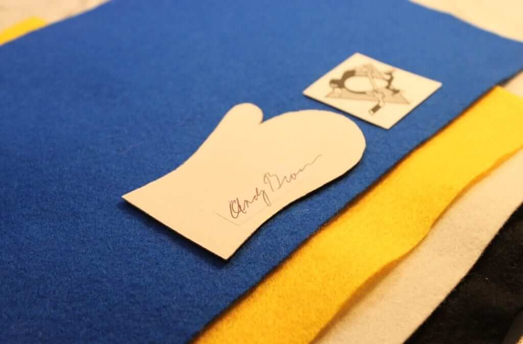
I usually attempt to cut out letters and shapes freehand, but in this case I used printed guides for the triangle and the outline of the penguin.
Next, I glue the cardboard to the main felt backing color and cut it out, and then do the same for the logo and other elements:
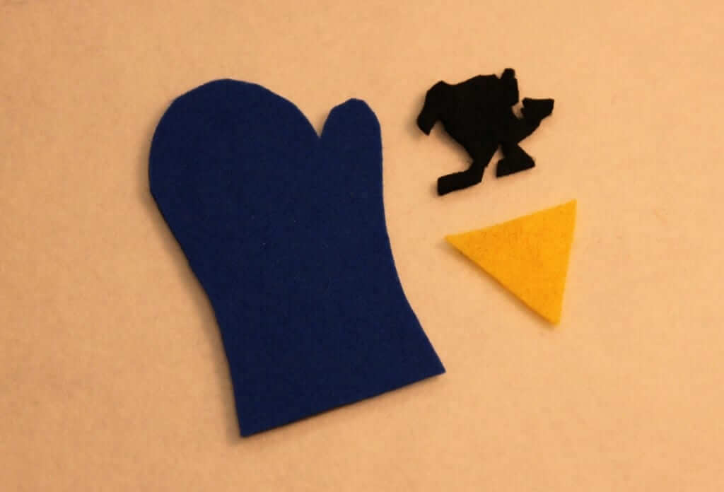
I then create the logo from the separate elements, building up layers of felt to create outlines as necessary:
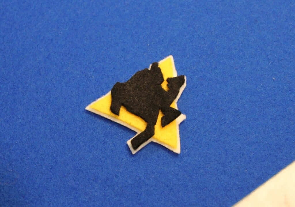
Then I add additional details — in this case, the penguin’s stomach, gloves, stick, and beak — until the logo is complete. I have recently purchased special snips to perform this type of precision cutting:
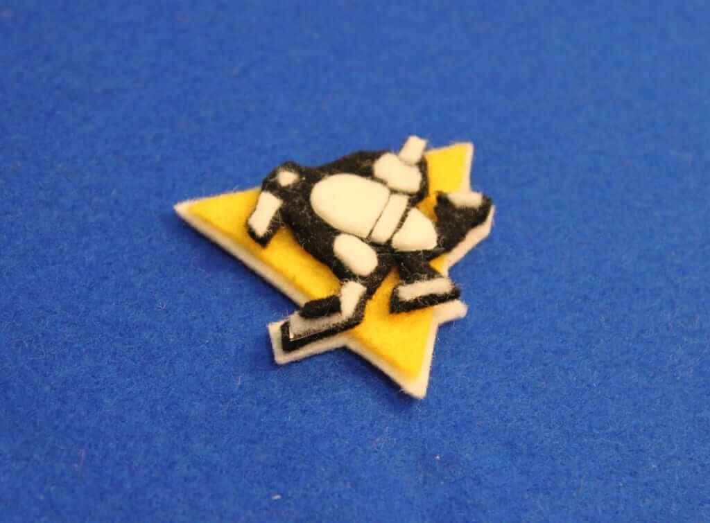
The next step is to add the appropriate striping and shoulder yoke to the background color:
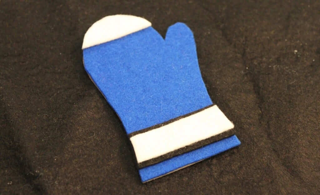
I always wait to glue on the logo last to ensure it is centered correctly. Once I do that, the final step is to glue the clothespin onto the back:
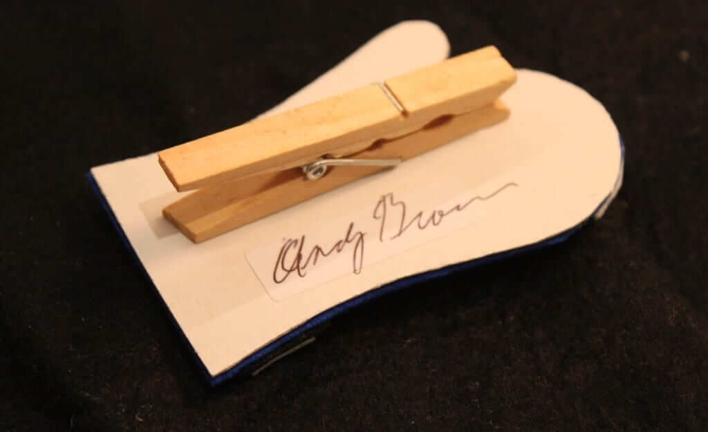
The clothespin actually has no real function anymore, because I no longer clip the mittens to a Christmas tree, but it serves as a connection to the very first crude mittens that I made. The sweater mitten would simply feel incomplete without the clothespin.
In this case, though, I clipped the finished Penguins sweater to a tree, just to show it off for Uni Watch readers:

I consider a mitten to be a success if the sweater it represents is easily recognizable. I do not want them to be perfect (and they cannot be, due to the limitations posed by the felt material and the shape/size of the mitten template), but I find part of their charm to be that they are so obviously imperfect. They are an attempt to combine an obsessive, nerdy level of detail with the messiness of a felt craft project. And making them has brought me much joy over the past 18 years.
My rate of acquiring autographs has far outstripped my work pace on the mittens — I now have about 500 autographs on blank cardboard that are waiting to be turned into sweaters. So this project will likely be continuing for a long time.
———
Oh, man — I don’t think it’s an exaggeration to say that this is one of the greatest projects ever featured here on Uni Watch. Big, big thanks to Tim for sharing his excellent hobby with us. Tremendous stuff.
Important T-Shirt Club reminder: If you collected all six of this year’s Uni Watch T-Shirt Club designs, you qualify for the year-end prize — a patch based on the jock tag graphic that appeared on this year’s shirts. In order to claim your prize, you must send me proof that you purchased all six shirts by the end of this week. The proof can be photos of the shirts or screen shots of your “Thank you for your order” emails from Teespring and Represent. Send your proof to me here. Thanks.
Raffle reminder: In case you missed it last week, the annual Uni Watch year-end reader-appreciation raffle is now underway. Enjoy.
Collector’s Corner
By Brinke Guthrie
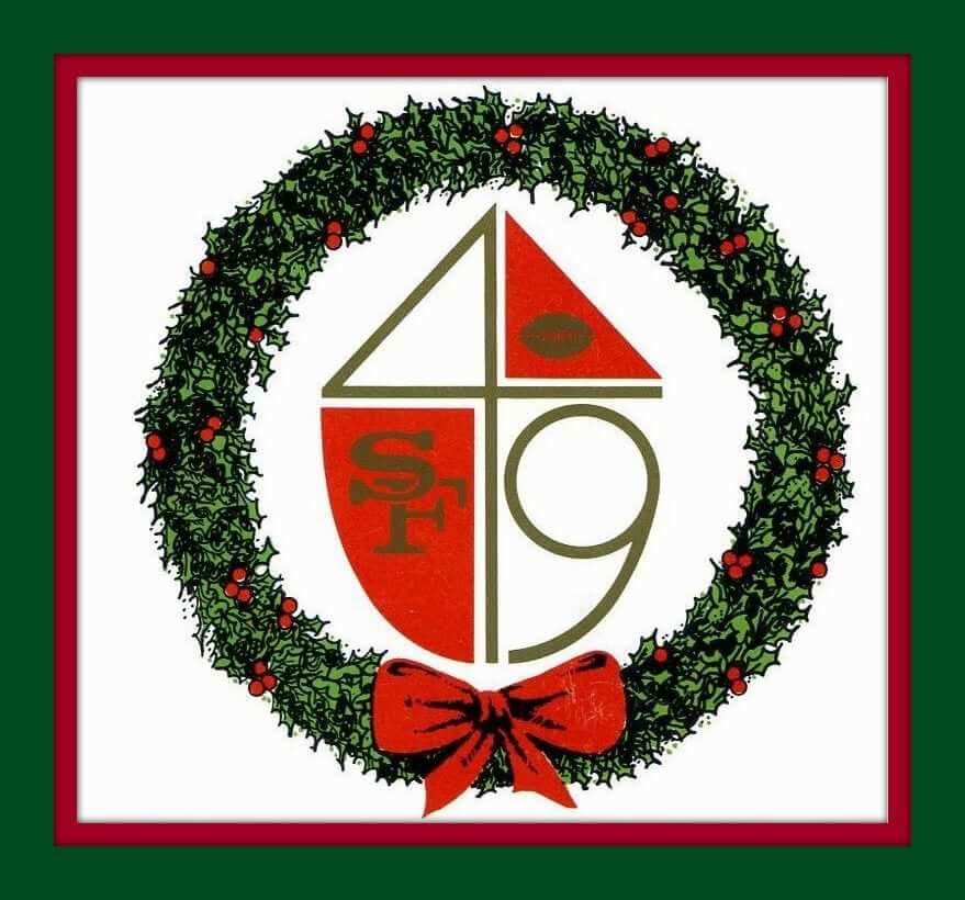
Here we are, just a few days to go before Christmas and Hanukkah, so we start off this week with a 1966 San Francisco 49ers Christmas card. It would be great to bring back that retro logo, but the 49ers have bigger priorities after this season’s mega-disaster.
Now let’s see what’s in Santa’s bag this week:
• The yellow outline is emphasized in this 1970s Steelers promo glass from your friends at Channel 11.
• Couple of Rams items here, starting with a nice-looking Starter vest with detachable hood, and a zip-front pullover from DeLong. And we can’t forget this gem of a jacket from Sears.
• Here’s one for Paul: a 1970s N.Y. Nets bumper sticker sponsored by the A to Z Equipment Corp. “Rebound With The N.Y. Nets!” [I did indeed see the Nets play back in the Dr. J era when I was growing up. Good times. ”” PL]
• This K.C. Chiefs sideline jacket from the 1960s or ’70s just proves that this is one timeless design.
• Want another old-school design from the sidelines? No problem — check out this Philadelphia Eagles jacket from the early 1970s. And sticking with Philly, we have another Sears item — this Eagles sweatshirt!
• Always loved the way mid-1970s NFL pennants depicted the helmets. Up until then, it was basically a bare bones profile of a helmet with a single bar face mask. This NY Giants version presents an entirely new “pennant style.” Here’s another style of helmet used on pennants of the same period — never seen this version until now as shown for the Bengals.
• Speaking of the Giants, why can’t they bring back this mid-1970s “NY” look as an alternate, as seen on this medallion? Wouldn’t even violate the one-shell rule.
• And one more for the Bengals: This women’s sweater is a size extra-small, and sure looks like another Sears design from where I sit.
• Here we have a 24″ inflatable Montreal Expos player from Taiwan because why not. Sure miss that uni look. Maybe Loria will sell the Marlins and they’ll move back to Montreal?
• Another long-lost (and lamented) logo, this time for the Quebec Nordiques on this white pullover.
• San Diego Trust & Savings Bank was the sponsor for this mid-1970s Padres cooler bag. It plugged something called “7/24 ’Round the Clock Banking.” Also, “Push Button Banking,” and “The Teller That Works Harder Than Humanly Possible.” Back then, you see, the ATM was a newfangled innovation!
That’ll do it. No Collector’s Corner next week, so we’ll see you in 2017. Until then, the staff of Collector’s Corner (um, me) wishes you a very happy holiday season and a happy new year!
The Ticker
By Mike Chamernik

Baseball News: The Staten Island Yankees will not change their name. The team was in the process of a name change but cancelled that plan. Further info here. … Sports Illustrated flipped this image of reliever Billy Wagner. He’s actually a lefty (from Jonathan Sellers).

NFL News: Couple of notes from last night’s MNF game: Panthers RB Jonathan Stewart’s facemask fell off after a run play (from Mak Popa). … Both Cam Newton and Greg Olsen had small marks or logos on the upper right face of their hand warmers. It might be a digital display (from Andy Connelly and Cork Gaines). … Newton wore Family F1rst cleats and Washington’s Ricky Jean Francois wore Sager Strong cleats during pregame warmups. … The Warriors’ Kevin Durant and Stephen Curry wore their favorite teams’ jerseys. … Cameron Wake wore an outdated (and Pinktober-themed) Dolphins hoodie after Saturday’s game against the Jets. The Dolphins last used that logo in 2012 (from an unnamed reader). … Let’s hope that Packers DE Mike Daniels sat in a puddle of water on Sunday (from LeRoy DePas). … Washington’s Fanbulance ”” a team-themed converted ambulance ”” has a new owner (from Tommy Turner). … God bless the National Film Board of Canada. Will Scheibler found some great footage of the 1967 Grey Cup. Will also sends us a collection of old CFL letterheads and a complete set of CFL ice cream helmets from 1976. … A sporting goods store in Eau Claire, Wis., has a neat Christmas tree made of Packers knit hats (from Michael Bialas). … Pirates legend Willie Stargell watched the 1979 AFC Championship Game from the nosebleeds of Three Rivers Stadium (and was that Dave Parker next to him?). “A far cry from LeBron James in his box during the World Series!” writes Jeff Flynn. “Steelers and Pirates players were really tight that year, the ‘City of Champions’ season.”
College Football News: Central Michigan’s NOBs were barely visible last night (from Jonathan Hall). … Here’s what Auburn has worn for each Sugar Bowl appearance throughout its history (from Clint Richardson).

Hockey News: New mask for Panthers goalie Roberto Luongo. … New alternates for the South Carolina Stingrays, a Capitals affiliate. Zach Spencer says that the logo appears to be too high up on the chest. … Good photo gallery here of every uniform worn in the Winter Classic (from Phil).

Basketball News: The Bulls and Pistons went grey-vs.-blue in Chicago last night. Ben Zobrist, the Cubs 2B/OF and World Series MVP, attended the game and received a personalized Bulls jersey. … The Mavericks nearly went through a redesign in the late 1990s. More info here. … During Tim Duncan’s jersey retirement ceremony on Sunday night, the Spurs put 97:16 on the game clock, representing the span of his career from 1997 through 2016 (from @Coach_KT). .. ESPN named the original Air Jordans as the best basketball shoe of all time. The site also told the story of Allen Iverson’s signature shoe, the Reebok Question. … Duquesne wore 1970s throwbacks last night. Here’s a clearer view of the uniform (from Rich Donahue).

Soccer News: Ross Barkley of Everton suffered a torn jersey yesterday (from @black_bile). … Werder Bremen of Bundesliga revealed a Christmas jersey (from Josh Hinton). … Atalanta, an Italian club, will wear a Christmas shirt for its match against Empoli tonight (from Ed Å»elaski). … FIFA fined England, Scotland, Wales, and Northern Ireland for wearing poppies on their jerseys during their Armistice Day games in November (from Mark Johnson).

Grab Bag: New logo for NASCAR. The previous logo had been in use since 1976. Also, Monster Energy is the new advertiser of the premier racing series, replacing Sprint. More details here (from David Firestone). … New logo for National League Lacrosse. Here it is in every team’s colors. I think it’s an upgrade. While it doesn’t give even a hint of being lacrosse-related, it’s still much better and more professional than the dated old logo. … An art gallery at New York University has a collection of punk and rock badges and pins (from Adam Herbst). … Michigan State Police are bringing back campaign-style hats next year for the force’s 100th anniversary. The hats were last worn by troopers in the 1920s.
Monster Energy sponsoring the top NASCAR series sounds like something out of Talladega Nights. Baby Jesus save us.
Thanks to Tim for sharing the mitten project! What a fantastic project – and Tim’s writeup was terrific too, answering most of the questions that came up for me when reading it. The only loose thread left hanging for me is that I’d love to see the whole collection documented, such as a Flickr album with front and back photos.
LAX logo: Is there any significance to the four-pointed star in lacrosse, or as a Native American or First Nations symbol?
Michigan troopers campaign hats: Ought to be a federal law requiring state troopers everywhere to wear campaign hats. That’s just what highway patrol officers – really any law enforcement above the level of city or town cops – should look like.
Winter Classic gallery: That’s like a “Man in the High Castle” view into an alternate reality where Canada won the War of 1812 and so today’s NHL has even better-looking uniforms. And the NHL is already the best-looking of North America’s top-level pro leagues. This season’s special event NHL unis have been more miss than hit, but for about the last decade the NHL has consistently given us terrific alternate and special-event uniforms, many of which would be a team’s best look if adopted as everyday home or away unis.
Hi arrScott,
Here is the explanation about the four-pointed star from the NLL website:
“NLL STAR: The logo is anchored by a four-pointed star, an acknowledgement of the four original NLL teams from the Mid-Atlantic region. The NLL Star serves as a guide, something to take the League into the future. It is also evocative of the Native American Morning Star, and pays homage to the roots of the sport and the tremendous influence of that community.”
link
Incredibly cool project, Tim–thanks for sharing.
Roundup: The Staten Island Yankees are not changing their name; it sounds like someone abruptly came to their senses.
Tim Merkley’s mitten project is one of the most enjoyable items I’ve seen. Anything worth doing is worth overdoing, and Tim’s collection is perhaps the proudest example of getting one’s geek on. Crafty, colorful, detailed, researched, and full of joy!
Punk rock pin badges are right in my wheelhouse. My own collection stands at 1,000+ and that Badge-A-Minit button maker is the best investment I ever made.
Move the Marlins to Montreal? Isn’t that replacing one problem with a bigger one?
Not fully on board with professional lacrosse, but the new NLL crest is a beaut. I’d be proud to wear that.
If you read the SI Yankees article, it is only a temporary delay.
From a marketing standpoint, it makes complete sense to change the name. If you are a Yankees fan, you are buying MLB merchandise. If you live on Staten Island and are a Mets fan, or if you just collect MILB merchandise but hate the Yankees, there is no way that you are buying SI Yankees merchandise. But you might buy SI Rock Pigeons merch to show pride in you borough or (for non-locals) if you just like the look/logo.
Parent-club nicknames make sense if A) The parent club has a strong nationwide following and B) The farm club in question is far away from the parent club. Hard to build fan loyalty or brand equity if those two conditions are not met. Nobody in Kalamazoo will be drawn to root for a minor-league team named the Padres, and no one in Staten Island is going to identify more with the local junior Yankees than with the big-league club across the river.
I just hope that the delay gives the Staten Island club a chance to come up with better replacement names than what they’ve got so far.
no one in Staten Island is going to identify more with the local junior Yankees than with the big-league club across the river
I’m not sure that was ever their goal.
Sure, Staten Island people will be expected to buy Staten Island stuff, but it seems to me that the idea was to layer their Staten Island-ness on top of identification with the Yankees. Not replace it.
I would suggest that the problem they’ve obviously been having has more to do with link of their link. Create a solid logo on a Yankees-type theme (link), and the Baby Bombers wouldn’t need to consider a name change.
You have to do better than name your team the Rumble Pretzels, Wind Leopards or Pizza Pigeons. No committees need apply.
Back when I lived in DC, I was able to chat from time to time with members of the family that owns the Potomac Nationals (née Cannons). They’ve been trying for years to get out of their current glorified high-school stadium and into a new one. Anyway, point being, when the Nats came to town in 2005 and Potomac was a farm team, the Silbers jumped at the chance to drop the Cannons nickname in favor of Nationals. Probably a smart move, since it was a chance for a little-known single-A team to introduce itself to the metro area. Four years ago, when the effort to build a new stadium really got going, the ownership was at first set on doing a complete rebrand; for a time, it seemed likely that the team would announce that it would become the Woodbridge Woodchucks if the stadium deal had come to fruition. A deal didn’t come together until two years later, and by then the owner had completely changed his mind, and he told me that he was leaning toward changing the team’s name to its local nickname of “P-Nats.” As in, the team’s jerseys would literally have “P-Nats” in script across the front.
Possibly mercifully, the stadium financing has stalled, and the new ballpark is indefinitely on hold, and the team is unlikely to spend dollar one on fiddling with its identity until after ground actually breaks on construction.
it sounds to me, after reading the articles about the rename, that they heard enough people saying that the name wasn’t the problem, the actual experience of trying to enjoy a SI Yanks game was the problem, and that giving the team a possibly laughable name before they improved the actual experience wasn’t going to help. given how fast some of these other rebrands have happened recently, i have to assume that where there was a will, there was a way. while i have no reason to doubt that they will one day soon change the name, perhaps they just decided to proceed with a revamping of the franchise in a more logical order. even a less “entertaining” name for the team may have been a mistake if the fan base just isn’t feeling the team in general. to give the franchise credit on assumption, perhaps they really did want to get it right and make the team into something really special (as opposed to a novelty), deadlines loomed and they saw that what they had was a mile off the mark, back to the drawing board, thus the “can’t hit the deadlines” comments. i respect that. personally i think that “baby bombers” would be a great name, one that fans have already given them, if of course it didn’t insinuate that they bombed babies.
Great project by Tim. I noticed some mittens are left hand and other right hand, does this has to do with players being left handed or it’s just something else?
Omar, it is random, although it would have been a great idea to have them match the way the player shoots/catches!
Thanks Tim
Tim, those mittens are works of art. I’m impressed with the level of detail and precision you can achieve in such a small space, and I feel like I could spend hours admiring the depth and texture of the finished products. Thanks for sharing!
Tim’s mittens are fantastic!
I had that set of DQ CFL helmet cups. I also had their set of NHL team puck cups. Wish I still did…sigh…
Re the Packer that may have sat in a puddle: Mark Schlereth (sp?) and other former players have said previously that it is not uncommon for players to relieve themselves on field, through/in their pants if necessary. My nephew played college ball and said the same (reportedly, guys would simply kneel down between plays and go). That may not be what we saw in that photo, but I could not help but think about it when I viewed it. Nastorama.
Yep. That was most likely the case. And given that it was less than 10 degrees in Chicago on Sunday, I don’t think there was much non-frozen water in which to sit.
I just didn’t want to accuse Mike Daniels of something he might not have done!
But in single-digit temperatures, wouldn’t a player risk literally freezing his nuts off? Use the sideline mystery tent instead!
WMU probably didn’t want anyone to know who they were, based on how they played.
CMU that is, not WMU.
That’s a terrible Mavericks logo. I’m glad it wasn’t used.
Looks like it may have been done by the designer of the Broncos’ current awful horse logo.
Absolutely amazing DIY today – love it! Especially the Canucks V jersey.
It is also a favorite of mine, and it’s signed by Stan Smyl.
Two things for Tim:
1. Amazing idea! I’m stealing the idea and making sweater shaped ornaments. Thanks! Big time.
2. You jerk. As a DIY contributor of the past, I’m jealous of your contribution.
Just keep kidding. Kind of.
I read that piece about the punk rock buttons and badges, but I’ve yet to make any clicks. How dare they, in their listing of band examples, not include the SUB HUM ANS? That is the quintessential punk rock badge.
Oopsies
Ignore the “keep”
and just realized they were only refering to pins
Tim, your mitten project is outstanding. You’ve taken uniform obsession/geekery to a new level. Best DIY project ever posted on here!
Tim, I just want to echo what everyone has said. I’m in awe of your project; using a mitten shape adds a touch of inspired whimsy.
I wear a campaign hat in my role as a Scoutmaster, and I love it. Heck, that’s in no small part how we recruit new leaders: “You get to wear the hat….”
No disrespect to anyone else’s that’s ever been posted as all are great, but this is my favorite DIY project I’ve ever seen on Uni-Watch. Bravo Tim. Also, count me among those who’d love to see an album of each and every design.
Thanks for the old CFL letterhead.
I forgot that Darrell Royal coached Edmonton. Also got a kick out of how Calgary had a 39-member Board of Governors in 1953. How on earth did they get anything accomplished?
I’ve written an ESPN piece about football helmet decal malfunctions:
link
Tremendous article about a fantastic project. Mad props to Mr. Merkley for this most impressive effort!
Love the hockey-sweater mitten ornaments, Tim. Just brilliant!
This was the most incredible DIY post ever.
Scrolling down, Penguins, Bruins… then that shot of the entire table. Holy Shit.
I’m blown away.
The Dolphins wore the throwback unis on Oct 23. I didn’t see them have any pink accessories in any of the game photos I found. Is it possible their sideline apparel was throwback and pink-accented though?
Not every October game is pink. Dolphins wore pink in Week 5 vs. Titans:
link
And Week 6 vs. Steelers:
link
Nothing says Yankees like the Uncle Sam top hat. If I were running things, I’d want it as a central part of the branding of the entire organization, top to bottom. Even if the teams are named Pizza Rats, that frakkin’ rat should be wearing an Uncle Sam hat.
Great project. I would strongly consider having a second Christmas tree just for the mittens and keeping it up year round.
Thanks for sharing your mitten project with us, Tim. It just looks absolutely fantastic!
That 1975 Giants logo is so beautiful. Not only is it well-constructed, but it looks great on the helmet.
While I was thrilled when the Giants dumped the awful wordmark helmet logo and replaced it with the classic “ny”, I think I’d really love them to change to the 1975 logo. They should at least use it as a one-time throwback.
Also, an editing point: the NLL is the National Lacrosse League, not “National League Lacrosse”.