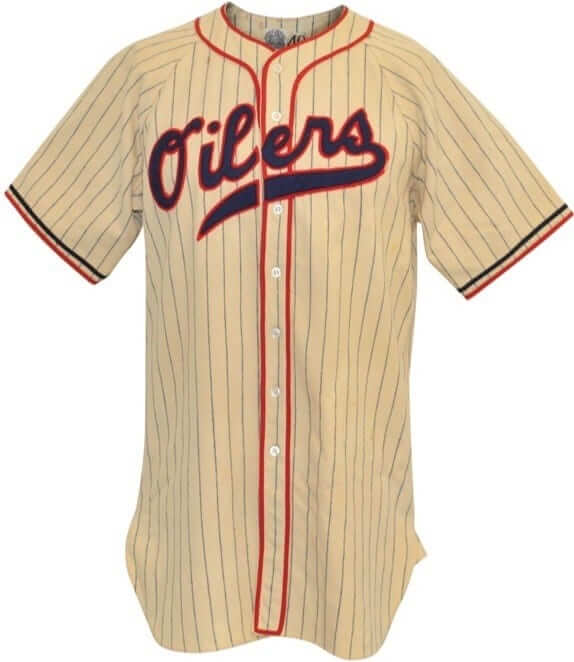
As you may have noticed in the left-hand sidebar, our friends at Grey Flannel Auctions are once again running a big catalog auction. One of the items that caught my eye is this 1940 Tulsa Oilers jersey (shown at right; click to enlarge) — what a beauty!
Here are some of the auction’s other notable items, most of them baseball-related:
• Interesting to see that Willie Mays’s 1972 Mets jersey had some tailoring alterations.
• I love how old Cubs jerseys used chain-stitching for the “C” on the chest logo.
• Speaking of chain-stitching, old Phillies jerseys had massive chain-stitched uni numbers that I never get tired of seeing.
• Back in the day, lots of teams used McAuliffe — now known as “the Red Sox font” — for their uniform numbers, including the A’s.
• Another team that used the McAuliffe font: the Angels. Interestingly, if you look at the back uni numbers, the “1” looks smaller than the “7,” but maybe it’s just the way the fabric is draping. (There’s another Angels/McAuliffe example, this one from 1977, here.)
• This batch of Jay Johnstone jerseys includes a 1980 Dodgers jersey that includes that season’s All-Star Game patch.
• Did you know the baseball Giants once used zippered jerseys? They did!
• If you look at this 1970 Indians jersey the red lettering/numbering with the black drop shadow feels a lot like today’s Reds uniforms.
• Fascinating to see that the Pirates used this kind of BP jersey. Everything about it — the collar, the zipper, the waistband trim — feels more like a basketball warm-up top.
• Speaking of the Pirates, you can have your very own Stargell Stars with this cap.
• I’d love to see the White Sox wear this early-1940s design as a throwback.
• Even a confirmed Yankees-hater like me can appreciate the coolness of this old Yankees belt buckle.
• Athletes aren’t the only ones in the ballpark who wear uniforms. Here’s an Orioles usher’s uni from the 1970s.
• Weird to see the Cowboys’ team name rendered in a script on this sideline jacket.
• Man, the 76ers sure used a lot of stars on their 1975-76 warm-up jackets.
Want to see more? You can access the entire auction catalog here.
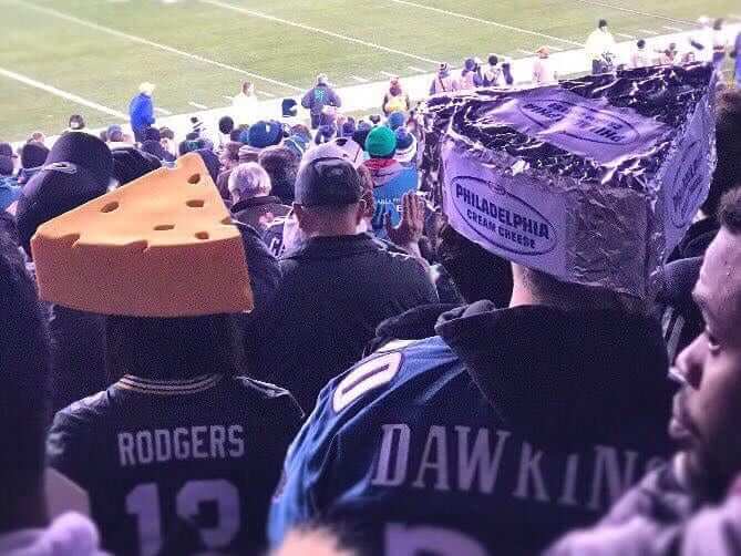
Too Good for the Ticker: It was a Battle of the Cheeseheads last night in Philadelphia, as the Eagles hosted the Packers and at least one Philly fan put his own spin on the Green Bay headwear tradition. Great concept, great DIY job. (Oh, and the Eagles wore their black alternates.)
(My thanks to @andrew_love_ and our own Mike Chamernik for this one.)
Collector’s Corner
By Brinke Guthrie
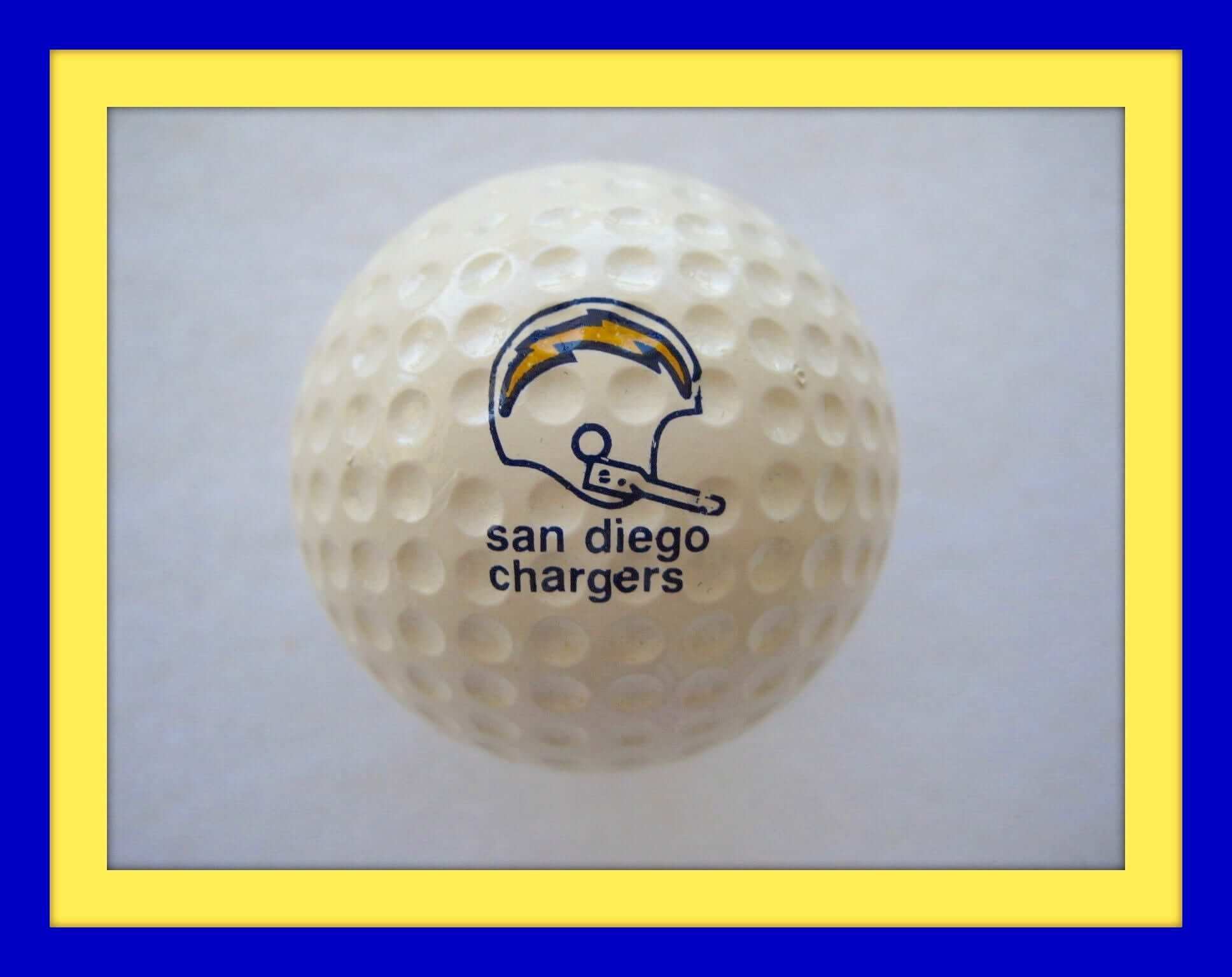
Chargers fans! Tee off to support your favorite team with this set of “rare” Chargers golf balls. They’re made by Faultless and date back to the 1970s. No guarantee they’ll improve your driving distance, but the all-lowercase lettering is interesting.
Now for the rest of this week’s picks:
• Take a look at this 1970s Buffalo Braves pennant. I swear until this moment I never knew that B had a feather in it. Of course, it also took me ages to realize that was a horn on the side of the Vikings helmet.
• Here’s a unique 1970s 3D Hank Aaron plaque, and that’s a darn good likeness, too.
• Got a few nice posters this week, beginning with this 1968 NFL poster sponsored by Kimberly Clark. Great graphics on this one!
• Maybe this was a promo poster in a department store..? This one simply says “NFL Headquarters” on it.
• And one more poster: Absolutely some of my favorite helmet graphics ever on this AFC/NFC poster from 1984.
• Just stay in tune, baby. The Oakland Raiders sing your favorite Christmas classics on this 1969 record album.
• Sears alert! Here’s a Baltimore Colts varsity jacket from the 1960s. The sleeves look like they could use some cleaning but otherwise it’s in good shape.
• Here’s another old varsity-style jacket. This one was from the 1960s made by Brill Brothers of Milwaukee, with “Packers” stitched on the front, but no team logo.
• In the 1960s when pro football was blowing up on TV, everyone and his brother made a football game. Here’s a board game made by Samsonite, believe it or not — the luggage people. Not to be outdone, 3M (Scotch tape) also made their own game.
• Ah, but baseball had their own games on the market. Computer games started to appear in the mid- to late 1970s, edging the classic electric baseball and football games to the sidelines. This handheld “Classic Baseball” game was made by Mattel. (And if the game malfunctions try fresh batteries.)
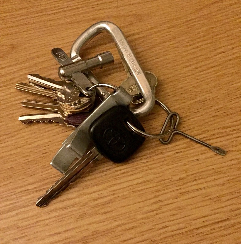
KRC update: The latest installment of Key Ring Chronicles is about one of those little keys that are used to open cans of Spam. Check it out here.
The Ticker
By Mike Chamernik

Baseball News: Bishop McCort Catholic High School in Johnstown, Pa., uses the Brewers’ ball-in-glove logo (from @Silverscreentes). … Brice Wallace has always been fascinated with the perfect timing of this 1975 photo of Pirates catcher Manny Sanguillen. “In 1993, I got my chance to mimic that photo,” Brice writes. “While shooting newspaper photos of Little League baseball at a dusty field in Elkview, West Virginia, I recalled that Sanguillen photo and, after several attempts, captured my own version. Obviously, the pitcher was throwing smoke.” … An anonymous reader knows a Cubs employee who received a jacket with a 2016 World Champions patch, a throwback to the team’s 1907 World Series emblem. “Kinda wished they had based it on the 1908 patch, though,” our reader says.

NFL News: Yesterday’s lede mentioned that Ravens RB Kyle Juszczyk was reportedly victimized by nameplate typo, but Paul didn’t have a photo. Now Will Shoken has provided one. … Peter Fredrickson, who works in real estate, was setting up a house for an estate sale when he came across an old box for a child’s football uniform. Although the box was empty, the package design is interesting. Lots of helmet anomalies there, including the Browns’ phantom “CB” design. … Stephen Curry lost a bet on last Sunday’s Oakland/Carolina game and had to wear a Raiders jersey this weekend. Curry is a big Panthers fan (from Brinke). … A group of players on the 1967 Saints wore throwback jerseys for a reunion this past weekend (from reader Tom M). … Seems that Ron Rivera has had his Panthers jacket for awhile. Former Raiders coach Tom Cable wore the same style of coat in 2010. It looks like the Reebok logo is gone from Rivera’s jacket, however (from Rudy Gutierrez). … The Vikings teased their Color Rush unis. Under the right light they look like retro Rams jerseys (from Andy Huebner). … Cowboys players got their first look at the the custom cleats for charitable causes that they’ll be wearing this weekend (from Klay Kuban).
College Football News: Missouri WR J’Mon Moore has an interesting NOB that I don’t think we’ve seen before. Would we call that a F’NOB? The Tigers also have a D-lineman named Josh Moore on the roster (from Seth Shaw). … Follow-up to yesterday’s North Carolina note: Here’s UNC’s record by every uniform element (from James Gilbert). … What do an ax, barrel, bell, and wagon wheel have in common? They all serve as the basis for college football rivalry game trophies (from Phil). … Michael Mariniello sends in two old photos of Bear Bryant, one with an elaborate facemask in the background, and the other with a player who has a letter on his sock.

Hockey News: U.S. Army officials aren’t thrilled with the new Vegas Golden Knights team name. The Army, which has a parachute team called the Golden Knights, is considering what kind of action, if any, might be appropriate. … The Flames’ Jyrki Jokipakka had a rip on the back of his jersey last night. Hey, at least they spelled his name right (from Ryan Feuerstein). … Here are this year’s KHL All-Star jerseys. Each division will have an all-star team, and the game will have a 4-on-4 tournament between the teams (from Teebz). … The AHL’s Bakersfield Condors are hosting an outdoor game at Bakersfield College in January. They will wear cream jerseys for the game. … Blackhawks D Duncan Keith has his own cereal and personal logo (from David Firestone, who also found a good vintage hockey sweater). … At Harvard home games, teams sit on opposite sides of the ice (from Dustin Semore). … In case you missed it during the long Thanksgiving weekend: The Penguins unveiled their jersey for the Stadium Series game against the Flyers on Feb. 25.

NBA & College Hoops News: Lakers guard Jordan Clarkson wore a kilt after Sunday night’s game. … Color vs. Color last night, as Florida State wore turquoise N7 uniforms against Minnesota. … Speaking of the turquoise N7s, Oklahoma State will wear its own version on Wednesday (from Justin Mitchell). … UCLA wore white and blue unis with no trim during the Wooden Legacy tournament this past week (from Chris Cruz). … Oral Roberts debuted gray uniforms last night.

Soccer News: Arizona United SC of the USL will now be known as Phoenix Rising FC. More info on the rename here. … Orlando City Stadium, the home of the city’s MLS and NWSL teams, installed a small section of rainbow seats in memory of the Pulse nightclub shooting victims (from Phil). … “A uniform tradition was broken yesterday when Theo Walcott wore short sleeves while the rest of the Arsenal team wore long sleeves against Bournemouth,” says Jay Reyes. “Arsenal is the only soccer team I know of where the club captain decides if the team will wear long or short sleeves and everyone has to follow suit. In fact, a few years ago a player was chastised for cutting his long sleeves with scissors before a game. Do you know of any other teams have a similar tradition?”

Grab Bag: Donald Trump has traded in his “Make America Great Again” cap for a new cap, with “USA” on the front and “45” on the side. He will be the nation’s 45th president (from Phil). … Tiger Woods, returning to golf after a 15-month hiatus, will have a Monster Energy logo on his bag at the Hero World Challenge this week (from Phil). … High-end manufacturers find that consumers are opting for luxury items with little or no visible branding. … A new Niketown store in Manhattan is causing problems due to large, unruly crowds spilling out into the street.
Link is wonky on first item in hockey section.
Fixed.
Proofreading:
“Athletes are the only ones in the ballpark who wear uniforms.” Should be “aren’t”, right?
Yes. Fixed.
On the zippered Giants jersey in the Grey Flannel Auction, it appears the numeral 2 in the #12 may be a numeral 5 that has been flipped vertically. I’m sure they didn’t have adhesive-backed twill numbers back then, so flipping a 5 into a 2 saved time/money.
If Rivera’s jacket is from 2010, not only was the Reebok logo removed, the panther logo was updated, too
Just a note on those Mattel handheld games – if it says “Classic” on it, it’s a remake from the 2000s.
Correct. I’ve got one like the one in the link. If you use the auction’s zoom feature, look at the back photo. It clearly says “2001 Mattel, Inc. CHINA”. Two more giveaways are (1) the sound button, and (2) the battery cover has a screw to hold it in place.
I still have an old one from my youth. Aside from not having the two items that I listed above, it says “Mattel Electronics” instead of “Classic Baseball” and the back of the game says “MATTEL INC 1978”
Right. I remember seeing the reissues of the baseball and football games at Walmart a couple of years ago.
I picked up one of the reissues for cheap back when they came out, and it seemed really poorly made, and stopped working quickly. Back in the very early 1980s, every kid I knew had at least one of those two games, and we beat the heck out of them, and they never failed.
I love that Bear Bryant pic with him holding a cigarette.
Will there be a Holiday Gift Guide this year? Sorry if it has been discussed or posted, have been off-line for a few weeks. So many great links year in and year out. Thanks!
Yes — it will run on ESPN tomorrow.
Awesome. Appreciate the effort that goes in to it. Thanks
“A group of players on the 1967 Saints ……”
Any day I see Billy Kilmer on the internet is a good day.
Oh, man! Do I ever love the old Saints jerseys with the gold numerals! The white ones looked great during the Color Rash game a couple of weeks ago.
Agreed. link
Two things –
The Padres had the same type of batting practice jersey as the Pirates did. I have Tony Gwynn’s version that Mitchell and Ness made a few years ago.
Finally – my old high school’s mascot was the Golden Knight, and they’re not making a big fuss over the Vegas hockey team. LOL
Yeah those BP jerseys have been mentioned once or twice on here. I believe there’s a Sports Illustrated cover showing Pete Rose wearing one.
At a baseball card show last year in NY a vendor was selling a similar Mets jersey for $150. I might’ve bit if it was $100.
I can see why the Cubs went with the throwback to the 1907 patch with this new WS patch. I do like the 1908 and it certainly fit the era, but it certainly is not something you would expect the team to wear now. The 1907 and the updated 2016 certainly have the more mainstream look (for better or worse).
Would be interesting to see someones thought on all the WS champions patches throughout history. I know of a few that stick out (as both good and bad) that have been used in my lifetime.
In addition to the 1907 logo being a better candidate to bring into the 2017 season as defending champions, maybe it’s a message that “it would be nice NOT to have to wait another 108 years to win it all again.”
Could you please correct the spelling of my name? It’s Shoken not Shokan. Thanks.
Done. Sorry about that.
Now I know how Juszczyk felt, haha.
I’m still calling him “Shokan”.
The item about the high school using the Brewers ball in glove logo should be Bishop McCort, not McCourt.
Fixed.
Glad to see they’ve also fallen prey to the MLB Properties “transparent webbing” gaffe.
I’ve always thought that the Braves (Buffalo, that is) had a very modern, very clean logo , without being boring. I think that it holds up well over time. Their orange and black unis, on the other hand. …
I’m not sure if the Braves logo was designed by the same company that did the Flyers – mainly black letter, little drop of orange.
Once you see the feather, go and look at the fake McAdoo jerseys on ebay where they look like footballs.
Plus, in the early 70s, I thought that feather would’ve been good for the Cleveland Indians – the feather could fit in the wishbone C and would also fit inside the script I.
I wonder how the Army feels about the New York and Texas Rangers.
“Ranger” as a type of infantry predates the formation of the U.S. Army, and it’s a generic word like “soldier” or “cavalry.” The New York Rangers are named after the original colonial-era North American unit from which the Army draws the name of its special combat force, and the Texas Rangers are named after an unrelated state force that also draws its name in part from that original colonial-era New England force.
Whereas “Golden Knights” is a specific name of a specific and famous U.S. Army unit. Something that Army vet Bill Foley surely knew when he chose the name, and something that any IP attorney would discover on the first page of the most preliminary search for related names and marks. “Golden Knights” is equally problematic as “Black Knights,” and on exactly the same grounds that led Foley to eschew “Black Knights” as his first choice. If he thought straight-up stealing a U.S. Army nickname was such a problem, then “Golden Knights” is no better than “Black Knights,” and he might as well have stuck with ripping off West Point and spared everybody his maudlin display of public agonizing over the name.
And, as any IP attorney can tell you, none of those Golden Knights play hockey.
Well then, did the US Army ever have a chat with Clarkson University Golden Knights?
link
If they can exist, I’m sure that a pro team can too.
US Army aside, I don’t see the issue with multiple teams sharing the same nicknames. We’re not even talking about the same dang league here. Somehow the sports world has gotten along fine with multiple Rangers, Giants, Jets (and the newest Jets just came along a few years ago – I don’t recall any legal hurdles jumped then.)
Mainly because “Winnipeg Jets” has been “continuously” in use for the NHL – so bringing it back wasn’t an issue (supposedly).
The New York Rangers are named after the original colonial-era North American unit from which the Army draws the name of its special combat force, and the Texas Rangers are named after an unrelated state force that also draws its name in part from that original colonial-era New England force.
I thought the New York Rangers got their name from newspapers having fun with their owner, “Tex” Rickard – “Tex’s Rangers”. Myth?
The Army has a parachute division with the name “Golden” in it? That is an unfortunate coincidence for them.
Walcott didn’t wear short sleeves, he just pushed his sleeves up. Mustafi also did it on Sunday.
I’m not sure about that. I though the same thing too but looking at Arsenal’s authentic kit it looks like the short sleeve version
link
Looks like that Raiders Christmas album just one of 26! Every NFL team got into the action!
link
There are Soundcloud links in that article so you can get into the holiday spirit with the dulcet tones of the San Francisco 49ers, if you dare.
…also the album is from 1970. Had it been from 1969, the cover would have read AFLPA. The NFLPA did not represent the Raider players (or any other AFL player) until after the merger. See link
That Cubs Jenkins jersey logo does not look chain stitched. Just normal stitching.
The KHL All-Star jerseys are on point. That’s the way to do a four-team format – four different jerseys, all different colors, and sufficient contrast on all of them.
Re: Bakersfield Condors – not another cream jersey. It just looks horrible on the ice. Like I’ve said before, they should leave the cream to baseball, where it looks so much better over the green and brown playing surface.
The benches on opposite sides of the rink must be a Boston thing. Boston College, Boston University and Northeastern also have benches set up like Harvard.
The old Boston Garden had the same setup until the NHL forced them to change in 1975.
The reason for the setup is that it gives the home team an advantage in a penalty kill. With the penalty box on the same side as the bench it makes it easier for the home team to get the right players on the ice after a penalty than for the visitors.
The NHL forced Boston to change, but not Montreal. The old setup was kept until the Bell Center opened in 1996.
Another thing to note: The benches are completely opposite what they were before the rink was renovated about a decade ago. In other words, Harvard could have chosen to put the benches on one side and the penalty box on the other, but instead reversed the footprint.
Beat me to it; the Forum is the only one that I truly remember having the opposing benches on either side of the rink (and not coincidentally, the penalty box being on the same side as the home bench). Didn’t know that about the Gahden, though; if they changed it in 75, it was right around the time I became a hockey fan, back when not every game was televised.
That’s why the second-period player-coming-out-of-box-must-tag-red-line rule exists.
The Androscoggin Bank Colisee in Lewiston, ME, formerly known as the Central Maine Civic Center, has the benches on opposite sides of the rink as well. The Colisee was most recently home to the AHL’s Portland Pirates and QMJHL’s Lewiston Maineiacs. I think a lot of rinks in Maine have that set up.
Here’s the historically interesting part of this comment: the Colisee was home to the famous Ali-Liston bout that resulted in one of the most iconic sports photographs of all time.
Re: bench situation at Bright Hockey Center (Harvard): not all that unusual in the college ranks, even in newer rinks. From memory, Boston College has it that way, and both Boston University’s old (Walter Brown) and new (Agganis) arenas are that way.
Maybe it’s just a City of Boston thing? (The old Garden was like that as well.)
RPI has that setup at Houston Field House, and Bentley has it at the John Ryan Arena (which is, admittedly, Boston-adjacent).
Notre Dame also has it that way at the Compton Family Ice Arena. If memory serves, they explicitly stated they were inspired to do so by the rinks in Boston.
I believe Michigan State’s Munn Ice Arena has the opposite bench set up too
link
Growing up on the small town Michigan rinks, this configuration wasn’t unheard of.
I had no idea that the old Montreal Forum was set up that way though. I learned something today!
D3 Williams College in western Mass has benches on opposite sides as well.
So many creepy things on that uniform box… all the disembodied helmeted heads floating around… It’s like the Governor’s aquarium in Woodbury with a football motif…
More to the point, notice the wrong “G” on the Packers helmet? Also “Atlanta Falcons” is on the list of teams on the box, but no disembodied Falcon head exists.
Re today’s KRC … Looking at that picture reminded me of the old military P-38 can opener. Thanks for posting.
We actually ran a KRC entry on the P-38 earlier this year!
link
And to fill in one gap in Evan’s KRC entry – the P-38 is amazingly good at opening a can, given its very simple design.
So let’s say that pressure on the Las Vegas team causes them to change their name. What options could there be?
Any Cheez Whizheads spotted? I’m told you can’t have a real Philly cheesesteak without Cheez Whiz.
Or provolone!
Provolone? Only on pizza steaks, if you follow the orthodoxy (which I know you don’t, iconoclast that you are). At least you didn’t go John Kerry on us! :)
Maybe it is because I was 9 and had that 1984 poster, but that looks like the pinnacle of helmet design for the NFL.
Funny thing is, Philadelphia Cream Cheese is made in Wisconsin. The Kraft plant that makes it is located in my hometown of Beaver Dam.
First, I love the old Skins uniform on the Samsonite game box. I’m usually not a big fan of the feather/stripe helmet, but I love the single stripe on the pants.
Second, loved the KRC story. When I was a little kid, I was fascinated by the way the Spam key worked. I loved rolling the key just enough so the package would open. Of course, my mom didn’t love the fact that when she went to make dinner several days later, she discovered that the Spam had gone bad because I’d broken the seal and left the opened can in the pantry.
The new Trump hat, is it fitted or snap-back? IMHO, a man of his age and stature should not be wearing a hat that is not fitted.
The player wearing number 12 behind Coach Bryant in the second picture is a man named Pat Trammell. He was the Bear’s first QB at Bama and would go on to be a well respected doctor. The first picture was taken while Bryant was at Texas A&MESS, as Alabama never, ever have worn sleeve stripes.
The player wearing number 12 behind Coach Bryant in the second picture is a man named Pat Trammell. He was the Bear’s first QB at Bama and would go on to be a well respected doctor. The first picture was taken while Bryant was at Texas A&M, as Alabama never, ever have worn sleeve stripes.