
Click to enlarge
Phil had this in the Ticker over the weekend, but I know some of you don’t follow the site on weekends, so just in case: The Diamondbacks announced a series of tweaks to their uniforms for 2017. You can see the full rundown of adjustments here, but the most notable changes are to the pants: The truncated side piping is now full-length, and the blood-stain gradations at the cuffs have been scrapped. Obviously both changes are for the better. Here’s how the new pants look on a mannequin:
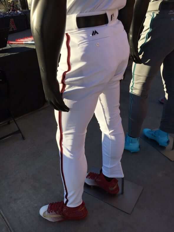
The news was first reported by The Arizona Republic, whose story on the uniform changes included a very interesting passage:
“We were listening to fans and players on the changes they wanted us to make,” [team CEO Derrick] Hall said. “We knew about a month into the season that we were going to end up making these changes.”
Hall said the diamond gradient design at the bottom of the pants didn’t look the same on the field as it did during the design phase.
“But once you have it approved and you’re already manufacturing, you’re stuck for the year,” he said. “We wanted to get to this offseason so we could make the changes.”
Two thoughts here:
1. I’m flabbergasted by this notion that the pants didn’t look the same “on the field” as they’d expected. It’s standard procedure these days to test-drive new uniform concepts on the field (or the court, or the ice, or whatever) and see how they look under various lighting conditions, on TV, on streaming video, and so on. That’s basic due diligence. Did they omit that step? Or did they convince themselves that it looked fine and then get caught off-guard by the negative fan feedback?
2. If you’ve already decided by early May that you’ll be getting rid of your pants design, it seems silly to have to stick with that design for another five agonizing months. MLB pants aren’t sold at retail, so there are no merchandising issues to worry about. It would certainly have been simple enough to get a new set of pants made with full-length stripes and no blood stains. It’s just pants — why wait until the end of the season? If there’s a rule against that, as Hall’s quote implies, maybe it’s time to re-examine that. (By way of comparison, look at the NFL, where the Ravens introduced those mustard pants late last season. It was a total surprise, they weren’t in the style guide, and that was all fine.)
Anyway, it’s an upgrade, so let’s be happy about that.
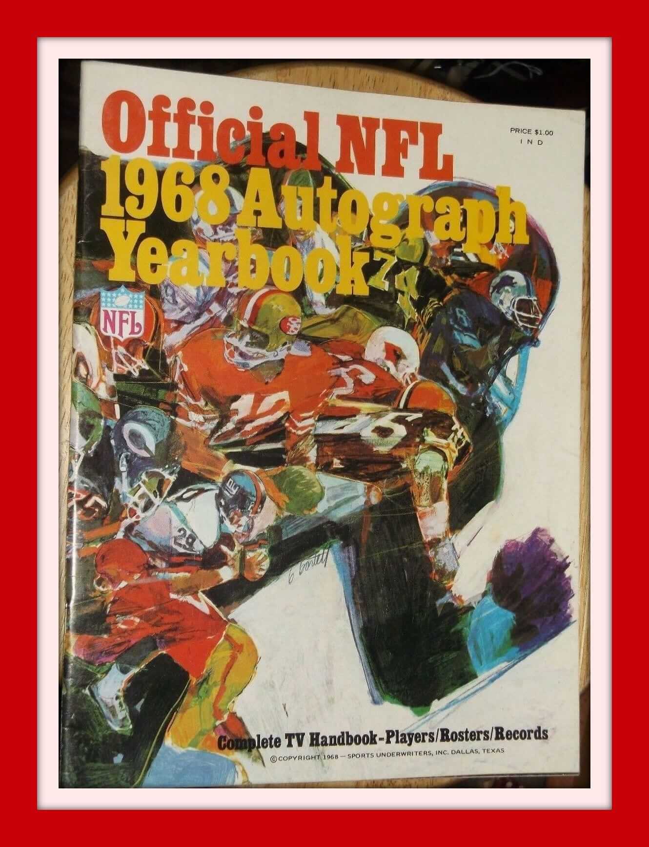
Wow, what terrific artwork on this Official NFL 1968 Autograph Yearbook. It had a TV schedule, rosters, and stats. I suppose there was a place for you to get autographs at training camps or games. Great stuff.
Now for the rest of this week’s picks:
• Great look to this Buffalo Bills poster. Gonna say 1980s for this one, but I’m not sure. That should be Joe DeLamielleure judging from the jersey number, along with some nice period Pumas.
• Here’s a nice set of 25 NFL pocket schedules from the 1970s.
• Apparently there was an event for NFL Alumni called “The Super Bowl of Golf,” and this is the satin jacket to prove it.
• Different rendering (low-profile white facemask) of the helmet design on this 1970s/1980s Atlanta Falcons school binder.
• Nice artwork on this 1970s NBA shoe box, although the seller’s claim that it has “hard-to-find Interior tissue paper” seems like a bit much.
• Remember back when sports logos used to be simple? Always liked this ABA Denver Nuggets logo.
• Check out these 1970s Phil Esposito street hockey sneakers from Converse.
• Nice clean look to this 1980s Vikings jacket from Chalk Line. Always liked how they put the NFL shield next to that pose of the team’s helmet.
• Boy howdy, check out this vintage photo of Mike Ditka. I didn’t even know he played for the Eagles! Turns out he played for them in 1967 and ’68, in between his stints with the Bears and Cowboys.
• Back in the day, they didn’t put too much effort into media guide design, as shown on this 1970 World Series media guide from the Reds.
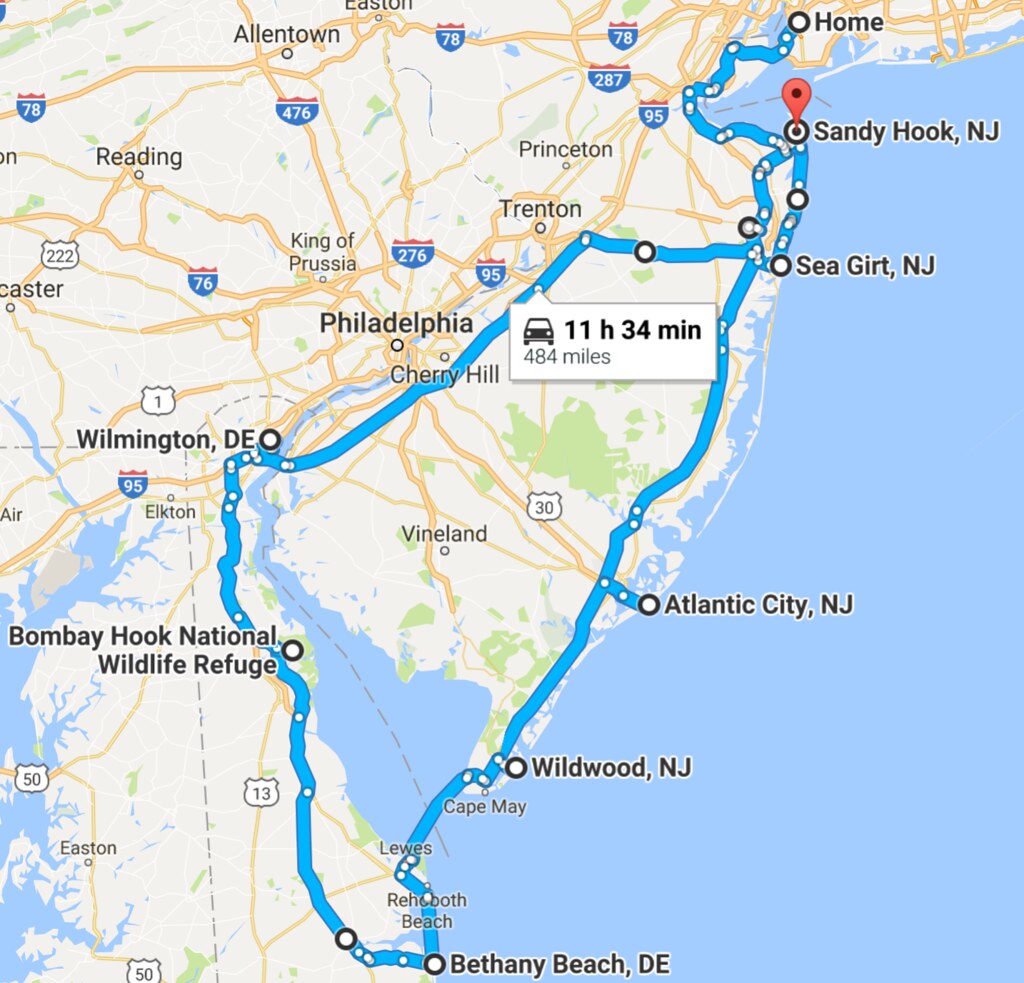
A quick report on a quick road trip: Last Friday the Tugboat Captain and I hopped in the car and drove down the Jersey Shore. The next day we took the Cape May car ferry to Delaware. The day after that we headed home.
A few highlights:
• On the first day, while walking on the beach in Asbury Park, we saw a humpback whale, which frolicked offshore for about 15 minutes before disappearing (we couldn’t get any good photos, so you’ll have to take my word for it). The next day we saw a school of dolphins swimming alongside our ferry, and then saw more dolphins while walking on a beach in Delaware (we couldn’t get any good photos, so you’ll have to take my word for it). Later that day, while exploring a wildlife refuge, we saw a bald eagle (was easy to see through binoculars but too far away to photograph, so you’ll have to take my word for it). A very good weekend for wildlife!
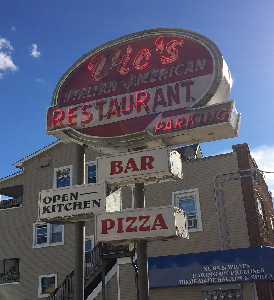
• On the first day, we stopped for lunch at my favorite Jersey Shore thin-crust pizza place, Vic’s in Bradley Beach, where we got a pie with pepperoni and lump sausage:

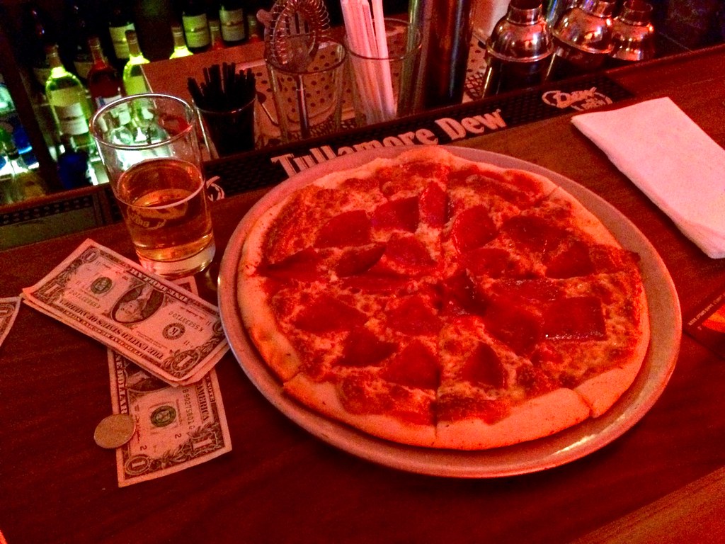
We liked that so much that we had another thin-crust pizza for dinner, this time at Tony’s Baltimore Grill in Atlantic City, where we got a salami pie:

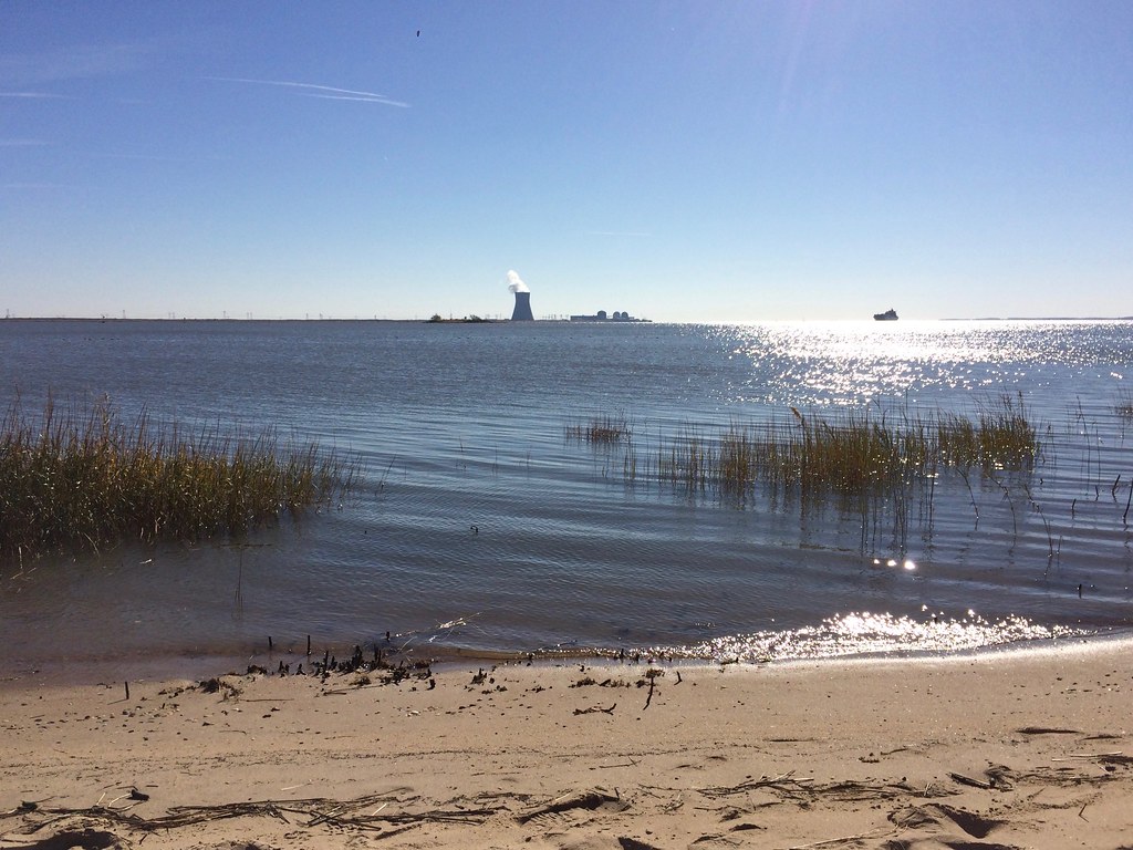
• One of the weird things about the northern Delaware shoreline — including that wildlife refuge where we saw the bald eagle — is that you have a clear view of a nuclear power plant cooling tower across the river in New Jersey. It makes even the most placid scene seem vaguely menacing:
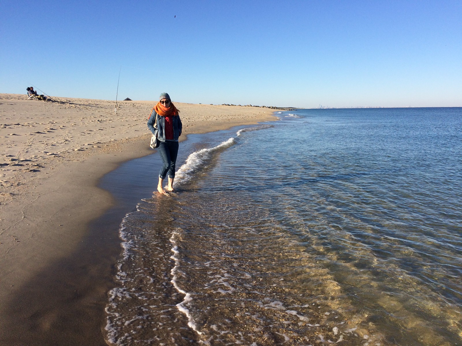
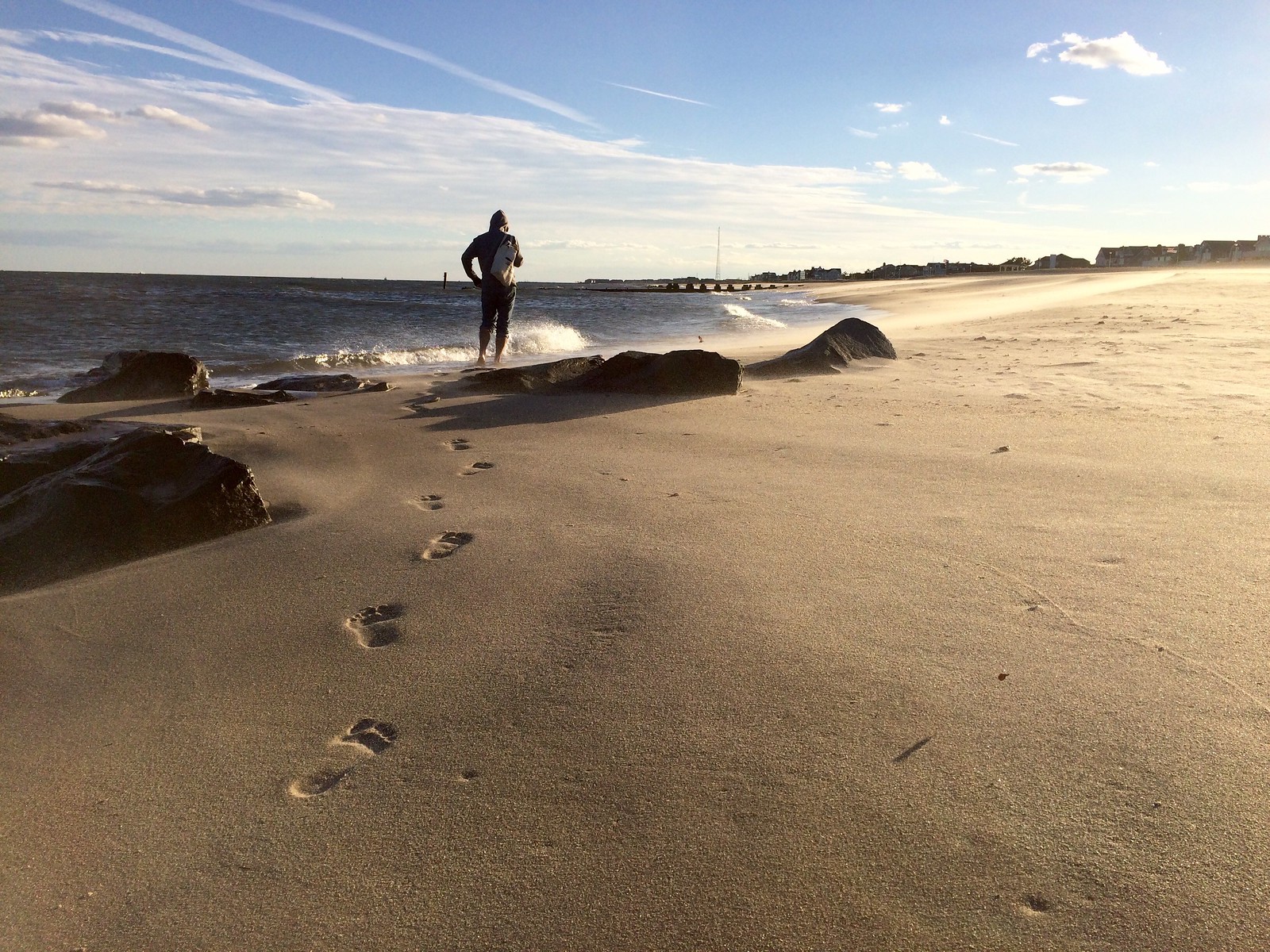
• We continued our habit of walking in the surf each weekend, although the water is now getting pretty damn cold. The second photo here is worth clicking on so you can see it at a larger size — it’s really nice (which has nothing to do with me being in the photo and everything to do with the photographer):
There was a lot more, not all of it good. I’ll spare you the details, except to say that a bunch of things didn’t work out the way we’d hoped and that the state of Delaware will not be getting a Christmas card from me. Also, we were stressed about some Real Life stuff, which didn’t always bring out the best in either of us. Also-also, on the way home we got word that a friend of mine had died. He’d been sick and hospitalized for a long time, so the news wasn’t completely unexpected, and on some level I’m glad his suffering has ended, but the whole thing still hit like a punch to the gut. (RIP, Billy.)
But that’s how life goes sometimes — some good, some bad. I hope your weekend had more of the former than the latter.
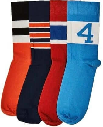
StripeRite reminder: The second batch of StripeRite socks, shown at right, is now available for ordering. For those of you who’ve already ordered, the socks will start shipping on Nov. 21.
My thanks, as always, for your consideration.
“(No) Vacancy” reminder: In case you missed it yesterday, I’ve written an article for Bloomberg Businessweek about motel vacancy signs. I hope you’ll give it a look — thanks.
The Ticker
By Mike Chamernik

Baseball News: The Royals will announce some 2017 uniform moves on Thursday, and it looks like they’ll be keeping their gold-accented jerseys (from Ryan Atkinson). … Here’s our first look at the Mariners’ 40th-anniversary patch on a jersey, and it looks really big (from Cesar Miramontes). … A Brewers ticket package includes a retro winter cap (from Adam Vitcavage). … Here’s a good piece on the House of David baseball team, which represented a strict religious commune in Michigan (from Joe Hollomon). … An archivist recently found a photo of St. Louis Stars Park, something Negro League baseball researchers have been trying to find for decades. “For baseball historians, it is more than exciting,” according to the article. “It is akin to finding a Lost Ark.” … The Brooklyn Cyclones will hold their annual Holiday Season Garage Sale, featuring game-worn gear, promo giveaways, and more, this Sunday (from Mary Bakija).

NFL News: Giants WR Odell Beckham Jr. and ESPN commentator Randy Moss swapped autographed jerseys last night (from Robert Hayes). … Darrelle Revis has “24” and “Island” on the soles of his cleats. As you may know, wide receivers who go up against the shutdown corner are stuck on Revis Island (from Phil). … Once again, Fox has been caught Photoshopping an image of Vikings QB Sam Bradford. This past weekend the network showed a graphic with Bradford’s head on Matt Cassel’s body. In October, his head was on Teddy Bridgewater’s frame (from Alex Sinclair).
College & High School Football News: Oklahoma will wear its Rough Rider alternates on Saturday (from Phil). … “There must have been a little confusion prior to Saturday’s Iowa Class 2A state semifinal game,” writes Jesse Gavin. “Both Mount Vernon and LaPorte City Union came out for warmups in their dark jerseys, but Mount Vernon switched over to the whites when the game started. My only guess is the Iowa High School Athletic Association failed to inform the schools which team would be designated the ‘home’ team, since the semifinal games are all played on a neutral site.” … Georgia may have tipped its hand about wearing black this weekend (from Mike McLaughlin).

Hockey News: Rangers G Henrik Lundqvist’s charity foundation held an event over the weekend. Several of his old masks were on display, including his first mask, which he painted himself (from Alan Kreit).

NBA News: Kevin Love endorses Banana Republic, the clothing company. Among his new fashions is a 3-in-1 parka. You may remember the Cavs won the title after coming back from a 3-1 deficit against the Warriors. … The Bucks’ court has an outdated typeface along the sideline. It’s supposed to be in the blocky font introduced last year (from Eric Pigo). … Jeff Brown noticed that roughly half of the Pacers didn’t have a 50th anniversary patch last night. … The Heat wore their military alternates last night.

College Hoops News: A little tough to see, but Oregon’s new road uniforms have wings on the shorts (from @BWall811). … There was a particularly vibrant color vs. color game last night, as New Mexico wore its turquoise N7 uniforms and Houston Baptist wore orange. Several schools are wearing the turquoise N7 uniforms for Native American Heritage Month.

Soccer News: Bosnia striker Edin Dzeko was ejected from a World Cup qualifying draw in Greece for pulling down the shorts of an opponent. In the NBA, Ron Artest once did the same thing. … Reader Timmy likes the typeface Estonia uses for its NOBs. I like it, too.

Grab Bag: New logo for Taco Bell. … JetBlue introduced a retro-looking logo. … On Friday night, the Maori All Blacks rugby team played the Irish club Munster, whose coach Anthony Foley passed away last month. “Before the haka, the captain of the Maori All Blacks presented Munster with a Maori All Blacks jersey with Foley’s initials on it,” says Eric Bangeman. “You’ve got to watch the video to see the full effect of the moment and the respect with which it was done. Also noteworthy is that the Munster players wore the socks from their club or school team instead of their normal blue socks.” Further info on those socks here (from Denis Hurley).
Sorry for your loss, Paul.
Sorry for the loss of your friend.
Condolences, PL.
As far as the D’backs go, it looks like the jerseys will still have the snakeskin pattern either on the sleeves or down the shoulders. I guess we have to settle for baby steps? And like you said, the pants should have been an easy switch since they’re not sold commercially like jerseys are – but with that said, you would think this would be the time to eliminate that and not disrupt sales mid-season, right? I ask from the point of aesthetics, but I understand the way business has crept into uniform design.
Thanks for the link to the House of David article. I’ve always been fascinated by them, particularly their baseball team.
Sorry for your loss, Paul.
Concerning the Bills posters, late 70s and yes it resembles Joe D while the generic RB is supposed to resemble Terry Miller #40. He was a 1,000 yd runner & ROY in 78. Miller slipped in 79 and the was replaced by 1980 ROY Joe Cribbs.
Sorry for your loss, Paul.
Did the D-backs have those eye-searing teal shoes last year?
Condolences, Paul.
Re: the Mt.Vernon, IA high school football jersey switcheroo, I played in the state semifinals for Mt. Vernon in the late 1980s and in that game our own team’s jerseys didn’t match – drove me crazy the entire season. Coach ordered a partial set of new jerseys, resulting in 2/3 of the team wearing the new ones and the rest of us wearing the old ones. In fact, I wore the same home & away jerseys all four years of high school. Major difference that year was differing sleeve stripes (new were Northwestern-style and truncated/old had two stripes that wrapped all the way around), TV numbers (new were on top of shoulders/old were on sleeves) and that the new jerseys didn’t tuck in while the old ones did. Hard to imagine a school doing anything like that today, but back in the 80s it didn’t seem to matter as much – except to me!
Hey Paul, you were in my neighborhood! Or at least in my parents’ neighborhood; they live in Asbury Park and I have been on that boardwalk, and eaten pizza at Vic’s, many times.
The town was in terrible shape even 10 years ago and it is great to see it slowly improving. Did you visit in the “bad old days”? You could see all kinds of glorious kitschy Americana like the link and the Convention Hall interior which would have been right up your alley.
I’ve been visiting there for many years, and have noted the steady pace of change.
That’s a long way from Shiga!
The Official NFL 1968 Autograph Yearbook was the first football magazine I ever purchased. It featured two page articles on each team forecasting the upcoming season and two more pages of head shots and facsimile autographs of almost every player on each team’s roster. There was also an AFL edition of the magazine. They also published editions for both leagues in 1969. I have all four and I would recommend them highly for anyone who is into collecting that sort of thing.
Nice road trip Paul. In the DC universe you would have hit Metropolis and Gotham, both oddly located on the Delaware Ba. link
Well, sometimes. ;)
According to that map, Philly’s in NJ. Huh. Good to know.
No, according to that map, it’s not.
And Paul – a NJ road trip with Pizza and no DeLorenzo’s Tomato Pies? You were SO CLOSE to them as well…
I will light a candle at church tonight for Billy, Paul. My condolences.
On a lighter note, being a New Haven pizza snob that I am, I must say that greasy Pepperoni and Sausage pie at Vic’s did look pretty divine. And that Baltimore Grill sign is classic. Businesses need to go back to 1970’s sleaze. More marketable. :)
Irritated at the Taco Bell logo, and normally such things don’t bother me much. They had a very distinctive look, then took the popular flat “Material Design” style and messed it up. Boring, predictable, and wholly uninspiring. Looks like a 1,000 other logos that have gone that route. Meh. Rant over.
PS sorry bout your friend, PL.
And to make it worse, the food is awful. :)
And here I was still missing the previous logo! A couple of Taco Bells I visit or used to visit have finally rebranded or renovated into new buildings with the new (now old) purple logo and they change it again. Downgrade! (Not as bad as the GAP fiasco a few years back but still a major downgrade, IMO.)
link
Sorry to hear about your friend, Paul.
Never knew that street hockey sneakers ever existed. It had to irritate Espo that they were offered in Montreal colors.
Looks like Vic’s could use some of that hard-to-find neon sign maintenance.
Actually, the Vic’s neon is in much better shape than that photo would indicate. Neon is notoriously difficult to photograph well, esp in daytime. I took a bunch of pics, and that was actually the best one.
I love link – there’s something so wonderfully incongruous in the juxtaposition of a calm winter forest, with undisturbed snow and beams of late-afternoon sunlight, with the energy and motion of the runners.
Is it my imagination or is that a tighter fitting on that D-Backs model? Could this portend an end to the baggy, baggy look?
Of all the tea leaves that one might try to read, the ones pertaining to a mannequin seem like the least productive, and also the least predictive.
Paul, not sure if you saw it yet, but link is linking to your (No) Vacancy article.
Want to add my condolences, Paul, and thanks for the House of David link, which made my day a little brighter, at least.
As a bowler, the HOD history held a real eye opener: “The House of David invented the automatic pin-setter in 1909, and later sold the patent to Brunswick.”
Hard to imagine a 1900’s cult giving the world such a gift.
I didn’t know that! Wow.
I find it hard to believe that the Diamondbacks couldn’t scrap their ugly pants before the start of last season because they were too far into manufacturing. Two reasons that can’t be an excuse: 1) for MLB teams, pants are not expensive, and 2) The revised version that they are using this season wouldn’t have taken long to manufacture/assemble and approve.
There’s gotta be some other reason. It certainly isn’t marketing either, because fans don’t buy team pants.
The most likely reason would be found in the fine print of Majestic’s contract with MLB. For instance, the manufacturer may be obliged to provide N number of pants to each team, representing an expected season’s worth, by a certain date in February or March, so the entire stock was already in hand and a change would have been an out-of-pocket expense for the club.
It’s the duration thing that makes uni flubs so cringeworthy for me these days. Time was, a team would realize its new uniform was a mess and make tweaks during the season, or scrap it for something new during the offseason. Nowadays, you sort of assume that any new uniform will be with us for several years even if it’s terrible. So good on the D-Backs for making these changes after only one season. They’ve taken a big step here, maybe about halfway, from terrible uniforms to a gentleman’s C of a uni set.
the manufacturer may be obliged to provide N number of pants to each team, representing an expected season’s worth, by a certain date in February or March, so the entire stock was already in hand and a change would have been an out-of-pocket expense for the club.
Yeah, but we’re only talking about roughly 35 pairs of pants at the date of replacement, or maybe twice that many for the duration of the season. What’s the big deal? That’s a few thousand bucks, max.
I was told a number of years ago by a local team supplier, that MLB players are typically issued only two each for their home and road pants. If you get a close look at them during the season, there are many repairs and patches to them. So, the expense issue to each team is a drop in the bucket for their budgets. For a 40 man roster, that would be 160 pairs, probably at a conservative wholesale cost of $20 each, totaling an estimated $3,200.
I’m going to go against the grain and commend Arizona for trying to lend some design to their knickers, and not have them be merely afterthoughts. Adding interest to the ankle area is a logical progression from covering the socks and stirrups. I’ll allow they could have finessed it better; the Diamondbacks have plenty of klutzy details.
Condolences on your friend, Paul.
Interesting note regarding the hyperbolic cooling tower you observed: there are actually 3 nuclear reactors on the ‘artificial island’ that make up 2 distinct power plants. The cooling tower is only used by one reactor.
Condolences for your loss Paul. Hope the next trip goes better. My wife and I just did a round trip from our home in Austin, TX to Colorado Springs, CO. Sometimes the car rides alone can be testy…..
I HEARD THAT!!
My condolences for the loss of your friend, Paul.
I went to college near Atlantic City and I’ve had many a pizza from Tony’s Baltimore Grill…thanks for the happy memories!
BREAKING NEWS: The New Orleans minor league baseball team is now the Baby Cakes.
And now, a dedication: link
In reference to the Mount Vernon, Iowa, high school football game on Saturday. Maybe I was the only one in the stands who noticed, but I think the Jersey Switcheroo was pre-planned. The Iowa High School Athletic Association determines home & visitor teams prior to the game and designates fans accordingly to sit on opposite sides of UNI’s dome stadium.