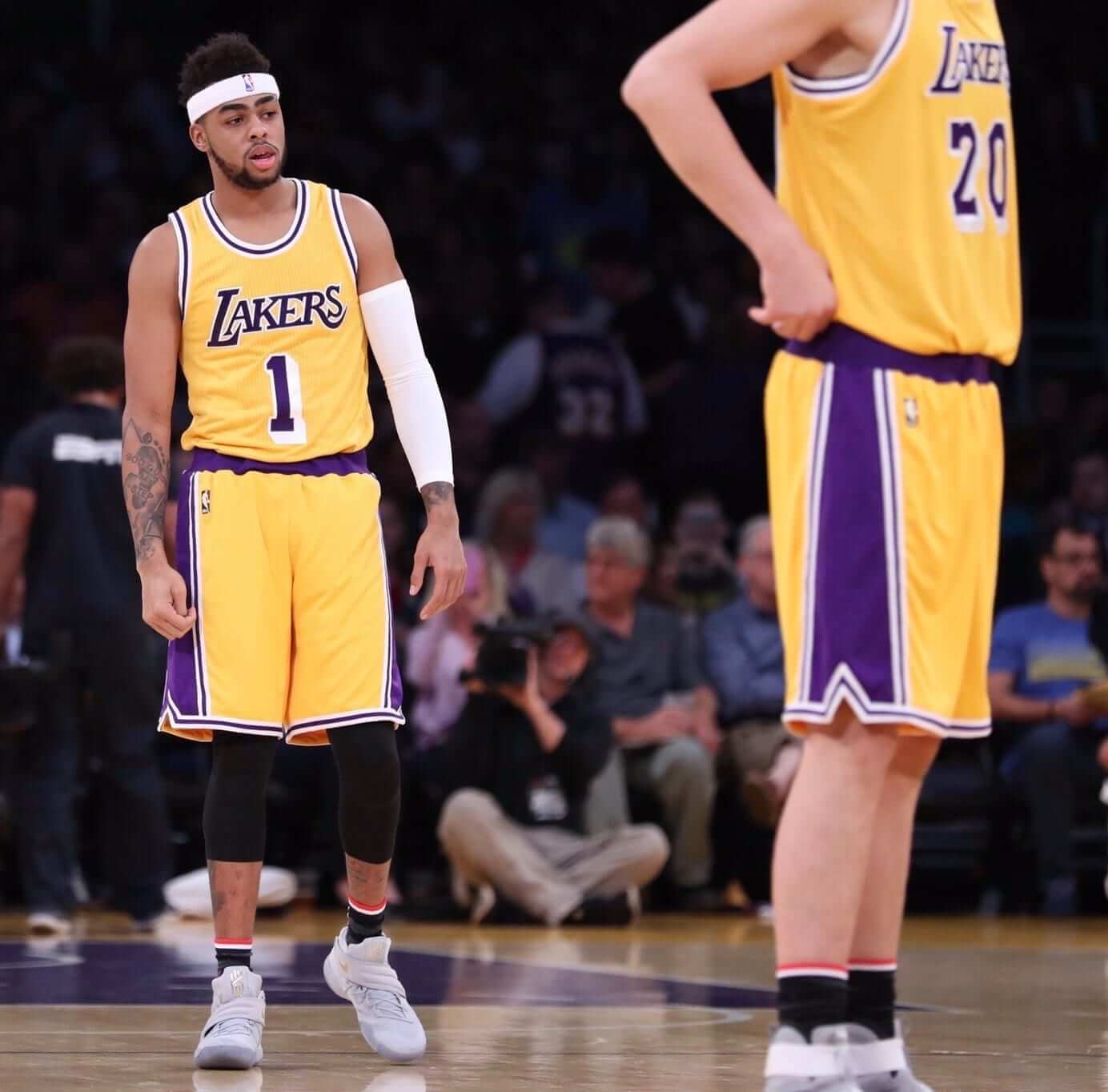
Click to enlarge
When it was announced that the Lakers would be wearing late-’80s throwbacks for last Friday night’s game against Golden State, several people felt obliged to quip, “Are they gonna wear the short shorts, too?” (As you can see above, the answer to that question turned out to be no.)
When people make jokes about the Lakers and short shorts, they’re referring to a 2007 game when the team wore 1980s throwbacks, complete with short shorts, against the Celtics. People ridiculed the Lakers at the time, saying that the shorts revealed a ridiculous amount of skin, and they’ve continued to ridicule them over the years. It’s become one of those moments that have been semi-canonized in NBA history, so even people who are only moderately uni-aware tend to know about it.
But here’s the thing: The issue in that game wasn’t actually the shorts. It was the socks.
First, let’s look at two photos — one of Magic Johnson and one of LeBron James, each with being guarded by an opposing player (click to enlarge):
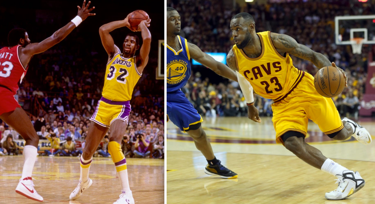
Obviously, the players in the photo on the left have much shorter shorts than the players in the photo on the right. But something else is different: Magic and the player guarding him wore high socks; LeBron and the player guarding him did not. As the shorts moved lower, the socks moved lower as well. The result is that the amount of leg exposure is actually pretty similar — it just moved from the thigh to the calf. (Granted, not every player wore high socks back in the day, but it was more the rule than the exception.)
Now let’s look at some photos from that 2007 Lakers throwback game with the short shorts (click to enlarge):
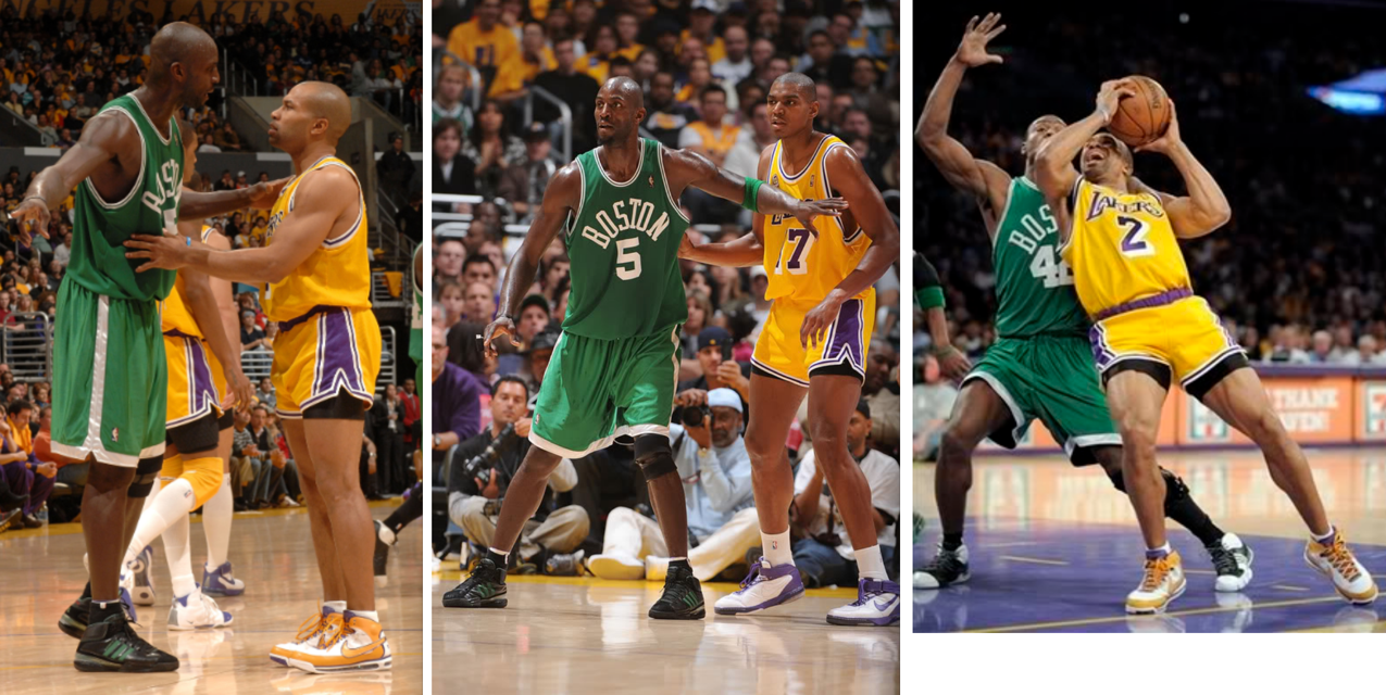
So yeah, they wore era-appropriate short shorts. But the real issue is that they didn’t wear era-appropriate high socks. The result was a lot more leg exposure — thigh and calf — and that’s what looked so odd.
People referencing this game always talk about the shorts, but that’s not the whole story. The real issue was the socks.
Election Day purple project: As you may have heard, some sort of election is taking place today. That means it’s time to revisit the phenomenon of TV reporters wearing purple.
For the uninitiated: The idea here is that the Democrats are blue and the Republicans are red, so mixing the two together yields the supposedly nonpartisan color of purple. Wearing purple becomes the reporter’s way of saying, “Just reporting the facts here. I’m not biased one way or the other.” (Yes, I realize many reporters are biased in one way or another, but that’s not the issue here. The issue is simply the phenomenon of TV reporters wearing purple on Election Day.)
If you’d like to help me document the extent of today’s purple-fest, here’s what you should do: First, if you spot any TV news reporter (local, national, broadcast, cable, public access, whatever) wearing a purple necktie, purple dress, or any other purple clothing or accessories, take a screen shot. Then either email the screen shot to me or, better yet, tweet the screen shot and use the hashtag #Nov8purple. (Please do not include @uniwatch in your tweet — just the hashtag.) Also, please include the name of the reporter and the TV station or network. Thanks.
Here are the screen shots people have posted so far:
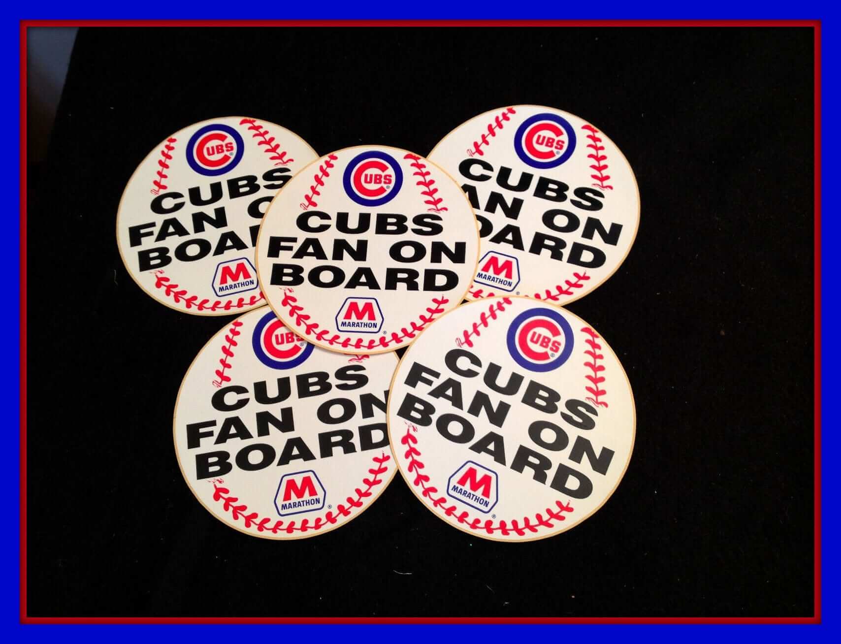
Well, the Cubs finally have their World Series championship. Congratulations to all their long-suffering fans! Let everyone know you’re a Cubs fan with one of these 1970s-issue “Cubs Fan on Board” stickers from your friends at Marathon Oil. Or get this inflatable Cubs beach ball, perfect for batting around the stands. And for you Cleveland fans, this Diamond Collection jacket from Starter is in excellent shape.
Now for the rest of the week:
• Clean up with ’dem Cowboys. This “Soap & Wash Set” is from Sears, 1982.
• Check this artwork on this 1970-1971 ABA season set of Volpe-designed Indiana Pacers thermal cups, also sponsored by Marathon. In fact, I’m using my “Cincy Powell” Volpe tumbler this very moment. I remember all these names vividly since they were always teeing it up with my Kentucky Colonels. This set does include the immortal Bob Netolicky.
• Here’s a nice-looking Green Bay Packers lamp from 1973.
• Did you know you can get NFL team patches for your Chuck Taylors? Here’s a set of Bengals patches.
• Three straight weeks for one of these: We’ve seen Indians and Tigers designs, and now we’ve got the Bronx Bombers on this 1970s poster.
• So many uni-specific details in this photo of Dandy Don Meredith, getting ready to take the snap from center Dave Manders (who I met at our local YMCA football banquet!). First, three stripes. Second, no chinstrap. Third, the star on the helmet was not yet in its final form, so this photo is between 1964-1966. The blue outline arrived in 1967.
• I’d be willing to wager that that’s Earl Morrall on the front of this 1969 NBC Pro Playoff board game.
• Staying with that same decade, how about this “Hail to the Chiefs” record, highlighting KC’s Super Bowl win over the Vikes. Of course, you’re gonna need a turntable. Kids, ask your parents.
Going, going…: This is the next-to-last day to order the Uni Watch T-Shirt Club’s latest design, which comes in three color options (grey, black, green) and is available here. Here’s the design:
Again, the shirt is available for ordeing here. My thanks, as always, for your consideration.
The Ticker
By Mike Chamernik

Baseball News: A Chicago history writer suggests that the Cubs should wear “World Champions” jerseys in 2017. The post contains previous examples of teams wearing unis that celebrate titles. … The Montgomery Biscuits held a hat design contest and you can vote for a winner (from @MDWDFW). … John Beckwith purchased this Red Sox jersey at a vintage clothing store in North Hollywood, Calif. “As a die hard Sox fan I was excited right away since this seemed extremely rare,” he says. “After a little research I believe this was actually a legit player jersey from the 1975 Sox team. All of the game worn Sox stuff from 1975 that I saw online is identical to this away jersey. I just can’t find any record of anyone who wore No. 52 for that year. Maybe it was minors?” Anyone know more? No coaches wore 52 in 1975, and no Red Sox players wore 52 in 1974 or ’76, either.

NFL News: The ’Skins teased a helmet with no center stripe and a gray facemask for this Sunday. The team wore burgundy throwbacks last year (from Tommy Turner). … NFL players, including several Raiders, wear Russell Athletic’s CarbonTek Padding System, which leaves an exposed Russell logo (from @RoParrish). … Thomas Dahmer is a fan of the helmets shown in Monday Night Football graphics. “How cool would that be for teams to have that option?” he says. “I’m not talking crazy thick but maybe 1/16th of an inch or so just to make them pop a little more like nose bumpers. That combined with a metallic sheen for some logos would give the teams an updated but traditional looks.”
College Football News: Oklahoma State RB Chris Carson wore a Black Lives Matter bracelet on Saturday (from @pistolsguy). … Maryland will wear all-red this Saturday (from Alex Elmore). … Texas Tech pressured a Colorado high school into changing its logo because it was too similar to Tech’s “TT” mark (from Glenn Chavez). … Virginia Tech is making a point to go “1-0” every week. The Hokies made T-shirts with the slogan (from Andrew Cosentino). … Field preparations are being made for the Northern Illinois-Toledo game at White Sox Park on Wednesday (from @datdamndj). … Stars and stripes helmets for Stony Brook this Saturday (from Alan Kreit). … Before the season, Northwestern’s Anthony Walker was chosen by his teammates to wear No. 1, an honor for a player who “truly embodies the values and character of the Northwestern football family.” In Saturday’s game against Wisconsin, however, he wore No. 11 to recognize teammate (and roommate) Matthew Harris, who retired recently due to a series of head injuries (thanks, Matthew Sampson). … UCLA will wear military-themed unis on Saturday (from Phil).

Hockey News: The new Las Vegas team will unveil its name and logo on Nov. 22 (from GKG_77). … North Stars vs. Seals games in the late 1960s featured a lot of green and gold (from Brian Codagnone). … Tyler Earles designed these Military Appreciation Night jerseys for the Knoxville Ice Bears. They will be worn on Friday. … The Capitals trademarked this logo in 2000. It was never used. Ken Chernoff saw the logo and touched it up a little (from Michael Alper). … The Blues’ Winter Classic jersey, which leaked late last week, will be officially unveiled tomorrow (from Phil).

NBA News: The Heat wore their military uniforms last night. Here’s the reverse view. The jerseys have the names of fallen service members from South Florida on them (from Phil and @sportslogosnet). … The Hawks have a new on-court projection for their pregame intros. Nothing will ever compare with the Bulls’ intros during their second title run. … A white teacher in Seattle went a little overboard with his Michael Jordan Halloween costume (from Chris Flinn).

College Hoops News: Michigan State will face Arizona in the Armed Forces Classic in Hawaii on Friday. The Spartans will wear black camo and the Wildcats will wear camo USS Arizona unis with “At ’Em Arizona” for the NOB (from Ryan Wardin and Derek Koltunovich). … Tennessee will bring back striped pants for pregame warmups this year (from Chad Fields, via Phil). … Here’s a look at Dayton’s uniforms from over the years (from Patrick O’Neill). … The Manhattan women’s team now wears Under Armour. The men’s team had already been wearing Under Armour last year. … New uniforms for San Diego. The “OJM” memorial patch is for Father Owen J. Mullen, the team and university chaplain, who died in October. … TCU’s new home jersey uses Nike’s “Frog Skin” print, which is also on the court (from Ivor van Esch). … A player on Chadron State wore his shorts backwards last night (from Brett Krajewski).

Grab Bag: New home kit for Germany for the 2017 Confederations Cup (from Stephen C.T. Wong). … New water taxis for Baltimore. The redesign was headed by Under Armour founder Kevin Plank, who wanted the vessels to have a historic flavor (from Andrew Cosentino). … No photos, but Whitman College, a small liberal-arts college in Walla Walla, Wash., changed its team name from the Missionaries to the Blues (from John Kimmerlein). … A Long Island high school volleyball team has some seriously ugly uniforms (from Paul Friedmann). … A company that creates logos using robotic software has raised more than $4 million. … Australia’s Northern Territory has a bold new tourism campaign. … Opie Taylor certainly wore lots of stripes in an episode of The Andy Griffith Show that Michael Bialas saw last night. … I voted yesterday. Instead of a sticker, I received a wristband.
Paul – The link to the Bulls intro put tears in my eyes…and I’m a Knicks fan.
When my wife and I were married in 1998, somehow, I (somehow) got her to agree to have the wedding party announced by the DJ with the same song (Sirius by Allan Parsons Project) in the same style. We were all announced with our “positions,” heights and college alma maters (exaggerated by 2 inches just like the pros). I was a 6 foot groom from Hofstra University. When I tell people that story, anyone who knows my wife calls me a liar. I still don’t know why she went along with it, other than it was one concession. The other 999 went her way.
Memories.
Nice story. Credit for the Bulls link goes to Mike (not me), who compiled today’s Ticker.
Credit to Mike, then. Thanks, Mike.
That’s tremendous! An awesome idea.
I’ve always hated the Bulls but I get goosebumps on goosebumps hearing “Sirius” and Ray Clay’s voice. “Aaaaaaaaaaaaand now! The starting lineup for your, CHICAGO BULLS!”
” A Long Island high school volleyball team has some seriously ugly uniforms ”
Yes. Yes they do. I’m not sure which version is more horrid.
Love the re-do of that Caps logo by Ken C. I see that as a future alt logo for them at the very least.
I wouldn’t mind seeing them do a throwback to the 97-07 unis when they were matching colors with the Wizards and Mystics.
If memory serves, Caps fans have a real aversion to the “swooping eagle” insignia. I thought it was nice (particularly the “Cassiopeia’s W” in the wing), but the problem seemed to be with the bird’s downward trajectory.
I might stop rooting for the Caps if they adopted that logo. The representation of the Capitol dome is dreadful. It’s like showing the Statue of Liberty without her torch. Also, trying to jam all 50 stars onto a flag at that scale is just bad design. It would be a fine logo for a high school, if a student had drawn it.
Maybe Brandiose should take a shot at it…
I can see it now…an angry-eyed Capitol using its muscular arms to snap a hockey stick in half.
agm, don’t forget the gritting teeth!
Interesting NPR piece on how the whole “Red/Republican, Blue/Democrat” thing got started in the first place.
link
Per baseball-reference(dot)com, the first instance of a Red Sox player wearing #52 was Jody Reed in 1987. Maybe it’s a spring training uniform?
That’s my guess. Also, it looks like the “5” has different sewing and is replacing some other digit.
Now here’s the surprise: no player wore 22, 32, or 42 for the Red Sox in 1975. I had been hoping to match one of those numbers up with the shirt’s size (44) to take a guess. Anyone know about coaches’ numbers for the Red Sox that year? Maybe one who would fit into a size 44 jersey?
I knew Whitman College alumni who swore their cheer was,”Missionaries! Missionaries! We’re on top!”
Your Whitman College alumni cheer jogged my memory. Thanks.
An old flying buddy of mine Jack Kelly, he being an M..I.T. / Hahvad type alumnus told me once that he used to attend basketball games at the ancient Briggs Center (Lavietes Pavilion now) and he and the crowd would serenade the visitors with this taunt, since cheering for a home team victory was a lost cause because, to quote Jack ” A degree is slightly more important than winning a game”. The cheer went something like this…
“It’s okay we’ll take this loss,
cuz someday soon will be your boss!”
p.s. My wife swears that when UNC played Norfolk State University in basketball (Jerdon era) the Tarheel fans would chant this…(it has to be chanted in a deep southern drawl to draw out the flavor of the discourse.
“We don’t smoke,
We don’t drink,
Norfolk, Norfolk.”
P.S. My all time favorite alumni cheer/chant story comes from an old pal of mine whose wife was a cheerleader at Oregon State. Their cheer was elegant and very to the point.
“Nobody licks our Beavers!”
(apologies to all the kids out there)
A similar cheer heard in the same scenario was: “That’s alright, that’s ok, they’re gonna work for us someday!”
I’m wearing purple today, but I’m not a reporter. Does that count?
(I didn’t know about this)
Re: USS Arizona uniforms
So instead of going battleship gray and using the navy number font, they decided to use a camo pattern that didn’t exist in 1941. When I look at the uniform, the phrase
“deeds, not words.” comes to mind.
A “lead gray” with white letters/numbers outlined in black would be nice looking.
In re: Dahmer’s suggestion about NFL helmets — my personal preference is against shiny. Of course, I’m probably the one guy that actually likes the leather/tan pants in the throwbacks. I tend to like uniforms that are low frills, functional and workmanlike.
Which of course means that the current Browns had me on the verge of a Charlton Heston-esque “You Blew It Up!”
That leaves me wondering what’s the plainest uniform left in professional sports? Celtics?
I also love tan pants in a uniform. To me, having neutral colored items make the bright team colors stand out more on the other elements. In addition, when you dress yourself, you would likely not choose to wear yellow pants with your burgundy shirt. You’d probably go with tan or grey, or even white. Why should a football uniform be any different?
As far as plain uniforms go, the Celtics are up there, maybe the Colts, Red Wings/Maple Leafs, and Dodgers if you want one from each sport?
You left out the Evil Empire (baseball)
I thought about it, but the Dodgers’ lack of trim on both uniforms (including typography) was the deciding factor for me. The Yankees’ pinstripes and their white trimmed road uniform are both “less plain” than the Dodgers’ uniforms, in my opinion.
I think the “plainest” MLB uniform is the Tigers’ home uniform, but their over-designed road uniform disqualified them from contention here.
You’d be hard-pressed to find a plainer uniform than the Yankees’. But since it’s done well, people tend not to notice.
I definitely agree in re: the Yankees’ roads. The home pinstripes seem to muddle the plainness a bit. I like the SF Giants home and the Tigers for that reason. I also like the NY Giants home, but I prefer the grey pants to the white they’ve been sporting recently.
“… when you dress yourself, you would likely not choose to wear yellow pants with your burgundy shirt. You’d probably go with tan or grey, or even white. Why should a football uniform be any different?”
~~~
Unlike the fashion world (in which the sports-uni complex is becoming increasingly more entangled), uniforms are designed to visually separate two teams as easily as possible, and all 9, 11, 5, 6 etc. players on the field, ice, court, pitch, etc. must be instantly recognizable to the fans, viewers, coaches, and most importantly — to each other. Color contrast, therefore, is very important (maybe not so much in baseball as the other sports, which is why white vs. gray works, but still, it’s important). In the business/fashion world, you are free to dress in a blue blazer and khakis or a blue suit, but also to bust out a crazy suit or sportscoat, shirt or tie. You’re not a team (per se) whose other members need to instantly recognize your presence at a glance. And members of a different office (team) might dress similarly to you and it matters not. This would be unacceptable in sports.
tl;dr version: it’s not a valid comparison between a football throwback and business (tho I get your point).
On a slightly different note — there’s nothing wrong with tan or gray pants, per se, on a uniform — but the reason for wearing them should be because they’re historically accurate (or team colors, like NYG technically are), not because your team should dress like “you” do to the office.
If that’s the function of team-colored pants, and if that’s the logic that dicates why football pants are team-colored, then they should make either the Steelers or Packers change pants when they play each other, as they should with all the teams who wear white pants when playing against each other.
I’m not trying to get sports teams to wear business attire out there, or to look less like a team, or to look more like their opponents. I simply think tan pants look better on a person than team-colored pants sometimes.
If two teams can play against each other wearing white pants, or yellow pants, or heck, black pants, silver pants or any color pants, then they can play each other wearing tan pants and suffer no loss of functionality.
This part of the discussion reminds me of when I was a kid and playing Khoury league baseball. We couldn’t afford baseball pants, so everyone wore jeans.
In addition, when you dress yourself, you would likely not choose to wear yellow pants with your burgundy shirt. You’d probably go with tan or grey, or even white. Why should a football uniform be any different?
Because it’s a sports uniform, not a suit. Sports uniforms would be *really* boring if they had to conform to the standards of professional business attire.
Totally agree. Packers have awesome tan pants when they go throwback Navy. Niners in white look great with tan pants. Giants looked a lot better with gray pants instead of the white they went to this year. Tan, gray, and silver are money. They all create contrast for both the home and away jerseys, and allow for nearly any helmet color to work.
I’ve worn my yellow/gold shirt with burgundy pants, or with
navy pants. I’ve worn yellow/gold or orange shirts with brown pants. I do take a number of cues in my everyday wear from sports teams.
The (Golden) Seals vs. North Stars game had to be from 1970-73. That was the lifespan of the green and gold Golden Seals unis.
The problem with the short short wasn’t as much the high socks as it was the baggy jerseys. With how much extra fabric they had hanging over the short and body it really made them look much worse.
With the real 80’s Lakers you could always see the thick purple waist band. It really breaks it up.
Small slip: “Obviously, the players in the photo on the left have much shorter shorts than the players in the photo on the left.”
Thanks. Fixed.
I’m not against tradition, but I also enjoy when teams with tradition update their looks with minor improvements. In this day and age with the NFL restriction on one helmet, it’s hard to get excited about teams doing something different with their helmets. Then you end up with the uniforms with a classic look only to have a helmet that looks out of place like with green bay, Washington, and Chicago(throwbacks). I’m not saying that they all need to change them permanently to a thick logo, but to use them with a modern color rash Jersey, or in special use would be fun.
I’ve always been of a mind that people like a new spin on an old favorite. Tradition and change can and do work in harmony.
The Chicago Bulls still do the intros the same way to this day but they lack the energy and enthusiasm of former Public Address Announcer Ray Clay. He was let go shortly after he wanted to announce Michael Jordan the same way when he came back as a Wizard.
Clay was too over the top. The current announcer (who was also Clay’s predecessor) is longtime Chicago radio DJ Tommy Edwards. Edwards was responsible for introducing “Sirius” to the pregame intros.
The over top delivery made it exciting. Tommy Edwards presents it like he’s reading from a script for the first time.
The “over top” reading was way too excessive. There’s something to be said for a bit of restraint.
My biggest example of a great update is Notre Dame with their helmets. At first when I heard what they were trying to do, I was against it, but now they have a look that made their look even more iconic.
Another reason why the Lakers’ shorts look weird: Basketball players were skinnier, more wiry back in the day. Big bulky dudes in short shorts looks out of place in basketball.
Sure, I think some combination of bigger dudes and the short shorts being paired with bulkier less form-fitting jerseys is a big factor too.
^ this.
The 2007 jerseys were too pajama-y. But good call on the socks being the cause of the short-shorts being so noticeably short (and weird).
Funny: MJ had this shorts lengthened, yet he pulls it up in this photo against the Lakers’ Michael “Coop 21” Cooper (sporting short shorts, of course).
link
Bronx Bombers 1970’s poster give us an idea of what the Yankees would look like trimmed in Dodger blue.
Three straight weeks for one of these: We’ve seen Indians and Tigers designs, and now we’ve got link.
What’s really cool about this is that it shows the original Yankee Stadium Frieze in its copper-green glory.
As to the NBC Pro Playoff game, I’m willing to wager that’s the Boston Patriot’s Vito “Babe” Parilli, not Earl Morrall, about to toss a pass against the Jets. I’m gleaning from the Pro-Football-Reference website that Parilli and Morrall wore no. 15 and never wore no. 16. However, according to the Gridiron Uniforms website, the font style would be from 1964-1965 (possibly pre-season 1966). Other evidence is the AFL-outfitted referee in the background of the cover photo, the fact that NBC broadcast AFL games, plus one leg of Pat Patriot appears to be visible on the blocking lineman’s helmet indicates to me that it’s Parilli. According to Pro-Football-Reference, the leaping no. 73 of the Jets might be Mitch Dudek, a backup defensive tackle.
Great stuff as always!
I thought it might be Parilli, it just looked facially a lot like Earl.
#Nov8RedWhiteBlue
I chose to wear a R/W/B shirt today to show the election is about the country, not about either candidate.
Similar – Blue/white striped shirt with red tie. I often wear a tie, but almost never a red one.
Re: the Sox jersey, as a local to North Hollywood, there’s always the chance that the local thrift store find is from a movie or TV commercial.
“this inflatable Cubs beach ball, perfect for batting around the stands.”
Until Security gets hold of the thing, and confiscates it. Or worse.
Here’s a non-answer to the Red Sox 52 jersey mystery. The ebay listing links to a 1975 Spring Training program. Every number from 14 to 54 has a player listed next to it – except 52. Only number 9 was retired and 13 wasn’t issued for almost 50 years. My curiosity has been piqued and hope to find the answer in a 1975 Media Guide, which may (or may not) solve it.
link
You might need the 1976 Media Guide to solve it. It looks to me like the 5 is slightly different in color and not sewn on entirely straight…the jersey may have gone down to the minors and had a number change. Are there any signs of a different number sewn on?