Click to enlarge
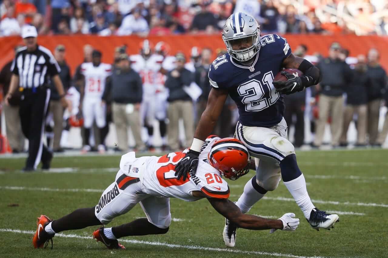
Rare sight yesterday in Cleveland, as the Browns wore white at home, which forced the Cowboys into giving us a look at their seldom-worn blue jerseys and light-silver pants. Lots of additional photos here.
In other news from around the league yesterday:
• Interesting-looking game in San Diego, as the Chargers wore their powder blue alternate jerseys and Titans wore powder blue pants, so the two teams were essentially wearing inverse versions of each other’s uniforms (similar to what we saw from the Bengals/Browns game two weeks ago). Additional photos here.
• Giants wideout Odell Beckham Jr. had an odd sock configuation. (And yes, he also had some custom shoes. You can get a closer look at them, and at a lot of yesterday’s other custom cleats, here.)
• Another player with unusual hosiery: 49ers running back DuJuan Harris.
• I think we may have seen this before, but the Ravens used upside-down “3”s for their 30 yard line markers.
• G.I. Joevember began in earnest, with lots of camouflage towels, caps, captaincy patches, cheerleaders, goalpost pads, and a lot more.
• In addition, some teams (or maybe all of them..?) added helmet decals for armed service divisions, and the Rams went further by having each player wear a memorial decal with the initials of a fallen service member. The Chiefs did something similar, having players wear pregame sweatshirts with the names of fallen service members.
• In a related item, Colts backup quarterback Scott Tolzien camo-brimmed sideline cap had an upside-down American flag.
• Aside from the aforementioned Browns, only one team wore white at home: the Rams.
• Speaking of the Rams, a fan attending their game wore this spectacular crocheted Rams hat, which I’m told was made for him by his mother.
• Players participating in postgame jersey exchanges included Ezekiel Elliott (Cowboys) and Corey Coleman (Browns); Antony Hitchens (Cowboys) and Christian Kirksey (Browns); Damien Wilson (Cowboys) and Briean Boddy-Calhoun (Browns); Mark Barron (Rams) and Leonard Johnson (Panthers); Todd Gurley (Rams) and Devin Funchess (Panthers); and Albert Wilson (Chiefs) and Marquise Lee (Jags).
• Here’s a list of players who protested during the national anthem. One notable exception from that list: Broncos lineback Brandon Marshall, who stood for the first time this season.
(My thanks to all contributors, including Andrew Cosentino, Lenny Vangilder, Tris Wykes, and our own Phil Hecken, Brinke Guthrie and Alex Hider.)
Click to enlarge
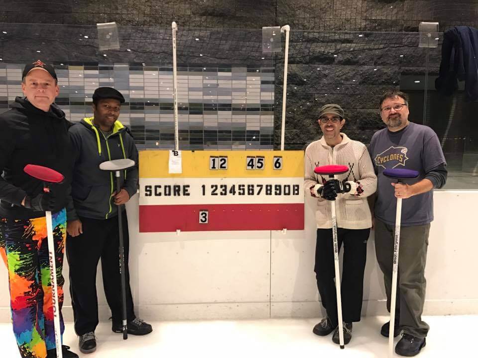
Long national nightmare finally over: Felt so good to be curling again last night. I wasn’t able to participate last year because of my broken arm, so I was worried that I might be seriously rusty. But it turns out it’s like riding a bike. And my squad recorded a “W,” too.
That’s our team shown above (from left): Phil, Omoy, yours truly, and Doug. To the uninitiated, it probably looks like we won by a score of 6-3, but curling scoreboards follow an odd format — we actually won 9-1. Not too shabby!
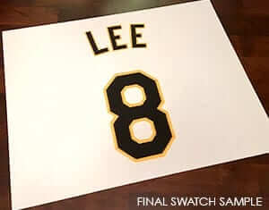
Uni Watch recommends: Two of Uni Watch’s favorite people — Game-Worn Jersey Guide guru Bill Henderson and former Orioles stitcher Joe Hilseberg — are joining forces for a new project. The short version is that they can put your name and chosen number, executed in your favorite MLB team’s colors and fonts, on a 16″ by 20″ piece of doubleknit jersey fabric that’s suitable for framing. You can get the full story here.

’Skins Watch (which was supposed to run last Friday but got lost in the shuffle): As recently as five years ago, I had not yet decided to oppose the use of Native American imagery by sports teams. (I eventually came to that position, and explained how I got there, in this 2012 post.) So in 2011 I thought it was pretty cool that I found a vintage varsity jacket from Lane Tech High School in Chicago, complete with a Native chief on the back. Later that year I thought it was even cooler when I found this vintage Lane Tech varsity sweater. Not something I’m proud of. Both items have been stowed away and I’ll never wear them again. I mention all of this because the Lane Tech student newspaper has announced that it will no longer use Native imagery in its logo. Good for them (thanks, Mike). … England’s oldest hockey team, the Streatham Redskins, is changing its name to the Redhawks. Key passage: “The club said it was facing no pressure from any outside source to change their name, but rather were choosing to make the switch as ‘a progressive and forward looking team who want to attract new supporters, encourage more local kids to join our junior club and create a positive image for ice hockey within our great city'” (from Rob Yasinsac). … Here’s an article on the guy, now 87 years old, who created Chief Wahoo. … A new TV ad supporting Republican presidential candidate Donald Trump aims to appeal to voters by saying his Democratic rival, Hillary Clinton, wants to change the ’Skins name.


Click to enlarge
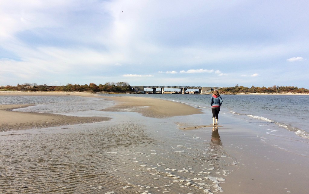
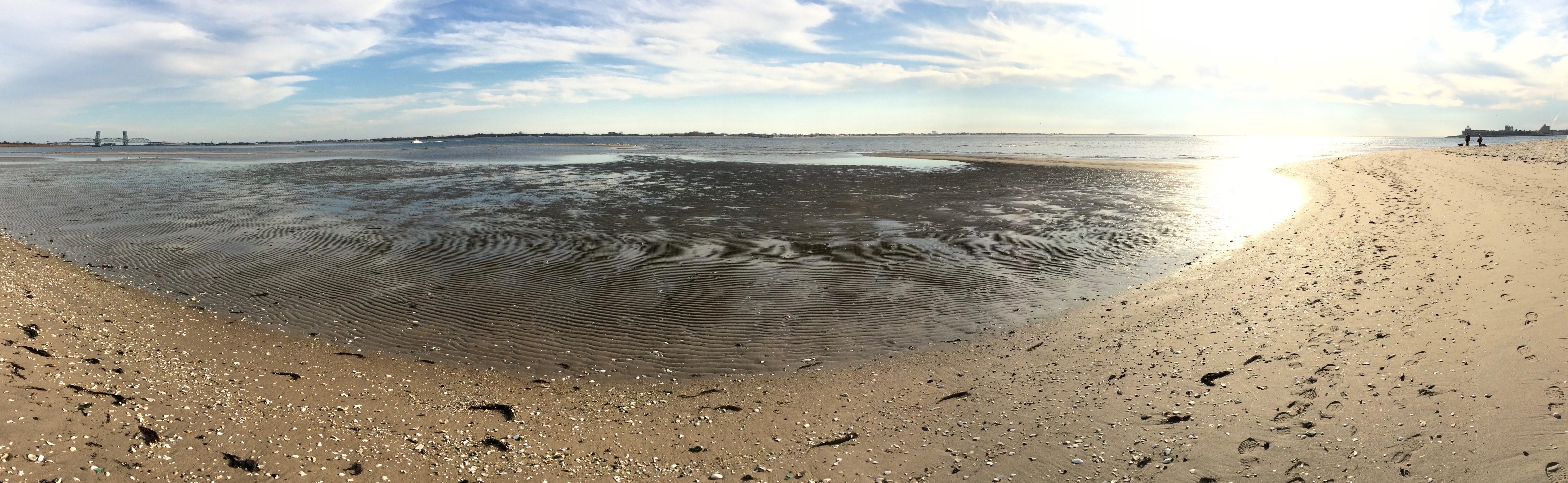
Best Summer Ever, continued: Pretty sure I’ve never walked in New York City surf in November before, but that’s what the Tugboat Captain and I did on Saturday, as we continued to refuse to accept the end of summer.
Our location this time was Plumb Beach, a medium-sized stretch of sand on Jamaica Bay that I’d never visited before. It was low tide, which among other things meant that we were able to walk out on a long sand bar, which felt like our own little private island:
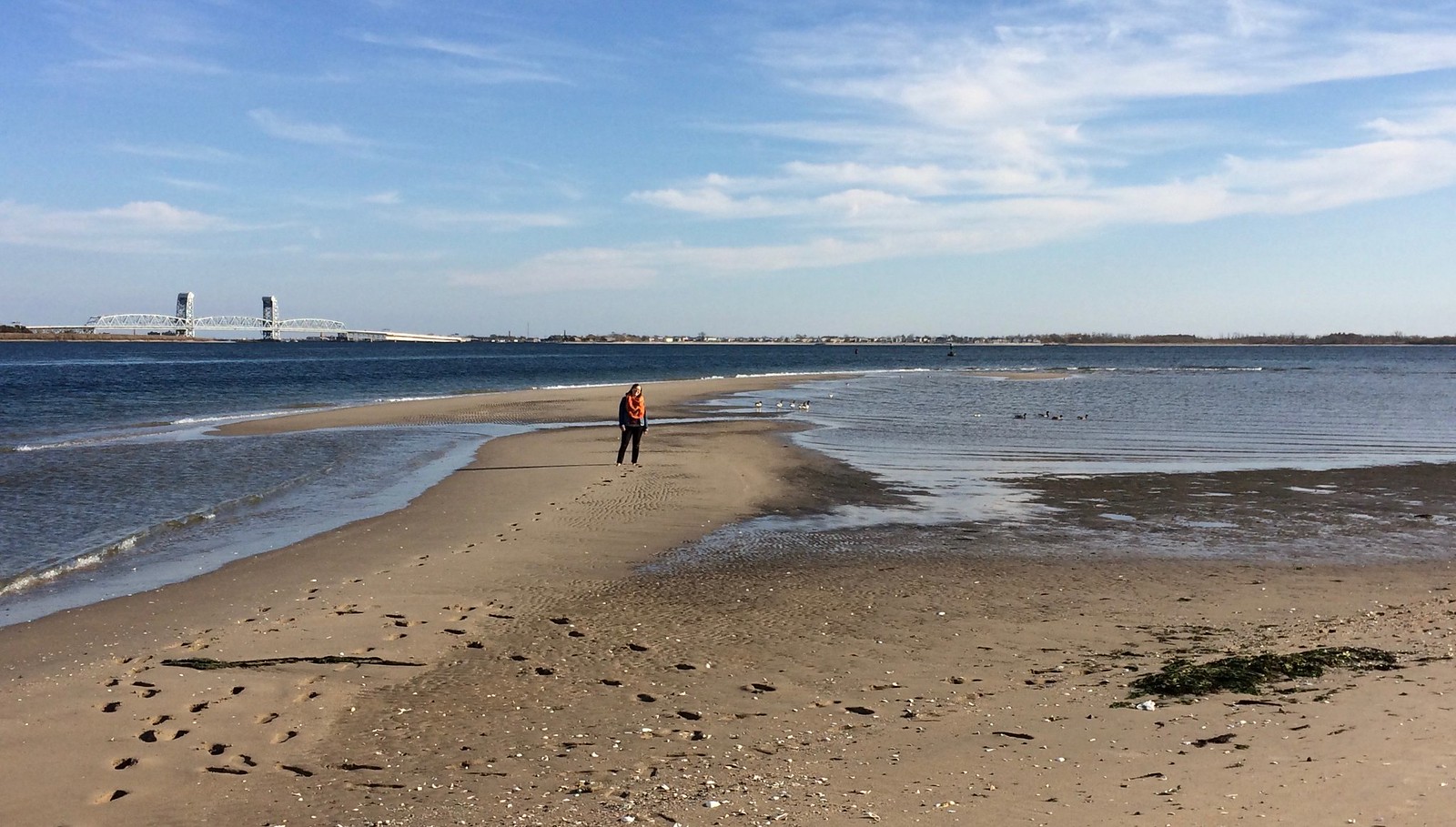
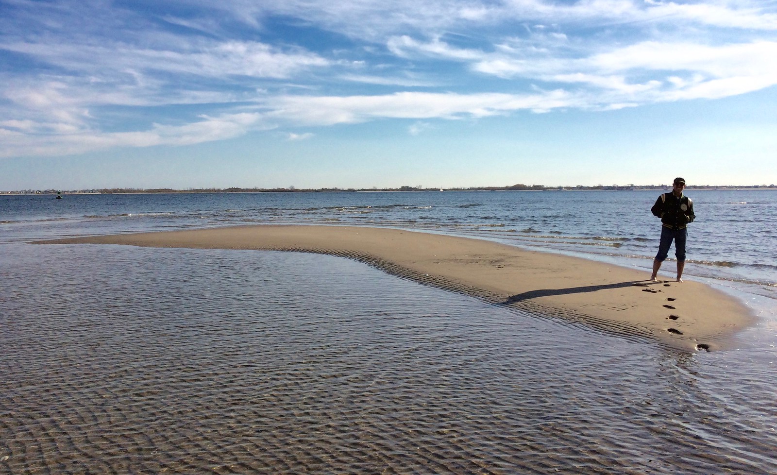
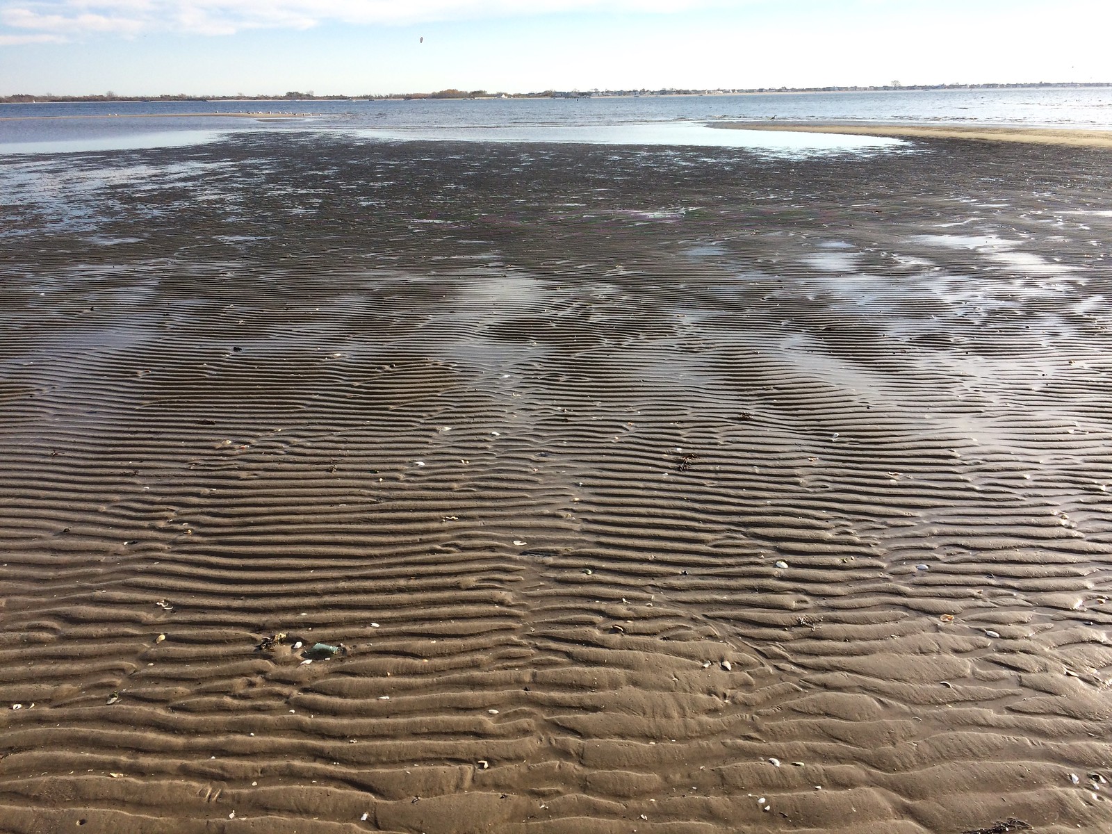
One odd and beautiful thing about Plumb Beach is that the sand in the water — and in the mud flats where the tide had receded — was ridged. I have no idea what makes that happen on some beaches and not others, but I really liked it:


It’s hard to express what a completely perfect afternoon it was. However you spent your Saturday, I hope it was just as good.
We’re going away next weekend and will be in the Delaware/Maryland region, so we may squeeze in one more walk in the surf, weather permitting.
Buy all our stuff already: As you may be aware, the Uni Watch T-Shirt Club’s football-based design (shown at right; click to enlarge) is now available for ordering. It’s being offered in three colors — grey, black, and green.
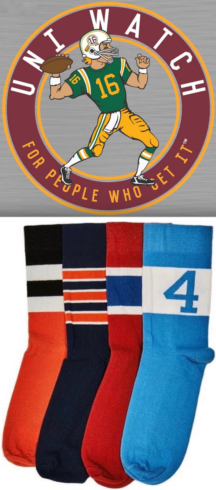
Also, the second batch of StripeRite socks, which takes inspiration from each of the four major sports, is available for pre-ordering. The socks will begin shipping on Nov. 21.
My thanks, as always, for your consideration.
Gift Guide reminder: I am very much in the market for cool items to include in this year’s Uni Watch Holiday Gift Guide. If you have any suggestions, please send them this-a-way. Thanks.
The Ticker
By Alex Hider

Baseball News: New Era logo creep appeared on the caps at the “Fall Stars” game on Saturday (from Niko G.). … Speaking of, no photo but David O’Donnell reports that the New Era logo was red on the Red Sox caps yesterday. The logo was white during the postseason. … Remember when teams got World Series pocket watches instead of rings? (From BSmile). … Lots of similarities between the Rockies logo and congresswoman Morgan Caroll’s campaign logo (from Lee Wilds).
College Football News: Reader Stephen Ceruolo saw a fan wearing a shirt with this Jumpman/Jim Harbaugh hybrid logo on Saturday. … Marshall will wear throwback helmets and a “75” decal to honor the 45th anniversary of the deadly plane crash that killed 75 football players and staff next Saturday (from C Dubya).

Hockey News: The Senators wore special decals Saturday in solidarity with Craig Anderson’s wife. She was diagnosed with cancer last month. … The Blackhawks honored the Cubs with an on-ice light show on Sunday (from Mike Chamernik). … New jersey for Oswego State. It contains the name of every player in the program for the last 52 years (from Ryan O’Donnell). … The Stars shared this image of an old Dallas Texans jersey on the 75th anniversary of the first pro game played in the city (from Ryan Short). … Check out the awesome NHL jacket this kid is wearing in this 1965 photo in the Toronto Telegraph (from Will Scheibler).

Basketball News: The Greensboro Swarm — that’s a D-League team — have a new mascot (from James Gilbert). … New uniforms for the South Carolina Gamecocks women’s basketball team (from WC). … When the Lakers wore their 1980s throwbacks on Friday night, the jerseys didn’t have the gold championship tab on the back. Is that standard for NBA throwbacks?

Grab Bag: Here’s what the top contenders wore yesterday at the New York City Marathon (from Chris Lotsbom). … Speaking of the marathon, here’s what it cost one guy to run in it.
Proofreading: “here’s what it cost on guy to run in it.”
Fixed.
I would so much rather have a pocket watch than a ring for winning the World Series. Or any championship, really. Especially one with a mechanical movement. There’s even more surface area for engraving and decor and whatnot, and it’s a functional thing. It would be less cool as a wristwatch, but a wristwatch would be something an athlete could wear, such as on TV after his career, and not look like something of a narcicist for wearing.
Are the Ravens “3”s upside-down, or inverted? Inverted and rotated? I’m sure someone knows.
I like that the Raiders have a very unique font for their yard numbers.
You have so many teams with custom fonts on their jerseys and in their end zones that use generic stencils for their yard markers.
As a math teacher, I would say it is reflected around the x axis. An upside down 3 would look like an E
On the beach: I’ve reached out to a geologist friend, since it’s a really interesting question. In my experience, that happens on every sandy beach, but you usually only see those regular ripples in the sand when you get past the break of any wave action. So I suspect that either/or it has to do with the size of the sand grains at that beach and the typical amplitude of the waves. I’d bet that finer-grained sand, worked by gently lapping water on a sheltered beach, would make for visible ripples on shore, whereas coarser sand on a beach exposed to ocean waves would only have the ripples some yards out in deeper water.
Re: gold championship tab on throwback jerseys
The tab was absent from the 76ers 1966-67 jerseys from Saturday’s game.
The Rams helmet with the initials of a fallen service member looks like it has the yellow horns (throwback), but the Rams wore gold horns yesterday. Maybe that helmet is for another week in G.I. Joevember?
Here’s some video of Michael Kopech pitching yesterday. The NE logo on his cap definitely isn’t white.
link
I’m sure this has been noted before, but the annoying thing about the Cowboys’ blue jersey is not so much that it doesn’t look okay, but that instead of being an inverse version of their white jersey, it’s a completely different design – different number fonts, different sleeve stripes, star logo.
It might be an interesting feature to do here a history of other such NFL jerseys. I can’t think of any currently, but I recall that the classic Vikings jerseys from the 60’s through the 80’s were like this…sleeve stripes on the home, UCLA stripes on the white. Any others?
Giants’ blue and white jerseys have different designs.
The Giants – sleeve stripes on the road, nothing at home. The Bears – different sleeve stripe patterns. The 74-99 Rams – colored sleeves on the white jerseys, not the blue ones. The 2000’s Bills with the white jersey having freakin royal blue numbers and being an even bigger mismatched mess than the Cowboys… The 70s-90s Cardinals – sleeve stripes on the white jerseys, not the red ones.
There’s probably a few others.
I know this gets talked about a lot, but I’d love for their white jerseys to have navy stripes and numbers. That would match the helmet. I don’t like the royal blue. I can’t stand the green/silver pants they wear with the white jerseys. I love the pants they wear with the navy jerseys. I also don’t like the idea that the jersey don’t match. Can’t they get it right?
Annoying? To me that’s my favorite uniform “quirk” the Cowboys have, and believe me, they have plenty. All of their jersey designs are different, which makes seeing them in a different uni and collecting their jerseys awesome. I wish more teams would do that. Just don’t get me started on the green pants.
I don’t have an issue with the design being different, just the color. I believe in the 1960s their blue uniform was the same color as the royal blue numbers on their white uniform, but changed it because they lost almost every time they wore the blue.
Can’t wait to see them in the Navy jerseys vs. Skins on Thanksgiving, who should be in white tops and burgundy pants. Imo that will be the best looking NFL game all year. Also hope Dallas pairs the color rash jersey with silver pants and navy socks and wears it twice a year as the alternate next year and going forward. It would be a good way to change things up for fans and still wear white at home.
Question Paul, does the NFL consider the Cowboys blue jerseys their home uniform, or is the white both home and away? I’m wondering if the alternate jersey rule applies to the blue jerseys.
There are no designated home or road jerseys in the NFL. The home team chooses white or color, and the road team wears the opposite (except on Thursday nights, but let’s not get into that).
As a Cowboy fan who lives in North Texas, I understand what everyone is saying. It SHOULD bother me too. But it doesn’t. I remember I got a Starting Line up of Emmit and the pants matched the helmet. I didn’t like it. At all. It looked like Detroit.
Also on Madden 12 or 13 there is a white jersey with navy numbers. So I’d use that with the away pants. Another no go. Just wasn’t right. I can’t explain it. Little things with uniforms drive me nuts. Like a white helmet with dark tops and pants. (Titans) Looks high school. Or pants, jersey helmet different colors at home. ( Ravens, Broncos, etc) Doesn’t bug me away( Steelers, Giants). I don’t know if it’s because it’s my team or because it’s the Cowboys. I think the latter. I hated the Stars old sweaters. The Rangers when they had black and drop shadows.
I wish they would go back to the number on the side of the pants from the Danny White era and the serif numbers though.
You’ll have to specify on the Stars, as since they came down I-35 from Minnesota they’ve had three different designs prior to their current uniforms (not counting the Mooterus third jersey, but then again, who actually liked that thing anyway?).
he plain ones that just had Dallas. What would you call that? Mike Riberio era? The one they went to after the Cup era style.
My main issue with Mooterus was it had red and red is clearly not one of our colors.
The plain ones. Not he.
Figured as much, but I just wanted to be sure.
I’m sure this has been noted before, but the annoying thing about the Cowboys’ blue jersey is not so much that it doesn’t look okay, but that instead of being an inverse version of their white jersey, it’s a completely different design — different number fonts, different sleeve stripes, star logo.
I don’t think that’s annoying at all.
I think the Packers’ road jerseys suffered greatly when they went from link to link.
Not every design looks good when you click-and-colorfill. The balance is often tied to the individual colors, and doesn’t work when you swap them out. The Mariners’ 40th Anniversary patch link when you swap out the color scheme. Everything that works in the original goes out of whack with that bright golden sky.
Rams 60s, maybe early 70s, Fearsome Foursome period. White, which were worn at home, had the shoulder stripe similar like the shoulder stripe that USC has. The royal blue jerseys, which they rarely wore, had stripes on the bottom of the sleeve.
New uniforms for the South Carolina Gamecocks women’s basketball team (from WC).
Why aren’t they called the Gamehens?
I always wanted a college that uses “Cardinals” or “Lady Cardinals” (Louisville, Ball State, Lamar, etc.) to wear brown uniforms, or at least a brown logo or brown trim.
My son and I attended the Arizona Fall League Fall Stars game on Saturday, and the caps the players and coaches wore were New Era flex-fits. They weren’t new fitted caps with the New Era logo on the side panel. They were the same flex-fits that have been sold all year (notice that they were all pre-curved), and New Era flex-fits always have the New Era logo on the side.
Missed that the Dolphins wore their teal tops at home yesterday against the Jets
Caleb Sturgis, Eagles kicker, sports some of the more outlandish knee displays in the NFL.
link
Lee
“Long Island” Phil looking like the John Daly of curling.
The background of that picture of a Rams fan in a crocheted hat makes it look like a giant inferno was raging outside the Coliseum.
LOL — funny you say that, as I actually follow Loudmouth Golf on Twitter (and those pants were a gift from them), so my “ads” sometimes include ones from Loudmouth, as was the case this morning. Interesting juxtaposition/pants selection today.
No excuse for the Uni Watching curling contingent not to be wearing baseball stirrups! Super-comfortable on the ice: You get two thick layers of socks around your thighs for maximum warmth near the ice, but only one layer of socks inside the shoe where you want a close fit for stability. I’ve found knickers and stirrups/sanis much more comfortable for curling than the stretchy fleece-lined pants and wool socks I would otherwise wear. When I switched from pants to stirrups last winter, I’m pretty sure I was the only one at my club. In just the first week this season, I’ve seen three other guys rocking knickers and tall socks.
Always fighting the good fight, Scott…
I’ve curled in rups many a-time, but not yesterday, and it was also about 50 degrees (remember, we curl on a outdoor, though covered, rink). I was pretty much sweating in my hoodie. Rups would have been tooooooo warm.
And when wearing loud pants, I’m not aboot to add even more garishness by rupping/cuffing/knickering. If I do wear rups later this season, they will be covered by my pants (though exposed when I shoot, o’course).
I switched to ‘rups in part because they’re cooler than the fleece-lined winter pants I would otherwise wear. But I also switched to knickers. Which link, though I picked up a couple of pair of solid-color knickers on closeout from link. I can see how ‘rups layered over full-length pants would get hot!
Our club keeps the rink air temps somewhere in the 40s. Funny thing is that when I curl a game, I usually have to shed layers down to my t-shirt on top to avoid overheating by the third end. But if I stick around and curl a second game as a sub, I typically have to keep my sweater and vest on the whole game to stay warm.
“Cooler” is not quite right. The stirrups are warmer than lined pants at the calf, but cooler at the thigh, so just a better balance for me. I also tend to run cold generally.
Do you think that the Colt’s upside-down flag was an honest error, or was the player protesting the current election, indicating that he feel’s we are “in distress” because of what’s happening tomorrow? (A flag flown upside down is the official indication of distress.)
link
There is no way to know, and it’s counterproductive to speculate on a matter that would involve ascribing political motives to someone whose politics are completely unknown to us. Let’s please move on. Thanks.
Without commenting on the event in question, an upside-down flag is not a sign of merely political disapproval or moral distress. It is a sign of immediate physical danger such that you or someone nearby requires rescuing right now. If a person is not about to die or suffer grievous injury without the immediate arrival of a cop, an ambulance, or a National Guard helicopter, then an upside-down flag is a disrespectful violation of flag etiquette.
From 4 U.S. Code § 8:
“The flag should never be displayed with the union down, except as a signal of dire distress in instances of extreme danger to life or property.”
I attended the local college womens’ basketball game Saturday night and sat next to a Native American middle-aged gentleman, with a windbreaker identifying him as an employee at the local Indian Colony. He was wearing a well-worn Chief Wahoo Indians baseball cap.
In addition to racing, I also collect game-used flip coins from various sports. While the NFL won’t allow advertising on uniforms, they have no trouble allowing them on toss coins.
link
Sunday you had San Diego in powder blue jerseys vs Tennessee in powder blue pants – that really weren’t the same powder blue. I kept trying to decide which powder blue was better.
That pro-Redskin commercial is NOT a Trump authorized ad. Do your homework.
Touché. Sloppy wording on my part. As clearly stated in the linked article, it was a third-party ad that supported Trump, not an ad by the Trump campaign. Thanks for setting me straight — I’ll adjust the wording now.
My name should be on that oswego jersey.
I played 1 game in 1 season there before the temptation of college took over.
I’ve never seen front jersey numbers right there on the bottom of the neck line before! I generally hate front numbers because it’s just too much clutter, but that’s the least bad spot I’ve seen if they have to be there.
Noticed the Ravens wore purple over black yesterday – a nod to their original dark uniform. Trouble with today’s version is unitard look (solid black pants and socks).
I miss when they used to wear the black pants with just the white stripe, paired with the purple jersey.
Something about that combo with the single white stripe gave it an enigmatic, cryptic look compared to usual NFL uniforms. Work well with the concept behind the team name.
Quoth the Raven, Nevermore.
link
Uniforms tonight were outstanding. The Seahawks in blue head to toe with green accents and the Bills in white head to toe with red and blue accents. Better than any color rash game we’ve seen on Thursday.
A question/ comment for uniwatch readers. I noticed in today’s article about the Chicago transit authority rolling out Cubs themed trains, the trains state World Champions. Why not World Series Champions?
Likewise, when the Cavs won the NBA title, posters and clothing merchandise referred to them as World Champions. And, when the Broncos won the Super Bowl there were references to them as World Champions.
However, the winner of the NHL never refers to themselves as World Champions – they are Stanley Cup winners.
Why does MLB, the NBA and the NFL refer to their winners as World Champions (when in fact it is not a true world championship they have won – like the World Cup of soccer for example) and why does the NHL not refer to their title winners as World Champions?
Does it matter? Does anyone care?