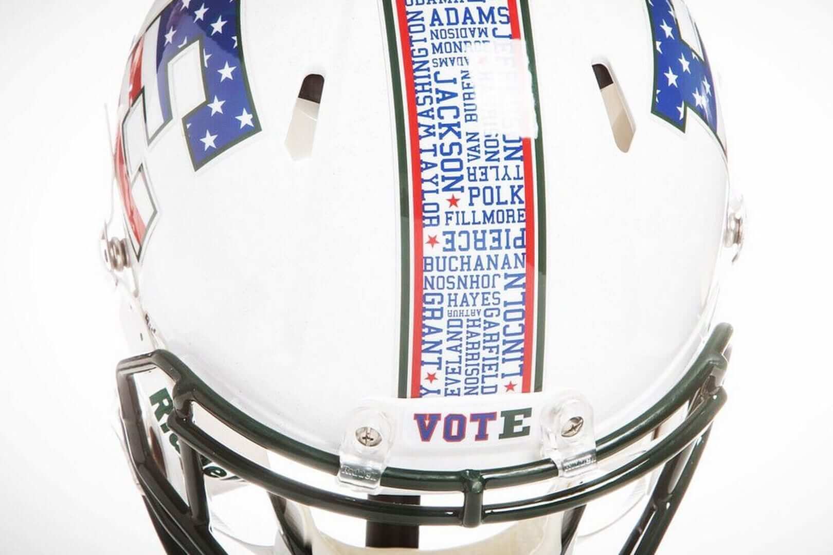
Click to enlarge
So this is pretty cool: Eastern Michigan will wear Election Night helmets, complete with the surnames of all 44 presidents and a “Vote” nose bumper, for next Tuesday’s nationally televised game against Ball State. Amidst all the stars/stripes uniform designs that conflate patriotism with either the military or “U! S! A!” jingoism, it’s nice to see one that simply promotes good civics. Well done.
Did any team do anything like this in 2012? If so, I can’t recall it. I do recall, however, that a few NBA players wore special sneakers on Election Night in 2008, with slogans like “Embrace Change, Vote ’08” and “Change Is Needed, Vote ’08.”
Getting back to Eastern Michigan, it’s a little odd that they’re sticking with their regular green facemask, but whatever. Additional photos and info here.
(My thanks to our own Alex Hider for letting me know about this one.)
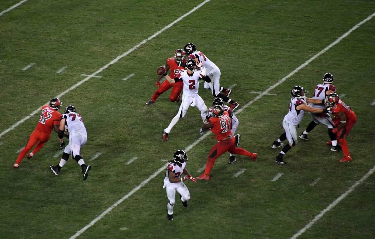
Click to enlarge
Meanwhile, in Tampa: The NFL’s latest Thursday-night game features the Bucs in mono-red and the Falcons wearing their usual white road uniforms. The weird thing, as you can see above, is that some of the Falcons wore plain white socks (which is how the Thursday-night look is supposed to work) while others wore their usual black-topped socks. Weird. Lots of additional photos here.
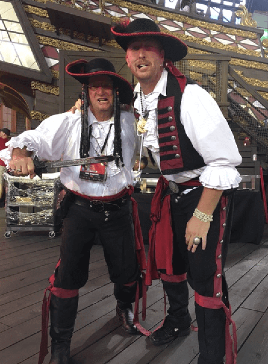
Also, you know that big pirate ship that the Bucs have in the north end zone? Reader Kevin Brown works on that ship as one of the pirates. “During the game we mostly toss out beads and T-shirts, take photos with fans, and spread good cheer with the crowd,” he says. “Our ‘uniforms’ all have a couple stock items like the pants and shirts, but they allow us to accessorize them like things like jewelry, belts and swords.” Here’s Kevin, on the right, with one of his co-workers:
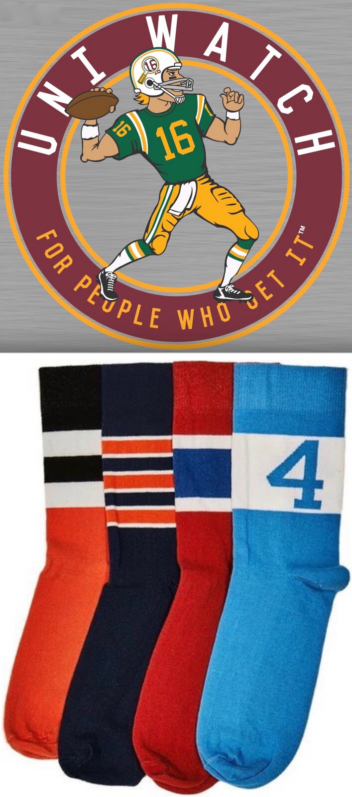
Buy all our stuff already: As you may be aware, the Uni Watch T-Shirt Club’s football-based design (shown at right; click to enlarge) is now available for ordering. It’s being offered in three colors — grey, black, and green.
Also, the second batch of StripeRite socks, which takes inspiration from each of the four major sports, is available for pre-ordering. The socks will begin shipping on Nov. 21.
My thanks, as always, for your consideration.
The Ticker
By Paul

Baseball News: The Double-A Binghamton Mets are now the Binghamton Rumble Ponies, complete with the obligatory rote Brandiose treatment. Sigh. The name and design refer to large concentration of carousels in the Binghamton area. Here are the new caps. … LeBron James lost a bet and will wear a Cubs uniform to the Cavs’ Dec. 2 game in Chicago (thanks, Brinke). … New 30th-season logo for the Charlotte Knights (from James Gilbert). … Cheap Trick has a pretty cool Cubs-themed shirt (from Jon Solomonson).

Football News: In case you missed it: The Browns will be going mono-white at home this Sunday, which means the Cowboys will be wearing their seldom-used blue jerseys. … Here’s what West Virginia will be wearing this weekend. … The high school attended by one of this week’s slain Iowa police officers is adding a memorial helmet decal in his honor. Further info here (from David Teigland). … In a related item, Iowa State added a helmet decal last night in support of the affected police departments. … Here’s a closer look at Duke’s new grey helmets (from Andrew Cosentino). … Here’s a new one, at least to me: UNC is giving away a shirt that shows football gloves (from James Gilbert). … Furman fans have voted on the team’s homecoming uniform (from Daniel Assey). … New military-rah-rah helmet for Cincinnati.

Hockey News: Here’s what the Blues and Blackhawks will be wearing for the Winter Classic. More on the Blues leak here. … When the Flyers wear their 50th-anniversary jerseys, their black helmet numbers turn gold, and the helmet logo gets gold trim (from John McMunn). … In a related item, the Flyers and Islanders went alternate vs. alternate last night (from Kristopher Sharpe). … BYU G Brandon Holt honors his deceased brother on his helmet’s backplate (thanks, Phil). … Election Night uniforms tonight for the Hunstville Havoc. Key passage: “The left leg of the uniform will have a picture of Hillary Clinton and the right leg will feature Donald Trump.” … The Tucson Roadrunners are going G.I. Joe tomorrow night (from @themeebs).

Basketball News: I put this in the baseball section, but I figure I’d better put it here too: LeBron James lost a bet and will wear a Cubs uniform to the Cavs’ Dec. 2 game in Chicago (thanks, Brinke). … The Lakers will wear 1986 throwbacks tonight, and for two additional games. The design had already been leaked months ago, but this is the team’s first official acknowledgment of it. … After an initial hiccup that caused a delay, the Cavs have a new court design. “The skyline returns, the center sword is gone, championship logos added, and the black baseline stays,” says John Sabol. … New uniforms for Tulsa, Providence, and Jacksonville. … Miami’s arena has a new name.

Soccer News: FIFA, which generally disallows political symbols on uniforms, is considering sanctions against Ireland because the tam included a reference to the 1916 centenary celebrations on its uniforms for a game back in March. … New uniforms for the Harrisburg Heat. … “Bayern München from the German Bundesliga is wearing special jerseys against TSG Hoffenheim on Saturday,” reports Anthony Zydzik. “They are made 100% out of recycled plastic and plastic that has been collected from the ocean off the coast of the Maldives. Real Madrid will be wearing a similar jersey on Nov. 26.”

Grab Bag: New jersey for Tour de France winner Chris Froomes’s Team Sky (from Craig Ackers). … New logo for the Aussie rules football team North Melbourne (from Scott Nuzum and Shannon Shark). … New jerseys for the rugby league team Huddersfield Giants (from @TheLupineOne).
On a serious note: A very important moment in our civic culture is now just a few days away. It’s been a long time coming — like, a really long time. I think I speak for everyone, no matter what your core beliefs or leanings may be, when I say the wait has been brutal and the path to get to this point has been torturous. At various points over the past several months, I’ve thought to myself, “Man, I don’t know how much more of this crap I can take.” You probably did, too. I hate to trot out a cliché like “our long national nightmare,” but it really does seem appropriate here. We all deserve better.
Like many of you, I sought refuge in baseball, football, and the rest of the sports world, and I guess it helped a bit. Ultimately, though, there was no escape from that creeping sense of dread and angst that was permeating our national character. I’d look at the calendar, count down the days until the ordeal would finally be over, and wonder if we’d all make it.
But now, finally, it’s almost here: the start of curling season, which arrives this Sunday evening. I for one can’t wait.
I saw the question asked a while back, but don’t think I ever saw an answer. Can someone explain the significance behind the “4” on the StripeRite socks? Totally blanking on who/what it would be for. Thanks!
link
Ah, very cool. Thanks for the scoop, Paul!
Is there a stripe/design reference for all the socks on sale?
Just wait for all the news coverage when Binghamton unveils a new costumed mascot.
Have you seen the PONY youth baseball logo? This new team logo looks like PONY’s with some added stuff on top.
It’s hard to hate brandiose for this. as has been discussed many times, including here on this site, the branding house or design firm does not necessarily have omnipotency over the branding. they simply provide the talent to bring the client’s vision to life. i have no doubt that these minor league owners are all jumping on a bandwagon that brandiose started, but that doesn’t necessarily put brandiose at fault. however, it is also the role of the design house to advise, using their “professional expertise,” and if brandiose is actually doing that, then they are committing crimes against design. for one artist to have a particular style in their personal art is one thing, but for an entire firm to churn out cookie cutter (and yes, as wacky as some of their stuff is, it is most definitely adhering to a strict formula) design packages for an ever-increasing number of clients who are very closely related and actually in direct competition with each other, is a major let-down. they should be encouraging people to be truly unique and different. when EVERY team has a shocking, controversial, and zany name, it’s not unique anymore. Nor is it unique when EVERY team has 4-6 hats, and the same number of uniforms, and those all follow that basic structure, team initials, location initials, primary logo, secondary logo, word mark, word mark, location, breast pocket logo. cartoony primary logo (usually a head or bust of the mascot) and a cartoon secondary logo of the full mascot in the act of playing baseball. and i’m sorry to some of these cities (most recently jacksonville) but your city’s nickname is not always so famous that it’s cool on a uniform. the golden state, the big apple, the windy city, new england, bean town, the twin cities, nola (or MAYBE the big easy), the mile high city. there, i think i’ve named all of the “official unofficial” place names that would justify jersey treatment. and only two of those are officially used as sports location names. i am always hopefully excited for these rebrands because, well, a boy can hope, but the rumble ponies, jumbo shrimp, and fire frogs design efforts now have me cringing at what new orleans and staten island will come up with. i do still look forward to seeing what the down east wooden ducks come up with though (hopefully excited).
i’m sorry to some of these cities (most recently jacksonville) but your city’s nickname is not always so famous that it’s cool on a uniform. the golden state, the big apple, the windy city, new england, bean town, the twin cities, nola (or MAYBE the big easy), the mile high city. there, i think i’ve named all of the “official unofficial” place names that would justify jersey treatment.
Who cares if “Bold City” (Jacksonville) is world-famous? As long as it signifies to the local fans, that’s all that matters. It may seem silly to you, but it wasn’t intended for you.
well said Dave.. as a designer myself I fell the exact same way.
The Pistons have a Motor City jersey which I think is as justified as any of your examples on your exclusive list.
Yeah, I don’t think “world famous” is the standard for nicknames. I don’t like them on uniforms period, especially when they’re this kind of marketing-agency nickname.
If it bothers you, encourage more talented people to focus on designing for these types of clients. There’s Brandiose and there’s Dan Simon. That’s where teams go because that’s who services the industry. Also, generally, the designer is not coming up with the team name, so you likely can’t blame Brandiose for those names.
Also, generally, the designer is not coming up with the team name, so you likely can’t blame Brandiose for those names.
Do you know that for a fact? The Binghamton team name choices were all sooooo awful. I strongly suspect that Brandiose consulted on them, although I admit that that’s just my supposition.
Yeah, the idea that a cultural reference has to make sense to people outside the area of its intent is ridiculous.
If you live in Spokane or Nashville or Muskegon and don’t think the Pelicans should have NOLA on their uniforms or (my favorite) that the Tampa Bay Lightning can’t have a third jersey that reads “BOLTS?”
Well, fine, you can hold whatever opinion you like. But it’s not intended for you.
I’m just annoyed that TNF is back to NFL network only (for a couple week). We cord-cutters make sacrifices to make our point though.
The Sling beta packae has NFL Network in addition to your local sports stations. $20 a month. It’s like 10 minutes behind so stay of social media during games but it’s awesome.
$20 a month is a pretty penny. Especially if it’s a delayed feed.
Thursday night games are streamed on Twitter:
link
“considering sanctions against Ireland because the tam included a reference to the 1916 centenary celebrations”: Tam o’ shanter?
I thought a tam was a hat, not a shirt/jersey.
(btw, the Tam O’Shanter restaurant in Pasadena was one of Walt Disney’s faves. I’ve been there. it’s darned good!)
link
Isn’t it a golf course?
In 2008 Miami (Ohio) and Buffalo went color vs. color (red and blue for Election Night, but they weren’t special jerseys.
link
“Both teams were given an NCAA exemption to wear their home colors for the Election Night game. Miami donned its home reds and Buffalo its traditional royal blues to reflect the 2004 election results of both school’s home states.”
Man, November 6th cannot come soon enough. Long national nightmare being over indeed!
See ya Sunday night, buddy…
We had a big chili cook-off in our corporate office yesterday. I ate so many kinds of great chili that I paid the price last night with really bad stomach issues.
Fortunately this morning I took a giant “Brandiose” and I feel much better now.
#BrandioseHurtsMyeEyes
What if the gloves on that UNC shirt had a picture of gloves with a picture of gloves with a …..
Is the first set of Stripe Rite socks sold out now? There is still a link to them on the page for the new set, but it comes up not found.
Not sold out! Not sure why link isn’t working — stand by. Will get it fixed.
Check that — turns out the first batch IS sold out.
I’ll let you know when we get more.
Can we just change the name to Thursday Night Color Blind Awareness?
Nice to see a few Falcons players realize how fracking stupid the monochrome looks without contrasting socks. Now if we can just get the other team to realize the same thing…
I know you feel differently, but the white socks/shoes with the white uni is far less offensive than the (insert color here) matching socks/shoes for a color uni. Won’t disagree that contrasting socks are better, but they should be worn by the red power rangers and not necessarily the white ones.
The new badge for North Melbourne is just as bad as what they had before. I would’ve liked to have seen them return to a profile silhouette.
link
I did like the last one. I just don’t like how all logos/mascots now need to look angry and aggresive.
What’s interesting to me is how they’ve changed their approach to the name. “North Melbourne” (especially “North”) is link, which is a far cry from the days link.
That probably has to do with the fact that there are about 9 different teams in the AFL that play in Melbourne. So you want to show, even if it is exclusionary, to reflect where you are from.
Quick addition: these 8 teams (now I have fact checked) play in 2 stadiums that they share so that Melbourne doesn’t have boatloads of stadiums used only once a week.
There was a time when I collected minor league baseball caps, because the designs were unique and fun. I guess that time is long gone.
Anyone else think the color rush Thursdays are EXTRA pointless when a team just wears their regular whites?
Color rush Thursdays are pointless regardless.
Leave it to the NFL to take what could be a reasonably cool idea (color v color under the lights), and turn it into the complete shit show it is.
Kill it.
Lee
No, don’t kill it. Just fix it. Bucs & Falcons? Atlanta goes mono black, and the Bucs wear creamsicle fauxbacks.
Exactly.
They just could not wear the Bucco Bruce helmets because of the helmet rules.
But I’d be all about all-orange. As long as you could read the numbers, which was not the case last night.
They could fix it by ditching Color Rash in favour of Throwback Thursday.
-Both teams wear throwbacks for Thursday night (which are normal looking uniforms compared to Color Rash). No need for colour vs. colour.
-There could be match-ups in which both teams wear throwbacks from the same era. Both teams wearing uniforms they wore at the same time in the 1960s, 1970s, 1980s, etc.
-Of course, some throwbacks may be compromised due to one shell NFL helmet rule.
-This could help Nike sell some jerseys as fans may open their wallets more readily for this rather than a mustard Jags jersey.
Oh, that final kicker, Paul. That was a fun twist. Well-written.
The fact that we have a nation where we’re free to discuss the minutiae of the aesthetics of grown men playing kids’ games tells me this is a pretty good place. Yes, there are a lot of things about our system that are broken, but it seems to me there are a lot of things that are right, too. No matter the result, I hope throwing the baby out with the bathwater isn’t something that occurs to folks after Tuesday.
Love the Blues throwback to lighter blue sweaters for the Winter Classic. Just wish they Hawks would be wearing red. Lighter-than-normal blue versus bright red would be beautiful to watch.
You’re right, that would be beautiful. And the colors are so distinct, there wouldn’t be any issues about contrast.
Blues need to own that color scheme, nobody uses a royal blue and yellow in pro sports anymore. It used to be a staple..you had the Sabres and Blues in NHL…Rams and chargers in NFL..Brewers and Mariners in MLB ..Pacers in NBA, and probably more that I didn’t list. Why has that scheme went by the wayside? I find it very appealing to the eye. Thoughts?
Golden State in the NBA. I always thought the Indiana Pacers wore Navy instead of Royal. And the San Diego Chargers also had Navy and Powder Blue in their color schemes. But don’t forget the Pitt Panthers and the hockey unis in Slapshot.
They wore royal until the Flo Jo uniform came out in the early 1990s, I believe.
but will the Lakers also be wearing the short shorts?
It is probably insensitive to point this out, but the quote on the back of Brandon Holt’s goalie mask (see the Ticker) appears to include a quote: “Let’s go boy’s” – if you’re going to immortalize your dead brother on your mask, at least get the grammar right. I know, I’m going to hell now.
So EMU will wear vote helmets in a game that starts after the polls close in their timezome.
EMU gonna EMU
Good civics or not, it’s still a flag desecration uniform.
this could have maybe fallen into the “‘Skins Watch” today.
link
Ah, crap — totally forgot to include ’Skins Watch today. Had it ready to go and forgot to copy/paste it into today’s entry. Will run it on Monday.
not sure if you noticed but the word VOTE on the nose bumper, the E is Eastern Mich’s logo… kinda cool how they try to incorporate their logo into the patriotic act.
Those Buc’s pirates need more flair. They’d never make it at Chotchkie’s.
I would have loved to have sought refuge in baseball this year, but in a lot of ways it kicked me harder than the election has.
At this point, I feel like Brandiose should just get it over with and rebrand every MiLB team just so they can all be uniformly silly. I think they have, to borrow a phrase, “Jumped the [Jumbo Shrimp].”
I would gladly take the Bucs creamsicle uniforms over the Color Rush ketchup version.
Al Michaels destroyed Color Rush and ‘yuppies’ in NFL marketing department when he was on with Costas and Bill Simmons on HBO.
And to quote someone on Twitter, Falcons/Bucs is so below a game Michaels should announce. More of an assignment for Spero Dedes or Kevin Harlan on Sunday afternoon.
Is it just me, or does blaming “yuppies” for anything kind of feel like making Ike jokes at this point?
Wondering how many folks might be offended by Vikings and Pirates these days and if we’ll ever see a time when those franchises will be petitioned to change their names. I’m not being sarcastic; I’m honestly wondering if that day may come. Such monikers seem out of step more and more in our culture. Thoughts? -C.
We’ve been thru this a jillion times:
1) There are no more vikings.
2) There are no more pirates (well, Somali, but not the kind we depict on uniforms).
3) Even when vikings and pirates did exist, they were not marginalized or oppressed classes.
4) Minnesota named its team the Vikings as a form of SELF-celebration, because Minnesota was settled by Scandinavians.
To equate these team names with names like “Redskins” and “Indians” is to fundamentally misunderstand the issue. Let’s please move on. Thanks.
Paul,
Thanks for the feedback. Mind you, I got no horse in the race on this (well, except I am a Bucs’ fan). But with all the violence in the world today, I can see how some people would be so sensitive as to try to affect change to team names less linked to said violence. I did not bring up the names you mentioned as part of my argument, and I apologize for being vague in presenting my question.
-C.
An interesting point. Think of the recent kerfuffle when the Astros wore Colts throwbacks but didn’t include the iconic revolver underlining the script. Hard to imagine that a team would ever adopt a firearm as a symbol, or even a nickname that explicitly referenced firearms. We’re unlikely to see a team named the Gunslingers or Snipers. (Musketeers? Maybe, but only if the identity emphasized swords, not muskets.) Could that social trend go further? Sure, but it’s a long way between objecting to a smoking gun on a baseball jersey to objecting to a name that tangentially brings to mind the massacre of Irish monks in the Middle Ages.
On a deeper level, “all the violence in the world today” raises deeper issues as a framing device. By any measure, the world is less violent today than any time in living memory. In the United States, domestic crime and political violence are near modern lows. Internationally, there are fewer interstate and civil conflicts today than at almost any point since WWII, and by some standards since the 19th century. If someone offered “all the violence in the world today” as a reason to ditch nicknames like Pirates or Vikings, I would push back against the premise.
it’s a long way between objecting to a smoking gun on a baseball jersey to objecting to a name that tangentially brings to mind the massacre of Irish monks in the Middle Ages.
For sure. Let’s also remember that, as we often discuss here, the default design trope these days is for every new mascot to be angry/ferocious/intimidating and spoiling for a fight — even when the mascot is a shrimp or a carousel horse! In other words, the current trend in sports graphics is toward MORE violence (or at least imagery that suggests a culture of violence), not less. Viewed in that light, a swashbuckling pirate or ransacking viking might actually be too tame, rather than too violent, for contemporary tastes.
I’m no fan of the ubiquitous toothy snarl of modern mascots. But I’m not sure I’d call them “violent.” Angry, obviously. Aggressive, perhaps. But I don’t see much violence depicted in modern mascots and looks, and even instruments of violence seem to be becoming less common. (For example, the Bucs flag-on-a-sword logo depicts an instrument of violence, whereas the Jumbo Shrimp mascot logos just show a snarly crustacean flexing his arms / hugging the state of Florida.)
One of the striking things to me about Anthony Zych’s gameday posters for the Blue Jackets and now the Devils is that they sometimes depict actual violence between players, teams, and/or the mascots or symbols representing the teams. That sort of overtly violent imagery used to be somewhat more common, such as on game programs and so forth, but it’s quite rare today.
I’m no fan of the ubiquitous toothy snarl of modern mascots. But I’m not sure I’d call them “violent.” Angry, obviously. Aggressive, perhaps. But I don’t see much violence depicted in modern mascots and looks…
As I specifically stated, many of them “suggest a culture of violence,” rather than being overtly violent themselves.
Then again, some of them *are* overtly violent. The new Rumble Ponies secondary logo, for example, shows a horse wearing boxing gloves and brandishing a club with obvious menacing intent. Leaving aside the problem of grabbing anything while wearing boxing gloves, the violent message is pretty clear.
Not to mention that neither a viking or a pirate is a race of people.
Basically, they were jobs/lifestyles.
Sheesh.
Lee
Technically, so are chiefs.
And FWIW, you don’t see much pushback against “Chiefs” as a nickname.
Actually, there are plenty of us who are very opposed to Chiefs.
Braves, too.
But first things first. ’Skins and Wahoo are the low-hanging fruit.
This is why the Peoria Chiefs nixed the Native American iconography and have been using a Dalmatian in fire-fighting gear for quite some time now.
See what they did there? Chief? Fire chief! Bingo.
The EMU helmet is even better with the green mask as it appears the helmet stripe and logo are both outlined in the same green. I think that makes better execution by not abadoning school colors!
The gold seems incredibly out of place on the Flyers’ uniforms.
Agreed, but the Islanders didn’t look that spectacular either.
Now THAT’S what the St. Louis Blues should look like, all day, every day!
-Jet
Thought I posted this last week but I don’t think I did… Did anyone notice that the Titans had their normal alternate blue jersey rendered in the Vapor template just for last weeks color rush game? It will be interesting to see if they stick with the new template or go back to the elite 51 when they wear the alternate again this year. As an OCD Cowboys fan I was really annoyed that I bought the double star “color rush” jersey last year only for them to re-make the same jersey in the new template (which I like alot more) this year. It wouldn’t surprise me if Nike switched alot of teams to the vapor template next year to sell more jerseys.
Also, speaking of the Cowboys, I relish the 2 or 3 times a year like this week when I get to see them wear something besides green pants and the same uniform every week. Love, love, love the blue jerseys and pants. Would really love to see them pair the color rush double star jersey with silver pants and navy socks next year as their alternate.
Re: Lakers throwbacks…..it would have been great if they could have gone whole hog and actually worn them one more time against Oklahoma City, but had OKC wear Sonics unis for the game. Just think how great that would have looked.
Curling is huge. Corporate bonspiels are a definite this time of year on the calendar. I run my own business and am not corporate but have always had an interest to curl.