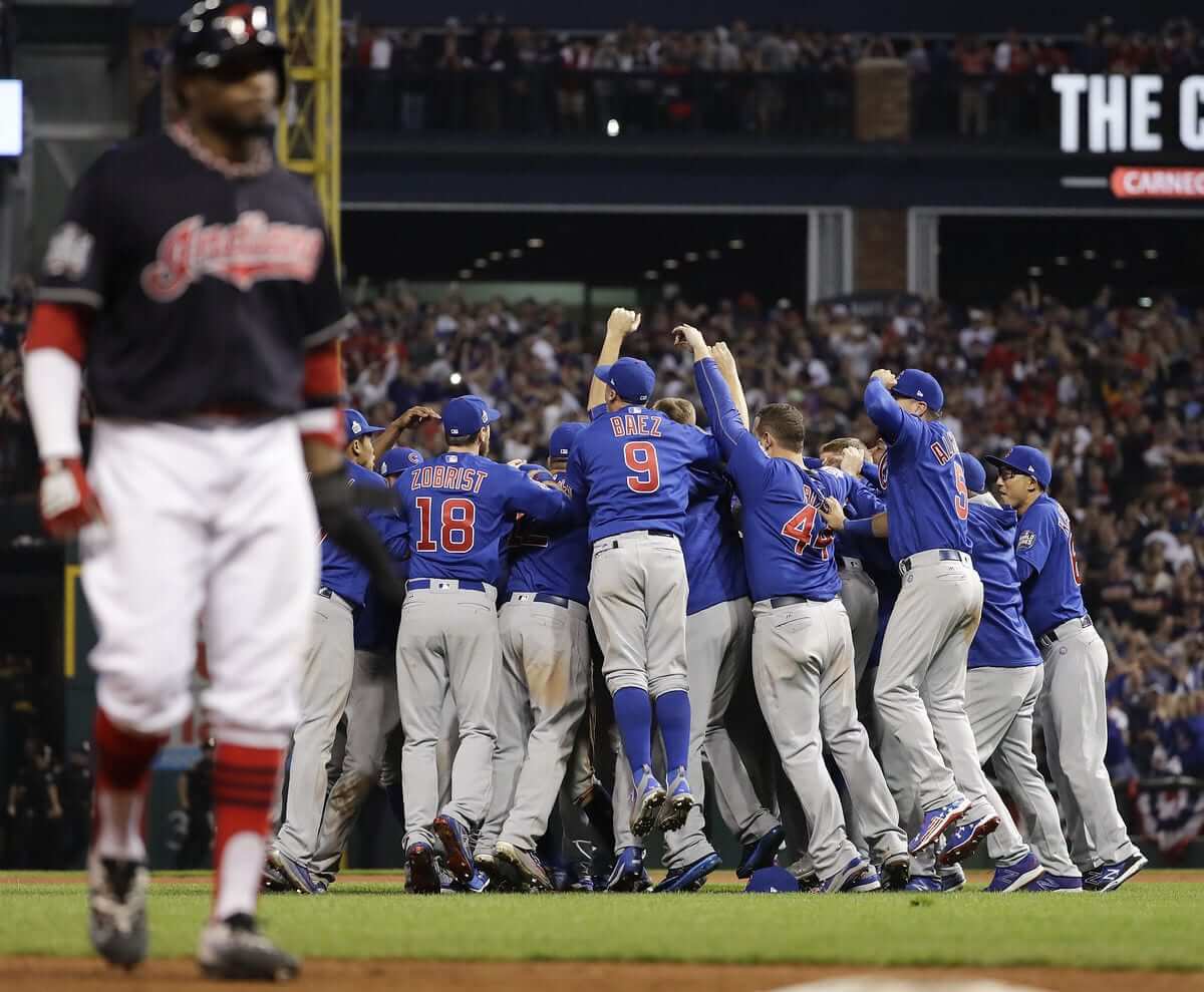
I know what you’ve all been wondering, so let me be the first to tell you: Yes, that was the first time both teams wore colored jerseys and a pitcher wore a single-digit number and JrOB in an extra-inning Game 7 with a rain delay. Historic!
Hell of a game, right? I always root for the National League team, plus I have a lot of friends in and from Chicago, so I’m pleased with the outcome, and I’m happy for all the long-suffering Cubs fans. It’s too bad that both teams were wearing softball tops, but that’s where we’re at right now in MLB.
A few notes from last night’s game:
• Cleveland DH Carlos Santana, who usually goes low-cuffed, decided to channel his inner Hunter Pence:
• Cubs outfielder Jason Heyward was another player who wore the same cap throughout the postseason (although given the way he hit, maybe he should have changed things up).
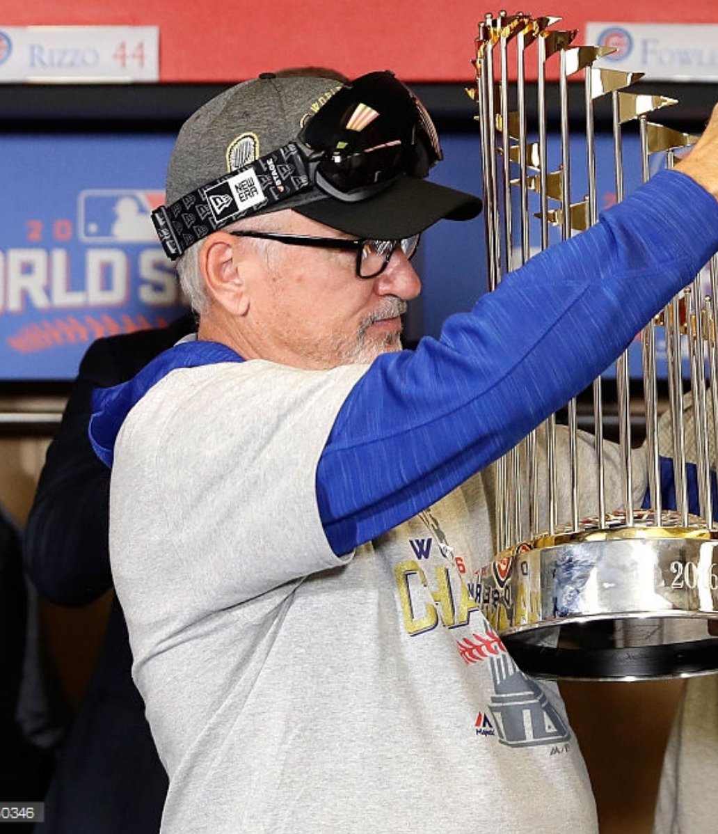
• New Era is now apparently the official celebration goggles provider of MLB (click to enlarge):
Chief Wahoo got a lot of exposure in this Series, with Cleveland wearing the Wahoo caps for all seven games (and throughout the postseason, for that matter). That led to a lot of anti-Wahoo articles over the past 10 days or so, and also prompted many people to ask what I thought this would all mean for Wahoo’s future, especially in light of MLB commish Rob Manfred’s stated intention to discuss Wahoo with team owner Larry Dolan in the near future.
My feeling all along was that a Cleveland championship would probably extend Wahoo’s lifespan by several years. Even if the team wanted to retire him (and it’s not clear that they want to do that), how can you retire a logo that your team just rode to a title? But given how things turned out on the field, I’m wondering if this might have been Wahoo’s last stand. We shall see.
The world already feels a little drearier now that baseball season is over. How long until pitchers and catchers?
Click to enlarge
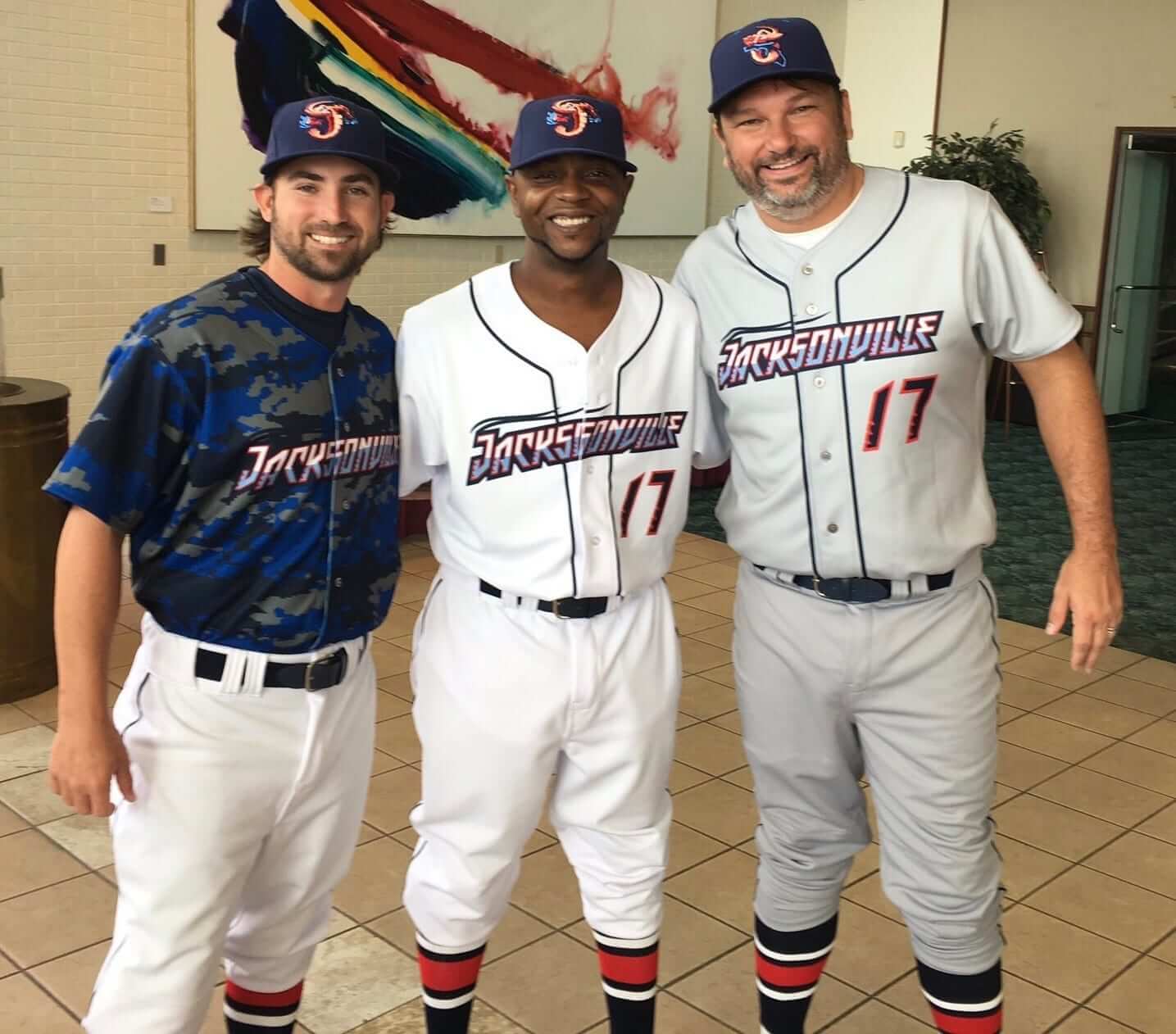
I’m guessing they won’t have a Jewish Heritage Night: It’s been a long time since I’ve seen so many people react to a new minor league team like they did yesterday for the unveiling of the Jacksonville Jumbo Shrimp’s new logo and uniforms. The team, which is the Marlins’ Double-A affiliate, was formerly known as the Suns.
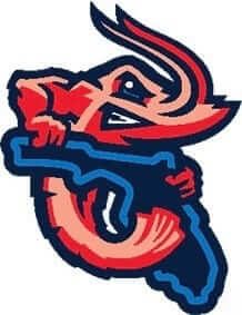
I’m pretty sure that the reaction didn’t have much to do with the team’s uniforms, which as you can see above are nothing special. It’s more about the team name and the logos, one of which — shown at right — sort of looks like a shrimp humping the state of Florida. Naturally, the shrimp has gritted teeth, as required by federal law, even though shrimp don’t have teeth. You can see the rest of the uniforms (six of them!) and logos here.
As it happens, Uni Watch webmaster John Ekdahl lives outside of Jacksonville, so I asked him what he thought. His response:
It definitely has a sort of quirky minor league baseball vibe for the nickname, which I like. “Shrimp” fits the city really well, actually. Mayport, which is the ocean access for Jacksonville, is famous for shrimp.
But the design itself stumbles into the boilerplate agency model we’ve seen for the past decade or so. It’s like there’s a template for these things now. I don’t mind the alternate one with the Florida state shape, but the shrimp itself is kind of forgettable. Typeface…. meh. Colors are pretty good. Underused and unique palette combination.
So, colors and nickname are good. Design itself? Factory agency stuff.
Pretty astute analysis, right? John wrote all of that without even knowing that this design was done by, of course, Brandiose.
John also provided the backstory for the “Bold City” alternate jersey, which is explained on this page, as follows:
When a consolidation referendum was held in 1967 [on the question of whether the Jacksonville should consolidate with Duvall County], voters approved the plan. On October 1, 1968, the governments merged to create the Consolidated City of Jacksonville. Fire, police, health & welfare, recreation, public works, and housing & urban development were all combined under the new government. In honor of the occasion, then-Mayor Hans Tanzler posed with actress Lee Meredith behind a sign marking the new border of the “Bold New City of the South” at Florida 13 and Julington Creek.
The “Bold City” moniker has taken hold since then, and is used by lots of local businesses.
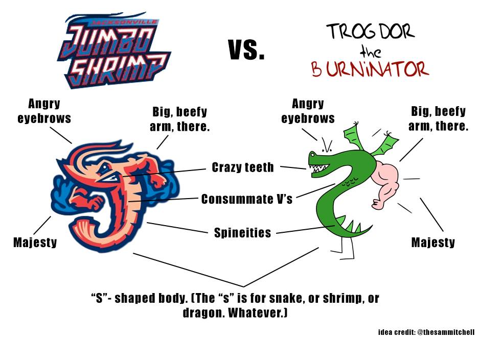
Meanwhile: I have no idea what Homestar Runner is, but it apparently includes a character called Trogdor the Burninator, which leads us to this (click to enlarge):
Finally, reader Marc Viquez used the Jumbo Shrimp unveiling as an excuse to show off his collection of Jacksonville minor league headwear (click to enlarge):
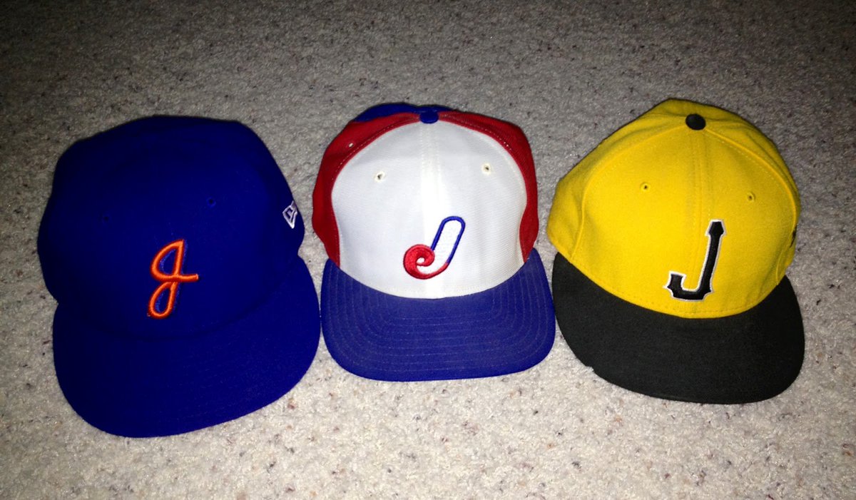
From left to right, those are the caps for the Jacksonville Suns (when they were a Mets affiliate in the late 1960s), the Jacksonville Expos (Montreal affiliate, late 1980s), and Jacksonville Suns (not sure when that’s from, but the Suns were never connected to the Pirates).
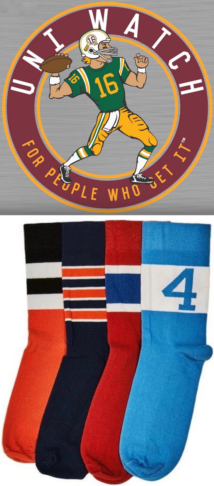
Buy all our stuff already: As you may be aware, the Uni Watch T-Shirt Club’s football-based design (shown at right; click to enlarge) is now available for ordering. It’s being offered in three colors — grey, black, and green.
Also, the second batch of StripeRite socks, which takes inspiration from each of the four major sports, is available for pre-ordering. The socks will begin shipping on Nov. 21.
My thanks, as always, for your consideration.
Got any good Gift Guide gets? As I mentioned yesterday, I’ll soon start working on my annual Uni Watch Holiday Gift Guide, which will appear on ESPN shortly after Thanksgiving. If you know of any good uni- or logo-related products that would make good additions to the guide — or if you sell any such products yourself — please feel free to let me know. Thanks.
The Ticker
By Mike Chamernik

Baseball News: Cubs manager Joe Maddon coached for the Angels for 13 seasons (and even stepped in as manager twice). His father died before Anaheim won the title in 2002, so Maddon has carried his dad’s Angels hat with him ever since (from Chad Osborne). … In 1915, sports editors from Cleveland’s four newspapers decided to rename the team the Indians. Other nickname nominees included “Blues,” “Euclids,” and “Eries” (from Todd Radom, via Phil). … Baseball uniforms involve a lot of sewing (from Phil). … Not only is there a new House of David Baseball Museum, in St. Joseph, Mich., but the place even has an old bowling bag artifact. The legendary bearded baseball team was founded in neighboring Benton Harbor (from Joe Hollomon). … Brandiose does it again: A new Carolina League team will be named the Down East Wood Ducks. The logo will be unveiled November 30 (from Jason Hillyer). … To remove his New Era cap logo, all Adán Encinas had to do was pick an edge and lightly pull. … New alternate caps for BYU (from @vemonator).
College Football News: Mississippi State will wear blacked-out American flag uniforms on Saturday (from @dawgvet06). … Jason Werth says his father is fascinated with 335-lb. Pitt D-lineman Tyrique Jarrett, who wears No. 6. “Who is the largest sportsman you can remember that wore a single digit?” Jason asks. “Perhaps bonus points if that digit is 1!” … New alternate helmet for UCF.

Hockey News: The Knoxville Ice Bears will wear military appreciation jerseys on Veterans Day (from Daniel Wiles). … The Soo Greyhounds will wear poppies on November 11 for Remembrance Day, a day when the Commonwealth of Nations honors those who died in war.

NBA News: The Hawks wore black at home, and the visiting Lakers wore yellow. … The Suns wore purple at home. … Super-baggy uniforms are being phased out as players opt for tighter fits that show off their physiques (from Phil). … Here’s a good Sporcle quiz where you guess the player based on the jerseys he’s worn during his career (from Noah Sidel). … Stephen Curry doesn’t wear Stance socks: He hides the old NBA socks under his ankle braces. … The Suns wore purple “Los Suns” uniforms at home last night, as a Dia de los Muertos gesture (from Rob Wallace). … Players in the Chinese Basketball Association are being forced to give up their Nikes because the league has a head-to-toe outfitting deal with a Chinese brand (from Zheping Huang).

College Hoops News: New uniforms for Central Michigan. Old version on left, new on right. … A Tar Heels fan says he got this UNC title T-shirt in 1957 from the team’s coach, Frank McGuire (from @Squish78).

Soccer News: UK Prime Minister Theresa May is not pleased that FIFA will not allow England and Scotland to wear poppies for Remembrance Day. FIFA is reiterating its ban on political, religious or commercial messages on uniforms. Also, Scotland will wear pink for the game, since their normal white sleeves clashes with England’s all-white uni (from George Chilvers and a bunch of other readers). … On a related note, two Premier League teams, Sunderland and Everton, wore poppies over the weekend (from Joe Hollomon). … “When Borussia Monchengladbach played Celtic in Glasgow, a local pub gave up on trying to spell the name and just wrote A German Team on their signs,” says Joanthan Bean. “This went viral, and the team themselves have adopted it as a nickname, even having scarves made up.” … Soccer’s National League blocked the Twitter account of a blog for pointing out Southport’s home yellow and away florescent green clash (from Craig Ackers).

Grab Bag: The footwear and fashion industry is having a stronger influence on wrestling shoe design (from Josh Lauderdale). … Sock regulations in international cycling are quite strict. The sport is trying to ban the use of compression socks (from James Gilbert). … A British university rugby team is supporting the anti-Israel boycott movement by wearing the Palestinian flag on its uniform (from Phil).
I don’t understand why there wouldn’t be a Jewish night in Jacksonville. Can you explain? Is there something antisemitic about the uniforms?
Kosher law forbids the consumption of shellfish, including shrimp.
Well, I’m glad I’m a gentile, then!
… and immediately I regret posting that because I didn’t think that statement through.
Ken Babby – the owner is Jewish
Haha…kind of funny to have a mascot that you eat. New article…mascots that are food. Some quickly off hand…Bison, Bucks, Scottsdale Community College Articokes, Marlins. I guess even Bears, but I find that weird that people would eat a bear.
Also Sharks, but I haven’t had a shark steak for years.
link
I’ll have to remember to cook up the steaks when my team, USC, plays the Longhorns.
Can’t forget my favorite… the Montgomery Biscuits!
Jewish folks don’t eat shellfish.
I would say more that “Jewish law forbids the consumption of shellfish,” like Paul did. But that definitely doesn’t mean that Jewish folks don’t eat it. Only people who follow the laws of Kashrut (generally more religious people) don’t eat shellfish. Nearly all Jewish folks I know (including myself) eat shrimp, crab, etc.
Which gets to my complaint about the name. On the one hand, props to Jacksonville for adopting a two-word nickname that’s actually a real thing. Jumbo Shrimp exist in the world, unlike, say, Fire Frogs or Muck Dogs. But Jumbo Shrimp aren’t a distinct species or type of the animal shrimp. “Jumbo” refers to the weight of the food shrimp. So the Jumbo Shrimp are named after a plate of food, not the wild animal the local fishery hunts.
I’d say they should be sponsored by The Bubba Gump Shrimp Co., but they don’t have a restaurant in the Jacksonville area (they do have a few elsewhere in Florida).
I never eat at restaurants that have “company” in the name.
Would you prefer “Jacksonville 21/25 Shrimp”?
I would suggest that Jumbo Shrimp are more famous for being a funny oxymoron.
I think George Carlin popularized the joke in the first SNL in 1975, putting Jumbo Shrimp next to Military Intelligence.
I fully expect them to schedule a Jewish Heritage Night which will be cancelled beforehand by an incredibly apologetic front office. “We didn’t mean to offend anybody but we just didn’t think things through…”
Can someone please link me to Paul’s entry on where the losing team’s championship merch goes? I can’t seem to find it. I’m stuck with just a phone and I’m not having any luck. Thank you!
I’ve never written about this (merch doesn’t interest me), but lots of other people have. Example:
link
Wonderful. So a bunch of racist logos are to be sent off for the world’s poor to wear. Sigh.
I’d be willing to bet that the merch has the block C and not Wahoo.
I was certain you had, Paul. I guess that explains why I couldn’t find it. I remember reading a piece about how championship merch does NOT actually get sent to the needy. If I find it, I’ll share a link. I know you’re into uniforms, not merch, but it’s a worthwhile read anyhow.
My wife has probably watched ONE baseball game in her life (last night).
What was her quote?…. “That guy’s pants look like pajamas.”
I asked if she preferred the high-cuff look. She said, “Yes, but their socks need stripes.”
My wife has also taken up commenting on players pants (hmm, should I be concerned?) On Santana’s pants, she said they looked terrible, should be below the knee, not above. Also thought Indians stirrups were cut too high. “Mid shin would look good,” she said. Love it!
Just remind her… It’s a cup!
You should marry her, she sounds like a keeper!
Lee
Louis Nix III wore #1 for Notre Dame…342 pounds.
link
I remember him playing against Michigan QB #98 Devin Gardner and thinking their numbers should be switched.
Here’s a shot of the two together. There’s probably a better one.
link
Louis Nix looks like the winner of this derby.
Shawn Oakman wore #2 for Baylor. He is just a large human being, 6’9″, 280 lbs.
Homestar is one word. Funnily enough, the name came about because of Mark Lemke; a friend of the creators, who happened to know nothing about sports, tried to imitate a local commercial that mentioned Lemke as an “All-Star second baseman for the Braves”, only referring to him as the “Homestar Runner for the Braves”.
Fixed.
Why doesn’t Brandiose just sponsor its own league already?! Goodness knows they’ve come up with enough new team nicknames.
Just wait for all the news coverage when Jacksonville unveils a new costumed mascot.
This pennant is almost as old as I am (you know it;s old cuz there’s no “circle R”).
Way to go Cubbies!
link
I was hoping for a classic white/grey matchup, but knew it wasn’t going to happen. I now fully expect the blues to become the primary uni for the Cubs next season.
Has any other WS team worn the same top at home and the road? I think not. So I’m hoping they’ll ditch the blue and opt for Home White/Road Grey if they ever make the WS again.
I haven’t done a game-by-game check, but I’m fairly certain the 1972-73-74 A’s wore the same jerseys at home and on the road. Ditto for the 1979 Pirates.
The Athletics probably did it first, and the Pirates wore their black jerseys in Game 1 in Baltimore and Game 5 in Pittsburgh, while they wore the gold in Games 2, 4, 6, and 7.
Well, it wouldn’t be anything new for them, seeing as how back in their pullover days, their road jersey was blue.
Seconded. Their National Association predecessors were even wearing white jerseys and navy pants link before the league formalized itself.
So you can’t really call jerseys that differ from the color of the pants “softball tops” if they have a tradition that’s older than the sport of softball.
I sincerely hope Wahoo sticks around until they’ve won a championship. What a terrible night last night was. Ugh.
Maybe Wahoo is the problem?
I was trying to get people interested in the Curse of Wahoo last night. Maybe we just need to start talking it up.
Wahoo is not the problem. But thanks for your concern.
If Wahoo is a problem than infant bears were a jinx for 108 years. How dare the Chicago NL baseball team insult those little bears by calling themselves the Cubs and depicting them with a cartoon logo.
John Jenkins played nose tackle at UGA back at the beginning of the decade. He wore #6 and tipped the scale at about 350+.
link
How will Cubs fans change now that the team has won? Fans had an endearing relationship with the Cubs when they were the lovable losers. Now, I suspect there will be huge expectations like most fans have. The uniqueness is gone. Still, that was one whale of a game 7.
I think the Indians should take this as an opportunity to retire Wahoo and maybe even connect with some Native American tribes to do something respectful the tribes approve. Win-win in my view.
The new socks are awesome! Ordered mine. Still guessing what teams. Here’s my guess and I am sure one or more are wrong. Orange is Astros baseball, Navy w/stripes looks like Bears football, the red looks like Canadiens hockey and the light blue looks like UNC basketball. Did I fail?
Orioles.
I knew I had at least one wrong. Thanks for the correction Paul!
How do you know all Native Americans don’t like Chief Wahoo? Just like all Americans, there are millions of Native Americans and each individual has a different opinion. That’s like assuming all persons with Irish heritage disapprove of Notre Dame’s mascot and nickname.
Thank you for equating a human being with a mystical fairy tale character. Now let’s move on. Thanks.
Paul, I too also (nearly) always root for the NL–in both the WS and the ASG. I guess being a fan of a NL team (and being an OLD guy), I still prefer that type of baseball.
For the NL unless it’s Phoenix, Miami or the Dodgers – although even they would get my support over boston.
Congrats Cub fans and link!
I kind of like the Jumbo Shrimp. If you’re going to throw away one of the classic team names in minor league history, you could do a lot worse these days than Jumbo Shrimp. And the logos and uniforms aren’t terrible, which is something these days. These are maybe B-minus unis to me, with more good bits than bad. If the team had been willing to embrace pink as the main bright color, with red as an accent, instead of the other way around, I think I’d like the uniforms a lot more. It would be a more interesting look, anyway, and the best aspects of the uniforms are the ones that strike me as interesting, such as the Jacksonville home script.
Still, the Trogdor similarity is a huge demerit to me. Pop singers have been sued into bankruptcy for less blatant sampling than this.
The original Trogdor: link
Personally, I think the shrimp looks a bit more like the “The S Is For Sucks” Dragon.
Hey – they’re wearing stirrups! And those are the Braves old stripe design!
True – although link appears to be wearing his backwards.
Typo: Second mention of Maddon in Ticker
Thanks. Fixed.
First thing I thought of when I saw the Jumbo Shrimp logo was the Clearwater Threshers. Similar color scheme, similar type logo. Doing a quick logo search I found out why.
Brandiose.
As do the Lakewood BlueClaws.
As bad as the biker shorts are…the detail we’re all seemingly missing here: midnight blue sanis(!) under red rups.
I think I like it.
Or are they red socks with navy heels? It’s not uncommon for socks to have a different heel color, and if that’s a stirrup opening, then it’s the strangest and boxiest opening I’ve ever seen.
Those sure look like rups. But why isn’t he wearing link?
Louis Nix wore #1 when he played for Notre Dame. He was a pretty big dude.
Bonus points to you. That is a big dude with a tiny number!
Brandoise definitely qualifies as “agency factory stuff.”
They’re mailing this stuff in with the template design style they have. Repeated over and over. I appreciate their dedication to the historical component of each redesign… but they need to look in the mirror with their graphic elements “style.” It’s very noticeable. And ubiquitous. Every team is different, but it all looks the same (iconography, line weights, illustration style, etc.).
Good for them that they’ve made a career of this. Bad for the industry that everything looks so ubiquitous.
You said it. Saved me from making my own post.
Jerome Bettis wore #6 at Notre Dame I think. Maybe the largest ‘offensive’ player to wear a single digit.
Clearly the Pirates and Orioles wore colored jerseys in game 7, 1979
US Soccer and Michael Bradley got one by FIFA, then, by his wearing of the rainbow captain’s armband. Maybe Scotland and England can do something like that.
link
I wish Jacksonville would incorrectly add an “s” like the Marlins.
Jacksonville Jumbo Shrimps sounds so much better.
– I still call them Minnesota Wilds.
Thanks Paul. Now I really want one of those Jacksonville Expos hats.
The yellow and black Jacksonville Suns hat is from their most recent, prior uniform update back in late 2009. The name and logos did not change, just their colors: the went from a blue/red/yellow combination to the yellow and black. And they were not nor have they ever been affiliated with the Pirates. The sold story I found on MiLB.com had this sentence: “…the new jersey features black mesh sleeves plus a black, gold and old gold sutash around the collar and down the front.” Has anyone ever heard of a sutash?
The proper spelling is soutache:
link
Usually see it referring to thicker piping, like that worn by the Brewers link.
As for those gold Suns caps, I really liked link. The caps especially looked good with the team’s link uniform.
My favorite is still their time link.
Really wish baseball was more “uniform” with their uniforms. Besides the pajama pants vs knickers, the guys who wear knickers should have their socks match. Some Indians had solid socks and some had stripes. Also the santitary socks, most were white, with Santana wearing black or navy. And I don’t remember who it was with the Indians, but one guy was basically wearing shorts, with his knickers pulled up over his knees.
Roger Goodell can fix out the MLB’s uniform inconsistencies.
Watching last night’s game, I can just imagine Roger Goodell having a stroke at the sight of so many players having fun and enjoying the game.
To my Uniwatch colleagues – Would you be content with the pants on baseball players if they weren’t so baggy and long?
Or do you feel “No way. They have to wear stirrups, or at least colored socks.”
For the stirrup/sock enthusiasts, do you like when the pants are bunched up under the knees, or do you prefer the pants at mid-shin?
Do some of you prefer socks to stirrups, or vice-versa?
No way. They have to wear stirrups, or at least colored socks.
Actually, I prefer link to the more modern thong stirrups. So I’m good with full socks.
But in any case, I think players should be legally required to show them.
My opinion: While I prefer a uniform sock showing, if pants are long they are no longer than a break at the shoes–no long baggy pants. Players can go either long pants or bloused pants. Socks may be solid or stirrups, but uniform within a team–they are part of the uniform of a team.
Agree with Paul that it kind of sucks that Game 7 of the WS looked like a spring training game.
I recommend the Trogdor flash game on the Homestar Runner site. It’s simple, fun, and really catches that early video game era feel.
link
Just. Bloody. Awful! Bad enough a designer created this, but an executive or three signed off! From the naming, to the typography, all the way down to the alt logo of the shrimp having its way with the state of Florida… Did they even spend 20 minutes on this before submitting?!
Welcome to Brandiose!
Worth noting that the Jacksonville Jumbo Shrimp’s owner Ken Babby is also the owner of and person responsible for naming the Akron RubberDucks, previously the Akron Aeros.
My issue with Jumbo Shrimp is that shrimp are only pink with a curved tail after you boil them, so that mascot is dead
You asked how long until pitchers and catchers report. In another weird coincidence involving this number, the Cubs report in 108 days.
This is the first time we’ve seen a team wear its softball alt top all seven games in a WS right? Unless the Rockies did it in 2007?
Rockies wore white for one home game. It was beautiful…
Yes, first time.
Rox didn’t even come close. They wore three different jerseys (black vest, white pins, grey pins) in the four-game 2007 Series.
Marlins wore black for five of the six games in 2003. That was the closest any team came until now.