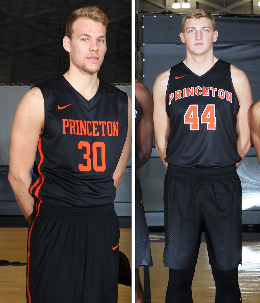
So here’s a question: Yesterday I tweeted the before and after photo pairing shown above. The shot on the left is last year’s Princeton basketball uniform, and the one on the right is what they’ll be wearing this year.
I almost never express opinions on Twitter — I just put information out there. So I didn’t say which version I preferred. I just said, “New uniforms for Princeton. Old version on left, new on right.” But to me, it’s a no-brainer: I much prefer the new version. The white outlining makes the typography pop a bit more, and the vertical arching is way better than the straight-across treatment. The old one looks like a stock uniform from a catalog. The new one — well, I suppose it looks like a stock design as well (almost everything in college basketball is now a templated stock design of some sort), but it looks like a much better stock design, from a nicer section of the catalog.
To my surprise, many people felt otherwise. Within a few minutes of my tweet, 10 people had posted replies, all of them saying the new version was a downgrade. (An 11th person eventually said he liked the new version.)
I realize Twitter is just, you know, Twitter. I’m also generally comfortable with my own opinions about uniforms, regardless of whether they fly in the face of public taste. (As we’ve discussed before, that’s part of a critic’s job.) Still, I’m puzzled by this one. There are plenty of times when I understand why people disagree with me, but I honestly don’t see the appeal of the older design here. Am I missing something? What do you folks think?
Buy all our stuff already: As you may be aware, the Uni Watch T-Shirt Club’s football-based design (shown at right; click to enlarge) is now available for ordering. It’s being offered in three colors — grey, black, and green.
Also, the second batch of StripeRite socks, which takes inspiration from each of the four major sports, is available for pre-ordering. The socks will begin shipping on Nov. 21.
My thanks, as always, for your consideration.
Got any good Gift Guide gets? I’ll soon start working on my annual Uni Watch Holiday Gift Guide, which will appear on ESPN shortly after Thanksgiving. If you know of any good uni- or logo-related products that would make good additions to the guide — or if you sell any such products yourself — please feel free to let me know. Thanks.
The Ticker
By Paul

Baseball News: The Mariners are adding a 40th-anniversary patch next season. Interesting that they’re square instead of round — we don’t see much of that these days. Additional info here. … While looking for something else, I noticed that comedian Fred Willard wore a Red Sox jacket while introducing Devo on an old episode of Saturday Night Live. … The Pirates appear to have a new spring training logo (from Fletcher Keel). … Here’s the coolest ticket stub you’re likely to see in the foreseeable future. “It’s strange that MLB teams used to play exhibitions in the middle of the season, and stranger still the ticket was repurposed for an entirely different game involving a different MLB team,” says stub savant Russ Havens. “It looks like this was reused for a game against the New York Giants on Wednesday, July 13, 1949, instead of the original game slated against the Philadelphia A’s on August 21, 1948.” … Here’s a good history of why umpires wear suits (from Dave Robertson). … Cubs reliever Aroldis Chapman is another player who appears to be using the same cap he used earlier in the postseason. … The Jacksonville Suns — that’s the Marlins’ Double-A affiliate — are changing their name to … wait for it … the Jacksonville Jumbo Shrimp. We can all go smack ourselves repeatedly in the head with ball-peen hammers now (blame Andrew Mallory).

NFL News: A customized Steelers jersey was featured on the TV series Man with a Plan the other night (from Chris Flinn). … Apparently the Browns will be wearing white at home this weekend, which will force the Cowboys to wear blue (from @AndyDTID). … Jamie Collins, traded earlier this week from the Pats to the Browns, will have SrOB (from Robert Hayes). … Remember when the Steelers wore mono-white? Eh, you probably don’t, so take a look at this video from 1970 (from Kenny Kaplan).
College and High School Football News: I was planning to interview Pitt DL Ejuan Price about his absurdly short pants, but my ESPN colleague Andrea Adelson beat me to it and did a great, great job. Highly recommended. … Ohio State will have 1916 throwbacks this weekend. Phil will have an in-depth look at this uniform on Saturday. … You can vote for the best high school football uniform in Michigan (from Alex Dewitt). … Flag-desecration uniform on Nov. 12 for Louisville. … Northwestern will go GFGS on Saturday (from John Muir). … Military Appreciation Day uniforms for Cincinnati (thanks, Phil).

Hockey News: Blues D Jay Bouwmeester had a tag sewn inside his jersey last night to commemorate his 1,000th NHL game (from Brendan Mongey). … New military-themed jerseys for the Green Bay Gamblers (from Brian Kerhin). … The Tulsa Oilers will wear a jeans jacket-styled jersey on Friday (thanks, Phil).

NBA News: If you’ve been thinking, “You know, what the world really needs is a $1600 NBA sweater,” then today’s your lucky day (from Tommy Turner). … Starting on Jan. 1, car owners in Indiana can order a Pacers license plate. … The Hawks are planning renovations for their arena (thanks, Mike). … The 76ers and Magic went color vs. color last night in Philly. … Meanwhile, the Cavs wore wine at home, forcing the Rockets to wear white on the road.

College Hoops News: Indiana and Kansas will both wear commemorative uniforms with inspirational NOBs for the Armed Forces Classic on Nov. 11. Kansas will wear that uniform again against Siena on Nov. 18. … New uniforms for Texas. … New “Look how champion-y we are” court logos for UConn (from Andrew Beard).

Grab Bag: American Airlines flight attendants had recently complained about skin rashes and other problems caused by their uniforms. Now their union has released the results of tests showing which chemicals are in the uniforms. … A popular Japanese girl band caused a controversy by wearing Halloween costumes that resembled Nazi uniforms. The band’s label, Sony Music, issued an apology. … New poppy-themed Remembrance Day jersey for Gloucester Rugby (from @Stumpy7780). … Speaking of rugby, the jersey for the British & Irish Lions’ 2017 tour to New Zealand has been spotted. “It’s the first time since 1993 the Lions have had a jersey made by a company other than Adidas,” says Eric Bangeman “The Lions are an all-star team made up of the best players from the Home Nations (England, Scotland, Ireland, and Wales). They play a series of matches against one of the three Southern Hemisphere powers (New Zealand, South Africa, and Australia) every four years.”
The old Princeton uniform is MUCH better. I live the single color and that font is better
LOVE
No question old uni way better. New uni looks like it’s from the 1960s grade school team.
It’s all about the font for me. Sure it would look better if they had a white stroke on there, but the typography on the right is so awful it makes up for it tenfold. The vertical arching also looks like a bad default photoshop setting.
I don’t like either of the Princeton jerseys, but I think the new one is worse. It looks like a generic sports shirt you’d get in the kids’ section at a Target. The white outlining doesn’t make the lettering pop, it just makes it more boring.
The old one is also pretty generic and boring, but less so to my eyes.
This is pretty much where I fall. They are both generic and look like they came from a stock catalog. Old looks like boring 90s high school practice gear and the new looks like boring 90s game gear for the same team.
I prefer the old version, without the white outline. I like the arched lettering, but the orange against the black looks better to me.
I like vertical arching, and I like the white outlines, but I prefer the style of last year’s lettering.
Re: Princeton – last year’s version has a retro feel, kind of like the Bears Monsters of the Midway uniforms. The lack of white outlines or additional flourishes makes sense.
The new seems unfinished, with the bright, white outline on the top & nothing elsewhere (like at the bottom of the shorts, or waistband). So to me, the new one feels out of balance between top & bottom.
My first thought was also of the linkuni’s.
That being said I think I prefer what the new version is trying to do. However, the white outline is way too thick. Make it a bit thinner, show that there are actually spaces in the middle of those fours and it might go from ‘stock’ to something a bit more.
It seems like that has become a common aesthetic in college hoops. Both Nike and UA have tried to bring back understated designs to the point of being too plain. As much as some of the cutting-edge designs go too far, it felt like an overcorrection last year. Even the script school/team name UA started using are plain to the point of being conspicuously plain. I am with PL – the new set looks nicer for Princeton. A little more character and detail.
I prefer the old version too. It’s all about the font for me– I like the simplicity of the block lettering and the plain orange. The new font just seems gimmicky for a storied school like Princeton.
The white outline allows me to picture the home white uniform with little difficulty. Without it, I worry the home jersey is a plain white shirt with black letters. Of course, making the word or number orange would fix that.
Princeton: Old version much better. I HATE that font on the new jersey. The block lettering on the old one is so much better.
Agreed. A vertical arch would be nice, but the font, clean contrast with no white outline, and side stripes are all vastly superior on the old version. The new one looks like a 1993 JV practice jersey.
I prefer the old one as well. The typeface is more interesting and to me, easier to read. Maybe on-court the white would help, but I think if nothing else, the white is too thick.
I have to agree with you Paul, this season’s Princeton hoops jerseys are much better. The arched lettering makes a huge difference. The other one looks like practice gear.
Old Princeton is nicer.
Agree with above ideas:
-outlining = target
-old font is better
-Monsters of the midway feel
-white doesnt go with anything else on the uniform
What does the white/home set look like?
I like the old one better. I don’t like outlines on lettering and numbering. I prefer one-color lettering and numbering. Both typefaces are generic, but at least the old one looks a little more retro and feels collegiate. The new typeface looks like the cheapest option available at the athletic store around the corner. Worse, that typeface is so bad, it looks photoshopped.
I like the white outline, but the apparent lack of any side stripes does make the uniform as a whole seem to be even more bland than the old version.
Old Princeton is much, much better. It’s all about the orange against the black. It’s such a pleasing color combination. Throwing white in there ruins a really good thing.
I like the old uniform sans lettering. It’s pure black and the side stripes look good. I think the straight across lettering is awful on the old uniform but like others I prefer that font. I would rather that font, arched, with a white outline. But the shorts and jersey base in the new uniform isn’t as good as the older version.
Old is better. The faux adidas stripes on the old uni are a negative.
However, that is outweighed by the more traditional block font. The block font is a better fit for a storied institution like Princeton. The white outline would look fine with the old uni but it’s the block font that makes the old uni better. It’s a subtle statement that Princeton doesn’t need Nike’s newfangled fonts to reflect who they are. Similar to the statement made by the Yankees current or Red Sox old road font.
Old uni, sans white, is far superior.
There’s no arguing with taste, but in terms of basic typography design, is is simply incorrect say, “The white outlining makes the typography pop a bit more …”
The white in this case largely fills in the interior shapes of most of the letters and numbers, and those interior spaces do most of the heavy lifting of communicating what each letter or number is. The way this outlining is executed makes the lettering less legible. Simple test for anyone who’s at least a little nearsighted: get at least arm’s length from the screen, take off your glasses, and try to name the letters backwards. Personally, I can’t distinguish every letter in the old jersey script, but I get most of them, and all of the vowels. I can clearly make out none of the letters in the new jersey, and even the numbers are harder to read. In addition, the outline has issues with color contrast. Because the lettering is already a bright color on a dark background, adding a proportionally thick outline of a second bright color obscures the edges and corners of the lettering. Instead of a solid edge to each shape, the new lettering has much the visual impact of a gradient.
If Princeton’s colors were orange and royal blue, then absolutely a white outline would help the lettering pop. But bright orange on black? White outlining will usually be the wrong choice.
This is an excellent argument for getting rid of the white outline. Well done.
I here I thought if I didn’t go on the Chris Creamer site today I could get away from the use of the word “pop” in regards to uniform or other design. sigh.
That said I prefer the old; cleaner look with a simple block font.
Most basketball jerseys look pretty generic to me anyway – name across top, number below and on back and usually no logo (or if I’m lucky a small logo) and not much else. It’s pretty rare you see anything truly interesting like, for example, ‘The City’ jerseys.
I prefer the new except for the apparent lack of side stripe. Add that side stripe in and it would be perfect to me.
Old is better. Like the side stripe. Like the lack of white outline (something I’d like to see more of in general, think the Dodgers’ current road alternate vs. their ’80s road jerseys or, in the other direction, the Yankees road flannels vs. current road jerseys). Cut of the jersey is better. Solid-color shorts (note the fade-in stripe pattern on the new ones) are better. Font is better, and the team name actually fits on the Jersey (though I agree vertical arching would improve it).
Princeton unis: put me in the minority as I prefer the newer set. One of the few times newer is better in unis for me.
Me, too – although I do like the orange stripes down the side of the old uni. Can’t tell from the picture, but does the new version include the stripes?
Jumbo Shrimp: “It’s a gritty, tough, hard-working shrimp,” Babby said. “The word that probably best describes it is tenacious.” I always found them to be tender and delicious with the right cocktail sauce.
As far as naming a team after food goes, it’s much inferior to the Montgomery Biscuits. You know, I’m really surprised no team has been named Hot Dogs yet, given the proliferation of dog and cat names in the minors.
Bring back the Macon Whoopee (RIP, ECHL team now defunct) and this whole debate becomes moot.
Slowly, the Southern League is going the culinary route. We now have the Biscuits, Shuckers, and Jumbo Shrimp in one league.
I can’t see “jumbo shrimp” without thinking of George Carlin pointing out that it’s an oxymoron, like “military intelligence.”
here’s a better break down from Eleven Warriors on the Buckeyes throwback jersey
link
Put a black outline between the white and orange, and you have a winner.
“It’s strange that MLB teams used to play exhibitions in the middle of the season…”
Not really. Before the union, the players were at the club’s disposal, and if they could sell a few more tickets playing a team from the other league, or make a minor league affiliate happy, especially if the train was going through town anyway, it didn’t bother management at all. I think there was actually a formal agreement that major league teams would play at their minor league affiliates or compensate them with cash well into the 1990s; by the end, the major league teams might give their starters one at-bat before putting subs and coaches and staffers on the field.
From Retrosheet’s link, we see these in Albany:
Pirates at Albany – July 26, 1948
Giants at Albany – July 13, 1949
The Pittsburgh Press in July 1948 doesn’t treat the game as anything special, and coverage of the game itself is two paragraphs at the end of a story about lineup changes. (The game was called by rain with Albany leading, 8-2.)
So as far as the ticket goes, I’ll guess that after the Senators printed those lovely tickets, the A’s cancelled their visit, and Albany repurposed them to the next season’s game with the Giants.
I recall fondly attending some in-season MLB exhibition games in the 1980s. I liked it too when the NHL hosted various Super Series games vs. Soviet club teams in the 1980s/early 1990s. I suppose there is less novelty for the idea now that many European players are in the NHL, but also that many North Americans are playing overseas too – the opposing team wouldn’t exactly be 100% Russian or Swedish etc. It would still be cool to see some version of that happen again. At the very least it was a rare opportunity to see a pro game up close – the arenas were usually half-full and the tickets lower priced.
The older Princeton jersey is so much better. I love the direct orange-on-black styling.
Fans of the Yankees and Mets of a certain age will remember the annual Mayor’s Trophy Game.
The Cubs and White Sox used to play the Crosstown Classic exhibition game in the middle of the season every year, before interleague play gave us six games that count every year.
The Jays and Expos used to play a single exhibition game during the season as well
link
Kind of ties in with the goodbye to Mosaic Stadium (formerly Taylor Field – home of CFL Roughriders) which was mentioned on this site this week:
I remember when the Toronto Blue Jays played an exhibition game there in Regina, SK during the season. The game was in May 1989 against the Canadian National Baseball Institute Blues.
link
Interesting Wade.
I saw that in the news about the closing of Mosaic but couldn’t find any photos (I was looking before the 26th).
I’d love to see what the whole field looked like. I imagine it was something like when the Goldeyes used to play in Winnipeg Stadium.
Yes mike 2 – The set up was similar to when Winnipeg Stadium was a baseball diamond. I was there behind the fence in left field. Was pretty makeshift. The football lines were on the field as can be seen on the one photo in the article. Was a short distance to the fence in left field.
The “Princeton” on the new one is way too wide and it’s distracting.
The old one has a classic feel and for a team that operates with just black and orange I think it’s a nice look.
Re: Princeton unis.
Aesthetically, I prefer the old ones, but for practicality’s sake, the new ones are far better. They are much more readable. Isn’t that what uniform numbers and letters are supposed to be? Too often with modern uni design, function follows form. Uniforms shouldn’t be designed to be viewed on a fashion runway. They’re meant to identify the team and the player and the design should accomplish that task first and foremost. Everything else is gravy.
Princeton: I too prefer the old. (Though there isn’t anything special about it.) The classic, old school, simple version is what I expect from an Ivy League school. Not to mention that the lack of white (light color) and straight forward serif font are “harder” or more aggressive. If it were my team I would want them in the more fierce threads (and I don’t mean that term like a New York runway designer).
Much prefer the old; simple and clean. The collegiate lettering (shoulda been arched though) and no-white-borders evoke an earlier day, appropriate for a venerable institution like Princeton. (Liking the new doesn’t make you a bad guy though, PL!)
I prefer the old Princeton uniforms too. I think with the advent of HD TV, the need for lettering to “pop” isn’t a necessity these days so I like the simplicity of one-color logos opposed to having a white outline around the lettering. The Dodgers dropped it on their road uniforms, the Orioles dropped it on their black jerseys in the late 90’s – it just seems to clutter the overall script – in Princeton’s case – the numbers.
I would also have to disagree that the older version has a “stock catalog” feel to it – I think the new one does. Generic font, no striping, one color line-to-line outline of text and numbers. If that uniform were shown with no other context, I wouldn’t automatically associate with Princeton University.
The old one gets my vote. They look basically the same, but what sticks out is the topography. The serf font conveys a more starchy Ivy League feel, while the sans looks like the coach ordered them right off the catalog. It seems bland an characterless.
Count me in the group that prefers the old jerseys. The vertically arched name is a good idea, but that font is horrendously generic. That orange is bright enough that it doesn’t really need a white outline, but if an outline is to be used, the number outlines should be about half as thick. A thicker outline like that would only work better with dark numbers, like maroon, navy, or forest green.
The old Princeton uni looks more “Princeton-y”. Their classic football unis have black and orange stripes with no white outlines. Same with Penn’s blue and red stripes. Dartmouth, when they choose to wear it, has a classic green and white look. Some uni elements evoke certain schools’ uni traditions.
I like the old one best too. In my mind, I see always see Princeton with straight orange on black, no outline. Must be from when I first saw some of their uniforms way back when.
Also, the shorts on the new style are awful – I’m already waiting for the gradient phase to fade away!
Is that a gradient? I thought it was just the way the light was catching them.
I prefer the old one too. Not 100% sure why, but I think it is because orange and black are contrasting enough that it’s perfectly easy to see. I like the colors and it’s a very classic look. Also, as Big Matt says above, the gradient on the shorts is awful.
For me, it’s all about the program. Princeton basketball connotates an older, more “fundamental-based” type of program. It would stand to reason that their uniforms would want to reflect that. Their Ivy League roots cry out for a more traditional look.
If was a choice of uniform for OK State or Oregon State, I’d prefer the newer updated model. But since it’s Princeton, go with the older, less modern uni.
I can’t disagree with a word of this. There’s nothing to like about the new trend of no trim around the neck/arms/waist/legs. At least, they could have made the gradient color orange and not grey.
I dig the Mariners patch, mostly because it’s actually an anniversary patch, and not a stinkin’ ordinal.
Agreed, good looking patch, but the M’s need to get rid of the teal-like green.
You’ll get no argument from me. I’d love to see the original royal and yellow make a comeback. The original M’s cap with the trident M is one of my all time favorites.
New style with old fonts
link
Gorgeous!
We have a winner.
That’s the same look they had back in 1988 when they almost knocked off Georgetown as a 16-seed in the NCAA tournament.
link
The layout may not be as good on the old one, but no outlines is always easier to read than something with outlines… especially from a distance. That’s sign-making 101… ever see street signs with an outline?
The new Princeton jersey top looks worse to me because of the lettering that looks too much like Arial. Being vertically arched doesn’t help it look more appealing–it looks way too much like something you’d find on a T-shirt for a local little league team.
Old one is nicer. White is to thick on the new numbers.
Princeton – the new uniform is a definite upgrade, on the basis of the white outlining alone.
The old one is better because the color of dark, straight up without the white, is just cleaner and classier. It’s a similar effect as to why the Pirates hats are so great and the Cleveland block C (if they would wear them) hats are so great. They’re clean and easy. Lighter color on top of darker color. No frills, just classic clean design.
I definitely agree about the Pirates (especially compared to their alt hat with the black-white outline), but I disagree on the Indians hat. Blue-on-red is scientifically proven to be hard to read against each other, so in this instance, the block C would do well to add some contrast between the two colors. I think the orange on the Princeton uniforms (and the Orioles jerseys) is bright enough on the black jersey that a white outline is unnecessary (just like the Pirates).
RE: Princeton. I prefer the old.
But specifically because I think the serifs are more interesting than the sans. The new type is a little wider so the 9 letter word takes up more (too much?) much space across the chest. Orange is one of a few colors that is bright enough to contrast with black and be legible. Ex: The Monsters of the midway set (orange on midnight blue) is legible with the 49ers set of red on black isn’t. So it’s a fine line. but I think orange shows up fine. Also not for nothing? I often prefer strokes (outlines) around type or numerals of a certain size (5-6+”) and less useful the smaller it is. So on uniforms like say…the NO Saints…I like the numbers outlined but can barely read the surnames when outlined from a distance. So the goal of making it clearer with a stroke can backfire at distance IMO.
I will concede that the arched is always a nice touch and would have been a nice update in and of itself.
The biggest issue with the current Princeton uniform is the typeface is an abomination. Sans serif, rounded and generic. It’s atrocious. The ONLY thing it has going for it is that it’s arched. Take the old, add a little weight in thickness, add a white outline and arch it… done. Or, leave without outline and arch it… done.
The designers at Nike continue to disappoint. Do they actually SEE the work they produce? Would love to hear from some if they have the courage to post here, or be interviewed.
I think the main issue people are seeing with the new Princeton uni is a result of the lighting on the photo. Both the black and orange look washed out.
Old by far. agree with sentiments that its not necessary anymore to have garish white outlining, especially on already bright colored elements, to permit better “pop.”
The new font is awful and has a JV feel to it.
I pick…the 3rd option! Double outline/the illusion of space between the main color and the outermost outline
link
Hmm… I doubt the double-outline would look good with the wordmark, especially the vertically arched one. Maybe a script wordmark instead? I’d be down with that.
I just kinda meant in general in terms of which one I prefer most often. Of the two actually presented, I far prefer the first/older option.
I loved the way the Vegas-gold Penguins, current Mariners, and 00’s Indians used the double-outline. Very classy IMO.
I like Princeton’s old uniform. I dislike the white outline on the new unis – especially on the numbers. It doesn’t read as precisely as the old uni. For example, the “hole” in the 4 on the new uni is almost completely filled by white. There should be more negative space or no outline at all.
I also like the old font for Princeton. The new is too rounded.
Man, if the Cavs had worn their navy jerseys last night instead of tomorrow night against the Celtics, we could’ve had two red vs. blue games in one night!
Interestingly enough, they’re scheduled to wear white at Philly on Saturday. Here’s their jersey schedule: link
Should also add that in addition to the number of characters of PRINCETON and the size of each letter…proportions are a factor. The stroke looks to be something more than 1/4 as wide as the character itself. So the more letters, the smaller the letters, the narrower the stroke needs to be (IMO)
Something like the Lakers wordmark..with fewer characters, larger characters etc….really benefits from the stroke.
This is different.
I like the new one, particularly how the white outline makes the characters pop. I also think that san-serif fonts tend to look cleaner, especially on uniforms that are generally seen from some distance away.
The only thing the old one has going for it in my opinion is the side piping, otherwise it looks like a uniform a YMCA youth league from the 80’s would be wearing. The lettering is squished and the serifs make it look too jumbled.
It’s the font on the Princeton jersey. The old font just feels old-school. The new font itself feels generic.
I suspect this is a lot of what’s behind the reaction. Instead of old school or new school, I’d say the old script looks like a school, whereas the new script looks like no school. The old jersey has its flaws, but it speaks the visual language of traditional college athletics. The new jersey is mostly a less flawed bit of design (excepting the white outlines, which are objectively quite bad) but it speaks the visual language of a fast food franchise employee uniform.
Great insight, arr. I love your comparisons
I also prefer the new Princeton uniform! Much sharper look, although I agree that both designs look generic.
I’m guessing most of the readers here and Twitter followers prefer simpler, more traditional looks (much in the same vein as this page in general). So I’m not surprised many people like the old design better.
Princeton jersey: I prefer the old style. As a kid, I preferred outlines and multiple colors on numbers (more is more). But ever since the NFL’s Chicago Bears starting wearing their Monsters of the Midway jerseys, I seem to prefer the color-on-color numbers with zero white outline (less is more). Can’t quite explain why.
Jamie Collins SrOB video: That must be a Browns practice jersey being stitched, as the game version of their brown jersey has Orange NOB.
I’m with you, Paul…I actually like the new version better in terms of the white outline and arching. However, I do think the font on the old uniform “fits” Princeton better…more traditional, ivy-league looking. I don’t know exactly how to define it, but that block-Arial-looking font seems a little too…I dunno…modern? for Princeton.
Arch the old font and outline the text number on the old uni, and I think you’d have a hybrid that better than both of them.
The old Princeton jersey is better for 2 main reasons to me:
1. The block lettering looks better than the generic Arial-ish font used on the new jersey.
2. The orange already pops on black (see: Orioles black alternate). Adding white legitimately makes it harder to read for me because of how jarring it looks. Even an outline of a different darker color might work but white is not that color.
1) Bouwmeester is spelled incorrectly in the Ticker.
2) Old Princeton uniform is much better. Ivy League schools, steeped in history, should retain the classic look. Two color numbering and lettering here is a “modern” look that doesn’t speak to me.
Fixed.
I’ll grade them on all the characteristics I can see in the photo:
CUT
The new one has a slimmer shoulder width. Assuming everything else is basically the same, that’s the deciding factor for me. Advantage NEW.
DESIGN
The orange striping on the old one activates the entire uniform in a way that the plain black look of the new one does not. The new one also has Nike’s signature (for the moment) linear fade at the bottom of the shorts, which drag it down even further. This is where I’m very surprised that you like the new one, Paul. To me, the old one represents the school, and the new one represents the maker. Advantage OLD.
TYPOGRAPHY
This one is very close, because there are strengths and weaknesses in both, and I think the best solution would be a combination of the two looks.
The white trim on the new one does make the typography “pop” a bit more in the sense that it’s brighter, but it also adds noise and makes it more difficult to read, especially at a distance. The plain black on orange is crisp, and it’s more unique, at least in 2016. The arched layout of the new one has a bit more character and has a finished quality that the straight across layout lacks. I like that the typeface on the new one is a bit more unique than the stock catalog block lettering on the old one, but it is a bit short for a long word like Princeton, and the readability is compromised further because of it. Again, while the typeface is a bit more unique on the new one, the plain varsity look of the old one is fitting for an Ivy League institution like Princeton. To a lot of people, that is the brand of schools like these. All things considered, advantage OLD.
Basically what most everybody has said – in case you are keeping score: plain no stripe basketball shorts are the worst! The old uni has charm, stripes pull it together. Hate the font (for a basketball team name) on the new jersey. I don’t care for the white outline at all. The new uni just looks unfinished.
So I checked out that video of the Steelers wearing mono-white; maybe it was something about the video quality, but at a quick glance, the Oilers’ uniforms almost looked almost like a “throwback-ized” version of the Patriots’ current uniforms. Like, in some alternate universe, I could definitely see what the Pats wear now as having evolved from something like what the Oilers were wearing then.
That being said, I’d much rather live in the universe where the red “Pat Patriot” uniforms existed at all, even if they don’t right now.
I slightly prefer the old Princeton uniform. That font is a major downgrade.
But I came here expecting there to be a poll. Figured this would be an obvious article in which to include one.
This is one topic I feel compelled to comment on – for two reasons:
1. Having working in/around the business of sports for 15 years, Paul is correct when he talks about the “stock” uniform in the catalog and its influence on the uniforms of college sports, especially basketball. Every Division I team under the Nike umbrella has the same designs/typography, and most mimic each other, even when they attempt to work from the “custom” selections that Nike provides. Non-major schools make uniform changes every year, thanks to the new availability of sublimated uniforms, and all seem to trend the same way (major schools go through many more steps/lengths in production, since Nike directly produces their uniforms. Smaller schools simply order through sporting goods dealers). Recently, in an attempt to go “classic”, the choice for many has been the condensed block type. Nike only makes 10-15 typefaces available each year. Having the “classic” look means having Nike’s recommended look, which limits originality.
2. Having worked in the business of television in the last five years, this Princeton change is a major upgrade for TV purposes. “PRINCETON” and the numerals stand out, thanks to a sans serif font and the white outline. If you’re Princeton, don’t you want that school name and the player numbers to jump out at you? It’s much more impactful on the audience, and the clean, outlined type is much easier for talent and producers to identify the players.
One commenter referred to HD TV as a good reason to go minimalist color-on-color with the design, like Princeton did last year, but that’s actually a bad reason. More people are watching D-I basketball on video streams (that are inferior to broadcast HD), or on devices. Bigger, and with more pop, is better. That’s why score bugs in the MLB playoffs and NBA regular season have gotten larger – to be friendlier on mobile devices. Princeton’s design stands out, and is friendly in the digital age.
I actually disagree. The noise and fuzziness of the outlined typography, as well as filling in of the negative space, is exacerbated by lower quality streams.
Also, I think these both jump out at you, but in different ways. When you add the white outline the whole word just takes on an ambiguous, word-like shape, which the white helps to push out. Without the white trim, though, the letters themselves jump out at you because they are more crisp and readable, which I prefer. The new one reads “block of orange and white letters,” while the old one reads, “PRINCETON.”
Here’s something for tomorrow’s ticker. The Sault Ste Marie Greyhounds of the OHL have unveiled their Rememberance Day sweater to be worn on November 11. link
Love that DEVO clip. :)
I tried to find an authoritative site that covers the various uniforms that DEVO wore through the years…this one has decent descriptions, but is lacking in visuals, unfortunately.
link
I prefer the old Princeton basketball unis because they look like a more timeless design to me. The lack of a contrast outline around the numbers and letters brings to mind old-school uniforms. The white-outlined “PRINCETON” on the new ones is going to feel dated in a decade or so. The only thing I prefer from the new set is the arching.
I prefer the new wordmark and number with the outline. However, the actual uniform design I prefer the old one with stripes on the side. That new one is a template that is just a plain color with no striping or piping and a slight gradient on the bottom of the shorts. It reminds me of a plain practice uniform. I pretty much always prefer to have the wordmark and numbers outlined unless it is drop shadow. I despise drop shadow.
The new version Princeton is a huge downgrade in my book. The font on last year’s jersey felt more “Ivy League” while this font feels more “beer league” and cheap. The only thing the new jersey has going for it is its “cut” which appears more traditional and less fitted. Those extra fat numbers on the new jersey are also awful.
There’s something about adding white as a third color to a dark jersey makes it look over-designed. It can look like a nice enough complete design, then removing white makes it look just as nice, but more clean and timeless.
My example is U-Mich’s hockey jersey striping from the 90s through much of the 00s
link
Compared to their striping now
link
The white was so superfluous. It looks like so much better now.
Perfect example. The only thing that would make the current look better? Ditch the white trim on the logo and typography! :-)
I prefer the vertical arching of the new one better, but the white outline is a significant downgrade, enough to ruin the whole thing.
I only like white outlines when there isn’t enough contrast between the two colors – black and blue, say. Orange contrasts more than enough with the black, so the white outline only muddies the design. Look at the numbers – the old ones “pop” so much more to my eye, whereas the white outline reduces the space within the 4s to a mere black speck (and obscures the serifs at the bottom of the letters). Much less legible.
Then there’s the letterforms themselves. The old serifed ones have a throwback, college feel. The new sans-serifs seem bland and generic to me, especially when paired with serifed numbers. Had they chosen link, the numbers might not have seemed so incongruous with the letters.
So can’t agree with you on this one.
Re Princeton:
I like the narrower shoulders on the new jersey and the white outline around the numbers. I prefer the straight across and no white outline on the PRINCETON name. I really don’t like the Diamondbackish fade to grey on the shorts on the new ones. I prefer the double orange striping on the sides of the old ones.
Re Jacksonville Jumbo Shrimp, I live here and can’t wait to get my hat. I love minor league baseball and Jacksonville and I love hats, but I’ve never been willing to purchase any of the Suns ugly gear.
I prefer the old Princeton jersey, but if they arched the name it would look better to me, because that’s more of a “traditional” look. I prefer the serif font, and actually think the white outline on the new jersey makes it less readable. I HATE that the Calgary Flames think their black numbers on red jerseys are readable because they put a white outline on them. Still not readable!
I prefer the old jersey. I immediately thought of the Orioles black alternates and how I liked it when they removed the white trim.
link
vs
link
With the trim looks clunky. Without looks smooth. Since it’s orange and black you don’t need the white to create contrast, there’s already enough.
Yep, older Princeton is better. Not great, but better. It at least feels Ivy League and a bit stodgy. the new one looks like the font got messed up and it defaulted to Arial when it went to screen printer.
I have always been partial to this uniform.
link
The shorts are atrocious, but the jersey, gorgeous!
So, the vertical arching and outline of the new one, with the typeface and stripes of the old.
I prefer the photo on the left aka the older Princeton jersey. Yes the lettering is straight across and simple but that’s the beauty of it. The newer version is fine too but since you were asking i’d take the older style if given a choice.
Both Princeton uniforms are perfectly acceptable. It’s not like it was are the old Buccaneers uniforms better than the garbage they wear now. That being said, the arched name and white outline are clearly superior.
Rumor has it that Nike will rebrand the Pacers next season. I wonder if the license plate will the reflect the change, should it take place, unless it’s a uniform-only rebrand.
In keeping with Uni Watch policy, I’m obliged to point out that such an action by Nike, should it occur, would be a redesign, not a rebrand:
link
What is up with the SR/JR craze??? I find it annoying as hell! I blame Ken Griffey JR even though it took 25 years for it to catch on.
Ken Griffey Jr. never wore “Jr” on any jersey during his career, except on his World Baseball Classic BP jersey.
Junior didn’t even wear a JR when he and his dad were teammates, for crying out loud. Somebody should tell these guys if it’s good enough for Griffey and Ripken, then it’s good enough for them.
Jackie Bradley Jr. is the first of the current wave, if I have this right.
Nonsense. Its not a craze, its his name.
If a person’s name has a Jr or Sr or III or hyphens or diacriticals, it should be on their jersey. We don’t get to rename players. We don’t have any right to be “annoyed” that Robert Griffin III or Pierre Garcon or Manti Te’o don’t have nameplates as clean as you’d like.
That would be true if it player’s full name appeared on the back of the jersey, Mike.
But “Smith Jr.” is not a surname. Neither is “Smith III.” If the idea of NOBs is to use the player’s surname, then generational suffixes don’t belong there.
I’m not trying to argue against (or for) the use of these generational suffixes. I’m simply saying that they don’t fit the protocol that NOBs have traditionally been used for.
Has anyone mentioned the shorts fading black-to-gray on the new unis?
I prefer the arched treatment, but that’s it.
Old > New
The font on the new Princeton uniform is awful… generic, boring, zero distinction. Thats why people wouldn’t like it.
But let’s be clear, we are comparing two very insignificant uniforms.
With the nickname of Tigers, and a black & orange color scheme, whoever said “done” to either design is lazy.
Lee
As far as the Jumbo Shrimp are concerned, minor league teams seem to function in a different paradigm where more is better. Perhaps the teams move/change affiliation so often it’s considered a waste of effort using “tested & true” nicknames and mascots.
I prefer the old Princeton jersey, too. The font used on the jersey feels more becoming of an Ivy League school. And, at least in that picture, the orange on black seems to pop more to me, compared to the white outline. Not that either is great, but I do find the old one easier to read and visually more appealing.
I prefer the new Princeton uniform. The old one looks like a practice uniform – unfinished.
Jacksonville Jumbo Shrimp: One of the secondary logos has the shrimp coming out of a either a shrimp boil, or a little cup of cocktail sauce.
I think the former.
Perhaps the drawing of a shrimp swimming through the batter and then diving into a deep-fryer didn’t “read”?
I’ll add my voice to the chorus that prefers the old Princeton uniform, mostly on the basis of not having unnecessary outlines–a personal pet peeve of mine. (Look at my White Sox–grrrr!) But also like general “old school” feel of last year’s uni.
Interesting ho win that 1970 Steelers segment of TWIPF, they seem not to have NOB’s on those unis. 1970 was the year, of course, the first merger year, when all the old NFL teams adopted the NOB….
If you look a bit more carefully (or on a larger screen), you’ll see gold lettering.
Softball tops in a game 7, such a disappointment.
Old Princeton uni in this case is better. Key point is the font choice for “PRINCETON” in the new set. Very generic sans-serif, too thick for the jersey. Not the right look for an Ivy League school and it clashes with the numbers.
Last word on this subject(?) The block lettering is condensed without losing legibility, whereas the rounded letters are too horizontal, making an illegible oblong. You’ll never get the title on the front of your uniform to be the Golden Mean (1:1.62) but approaching it is the mission of a good designer.
Have you see all the Steelers gear on “This is Us”? Much of the story is based in 1980 Pittsburgh.
Also I like the new Princeton Arched lettering, but I dislike the lack of stripes and the GREY-DIENT on the shorts.
Zero personality in the new ones. Follows all basic design petrified opportunities of a 90s AAU team template maker. Horribly forgettable for today. If those made of nylon “dazzle” material, it would be so appropriate.