[Editor’s Note: Today we have a guest entry from Brian Rowland, who maintains an L.A. Kings equipment-tracker blog and has some observations to share regarding hockey gear. This entry was written and edited prior to yesterday’s news that the owner of the Bauer brand has filed for bankruptcy. It remains to be seen how that will affect the issues discussed in this piece. ”” PL]
By Brian Rowland
I really enjoyed Paul’s recent ESPN piece on manufacturer’s logos on uniforms. It’s related to an interest of mine: maker’s marks on hockey equipment.
The current NHL season is particularly interesting in that regard, mainly because of the major hockey brand Bauer and its parent company buying out rival Easton.
Equipment manufacturers have to pay the NHL a licensing fee for each piece of equipment on which they want their logo to be visible (helmets, sticks, gloves, pants, skates, etc.). With Easton being acquired by Bauer, but still existing as a brand, it looks like Bauer is only paying the licensing fees for Easton on sticks. This has led to some interesting situations:
• Players who previously wore Easton are switching to different brands.
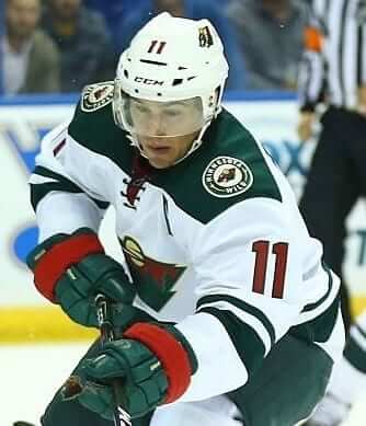
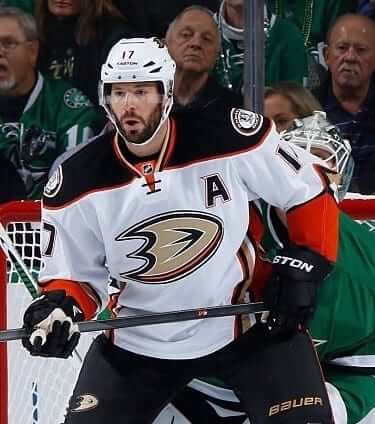
• Some players still using their Easton gear but blacking out the Easton logos. For example, look at Zach Parise’s gloves:
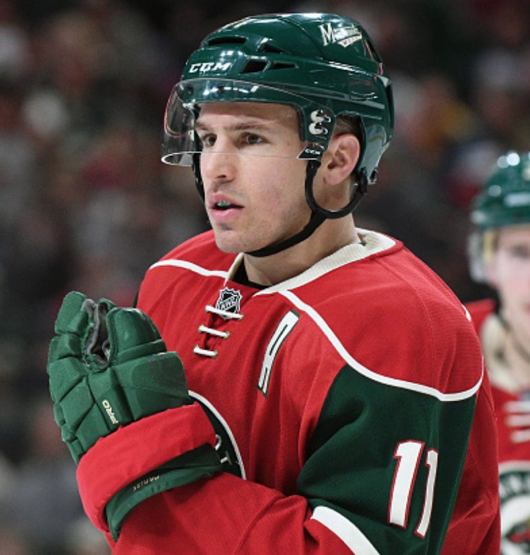
It’s the same thing with Jack Muzzin’s gloves — and also his helmet:
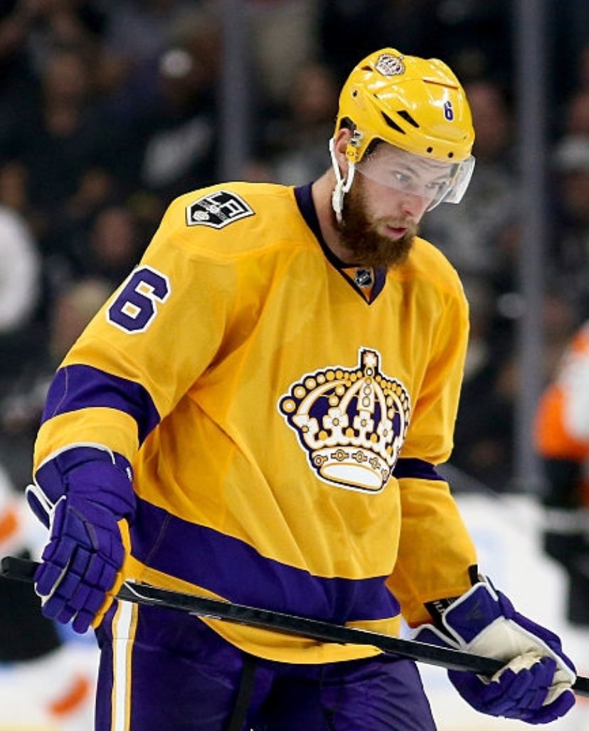
And also Kyle Clifford’s helmet:
• Some players are wearing Easton gloves but with the Bauer logo, like Drew Doughty.
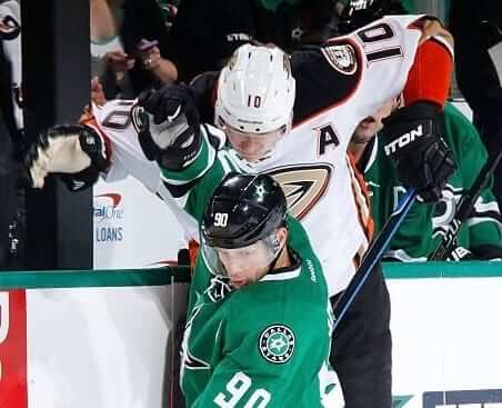
• And some players are just going ahead and wearing their Easton-branded gear anyway, like Ryan Kesler and Corey Perry in Anaheim:
———
Good stuff. My thanks to Brian for filling us in on something that would have completely escaped my notice.
Click to enlarge
Collector’s Corner
By Brinke Guthrie
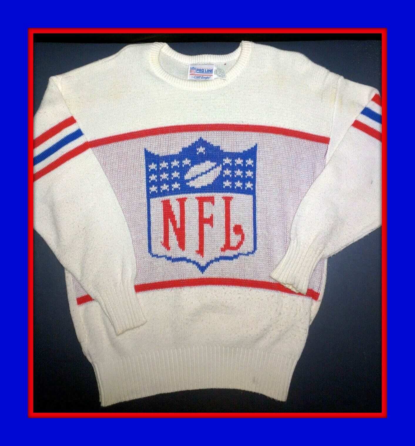
We’ve featured plenty of Cliff Engle NFL sweaters here at Collector’s Corner over the years, but I’ve never seen one with the NFL shield before! They could’ve made the NFL lettering a bit thicker, but otherwise it looks great. Perfect for a Sunday afternoon of watching football on the TV.
Now for the rest of this week’s picks:
• These Pittsburgh Steelers plastic yellow buckets would have been just the thing for Halloween last night. Get it now and use it for next year’s trick-or-treating!
• Here’s a 1970s Steelers bicycle plate still in the package. If I remember right, you took a bit of wire and hung these right under your seat.
• Take a look at this photo of the Cowboys O-line from the early 1970s. I remember all of these guys. The reason I included this listing is simply to stress how the Cowboys’ uniforms should look. Am I right? Or just nostalgic?
• The look on this 1967 Philadelphia Eagles pennant is simply timeless. No midnight green to be found.
• This 1970s Detroit Tigers poster is similar to the Tribe one that we featured last week.
• They really went all-out for the cover art on the 1967 NFL Pro Bowl media guide, didn’t they!
• Terrific artwork for this 1967 Vikings edition of “This Is NFL Football.”
• Cool-looking 1970s L.A. Rams wristbands, still in the package. Or perhaps you’d prefer the Philadelphia Flyers version.
• Nice ceramic Denver Broncos football bank from the 1970s.
• This Miami Dolphins polo shirt by Antigua is most certainly late 1980s to mid 1990s, not 1970s as the seller claims.
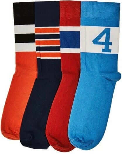
StripeRite update: In case you missed it earlier, I’m excited to share our latest batch of StripeRite socks with you.
The basic concept behind StripeRite remains the same: You want to show your stripes, literally and figuratively, but how can you do that when the stripes found on most stirrups and athletic socks are up around your calf, where nobody can see them unless you hike up your pants? Our own Scott M.X. Turner ”” the guy who designs all the Uni Watch membership cards ”” came up with a great solution to that problem: What if there were socks with the stripe patterns down by the ankle? That way the stripes would be visible as you walked, when you crossed your legs, when you put your feet up on your desk, and so on.
We were very happy with the response to the first batch of StripeRite designs. Now I’m happy to show you the second batch, which takes inspiration from each of the four major sports:
.
.
Nice, right? They won’t be ready to ship until Nov. 21, but you can preorder them now. They’ll definitely arrive in time for the holidays. The socks are available individually or as a four-pack. As always with American Trench product, the socks are made in the USA and shipping is free.
Continued kudos to Scott Turner for coming up with the idea for these socks, and to American Trench honcho Jacob Hurwitz for executing Scott’s concept so well. Again, you can preorder the new designs here, and the first batch is still available here. Thanks.
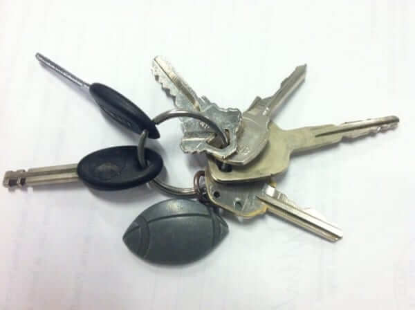
KRC update: You’ll like this: The latest installment of Key Ring Chronicles is from longtime Uni Watch reader/contributor Kenny Ocker, and it’s about the little metal football on his key ring. Check it out here.
The Ticker
By Mike Chamernik

Baseball News: Here’s the logo for the White Sox’s newly christened Guaranteed Rate Field. The Sox wanted to change the downward arrow to a home plate, but that idea got rejected. The naming rights deal will last for 13 years (from Brinke). … With an assist from his mother with sewing, reader Joe Hilseberg made this DIY Rockford Peaches uniform for his daughter for Halloween. … I receive Arizona political ads for some odd reason. Yesterday’s email was baseball jersey-themed.

NFL News: The Bears wore their Monsters of the Midway throwbacks for last night’s game against the Vikings. … The Giants wore a No. 38 memorial helmet decal during the 1986 season, including in Super Bowl XXI. They were honoring running back and 1983 Mr. Irrelevant draft choice John Tuggle, who died of angiosarcoma before the season. … Dez Bryant wore a custom-fit hoodie-equipped suit while speaking to the media yesterday (from Jake Patton). … Several readers mentioned that the Cowboys players who came out for the overtime coin toss on Sunday night appeared to have non-matching pants colors. Now we finally have a visual for that, thanks to this screen shot provided by The Jeff.
College Football News: Duke is preparing its Battleship Grey helmets for Saturday’s game against Virginia Tech. Here’s what the finished product will look like (from Michael Manker). … Leading wide receiver prospect Donovan Jones announced the top five schools he’s considering by tweeting an image of himself in a Franken-uniform (from Frank Manganello).

Hockey News: Sweden wore a soccer-style collar in the 1984 Canada Cup (from Moe Kahn). … The Sabres wore orange jerseys for a Halloween practice in Minnesota yesterday. They play the Wild tonight.

Basketball News: Eric Bledsoe’s name was misspelled on his jersey on Sunday. Between that and the game’s halftime show blooper, things are pretty dismal with the Suns right now. … The Kings’ DeMarcus Cousins was fined for throwing his mouthpiece the other night. … The Warriors only wear their 70th anniversary patch on their white jerseys. The patches are absent from their road jerseys and TMC fauxbacks (from Michael Marconi). … The Kings played the Hawks last night, creating a logo matchup reminiscent of a certain early-80s arcade game. … New uniforms for Boston College (from Phil).

Soccer News: Barnsley’s Sam Winnall suffered a gash to the forehead during Saturday’s match against Bristol City. He later returned wearing a blood jersey (from Mark Murray). … The designer of the World Cup trophy has passed away at the age of 95 (from John Muir).

Grab Bag: A case involving cheerleader uniforms has reached the Supreme Court. The case stems from an apparel manufacturer that may have copied the design of a competitor. Lots of details from yesterday’s oral arguments here (from David Shucosky). … David Firestone is fascinated with the garishness of this racing suit. All those ad patches, lined up-and-down.
There’s no (Cowboys) link in “Now we finally have a visual for that, thanks to this screen shot provided by The Jeff.”
Fixed.
Kind of glad the Vikings didn’t try to go crazy with their uniforms for last night’s game. Pretty good looking.
Agree re: the Cowboys unis.
Especially the number font.
I love the old number font! I hated it when they changed to the big blocky ones they’ve worn for the last 30 years. The TV numbers, however, look better on the shoulder.
Noted before I believe, but the Eagles pennant has “The” before the team name.
Looks like a newspaper title.
That’s rare to see, but I link.
Here’s the logo for the White Sox’s newly christened Guaranteed Rate Field. The Sox wanted to change the downward arrow to a home plate, but that idea got rejected.
The White Sox made their bed, now they have to lie in it.
Technically, the ISFA made the bed for the Sox. But the Sox have a sweetheart deal on rent, so I guess they get what they pay for.
Those renderings aren’t 100% accurate. The Fox32 Facebook page had an actual photo. Slightly different but still terrible.
link
They’re both official; one’s a horizontal treatment and one is stacked.
True. I was just pointing out the difference between what the linked yahoo page was showing vs what actually is on the building.
The Sweden collar photo must’ve been after a post-game jersey exchange because that is definitely Canada’s Larry Robinson in the Sweden jersey.
… and the Swede in the Team Canada sweater is Robinson’s teammate, Mats Naslund. Like soccer, hockey players in international competitions have been known to trade sweaters after a game. The funny thing about the photo is the size discrepancy; trying to imagine Big Bird squeezing into Naslund’s medium sized sweater, while Mats is swimming in Robinson’s.
Huge shout-out to the DIY Rockford Peaches uniform for Halloween. Well done! If she had come to my door wearing that uniform, I would’ve emptied my candy bowl in her bag, and called it a night.
Many thanks to Paul for posting my piece on hockey equipment above. The Bauer/Easton thing is a complete train wreck and as a result, there have been a ton of changes to players’ gear even since I originally wrote to Paul. Some of them include:
*Guys that were covering up the Easton logos on their gloves are starting to receive their Bauer-branded Easton gloves and wearing them in games. Jake Muzzin is an example of this.
*Easton helmets are starting to show up with Bauer branding (Steve Ott in DET), but most guys are still just blanking out the Easton logo.
* More and more guys are just switching from Easton/Bauer to other brands. Ryan Kesler (mentioned above) has switched to Warrior gloves.
*Something is messed up with Bauer’s lead time with getting sticks to their guys. Jeff Carter in LA, who has been head-to-toe Bauer for practically his entire career, was forced to use a CCM stick for a handful of games before switching back to his usual Bauer.
Also, PSG, the parent company to Bauer/Easton filed for bankruptcy yesterday, so I’m sure that changes will be ever-present this season.
Not unprecedented; if I recall correctly, CCM had declared, and was purchased out of, bankruptcy years ago.
Regarding the Easton name in the NHL, it was likely only a matter of time before it was phased out anyway. The NHL has individual categories for equipment (at one time there were seven), and the licensing fee is per category, per brand. One single pair of gloves with your company name on them in the NHL will cost the licensing fee (last I heard, it’s $250,000). A company like PSG, with both the Bauer and Easton brand gloves? That’s TWO separate charges of $250k. Same thing for the helmets, sticks, skates, pants, and protective gear like elbow pads, etc.; you carry two brand names, you pay twice the fee. That’s why some of the brand names we grew up with disappeared; the corporate owners weren’t interested in paying extra fees for the smaller brands. At one point, The Hockey Company (an amalgam of six companies headlined by CCM, subsequently bought by Reebok) had FOUR different brands of gloves in the NHL. When the fees kicked in, some brands were reduced to one or two categories (Koho and Jofa), while others were dropped altogether (Canadien and Titan).
Fascinating info Brian and PaulS.
I’m surprised the old brand equipment aren’t grandfathered. It’s not like teams are pulling rogue logo equipment off current production lines. It’s just the obsolete stuff that’s left over. Players wear through multiple gloves/skates a season. It seems like the new stuff would find it’s way to the ice fast enough.
Well you could argue that Reebok is basically grandfathered in…every once in a while you still see old Reebok gloves, breezers, or a helmet. The old brands should be blacked out because there is supposed to be a fee to display the name, but if there’s one time when the “damage” of lost fees is totally minimal, it’s for Reebok–affiliated with CCM and the name on the jerseys anyway.
When I played hockey as a young man, used to wear Tackla pants. That was a quality hockey pant. Don’t see them in the NHL anymore like one used to. I wonder what happened to that brand?
Tackla is now part of Montreal hockey, which of course, is based in (wait for it) Finland.
Also meant to say, Montreal doesn’t pay the licensing fee, which doesn’t necessarily mean there aren’t players wearing Tackla pants in the NHL. The rules say that any player can wear anything they want, provided that it meets the league’s regulations; however, unless they’ve paid the licensing fees, they may not have a brand name or logo that shows. Tim Thomas was the poster boy for this: he’d wear just about anything, including at least two brands of pads that almost no one has ever heard of.
Another relatively big name in goaltending was Brown; John Brown has made goalie gear since the late 60s, including for the NHL. After VanBiesbrouck retired, I don’t know that anyone has worn the outer stuff, but many goalies wear his upper body protection.
Went to the Clippers-Suns game last night, I thought for sure the Clippers would go with the black and the Suns would go orange.
In that link, is Sean Lee #50 wearing the road pants, the ones paired with the blue jersey?
No, the blue stripes are still royal, not navy.
link
I think he is wearing the same pants, it’s just how different they look in the lighting. If you watch the locker room vids all the pants look extremely green. Those things mess with your mind, man. Unless Nike messed up on the blend, or they are actually making a concentrated effort to remove the green.
You realize that all 3 players are in the same lighting, right? I wouldn’t be surprised if it was something as simple as his pants accidentally getting washed with the jerseys or something and color bleeding (remember how the flywire collars used to turn blue?). But they’re clearly a different color here.
I think there is a case to be made to even the most staunch of traditionalists that the Cowboys need to update their uniforms. Tex Schramm designed the uniforms so that the royal blue would appear navy and the pants so that they would appear silver to match the helmet. I highly doubt that Sean Lee was wearing different pants. That picture just proves how insanely different the pants can look in different lighting. Go watch the video of the Cowboys in the locker room after the game and everyones pants look so green they could be the Eagles away pants. I seriously think the Dolphins could wear the Cowboys pants with orange striping and it would work. Tex Schramm was an innovator of sports uniforms, and I think keeping the Cowboys uniforms so mis-matched and inconsistent is spitting in his face. Which is ironic, because I’m sure the justification for never changing them is “tradition”. But go back and look at almost any picture from the Staubach era and you will never see green pants. You see navy numbers and silver pants that match the helmet. The Cowboys should do the following:
1. Go back to the original numbering they use on the throwback jerseys
2. Use the navy blue they are using on the double star jerseys for the home white uniform instead of royal blue. Cowboys colors are navy and silver. (I’ll admit, I might be OK with continuing to use royal blue as the blue for the home jerseys..it’s a quirk that’s sort of grown on me, though they look too much like the Lions sometime)
3. Make the pants a silver blue that matches the helmet. Not a boring grey, but a silver blue with emphasis on the SILVER.
4. Keep the other uniform sets the same. One of my favorite things about the Cowboys is that all of their jerseys are different designs. That is awesome because they are not all just carbon copies with inverted colors. More teams should do this.
5. Go back to silver stripes on the navy blue socks.
6. Once color rash is over, pair that gorgeous Nike double star jersey with silver pants and navy socks and wear it as a home alternate twice a year. If we must endure color rash to get that double star jersey, the Broncos, and the Chargers uni’s then so be it.
OR
At least just make the silver blue pants actually look more silver blue like the photo made Sean Lee’s pants look. Ah, it feels good to rant about stuff I can never change.
Get rid of the black outline on the numbers and sleeve stripes? And there’s definitely two shades of pants there.
I’m more a hockey and baseball uni guy, but Lord, those Dallas uniforms need some consistency. Navy blue at that.
Problem with the Cowboys’ uniform is the mismatch in colours (silver and blue) between the helmet and pants. Especially noticeable when they wear white. Blues don’t match between the hlemet and jersey. It would look much better if the blues and silvers were consistent.
I have a solution. It would allow them to have a consistent colour scheme for both the light and dark uniforms, as well as being a nod to the past. Just the dark royal blue and blue silver – like this!:
link
I’m all for that, too.
Personally, this is my favorite look: link But you can still see a slight hint of blue in the helmet that’s absent from the pants.
I don’t know if they’re trying to replicate that with the damn-near-aqua pants they wear most of the time, but it looks ridiculous. You’ve got pants that are, for all intents and purposes, one shade of blue (almost baby blue, no?). Witten’s compression sleeves and the socks appear to be regular ol’ blue (Mets, Cubs, Blue Jays, Royals, etc.). Could be due to sweat, but the jersey’s chest numbers (phthalo?) appear to be a different shade from the stripes on the “sleeves.” And, of course, there’s the navy on the helmet.
Indiana MBB will wear alts for their game against Kansas in Hawaii on Nov 11. That means they’ll wear at least 2 alts this year since Adidas always comes up with something for the postseason. I don’t think they’re that bad, I just don’t think IU should wear alts.
The Adidas release also had kind of a dumb mess up in their statement. “The word ‘Courage’ will replace the names of each Hoosiers player” but they don’t have names to replace.
Looks like Kansas will wear something similar as shown in the last pic in the gallery.
link
Mariners announced 40th anniversary patch today – sorry if I missed this being covered before.
link
“The look on this 1967 Philadelphia Eagles pennant is simply timeless. No Midnight Green to be found.”
I’ve hated Midnight Green ever since Jeff Lurie’s ex-wife chose that color in 1996. Philly had the best looking uniforms in the NFL and the went from first to worst in one off season. BRING BACK KELLY GREEN. DO IT NOW.
Pardon me for asking, but what team does the light blue American Trench sock represent?
link
Thanks!
Eddie Robinson might as well have worn a shirt that says ‘Build The Pipeline!’