
Photo illustration by Olivia Brestal; click to enlarge

You all know the photo shown above — it’s “The Catch.” Except, as you can see, it’s actually “The Cat-ch.” The ball has been replaced with a kitty.
That absurdist yet endearing bit of Photoshoppery is the work of a woman named Olivia Brestal (that’s her at right). She recently started a blog called Great Meowments in Sports History, which has a simple premise: She takes iconic sports photos and replaces the ball with a cat. A few of her early efforts — particularly her shot of a feline-bedeviled Bill Buckner — look completely plausible.
I love sports photography and I love cats, so I recently got in touch with Brestal and asked if she’d consent to an email interview. She readily agreed. Here’s how it went:
Uni Watch: First, let’s get some basic info about you. How old are you, where do you live, and what do you do for a living?
Olivia Brestal: I am 26. Moved from Dallas to Kansas City last month to take a position as a Creative Lead/Photographer position with the MLS club Sporting KC.
UW: Which sports are your favorites, and which teams do you root for?
OB: As a kid, I’d say baseball and hockey were my favorites to watch. I was also oddly obsessed with the X-Games. In recent years, soccer has taken the top spot. I’m from St. Louis, so I root for the obvious hometown teams: Cardinals and Blues. From living in Chicago and Dallas, I picked up rooting for the Chicago Red Stars and Dallas Mavericks. I became a Chelsea FC fan during post-college unemployment, when I could watch Champions League replays all day. So a mix of everything.
UW: When and how did you get the idea for this ball/cat project? Were you inspired by any similar projects?
OB: I first thought of the idea about three years ago while sitting around the FC Dallas office. Puns and cat memes were popular in the marketing department. I always thought it would be hilarious if you took these rough and gritty athletes and switched out the ball with a fluffy cat. I stumbled upon a blog once where they had mascots doing human things (“This is SportsCenter”-type scenarios), and it kind of snowballed from there.
UW: Why cats? Why not dogs, or hamsters, or armadillos, or whatever?
OB: The internet loves cats. They are the most ridiculous, spastic animal. And I enjoy a good cat pun. Although you may have something with the armadillo idea…
UW: Do you own cats yourself? If so, what are their names, and what else would you like to say about them?
OB: My sister and I have a cat at my parents’ house in St. Louis. The name she came with was Hillary, but she soon became fairly rotund and took on the name Chubz. Chubz is quite lazy, which makes for great Snapchat doodles. She’s a Snapchat legend amongst my friends.
UW: Do you plan to insert your own cats into the sports photos, or are you just using stock photos? Is it tricky to find just the right cat image to insert into a given photo?
OB: I usually just use Google to find photos. Lots of options. The position and/or facial expression of the cat in the photo can make all the difference. The hardest part is getting modern-day photos of cats to match the old grainy photos of yesteryear.
UW: What are some of the iconic sports photos do you plan to use?
OB: A couple that I’ve jotted down in the past few days are Buckner, Bartman and the Cubs, Willie Mays’s catch, Maradona “Hand of God,” David Tyree’s catch. [In the time since this interview was conducted, Brestal has now done most of these. ”” PL] I also want to do the Brandi Chastain World Cup photo, although that would be replacing a sports bra with a cat, instead of replacing the ball — I’m sure people will allow it. My friends have started sending me a bunch, so the list is growing. I also plan on adding current-day photos as events happen.
UW: How long does it take to Photoshop something like “The Cat-ch”?
OB: The Cat-ch took me about 15 minutes.
UW: Anything to add?
OB: The goal is to post about three to five photos a week. I’ve also thought about a “This day in sports history” daily format. We’ll see.
———
Purrrrrrr. You can keep up with Great Meowments in Sports History here.
ESPN/World Series reminder: In case you missed it yesterday afternoon, I’ve written a Uni Watch World Series Preview column for ESPN, breaking down some of the uni-notable details for each team. Check it out here.
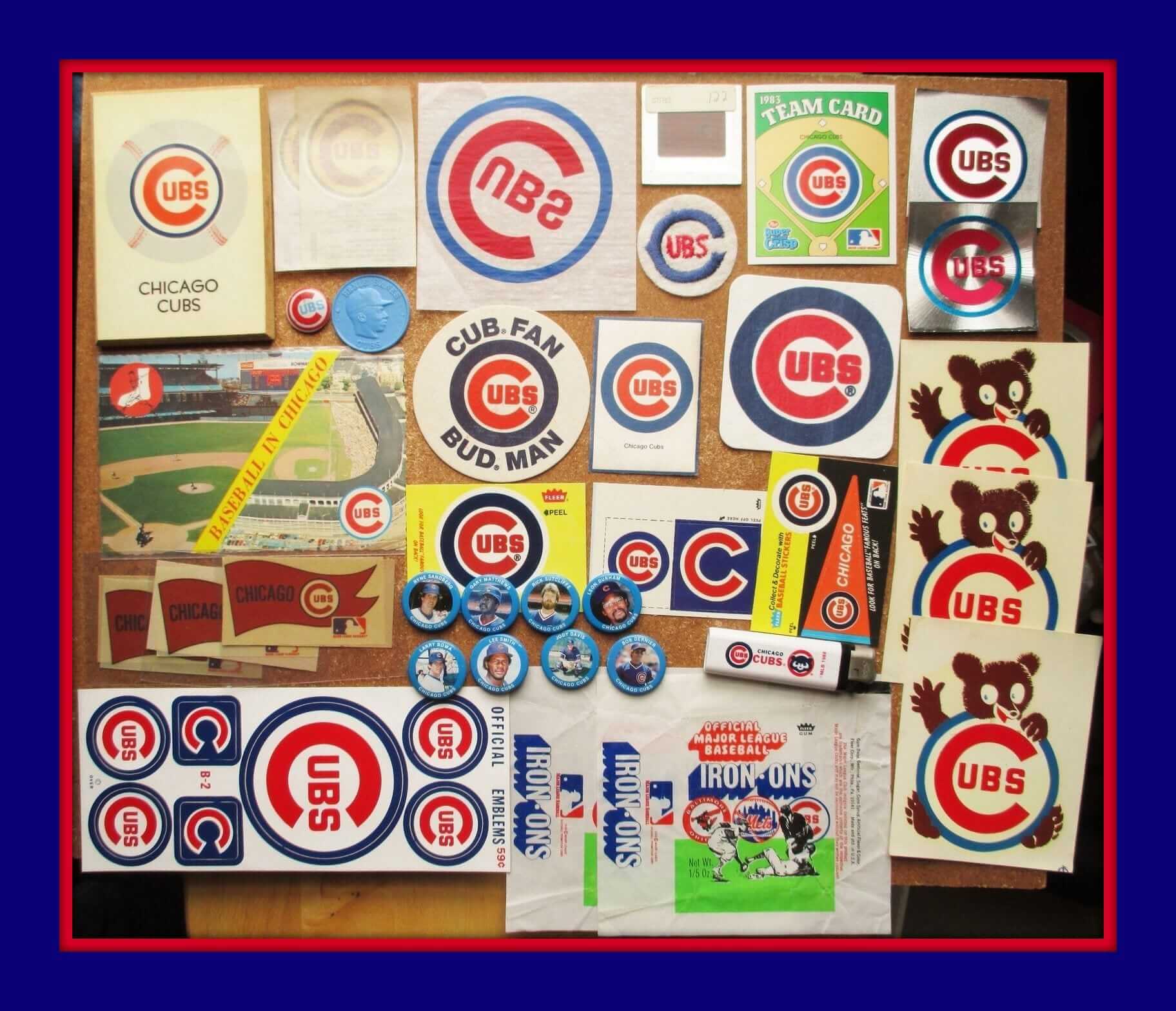
Click to enlarge
Collector’s Corner
By Brinke Guthrie
Tonight is Game One of the Fall Classic, so we’re all Cubs and Indians today. May the best team win — both have long-suffering fans who deserve to see their team emerge as champions. For the Cubs, start out with this 1960s-1980s set of stickers, buttons, and more — a great way to get in the mood for the World Series.
Now let’s see what else we have in this World Series edition of Collector’s Corner:
• Here’s a Tribe item sure to warm Paul’s heart: a pair of 1970s Indians stirrups.
• Let’s play two! That’s what you’ll be saying with this 1970s Ernie Banks instructional record with some kinda ball on a rope.
• Here’s a great-looking 1970s Indians poster!
• The Cubs’ scorecard art from the 1960s was simply amazing.
• I like these 1970s Fleer Indian stickers, notably for the “disco” treatment the Fleer artists used on the city name.
• I like the simplicity of the Cubs jacket designs — they’re usually basic blue. This one from Chalk Line also includes the NL logo, which is rather prominent.
• Duane Kuiper is a longtime Giants radio/TV guy who hit precisely one home run in his MLB career with the Indians and Giants. Here’s his bobblehead commemorating that one dinger from 8/29/77, when he was with Cleveland — and this was a Giants giveaway from a couple of years back! Rarely does a team do a giveaway of a bobble with another teams uni, but that’s how highly he is thought of by Giants fans.
• The inside has seen better days, but nice bold graphics on this vintage Cubbies trash can. Listing says 1960s or 1970s. I’d lean more towards the 1970s.
• Love the 1970s Indians jersey font as shown on this Cleveland Plain Dealer promo tee.
• I like how the navy outline on this old 1950s Cubs pin follows the “S” in the name.
Okay — now let’s play ball!
StripeRite update: In case you missed it yesterday, I’m excited to share our latest batch of StripeRite socks with you.
The basic concept behind StripeRite remains the same: You want to show your stripes, literally and figuratively, but how can you do that when the stripes found on most stirrups and athletic socks are up around your calf, where nobody can see them unless you hike up your pants? Our own Scott M.X. Turner ”” the guy who designs all the Uni Watch membership cards ”” came up with a great solution to that problem: What if there were socks with the stripe patterns down by the ankle? That way the stripes would be visible as you walked, when you crossed your legs, when you put your feet up on your desk, and so on.
We were very happy with the response to the first batch of StripeRite designs. Now I’m happy to show you the second batch, which takes inspiration from each of the four major sports:
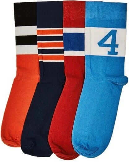
.
.
Nice, right? They won’t be ready to ship until Nov. 21, but you can preorder them now. They’ll definitely arrive in time for the holidays. The socks are available individually or as a four-pack. As always with American Trench product, the socks are made in the USA and shipping is free.
As promised, all the profits from sales of the first batch are being donated to the Jackie Robinson Foundation. A check for $4,451.25 is on its way to them now. Those first four designs are still available, and all profits from them will continue to be donated to the JRF.
Continued kudos to Scott Turner for coming up with the idea for these socks, and to American Trench honcho Jacob Hurwitz for executing Scott’s concept so well. Again, you can preorder the new designs here, and the first batch is still available here. Thanks.
The Ticker
By Paul

Baseball News: A Chicago bakery has been selling Cubs jersey cookies, along with Packers cookies at an unreasonable price (from Jordan Cutler). … The lions outside the Art Institute of Chicago have been outfitted with giant Cubs caps (thanks, Phil). … Here’s some phantom Indians World Series memorabilia, including a 1951 WS pin and 1959 WS tickets (from Robert Hayes). … A Cardinals blog is running a bracket-style challenge to create a new cap. … Good story on the stitchers who sew the World Series patches onto the jerseys (Phil again). … Here’s a look at the official World Series ball (thanks, Mike). … Also from Mike: The Yankees are adding fan decks to the batter’s eye. … And yet another from Mike: Are the Indians hinting that they may wear white tonight? They wore navy for seven of their eight playoff games, and Corey Kluber usually prefers the navy, so probably not. … Washington State football coach Mike Leach says he’s rooting for Cleveland, because, among other things, “I think there are too many out-of-the-woodwork people that like [the Cubs] that like them because they like the uniforms. Don’t know the first thing about baseball. Probably have never even attended a Cubs game.” I dunno, rooting for a team because of their uniforms seems like a perfectly good rationale to me. … Good story on why Cubs hitting coach John Mallee wears No. 11 (from Andrew Cosentino). … Interesting story on the history of the Cubs’ “W” flag — highly recommended (from Todd Radom, who’s quoted in the story).

NFL News: Check out this shot of Dolphins DB Byron Maxwell. As you can see, his throwback jersey on Sunday had real sleeves, but the sleeves had only three stripes, instead of five like everyone else (good spot by Derek Reese). … A DC-area Nike store has a mannequin wearing a mono-yellow ’Skins uniform. … Here’s a fun SuperSonics-themed NFL uni concept. … Some Dolphins fans have started an online petition to get the team to stick with its throwback look (thanks, Phil). … Surprising to see that the Broncos use their old logo for scoreboard graphics. … Speaking of the Broncos, I’ll come out and say it: Their navy alts, which they wore last night (and which of course used to be their primaries), look better than their orange primaries (which used to be the alts). I’m not a fan of this template and wish they’d go back to something more traditional, but if they have to wear it, I think the navy is the way to go. The combination of the bright orange jerseys and the superhero costume elements is just too loud.
College Football News: Serious biker shorts the other day for Indiana CB Marcelino Ball (from John Koziol). … San Diego State has new Aztec-patterned Mountain West Conference logo decals (from Eric Reckman). … New alternate uni this weekend for Kennesaw State.

Hockey News: The Jets plan to wear their Heritage Classic throwbacks two more times this season (thanks, Phil). … Kiss-themed jerseys for the Reading Royals (thanks, Phil). … The Blackhawks wore purple “Hockey Fights Cancer” warm-up jerseys last night.

NBA News: Did you think the Cavs would add a gold-trimmed jersey for tonight’s season opener? Think again — they’re going with the black sleeved alternates, which served as their good luck charm during the Finals. As you can see, they’ll have a championship patch for the opener (thanks, Mike). … Speaking of the Cavs, their players have been unusually enthusiastic about spending time with the O’Brien Trophy. … New Era is now the official headwear outfitter of the NBA (from @BlackburnNathan). … Interesting to note that the Nets’ warmup jackets have sleeve trim that says, “Est. 2012.” That’s the year the team moved to Brooklyn, but the franchise was actually established in 1967. That’s part of a larger pattern of the team erasing its New Jersey past (Mike again).

College Hoops News: Wake Forest has added an “AP” memorial patch for Arnold Palmer, who played on the Wake golf team back in the 1940s. … Wisconsin’s new schedule poster is very uni-centric (from John Okray). … New uniforms — and definitely an upgrade — for St. John’s.

Soccer News: The Seattle Sounders are promoting their jersey advertiser a bit more than most teams do (from John Kimmerlein). … New uniforms for the Harrisburg Heat (from Jim Vilk). … Here’s an animation showing every Inter home shirt worn by Javier Zanetti from 1995-2014 (from Keaton Köch).

Grab Bag: Daytona Speedway is inviting NASCAR fans to vote on which tri-oval grass design should be used for Speedweeks 2017 (from Clark Ruhland). … Lots of great college sports poster designs showcased in this Twitter feed.
Ahh, the formula cats+photoshop=internet has another smash hit.
That Ernie Banks batting thing reminds me of this device i had as a kid:
link
also, note that while Johnny has no logos, one kid does. Oops.
I’m with you on the Broncos navy jerseys. MUCH better than the orange. It seems like they just crammed the orange out there as a hearken back to their previous color scheme. it just doesn’t work for me.
Agree on all fronts concerning the Broncos. It’s a team in need to go to a more traditional look, tone down the orange hue, a true burnt orange, to me would fit better with the western motif of their name “Broncos”
IIRC the original idea when switching from yellow/brown to orange was to use burnt orange like UT Longhorns, but the manufacturer screwed up (kind of like the light blue helmets for Ole Miss).
As a Broncos fan, I could not agree more — in the current uniform combinations, switch the orange jerseys to alternate status and keep the navy jerseys for the primary. Also, keep the helmet striping and logos from the color rush uniforms <– IMHO, I thought those were simply awesome!
I have to agree wholeheartedly with Paul’s assessment; despite the template being responsible for a lot of terrible elements creeping into the NFL uni-verse, the navy jersey is a far better look than the orange.
Agreed. I hate to admit it but the blue does look better. The Broncos should, however, go back to their classic Orange Crush unis. Those were great…except when they wore orange pants with the white jersey. I didn’t care for that look.
Colour rush jerseys, helmets, and logos with white pants, done, fixed.
Totally agree. Wouldn’t mind seeing a powder/royal blue instead of navy though.
I dont recall there being a ball in the picture, but how about the famous dejected Y.A. Tittle photo? Y.A. Looking down at a lil kitten.
link
Thats exactly the one!
Byron Maxwell was just going old school with his throwback on Sunday – wearing the template with what passes for full sleeves these days but shortening it by cutting off 2 stripes.
The Jets plan to wear their Heritage Classic throwbacks two more times this season (thanks, Phil)
Those are in every way better uniforms than what they have now.
They are very similar what I feel is the best Jets uniform of all time:
link
I’m not a fan of the white shoulder yoke on the 1978-79 blue Jets jersey. I think the jersey looked better in solid blue in the previous seasons. I have also never been a fan of the white shoulder yoke on the Capitals classic red jersey so at least I’m consistent.
Solid blue jersey is a good look too. I do like the blue pants compared to the red. I am a fan of the white shoulder yoke with the blue pants.
I think I am partial to this look because it is basically the same uniform that was later worn by my favourite major junior hockey team (WHL Regina Pats) while I was growing up during the 1980s. Yes – the Pats wore both Cooperall and short pant versions during that run with this uniform.
From St. Louis?
Oh my gosh… where did she go to high school?
Yes!
Ha!
Cool lede! I made a reverse-Brestal:
link
Cubbies broke one curse, lets go break another! #iaintafraidofnogoat
Unless the Broncos do a total redesign, the best looking set they’ve worn is the 1994 throwback/mid sixties set with contrasting sleeves like link and link.
The worst thing about the blue jerseys is when they do link.
Agree; those were fantastic. As much as I dislike contrasting sleeves in baseball (be it with sleeveless vests or link), I think it’s a great look for football.
Ugh. Those Angels unis were an optical migraine. No redeeming qualities whatsoever. But I think contrasting sleeves can look good on a baseball uni, provided they’re raglan rather than set-in.
I concur…
Bad Disney!
On the upside, the great Todd Radom redesigned the uniform and that look is still going strong, even if the “Anaheim” away jersey is just a memory.
From those renderings, it looks like the Yankees are removing some of the obstructed view bleacher seats to install those new fan decks. In the pic here (link), you can see how the bleachers currently go right up to the batters eye structure. The renderings appear to show fan decks to the side of the current structure.
Those seats will not be missed. One of the few changes they’ve made at the Stadium that I like.
Very disappointed to see that link next season. The author of the article hates them; I can’t see why someone would dislike a uniform that is traditional and timeless to that extent.
I’d love to see the Cubs dig into their history — explored quite a lot these past few years with the 100th anniversary throwback season — to make an alternate home uniform. Either that or get those ugly names off the pinstripe jerseys.
Cream looks great in flannel, in polyester it just looks fake, in my opinion. I’m actually looking forward to seeing if Under Armour will render some of those classic uni designs in their faux flannel material. Could be interesting.
Doubt it. I remember an interview between PL and Under Armour. Cream is a simple color scheme to UA, while that amazing heritage gray was a pattern arrived at by trial and error. Not sure how you could engineer any “texture” on cream double-knit, but I’d be open to seeing how it looks!
You could do it just like the greys were done, but with a different color scheme (not sure if the texture is part of the knit or if it’s sublimated after the fabric is knit, I’ve seen evidence of the latter). It’s just a mix of whites and creams instead of greys.
Sorry, Mark. That was a fauxback I could not support. In my universe, the Indians are a team with white pants and navy blue shirts.
Navy blue shirts look great on the road but you need something lighter for home games. How about link with script lettering on the front and a quirky non-serifed “1”?
That’s a 1948 Satchel Paige jersey. It’s got the original version of Wahoo on the sleeve. That, and it says so right on the front. ;)
Satchel must have borrowed Larry Doby’s jersey for a day. Either that or the knockoff jersey manufacturer is not to be trusted. :)
Not news – I think that came out in summer – but I’m still bummed out about it. That’s the best home uniform the Indians have worn in 40 years. The block lettering is much more Clevelandy than the script. Also, the script is a remarkably crappy script, among the worst jersey scripts in big-league history.
I’m surprised that they still sew World Series patches onto the unis. I’d just assumed that they’d be that “liquid chrome” or whatever it’s called.
I’m shocked, SHOCKED, to see that that Cards blog is pulling for the Indians.
The Nets have sold Brooklyn merchandise with “Est. 1967,” which just seems…I dunno, “off?” Can’t think of a better way to word it.
Those Packer cookies may be a bit overpriced, but the Hamantaschens look delish. Too bad there aren’t any with prune filling.
MLB just posted a bunch of posed portraits of the Cubs in their Blue alternates to the official Instagram page. If last year’s WS is any indication, Chicago will open the series with the blue jerseys.
Cubs are in their normal road unis. Happy to hve been proven incorrect.
The advertisements on the boards during the Blackhawks-Flames game were all mauve purple as well.
Did somebody say “inserting cats into sports”
link
This is tremendous!
Anyone who, like me, has a “Swiffer cat” will laugh out loud at this.
Jon, I confess that I would not have pegged you as a cat person! Live and learn.
Nothing to do with anything, but check out this link for the Cubs.
“Do you like gladiator movies, Cadet?”
That all yellow Washington uniform is the colour rush uniform they won’t get to wear this year, but next year look out.
Looks like sumpthin’ Arizona State would wear.
Bumped into the exxonmobil website and ran across this company-history-related baseball item — item
link
The replace-balls-with-cats thing was done a few years ago as well: link.
My submission:
link
Oh no! Didn’t realize it had already been done!
Am I the only one who thinks the Redskins color rush uniform would look awesome with the burgundy pants?
Also Paul, I’ve read a few rumors the last few months (forgive my lack of sources) that Nike was planning some sort of throwback theme for the Thanksgiving games, and that the Cowboys could potentially wear a version of their old royal blue jersey (the one that began the blue jersey curse). I think that could have been started by those initial color rush leaks but I didn’t know if there was any credence to the rumors.
2008 vs Pittsburgh
link
link
GIS “redskins steelers 2008” will yield many more results if you’d like to look
Washington would probably improve their dark jerseys by switching to yellow numbers and white outlines.