Click to enlarge
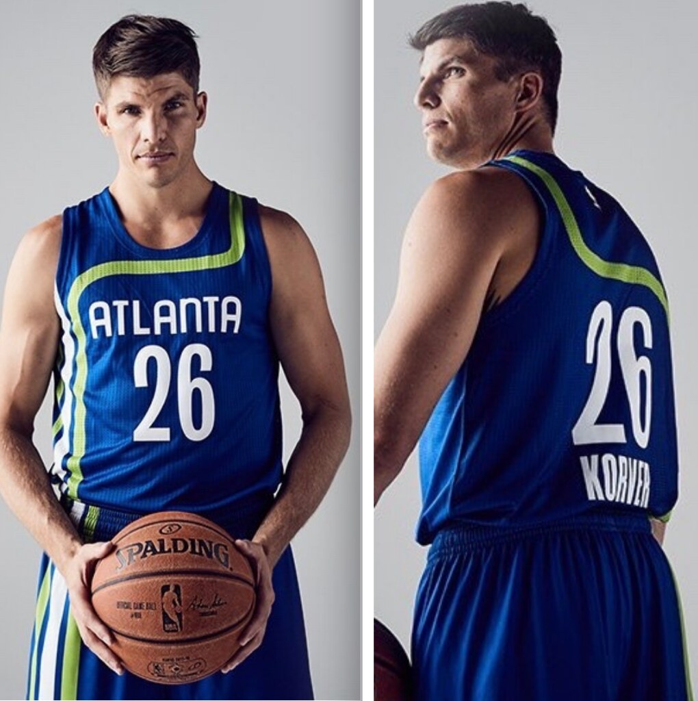
We’ve known for a while that the Hawks would be wearing an early-’70s racing stripe throwback this season (Conrad Burry broke that news, along with the rest of this season’s throwbacks, back in February). But yesterday was the first time the team acknowledged that they’d be wearing them, and we also got our first look at a photographs instead of mock-ups.
First, let’s compare the throwback to the original:
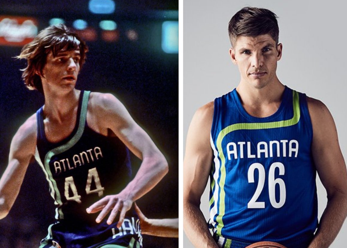
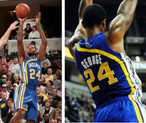
Not bad, although I find it a little disappointing that the stripe is so horizontal across the chest, with none of the original’s graceful curvature. At first I just chalked that up to jerseys being cut wider nowadays (and players being bigger), but then reader David Dearing pointed out that Adidas had no trouble retaining the curvature on the Pacers’ racing stripe throwbacks a few seasons back:
Given the Hawks’ current infatuation with neon green, some folks have wondered aloud why they’re going with the blue road throwback instead of the neon green home version. As it turns out, that Hawks already wore that design as a throwback in 2003, so maybe they wanted to showcase the blue version this time around (or maybe they’re just taking mercy on our eyeballs).
I’ve always loved the racing stripe template. We even used it for the Uni Watch T-Shirt Club’s basketball-themed design earlier this year. I’ve always associated the template with the Pacers and viewed the Hawks’ version as a knockoff (maybe because a team with a racing-associated name like “Pacers” seems like a more natural fit for a racing stripe design), but the reality is that Indiana was actually copying the Hawks. The Hawks’ website says they wore the racing stripe from 1970-72, while the authoritative Remember the Aba site says the Pacers wore it from 1971-74. Kinda crazy that such a distinctive design would be copied by another pro team (albeit in a different league at the time). It would be like another MLB team copying the tequila sunrise in the mid-1970s.
Who designed the racing stripe template anyway? I’ve never seen that story anywhere, so yesterday I contacted the Hawks and asked if they had that info in their archives. They’re checking — stay tuned.
The Ticker
By Paul

Baseball News: Indians P Trevor Bauer, who had to leave Monday night’s ALCS game when stitches on his fingers gave out, normally chooses to wear a grey jersey on the road, but on Monday he chose the navy alt. Why? So blood from his finger wound wouldn’t show (from Mike Petriello). … The Braves’ new stadium will include a brewery (from Andrew Cosentino). … Blue Jays starter Aaron Sanchez was still wearing a José Fernández memorial cap inscription yesterday. It’s interesting to see that MLB decided, right from the start, to allow all of the DIY Fernández memorials. … Here’s a pretty cool GIF that simulates a stop-motion pitching animation with baseball cards (from Mike Hillman).

NFL News: Here’s some tremendous 1967 footage of the Steelers’ “Batman” uniforms in action. If you skip ahead to the 1:40 mark, you can see that placekick holder Dick Hoak, No. 42, did not wear a facemask (from Adam Prince). … The Bengals willl wear their orange alts this Sunday (thanks, Phil). … Jimmy Lonetti likes the uniforms in this Geico ad. “I’d go so far to say the orange/black ones would be in the upper half of the NFL,” he says. “The Bengals should definitely consider them.” … The Broncos will wear their blue alts next Monday (thanks, Mike). … In case you hadn’t heard, Pats coach Bill Belichick thinks sideline tablets are worthless. Oh wait, a company paid a lot of money to have its name mentioned in conjunction with that product, so let me rephrase: Bill Belichick thinks the Microsoft Surface tablet is worthless. Great brand exposure!

Hockey News: The Cardiff Devils — that’s a Welsh team in the British Elite Ice Hockey League — are retiring No. 26. … Whoa, look at this tremendous 1967 L.A. Kings prototype! Never seen that before (from Eric Lichtenberg). … This is interesting: The Oilers revised one of their championship banners because a “5” was actually an upside-down “2” (from Chris Creamer). … This is interesting: The Penguins’ equipment staff scans each jersey into a digital database. Do other NHL teams do this? What about other sports? (From Brian Merrifield.) … The Pittsburgh Post-Gazette has created a pretty good-looking Penguins jersey timeline (from Alex Iniguez).

Basketball News: A giant LeBron James poster in downtown Cleveland is being updated to include the gold championship jersey tab (from Kyle Mackie). … Lots of Warriors-related uni information in this piece, including the news that rookie Patrick McCaw chose No. 0 because he “had zero doubts into coming into the League and zero worries.” … New uniforms for Dayton (from Detroit Don). … New road uni for Utah (from Trent Knaphus).

Grab Bag: Pinktober has spread to U.S. Navy fighter jets (from @BettieDavisFries). … Here’s the story behind Target’s logo. … New purple uniforms for Delta Airlines — the latest installment in their long uniform history (from Phil and Wolfie Browender, respectively). … David Firestone has written a piece about logo creep in auto racing.
Click to enlarge

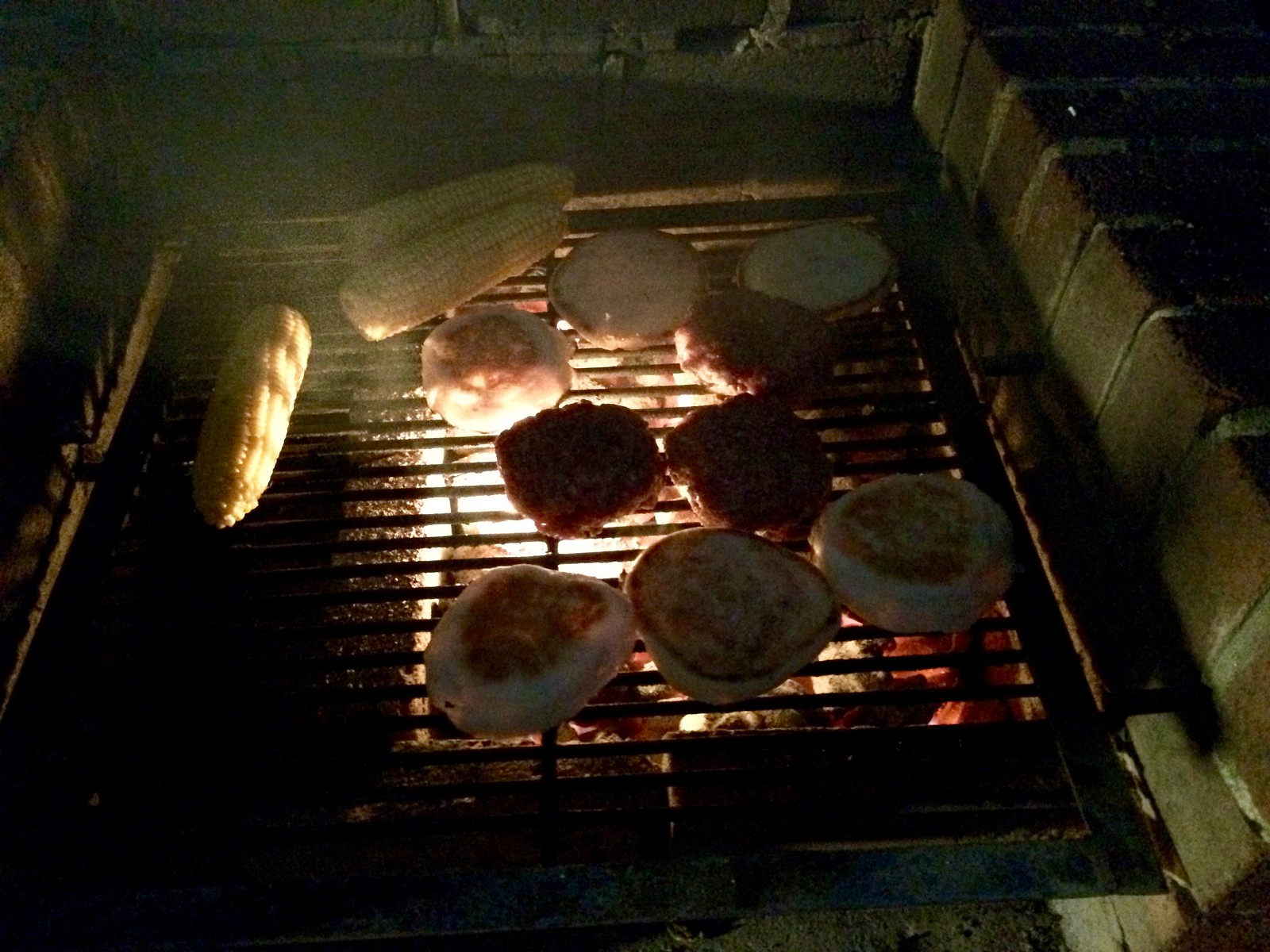
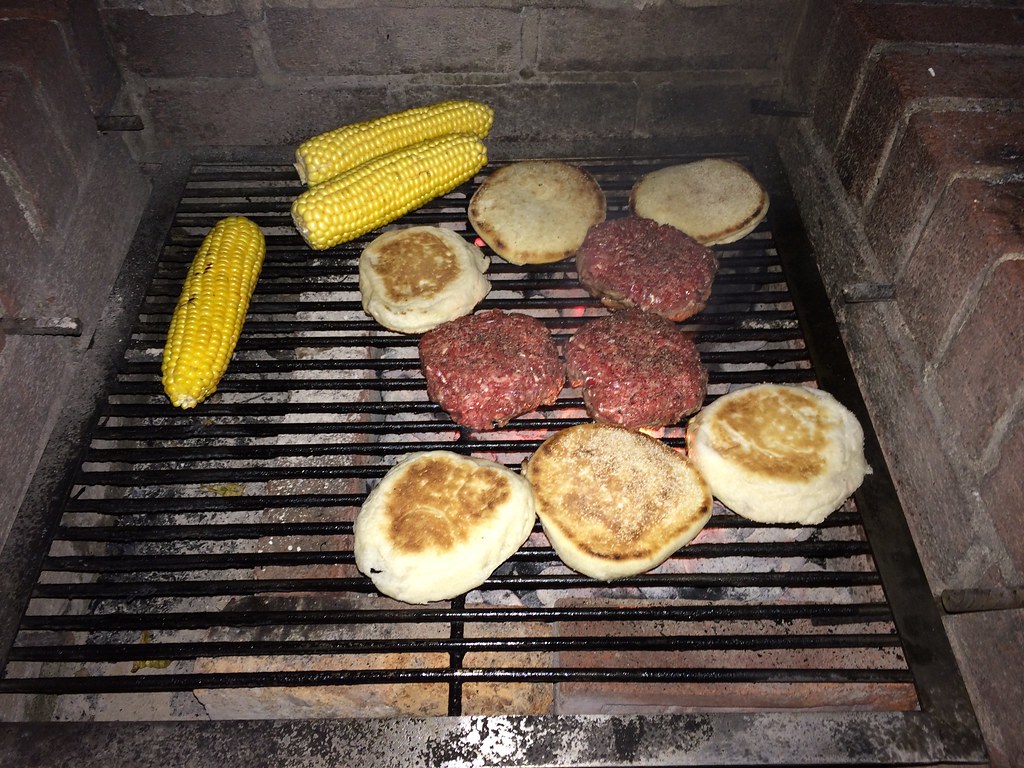
What Paul did last night: Temperatures here in NYC have been unseasonably warm this week (yesterday topped out in the low 80s), so I was joined in the backyard by the Tugboat Captain and longtime Uni Watch pal Carrie Klein as we fired up the grill for a rare mid-October cookout. Felt just like late spring or early summer, except it got dark much earlier, leading to the nice coal-lit tableau shown above.
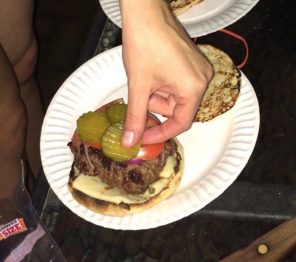
Our menu was nothing fancy — just burgers (with English muffins serving as the buns, natch) and corn corn on the cob. Here’s how it looked with the benefit of flash:
Kind of wish the Hawks would have done these colors for their main color scheme for their re-branding a couple seasons ago.
This is the part where I have to say, “Redesign, not rebranding.”
link
One of the best things about the blue/green color scheme was the way it was used for the Seattle Seahawks in 1976, and the complementary colors (orange/red) were used on their expansion twins, the Tampa Bay Buccaneers. Unique!
Watching Phi Slama Jama 30 for 30 last night, I noticed that many players wore different numbers on their home and road jerseys, including Drexler (22/23), Olajuwon (34/35), Williams (20/21) and Anders (32/33). Seems very odd; does anyone know why?
For a long time, the convention was that the home team wore even numbers and the road team odd (or vice versa), so that when an official called a foul on number 25, there was no ambiguity. That was much rarer by the ’80s, but some teams apparently still did it.
Very interesting. Thanks!
Although if Houston was the only school doing this in the ’80s it sort of defeated the purpose.
Houston was one of the only major colleges to do this, but many high schools at the time also had the even number=home, odd number=away protocol. I think one reason was so ref’s calls would be totally understood — he holds up an even number, they know it’s the home team.
My high school did this. It was also a big deal when they ordered single digit numbers. I remember a friend of mine was a big Rex Chapman fan and had to beg them to order a jersey set with 3 for home, 4 for away. Before that, he’d worn 13 and 14.
We did this through my freshman year of high school in NJ (1990-91), I was #3 at home, #30 on the road. 2 different designs too, so it might have been issue of available hand-me-down jerseys as much as referee convention.
Hope the Steelers bring back “Batman” to replace bumblebee throwback.
Finding a place for the nameplates could be dodgy. Maybe they could go below the number.
I think there’s plenty of space in the gold to fit a nameplate. Maybe straighten it out so the three points of the triangle are shoulder/shoulder/throat.
Seems so logical – their striping pattern link, so they should ditch them in favor of an iconic (and historical) element that does.
Anybody else agree that the Giants’ white uniforms looked a whole lot better in those highlights, with blue numbers instead of today’s red?
their striping pattern doesn’t fit on jerseys anymore…
Then change the jerseys, not the stripes:)
I’d like to congratulate the Dayton Flyers and Utah Utes on making the jump to the NBA.
Meant to change “NBA” to “Basketball.” Now fixed.
“you can see that placekick holder Dick Hoak, No. 42, did not wear a facemask”
This is true, but there’s footage of him at halfback in the fourth quarter, and he does wear a facemask then.
I can’t say I expected to see footage of the 1967 Steelers solidifying their hold on last place in the Century Division today.
Hoak also wearing no chin strap. I suspect given that Hoak was the Steelers running back that year as well as apparently holder for Place kicks, he had a helmet that he wore without a face mask when he was holding so that the facemask did not get in his View of the football being snapped back to him. There are plenty of other pictures in a brief search that show Hoak as a running back wearing a pretty commonplace two Bar facemask.
Proofreading: corn corn on the cob
I had the pleasure of exposing some friends to the joys of grilled corn on the cob. I soaked in salt-water with the husks on for an hour. Then I pulled back the husks, seasoned with lemon pepper, pulled the husks back on and grilled for 30-45 mins, turning every 10 mins over glowing coals. We could have had that corn for desert it was so tasty. No need to add butter or additional salt/pepper.
I’m trying English Muffins next time. Thanks for the tip
As I’ve written before, they are the best burger buns. The ONLY burger buns. Just soft enough without being mushy, just firm enough without being too chewy. And they’re made for toasting.
We used the larger “Sandwich Size” variety last night, but the regular size works too, depending on the size of your burger patty.
Once you go English Muffin, you’ll never go back. They even make Vegan Black Bean Burgers tasty!
I’ll try this, but first I want to try crumpets.
I mean I’ve had them, just not with a burger.
The Geico unis look a lot like what the BC Lions (CFL) in the early 70’s
link
Interesting that the green throwbacks that the Hawks used in 2003 also had the racing stripe run more horizontally across the chest.
Always wondered how the coaches/players can see anything on the tablet screens when LED screens are notoriously difficult to see clearly in full sunlight. And, looking at MS’s Surface FAQ page, electromagnetic interference can really screw around with the tablet’s performance. So let’s see: (1) hard to see in daylight; (2) other electronic gadgets interfere with it. So playing outdoors and being in and around portable 2-way radios, TV cameras and equipment, etc makes using the tablets potentially useless. I say Belichick has a good argument.
Never mind the visibility and wi-fi issues, I’ve always found paper the better medium when it comes to jumping between information whether it be pages in a book, a stack of pictures or what have you.
Regarding the Penguins jersey history article: Nice try… but given that I counted at least six errors (including a repeating one with the shoulder robo-penguins), I think I’ll stick to NHLuniforms.com for my jersey history.
The thing that always gets me when the Pens’ jersey history is recounted is the whole switch to black and gold in 1980, and how the Bruins protested. The idea that the Pens won the argument on the basis of the NHL Pirates just seems ludicrous to me. When I look at link, I find it hard to believe that anybody in the league would even entertain Boston’s claims to “exclusive ownership” of their colors. Even then, black and gold were on the Pens’ jerseys since 1968, on the logo, so really it just seems to me to come down to Jeremy Jacobs throwing a temper tantrum, and somebody coming up with a convoluted explanation to allow the Pens to get their way while overlooking the reality that was right in front of them.
I wish NHL teams who share colors were allowed an alternate home and away uniform set for when they play each other. Maybe a black and white set for when the Bruins play the Penguins. A red and white set for when the Rangers play the Canadiens or Capitals. Blue and white for the Capitals.
And while we’re on it, I wish Jeremy Jacobs just kept the stripe on the Bruins’ pants.
Hockey pants without stripes are like a day without sunshine.
Amen, Walter.
What’s worse is that I’m pretty sure back in the 90’s, Al Davis made some sort of protest to the effect that the Carolina Panthers shouldn’t be allowed to wear black jerseys with silver pants and helmets because that color scheme because it was “owned” by the Raiders.
Never mind all the bright blue trim on the Panthers’ uniforms.
Obviously, this effort failed.
Agreed on the English muffins for burgers, have been doing that for a while. They have to be toasted though.
Well, yes. That’s why I had them on the grill.
Majestic’s team-issued uniform pants for MLB include QR codes in the tag (since 2014?) but I don’t know what happens if you were to scan the code. My guess is it links to something that just shows that that pair of pants was made for [player name].
Typo alert:
Lots of Wariors-related uni information…
Thanks. Fixed.
That L.A. Kings prototype is AWESOME! Would also make an outstanding jacket.
It would be nice to have a full shot of that prototype, and not just close-ups.
Fortunately, a quick search turns up a bunch of photos:
link
Surely the Flint Tropics were the original “racing stripes” team :P
Great costume design in that film; I totally buy link an an ABA team.
After all the bitching by Microsoft about teams referring to their tablets as “iPads”, I can guarantee they wished Belichick did just that yesterday.
In the NFL ticker you mentioned the Bronco’s are going mono-blue, but the article you linked states “The Broncos will break out their alternate uniforms of blue jerseys and will pair them with white pants.”.
Broncos
I think they’ve actually revised that today. Story originally had a mono-blue photo. Will adjust text accordingly.
After watching the great Steelers-Giants “Game of the Week” from 1967, YouTube guided me to “This Week in Pro Football,” Week 7 of 1972, which included the Bears at the Cardinals. This was the season the Bears wore standard block numbers on their white jerseys (which looked awful to my eye), but I noticed #21 and #24 had the older jerseys with the traditional Bears number font, #21, Cecil Turner, being visible at 14:18 and 15:45 and #24, Don Shy, at 16:49.
link
And just to bring everything full circle, Don Shy was featured in the 1967 Game of the Week as a rookie, #25 on the Steelers.
A couple of cancer-related unis:
Walnut Hills High School in Cincinnati wore went Pinktober for their game against Kings last Friday night.
Georgia Southern’s volleyball team wore blue some time ago to honor a player’s uncle, who’s suffering from prostate cancer.
Is it relevant that the pink paint job appears on a decommissioned naval aircraft? Just imagine if the Navy saw fit to give the pink treatment to an active plane!
Pre-GIFs, one way to show motion was with flicker/flip books. Here is a cricket example, featuring the great Sir Donald Bradman:
link