Update, 4:55pm: My take on the new NFL uniforms can be found here.
We’ve been wondering for months now when the NFL would finally reveal this season’s solid-color uniforms for Thursday-night games. There are strong indications that today is the day. The Patriots’ design will apparently be revealed at 9am Eastern, we’ve known for several days that the Bengals’ design will also be released today, and assorted retailers and other sources are all indicating that the moment has finally arrived.
Watch this space as the morning unfolds — I’ll have basic coverage here on the blog and will have more to say over on ESPN.
(And yes, I’m aware that a lot of leaked images were floating around yesterday. I have no idea how legitimate they are — maybe they’re the real deal, maybe not. Either way, we’ll know soon enough. We’ve all waited this long, so a few more minutes or hours shouldn’t hurt.)
Update, 8:53am: And so it begins.
FIRST LOOK: Nike Color Rush Jerseys For Giants, Bills & Dolphins pic.twitter.com/VjELb19Bfv
— Darren Rovell (@darrenrovell) September 13, 2016
NEW Color Rush uniform for Steelers, to be worn on Christmas Day vs. Ravens. pic.twitter.com/HBglMnAHkA
— Paul Lukas (@UniWatch) September 13, 2016
Color Rush uni group shot. pic.twitter.com/CvcwoxOEgb
— Paul Lukas (@UniWatch) September 13, 2016
This week's Color Rush match-up: Jets (white) at Bills (red), which avoids last year's colorblindness problem. pic.twitter.com/EBOP9ghuHM
— Paul Lukas (@UniWatch) September 13, 2016
Promo pics for Texans/Pats Color Rush game 9/22 show both teams in blue – can't be right. Changes presumably coming. pic.twitter.com/xNQrms8Ed3
— Paul Lukas (@UniWatch) September 13, 2016
Color Rush 9/29 game features Bengals (white) at Dolphins (orange). pic.twitter.com/29M3tRw9Z3
— Paul Lukas (@UniWatch) September 13, 2016
UPDATE: Texans will wear white (not navy) in Color Rush game vs. Pats on 9/22. No photo of white uni yet available. pic.twitter.com/drXX1a3XYs
— Paul Lukas (@UniWatch) September 13, 2016
UPDATE: Photo of Texans' white Color Rush uniform, to be worn 9/22 vs. Pats, now available. pic.twitter.com/iLJnq6GIhb
— Paul Lukas (@UniWatch) September 13, 2016
Oct. 6 Color Rush game features Cardinals (white) at 49ers (black). pic.twitter.com/H9r7UnkbOI
— Paul Lukas (@UniWatch) September 13, 2016
Color Rush game for 10/13: Broncos (orange, with new helmet tape/decals) at Chargers (blue). pic.twitter.com/tYYBcJMPeE
— Paul Lukas (@UniWatch) September 13, 2016
Color Rush Oct. 20: Bears (dark navy) at Packers (white). pic.twitter.com/JnjnUef3zj
— Paul Lukas (@UniWatch) September 13, 2016
Color Rush 10/27: Jaguars (gold) at Titans (blue). Same unis they wore against each other last year. pic.twitter.com/320e0lCZsJ
— Paul Lukas (@UniWatch) September 13, 2016
Color Rush Nov. 3: Falcons (white) at Bucs (red). pic.twitter.com/93e3J7V73P
— Paul Lukas (@UniWatch) September 13, 2016
Color Rush Nov. 10: Browns (white) at Ravens (purple). pic.twitter.com/7rocss9XhT
— Paul Lukas (@UniWatch) September 13, 2016
Color Rush Nov. 17: Saints (white) at Panthers (blue). pic.twitter.com/0TaYWBxrE3
— Paul Lukas (@UniWatch) September 13, 2016
Color Rush Dec. 1: Cowboys (white) at Vikings (purple). pic.twitter.com/wl0wwWkXAL
— Paul Lukas (@UniWatch) September 13, 2016
Color Rush Dec. 8: Raiders (white) at Chiefs (red). pic.twitter.com/oIjcHwIJAa
— Paul Lukas (@UniWatch) September 13, 2016
Color Rush Dec. 15: Rams (white) at Seahawks (green). pic.twitter.com/k8hgm8MZIZ
— Paul Lukas (@UniWatch) September 13, 2016
Color Rush Dec. 22: Giants (white, with throwback helmet logo) at Eagles (black). pic.twitter.com/EMSj1QlnLG
— Paul Lukas (@UniWatch) September 13, 2016
Steelers to wear black Color Rush uniform on Christmas Day vs. Ravens (who are expected to wear white, no pic yet). pic.twitter.com/laPMegfP7q
— Paul Lukas (@UniWatch) September 13, 2016
And that’s it, at least for now. I’ll have some thoughts about each game’s uniform pairing later today on ESPN.
Collector’s Corner
By Brinke Guthrie
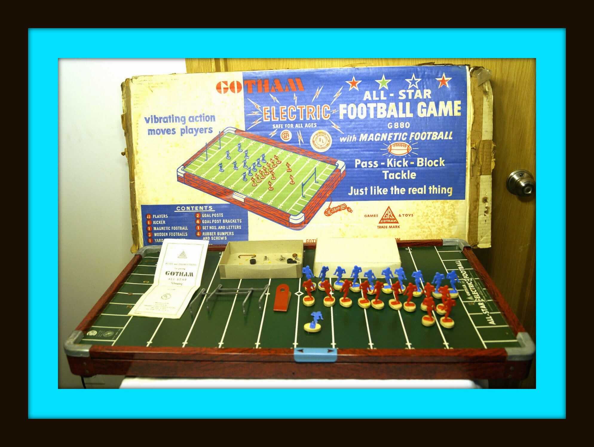
Been reading a fascinating book on my Kindle: The Unforgettable Buzz: The History of Electric Football and Tudor. (I’ll have a review on it once I’m done- it’s a lengthy read!) So far, the battle in the book — besides the one on the vibrating field — is between the rival companies Tudor and Gotham, who really went at it. Here’s one of Gotham’s efforts from 1954: the Gotham All Star Electric Football Game, model G-880. And in the interests of equal time, here’s a Tudor NFL Team Set, which I never even knew existed. And check out this Falcons set—do you remember those stick-on numbers? Man, I sure do.
Now to the rest of this week’s picks:
• Bart Starr stars in this print ad for the Goodyear Tire & Rubber Company. Own a set of Official N.F.L. Team Emblems! Complete set of 15, just a buck. Must be stickers, and they sure look like Chiquita NFL Stickers to me!
• Never seen these before: a predecessor to the famous NFL 1972 Sunoco album and stamps, it would seem. These are American Standard Oil Amoco NFL All-Pro Football Stamps (whew) from 1966, and boy howdy will ya look at the artwork. I’m guessing the players didn’t have final say on how they looked.
• Look at the 1966 helmet art for this embroidered Colts patch, sponsored by National Beer.
• Also from the Colts: this 1960s button says “Our Colts are best and so is Baltimore.”
• Had one of these! This is a Cowboys throwback jersey, I assume for Duane Thomas. These were well made — very heavy-duty jersey knit, with embroidered numbers. Fine work by Champion.
• Another classic ring-pull zip-front sweater from Sears, this time for the Denver Broncos.
• Here’s the 1969 Official Touch Football Play & Rule Book from our friends at NFL Properties. Wish we had this when we played touch on the Terrace Park soccer field back in the day.
• Love the clean simplicity of this 1960s Packers coffee mug from Chase Sanborn coffee.
• See this supposedly 1970s Vikings tee? Can’t say that I’ve seen this type of facemask art used on a shirt before.
• September 3rd, 1967. That’s the date on this game program between the 49ers and the Ray-duhz. Check out that cover art!
• And from reader Will Scheibler, check out this Pittsburgh Pirates warm-up jacket from … wait for it … 1905!
Classically inconspicuous: I’ve long been intrigued by the standard package design for supermarket bacon, which shows the bacon slices fanned out to create the illusion of leanness, and then on the back there’s the little window showing the “representative slice,” which of course is much fattier, because bacon is, you know, naturally fatty:
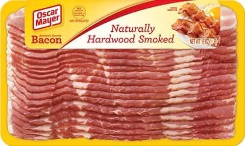
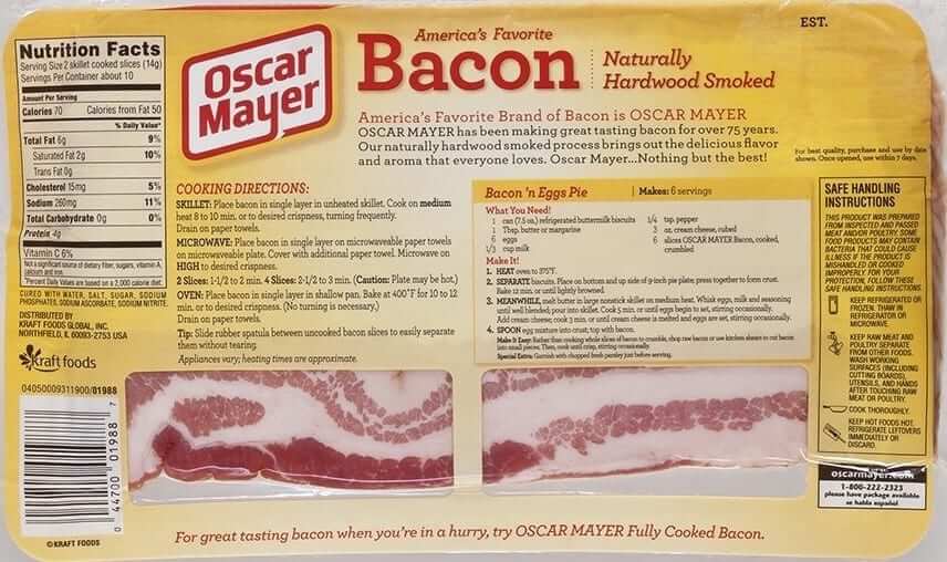
It’s an ingenious packaging format. Who came up with it? What’s it called? Are they legally required to show the slice on the back?
I’ve written an article that answers all of those questions, and more. It’s up today on the Bloomberg Businessweek website. I’m pretty happy about this one, people, so I hope you’ll check it out. Also, I’ll be talking about the story on this evening’s segment of the radio show Marketplace, so tune in for that as well. Thanks.
And speaking of inconspicuous details…: While walking on various beaches this summer, I’ve noticed that when a wave inches its way up the sand and then recedes, it often leaves a herringbone/zigzag pattern in the sand. I’ve probably seen this for years, or even decades, but I never really noticed it until this year (for all of these pics, you can click to enlarge):
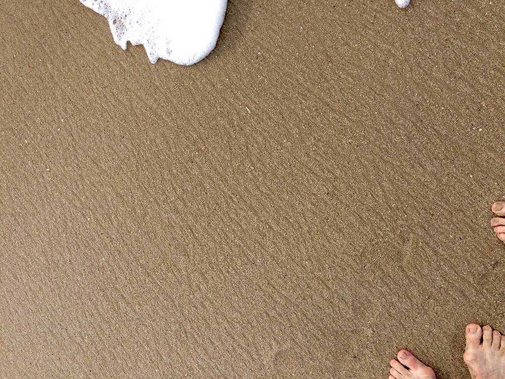
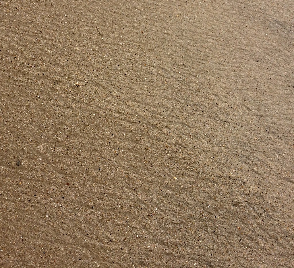
I’m intrigued by how the water creates such a geometric pattern. How does that happen? Anyone..?
Even weirder: The other day I noticed that almost the exact same pattern appears on the bottom of Lorna Doones!
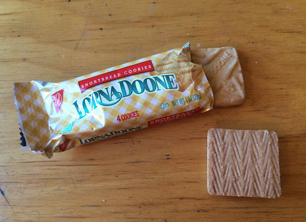
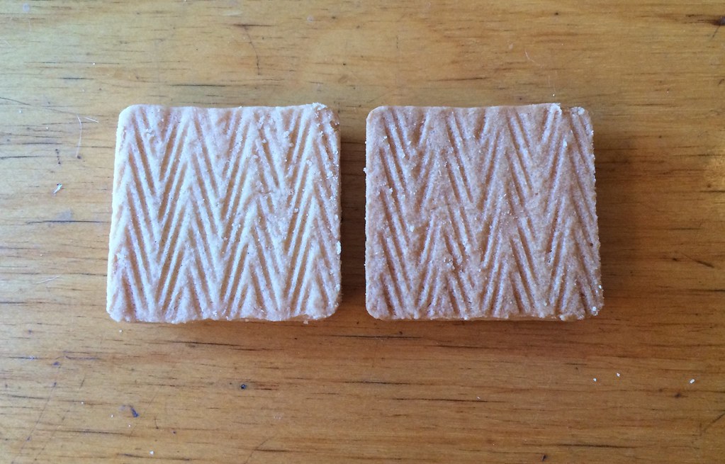
Obviously, that pattern is imparted by the conveyor belt that carries the cookies, or maybe by the mold that forms them. Anyone know more about that?
At first I thought I’d also seen this same pattern on the bottom of a Snickers bar, so I rushed off to buy a Snickers, only to find that its bottom pattern actually has a slightly different kind of zigzag pattern, more like an EKG readout:
Soooooo fascinating. If anyone knows more about any of this — the ocean/sand thing or the bottom-of-junk-food thing — I’m all ears. Thanks.
The Ticker
By Mike Chamernik

Baseball News: The Pirates wore grey last night, making it seven different jerseys in a week. Working backwards, they wore 1979 yellow throwbacks, black alts, Homestead Grays throwbacks, camo tops, 1971 white throwbacks, and their standard home whites (from @redbuppy). … A’s rookie Joey Wendle bats barehanded. … Mariners call-up Daniel Vogelbach will wear No. 20. … The Red Sox are giving away this Big Papi shirt-jersey tonight. It features his trademark gold chain. … A Blue Jays fan with a comically oversized glove snagged a foul ball on Sunday. … Rays rookies dressed up in patriotic wrestling singlets. … As of yesterday morning, all the division leaders had roughly the same color scheme, although the Dodgers’ touch of red is a stretch. … New hats for Youngstown State. That’s from Robert Hayes, who also notes that the team wore stirrups and zip-front vests in the 1960s. … An Astros fan wore a misspelled jersey last night (from Bart McKay, via Phil).

NFL News: 49ers teammates Colin Kaepernick and Eric Reid took a knee during the national anthem last night. On the opposite sideline, Rams teammates Robert Quinn and Kenny Britt raised their fists. Meanwhile, Broncos LB Brandon Marshall lost another endorsement deal yesterday, this one with CenturyLink, due to his anthem protest last Thursday. … The NFL will allow personal messages on cleats during Week 13 this season. The messages must promote a charitable cause and will have to be approved in advance by the league (from Phil). … The underside stripes on Antonio Brown’s sleeves look pretty weird (from John Dankosky). … Several Chiefs and Chargers swapped jerseys after Sunday’s game. … I dig the cartoon logo on this “Riverboat” Ron Rivera T-shirt. … The Rams’ Fearsome Foursome wasn’t always so intimidating (from Ronnie Poore). … The NY Daily News ranked the 32 NFL logos. Nothing of substance in that piece, though. It’s click bait-iness is particularly evident when compared to Zach Lowe’s NBA logo rankings from last summer, which featured thoughtful design critique and input from actual designers (from David Smolowitz). … Little-known fact: An arena team called the Albany WarBirds was set to unveil its name and logo on September 12, 2001. The team was eventually named the Conquest (from Mitch Goldich). … Recently retired Lions WR Calvin Johnson is participating on Dancing With the Stars, and last night he and his partner Lindsay Arnold wore Lions-themed outfits, complete with Johnson’s familiar No. 81. … Super Bowl 50 was played at the the 49ers’ stadium, which presumably explains why a member of the chain gang at last night’s Rams/Niners game was wearing a vest with the Super Bowl 50 logo.
College Football News: Ohio State will wear Woody Hayes-era white throwbacks on Saturday (from Phil). … LSU will wear gold throwbacks on Saturday. Here’s another view and a detailed look at the uniform (from Brian Rees). … Several letters in Wisconsin’s new end zone are upside-down (from Nate Neumann). … Central Michigan players wore a mix of glossy and matte helmets on Saturday (from Kurt Witten). … The colors from Michigan’s official style guide don’t match the new Nike colors (from Phil). … An Iowa fan has some aggressive Hawkeye tattoos.

Hockey News: The Canadiens presented a No. 71 jersey to Peter Thomson, the Representative of Fiji to the United Nations and the incoming 71st U.N. General Assembly President. … Devils rookie defenseman Yohann Auvitu will wear No. 33.

NBA News: Chinese media outlets are reporting that the Rockets will retire Yao Ming’s No. 11. He was inducted into the hall of fame last weekend. … The Hawks are letting fans swipe left and right (like or dislike) every logo in team history. The logos come from Chris Creamer’s SportsLogos site. … James Harden will wear a “Ghost Pepper” colorway of his Adidas Crazylight shoe for a few games this season. His signature shoe doesn’t launch until next year. … In case we didn’t already know, the Raptors revealed when they will wear their Huskies throwbacks and Chinese New Year unis.

Soccer News: New York City FC’s Andrea Pirlo has new burgundy cleats that represent his love of red wine (from Mikey Traynor). … New kits for Newell’s Old Boys, an Argentine club.

Grab Bag: The NCAA has pulled seven championship events out of North Carolina, including the first two rounds of next spring’s March Madness, in response to the state’s anti-LGBT law. … The Joint Program Executive Office for Chemical and Biological Defense is holding a competition to design a suit that protects against chemical and biological attacks (from James Gilbert). … New logo for Snapdeal. … The English post-punk band Public Image Limited sells a cycling jersey (from Eriq Jaffe).
Is the NFL logo with the Nike swoosh an official thing or just for fun?
Cool piece on the bacon packaging!
I asked Phil (whose digital design skills are much better than mine) to create that logo back in 2012. My concept, his execution. We’ve used it periodically here on the site since then.
But I can totally believe it as an official thing.
Just wait…it is “Manifest Destiny.”
mmm…bacon
I remember learning about the mandated cut out during a segment in governmental economics (fun stuff) that could have been called “stupid law, or helpful consumer regulation”. I do agree that the “block” style bacon (I think Oscar Mayer does it for their fancier bacon styles) is a better representation of bacon’s true nature.
Suspected typo in the Bloomberg piece: But the reality is far less prosaic: It’s due to a federal regulation.
Should be “more prosaic,” unless the assertion is that “federal regulation” is the more romantic, less commonplace alternative, which doesn’t seem to be the sense of the paragraph.
The bottom of the Snickers would be from the conveyor lines after it has been coated. Suspect the conveyor has that pattern to help avoid sticking because there isn’t a lot of contact in any one particular direction.
I hope the leaks are not right – if they are the Patriots/Texans game is going to be a dumpster fire.
Electric football? Bacon? Geometric patterns in sand, Lorna-Doones and Snickers Bars? All in one post? I LOVE THIS PLACE!!
Also, Paul and Kai Ryssdal in the same half hour of radio tonight? Epic!
re: beach sand – I suspect your photo was taken closer to the water than to the limit of the wave. The wave has a non-zero speed parallel to the shoreline, so when it washes up the beach it creates the lines in one direction, and when it washes back down the beach it creates the lines in the other direction…
ed
This is basically what I would point out too. (FWIW, I am a geologist, but I don’t specialize in coastal geomorphology.) Basically, it is actually fairly uncommon for waves/water current to run perfectly perpendicular to the shoreline. The typical phenomenon is that waves approach the shore at an angle less than 90º; this is why beaches can be modified by wave action over time, and why humans build measures that prevent this ‘longshore drift’ such as jetties, breakwaters and groins. There are some helpful descriptions and images here: link
Perhaps it was mentioned on this site at some point and I missed it (and also, I pay zero attention to preseason NFL football), but why are the L.A. RAMS horns/yellow so banana-y?
It’s not bright yellow and certainly isn’t metallic. What shade is it supposed to be? Nicotine teeth yellow?
They’ve moved from Gold to that odd shade of Yellow.
Patriots leak is accurate.
link
Eagles going all black for the rush.
link
I feel a rush of an absence of color. . .
if you go by the leak.. The Browns wont have the “CLEVELAND” across the chest
link
forgot the link
I really hope that’s a preview of their inevitable rebrand.
Browns will be wearing all-white vs. all-purple Ravens on November 10.
link
Yeah, both their colors get into color-blind territory. So white it is.
Still like the brown and orange.
personally like the CLEVELAND on the chest
That Public Image Limited cycling jersey is better looking than 98% of the stuff out on the roads. I want one.
The LSU uniforms are fauxbacks. The jersey collar has the “Sailor Mike” logo, the sleeve stripes don’t wrap around, and the pants have an “L” on them. I’m not sure if they wore white helmets in the 1940s (probably still the leather helmet era), which is the era to which the jersey “throws back”, but I doubt the numbers were gold on the helmet back then.
I thought LSU wore dark gold helmets with a blue stripe in the late 40s.
Why not wear that instead of white?
LSU never wote Navy Blue – the dark Purple appeared to be Navy. Prior ro the early 2950s switch to Yellow/Athletic Gold, LSU wore head to toe Old Gold – painted leather helmet, jersey and pants. In 1949 they wore Purple plastic helmets with a sinhle Old Gold stripe for the first two games, then switched to the older Old Gold leather helmrts for the balance of the season. I have the 1959- 1950 yearbook with numerous photo, but no explanation gor the switch back to leather helmets. Early 1950s switvh ed d to wearing Purple jerseys with curved numerals – similat to Ohio State font in that era, then in mid 1950s switched to wearing White jerseys at home with UCLA string and Athletic Gold helmets and pants – essentially what they wear today.
LSU never wore White helmets until the DiNardo era when he paired them with Yellow jerseys and White pants because he hated Purple and was occasionally not allowed White at home due to telporary NCAA Rules allowing visiting team to veto White at home.
No clue as to planned White helmets other than they already have them issued for rsre occasions such as last year’s games vs. Ole Miss and South Carolina.
Cheap move by LSU.
1949-1950 yearbook
Thanks for the info Nick. Interesting. Ya I should have said a purple stripe.
The Patriots color rush jerseys are better than their everyday jerseys. I dig it.
I was about to say the same thing. I approve. Although one rumor out there had them in red for the color rush, goes to show how true these things can be
Green Bay:
link
Not. A. Fan.
Ehh, better than all green or all cheddar.
Either of those could have been a throwback. As could an all-white. Any of which would have been better than alternate pants, which may now make their way into the rotation.
Broncos Color Rash unis from their website:
link
Interesting that the helmet shown has the throwback logo on it, which is much better than the current logo.
The numbers and stripes are reminiscent of the 1990s version of their classic unis as well.
This article talks a bit about the physics that cause patterns in beach sand: link
This article mentions it but is more about wind and sand patterns: link
Basically when you get fluids travelling over small grains, interesting things happen.
The world has turned upside down: I actually like a lot of this season’s Color Rash unis, both in general terms as decent football uniforms and specifically for the teams in question. Maybe just a case of my standards and expectations being sufficiently lowered by what has gone before.
The Patriots/Texans wearing blue is obviously an NFL conspiracy to get Jimmy Garoppolo to throw to the wrong team after a punishment that backfired by Roger Goodell.
The upside-down “N” in the Badgers’ end zone would fall under the purview of that website Paul featured a few years ago. By the way, don’t ever post a comment on that site; it’s like trying to get into Fort Knox.
Beyond dumb…why would they craft uniforms for teams that can’t wear them due to match-ups (IE HOU and NE can’t both wear blue, the Jets can’t wear the green, I’m betting the Ravens won’t wear purple vs the Steelers black)…it seems like half of these are either a) uniforms teams already wear (Eagles, Patriots) or b) won’t ever see the field. I know helmets are limited to 1 due to the league’s rule, but I still can’t believe they opted for this instead of throwbacks.
Why? $$
True…but it’s awfully dumb to be a jersey a team never wears
These aren’t 2016 Color Rush uni’s, meaning they aren’t just for this year. I think these teams will wear their Color Rash uni’s next year if the match-up works out that way.
It’s worth noting that the proceeds for sales of Colour Rush jerseys are going to charity, so it’s not AS $$$ as you might think
The NFL One-Helmet per player rule (or strong suggestion??) really sucks when combined with the color rush unis. The Bengals will be wearing white color rush unis with their orange and black helmet. Is it even proven that only using one helmet reduces the chance of concussion?? How many helmets per year do the Oregon Ducks wear??
The issue isn’t so much about changing helmets, but changing models of helmets in-season. Because a different model fits differently, they don’t want players changing models, just because their usual model is no longer in production.
Personally, I think the NFL should stop grandfathering in old helmets.
Is it even proven that only using one helmet reduces the chance of concussion
It’s not about concussions, it’s about the small sub-concussive hits that happen on every single play.
I think there are 30 or more multimillionaires preventing the NFL from allowing teams to change hat colors on a weekly basis. Those are the quarterbacks, who tend to throw to helmets.
There’s no proof
It would seem to me that a brand new properly sized and fitted helmet would provide better protection than one with inner padding pushed and worn down over 15 to 20 weeks of almost daily wear and tear.
Ravens Color Rush:
link
Ravens Color Rush
Twitter – link
I enjoyed the bacon article. Seems odd the companies and former employee were so tight lipped. With out giving anything away, were you told anything off the record to indicate why they would not comment for your story? I would think they would enjoy the free publicity.
The Oscar Meyer bacon packaging was also the inspiration for a 7″ single that I happen to have a copy of.
link
TL/DR version – The record is colored vinyl that resembles the marbled look of bacon and the back of the record sleeve has the “representative slice” cutouts on the back so you can see the vinyl. The packaging got the record into the permanent collection of The Smithsonian and is officially considered a National Treasure.
The record is pretty good, too.
Holy cow – that’s amazing.
That is really, really cool.
Awesome! I know Rob Warmowski (who played in Buzzmuscle and conceived of this record packaging) from a different internet community. Small world!
”Springfield (MA) Thunderbirds to unveil mascot and jersey designs.”
link
Well, according to link, Lions president Rod Wood has said that Detroit won’t be wearing their black Color Rash unis this year, because they’re not playing a Thursday Night Football game. Nevermind that the Cowboys and Panthers did their Color Rash on Thanksgiving last year in their usual non-TNF timeslot. Of course, I’d just as soon the all-black uni NEVER take the field.
On the plus side, I do like that the Giants are going 80s-90s throwback, complete with “GIANTS” on the helmet. Though they still have that ugly-ass “ny” below the collar. I’ve never liked that particular logo, and it looks horribly dated.
I dig the Bengals’ all whites (The Cincinnati Zoo has white tigers). Wish the helmet could be black and white too. Interesting that the number font is different. Wondering if a uni change is in the future…
As for the Wisconsin endzone, it also looks like the “S” is flipped also.
I really wish they’d let the teams wear contrasting socks. That’s the biggest problem with this whole thing.
Me too, but that would ruin the whole point from their perspective. They’re trying for the unitard pajamas look.
Uniform yes but I wouldn’t call it a leotard since the look extends to the shoes rather than stopping mid calf.
So if not leotard, what? Footie Pajamas?
Agreed. Most of these actually aren’t terrible (some I actually think are improvements)…until you notice the leotard effect.
Ok, the socks are the second worst thing. The freakin Raiders wearing white instead of silver is just so stupid I don’t have words for it.
They can’t wear all silver – Nike doesn’t do metallics.
I love that white jersey, so close to link. Thicken the black outline and make it the new road jersey.
Well… Nike needs to get their shit together. All-black would’ve worked too, the Chiefs red is rather bright. Don’t get me wrong, I love that particular white jersey, but people are going to bitch about the numbers not being readable, and the white pants are just wrong.
Paul, I had you pegged as a slab bacon guy. ;)
New York City FC’s Andrea Pirlo has new burgundy cleats that represent his love of red wine
It’s a little more than that; he worked harvesting grapes as a kid and in 2007 he bought a vineyard in Italy, which his family runs today.
And have to say, burgandy-colored boots are going to look amazing with NYCFC’s sky blue.
And the hate against the Lions jerseys is on now! link
Key phrases: “Matt Millen” “Carolina Panthers”
And the goddamn William Clay Ford, Sr. patch being a perma-memorial. We Lions fans want to FORGET him, but the damn team won’t let us!
I tweeted this question, too, but are the green accents on the Jets uni for Thursday kelly green? Or are they just wearing their regular all-whites and swapping out the facemask for white? The above stock photo makes the green look kelly, but if you look at the pic the posted on social media (link), the decal looks like the usual drab green. Last year, they replaced their decals with kelly accents, so I’m thinking it’s the former.
I believe so, yes.
If you recall, last year’s Color Cash jerseys were kelly green but the shoulder inserts and logo patches were the standard hunter/forest green (and are, ironically, the only part of the standard jersey that uses the correct shade of green).
UPDATE: Apparently, link.
RE: Color Rash. Some of these uniforms, from purely a template perspective, actually look good. I like how some are attempted throwbacks. Of course, the slavish devotion to a monochromatic scheme ruins most of them (I guess that is the point, huh). Better socks with a little contrast or striping would help a lot of these uniforms. The Packers uni would be decent with some striping on the socks..or even their normal socks.
A Modest Proposal
If we’re being honest, wearing matching jerseys and pants really isn’t that unusual in the NFL today, what really make the Color Rash unique is what goes on below the knee. I’d like to make two simple proposals. I think the NFL should eliminate mandatory whites in their socks and allow for teams to designate colors other than black and white as their cleats.
As bad as some of the Color Rash uniforms have looked, none of them sport the dreaded leotard or uni-tard look. Every player on every team has uniform hose without the wild variances between high and low whites that we often see on a weekly basis. A solid sock, also allows to teams that have inexplicably opted for the leotard look to opt for solid white socks instead, better retaining the proper knickered form.
Team wide colored cleats have been common in baseball since the 1960’s and I can see how teams like the Rams, Colts, and Chiefs would benefit from being able to use a similar look. It’s already common in the college game and bringing it to the NFL could spur a striped sock renaissance like what we’ve seen of late in baseball.
As classic as the socks with whites are, I think the NFL uniform would greatly benefit from eliminating them as a mandatory feature.
I think the NFL should eliminate mandatory whites in their socks and allow for teams to designate colors other than black and white as their cleats.
The NFL does allow players to wear cleats in team colors. They have for a couple years. They have the option of team colors or one of either black or white, depending on what the team has designated as their official version. The Packers are a black-shoe team, but plenty of players link.
As bad as some of the Color Rash uniforms have looked, none of them sport the dreaded leotard or uni-tard look.
link
They have the option to wear the designated black/white or team colors yes. What I’m proposing is teams having the option to eliminate black or white entirely. Give clubs the option to outfit the whole team in colored cleats just make it uniform. So no situations where some players are wearing white and others are wearing blue/red/etc.
The leotard/uni-tard look is defined by an appearance where the color ends at mid-calf or above the ankle which is reminiscent of yoga pants.
The leotard/uni-tard look is defined by an appearance where the color ends at mid-calf or above the ankle which is reminiscent of yoga pants.
The unitard look is defined by pants and socks of the same color. Adding the same color shoes to the mix, or eliminating low whites, does not make it any less a unitard.
Giants have the Giants word mark on the helmet on their website pic
New NFL jerseys use the Nike Vapor Untouchable template instead of the Elite 51.
Doesn’t having so many white uniforms defeat the whole idea of the “Color Rush”?
What? White is a color too!
It’s all colors!
Replace the blue pants with gold and keep the gold face mask and the Chargers set would be a good full time look. With the exception of the powder blue alternate, the current Chargers set hasn’t aged well.
Seahawks are going full on slimer look haha. I was really hoping my Lions would go with straight Honolulu blue rather than bfbs.
Ok, I’m thinking that Hawkeye fan may have a few screws loose. Best coach ever? No national championships, how many Big Ten titles?
WOW, Chiefs…all red…been there done that. Not very original. Thankfully they didnt do all yellow!
Relative to the Collector’s Corner and the book about Electric Football (which I played ad nauseam with my dad as a kid), I am reminded of a scene in the highly underrated animated show “The Critic” in which it is imagined what a Ken Burns documentary about the game would look like.
link
What is going on with the Broncos helmet?
They fixed it. ;)
They’re using the throwback “D” logo, and added stripes to the center.
Giants and Broncos color rush uniforms and helmets look like 80’s throwbacks.
Falcons, Cardinals, Texans, Jets are the regular white jerseys – nothing to see here, move along.
I actually like the sleeve stripes on most of these. They’re better than the everyday uniforms. Saints especially
Me likey some of these. Saints, Broncos, Giants, Raiders, Chargers, Steelers.
Patriots might be better if they slap Pat Patriot on the helmet.
Others are either too garish (Bucs, Jags, Titans, Ravens, Bills) or minor variations of current unis (Jets, Falcons, Texans, Chiefs, Bears, Packers).
I understand the Jets are going with white facemasks, and not going with the shiny decals from last year.
I like the color rush unis….Now if we can get rid of the white hats that the Jets, Cardinals and Chargers have to wear then it would be friggin’ awesome. The Steelers look is pure greatness. I would love to see what Gold on Gold will look for the Steelers.
Jets and Chargers, sure, but Cardinals? They’ve always had white helmets.
I know but white hats suck…except Longhorn, Mustang and Buccaneer. Those are the only white hats I like.
Yeah but the cardinals only have 2 colors and you couldn’t put a red cardinal logo on a red helmet. That would look stupid.
I actually like the white hats. I always thought that the Steelers and Bears specifically looked clunky when wearing white jerseys.
I think it’s something about wearing helmets that are the same color as the jerseys. Teams like the Raiders and Cowboys obviate that issue by not having jerseys in their helmet colors.
Giants have knocked Color Rush out of the park IMHO. Managed to get a classy throwback inc. helmet into the whole thing. Love that old white jersey with the 80s trim and the GIANTS on the helmet!
Was worried it would be blue and red all over or some such monstrosity.
In general a lot of the white unis look good, the saints one for example. Looks like Color Rush will be a lot improved in it’s second year.
I’m on the fence on the G-Men color rush choice. I know this team is conservative in many approaches, and I appreciate that about the organization. Just for once I was hoping they would throw caution to the wind and go with a one time lapse in judgment! Was looking for all red, all blue and maybe even all grey! I do like this uni, and maybe it should be the standard road? I was really looking forward to something flashy for once…..
The best thing about any of the Color Flush teams shown is the stripes on the Bears and Chiefs socks.
Anyone else notice that the big group shot has different uniforms than the individual shots for some teams?
The Jets, Rams, and Cardinals are all wearing white, apparently, but shown in colors on the Group Shot.
It’s also really disappointing that there are repeats of match ups and uniform combos. If you’re trying to impress 17 year olds (I’m looking at you, NIKE), you need to keep it fresh! Nobody wants to wear Last Year’s jersey.
Anyone else notice that the big group shot has different uniforms than the individual shots for some teams?
The Jets, Rams, and Cardinals are all wearing white, apparently, but shown in colors on the Group Shot.
It’s strange, I know, but those are the official color rush uniforms for those teams. They have to wear white because of a colorblindness clash, though. So… just for merchandising?
I actually like almost all the jerseys.I like how teams with silly fonts went back to pepper block fonts.Steelers,Bengals,Broncos are doing it right.
49ers DB Jaquiski Tartt started last night’s MNF vs the Rams wearing red undersleeves. After halftime he had switched over to white
I don’t understand why they call it Colorado Rush if all the uniforms are monochromatic. If color is the focus why not have some teams with contrasting jerseys and pants, possibly a combination the team has never worn? Contrasting jerseys and pants would greatly improve some of the uniforms
I don’t understand why they call it Colorado Rush if all the uniforms are monochromatic.
Because you have one team outfitted head to toe (well, shoulder to toe) in one color, against another shoulder to toe outfitted in a different color.
I don’t happen to like this promotion, but it has a certain internal logic.
By my count, there are 14 (probably 15 pending the Ravens uniform vs. Steelers) white vs. color matchups, and only 2 color vs. color matchups. Not quite what I was expecting when the whole Color Rash thing was introduced last year. I thought the whole point was to start having special color vs. color matchups, not monochrome color vs. monochrome white. We already had some teams wearing monochrome color or monochrome white before.
I’m also interested in seeing the link paired with the Ravens link jerseys.
Agreed, a lot of white vs color match-ups, so what was the point…don’t get me wrong, some look great, especially the Saints. But some of these easily could have been avoided. Why couldn’t Houston (or NE) wear Red? Why couldn’t ATL vs TB be Black vs Orange?
Yeah, the NFL really effed this up. Even if you’re worrying about colorblind issues, there’s no reason for this many white uniforms.
I must admit that while I dislike Color Rash a great deal, I actually like the Patriots jersey. Honestly, I wouldn’t mind if the regular home jerseys were tweaked a bit like that, including the striping.
As far as non-rooting interest goes, I’m a big fan of the Vikings and Giants jerseys.
The Skins aren’t even going to be wearing the color rash uniforms this season, but you can buy an official jersey for $150. Ridiculous.
Also, I think this is my favorite comment about the Skins and color rash:
“Color Rush??? What they really need is a pass rush!”
I didn’t think I would like the color rush uniforms but Wow! I think the Chargers and Saints look better than what they wear now. I like gold pants better with the Chargers but love that royal blue with the white helmet.
Regarding that white Cowboys jersey, I believe Champion advertised it as a Dorsett. Duane Thomas played for Dallas in 1970-71 when the numbers appeared right above the sleeve stripes. I remember Thomas was supposed to play for the Philadelphia Bell but his rights were traded to the Hawaiin’s
These jerseys were sold in the early 1990s and that one in the photo was definitely sold as a Tony Dorsett jersey. I bought the Unitas and Namath versions from the mail order successor company that was Manny’s Baseball Land.
The jerseys were OK, heavy 100% cotton and long sleeve with double shoulders and elbow reinforced patches, but the bodies were very short and the cotton really wasn’t anything like a football jersey. In sum, a disappointment.
So many of these throwbacks look nice but simply miss badly. The only truly great NFL throwbacks that I have ever seen for retail sale are early 1990s Mitchell and Ness durene jerseys – almost perfect. Then the 1994 75th NFL anniversery authentics made available for only certain teams, others never made available. The Steelers 1933 and the Giants 1960s durenes were great and sold on a limited basis. Teams like the Saints were never made available.
I also had the Namath Champion jersey, I think it was 1997 or 98 that I got it. At first it looked great but it was just cotton like a tshirt and after several washings started to fall apart. Yes, the early M & N durene jerseys were just about perfect but once they started making them overseas the quality went down and they started to have a box cut look to them. I thought the 1994 NY Giants durene’s that were made by Cosby were excellent and I owned a 1994 Natrone Means powder blue Chargers jersey that was really nice. Homerun Derby used to do throwbacks that were made by Southland that were better than many of the M&N versions
Wow. We both had a lot of the same stuff and i agree with your observations. Home Run Derby does/did have a lot of interesting stuff. I found them by accident and bought a couple of their jerseys made by Southland – including a CFL Argonauts jersey from a,run of them he made to commemorate their early 70s Grey Cup. . Heavy knit material true to the era -which the Cowboys actually wore for cold weather games. I lost track of HRD, but very interesting product.
Since it is Color Rash – was expecting some crappy looking uniforms – and we got lots of that.
However, pleasantly surprised today as many of the uniforms look decent (as decent as you can get for a mono-colour uniform). Was not expecting that.
Some of these plant the seeds for good ideas for possible uniform changes in the future. The Saints would look good wearing that as a road uniform now (with black socks). Same with the Giants (even with the NY logo on the helmet). Jets in kelly green. Browns Color Rash outfit plants the seeds to solutions for that present problem that they call their uniform today.
Brinke, I always enjoy seeing old electric football sets. I had a Tudor Tru action 500 I think it was from early 60s. Still have it. The Gotham sets are fun to look at.
Glad Ohio State will wear those unis vs Oklahoma but I sure wish they were the permanent unis along with gray sleeves on the home jerseys.
The color rush has some ok unis. Still a wacky concept.
agree on the tOSU. love that look so much
Yep Tony, Many other Buckeye fans think the same way.
WOW that Pirates warm up jacket from over 100 years ago.
Only $59,500
re: NY daily new rankings
Panthers & Jaguars: “They came into the league in the ’90s and it shows in both designs. Terrible decade.”
both of them have updated their logos since then
Didn’t the Texans already wear their Color Rash Whit uniforms this past weekend? They did go all white at home; the only team that wore white at home this weekend and won.
Just saw 2 Youngstown State baseball tidbits from Robert. Nice.
I have to get the Seahawks Color Rash jersey. The only jersey I own now is the lime green one they only wore once!
My take on the new NFL uniforms:
link
Lots of follow-up here on the blog tomorrow. See you then — I’m totally wiped out from today’s events.
After doing some quick research, there’s different conveyor belt patterns depending on what you’re moving on the belt.
link (Commercial construction)
link (Food)
I worked in a cookie factory for many summers. That’s definitely the conveyor belt leaving an imprint on the bottom of the cookies.
MLB Update:
Reds are wearing their Red shirts tonight (This is the second time they have worn their normal alternates at night – they’re normally worn at day games)
The NFL missed on New Orleans Color Rash. They should have used all gold and rename it brass.
Two good things — no, great things — to come from the rash of Color Rash:
1) As for one of my two teams (I’m a Gemini; I reserve that right), this is almost the greatest uni the Saints will ever wear. A semi-throwback for their 50th year. My all-time favorite jersey anywhere: the ’67-68 home whites with the gold numbers, only better because the new white pants are a huge improvement from the original gold. I say “almost” the greatest because (thanks, Goodell!) they can’t bring back the original gold helmets and ditch the old gold. And this time, damn it all, they better have the jerseys for sale — when they did these throwbacks in ’94, they didn’t sell replicas to the public for some inexplicable reason. (I see SI concurs with my choice for No. 1 …)
2) The return of perhaps my second-favorite jersey: the 1970 Raiduhhhs road whites with the silver numbers. The George Blanda. Or maybe the Jim Otto?
As for random thoughts … My other favorite team? I never did like the Giants’ ’81-’99 road whites. A full-throated meh … I like the Seahawks’ electric snot — the jersey is a snottier version of one of my favorite WFLs, the Portland Storm … Even being a Saints fan, Panther Carolina blue is always a wonderful thing to see … Great Chargers mashup — the current ’60s-inspired helmets and the ’70s Don Woods blues with the yellow numbers … Never a Broncos fan, but it’s nice to see the D again … Liked the Steelers, too — a throwback to the ’50s up top and they’re badass enough this year to deserve to go all-black … And I would love to see the Snyders have to wear their color rash at Heinz Field. It’s only fitting.