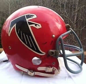
We all know the basics of the Atlanta Falcons’ logo history. The team wore its original falcon logo from 1966 through 2002 (as seen on the helmet shown at right), and then in 2003 they replaced it with the more stylized logo that they still wear today.
But here’s something you might not know (and that I didn’t know myself until reader Matthew Dunn recently brought it to my attention): There were at least four different versions of that original logo — and there have been extended periods when two of those versions routinely appeared on the Falcons’ uniforms at the same time.
Let’s start with the Falcons’ first two seasons — 1966 and ’67. For those two years, the team’s primary logo appeared on the uniform in two places: on the helmet and as a sleeve patch. But the two logos, while very similar, didn’t quite match. Take a look at these photos, all of which are from those first two seasons (for everything in today’s post, you can click to enlarge):
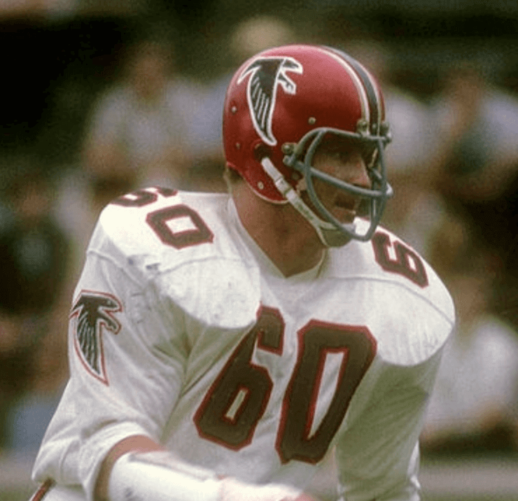
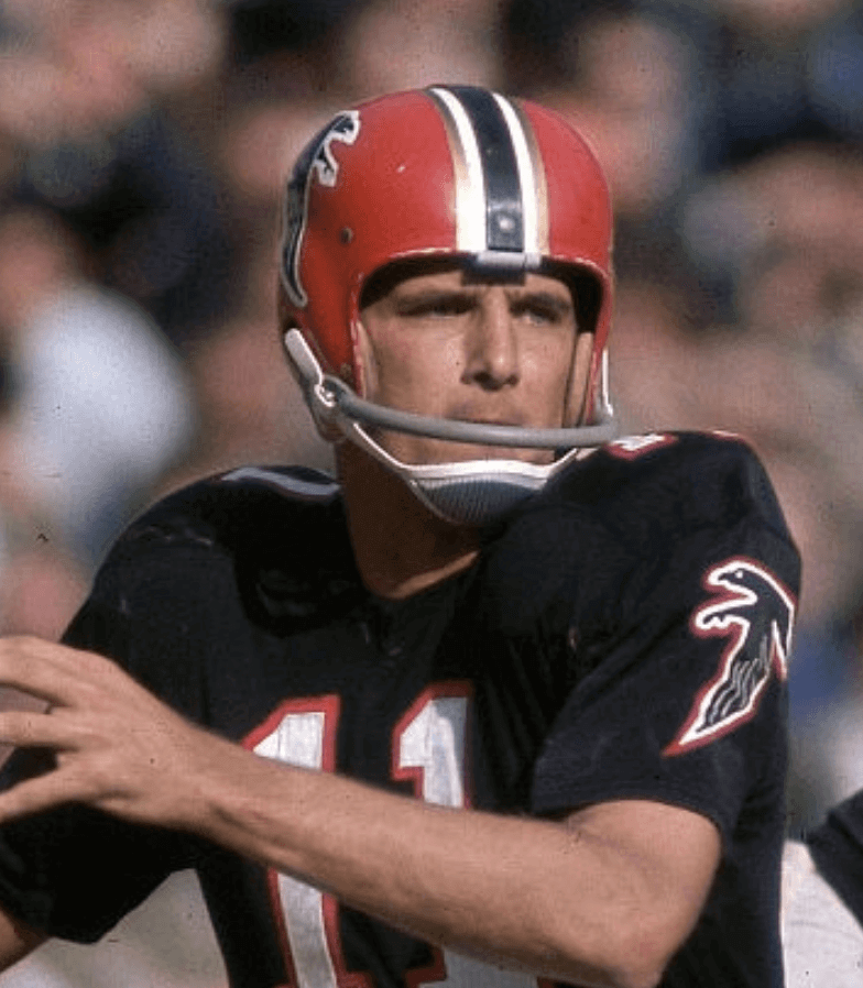
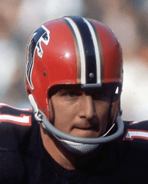
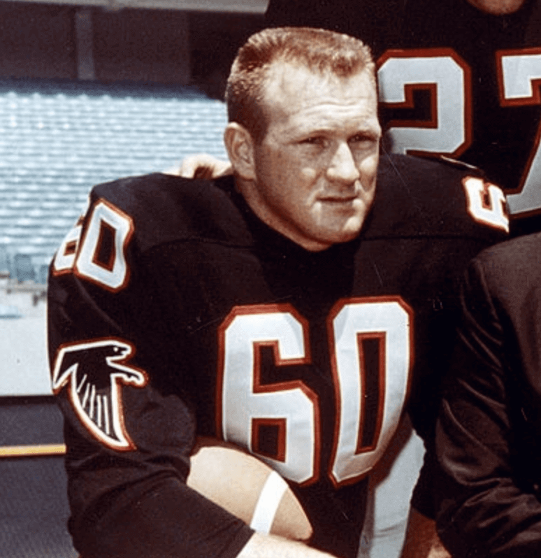
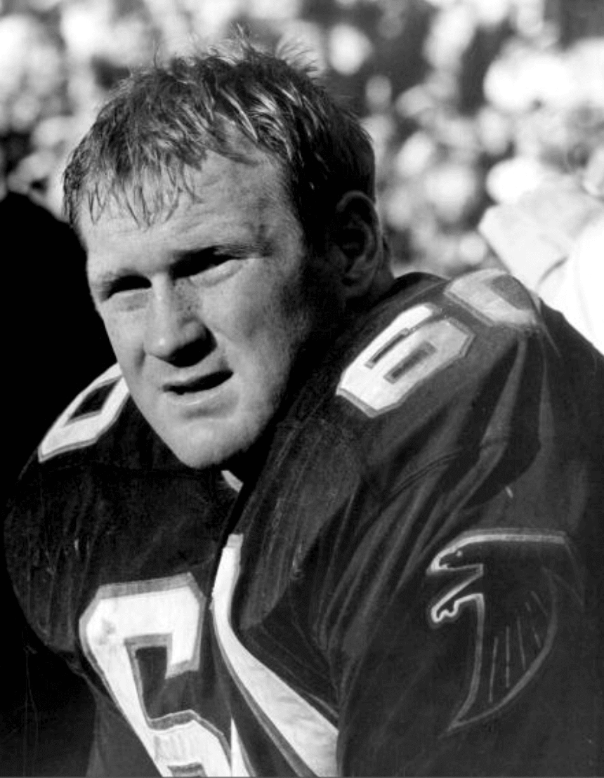
As you can see, the helmet logo has a vertical white line separating the falcon’s head and claw from the rest of its body. This white line does not appear on the sleeve logo.
The Falcons got rid of the sleeve patch in 1968, but they brought it back in 1978. This time the sleeve patch included the vertical line separating the head and claw from the rest of the falcon’s body. But there was a new inconsistency. To see what I mean, take a look at these photos:
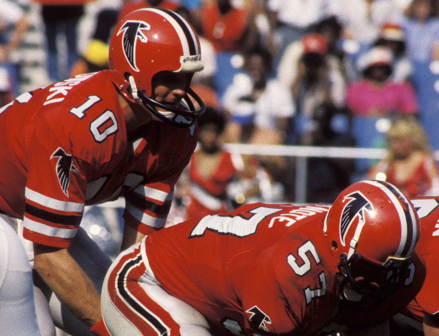
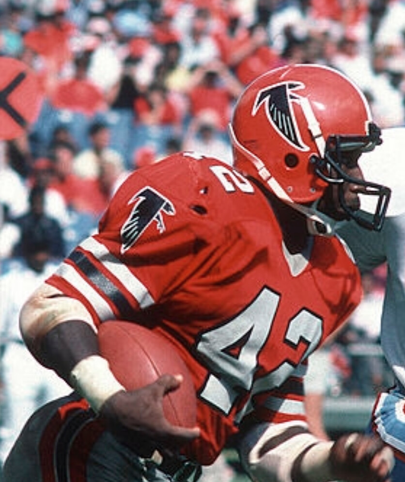
If you look closely, you’ll see that those five lines on the wing — I guess they’re supposed to show the delineation of the feathers are floating against the black background on the helmet, but those same lines on the sleeve patch connect with the wing’s white outline.
So once again, the helmet logo and sleeve logo didn’t match. But this mismatch was completely different from the original mismatch in 1966 and ’67.
This helmet/sleeve discrepancy lasted from 1978 through 1989 — except for one season. That was in 1985, when there was yet another mismatch. Take a look at some photos from that year:
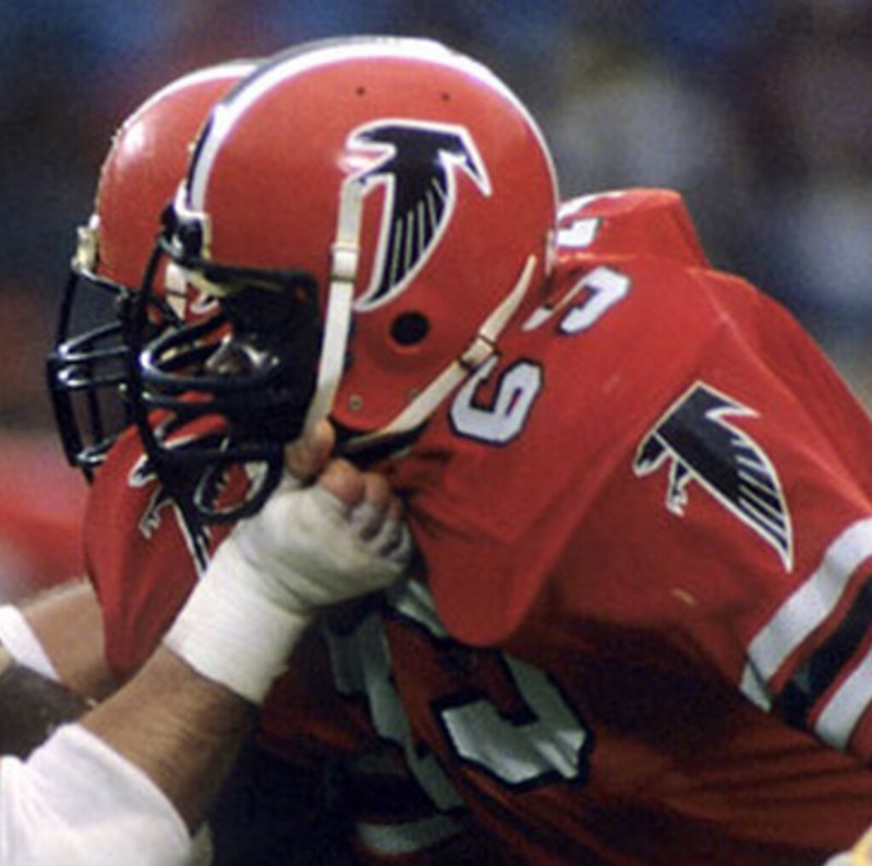
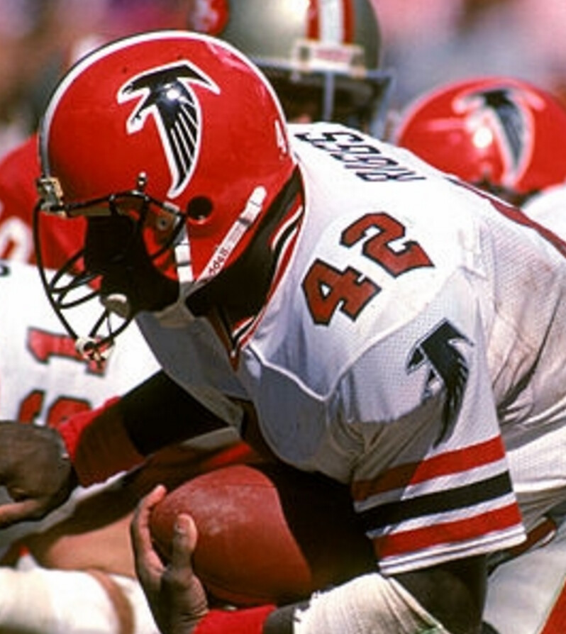
As you can see, this time the five lines on the wing are consistent (in both cases, they connect with the base of the wing and are no longer floating), but the vertical line is once again a problem. It’s there on the sleeve patch but not on the helmet. As far as I can tell, this mismatch only took place in 1985, because that’s the only year that this version of the helmet logo appeared.
That brings us to the end of the Falcons’ red-helmeted era. In 1990 they switched to black helmets. But the logo inconsistencies remained — from 1990 through 1996, the wing lines were once again floating on the helmet but touching the outline of the wing on the patch:
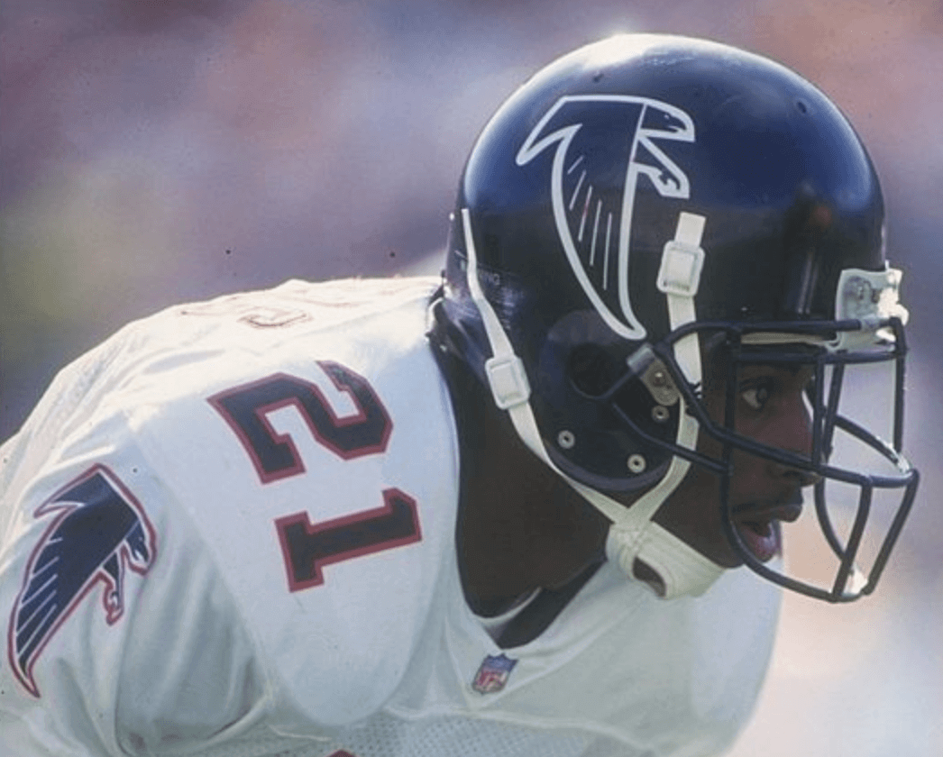
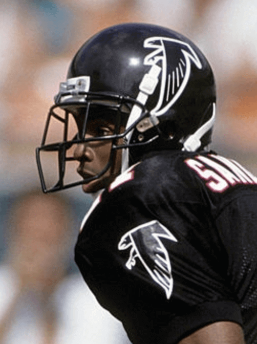
So there were at least four distinct versions of this logo floating around up through 1996, and two of them were being used on the team’s uniforms at any given moment from 1966 through ’67, and again from 1978 through ’96:
[table id=30 /]
But in 1997, something amazing happened. Here, take a look at these pics:
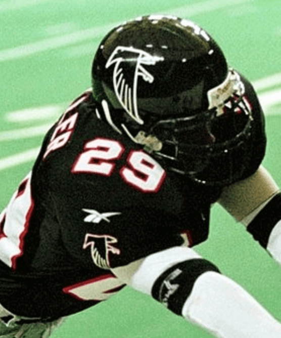
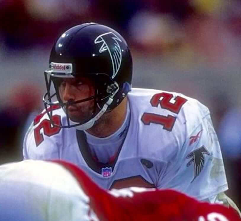
That’s right — the helmet and sleeve logos matched! They were both Version 3. It was the first time in Falcons history that the helmet and sleeve logos matched up. Both logos stayed the same through 2002, after which the team got a makeover.
All of this is was news to me — a great example of a uni storyline that’s been hiding in plain sight. Did anyone else know about it?
One additional point: The Falcons wore 1966 throwbacks from 2009 through 2012 — a period that includes the NFL’s switch from Reebok to Nike. Throughout this period, regardless of manufacturer, the throwbacks used Version 1 of the logo (floating lines on the wing, vertical line present) on the helmets and on the sleeve patches:
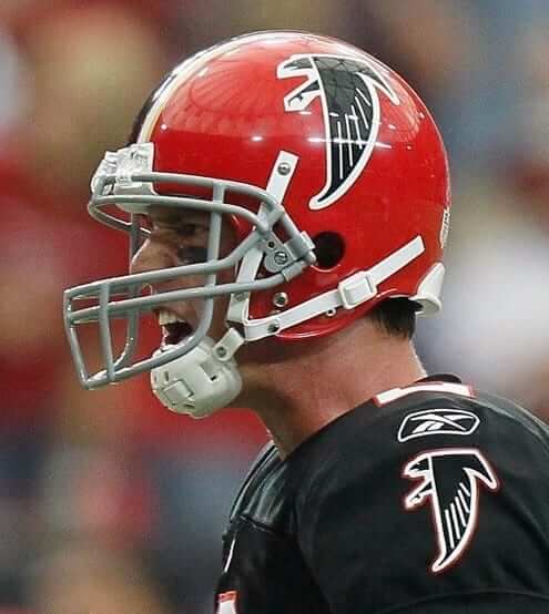

The good news is that the throwback helmet and sleeve logos were consistent. The bad news is that the sleeve logo was historically inaccurate — it should have been Version 2. But none of us realized that at the time.
(Major, major thanks to Matthew Dunn for letting me know about this one.)
ESPN reminder and more NFL stuff: In case you missed it, my annual NFL Season Preview column, with all the new uni changes for the current season, is avaialble now on ESPN.
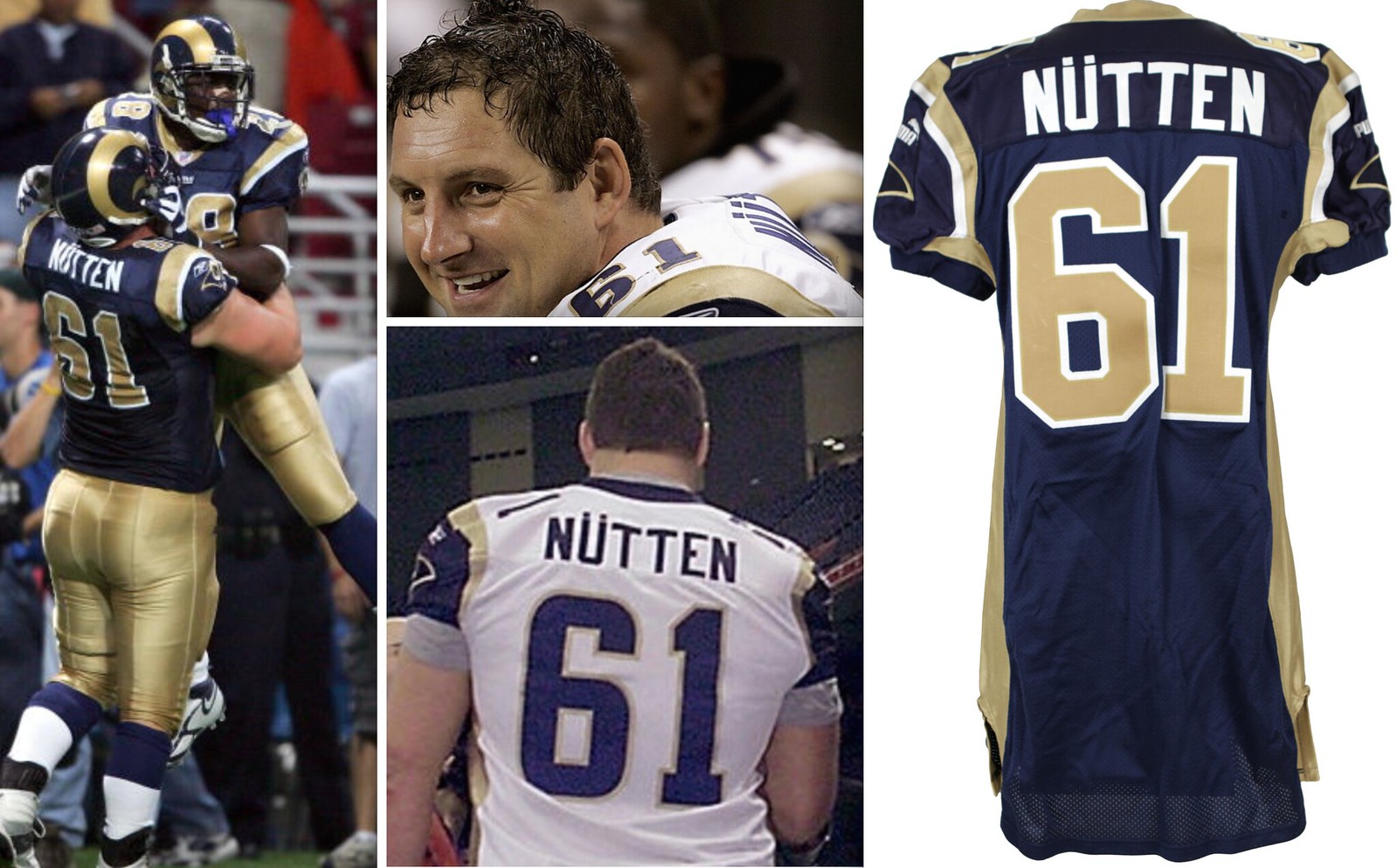
Incidentally, we made a change to that column yesterday afternoon, based on the following: I wrote that Vikings wideout Moritz Böhringer, had he made the team’s final roster cut, would have been the first NFL player to wear an umlaut as part of his NOB. But we removed that after readers Steve Lega and John McSweeney reminded me about a player I’d completely forgotten about: Tom Nütten, who played for the Bills and Rams from 1995-2005 (click to enlarge):
My thanks to Steve and John for setting me straight — greatly appreciated.
Another item missing from the ESPN piece (because it was announced while I was on vacation, although that’s no excuse) is that the Rams will be wearing their throwbacks twice this season. To my knowledge, the dates haven’t yet been announced:
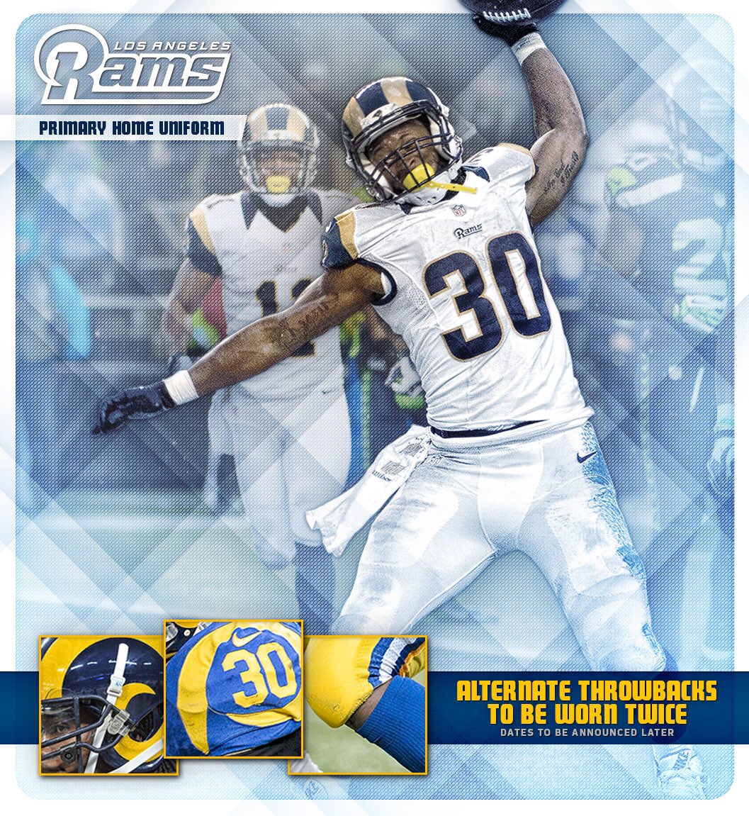
Thanks to Jim Bendat for filling me in on that one.
Click to enlarge
Collector’s Corner
By Brinke Guthrie
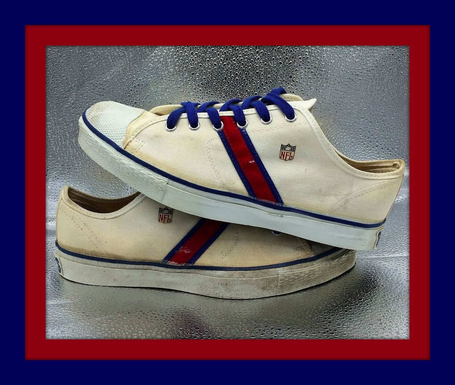
It’s Super Bowl 50 rematch tomorrow night, as the Broncos will kick off the NFL season by hosting the Panthers at “Your Name Here” Stadium, so let’s get rolling with some vintage football stuff. Ever seen these before? Officially licensed 1970s New York Giants sneakers — from Goodyear, of all people. Back then, anyone could get a license for NFL stuff!
Now for the rest of this week’s picks:
• Speaking of the Broncos, you’ll be in retro style with this orange polo from Logo 7, with the embroidered left-facing helmet. See, kids, back in the day, they actually sewed these things on — no heat pressing!
• The boys are back in town — specifically, the Rams are back in L.A. Welcome them back home with this 1970s Gresh helmet plaque.
• NFL players who took part in the March of Dimes Celebrity Golf Classic took home this gym bag.
• Steelers fans, you’ll always know what time kickoff is with this 1970s-era watch by Lafayette.
• Lions fans will fondly remember the days of Wayne Fontes (well, maybe not so fondly) with this Cliff Engle crewneck sweater.
• That’s clearly Larry Csonka on this vintage Dolphins poster.
• Take a look at the Great Gazoo-like player on this 1970s Saints tee. Bring this guy back! [That is, of course, Sir Saint, and I agree that he definitely needs to be brought back into circulation. ”” PL]
• One more from the Saints: Wouldn’t they look great with black helmets? Here’s a look at their brief flirtation with that look. More on that episode in NFL history here.
• How ’bout dem gumballs! They licensed everything else back in the day, so why not a Cowboys gumball dispenser?
• Who-Dey! Back to the days of Greg Cook, Nippert Stadium, and the legendary Paul Brown. Bengals fans, go retro with this 1960s Acrometal helmet plaque.

New advertiser shout-out: As you may have noticed in the right-hand sidebar, we have a new advertiser — Anthony Verna, an attorney who specializes in intellectual property law.
Longtime readers may recognize Anthony’s name, as he’s been a reader and contributor to the site for many years. I’ve consulted with him many times — sometimes to help clarify a trademark-related situation in the uni-verse, and sometimes to seek advice or potential representation regarding my own legal issues — and can attest that he’s a sharp mind and a swell guy. If you’re facing a legal issue involving trademarks, copyrights, or any other aspect of intellectual property, Anthony’s your man. Tell him I sent you. Thanks.
T-Shirt Club reminder: In case you missed last week, we’ve launched our latest Uni Watch T-Shirt Club design.
My creative partner on the T-Shirt Club project, Bryan Molloy, no longer works at Teespring, so we’re doing this shirt with his new employer, Represent, which operates almost exactly like Teespring does. From your standpoint, the customer experience should be virtually identical.
Now then: Our latest shirt is devoted to soccer. Here’s the design (for all of these images, you can click to enlarge):
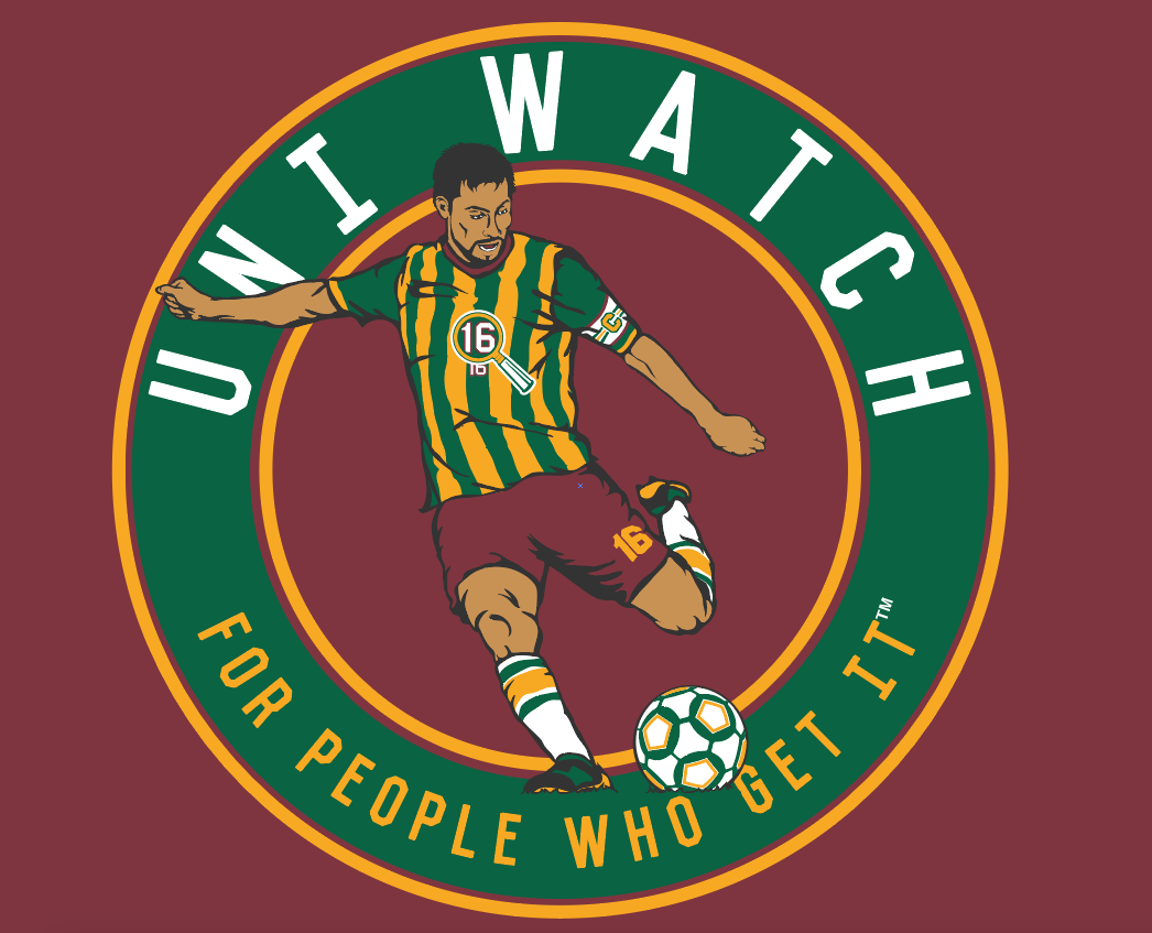
We’re offering this design in four different shirt colors — maroon, black, dark green, and heather grey:
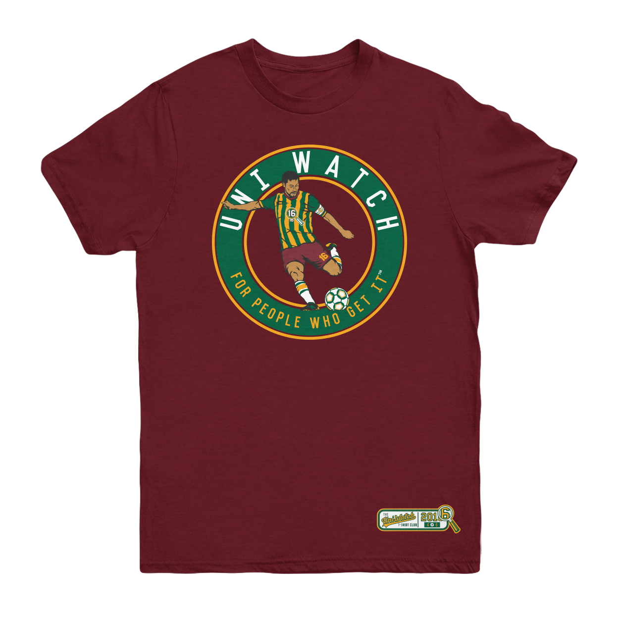
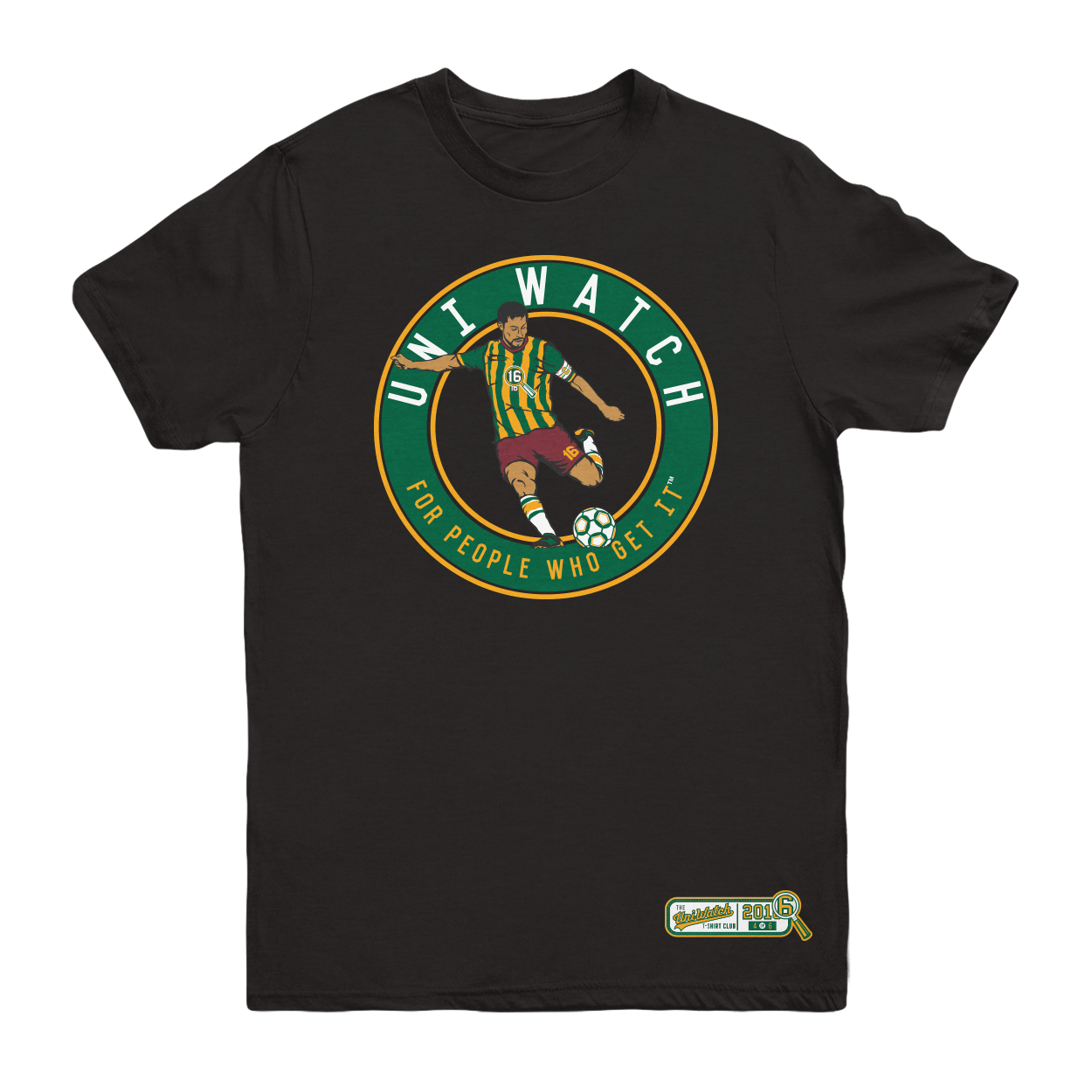
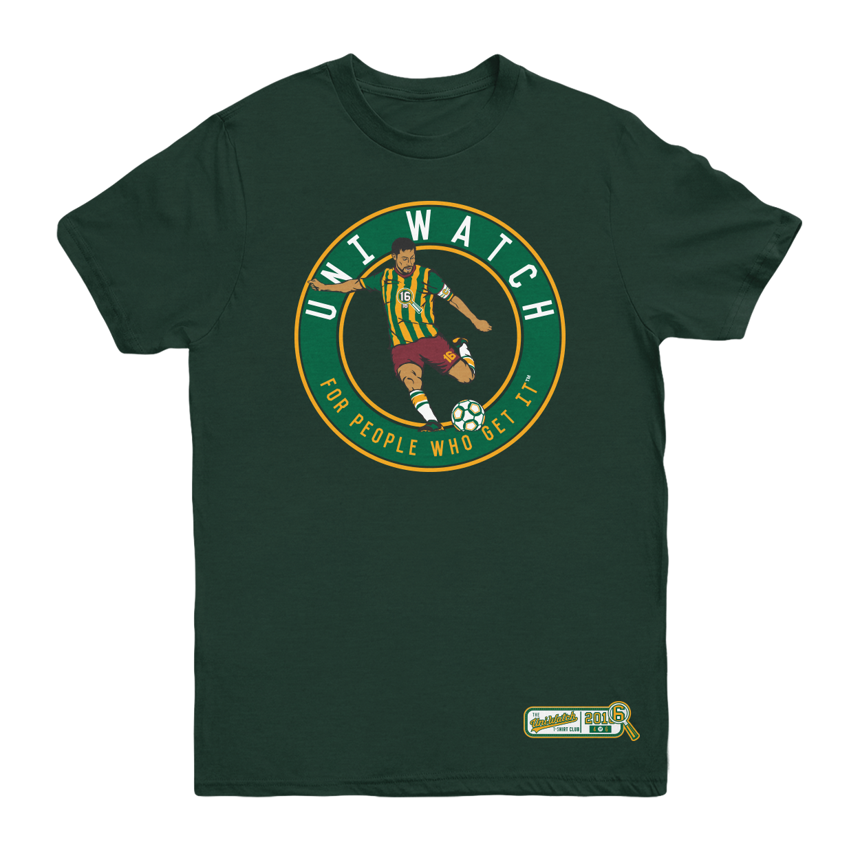
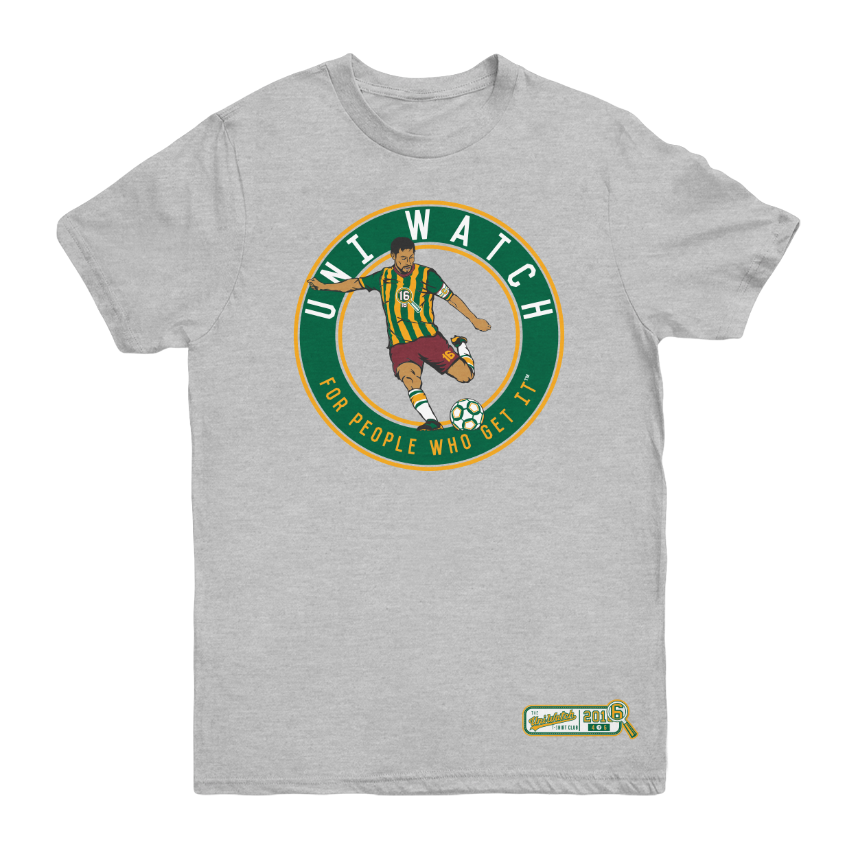
The shirt is available here. It’s available for a slightly longer period than most of our previous shirts, in part because I want to build in some extra time because of the Labor Day weekend, and also because traffic here on the site is a bit lower during my August break. Basically, I just want to make sure everyone has a chance to see and order the shirt.
One more time, the soccer shirt is available here. My thanks, as always, for your consideration.

KRC update: The latest installment of Key Ring Chronicles is about a Hubbell light switch key — the kind used to turn on banks of overhead lights in schools and other large institutions. Check it out here.
The Ticker
By Paul

Baseball News: The Padres and Red Sox will wear 1936 throwbacks — a Pacific Coast League design in the Padres’ case — tonight (from @MileHighPadres). … Cleveland SS Francisco Lindor wore a Space Jam T-shirt during pregame warm-ups yesterday. … The Fresno Grizzlies have wasted little time capitalizing on the “Taco trucks on every corner” line (thanks, Alex). … While watching last night’s Mets/Reds game, I noticed that Reds starter Brandon Finnegan had a little mark on his cap. Some quick photo research revealed that he’d had it on his home and road caps since at least July 29. I posted a query on Twitter and was told by several people that it’s a memorial for Superhero Micah Ahern, the TCU baseball mascot who lost a battle with cancer earlier this year. The cap mark is a rather inexact match for Micah’s logo, but a nice gesture all the same. … Marlins 2B Dee Gordon’s batting helmet logo was AWOL last night. Rumors that he removed the logo to protest Tom Brady’s suspension are almost completely untrue. … You probably knew that a few D-backs players have worn black socks with teal stripes. But did you know that the teal stripes have red outlining? (From Tom Denne.) … Back in 1983, Miller Lite did a commercial featuring a softball game between the “Tastes Great” and “Less Filling” teams, both of which wore full uniforms.

NFL News: Here’s a good look at the stripeless jerseys the Bears used to wear in the preseason. Looks like QB Bobby Douglass was wearing a windbreaker under his jersey, too (from Bob Gassel). … Bud Light has a new ad campaign. Key quote, from an Anheuser-Busch marketing exec: “Just like wearing your favorite player’s jersey or team colors is a badge of honor, so is drinking from your Bud Light team can.” Uh, right. … Washington is planning a burgundy towel giveaway for this Sunday’s game against the Steelers (from Tommy Turner). … Speaking of the Steelers, this will be the last season for the bumblebee throwbacks, but that design is going on with a bang on this holiday ornament (from SmallPapi). … Saints WR Willie Snead is the latest NFL player to add RNOB. He had previously worn it at Ball State but not in the NFL (from Ernie Ballard). … A 49ers podcaster says the team’s Color Rash uni will be red. And maybe it will be! Or it won’t be! That’s about the level of discussion this topic has descended to. … You know, if Color Rash looked more like this, that would work for me. … Sunday is Sept. 11, so expect to see a lot of this type of stuff on the field. … Return specialist Devin Hester signed with the Ravens the other day. He wore “Hester” as his NOB with the Bears and Falcons but will have SrOB for Baltimore (from Andrew Cosentino).
College Football News: It’s hard to see, but Ohio State has added some lettering above the NOB. It spells out “Buckeyes,” and was added for the spring game a few months ago (good spot by Scott Mason). … Cincinnati will be desecrating the flag this weekend (blame Phil). … Utah State has an updated navy uniform with “Aggies” on the pants (from Kurt Adison). … What’s worse than biker shorts? Biker shorts with swooshstika leggings peeking out (from Brad Eenhuis). … 1941 throwbacks — or at least throwback helmets — apparently on tap this season for Oregon State (from John Malcolm). … High school teams in Texas rarely get to play on natural grass.

Hockey News: Reader Ryan Townsend notes that the Sharks are posting a series of “countdown to the start of the season” images, and they all show the team’s jersey without the front jersey number. As you may recall, the number was replaced last season by an anniversary patch, and there had been some speculation regarding whether the number would return. It appears it will not, which I count as a good thing. … Kevin Clark is entering his 10th season as the Devils’ PA announcer, so a creative Devils fan made this logo for him. … The Penguins are placing their anniversary logo at center ice (from Jared Grubbs). … “Yesterday’s Champions Hockey League game between Red Bull Munich and HC Fribourg-Gotteron looked pretty clashy, with both teams wearing white/navy ensembles,” says Bern Wilms. … Gorgeous 80th-season throwbacks for the Oshawa Generals.

NBA News: The Suns have restored the purple border to their court. It had been part of their floor design from 1968 through 2000 (from Josh Pearlman). … Ty Lawson will wear No. 10 with the Kings. “He wore 3 during his first six years in the league with the Nuggets, and also 3 with the Rockets at the start of last year,” says our own Mike Chamernik. “He wore 10 during his stint with the Pacers at the end of last season.”

Grab Bag: A bunch of Nike third soccer kits have leaked (thanks, Phil). … Really good article on how tennis balls are made. Recommended (from Ken Traisman). … “An acquaintance of mine recently launched a Kickstarter campaign for a product I thought you’d appreciate,” writes Markus Kamp. “His partner, inspired by his kids’ refusal to wear typical store-bought bicycle helmets, designed a helmet that resembles their preferred headgear: a backwards baseball cap.” … In case you hadn’t noticed, a lot of the U.S. Open participants are wearing the same neon-based outfits.
I’ve never quite gotten the Falcons logo. I mean, I do, but I don’t.
I guess they were trying to force the “F” shape, thus the front facing talons, but it just seems so odd to me for the wings to be in that position but the talons be forward. I just don’t get it. Never have.
When I was growing up, I always saw this logo wrong. I thought the tail feathers were part of the head–like the tuft of feathers that some birds of prey have on the back of their head. I then thought that the wing was essentially the whole body of the falcon and the falcon was standing upright and holding its claw out, almost like a vampire reaching a hand out of a cloak.
When the white line between the hand and body is absent, this optical illusion problem is exacerbated.
That’s funny. I had a similar issue with the (old) Lions’ logo when I was growing up. I always thought the weird circular space between the bottom jaw and front legs was an eye, which meant the front legs had to be a mouth.
Looking back at that logo, though, I actually like it quite a bit.
The Falcons’ logo is pretty goofy looking. I can’t decide if it’s one of those “so bad it’s good” things or not.
Yes – I thought the Falcon was standing up and had teeny little T-Rex arms.
But then I also always saw the Bills logo as a fuzzy bug which was wearing really large sunglasses with red ear pieces.
I’d been watching the NFL for 20 years (!) before I realised the (current) logo was meant to be an F.
20 years!
I never knew it either.
The original Falcons’ insignia is stylish, simple, bold, and timeless; a favorite, particularly on the red helmet. But passing it off as an “F” is a bit of a stretch.
I never once thought it was an F until I started writing about uniforms, when people started mentioning the F to me. Seems like a stretch to me as well, but it appears to be a semi-popular notion.
I had the logo wrong too…I thought it was just an abstract head/talon/wing design. But I totally missed the “motion” of the wing as flying. One of the helmet-dedicated websites has a great high school take on the logo; it’s angled so both wings can be seen and the flying motion is more evident.
Ornithologically, when a falcon dives for prey, it does so with its belly parallel to the ground so it can get its claws on its target. The wings are down during the swoop so that as soon as the talons make contact the bird can start flapping again to gain altitude and get away.
You know what would be great is if someone found a photo of an actual falcon in a similar pose as the logo.
link
This is really blowing my mind. I was born and raised in Georgia and as a kid always liked the falcons’ logo for what I saw as its artistic abstraction. I mean, it’s supposed to be a falcon but it’s sort of standing up with its little arms out! It looks less like a falcon and more like the creature from the movie “Alien.” But now you tell me that the back of the Alien’s head is the tail and his body is a wing?!?! Can we get some confirmation from the artist that this is what he/she intended to depict?
Leave it to the Falcons to have some of the oddest inconsistencies in the major four sports.
I’m somehow heartened that the decals didn’t have to match the patches, and that the discrepancy could go on without getting attention for several decades. (Although I’m sure there are some people who’ve been bothered since they originally saw that.) Somehow, the team and league survived.
I agree, there’s something charming about this type of “mistake,” and about its ability to survive for so long.
Another discrepancy with the earlier Falcons logo has to with the talons. The helmet logo seems to have the outline be more straight-edge, while the patch follows the detail of the talon.
Awesome NFL preview. Really bummed about the Seahawks Xbox ( I am guessing that’s the color they use) Color Rash uniforms. The last time they used that color I threw up a little
I would say all raptors are capable of achieving that pose and often do; right as they are about to strike their prey they would move the legs from a resting aerodynamic rear position to a front facing one. I think in nature this is realistically accompanied by a movement of the wings upward and outward to catch the air and slow down during the strike a bit. But even given that I do think the approx pose of the logo is possible and never bothered me. It just doesn’t look much like a falcon. The legs, neck and beak are too long (to force the F shape you’re referencing.
A couple editing things:
Space Jam probably ought to be singular. Also, I’m thinking the Devin Hester item belongs in the NFL section, rather than college.
Thanks. Both fixed.
It seems the Space Jam link isn’t properly closed, as it’s bleeding into the Fresno Grizzlies text.
Fixed.
The Devin Hester item belongs in the NFL section.
Fantastic Key Ring Chronicles! I’m glad I clicked on the link.
Glad you liked!
When I was in high school, my delinquent friends and I discovered that a dime could easily turn off those fancy keyed light switches. Much hilarity ensued.
At my high school ke and my buddies did the same but with a broken paper clip shaped like a “U”
The natural grass field linksays page not found
Link now updated. Here’s the proper URL, so you don’t have to scroll back up:
link
Unless the Bears played the Packers during the preseason, there’s no way that pic isn’t the regular season. GUD shows the Bears had stripeless navy jerseys from 1971-73. I remember reading about how teams in the early 70s had sets with different fabrics (which fabrics are escaping me), and that some versions didn’t have stripes. The Dolphins and Vikings are two other teams that had that as well.
OK, so the Bears did play the Packers in the 1971 and 1973 preseason (who knew?), but those jerseys were also used in the regular season.
And in 1972. Weird.
It couldn’t be 1973 because it’s a plain white “C”.
!971 and 1972 preseason games were played at Milwaukee, so Packers would not have been wearing white. Photo in following link is 1971 preseason game v. Bears; Pack wearing green. (Note: Karl Kremser signed with the Packers for training camp that year. Even though photo says Kremser was a “rookie”, it was after playing for Dolphins in 1969 and being released in 1970, then teaching high school until Kremser joined GB in the 1971 for training camp; see interview in second link.)
link
link
It’s not the 1972 game at Chicago because the mag says “Fall 1972” and anyone who used to buy mags back in the day knows that the fall issue came out prior to autumn and that game was played on November 12.
By way of deduction, I’d say this is the November 7, 1971 game at Soldier Field.
link
I think it’s awesome when someone actually does the research to find something like this out instead of just wondering. I’m often too lazy, or don’t know where to look.
For those teams the striped jerseys were durene and the stripeless jerseys were mesh. I suppose that for some reason those teams’ suppliers couldn’t get the stripes screened on properly (durene jerseys had the stripes woven in the fabric).
In other Falcons logo news it looks like they are another team beginning the ridiculous “don’t step on the locker room floor logo” tradition. If it’s so disrespectful to step on a logo then just don’t put it on the floor – right?
link
Loved seeing Sir Saint again in “Collector’s Corner.” It’s a shame that major sports leagues take themselves so damn seriously and every new logo (primary or otherwise) or mascot has to have a “fierce” expression* or worse, . It’s grown tedious. It seems all the “happy” logos that exist were designed decades ago. The only time you see a friendly-looking modern logo or mascot anymore is when it’s aimed at kids, and they neuter it so much it looks more at home in a Fisher-Price ad.
There’s enough anger in this world. Do we really need everything in sports – a supposed distraction from reality – to look so pissed off?
* = I’m no expert on the latest logos, so maybe I’m missing something.
Oops… posted before finished. Meant to write:
…every new logo (primary or otherwise) or mascot has to have a “fierce” expression or worse, a bland, neutral appearance.
Here’s a happy bird for you. link
I was very happy to see the Saints bring back Sir Saint back in 2009-2010ish. Love the whimsical nature of it. Now they just need to get rid of those stupid black leotard pants and ditch the horned collar–the Reebok template gold collar is so much better. Wouldn’t mind seeing the old-style big, single-outline Fleur de Lis come back either–although at this point it’s probably DOA given the team’s relative success with the more ornate Fleur.
That Bobby Douglass uniform has to be from 1971 or 1972. Can’t be 1973, since that was the year the Bears changed the “C” on their helmet to orange.
I always loved the Falcons’ red-helmeted uniforms, those worn by Steve Bartkowski and Gerald Riggs. I remember when Glanville came and they switched, I thought it was the first case of BFBS that I could remember.
Who did it first, the Falcons or the LA Kings?
seems like they happened around the same time. But I agree, they seemed to have started it maybe.
Or was it the White Sox?
The Kings changed to black and silver for the 1988-89 season. Kings were first out of those 3.
I always thought the Kings were changing to look like the Raiders.
Fitting that the Padres are wearing their vintage PCL uniforms tonight against the Red Sox, since they essentially function as the Sox’ present-day PCL affiliate…
Main stories like today’s are why Uni Watch makes my internet a better place. Great job!
Swooshtika? Really? I mean I know you don’t have the fondest sentiments towards Nike, but Jesus Christ.
That term has been around for at least 15 years, maybe more. I don’t know who invented it (anyone..?), but it caught on when Nike began carpet-bombing everything with its logo.
link
Yeah, I’m with Bud on this one. My daughter is named for her grandmother, who was murdered in a German death camp with her three daughters, so linking Nike’s dubious corporate practices to the Nazis isn’t a comparison in which I find much humor or cleverness. I’m sure “swooshstika” sounded edgy and funny to whomever coined it, but to anyone actually affected by the Shoah, it comes off as outrageously tonedeaf and lacking in perspective.
Unintentional humor alert: Dude questions the use of “Swooshtika”, I assume due to its potential to offend, then closes with “Jesus Christ”. Reminds me of on Christmas in which I was at my parents’ home, and my father emerged from his room wearing his usual daily jogging gear. My mother exclaimed, “You’re going to run on Christmas??? Jesus Christ!” Fell on the floor laughing.
First off, thank you for the kind words, Paul. It’s an honor.
Secondly, you’d think that soccer teams would use the Champions League to showcase their own look – their traditional look. Instead, they’re using the Champions League to look like . . . well, someone completely different.
One other thing with the Falcons logo, on the helmet the tip of the wing always seems to end in the tip curling forward. On the sleeve the tip, usually, ends pointing straight down (black part, not the white outline). Notice it on #65 in the red jersey and Deion in the black jersey. It appears the only ones where they match correctly is on the original and the throwback. Just another inconsistency.
In the earlier photos, it looks like (maybe) they did that to curve it front of the earhole. Who knows.
The latest installment of Key Ring Chronicles is about a Hubbell light switch key.
The Hubbell insignia looks familiar; I’m betting those were the people whose office landscaped the huge sign facing the Wilbur Cross Parkway in Milford, Connecticut. I think that is now a campus of the University of New Haven.
love how Douglass appears to not be wearing a chinstrap- channeling his inner Kilmer .
Apologies if this has been mentioned before, but how cool would it be to have an actual jersey made of the soccer jersey on the current T-Shirt offer? Is this possible? How many people would want it? Could we do the same for the other jerseys on the basketball and baseball t-shirts?
And don’t forget hockey!
Honestly: Getting actual jerseys made hadn’t occurred to me, and I’m not sure anyone has raised that point before. Would anyone out there actually be interested..? Speak up, people.
I would definitely be interested in a UW hockey jersey/sweater depending on the price point.
If you had a actual link, I’d buy that.
A Uniwatch hockey jersey w/diagonal RANGERS lettering:
U
N
I
W
A
T
C
H
And Uniwatch viewing glass secondary on the shoulders… very cool
link
I would be VERY interested in a UniWatch baseball jersey, and perhaps even a hockey sweater.
I would be up for UW hockey and baseball jerseys.
I would pay for an actual hockey jersey.
Then I’d wear it to play hockey on our lake, I’d tweet some photos, Phil would make fun of me, the usual.
wasn’t the “BUCKEYES” word mark added to the tOSU jerseys last season?
In the photos with Matt Ryan wearing the throwbacks, is that gold trim on the helmet stripes? Never noticed that before.
Looks like it’s on the originals, too. Nevermind.
They’re tiny.
Since the Falcons were using the same colors as the University of Georgia, they added the gold stripes as a nod to Georgia Tech to be all-inclusive and not offend any GT people.
I’m glad the purple is back on the hardwood in Phoenix. The colors don’t quite compute on Clemson’s uniforms (purple stripes on a tiger?) but it makes a lot more sense for the Suns. Anything you might see in a sunset.
1973 Vintage Wheaties NHL Hockey Poster Collection Box Back. Sweet.
link
I think there’s also another inconsistency between the Falcons helmet logos and their sleeve logos. Looks to me like the tail feather portion of the logo has different shape and different angles in some of the photos. Or do I need to go see my ophthalmologist again?
On the 1985 version, the top of the tail feather on the jersey looks like a right angle, but the one on the helmet looks a little obtuse.
It may be the folds of the fabric, the little screen I am looking at — and/or my bad eyes — but check out the ‘openness’ of the beak. Most especially on the Sanders picture.
In addition, look at the mouth (and eye) on the very first two pics. Big eye, closed beak on the patch but not the helmet?
Bring back Sir Saints? Like this?
link
Sir Saint with the giant chin has actually been walking the sidelines at Saints games in the Dome for the past few years. He’s back.
That’s Sir Saint on the left.
link
Or maybe this:
link
I heard Sir Saint was in the Witness Protection Program and living in Quahog.
link
Re inconsistent logos: the Detroit Tigers home cap and jersey logo haven’t matched for a long time. Different styles of Olde English Ds.
link
Proofreading: at the beginning of the article you have “There were at least four different versions of that original logo – and there have been extended periods when at two of those versions routinely appeared on the Falcons’ uniforms at the same time.” Looks like you are missing the word “least” between “at” and “two”, yes?
Simpler to just remove the stray “at,” which I’ve now done. Thanks for the catch.
I love the old Falcons uniforms. Especially the late 80s silver pants look. What they wear now is a clown suit. I could live with the new helmet, but that number font and sleeve stripes are too much.
Another minor discrepancy…
The red outline. When they finally used the same logo they couldn’t decide on an outline or not. The jersey had it while the black helmet didn’t. ON the red helmet it wouldn’t have been visible but the black helmet, why not?
Interesting thing about the new Budlight campaign: if it’s anything like last year Packers fans won’t be able to wear that “Badge of Honor” as they don’t make Packers cans or include them in the advertising.
I don’t drink Budlight anyways but it’s weird that there is some kind of barrier to them being included in these nationwide campaigns (not sure if it’s a sponsor deal or if GB doesn’t want to upset the Wisconsin-based brewers).
I’m of the opinion that the Falcons should go back to Red helmets over black jerseys (relegate the red jersey to alternate status), but I’m torn on whether a return to the old logo or an updated version of the current logo would be best.
If it’s an update to the current logo the silver would need to be swapped for Gold, and I would like to see Gold on the jerseys as well (in addition to the Gold stripes on the helmet), but there’s something really simple and satisfying about the original logo on the Red Helmet.
Actually, I think that vintage Dolphins poster is a take of Jake Scott, not Larry Csonka.
link
What I want to know is what’s up with that tan/brown border on the helmet stripe? And those D-backs socks are awesome.
The tan border is actually gold and was included to placate Ga Tech fans who might be offended by the UGA color scheme. This was a short lived accent.
I find SWOOSHTIKA more offensive than REDSKIN……sticks and stones, though.
Regarding how tennis balls are made…can anyone tell me EXACTLY what percentage of a can of tennis balls is empty space? (Assume a perfect cylinder for the can). Do not google the answer. You can guess or use math formulas to calculate it exactly.
Just realized this post was from yesterday…I have been busy…so I will just give the answer…exactly 1/3 is empty space.
Speaking of those Hubbell light switch keys, just wrapped up a film shoot, in which we needed a museum to turn off some lights, while leaving others on and…
1: “we don’t know how to turn those without shutting the circuit.”
2: “there has to be a way, can we just take the bulbs out, if not we black them out”.
1: “let me call the former building manager, maybe he knows”
2: “ok”
1: ” yeah, there is this special key for them, it’s on top of the first figure.”
… Still there years later, that key, tied to a string
Re: Oshawa Generals 80th jersey…
Love my Gennies & agreed these look good, but:
Not a true throwback – faux’ show!