
Click to enlarge
[Editor’s Note: Today we have a guest entry from longtime reader/pal Jeff Ash, who lives in Green Bay. He has a good story to get us ready for the NFL season. Enjoy. ”” PL]
By Jeff Ash
Fifty years ago this week, Green Bay’s biggest department store, Prange’s, opened a Packer Shop. You can see the announcement in the ad shown above, which ran in The Green Bay Press-Gazette on Sept. 4, 1966 — exactly 50 years ago yesterday.
It was billed as “the official NFL-appointed Packer Shop featuring clothing, accessories, uniforms and gifts in the official Packer colors and bearing the authentic Packer insignia.” Prange’s also put the uniforms of the other 15 NFL teams in its display windows along the street during the Packer Shop’s first week. (That’s right, there were only 16 NFL teams back then — half as many as today.)
Prange’s had stores throughout eastern Wisconsin, and those stores had Packer Shops of their own. I vividly remember the Packer Shop in the Sheboygan store. There wasn’t much to it, just a small display tucked into the men’s department, but it had Packers clothing and hats and pinbacks and pennants. Back then, you seemingly couldn’t get that stuff anywhere else.
The Packer Shop at Prange’s was seasonal. I always watched for it to reappear each fall, and wondered why they couldn’t leave it up all year round.
Prange’s also brought Packers players to its stores for autograph sessions. When I was 10 or 11, I convinced my dad to take me to Prange’s in Sheboygan when the Packers were there. I got autographs from Ray Nitschke, Bob Jeter, and Mike Mercer, and I still have them. Here’s Nitschke’s [click to enlarge]:

What startled me was that the players wore suits instead their uniforms for the signings. I guess I was already a Uni Watch sort of guy at the time, even though Uni Watch didn’t yet exist.
———
Very nice story, Jeff — thanks so much for sharing. It’s an honor to have your byline here on Uni Watch.
Vikings number font confuses everyone ”” even the Vikings: Here, take a look at this tweet about newly acquired Vikings quarterback Sam Bradford and see if you can spot the problem:
Sam Bradford will wear #8 for the #Vikings. pic.twitter.com/JeFX4cBYNQ
— Minnesota Vikings (@Vikings) September 3, 2016
The issue, of course, is that the Vikings use those stylized numerals with the curvilinear serifs for numbers in the tens column, not numbers in the ones column. Players with single-digit numbers get the conventional-looking numerals, not the stylized numerals.
it’s tempting to blame the underpaid graphic design assistant who created that mock-up of Bradford’s new jersey. But the real blame lies with Nike, which created this nonsensical numbering system — and with the team management, which went along with it.
(Kudos to reader Kenneth Warren for spotting this one.)
Too good for the Ticker (especially since there’s no Ticker today): I’m just gonna let this one speak for itself:
Steve Grogan with the neck roll that rivaled the Great Wall of China in size @UniWatch @Super70sSports @PhilHecken pic.twitter.com/8wj1ZkWl30
— Pro Football Journal (@NFL_Journal) September 5, 2016
Panel discussion reminder: This Thursday afternoon, Sept. 8, I’m going to participating in a panel discussion at Baruch College in Manhattan regarding the use of Native American imagery in sports.
The event will run from 12:45-2:15pm (yes, I realize that’s an awkward time frame for anyone with a regular job) and is open to the public, although attendees are supposed to register/RSVP in advance. You can do that, and see additional information about the event, here.
T-Shirt Club reminder: In case you missed last week, we’ve launched our latest Uni Watch T-Shirt Club design.
My creative partner on the T-Shirt Club project, Bryan Molloy, no longer works at Teespring, so we’re doing this shirt with his new employer, Represent, which operates almost exactly like Teespring does. From your standpoint, the customer experience should be virtually identical.
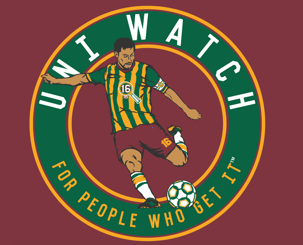
Now then: Our latest shirt is devoted to soccer. Here’s the design (for all of these images, you can click to enlarge):
We’re offering this design in four different shirt colors — maroon, black, dark green, and heather grey:
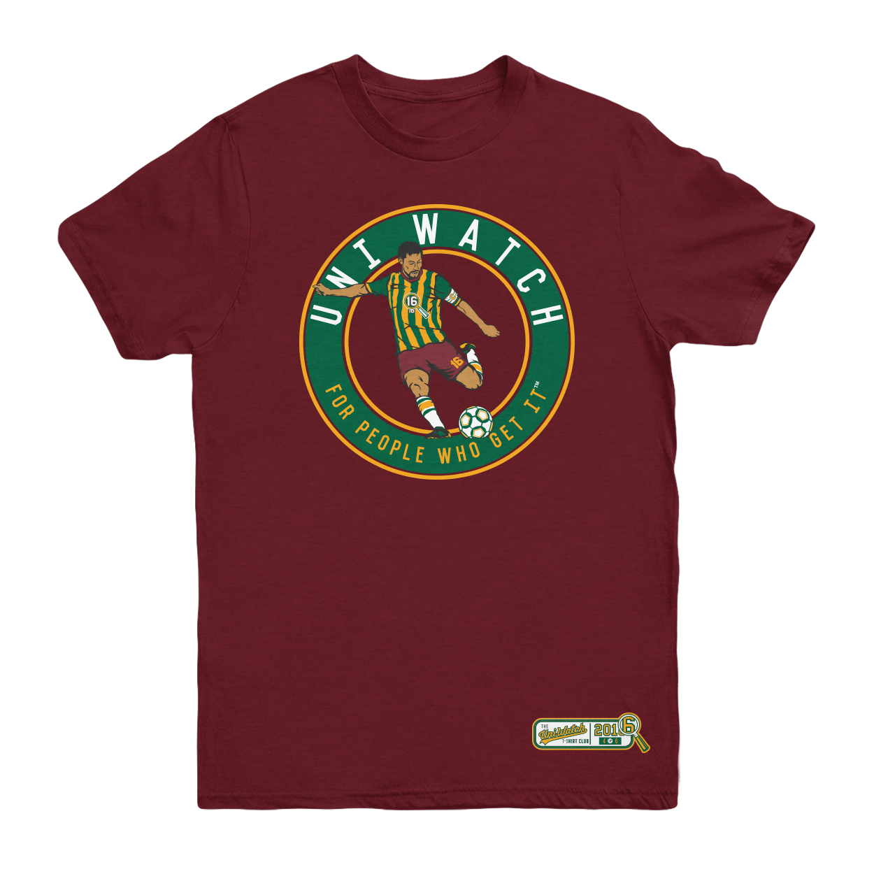
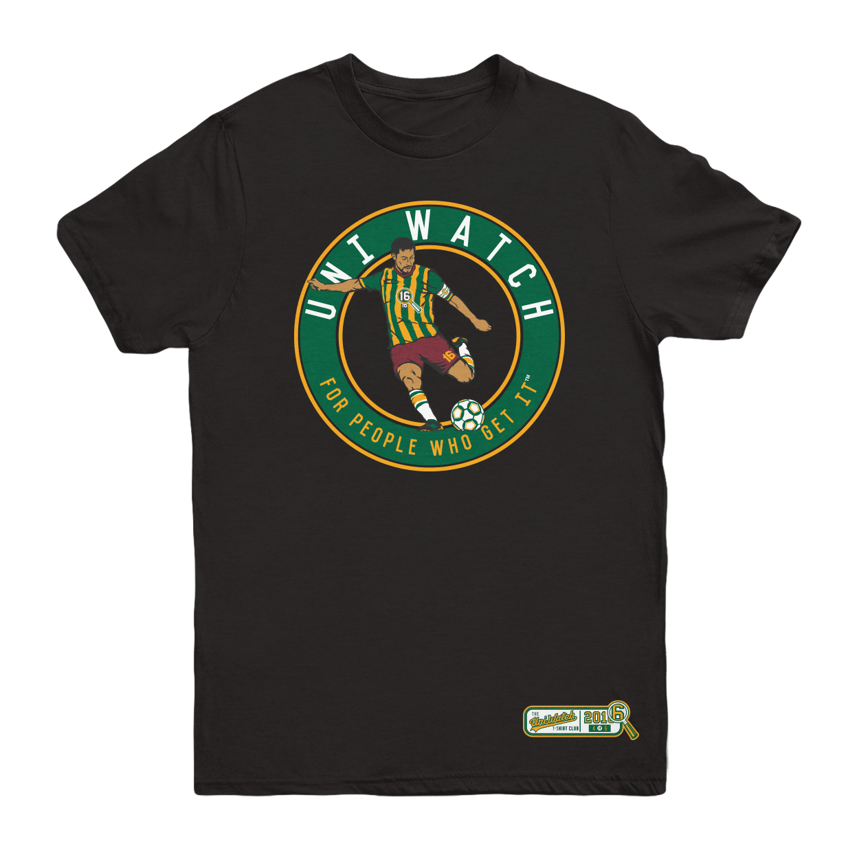
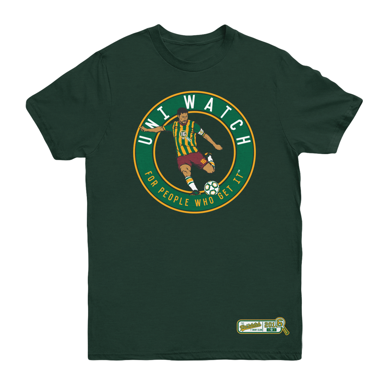
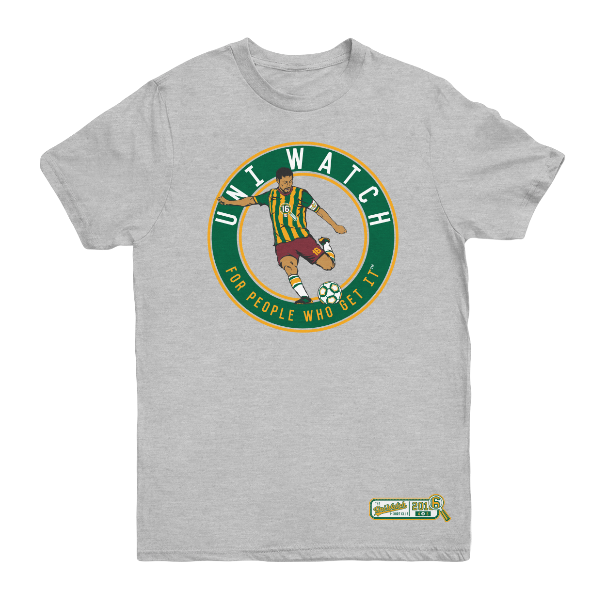
The shirt is available here. It’s available for a slightly longer period than most of our previous shirts, in part because I want to build in some extra time because of the Labor Day weekend, and also because traffic here on the site is a bit lower during my August break. Basically, I just want to make sure everyone has a chance to see and order the shirt.
One more time, the soccer shirt is available here. My thanks, as always, for your consideration.
That’s it for today. We’ll get back to regular content, complete with a Ticker, tomorrow. If you have today off, enjoy the holiday. If you’re working, thanks for keeping the world spinning while the rest of us get to take a break. See you all tomorrow.
I am excited about the start of the NFL season. When looking at the 32 teams, there are some great uniforms. There are also a good number of teams that could look just as great but have uniforms that need fixing.
I mourn the death of kelly green in the NFL. Not certain what was behind the conspiracy to kill the kelly green. We have 32 teams (a lot) and not one of them wears this basic, pure green that looks so good on a uniform.
Yet, I remember when we had 3 teams that used it at one time (Eagles, Jets, Seahawks). That was when 2 teams in the NFL used to wear kelly green helmets.
I was a fan when the Jets brought back their vintage look, but disappointed when I noticed the shade was hunter green. It just has not looked right to me with the green being too dark. The midnight green of the Eagles is a product of the 1990s uniform trends and could use a refresh.
Both teams would benefit from a return to kelly green. If this happens, you know I will be celebrating for the NFL kelly green rebirth.
Hunter green is too dark. It strikes me as a shade of green that aspires to be black. I like to think of it is GFBS.
When the Eagles redesigned their uniforms and trotted out that color, I re n ember a columnist describing it as the color green you see under the deck of your lawn mower after cutting wet grass. He was spot in. Wish I could remember his name …
Does anyone else have problems with Shockwave Flash crashing on this website?
@Matt C: disable Flash by default in your browser settings. You’ll be glad you did.
I thought the Bradford confusion was primarily going to be that he will have a number in the teens on his shoulder while wearing eight on the front and back, haha…
On the other hand, I thought the confusion was that people thought his name was Braoforo.
I distinctly remember a Cowboys shop at the Sanger-Harris dept store in Dallas- and coincidentally, I was just thinking about this. I’d walk in there and my eyes would GO LIKE THIS at all the stuff. Tho I don’t specifically remember them, I’m sure McAlpins and Shillito’s had the same in Cincinnati.
I hate those ridiculous Viking # fonts as well. However it’s hard to be too critical after those panel circus jerseys they wore a few years back. They should have just gone back to the Purple People Eater era uniforms.
Getting a real Tampa Bay Rowdies vibe on the jersey-within-a-shirt. Not quite the lemon & lime Tic Tacs of the original, but pretty similar.
Instagram is going crazy over the new Oregon Ducks jerseys. First Grey now highlighter yellow with updated wings.
I am amused by the mascot contest in the newspaper ad from 50 years ago. (Note: There were 15 NFL teams back then; New Orleans did not start playing until the following year.) It wasn’t for boys to accompany players at the start of the game, but for only one boy (and his father) to watch the game. And the season-ending grand prize of a ticket, again, for only one boy (and his father) to attend either the playoff bowl game in Miami, or the Pro Bowl, but not the Super Bowl!
You’re right on the 15 teams. I misread that. Delete “other,” and it’s correct.
Very cool story, Jeff. Thanks for sharing.
historical story good
Nice detail your blog….
link
Is it just me, or do the “updated” Cleveland Browns uniforms look worst and more ridiculous each and every passing day?
Also, the shoulder number on the Bradford jersey is not 8. Looks like it starts with a 1.
Regarding the Sam Bradford photo with the incorrect number font there is something else that seems off. Bradford is known for his extra long baggy sleeves that resemble the sleeves from the 80’s. The sleeves in the photo are the short cuffed ones.