
Yesterday, the Philadelphia Flyers, one of a number of teams who will be playing their 50th NHL season this year, unveiled a “Golden Anniversary” jersey — there was some discussion of it on Uni Watch yesterday — and immediately everyone seemed to hate it (like really HATED it). Personally, I happen to like it, myself, but that’s neither here nor there.
I’m pleased to introduce you to Michael Paolucci, Uni Watch’s newest correspondent, who was AT the unveiling yesterday, and will now give us his own take on the festivities. I want to note that on August 17th, Michael approached Uni Watch to let us “know that the Flyers will be unveiling their new third jersey to commemorate their 50th season at my work on the 31st. Even though it will be covered in the press I’d be happy to write up a uni-centric report for your site.” After some back and forth (and some discussion as to whether Paul or I would be working that day), we set Mike to work. Here’s his coverage (you can click on any photos below to enlarge — all photos by Mike Paolucci):
Flyers 50th Anniversary Jersey Unveiling
By Michael Paolucci
Yesterday, the Flyers unveiled their new alternate uniform for the 2016-2017 season. It is the 50th season for the team who entered the league, with five other teams, as part of its expansion in 1967. They made the announcement from One Liberty Observation Deck in Center City, 57 stories above Philadelphia. As the venue’s GM Evan Evans stated, “there’s no better place to start the season than on top.” On hand for the Flyers were President Paul Holmgren and Flyers Captain Claude Giroux who modeled the new threads (well, at least the jersey).

You can see the gold accents throughout the jersey. Gold surrounds the logo on the front and both the numbers and captain’s C are done in gold with black outline. 50 is commonly known as the ‘golden anniversary.’

Interestingly, the Flyers chose to go with a black nameplate on a white jersey, like they have on their road uniforms, only these have white letters outlined in gold creating a tri-colored nameplate.

While the Flyers look has remained pretty consistent over the past 50 years, you can see in the picture that they’ve gone with and without piping, from time to time, and the shade of orange has become brighter. These alternates are sans piping and feature the current vibrant shade of orange. They do, however, manage to work in some touches from years past.

I spoke with Sarah Fergus, the team’s Manager of Marketing Communications, who told me that both the uniforms and 50th anniversary logo were designed in house. After looking over dozens of prototypes last December, Flyers senior executives presented their selection to Ed Snider, the Flyers founder and former chairman, who signed off on both designs right away. Snider passed away, earlier this year, after battling cancer. The team will also wear Ed Snider tributes on their helmets featuring Snider’s signature and the logo will be featured as a shoulder patch on all of the Flyers uniforms, this season. It includes the keystone representing the state of Pennsylvania and a gold 50 with the year the team was founded scrolled across the bottom.


It was hard to tell from the images the team provided, but the gloves and pants will also have gold accents and there are newly designed socks to match (since Giroux was wearing shorts, you can see the socks displayed on the giant Ben Franklin legs which are located in the building’s lobby). The Flyers will wear the new jerseys for 12 prominent home games, this season, including Opening Night.


Thanks, Michael! Awesome job.
If you want to read a bit more about the unis & unveiling, you can click here, here or here.
Well, readers, what say you? Do you agree with *most* of social media that these are not so good? I happen to think they look pretty sharp, but that’s just me. How about you?
.

Parting…such sweet sorrow
And so, I endeth my annual weekday run on Uni Watch, helping recharge Paul’s batteries during his August hiatus. Having a full-time office job isn’t the most conducive to doing the weekday UW, but somehow I managed to make it though. But I couldn’t have done it without all of you and your infinite patience. I’m still amazed Paul is able to do this for us, day in and day out, for eleven months — this is definitely a full-time job!
There are far too many people I have to thank for making this month pass (relatively) smoothly — but all my Olympic Correspondents, a couple guest writers, and the Griffins Design Contest helped immensely. But I do want to single out Brinke and Leo Strawn, Jr., for the Collectors Corner and Leo’s World respectively (and Brinke also contributed a lede AND a Question of the Week), plus my buddy Todd Radom, and everyone who either tweeted or submitted items for the Ticker. You guys rock.
Special special thanks go to the guys who do the tickers three days a week — Alex Hider, who compiles the ticker for Mondays (and this past month, actually handled the Uni Watching g-mail account Fridays through Sunday) and a SUPER special big plus-plus thanks to Mike Chamernik, who does our Tuesday and Thursday tickers PLUS he handled an entire day (lede, ticker and middle sections) when I was actually completely swamped with my office job. These are the behind-the-scenes guys who REALLY keep Uni Watch going!
Please join me in thanking them all.
You guys are all aces!
I will now GLADLY return to my normal weekend duties (although not this weekend…I need my own blog-cation this weekend), and will be back on September 10th as we kick off the College Football Season with an extravaganza. Be sure to check that out — and beginning on September 11th, the normal Sunday Morning Uni Watch crew will be back and better than ever.
And finally, thanks also go to Paul, our leader, for all of his effort in bringing us Uni Watch day in and day out (well, except for August). It’s a well earned month off, and just doing the weekday thing for one month makes me appreciate more and more the effort it takes to keep UW going every day.
Here’s the keys back, boss. I gave her a wash and left you with a full tank.
Thanks for letting me take her for a spin.
.
T-Shirt Club reminder: Paul here. In case you missed it earlier this week, we’ve launched our latest Uni Watch T-Shirt Club design.
My creative partner on the T-Shirt Club project, Bryan Molloy, no longer works at Teespring, so we’re doing this shirt with his new employer, Represent, which operates almost exactly like Teespring does. From your standpoint, the customer experience should be virtually identical.
Now then: Our latest shirt is devoted to soccer. Here’s the design (for all of these images, you can click to enlarge):
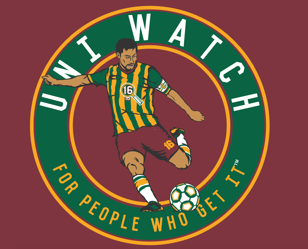
We’re offering this design in four different shirt colors — maroon, black, dark green, and heather grey:
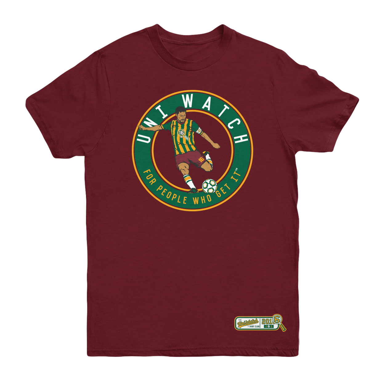
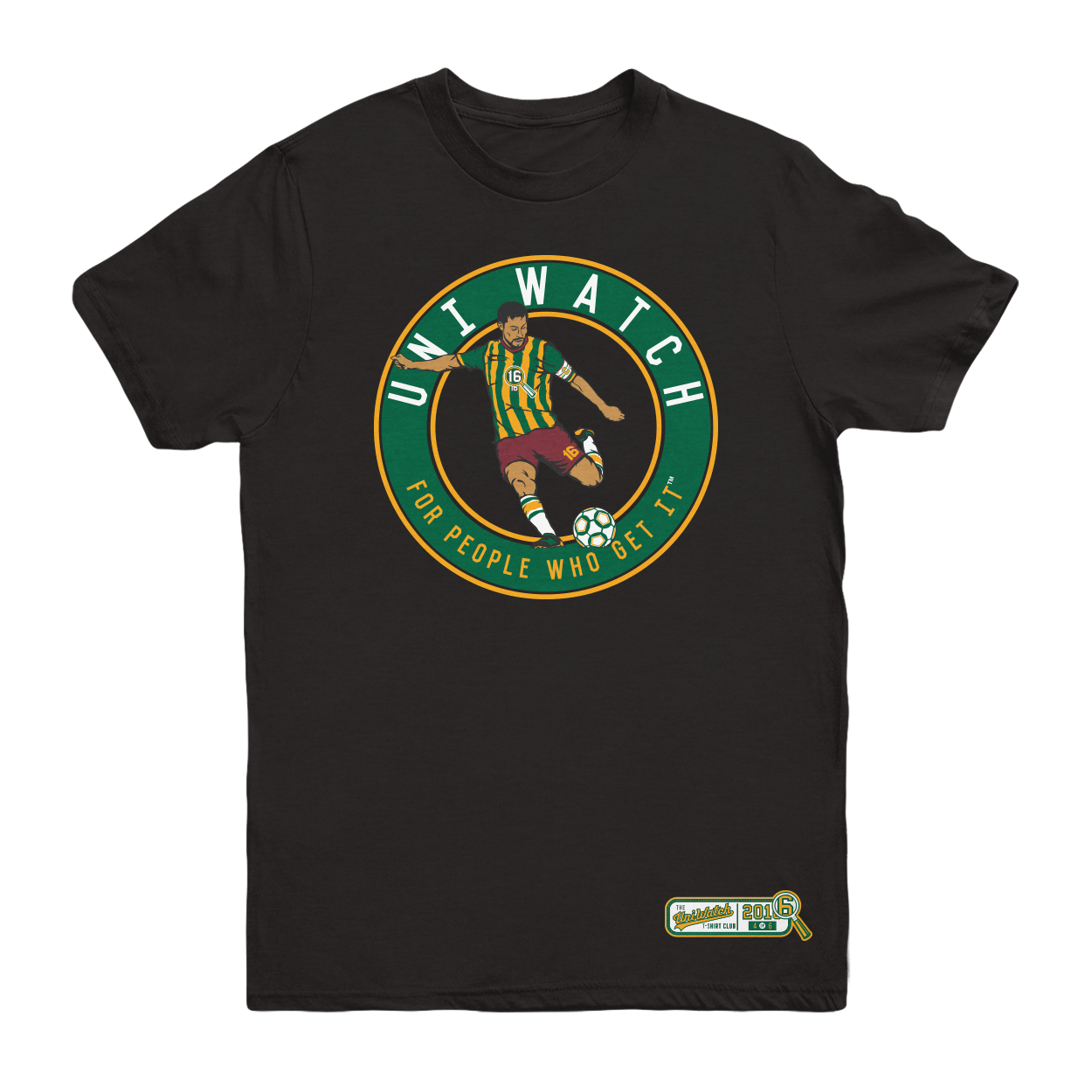
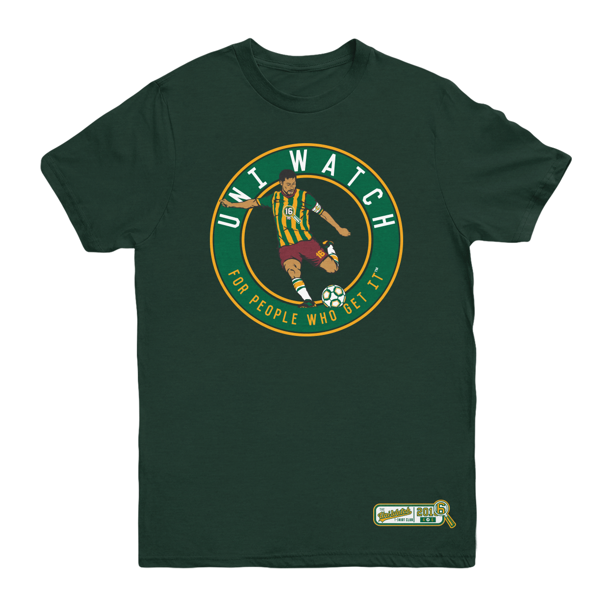
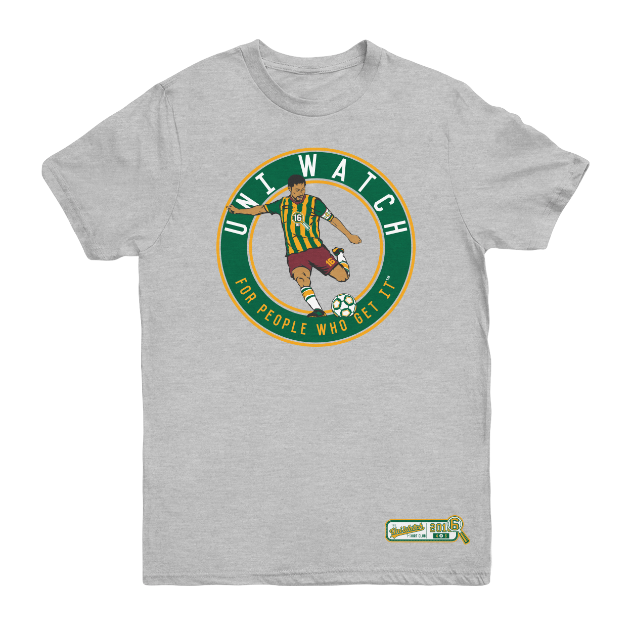
The shirt is available here. It’s available for a slightly longer period than most of our previous shirts, in part because I want to build in some extra time because of the Labor Day weekend, and also because traffic here on the site is a bit lower during my August break. Basically, I just want to make sure everyone has a chance to see and order the shirt.
One more time, the soccer shirt is available here. My thanks, as always, for your consideration.
.
Panel discussion: Paul here. Next Thursday afternoon, Sept. 8, I’m going to participating in a panel discussion at Baruch College in Manhattan regarding the use of Native American imagery in sports.
The event will run from 12:45-2:15pm (yes, I realize that’s an awkward time frame for anyone with a regular job) and is open to the public, although attendees are supposed to register/RSVP in advance. You can do that, and see additional information about the event, here.
.
The Ticker
By Mike Chamernik

Baseball News: Dioner Navarro rejoined Toronto this week after a half-season in Chicago. The Blue Jays saved his dirty helmet. … The Cardinals’ Adam Wainwright asked fans whether they preferred long pants or exposed socks (from Elena Elms). … Also from Elena: For years, Cardinals P Jerome Williams has worn a pink glove to honor his mother, who died of breast cancer. Williams was spotted using a Hello Kitty glove for warmups the other day. … Check out this life-size David Ortiz statue made of Lego blocks. … A couple Cubs fans dressed up as zombies from 1908 (from Josh Hinton). … The Dunedin Blue Jays will wear plaid tonight (from OT Sports, via Phil).
College Football News: Tennessee revealed its Pat Summitt memorial decal. … A graphic artist Photoshopped a bunch of helmets into the colors of rival teams (from Phil). … New field design for Virginia Tech. The Hokies also have a new equipment truck (from Andrew Cosentino). … Here’s a preview of the uniforms Kansas will wear this season (from Phil). … Arizona will wear helmet memorial decals to honor offensive lineman Zach Hemmila, who died in early August. Coaches will wear hat patches (from Phil). … More marching band-themed football unis, this time for the Big Ten and SEC (from Nathan Gruber). … New white uniforms for North Greenville (from Andrew Tranum, via Phil). … Clemson will wear all-white against Auburn. … Syracuse will wear orange-over-blue on Friday. … White helmets for New Mexico tonight. … Texas State will go white-over-maroon this weekend (from John Beck, via Phil). … Unclear how legit this is, but here’s an all-black jersey for East Carolina. … New alternates for Northeastern Oklahoma A&M College (from @tr3yseph, via Phil). … This is interesting: A company called Tredcals makes pads with 3D logos on them.

Hockey News: New uniforms for the Calgary Hitmen of the WHL (from Wade Heidt). … New practice jerseys for Robert Morris (from Alan Saunders, via Phil). … The new mask for the Red Wings’ Petr Mrázek pays tribute to the final season at Joe Louis Arena.

College Hoops News: Cincinnati made slight adjustments to its home uniforms. … In 1991, Seton Hall’s Marco Lokar refused to wear the American flag patch on his jersey during Desert Storm. Considering his Christian faith, Lokar said he could not support any war. He started to receive threatening calls and ended up leaving the school, returning to his native Italy (thanks, Jon Volpe).

Soccer News: Puma used a 3D perspective chalk drawing to announce new uniforms for Italy (from Conrad Burry, via Phil). … Denmark revealed new all-white unis. The language of the press release is a little unclear, but it sounds like the all-whites were one-off unis worn last night only. Another uni set will be revealed today and worn this weekend (from Bernd Wilms).

Grab Bag: New license plate design for Maryland (from Andrew Hoenig). … England’s rugby team unveiled a new alternate kit. Note the St George’s cross graphic and the 3D rose emblem (from Josh Jacobs and Eric Bangeman). … Dustin Johnson lost the “M” on his TaylorMade hat (from Dustin Gabler). … ESPN dropped the “.go” in its URL (from Paul Lee).
.
And that’s it for today. And this week for me. Paul will return tomorrow (yay!).
Thanks everyone, for a great month. I hope you enjoyed it all. I’ll be back Saturday September 10th. Till then…
Follow me on Twitter @PhilHecken.
Peace.
“#worstjerseyinFlyershistory”
— Puckboy
.
Thanks, Phil, for steering Uni Watch through August.
“On top”? Gold accents? That’s stuff usually reserved for teams that *haven’t* gone 41 years without a championship.
Good job Phil!
I said it yesterday, and I’ll say it again today: the combination of orange, gold, and black makes me think of the Ducks. Plus, there’s Pittsburgh’s relationship with the color gold. Finally, the more that I look at that jersey, the more I realize that the gold is just a bit too gaudy.
I really do like Mrazek’s new mask. It’s nice to see the tribute to Gordie Howe and his final All-Star Game appearance on one side, and the nod to Steve Yzerman’s playing career on the other.
I didn’t think “Ducks” right away w/ the orange, black, & gold, but I’m not a fan of orange & gold paired together. It might look cooler if they were to replace orange with gold, but I could definitely understand, anti-Pittsburgh-wise, why they didn’t go that route.
The Flyers anniversary jersey is still better then the NY Islanders black “Brooklyn Pride” jersey. Brooklyns colors are blue & gold!
Gold? I thought that was orange.
Chris is right – the borough’s official colors are blue and gold.
But black and white has become the unofficial color scheme in recent years.
Ah. I was actually thinking of the Islanders’ colors. My bad.
See ya next year!
I think they went a bit overboard on the gold. I think just the numbers and captain patches would have been fine. With that said, though. I like the uniform striping itself more than I like their current one. There’s a great balance of team color and the strange overlap of the sleeve stripe and numbers has been eliminated.
This also illustrates how great of a color scheme orange and gold is. It’s a shame it’s so underutilized.
After having a half a day to mull over the jerseys, I like them. If the winter classic jersey ends up being a tribute to the 82-07 set, then all will be right in the world.
Thanks for the good work, Phil! My take on the Flyers anniversary jersey is that it is too much for a whole uniform. The gold accents would work better as a patch, but overwhelm a uniform.
Thanks, Phil, et al. Great job!
Is the 2004-2005 lockout actually considered a season?Technically, this is only the Flyers 49th season of playing hockey. Also, since the teams from that expansion began play in the 1967-1968 season, their 50th anniversaries are not until next year (2017-2018). Am I missing something with these ’50’ celebrations?
If not for the lockout, it would be their 50th season (Paul’s covered that topic before*), so maybe the NHL is just choosing to pretend the lockout never existed? But just because a season is cancelled, does that mean it didn’t exist in the first place since there would be no season to cancel? Oh man… that hurt my head. It’s too damn early for philosophical mumbo-jumbo.
*http://www.uni-watch.com/2016/03/08/when-is-an-anniversary-patch-not-an-anniversary-patch/
The anniversary is 2017. Not 2017-2018, just 2017.
If that is their thought process, then they shouldn’t wear them in the 2016 calendar year. They should come out on 1/1/2017 and be mothballed on 12/31/2017, but that doesn’t make sense because it encompasses two NHL seasons.
Therein lies the problem with these sorts of things… the fact that the seasons straddle the calendar years.
I like the new Flyers’ uniforms fine. But I’m not a “true believer” which seems to have some traction in this day and age. Even so, I’m disinclined to defer to the fanatics.
I’m a Flyers fan and I hate the anniversary jerseys. The gold is distracting and looks completely out of place. The orange top and bottom doesn’t work for me visually either. It feels like they took one of those ‘fashion’ t-shirts and slapped the rest together in Photoshop. Big disappointment.
Lifelong Flyers fan, and I agree with the majority here. Thumbs down on the gold. It makes me think Penguins of recent vintage more than anything. And orange and metallic gold don’t look good together. Moreover, the sleeve stripes and yoke have no link to the past. The current sweaters pay homage to the original design. They could’ve done something to represent the 1980s design, where the sleeve stripes became curves and outlined with black.
Great idea for alternate Philly sweater: Take white sweater, reverse the white and black (with the exception of the crest), player names can be white on orange oblong. Bing, bang, boom, we’re done!
Also, enjoy your Labor Day break, Phil!
Paul’s Nightmare Realized: LSU has a new Volleyball floor.
link
I’m completely done with every design element of a uniform being given the P.R. treatment – “the Tabby design honors former captain and HoFer Gordie Howe’s cat, Tootsie.”
Puke.
link
The tweets in cfb section says Oklahoma a&m in it but I believe that would now be Oklahoma state
Here’s a preview of the uniforms Kansas will wear this season (from Phil).
Have you seen any athletics program led more astray by a persnickety reliance on a school’s idea of “branding”? This team’s uniforms are the suck. At the very least, the football squad should revert all its type to Varsity Block.
I first saw Tredcal on here, and I contacted them about getting some for my youth football organization. The kids love them, and so do the parents. I’ve recently been approached by the middle and high school parents and coaches about getting them for those teams as well. Great looking, and durable.
The only good thing about the gold accents are that they take our focus off of the incredibly bland and amateurish design of the rest of the jersey.
People should relax; it’s a short-term anniversary uni. As such I can live with gold accents, and while it has another stupid black nameplate and the stripes aren’t terrific, at least it has no awful “vintage white” like the old alternate. Orange and beige look horrible together.
I don’t even see these as much worse than what they regularly wear, which I hate. They should just return to the circa 1982-2007 uniforms, those were great and uniquely theirs.
The college football ticker item referencing Oklahoma A&M should actually be Northeastern Oklahoma A&M College out of Miami (pronounced my-AM-uh), OK.
Thanks – fixed.
I think I’ll ignore HS and JuCo uni changes in the future, unless they’re really intriguing.
Thanks again to Phil for another great August. Always a pleasure.
Phil, excellent job during August and welcome back Paul.
Was looking at the link of the Kansas uniforms and they have a red helmet with a yellow facemask. Particularly hideous.
The gold on the jerseys clashes with the orange. The two colours just don’t go well together.
They should have done either just a bit of gold (a bit of trim, the way MLB teams do special jerseys after World Series wins), or gone all-in and replaced the orange with gold.
What they’ve done, a lot of gold with a lot of orange, doesn’t work.
But replacing orange with athletic gold leaves you with black and gold. Them’s is Pittsburgh colors. We don’t do that in Philadelphia. Gonna pass on that and leave that to the other end of the Commonwealth.
I’m imagining something more like this
link
Making gold and orange basically equal is a terrible mix of colours. I’m just suggesting that one of them has to go for these colours to work together.
When the Flyers unveiled their 50th anny patch at the end of last season I was anticipating an impressive jersey. And they delivered, except for impressing me the wrong way. Too much gold, as some other folks have posted. If they went with a gold outline on the numbers, like they have on the crest, it would have made a big difference. Plus the orange yolk then white sleeves then orange/black banding at the wrists disrupts the flow/continuity of the jersey. And they will have pants and socks to match? Oy. Only good thing: we will be subjected to this just 12 times.
I like the Flyers uniforms. It mentions gold accents on the pants. Does that mean the pants will have stripes? Hockey pants look better with stripes.
So these days the NHL teams generally wear colored jerseys at home. I can understand white because that was the home color back in the day. But an orange 50th anniversary sweater to wear at home a few additional times would be cool too.
In 1991, Seton Hall’s Marco Lokar refused to wear the American flag patch on his jersey during Desert Storm.
When I tried to recall this story, I misidentified the player as Marco Baldi. But Lokar is a sad example of an athlete sacrificed on the altar of jingoism.
In regards to the helmets done in rival colors: When I saw OU IN the UT and OSU colors, I kept wondering how many Oregon State helmets there would be. I’m surprised Oregon hasn’t had an orange uniform yet.Wouldn’t that be an ultimate middle finger to your rival? Come out in their colors on rivalry weekend.
Thank you for all your hard work this month Phil, and to everyone else who contributed. I know some wise-asses saw fit to complain about the content on this free website but I appreciated all of it. Cheers!
Ditto to that. Strong work, you’ve earned a break.
Everything about the Flyers anniversary unis ought to make me hate them. I mean, to start with, it’s the Flyers. In terms of straight-up colors, the gold clashes with the orange. It symbolizes merely existing, not winning anything. It’s far more than an accent; if anything, this season’s Flyers unis are orange and gold with black accents. I could go on for a while listing reasons why, intellectually or rationally or whatever, I ought to hate on these unis big time. I mean, I honestly really, really want to dislike them.
And yet, I’m a fan. The rational part of my brain is all like, “Here are twelve reasons why these unis suck,” and the aesthetic part of my braid is all like, “Sure, but they look terrific.” Like, if I were a Flyers fan, or even just less than a white-hot loather of all things Philly sports, I would want the Flyers to consider a color change to range and gold with black accents. Sure, that’s basically Ducks colors, but the Flyers do a much better job balancing the colors attractively home and away. Pens? Bah! The Pens have never been a metallic gold team, no matter what flashy crap they’ve worn on the ice for a few years at a time. As long as Philly stays away from yellow, it’s fine.
The Flyers uni reeks of poor design. Ed must not have cared when he “approved” them. Poorly done, much like the Flyers since 1987 forward.
And why does this organization think everything can be difficult be in house? I’d have rather seen the teal concern TD from the 90’s than these.
Damn autocorrect on iPhone!
Personally, I really like the Flyers anniversary jerseys. Guess I’m just weird like that.
Thanks for the great August Phil, enjoy your break.
Great job Phil!
Happy to help, buddy. :)
Cheers!
Syracuse football unis are the absolute worst! Way to mess up a great color scheme with those God awful fonts. I mean what the heck is that scribble? Makes West Virginia’s look good.