
By Phil Hecken
Well — it took a month, from my first weekday post until my penultimate one — but we now have TWO winners for the Grand Rapids Griffins Alternate Uniform Design Contest. In all, there were 85 designs submitted (you can check them all out here), which you guys narrowed down to a final 12. The Griffins took it from there, and they’ve now made their decision. Here’s Marissa Malson, Digital Marketing Manager for the Griffins:
We have our winners! We did decide to choose the top two designs. The winner will be worn on January 21 and the runner up on March 24.
Those designs were submitted by readers Dan Kennedy and Adam Cain. Dan’s design was chosen the winner, and Adam’s design was the runner-up. Here’s Marissa once more:
The Griffins would like to thank everyone who took the time to create a design and submit it in our contest. We were thrilled with the number of creative and quality jersey designs we received out of the fan voting process. After a vote between staff and ownership, we have chosen two designs that the team will wear this season. Congratulations to our winner, Dan Kennedy, and our runner up, Adam Cain!
Awesome, and congratulations to Dan and Adam! Hopefully you gentlemen can attend the games on the dates your sweaters will be worn, as part of your prize package. And please make sure to get a photo of yourself in your jersey, once you have it!
One last time, here’s the design Dan submitted:

And here’s Adam’s:

Great stuff, and great designs from everyone who participated! Big thanks to everyone involved, and to you readers for voting and indulging us in a little mid-summer hawkey!

Leo’s World
“Leo’s World” is a new, semi-recurring feature here on Uni Watch weekends (and now, weekdays during Paul’s blog-cation), featuring some excellent uni-related finds from Leo Strawn, Jr.. Each installment will feature a new, unique or just very cool collection of related uniform observations and research. You can click the images below to enlarge. — PH
Familiar Players in Unfamiliar Uniforms, v 5.0 PCL Revisited
By Leo Strawn, Jr.
We’re all familiar with those odd photos of our favorite players either just starting or finishing out their careers in unfamiliar uniforms. Rather than just post a bunch of photos, I thought it would be fun to let readers guess who these legends are.

Back again with more photos from The Grand Minor League by Dick Dobbins. The book is a treasure trove of Pacific Coast League photos.
Today’s edition of FPiUU consists of MLB players and managers in their PCL uniforms.
Ready? No Googling…

1. Championships came easy for this manager, shown here celebrating a 1948 PCL title with the Oakland Oaks.

2. We’re accustomed to seeing this legend in a Los Angeles uniform, just not this LA uniform from his playing days with the PCL Angels in 1957.

3. Name the nine-time MLB All Star shown here in 1956 when he played for the San Diego Padres of the PCL.

4. This seven-time All Star, shown here in 1957 with the Seattle Rainiers, is probably best known for his base running ability but also won 2 Gold Gloves.

5. This PCL San Diego Padres manager played in the first (official) MLB All Star Game.

6. Pictured here in his LA Angels uniform, this man also played for the Dodgers and Cubs but achieved his fame and fortune in another profession.
Extra point if you know what pro sports team had a roster that included #6 and Otto Graham in their inaugural season and won their league championship that same season. (Hint: That team has only won one championship since.)
Answers:
Extra point. (More info on that team here.)
How did you do on this PCL Edition?
Till next time…
Cheers!
Thanks, Leo!
Hope you guys enjoyed these weekday editions of “Leo’s World.” The feature will now resume on the weekends, so make sure to check ’em out!

HELP WANTED!
Hey kids, College Football Season is just around the corner, and that means the return of Sunday Morning Uni Watch.
I’m pleased to announce my entire crew from last season — Terry Duroncelet, the man who brings us a look at all the uni shenanigans from every Saturday (and sometimes Thursdays, Fridays, and Tuesdays) during the entire football season; Joe Ringham, who is returning for his second season handling the “5 & 1”; and my four uniform trackers from the Power Five: Rex Henry, our ACC Tracker, Dennis Bolt, who handles the PAC-12; Kyle Acker the Big XII big guy, and late addition Davis Vinckier the B1G guy — will ALL be back!
You’ll notice no one is tracking the SEC. Yet.
Last year, Rex ably did double duty as both the ACC and SEC tracker, but that’s a LOT of work, so with Rex’ blessing, I’m now in the market for a new SEC Uniform Tracker.
If you’re interested (and you must have the ability to come up with a template and have graphics ability — I can probably have one of the current trackers assist you), and want to track the SEC uniforms for the 2016 season, including the Bowls, please let me know. Shoot me an e-mail: Phil.Hecken@gmail.com, with the subject line “SEC Tracker.”
In addition — last year we kinda/sorta parried about having tracking for conferences other that the Power 5. If you’d like to take on that project, shoot me an e-mail on that as well. I’m not sure if we’ll add other conferences, but if you’re up for it…I’m up for it.
T-Shirt Club reminder: Paul here. In case you missed it earlier this week, we’ve launched our latest Uni Watch T-Shirt Club design.
My creative partner on the T-Shirt Club project, Bryan Molloy, no longer works at Teespring, so we’re doing this shirt with his new employer, Represent, which operates almost exactly like Teespring does. From your standpoint, the customer experience should be virtually identical.
Now then: Our latest shirt is devoted to soccer. Here’s the design (for all of these images, you can click to enlarge):
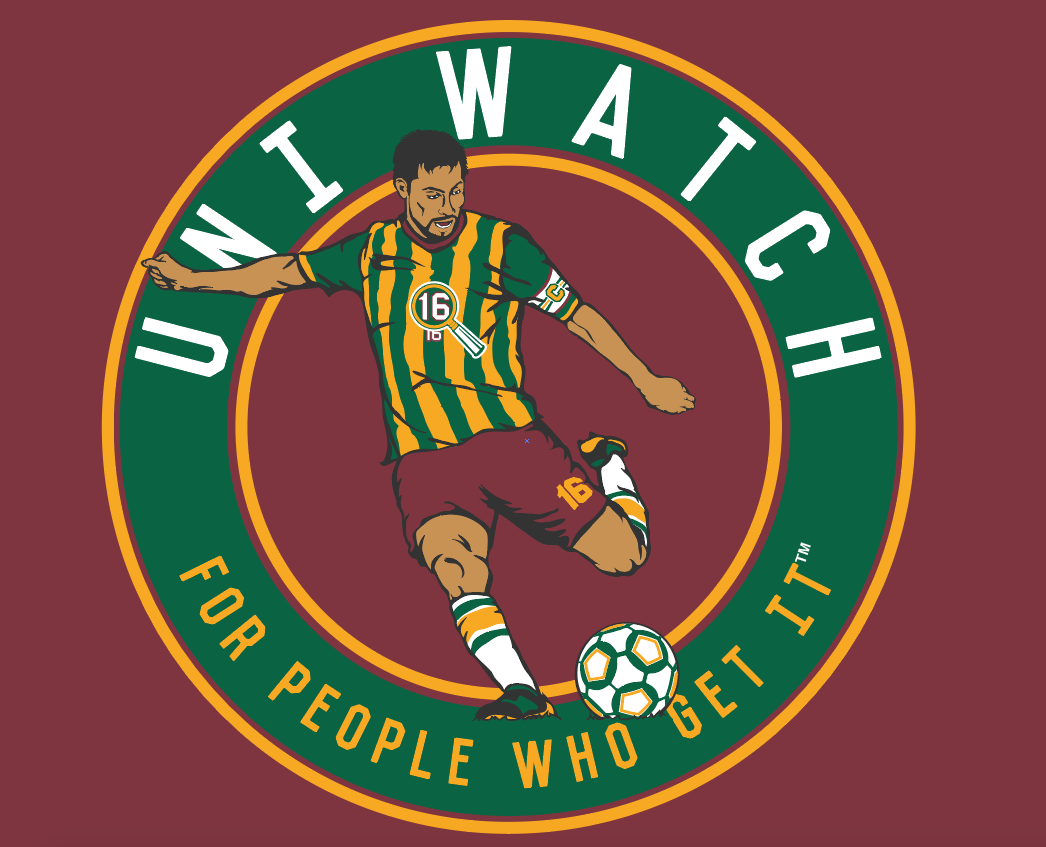
We’re offering this design in four different shirt colors — maroon, black, dark green, and heather grey:
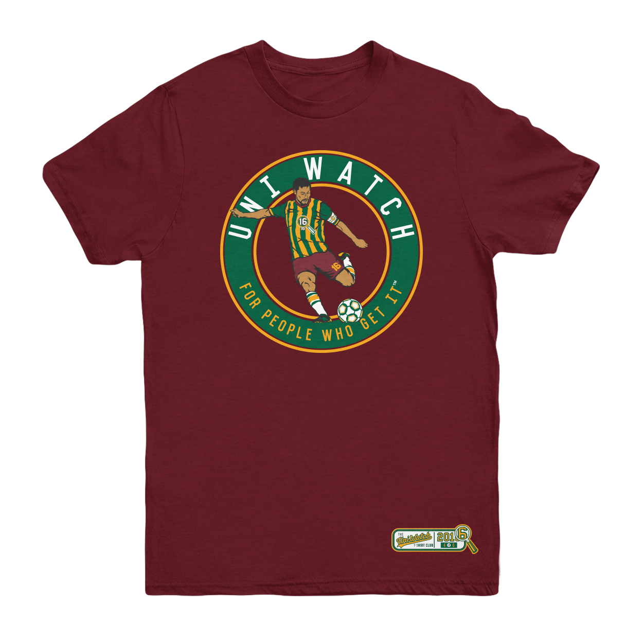
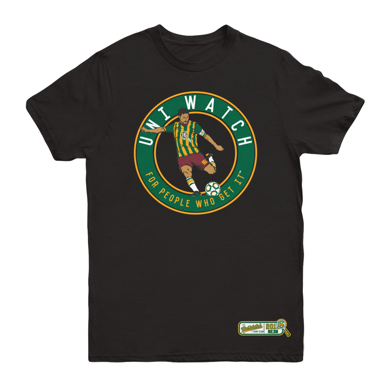
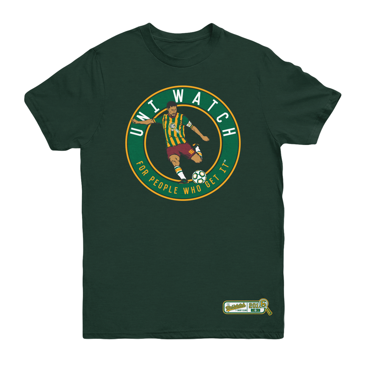
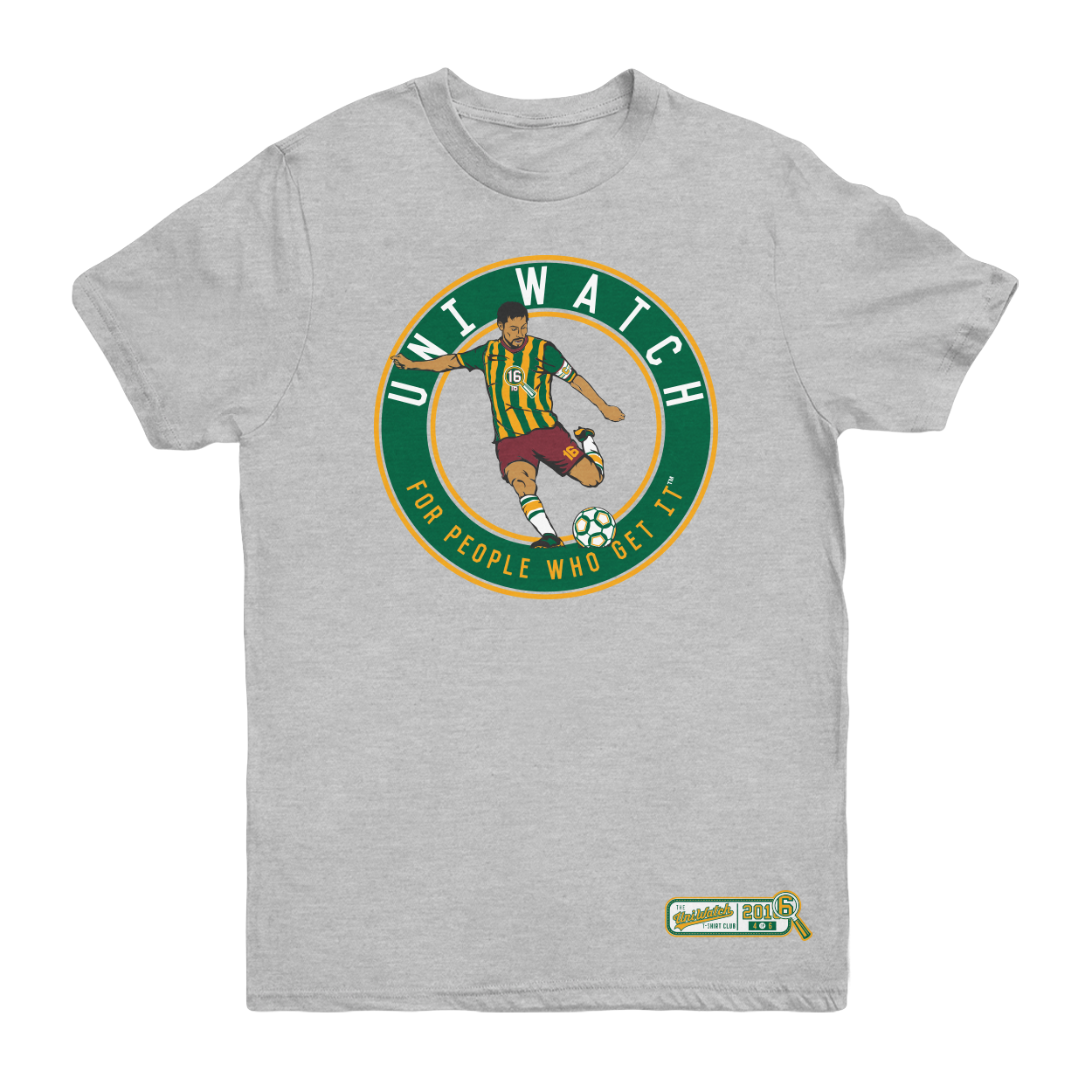
The shirt is available here. It’s available for a slightly longer period than most of our previous shirts, in part because I want to build in some extra time because of the Labor Day weekend, and also because traffic here on the site is a bit lower during my August break. Basically, I just want to make sure everyone has a chance to see and order the shirt.
One more time, the soccer shirt is available here. My thanks, as always, for your consideration.
Panel discussion: Paul here. Next Thursday afternoon, Sept. 8, I’m going to participating in a panel discussion at Baruch College in Manhattan regarding the use of Native American imagery in sports.
The event will run from 12:45-2:15pm (yes, I realize that’s an awkward time frame for anyone with a regular job) and is open to the public, although attendees are supposed to register/RSVP in advance. You can do that, and see additional information about the event, here.
Uni Watch News Ticker
By Phil

Baseball News: The Hiroshima Carp had some hot pepper uniforms. Says tweeter Graveyard Baseball, “Fittingly, they’re in 1st place.” The special uniform is so popular that it’s already sold out. It’s made by Mizuno. Here’s the back. … Also from Graveyard, the EDA Rhinos of the Taiwanese league (CPBL) will be wearing these on 9/3 in remembrance of a late manager. … And one more: Hokkaido Nippon-Ham Fighters went retro. Early 1970s uniforms in Tokyo Dome, their old home. … “Gotta love this picture that appeared on ESPN’s Trivia Tuesday quiz: Michael Jordan in Spring Training for the White Sox, with his hat on under his batting helmet, and some Upper Deck advertising on his sleeve and helmet,” says Max Wagner, who adds, “Didn’t know MLB teams had dabbled in uniform advertising pre-Yankees Ricoh ads.” … The Midland RockHounds spent the weekend as the Midland Millionaires (from OT Sports). … You might have heard ex-NFL QB Tim Tebow had a baseball tryout yesterday. He wore a blacked-out USC helmet (from Matt Shevin).

NFL News: The Saints now have an area in the Mercedes Benz Superdome that honors local high school football teams (from Benji King). … Atlanta Falcons president Rich McKay doesn’t anticipate a new uniform or logo change for the team when it moves into the new Mercedes-Benz Stadium in 2017, but McKay would like to see the throwback uniforms dusted off a couple of times a year (thanks, Paul). … “Apparently at Sunday Nights Bengals/Jaguars game the Jaguars grounds crew hung this sign in memory of Bengals groundskeeper Darian Daily who passed away earlier in the week,” says Patrick O’Neill. “My sympathies go out to his family. From a Uni Watch perspective, I have never seen the State of Ohio with Bengals stripes used in any connection either with the Bengals or the fans’ ‘Who-Dey’ chant. I think this is a ‘one off’ created by the Jaguars staff.”
College/Other Football News: In case you missed it, here’s what the Fresno State Bulldogs will be wearing on game day (from Kyle Klembara). … Mercer will go black on black on black (from Carter Barfield). … The Winner of the “Battle at Bristol” (this year featuring Virginia Tech vs. Tennessee) will get this neat-looking trophy (from Dave Doop). … Looks like this year’s Ole Miss helmets have raised “REBS” on the nose bumpers (via Nick Carr). … Here’s a cool shot of new VT stencil being laid in the end zone. … TCU’s white helmets are going from gloss to matte this year (h/t Jeff Gdula). … “Here is a picture of a couple of football players from Archbishop Alter High School in Kettering, Ohio wearing, what appears to be, Under Armour jerseys and Russell britches,” says Patrick O’Neill. “Also notice the ‘Crusader’ or ‘Jerusalem’ Cross for the ‘t’ in ‘ALTER’.” … This isn’t necessarily new news, but just in case: According to this article, the Miami Hurricanes may be ditching their feather stripes for more traditional this season (from Helmet Addict). … The Cincinnati Bearcats will be going stormtrooper wearing all white for their home opener against UT Martin. … Oops. … An intrepid writer attempted to solve the puzzle of CU’s uniform combinations. … Here’s a look at the New Mexico hats, minus stickers. … And, here’s the finished product (from JJGRIEGO). … Denison football has added some “slick gray alternates to its uni lineup. … “Pretty cool High School Adidas Techfit uniform unveiling!” exclaims Colin “little” Sullivan

Hockey News: “I know there are a lot of ugly (intentionally or not) uniforms used for special occasions, but it’s hard for me to think of an uglier one that’s used regularly than the OHL’s North Bay Battalion,” says Tim Kavanagh. “You might say, hey, that might just be a browser colorizing issue, but here’s the team in action. It got me thinking of what is the worst/ugliest uniform used in sports; have you done an article/poll on this?” … New mask for Blue Jackets goalie Joonas Korpisalo (from Mike Chamernik). … Jonathan Quick got himself a set of pads, blocker and glove from Vaughn for the USA for the Hockey World Cup (from BIZBO).


NBA & College Hoop News: Yowsa — check out the uniforms of the Seattle Pro-Am league. Submitter Randy Williams remarks, “Just saw this little short clip, and while the ball skills are pretty cool, the uniforms are not. These should be the text-book definition of ‘fugly’.” … The University of Montana Grizzlies will have new white uniforms for the 2016-17 season (from Eric). … Here’s a thing that exists: a Klay Thompson SJ Sharks bobblehead (from Mike Chamernik).

Soccer News: Usually quirky, themed jerseys are the provenance of Minor League Baseball, but the City Islanders (of the USL) were wearing Star Wars-themed jerseys yesterday evening. Gotta say that looks odd (from Nick Colosimo).

Grab Bag: Here’s a good bit of Russell Athletic history: In Paul’s ESPN piece on new college unis, he mentioned Russell, specifically referencing back to their old school uniform styles from the 1990s. “We miss those days, too!” says Julia Cohan who works with Russell. “Our brand has come a long way, and we are very proud of it’s progress. If you could help me by sharing our history it would be much appreciated.”
And that’s it for today. Congrats to Dan and Adam, and thanks to the Grand Rapids Griffins for allowing Uni Watch to host this year’s alternate jersey design contest! Big thanks, especially, to Marissa Malson of the Griffins, who was absolutely great to work with! Thanks also to Leo for his final weekday edition (for 2016, anyway) of Leo’s World.
I’m back tomorrow with one final weekday post (and it should be a doozy, so please come on back), before handing the keys back over to Paul. Everyone have a great Wednesday, and until tomorrow…
Follow me on Twitter @PhilHecken.
Peace.
“College football is allowed to have whatever values it wants. It’s the tradition and heritage angle that would interest me in the sport, if they were true. The kind of uni preview Paul has to write perfectly explains why I feel no interest whatsoever in watching the games, except maybe Army-Navy, where the tradition and heritage are actually real even though both are now donning clown suits like everyone else for the game.”
— R. Scott Rogers
I feel bad for all the people who submitted cimpp
Darn it, I missed the submission deadline! Well, if anyone’s interested, here is my Griffins jersey!
link
I feel bad for all the people who submitted completely original designs and lost to a recolored Team Russia jersey. Though I guess they said the logo had to be original, not
Not the stripes. Sorry. Stupid phone.
I wonder if Reebok and/or the AHL will stop that jersey from being worn because of it. Hopefully they do, because the “winning” jersey is a ripoff.
The runner-up is a better jersey and slightly more original, if you overlook how it mimics an older Black Hawks striping pattern.
Maybe that guy who only submitted a logo (and still got a ton of votes) had it right and understood that the jersey itself doesn’t matter.
Not saying I would have won had I done things differently, but I discarded one version of my design because I thought it looked too much like a recolored Texas Stars. Now I’m thinking I clearly didn’t need to be worried about that.
Man, can you imagine if the NFL required every team to have a completely unique striping pattern? I mean, who gets to keep the thin single helmet stripe? Indy, Pittsburgh, Oakland, New York? How do you decide? What about the 2 colored stripes with white in the middle? Dallas, New Orleans, Green Bay, Cleveland, San Fran…? I mean, damn…
My point… is that who freaking cares if it’s the same stripe pattern as another team if it’s a different color scheme? Especially if the team that it’s “ripping off” isn’t even in the same country, let alone the same league? It’s a one game jersey for a minor league team. Sheesh.
Maybe it matters because this was a competition? The point as I understood it was to come up with an original design. This guy came up with an original logo but he did not come up with an original jersey.
It’s not a matter of whether or not it’s boring, it’s the guy who didn’t even bother coming up with his own design was rewarded with the win.
I thought the point was to make a cool-looking uniform that the team would wear for a game. Borrowing a stripe pattern after spending a few hours working on a unique logo just doesn’t seem like a big deal to me, especially when, as I already posted above, plenty of professional teams already share design elements. Maybe if this was a Nike/Adidas/UnderArmor created uniform with a 2 year “design process”, that might be a valid complaint… but it’s a fan-creation done in less than a month. The winner isn’t getting paid, they’re getting a ticket to watch a game that they might not even be able to attend, and a jersey.
The point was to make a cool looking uniform… Via competition.
Take a look at Matt McElroy’s design. Or Jen Harley’s. Or read the post that Clark Rasmussen included the address to on his, detailing the design process. It’s pretty clear that some people did a lot more than just slap something together in a few hours.
I have trouble with Dan Kennedy claiming that design as his own. He may have created the logo but he did not design that jersey, Nike did. He gets rewarded for it anyway.
I’m pretty sure that reviewing the original design brief will show that Michael B is wrong on facts: The point was to come up with a good jersey. Not “original,” but good. Dan’s design was mostly original; have the critics even looked at the crest and shoulder patches? Keep in mind that the last Griffins alternate jersey shown on Chris Creamer’s site is a straight-up repo of the Caps’ home jersey. Not even recolored! Recoloring a well-designed stripe template to match an original jersey crest is unquestionably within the brief of this contest. If it weren’t, the Griffins wouldn’t have chosen it!
I think Michael B is caught up on the word original but I agree with him. The task was to design a jersey. Is recoloring someone else’s work “design?” I don’t think it is. Apparently the Griffins disagree. Apparently several people here disagree. Maybe more of next year’s contestants will keep that definition in mind.
I didn’t want to diminish any of the entries, most of which were really terrific, by naming favorites during the voting. But the two winners were my favorite designs. Big congratulations to Dan and Adam, and thanks again to everyone who submitted designs. Seeing all of the varied, creative designs was the highlight of the August uni interregnum for me.
“Mercedes Benz Superdome”, “Mercedes-Benz Stadium”.
This is way out of hand
In basketball, you have the same thing – Miami Heat play in the American Airlines Arena, and the Dallas Mavericks play in the American Airlines Center.
Also, I’m in North Carolina, and there’s BB&T Ballpark, home of the Winston-Salem minor league baseball team, and then across town is Wake Forest’s stadium, BB&T Field. And just down the highway in Charlotte is ANOTHER BB&T Ballpark for their minor league team.
Well, they’re going to have to tweak those designs, because those are Nike templates, and the AHL wears CCM-branded Edge unis.
Ticket correction in the college FB section. Should be Fresno State. Not just Fresno.
Thanks, fixed.
You are welcome. Keep up the great work. Thanks for being relief captain this month.
The Upper Deck ads on Jordan’s gear identifies that picture as coming from the link, held during the All-Star festivities at Camden Yards.
By the way, it’s a bit disappointing to see that Tom Selleck, a native Detroiter who often wore a Tigers cap in his role as Thomas Magnum, wore an Orioles uniform for that event. Freakin’ sellout! :P
It took me a bit to find that video. I knew Jordan had participated in some sort of charity event wearing a #23 Sox uni, but my Google-fu kept failing, taking me to the 1994 exhibition game at Wrigley, by which time he’d embarked on his baseball career and switched to #45. I managed to stumble upon a link to an article about the home run derby, but with no pictures. Once I had the name of the event, searching for that title allowed me to hit paydirt and find that video clip.
Who’s with me in my crusade to get the Mendoza Line renamed the Jordan Line?
Fewer people than you’d probably like. Jordan spent some time playing baseball (or “wasted some time,” if you prefer). He did not make baseball his athletic career, as Mendoza did.
Yes, this is a rhetorical question, but why is ESPN seemingly in love with Tim Tebow? He says he’s not doing this for the publicity, and yet . . . and ESPN is just happy to go along with the stunt, devoting an unbelievable amount of space to his “showcase” during pennant-chase season. He’s a failed football player and that’s it. Why the hype? There ain’t no there there.
Even worse, MLB Network is fawning over him also.
Gotta fill that 24 hours with something. If there’s no real news they’re happy to invent some.
ESPN and others report on him for one simple reason: their research shows every time they do, people read their stuff. It’s not ESPN’s love of him, it’s their readers’. If people stopped clicking on the stories about him, they would stop reacting to everything he does.
I’m not a Tebow fan, but beyond the fact that readers are triggering the coverage, a former Heisman winner and NFL player trying to make it in MLB is still a good story, has-been or not.
Good point…the “Worldwide Leader” also provides us a steady diet of Jerry Jones, Tom Brady and Nick Saban.
Meh. It’s better than their recent fawning over Bruce/Caitlan Jenner for being a hero of some sort.
Caitlin Jenner is stunning and brave!
Vehicular manslaughter is neither stunning nor brave.
I will now measure my age from the moment I first saw the map of Ohio with tiger stripes:)
I actually own a t-shirt with Ohio in tiger stripes, an ear hole somewhere around Lucasville, and a 2-bar facemask sticking out into West Virginia.
The “Who Dey” image with the tiger-striped Ohio standing in for the O is actually link. I’m guessing whoever printed the sign for the Jaguars swapped the white and black on the image so as to not to use up a bunch of ink/toner for a solid black block.
Great job Dan, Adam, and everybody that submitted jerseys for the Griffins! I really hope that we do this next year!
Ten internet bucks says the winning jersey never hits the ice because it’s a ripoff.
The Jordan photo was from the 1993 Celebrity Home Run contest at Camden Yards. Upper Deck was the sponsor… I was there!
link
Those pants are rather low-cuffed, but are a lot better looking than pajama pants.
And like I said in my comment earlier, it’s still wrong for me to see Selleck in O’s gear. It’d be like Dave Coulier in a Leafs sweater, or Tim Allen in a Bears jersey.
I don’t want to mention who’s jersey I liked best, as it’s neither here nor there… But I did show my wife the “finalists” and she was not impressed (with most of them) stating “that’s ugly” multiple times. LOL So I guess I’m saying why does it matter what they picked if they all were pretty bad? The finalist design she did like probably never had a shot of winning anyway.
Some parts of the history of Russell Athletics seem to have been glossed over. Maybe they don’t miss those days so much.
link
Think the Flyers third unis are being revealed today at noon. At least their twitter would make it seem so.
Flyers 50th Anniversary Jersey:
The numbers on back remind me of the bonus round wheel from The Price Is Right t.v. gameshow.
#worstjerseyinFlyershistory
Still not worse than the RBK edge template that hacked up their classic look, but it’s not what I was hoping for. Gets a solid “Meh”
Yeah the black Reebok Edge jerseys are godawful, and I think take the lead for worst merely by virtue of being a primary uni set. This is only for twelve games in one season. That black thing stayed around for years
Like the Blues’ first Edge unis, I considered the Flyers’ first Edge unis to be a bad parody, a funhouse mirror distortion, or just a complete mutilation of their prior sets.
The 2000s orange third jersey was far and away their worst pre-Edge unis, and are definitely among the worst of the worst.
My first thought on these new unis, of course, was “Gold is a Penguins color! Why would the Flyers use it?” However, as I got to thinking about it, I realized that they really, REALLY didn’t think through this combination of link. It’s all the more worse that the Flyers’ first opponent in their anniversary jerseys is none other than the Ducks!
On the plus side, all of the gold on the jersey is restricted to the numbers, letters, and the logo trim. Therefore, it would be simple to reuse the jersey in the future without the gold.
One last note: the contrasting nameplate has to go. It was cute when it was just used on a third jersey, but the Flyers have been doing it on ALL of their jerseys in recent years. Can we please just go back to normal nameplates already?
I don’t mind the contrasting nameplate on the orange jersey, because of the historical significance. However, the black nameplate on the white unis should have never happened. The lack of one on the uni in question would have been a nice opportunity to differentiate it even more, you know, for color blind folks ;)
Amusingly, I was reminded of when Steve Ott leaked the Sabres’ “turdburger” third jerseys back in 2013, and how I edited the jersey to replace the Sabres’ logo with the Predators’. And I even managed to find my original image and link!
link
Link to photos of the new uni.
I’m politely disagreeing with the hockey ticker.
I’ve attended a lot of OHL games.The reebok edge era has lead to many ruined/horrible designs, but the Brampton/North Bay Battalion are not one of them.
After enduring many years of every team shifting their palette to darker shades of red/navy/black, the Battalion stood out with a flashy green unique color, and instead of opting for an easy black helmet, they had their own custom helmet color molded to achieve a look that’s used by nobody else. Green is very under-utilized in hockey especially on helmets.
I guess you can argue the cartoon crest is in kinda hokey, but the striping is traditional but unique enough that it’s their own too. They are flashy and modern without resorting to wacky side panels or modern zigzags or horizontal piping.
I’m also a fan of that Battalion uniform — with its use of unique, distinctive colors and traditional stripes, it’s pretty much what I look for in a hockey uniform. I’m not in love with the crest, but overall, it’s one of my favorite minor-league hockey designs.
The particular shade of green may not be the most pleasing, but the Battalion’s jerseys look far better than any G.I. Joke camouflage jersey I’ve seen. And yes, there are far worse jerseys in the OHL thanks to some ill-conceived usages of the Edge templates. Credit to the Battalion for keeping their original design intact.
I agree with Eric. Just because it is different and unique – it does not make it ugly.
This is fatigue green. A unique colour that matches the identity of the team as the Battalion. They have been wearing this uniform for almost 20 years with minimal change. The helmet is cool.
If they were to change it – that would be a bad decision.
Situation is similar to the original Anaheim Mighty Ducks when they unveiled the plum jerseys and helmets. Different and unique to them, not ugly.
The crest on the North Bay Battalion jerseys look a lot like link from Street Fighter
Re: Atlanta Falcons not planning on changing uniforms when they move into the stadium.
Disappointing. I feel they would be better served talking that opportunity and going with a modern retro redesign.
They could keep the present logo and would look good going back to more traditional uniform striping with red helmets, black jerseys, white pants full time.