
[Editor’s Note: Paul is on his annual August break from site. Deputy editor Phil Hecken is in charge from now through the end of the month, although Paul is still on the clock over at ESPN and may be popping up here occasionally.]
By Phil Hecken, with Alex Hider
Follow @PhilHecken
We continue today with our look at the uniforms of the 2016 Summer Olympic Games from Rio (you can see past entries on Women’s Soccer here and on Diving here). I’ve tasked my “Rio Correspondents” with coming up with their own take on a specific sport or discipline, and they’ve put their own twist on each piece. Today, our own Alex Hider will be taking a look at the uniforms of basketball (men and women).
As you know (or should), Alex compiles our tickers for Mondays, and for this entry, I had the added bonus of him actually coding the piece in our Uni Watch dashboard (thus saving me a LOT of time uploading, hosting and coding the photos you’ll see below — thanks, man!). So, I’ll now turn the rest of the lede over to Alex, who’ll take a look at your 2016 Rio hoops unis.
Olympic Basketball
By Alex Hider
Looking at the basketball uniforms for the 2016 Rio Olympics, it’s hard not to feel like you’re watching a NCAA Tournament game in the middle of the summer. That’s because Nike and Adidas ”” which are outfitting a majority countries competing in the men’s and women’s tournament ”” have taken the #TeamBrand approach and designed all of their Olympic basketball uniforms in a similar way.
That uniformity goes all the way down to underwear, as every model Nike has released shows players wearing matching knee sleeves that extend below the shorts. Will all players be required to wear them? That remains to be seen.
The good news is that the template ”” while boring ”” is mostly inoffensive and unlikely to make your eyes bleed, as is often the case while watching March Madness.
Meanwhile, Adidas is outfitting all of their countries with a shoulder-yoke contrast template. The design works much better with some countries than others (looking at you, France).
One more note before we get started: FIBA allows teams to wear uni ads for their tournaments and exhibitions. They will need to be removed before the Olympics actually start, meaning there won’t be as much logo creep as you see here.
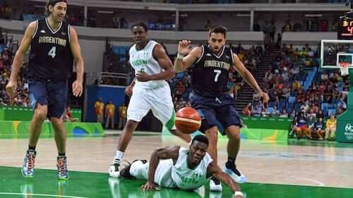
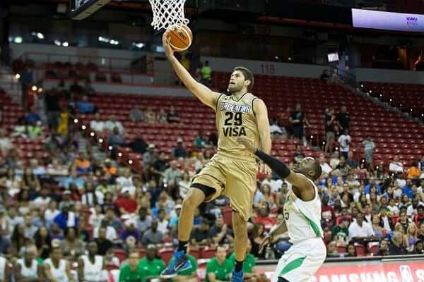
ARGENTINA
Men’s white
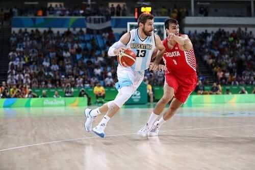
Men’s blue
Men’s gold
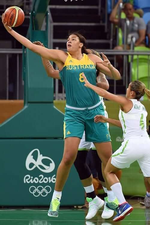
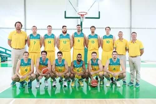
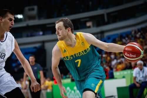
AUSTRALIA
Women’s gold
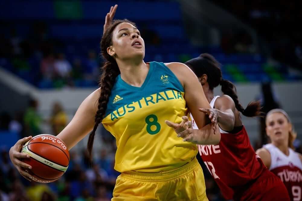
Women’s teal
Men’s gold
Men’s teal
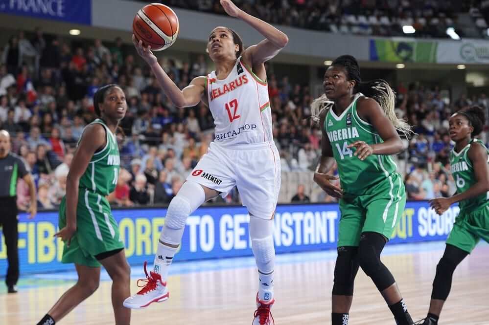
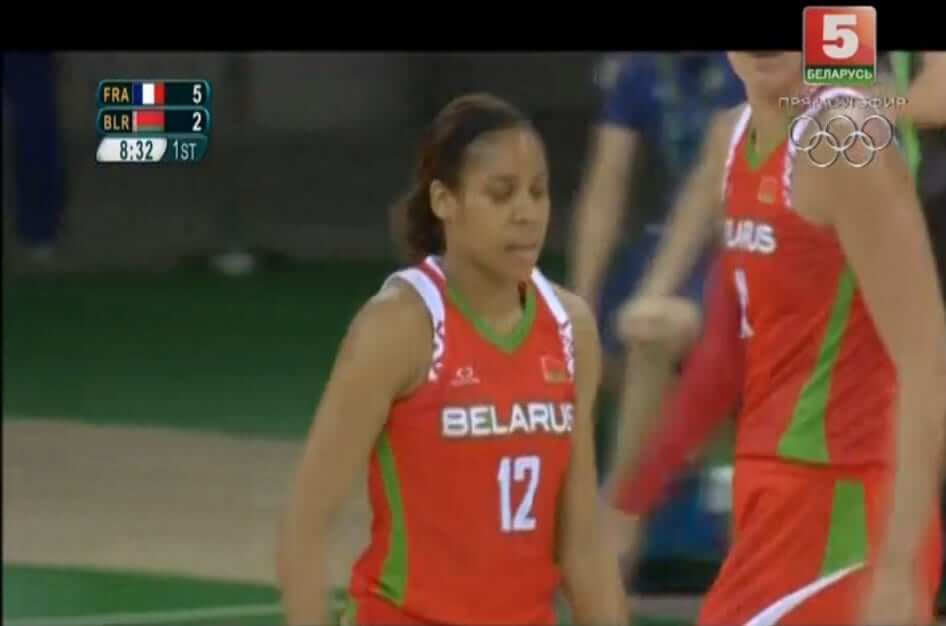
BELARUS (W)
Women’s white
Women’s red
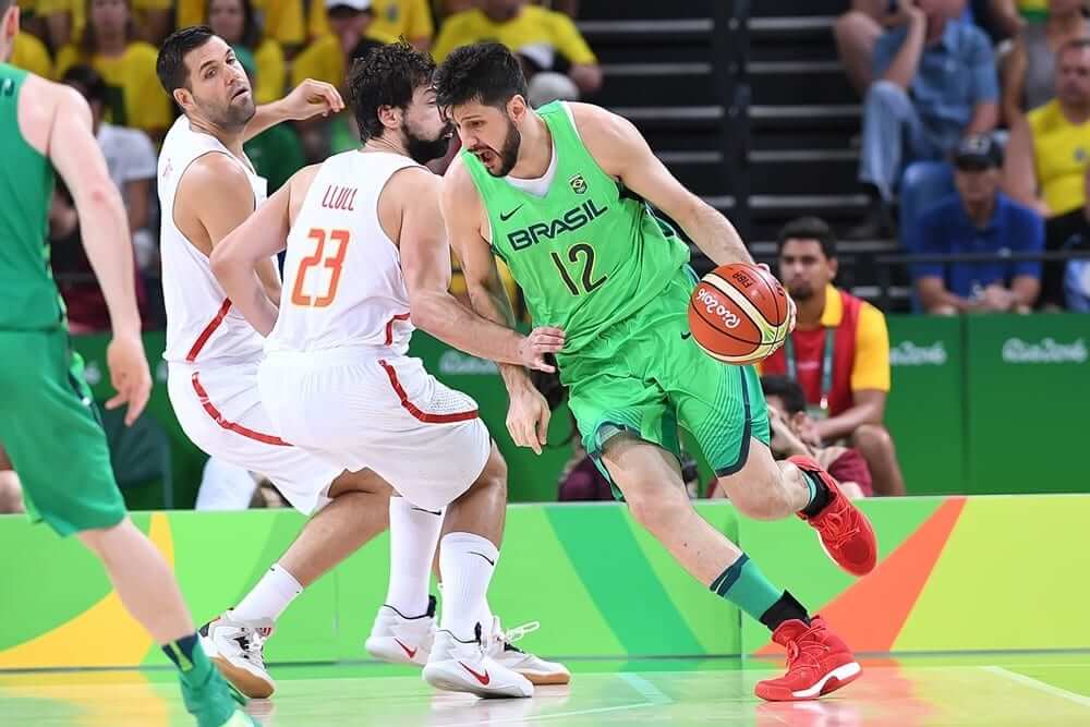
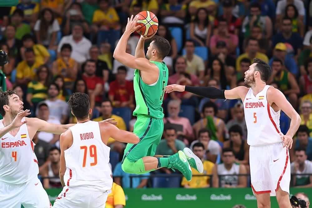
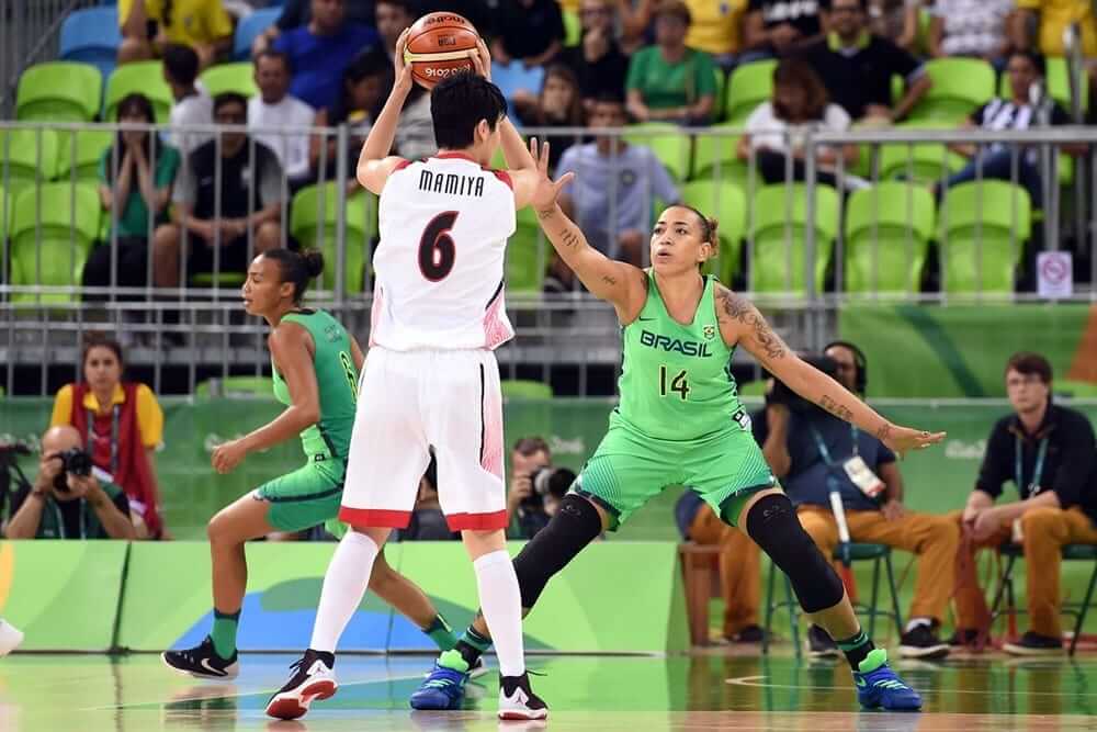
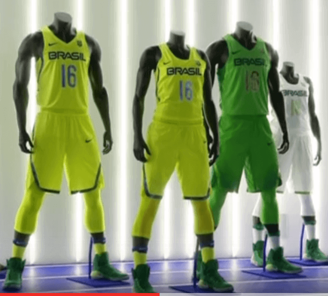
BRAZIL
Men white
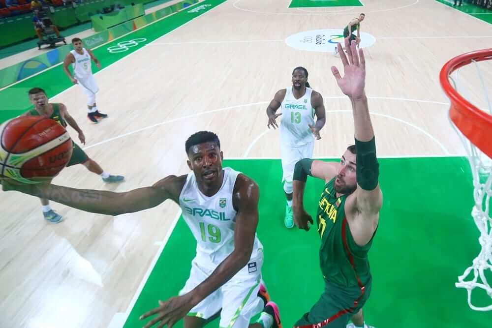
Men lime/green
Women white
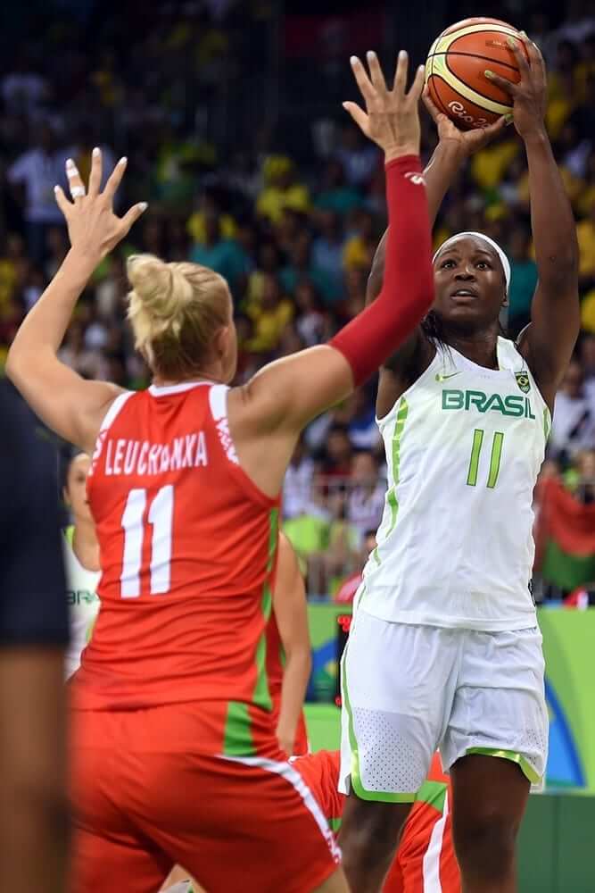
Women lime/green
According to Nike mock-ups, we may also be seeing highlighter yellow from the hosts at some point during the tournament.
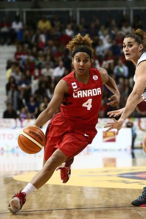
CANADA
Women white
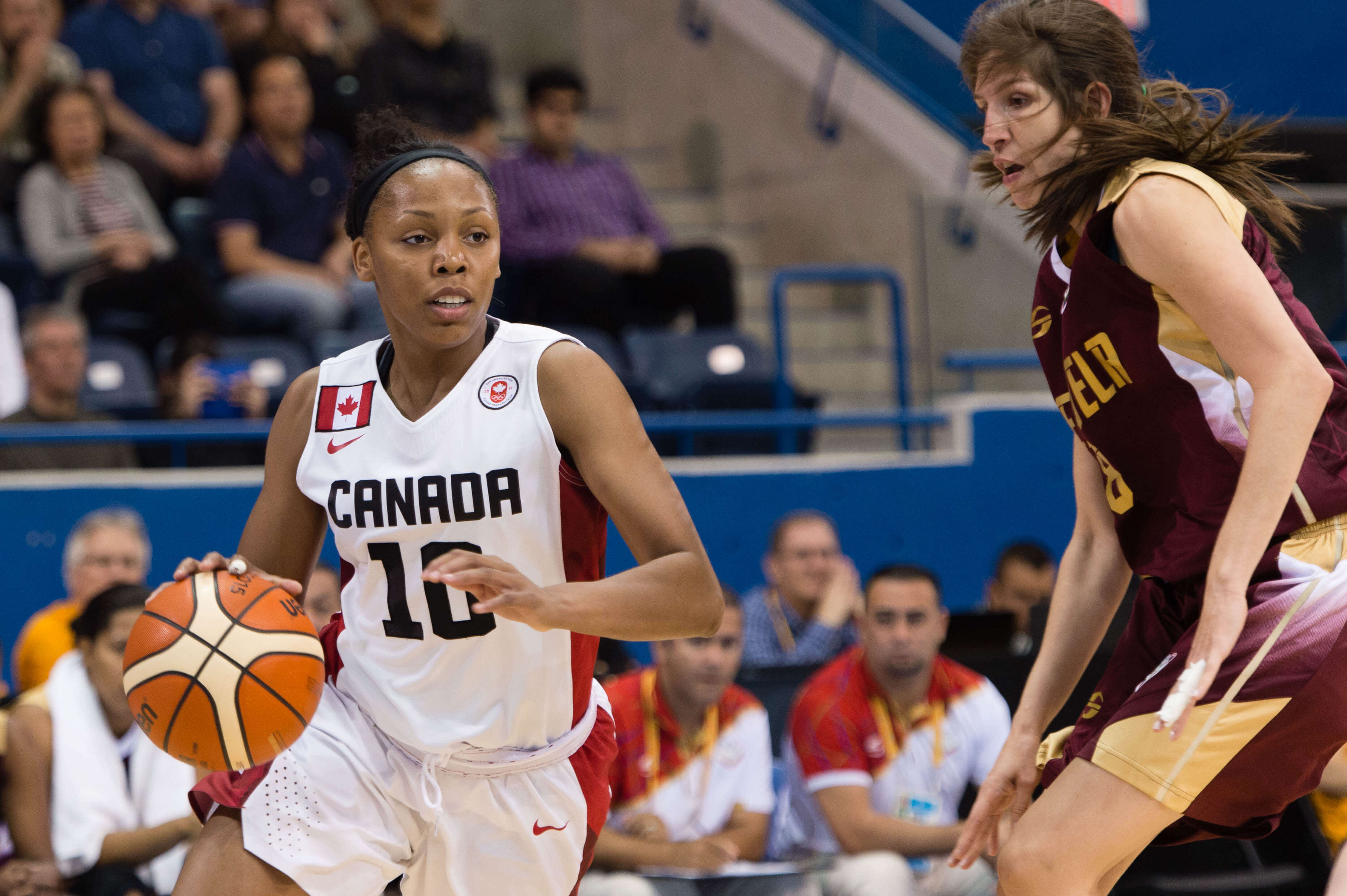
Women red
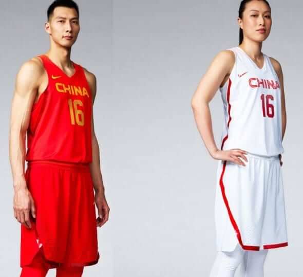
CHINA
The men and women will be wearing similar white and red threads.
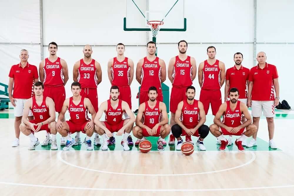
CROATIA
Men’s white
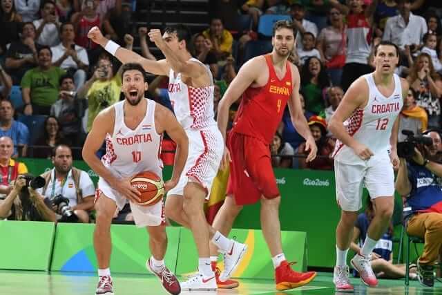
Men’s red
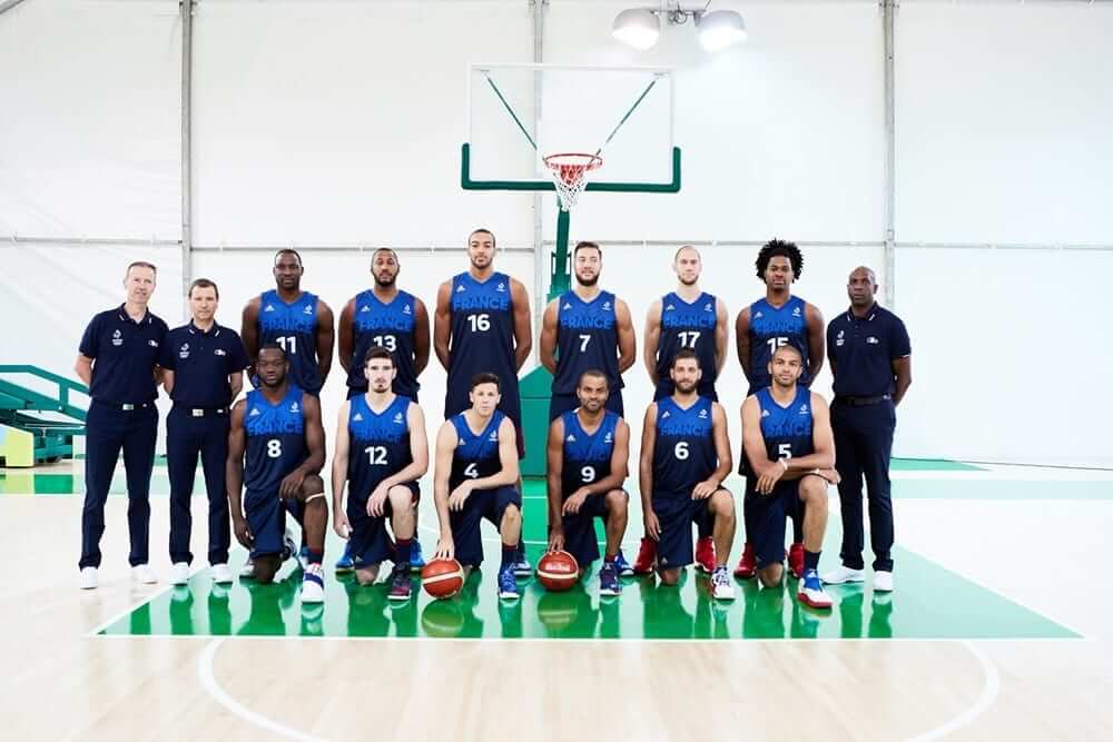
FRANCE
Women’s white
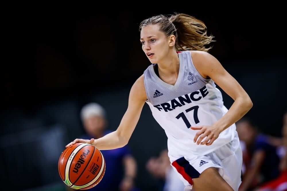
Women’s blue
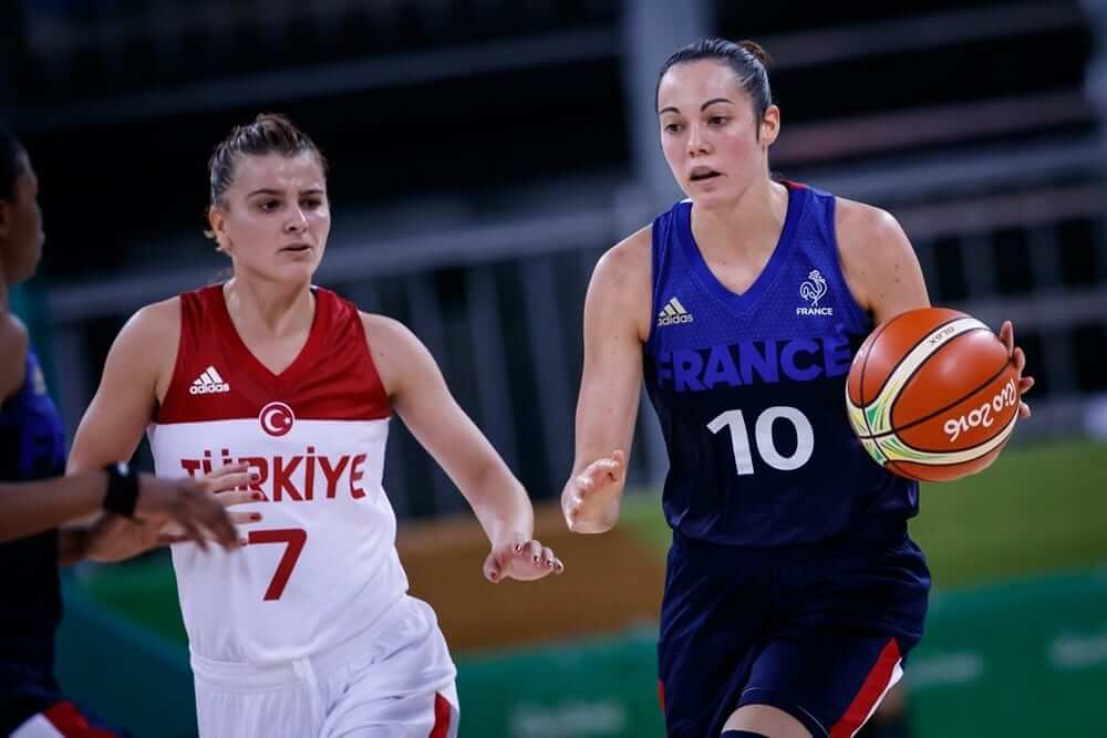
Men’s white
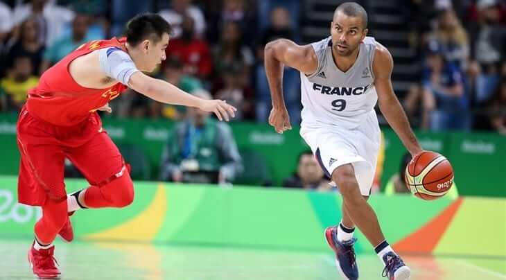
Men’s blue
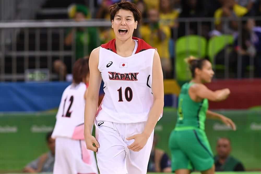
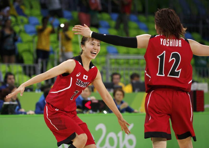
JAPAN
Women’s white
Women’s red
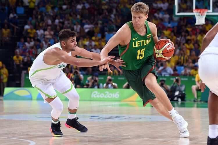
LITHUANIA
The men’s team is also using Nike’s template.
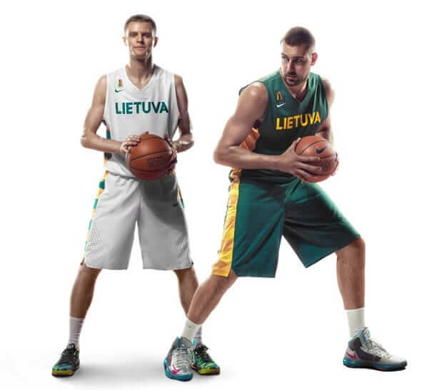
However, it seems as if their green shorts and jersey don’t exactly match. Not sure if this is due to arena lighting or non-matching fabrics, but it could be a flat out screw-up by Nike.
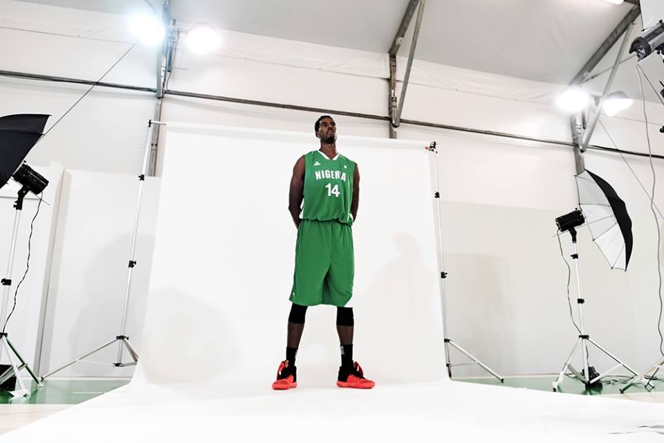
NIGERIA
Men’s white
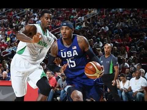
Men’s green
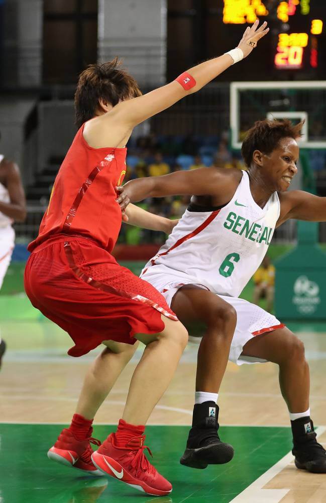
SENEGAL
Women’s green
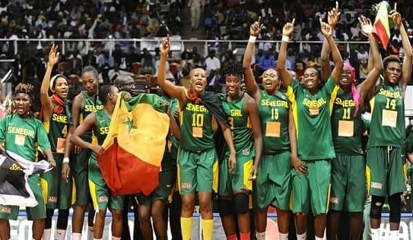
Women’s white
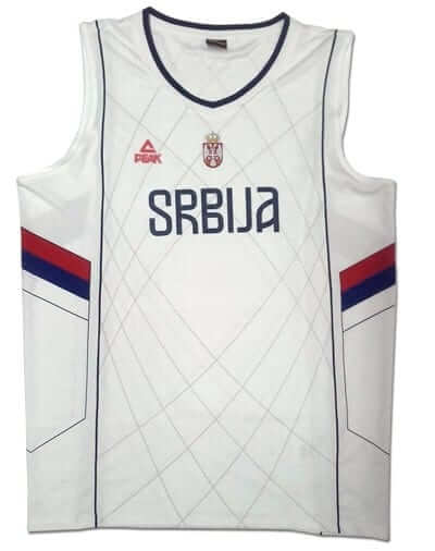
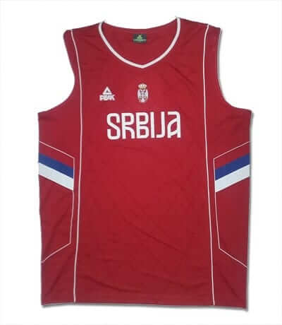
SERBIA
Both the men and women’s team will be wearing this template.
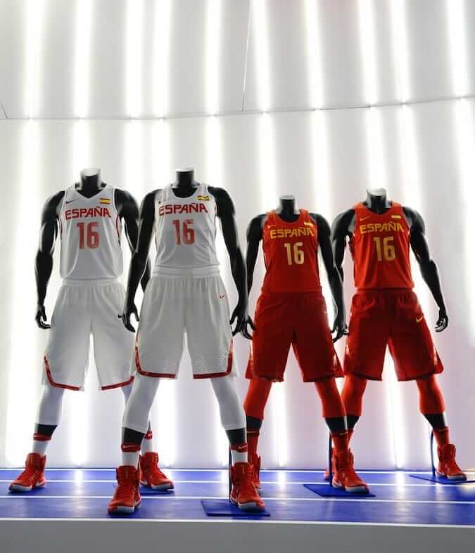
SPAIN
Spain is also doing the #TeamNike thing.
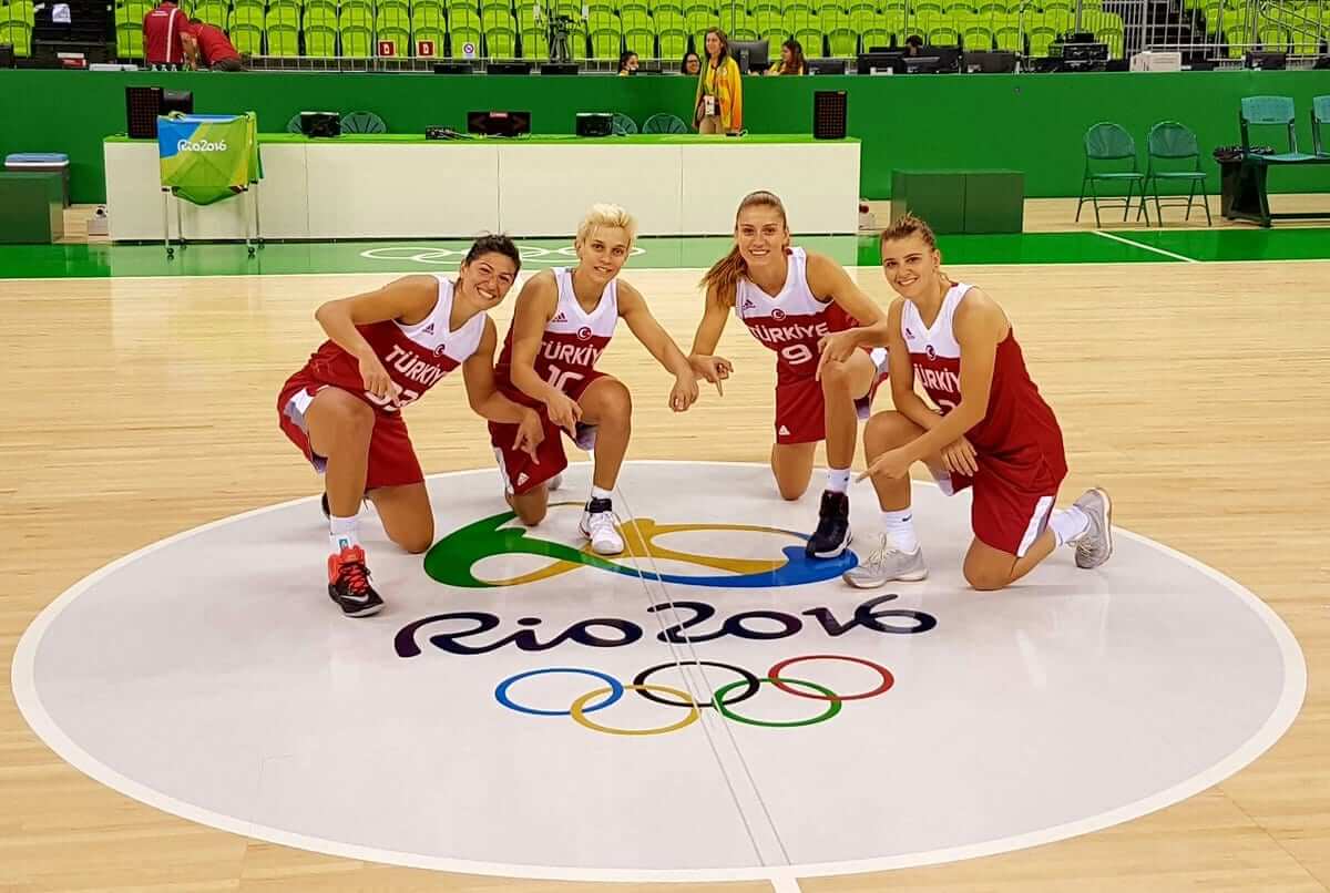
TURKEY
Women white
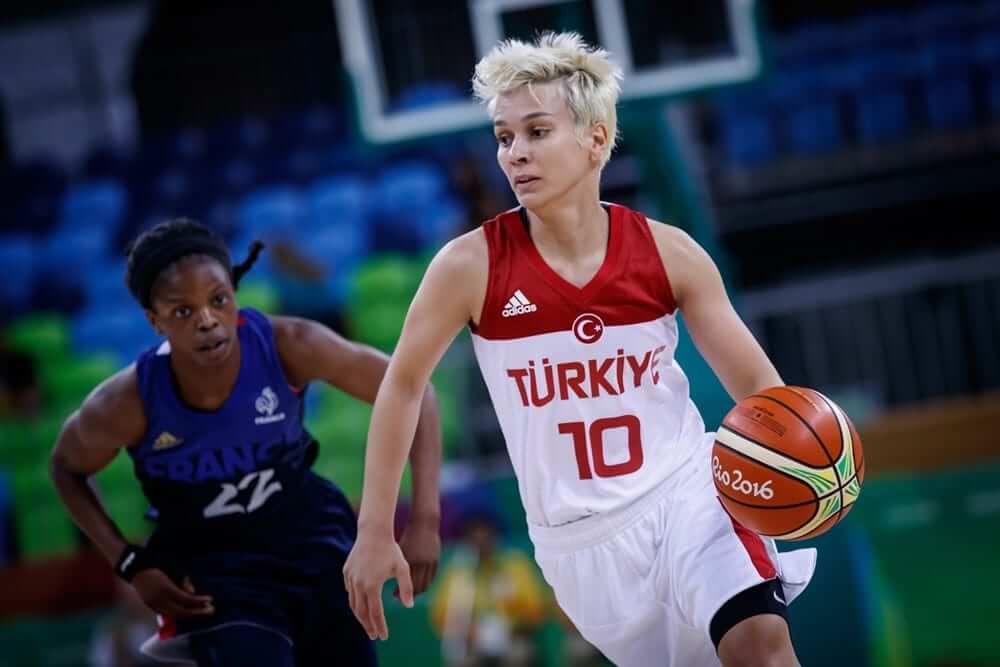
Women red
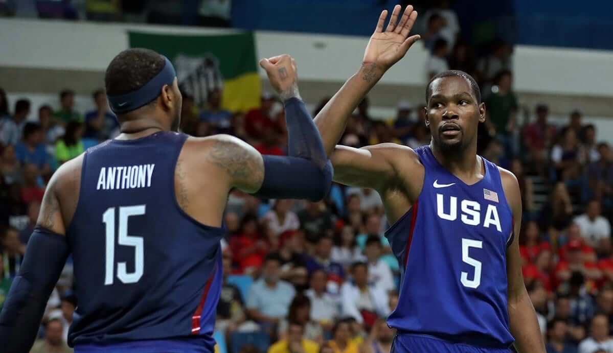
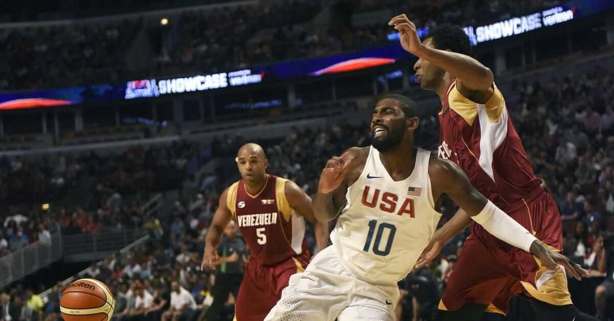
USA
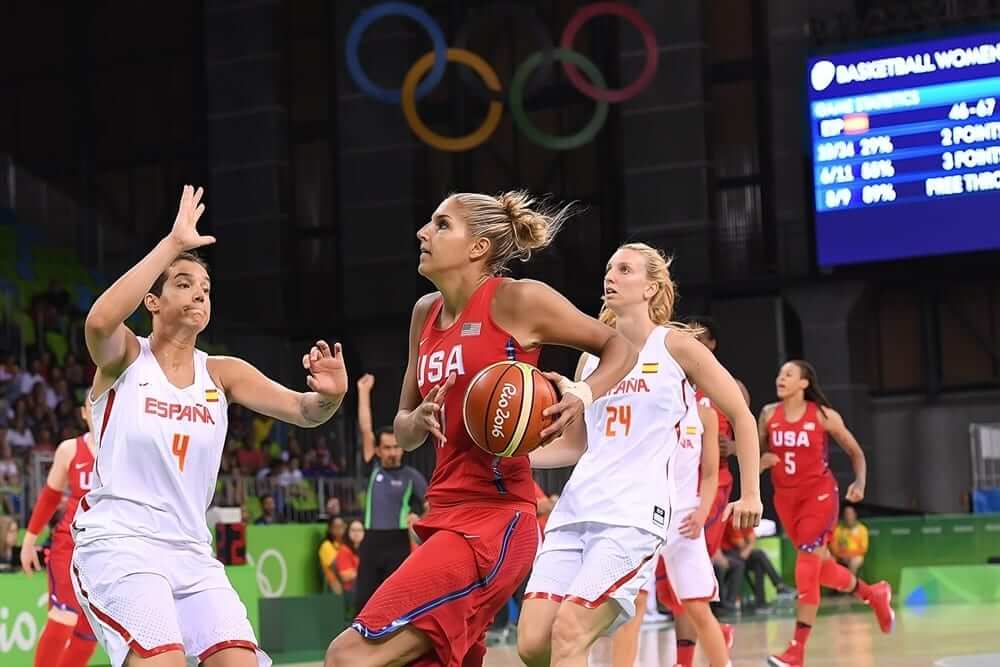
Women white
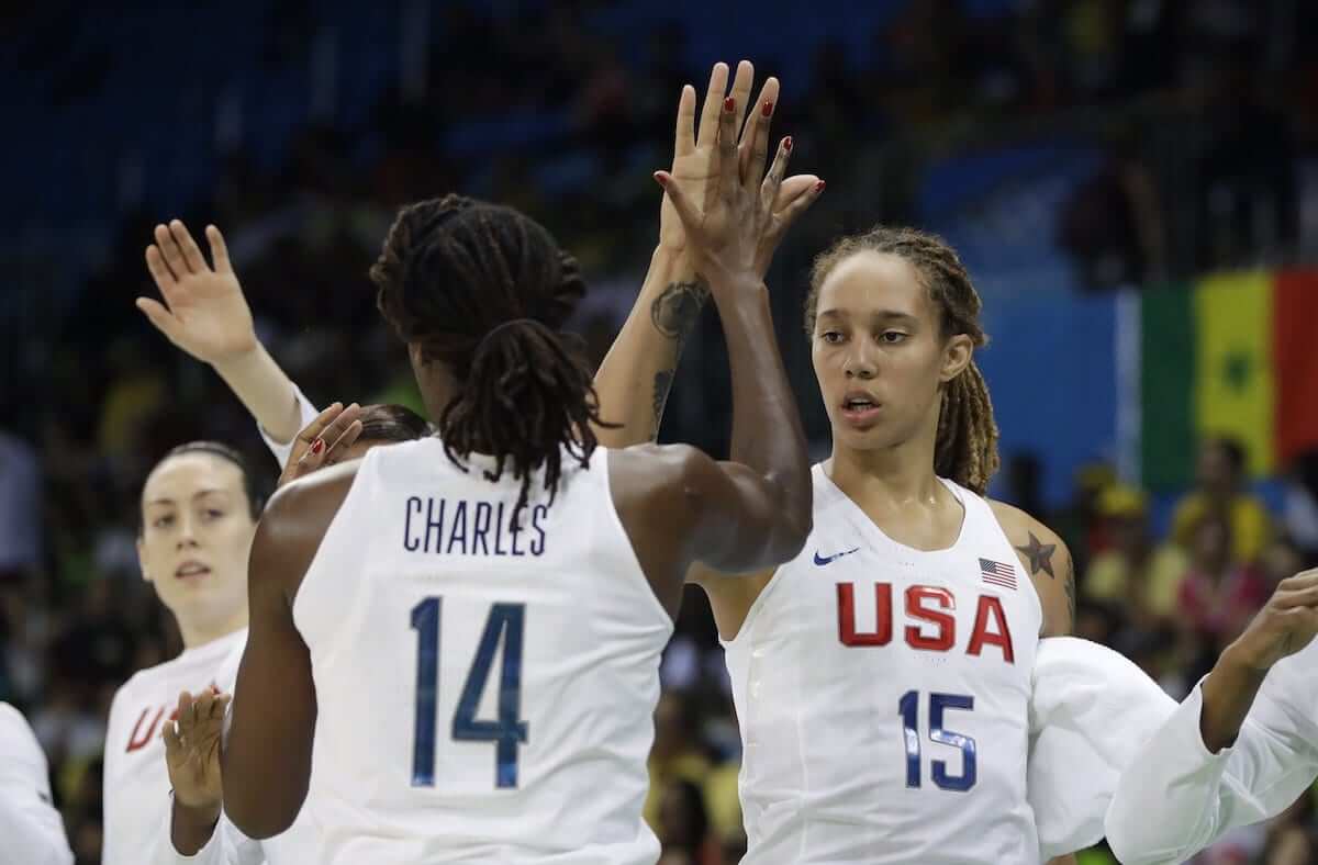
Women red
Men white
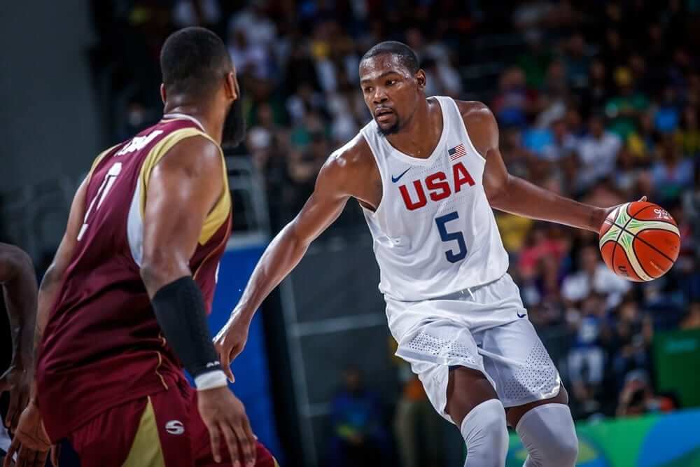
Men blue/navy
VENEZUELA
Men white
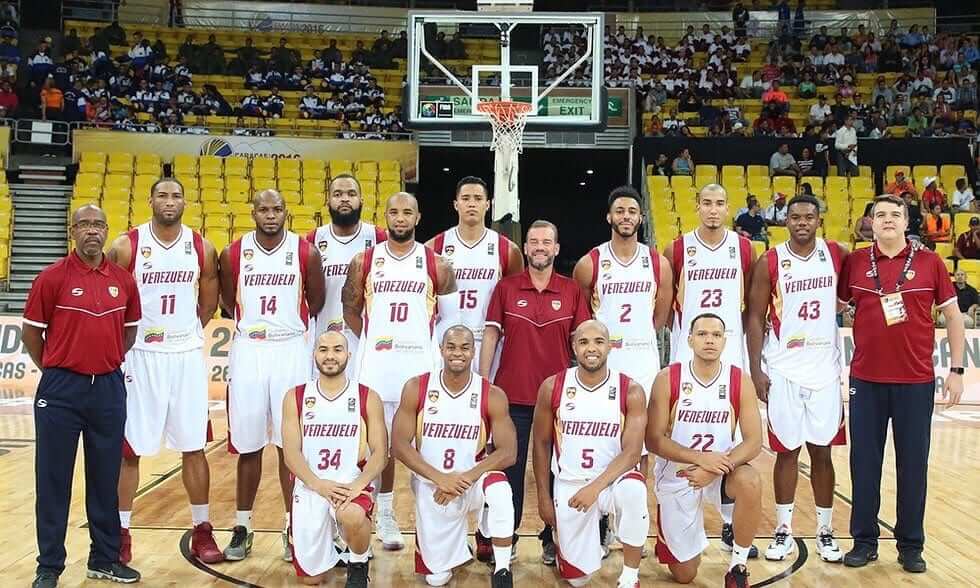
Men red
Thanks, Alex!
OK, readers — what say you? Who’s got the best set of unis? Who has the worst? If you were to rank them, (or pick a top 3), what would you pick?

.

Leo’s World
“Leo’s World” is a new, semi-recurring feature here on Uni Watch weekends (and now, weekdays during Paul’s blog-cation), featuring some excellent uni-related finds from Leo Strawn, Jr.. Each installment will feature a new, unique or just very cool collection of related uniform observations and research. You can click the images below to enlarge. — PH
OPI Gumball Helmets and a 1966 Miami Dolphins Prototype Helmet?
By Leo Strawn, Jr.
I’ve mentioned this before, but I want to go a bit more in depth on the subject, and on gumball helmets in general: This could be evidence of an orange 1966 Miami Dolphins prototype helmet.
Orange Products, Inc. (OPI), the company who made gumball helmets starting in the mid-60s, apparently had to work with information they got from individual teams in AFL (unlike the other league who had NFL Properties taking care of marketing their teams). Evidently, when OPI contacted the Fins before the 1966 season Miami had other ideas for their helmet. No doubt Miami was busy with more important things in preparation for their inaugural season of 1966 and either never got back to OPI with changes or else did so too late and OPI had already gotten gumball helmets ready for the upcoming season. Either way, the 1966 OPI helmets for Miami were orange, so it seems logical that the Dolphins were seriously considering that color for their helmet.

Here is a photo of an authentic 1966 OPI orange Dolphins helmet, one of the holy grails for gumball helmet collectors.

There are customs out there (collectors beware!) but there is evidence that the orange Miami helmets were actually manufactured by OPI in 1966 in the form of the instruction sheet…
…that came with the AFL kits that year and a note regarding the changes for the 1967 helmets.

Notice the 1966 instruction sheet says “orange” for shell color where the logos are shown, as well as below those graphics where the stripe instructions can be read.

That Miami image shows lettering around the logo, so the Fins may have been considering that, too. OPI never made stickers that way, just the orange without the sunburst for orange shells that came in 1966 AFL sets and, later, the two we’re familiar with, the dolphin with head inside the sunburst:
and the more common one they wore for most of their history with the head outside the sunburst, both of those on white, of course. (Yes, for those who weren’t ever quite sure, it’s a sunburst, not a hoop of fire.)

If you look at the San Diego helmet logo…
…it seems reasonable to assume they must not have gotten permission from the Chargers, and later, the Bengals, to use their official helmet logos until after the merger when NFL Properties would have taken over the AFL teams’ merchandising, so the OPI stickers for those teams in the 1960s are different from what those teams actually used. The graphic OPI used for San Diego’s gumball helmet comes from their AFL logo. Similarly, the Bengals helmet lettering used by OPI…

…was actually Cincinnati’s wordmark for their two AFL seasons.

Notice also that sheet still has the 1964 Jets logo.
It was common for OPI to leave images on instruction sheets back then that were no longer in use or had never been used, to save time and money. Another example is the Redskins on the early NFL kit instructions and boxes.

The image shows a feather up the back and then the spear graphic on side of the helmet on the image, so both are visible. Evidently, when OPI prepared those boxes and the instruction sheet graphics they were under the impression that Washington would wear that 1964 helmet in 1965, OPI’s first year for manufacturing NFL gumball helmets, so someone either didn’t notice or didn’t care about the feather still being on the back of the helmet.

OPI instruction sheets also have anomaly with the Falcons helmet graphic in 1967 showing a prototype logo Atlanta never wore and that OPI never produced.
The list of OPI oddities doesn’t stop there, but I’ll write more about those at another time.
Back to those orange Miami helmets: I did two mock ups based on the August 8, 1966, SI cover to show what Miami’s helmet could have looked like. (Odd side note about the original photo: It was taken by Neil Leifer who took a bunch of great sports photos in the 60s and 70s. This one, for the SI cover, was taken at St. Pete, so that’s the Gulf behind Frank Emanuel, not the Atlantic, which I thought was a weird choice for a photo of Miami!)

This is the first mock up, faithful to the OPI gumball version.
However, as anyone knows who has ever collected gumball helmets, the kidney shaped stickers made it impossible for the helmets of some teams to be accurate with regard to size and placement…

…so I did a second version to show what their helmet could have looked like if the tail of the dolphin wrapped around the ear like the horns on LA’s helmet.

I wrote to the Dolphins organization years ago about these orange helmets but never received a response. Maybe one day there will be a news story about someone cleaning out an old storage room in Miami and running across a layout of the proposed helmets…or even a full size orange prototype!
If anyone has any evidence aside from the OPI gumball helmets regarding an orange Dolphins prototype, please let us know!
Till next time…
Cheers!
.

Grand Rapids Griffins Contest Design Reminder
I’m currently hosting a contest to redesign an alternate jersey for the Grand Rapids Griffins. All the details are here.
The deadline for all submissions is Thursday, August 11th (Midnight Eastern Time).
Remember to send all your entries to Phil.Hecken@gmail.com in the format described in the article.
Good Luck!
.
Uni Watch News Ticker
By Phil

Baseball News: Oooh. Check out the beautiful red and white striped stirrups being sported by the West Virginia team in the Little League World Series (from Mark Wolven). … This Saturday night will be Dora the Explorer night for the Rancho Cucamonga Quakes (from OT Sports). … Paul Molitor had a triple for his 3,000th hit in 1996. “When he did it, playing for Minnestota, at Kansas City — the Royals shot off fireworks and did a tribute video for the visiting player (unusual),” says Ariel Shoshan. Twins Manager Tom Kelly came out of the dugout to congratulate. His hat was a snapback model. Ariel asks, “Did he always wear that? Did the AL allow it back then? Does MLB now?” … The Boston Red Sox canceled last night’s David Ortiz bobblehead giveaway due to the Bobbles being unacceptable. They should have had Robert Marshall make the molds (h/t Brinke and Mike Chamernik). … Check out this photo of Ted Simmons, with American flags on his shin guards. After some Twitter help, we believe it says “FREE THE HOSTAGES”, and Getty dates it to circa 1980, which would jibe with the time of the Iranian Hostage Crisis (thanks to Relationship George for the original tweet). … Looks like the Reds are joining the “College Night” trend (from Nick Colosimo).

NFL News: Have you ever wondered what every NFL helmet would look like if it were shown as “color opposites” (also known as a “negative” for those who’ve ever shot film)? Wonder no more. … Eric Wright thinks the Titans should go light blue sock instead of navy (check out this shot from Monday night’s scrimmage). They should also go mono-white. … New England Patriots head coach Bill Belichick showed his support for safety Nate Ebner, who’s away from the team competing at Rio 2016, at training camp Tuesday. Belichick wore a special shirt emblazoned with Ebner’s USA Rugby number (from Ted Arnold). Turns out it’s not just Belichick.
College Football News: This “pre”season, the Marshall Thundering Herd are wearing padded helmets during practice (from David Cline). … Auburn players have worn the wrong number font a few times. Details on many instances here (from Clint Richardson). … Here’s an Alabama coke display in a Tuscaloosa Walmart (from Griffin Smith). … Oooh — take a look at Dick Todd’s 1938 uni. Todd was a sensational RB for Texas A&M (h/t Ryan Sprayberry). … Not sure if we saw these before, but just in case: New unis for Howard. … Looks like Sparty will have a(nother) alternate this season (via Mike Cooper). … Another day, another list: this one is the 10 best new unis in College Football. … Whoa Nelly! Check out Woody Hayes’ shirt! Looks like a durene/mesh jersey (or at least the material) with a collar added (great spot by Mike Knapp). And John Turney has likely provided the answer. And here’s an example of one.

Olympics News: In a sport usually known for its competitors having the tiniest of bikinis, the Egyptian Women’s Beach Volleyball team is attracting attention for the opposite reason. … How a 12-person studio in Melbourne helped design the basketball jerseys for the Olympics’ Men’s & Women’s hoops teams. … In order to increase TV ratings, the US Men’s gymnastic team wants to compete topless (h/t Jimmer Vilk). “People make fun of us for wearing tights,” Sam Mikulak, the four-time national men’s gymnastics champion, said. “But if they saw how yoked we are maybe that would make a difference.” Mikulak did not extend his suggestion to the Womens’ team, which would undoubtedly increase ratings should they, too, compete topless. … Check out this collection of ticket stubs for each Olympic Summer games starting in 1924 and running though the current games in Rio de Janeiro (from Russ Havens). … Klay Thompson has some patriotic shoes for the Olympics. … Well, we knew the Olympics wouldn’t be perfect, but — the Olympic Diving Pool has turned green, and no one knows why (from Alex Hider). … Oops — a USWNT’s soccer player’s hair dye ran onto her jersey numbers (from Mark Johnson). … Yesterday, USA Coach was rocking a USA-less jacket, but the swoosh was still there (from Steven Carlson). … According to this article, Russia’s Olympic unis are totally “dope”. … I’m not sure that the US Code as applied to flags covers swim caps, but if it did, it seems Michael Phelps’ cap doesn’t (from Brody Lyons).

Hockey News: In a KHL game that may have been more notable for the fighting, Uni Watcher’s also took notice of the fact that the game was color versus color (good spot from Ken Traisman). … The Penguins have unveiled new uniforms for 2016-17. No, not those Penguins — the Wilkes-Barre/Scranton Penguins. … Las Vegas still doesn’t have a name for its future hockey team, let alone a uni, but here’s a concept for the Las Vegas Peregrines (submitted by Tony Caliguiri). … St. Louis will be the site of this year’s Winter Classic, and here’s a look at the logo, appropriately on “home plate” at Busch Stadium. And if we can go by the vintage Blackhawks logo on the wall, we’ll probably see the ‘hawks going pretty far back into their uni history for their uni inspiration (from Zack Pearson). Will that jersey possibly be from the ’55 era? And will the Blues throw waaaaay back [for them]? From Austin Bachmann). Here’s a bit more on that. … The San Jose Sharks are having Brent Burns ‘grill’ giveaway next season (from Ted Arnold). … The Lake Erie Monsters have now become the Cleveland Monsters (via John Muir). Here’s a look at the new sweaters they’ll wear this upcoming season (h/t jon d). … You can read more about the Monsters transformation here. … Looks like the San Jose Sharks (wow, two ticker mentions) will have new secondary logos (from Daniel Pedroza).

NBA News: Going out with a bang: adidas will begin its final year of outfitting NBA clubs (well, at least until Nike’s contract expires) and they’ve given the Orlando Magic this new alternate jersey (h/t Megan Brown and Mike Chamernik). I thought it was just a fashion top at first, but no, it’s frighteningly real. Here’s some more on that (from Yancy Yeater). … New logo for James Harden (h/t Mike Chamernik). … So, here’s (another) list of the NBA’s worst current alternate unis.

Soccer News: After a summer hiatus, the Design Football podcast has returned with two new episodes – both accessible on the Design Football front page. In one, presenter Jay speaks with Colin Forde, an Irishman who has worked as both a kit distributor for a manufacturer and a kitman (i.e. equipment manager) for a League of Ireland team while in the other his guest is Rich Johnson of The Football Attic discusses his ever-growing collection of shirts (from Dennis Hurley). … New kits for the boys of Mullen High School (from Marc Gustafson). … Here’s an interesting article that has the MLS transfers (the soccer equivalent of trading players for cash) of the past transfer window in jerseys (from Josh Hinton).

Grab Bag: Some teams do pink for 1-2 days, some for a month. Middlesex’s T20 cricket team has been pink since 2007 (from Jimmer Vilk). … Who knew there was a big market for fashion statements for morticians? Well there is (thanks to Tommy Turner).
.
And that will do it for today. Thanks to Alex for his Olympic hoops uni rundown, and Leo Strawn for another stellar episide of Leo’s World. I’ll be back atcha tomorrow, but until then…
Follow me on Twitter @PhilHecken.
Peace.
“This is the first time I’ve seen the word triskelion in a non Star Trek discussion. Bravo!”
— Jon Rose
.
“Oops – a USWNT’s player’s hair dye ran onto her jersey numbers (from Mark Johnson).”
There are lots of USWNTs at the Olympics. You might want to specify soccer.
Fair point, Jerry, although I’ve never heard any of the other teams referred to by that acronym. But edited to say “soccer”.
I also have never heard it used for other sports, when I see USWNT I assume soccer. Even when I google ‘USWNT’ I get the soccer team.
It’s interesting to see Japan outfitted by Asics as I didn’t think they did jerseys at all.
That red stripe on the Chinese jerseys looks like a strip of tacky tape, looks almost as bad in other colors.
The Serbian uniforms by Peak are pretty awesome though.
”Early hint is a possible “modernized” original 1967 Blues sweaters for the Winter Classic.”
We can hope so!
(Uncle) Leo!!
There was another company in the late 60’s/early 70’s that also made NFL gumball helmets, but they were slightly bigger (they actually fit my G.I. Joe’s head! Do you have any info on that company? do these ring a bell with you?
Thanks for the great info/fun !
I was going to ask the same question, Dumb Guy. I still have three of these helmets that I got from the gumball machine at the Big N back in the early seventies.
Hey Dumb Guy and Clarbird!
If you recall, some of the gumball helmets had pencil sharpeners. The sharpeners fit inside four platens that stood out from the inside, top of the helmet. Those platens were inside every OPI helmet.
But you’re correct, there were other manufacturers who jumped on the bandwagon. Of course, manufacturers in Hong Kong did knock-offs (seems like everything back then had a cheaper, unofficial HK equivalent that didn’t quite make the grade when compared to the original). The early HK versions were misshapen a bit and didn’t have those platens and would usually say “Made in Hong Kong” inside. They frequently had incorrect colors, logos, striping, etc.
If look inside those jumbo helmets you mentioned, they also should have no platens. These were made in Canada, and inside the helmet should say so.
They were likely made larger to get around copyright concerns with OPI because the logos and striping were correct on all that I’ve seen. In other words, they contracted with AFL teams and NFL properties but sidestepped OPI’s copyright on the gumball helmets by making them larger.
OPI made helmet buggies too, and the helmet shells were larger on those, but I’m not certain you could remove one from the chassis without damage, so I’m guessing you have the Canada versions. I have 3 of those myself and was kind of shocked at the odd size when I got the first one (it was part of a lot of gumball helmets). Same reaction when I saw the odd graphics on the first HK helmets I encountered.
I have been in touch with a couple of long time gumball helmet aficionados, one of which is currently writing a book on other OPI products (basketball/hoop sets, hockey sticks, etc.). When he is finished and I have caught up on finishing other projects I have underway, three of us are putting our heads together for an online database which I was working on by myself for about six months prior to locating these two gentlemen, and I’m confident we’ll be able to have that up and functioning sometime in 2017. Will let UW know when that is a reality!
Cheers!
Thanks for the info, Leo.
*Clarybird (How could I screw up my own name?)
No worries!
Very cool. Thank you.
btw: I want to scream every time I see one with:
The facemask on the back! (or upside down)
A “white” stripe where no stripe at all should be!
Decals on the wrong side!
Scream or laugh, I can’t decide. :^)
Totally agree!
I would add to that list:
Steelers helmets with logos on both sides.
Browns helmets with solid orange kidney stickers. OPI started putting TM on kidney stickers around 1994, not long before they quit making gumball helmets, and they actually made solid orange kidney side stickers for Cleveland with TM on the solid orange. :)
Leo,
The Chargers diagonal lightning bolt is the same as the 1960s helmet insignia for the CFL’s Winnipeg Blue Bombers. I once saw on eBay a CFL gumball set with Chargers/Blue Bombers helmet. I love the blog and your personal take on the the Royals logo.
Though it was a well remembered look and a Grey Cup championship season for them, I am pretty certain the Winnipeg Blue Bombers only wore the lightning bolt on the helmet during the 1961 season. They did not wear the lightning bolt in the 1959 and 1962 Grey Cups. I have seen photos labelled 1960 and they are not wearing the lightning bolt.
The lightning bolt motif made a return to the logo and the uniform of the Bombers during 1995 redesign (lightning bolt-W logo). It remained part of the logo until 2012, when the lightning bolt was eliminated from their identity again.
I was aware of the OPI CFL helmets, but I’m not sure I’ve seen that particular Winnipeg helmet. Will be on the lookout for that one.
Thanks for the compliment! Cheers!
Hmm, flag etiquette absolutists that I am, I’m nonetheless on the fence about the swim caps. On the one hand, the Flag Code prohibits using any portion of the flag on an athletic uniform. It’s a strong, absolute, and unconditional prohibition. Why? Because the flag should never be exposed to conditions where it is likely to be soiled, ripped, rubbed on the ground, or otherwise physically desecrated. Which inevitably happens to any flag patch on a baseball jersey or a football helmet or other piece of a sports uni or equipment. But a swim cap is arguably not really part of a “uniform,” and anyway swimming carries very little risk of the flag on the swim cap being soiled, torn, or otherwise desecrated. So on the athletic uniform prohibition, I think there’s a strong argument that swim caps don’t violate the letter of the Flag Code and a weak but plausible argument that they don’t violate the spirit of the Flag Code.
But the Flag Code does grant explicit permission for “patriotic organizations” to display the flag on their uniforms. The history there is that it was intended to permit then-new municipal police forces and Boy Scouts to wear the flag on their sleeves. Now, the US Olympic team is first and foremost a sports team, not a patriotic or nationalist organization. But it does represent the nation, and at least sort of quasi-morally, American athletes are competing to do honor to our country. So I think there’s a reasonable, if weak and, to me ultimately unpersuasive, argument for permitting a flag patch on any Olympian’s uniform or equipment.
On the other hand, the Flag Code is unconstitutional and nothing more than a guideline at best. That horse hasn’t just left the barn, it’s gone and evolved telepathic powers and torn the barn to the ground while performing a catchy song & dance routine.
The Flag Code is just that, a code, and has no legal backbone. It’s mostly a custom that inspires the wrath of Boy Scouts, precocious children and veterans.
I don’t know what that means. The “Flag Code” is covered by Title 4 and Title 18 of the UNITED STATES CODE, in other words, its the law, not a “custom.” Also, the Code section is not “unconstitutional” otherwise it would be stricken from the USC. I assume that you are not an attorney.
Well, the Flag Code enumerates no penalties for violating it, but rather leaves elucidation/enforcement of it up to the States:
link
And some State laws have been found unconstitutional, and while most States do still have flag laws on the book, they’re mostly limited to acts of violence against them. And the few statutes that purport to impose a penalty for “misuse” of a flag likely would be found unconstitutionally vague, at least IMO. As an attorney.
Link for the second point:
link
Not sure what the problem is with the Magic alternate jersey. I think it looks pretty good overall and really great by Adidas basketball standards, especially considering the lousy logo that was already in place. Did you want more of link?
I don’t mind the truncated striping, but I do think it’s pretty lame that it apparently doesn’t go onto the back at all. And, most importantly, it doesn’t have sleeves.
Helmets in opposite colors…….
Hasn’t everyone on this board done that already in Microsoft Paint while killing time at work???
No, we usually just swap the colors around, like taking the Broncos and giving them an orange helmet with blue stripes… actually using a photo-negative is kinda stupid.
Thank you for making my point for me.
Per Nike representative in Rio, Senegal and Lithuania’s green shorts were supposed to be worn with mismatched jerseys, but FIBA requeired monochrome uniforms. At leats that’s what I’ve been told.
Any idea why the women’s white Senegal basketball jersey has white tape over the flag?
No, but will look into it.
Typo: “which would jive with the time of the Iranian Hostage Crisis.”
Should be “jibe with.”
I was ready to chime in on this very point; however the OED concedes that “jive” can mean “to make sense, fit in.” But Merriam-Webster is having none of it, so choose your source.
Yeah, no, I meant to write “jibe”, but ended up talking jive. Mah bad. Now fixed.
…Ain’t no thang…
“It’s OK, Phil speaks jibe.”
Big laugh line from the upcoming uni-centric remake of AIRPLANE.
Shiiiiit, maaaaan. That honky muf’ be messin’ mah old lady… got to be runnin’ cold upside down his head, you know?
“Ay Holmes, I can dig it! So I say what I say, Pretty J, I do that same ol’ same ol'”
Countries whose identity is intertwined with fabric patterns (Belarus, Croatia, Turkmenistan, et al) look great when said patterns are incorporated into their athletic apparel.
Australia isn’t wearing teal. If you can’t differentiate between colors, you probably shouldn’t be writing an article on sports uniforms.
What color are they wearing then? It certainly looks rather teal-ish in the photos.
Green, of course, one of their national colors. Now it might have been a poor attempt to make green uniforms…
Australia’s national colours are green and gold. The Australian Olympic Team wears a shade of green inspired by the leaves of the national floral emblem, the golden wattle. But calling the uniform anything other than green and gold is as wrong as saying a US national team is wearing red, white and navy.
Las Vegas still doesn’t have a name for its future hockey team, let alone a uni, but here’s a concept for the Las Vegas Peregrines (submitted by Tony Caliguiri).
I’m kind of hoping they choose the Las Vegas Gold. One of the better USFL nicknames.
They certainly will not use one of my favorite USFL nicknames, Gamblers or Gunslingers.
But the Gold were in Denver, not Vegas.
The BEST name for a Vegas hockey team is
“The Whales” << get it? Beautiful.
+1
St. Louis will be the site of this year’s Winter Classic, and here’s a look at the logo, appropriately on “home plate” at Busch Stadium. And if we can go by the vintage Blackhawks logo on the wall, we’ll probably see the ‘hawks going pretty far back into their uni history for their uni inspiration (from Zack Pearson). Will that jersey possibly be from the ’55 era? And will the Blues throw waaaaay back [for them]?
The clueless NHL creative group historians once again miss the net. The Hawks logo shown in the thread link was last worn in 1946-65, two years before the Blues EVER played a game in the NHL… such a mockery.
Anyway… how about this for the Blues Winter Classic jersey?
link
How about this?
link
link
-Blues just have to go with the original blue uniforms from 1967-1968. Plain and simple, no debate. Us hockey uni-lovers have been waiting for this uniform to appear for a long time.
They need to go all out and make sure that the helmets, gloves and pants match the appropriate shade of blue.
-Regarding the Blackhawks, see they are wearing the logo that originated in 1955. Would have been cool if in one of these Classics they would have broken out an original throwback that was a nod to their late 1920s, early 1930s uniforms. The black and white uniform with no red.
Cool concept with the helmets of the opposite colors. Falcons, Cowboys, Packers and Chargers turned out very cool looking.
Those lil leaguers need a demonstration of how to wear stirrups properly, looks to me as they have em on backwards!!
FWIW Tom Kelly would wear snapback hats all the time when he was managing the Twins. Not exclusively, but pretty frequently.
RE: Alabama Coke display…..
I guess if definitely does NOT read: ” Aroll Atide ” to Phil!
I like the orange dolphin helmet, but understand why they didn’t go all the way with it.
White does look a lot cleaner all around.
Good research, Leo! Always enjoy your work.
Thanks for the kind words, Seth!
Cheers!
I’m happy about Cleveland owning their only pro hockey team.
I get that teams choose vague geographical identifiers like “Lake Erie” to be inclusive of a wider region, but when I see teams like “Quad Cities” or “Carolina”, “Florida” it just confuses me about where the team is located. Embrace your city, people will know actually know where you’re from.
As someone who lives in the Quad Cities, you are wrong about this. The baseball team plays in Davenport, IA and the hockey team in Moline, IL, but both represent the group as a whole. You would kill your team deader tha black plastic if you named them after just one of the four.
Those new San Jose Sharks secondary logos are both unnecessary and terrible.
Anybody know anything about if the Mets will be going “Los Mets” jerseys this year? They usually do but did not last year and I was curious if anyone knew what the plan was.
Odd thing about that Las Vegas Perigrines concept:
If you look at the padding inside the waist of the shorts, it sort of resembles the logo. Subconscious, purposely planned, or just coincidence?
link
Good eye
link
Are peregrine falcons really called “peregrines”? Isn’t that just an adjective that modifies “falcon”?
link
I like that magic alt jersey. Sometimes less is more and I don’t care for pinstripes on basketball jerseys.
The Michigan State alternates are the same as last year.
Re: Gumball helmets, Sorry if I missed it but that Browns concept seems unmentioned. It’s their famous “never was” helmet. But I thought that was later and revealed on MNF, not in the off-season or before the merger. Or was that the awful SF concept from the early 90s…? Curious. But great read!
I was also wondering about the Senegalese women’s jerseys. The green jerseys also had the flags covered with tape. Thank you for looking into it!