Click to enlarge
I spent most of yesterday on a boat (more on that later), so I didn’t catch much MLB action, although I did my best to catch up later on. The short version: Most of the jerseys seemed okay and all of the caps were embarrassing. Speaking of which: I hear through the grapevine that this cap template was originally being cosidered for the All-Star Game before they decided to use for Independence Day instead. Very patriotic!
A few notes:
• The White Sox wore a variation of their basic “Sox” home jersey but, oddly, wore their throwback batting helmets:

• The A’s, as is so often the case on July 4, looked particularly ridiculous wearing colors that have nothing to do with their team colors:

• As has been the case with all the holiday jerseys (Ma’s Day, Pa’s Day, Memorial Day, etc.), the circle-R trademark symbol on the Cubs’ jersey logo was nowhere to be seen:

• The grey interior space on the Reds’ chest logo looked particularly bad:


• Interesting to see the Giants wearing white at home, instead of their usual cream:

• The Phillies’ NOBs were barely visible:


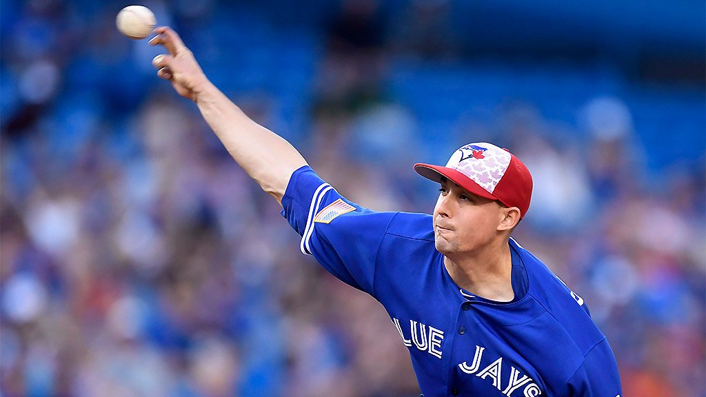
• The Blue Jays wore their regular blue alt jerseys, but without their 40th-anniversary patch. Instead, they wore a Canadian flag patch on the left sleeve and an American flag patch on the right sleeve, and their caps had silly little maple leaves instead of silly little stars (the second photo can be clicked to enlarge):

• Pirates catcher Erik Kratz wore a stars/stripes chest protector:
🇺🇸🇺🇸🇺🇸 pic.twitter.com/rCveqX00nM
— MLB GIFS (@MLBGIFs) July 4, 2016
• Several players, including Carlos Gomez and Luis Valbuena of the Astros, wore star-spangled compression sleeves:


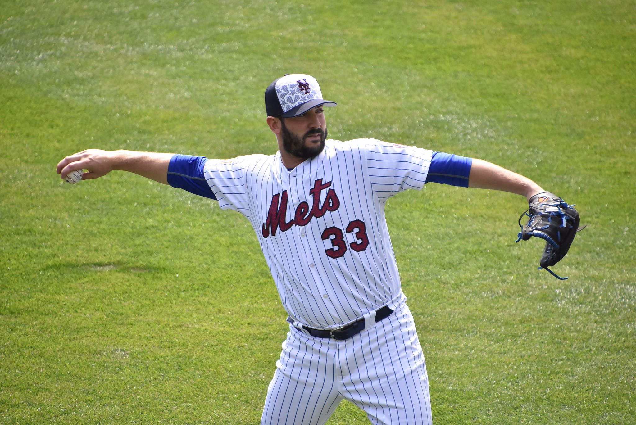
• Mets starter Matt Harvey wore white shoes:

Harvey, incidentally, has started three of the Mets’ four special-uniform holiday games — Mother’s Day, Memorial Day, and now Independence Day (but not Father’s Day). Throw in the other Mets jerseys he’s worn this season and he’s probably in the running for having worn the most uniforms of any starting pitcher this year — no mean feat for someone who’s pitched so badly.
Finally: Proceeds from the sales of these jerseys and caps are going to MLB’s Welcome Back Veterans charity. That’s very nice, but it’s also the latest example of MLB promoting bad history and bad civics, because Independence Day is not about honoring the military. It’s the anniversary of when the Declaration of Independence was ratified by the Continental Congress. A more appropriate move would be to donate funds to the National Archives (where the original Declaration is preserved), or to donate funds to Independence Hall National Historical Park (site of Independence Hall, where the Declaration was debated and adopted), or to support American history programs in public schools (which could teach kids, among other things, that Independence Day is not about the military). Instead, MLB has yet again chosen to conflate patriotism with support for the military — a terrible piece of political messaging. Very disappointing.

Click to enlarge
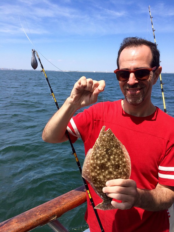
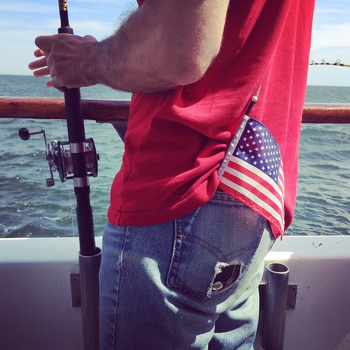
And you should’ve seen the one that got away: The Tugboat Captain and I decided to spend our Independence Day on a fishing charter that operates out of the southern tip of Brooklyn. As you can see above, I wore holiday-appropriate hosiery — something that was sorely lacking amongst my fellow seafarers.
About 45 seconds after we dropped our lines in the water, the Captain landed a fluke. Alas, it wasn’t a keeper (anything smaller than 18″ has to be thrown back), and neither were the other six fish we landed during the course of the afternoon. But it was a great day — perfect weather, good people, plenty of cold beer (for all of these, you can click to enlarge):

The other passengers and the crew were a melting pot of ethnicities — some Asians, some Hispanics, and a surprisingly large contingent of Orthodox Jews, one of whom wore a baseball cap with a logo that I couldn’t resist photographing:
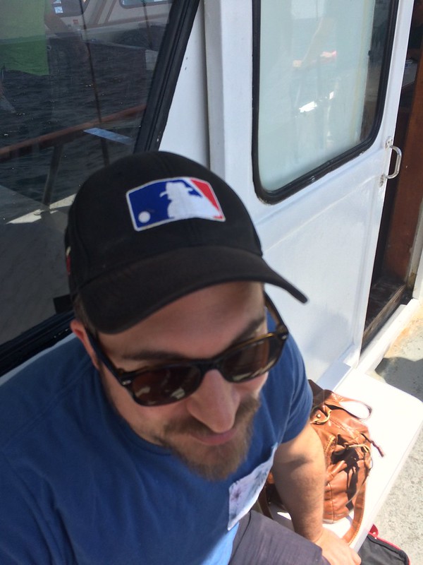
He explained that it was from a Jewish softball league he’d once played in. I told him I had known Jerry Dior, the designer of the MLB logo on which his cap’s logo was based, and he said, “Really? Wow, I’m a graphic designer myself, and I’ve always wondered about that.” Small world. And it gets even smaller when you’re fishing.
The Ticker
By Alex Hider, with an assist from Paul

Baseball News: Not uni-related, but check out the hole-in-one that Josh Reddick hit for the A’s at Oakland Alameda Coliseum the other night (from our own Mike Chamernik). … Here’s a cool behind-the-scenes look at how the roof at Miller Park opens. … The White Sox’s Tim Anderson tucks his jersey into his underpants. Yikes (from Chuck Rios). … Mets 1B James Loney was wearing orange sannies on Sunday — apparently the first time any Met has ever done that (thanks to all those who shared). … Wait, check that, Loney also wore the orange sannies with his Royal Giants throwbacks a week or so earlier. … Brian Love points out that as of Sunday night, the Dodgers’ were two-for-two when Howie Kendrick wore stirrups. He also sent along some shots of the Dodgers’ Old-Timers Game (note the patch on the right sleeve). … Is that a snow-white Mets jersey in the background of this TV ad? (From Niko G.). … Looks like the someone used a photo of a patch instead of a Fort Bragg Game graphic in this ad (from James Gilbert). … Neil Walker is from Pittsburgh, but it’s still strange to see him on the bottle of “Steel City” mustard now that he plays for the Mets (from Jim Vilk). … ESPN analysts went red, white and blue Sunday night (from Ethan May). … Awesome shot of the roof detailing at the Polo Grounds, circa 1912 (from BSmile). … The Salt Lake Bees mowed the Liberty Bell into the outfield for Sunday’s game (from Trent Knauphus). … The Brooklyn Cyclones became the Coney Island Franks on Sunday. Here’s another look. (thanks to everyone who shared). … The Kalamazoo Growlers wore Uncle Sam-themed July 4th uniforms on Monday. … The Sioux Falls Canaries and the Winnipeg Goldeyes went #SocksUpForKids on Sunday. Seems like a movement that the entire uni-verse can get behind, but I can’t seem to find any information on the campaign. Anyone have any info? (From Jennifer Hayden). … Number color inconsistencies for the Somerset Patriots last night (from Nick Yaeger). … Two new looks for the Chunichi Dragons of Nippon Professional Baseball (from Graveyard Baseball). … Jose Reyes, due to be called up from the minors and activated by the Mets today, will wear his old No. 7. It’s not yet clear what Travis d’Arnaud, who had been wearing that number, will switch to. d’Arnaud had worn No. 15 earlier in his career, but Matt Reynolds is currently wearing that number. … Lots of new content at Craig Brown’s Threads of Our Game site, which chronicles pre-1900 baseball uniforms. Get the latest update here. … Uncle Sam was a pajamist (from Pete Woychick). … Here are this year’s Double-A All-Star Game jerseys, which are based on the design worn by this year’s hosts, the Akron Rubber Ducks (from Justin Huyck).

Pro Football News: Lots of helmet number inconsistencies for the Hamilton Tiger-Cats (from Steve B. Creations). … Before coaches wore windbreakers and sweatpants, they wore this (from Pro Football Journal). … In case we haven’t seen it before: Antonio Brown has been wearing a personal logo on his arm band (from Jason Triplett).

NBA News: In an effort to recruit Kevin Durant, the Patriots’ Julian Edelman posted an terribly-photoshopped photo of him wearing a No. 35 Celtics jersey. Brian Jud points out that Durant wouldn’t even be able to wear 35, unless the Celtics un-retire Reggie Lewis’ number. … The New York Daily News used a ton of outdated logos in a free agency graphic (from Jacob Resnick). … Sometimes, in summer league ball, you’ve got to get creative (from Johnny).

Grab Bag: Red Bull’s F1 racing team went all out with lederhosen suits during the Austrian Grand Prix this weekend ”” they even posed for a Sound of Music-esque photo shoot. (from David Firestone). … What do gun stores, ED pills and bail bondsmen have in common? They’ve all sponsored IndyCars (also from David Firestone). … Here’s your chance to vote for NASCAR’s paint schemes of the week. … It’s not every day you see a four-digit uni number. Paris St. Germain signed Grzegorz Krychowiak through 2021, and made a jersey to commemorate the signing (from Jeremy Brahm). … Here’s a bizarre dress code: At one Brooklyn courtroom, immigrants who’ve gone through the naturalization process and are about to take the oath of citizenship are told that they can’t take the oath if they’re wearing blue jeans. … After a businessman from Abu Dhabi was mistakenly identified as a terrorist while traveling in Ohio, the United Arab Emirates has warned its citizens to avoid wearing traditional clothing when traveling abroad. … Thanks to a rule change, the Rio Olympics will be a much bigger branding advertising free-for-all than previous Games have been. … An unexpected result of the UK’s Brexit vote is that it may cause complications for British sports.
Proofreading: “Uncle Same was a pajamist”
“Before coaches wore windbreakers and sweatpants, they wore this” Before coaches became models for merchandise, they wore whatever they wanted: suits, polo shirts, bow ties, hats, baseball caps, sometimes even checked pants.
Fixed.
Fishing excursion looked like it was a lot of fun. Bright sun and cold beer and a few fish. The stirrups are simply awesome Paul.
Ya gotta think the reason for the Sox using their Sunday alt helmets is because they are blue with a red brim. Better match with those things called uniforms yesterday instead of their black helmets.
The Brewers catcher also had the star spangled chest protector. Must be because All Star has the advertisement deal as “official” and thus carte blanche to do that.
The Fuddruckers evolution scene from IDIOCRACY came to mind when you explained how the MLB turned Independence Day into a Military celebration: link
Well this didn’t look as bad as it could have (since most teams have red or blue in their kits) but still not thrilled with the changes.
The A’s uniforms from the 4th of July sorta-kinda remind me of the Philly/KC A’s unis, minus the Oakland part.
link
My thoughts exactly. Instead of the stars & stripes, it’d be awesome to see a throwback!
“Proceeds from the sales of these jerseys and caps are going to MLB’s Welcome Back Veterans charity.”
How much of the proceeds? You mean to tell me MLB is so poor that it has to create and sell special gear just to make a charitable donation? It couldn’t just write a large check without having special merchandise? Not likely so it wouldn’t be interesting to know how much MLB and its “partners” (Majestic, New Era, Fanatics, Lids and other retailers, etc.) make off these special uniforms.
My understanding is that MLB, Majestic, and New Era do not keep any profit.
That was not always the case, but that has been the case for the past several years.
Let’s pick the right battles. They’re not getting rich off of this; they’re just distorting history, providing a bad civics lesson, and sending a terrible message.
Please explain distorting history.
Already explained in today’s text. Let’s move on. Thanks.
On top of the fact the uniforms look like shit.
Too bad you couldn’t go fishing on a tugboat.
Also, as an archivist who is constantly looking for a full-time job, the idea of donating the proceeds to the National Archives is very appealing to me!
Also, Jacob Resnick- I doubt you are reading this, but I am very surprised to find another Resnick here! Hello long-lost cousin! :P
I was a Federal archivist for 17 years…been a contractor for the last 11 years…good luck in your job search!
After looking at the Atlanta Braves 4th of July uni, do you know why they drop the Tomahawk from all of their holiday/military designs? I know you have talked about the potential of phasing out the tomahawk all together, but is there a stated reason for the lack of the Tomahawk? It is just weird seeing such a big part of their logo missing. As a fan I would not be opposed to seeing it gone permanently.
No stated reason that I’m aware of. But given the obvious problems that arise when intermixing Native American history and American history/militarism, I’d think they want to play down the Native imagery for holidays like Memorial Day and Independence Day.
Also, it’s worth noting that the team’s red and cream alternate jerseys do not have the tomahawk either.
The cream alts do have a tomahawk sleeve patch, though.
link
I wonder why the Braves holiday designs this year didn’t include the front uni number to better mimic the cream alts. I think without the tomahawk or the number, there is too much empty space on the jersey.
Regarding the Photoshop of Kevin Durant possibly joining the Celtics and wearing #35; as pointed out by another the number is retired. However, the mother of Reggie Lewis (the deceased Celtic who wore that number) had granted the team permission to allow Durant to wear the number if he had wanted to:
link
Not that it matters since Durant signed with Golden State, but Reggie Lewis left behind a widow & children. Consequently, even had the Celtics needed “permission” from someone to bring #35 out of retirement, it wouldn’t have been from his mother.
Along with the outdated logos, the New York Daily News item also has typos (“Bradey” Beal) and misinformation (Evan Turned signed with Portland, not Boston). A trifecta of errors!
Amusingly, the Hornets’ logo isn’t merely outdated, it’s from the wrong franchise! That’s a New Orleans Hornets logo; there was never any yellow in Charlotte’s logo.
By the way- Harvey also started (and was Star Spangly) last July 4 in LA as well.
I spent most of yesterday working at a boathouse and listening to cricket, so I didn’t catch any MLB action. From the looks of it, I consider myself lucky.
I used to love baseball on the 4th. Now, it’s become as annoying as the illegal fireworks display that went on all weekend in my neighborhood.
I listened to the Brewers-Nats game outside while cleaning the chicken coop and banding hens, and from the looks of it boy am I happy I decided to take in the game entirely by ear.
I could forgive a lot of uniform shenanigans if teams would just wear their normal caps. The cap is just so central to recognizing a player or a team, and for most teams the cap is the best part of the uniform anyway.
I really wish that teams that were on the road had been given gray versions of the caps. The white looked especially bad with road grays.
To add to the 4th uni stuff:
The Brewers had special stars and stripes batting helmet decals.
Giancarlo Stanton had a black-and-grey star spangled arm sleeve.
This has probably been covered before, but I expect the reason why any alternate-colored version of the Cubs’ logo lacks the ® symbol is simply because that’s not the registered trademark.
The ® stands for “registered,” viz., registered with the U.S. Patent and Trademark Office (USPTO), whereas the â„¢ symbol means, simply, “trademark.” Not all trademarks are registered with the USPTO; a trademark doesn’t have to be registered to be protected under the common law, although registered trademarks enjoy special protection under the federal Lanham Act.
The point is that the trademark of the Chicago Cubs that is registered with the USPTO is the round “C/UBS” logo in Cubs colors. Unless they register a different-colored version of the logo, that version would not bear the ® symbol.
Ah, good info. Thanks, Jay!
The Reds’ fancy typeface was a lot more legible with the drop shadows taken out. I hope they were paying attention. One team not paying attention was the Phillies. What a mess! How much better it would have looked had they gone polar white like the Giants, or simply used the red pinstripes. Or better still, bag this stupid exercise.
The Blue Jays were also wearing red belts with their July 4 mess.
The whole thing (hat, belt, softball top) was an unholy disaster.
As a former National Archives employee who spent six years of his Archives career (17 years total) in the same building that housed the Declaration of Independence, I would be ecstatic if a percentage of the proceeds from the 4th of July unis went to the National Archives Foundation. Sadly, I don’t think that’s ever gonna happen…
To Ron, and to all current and retired civil servants at all levels, thanks for your service! And that idea is a terrific one – the National Archives shouldn’t need to solicit private donations to safeguard the nation’s physical and intellectual patrimony, but it does, and the National Archives Foundation would be a worthy recipient of any Independence Day-themed fundraising. Also the National Parks Foundation on behalf of Independence National Historic Park in Philadelphia.
Proofreading: It’s Josh Reddick not Riddick at the top of the baseball ticker
Fixed.
Was at the Nats/Brewers game yesterday and noticed that the Brewers, while looking completely awful with red on their uniform, had the matching red outline on their batting helmet logo. (You can see in this photo link that Lucroy also was sporting it on his catching helmet.
Also had the pleasure of seeing Brewers bat out of order in the 1st. Can’t say I can remember seeing that in an MLB game before.
Lucroy, played first yesterday. Martin Maldonado did the catching.
Oops sorry, Lucroy must’ve moved to catcher at the end of the game. Maldonado started the game, and was sporting the patriotic catchers gear.
ESPN got into the act yesterday as well, with segments about wounded warriors (very inspiring) and one about a pitcher for Army who was drafted by the Yankees. Good stories, wrong holiday. I got very tired of the anchors thanking veterans for their service all day. Really? Don’t they know about Veteran’s Day, (which originally began as a celebration for the end of WWI)? At what point did we all get so patriotic all of a sudden. BTW, I’m retired military, but this is all very contrived. All of this faux patriotism has made me very cynical. Enough already. If Congress would just take care of veterans instead of relying on the public to fund all of these charitable causes, maybe we could do without all this BS.
I feel the same way, Greg. I listened to ESPN’s radio broadcasts of both the Fort Bragg game and the games on the Fourth and the fawning over the military was over the top and incessant. It seems every holiday and every sporting event is now a vehicle for promoting the military . Whoever runs the PR department for the Department of Defense is riding a real high right now.
Technical Question…I think of sannies as very plain, thin socks that are worn under stirrups. It looks like Loney’s orange socks are thicker, as they have some kind of texture on them…perhaps he improvised them from other socks. Would you still consider those “sannies”?
I use “sannies” to broadly mean any undersocks worn beneath stirrups.
Others — perhaps including you — would draw a distinction between certain kinds of socks and “true” sannies. I wouldn’t necessarily try to argue with you on that; it’s just a finer distinction than I feel the need to make.
Thanks for linking to the Threads of Our Game project in the Ticker! Just last night I came across a 2004 paper presented at a regional SABR convention that included contemporary newspaper accounts of the uniform of the 1867 Madison Capital Citys. Thanks to the mention of ToOG in today’s ticker, I was able to forward a PDF of the paper to Craig for potential inclusion.
A couple of observations from yesterday’s Royals/Jays game, which I had on in the background while we had friends over for dinner:
The Royals’ Cheslor Cuthbert had a very patriotic compression sleeve: link
I think it was KC’s feed we were watching on MLB.tv, but I recall one of the announcers mentioning how the combination of the script font on the Royals’ away jerseys and the red and white reminded him of the Expos (presumably 1992-2004/relocation). I can see what he was getting at, though the colors would have to be flipped on the away jersey: link
Render the script in red, and boy howdy the Mets sure look like the Twins. I mean, not the crappy uniforms the Twins currently wear, but the good uniforms the Twins wore starting in 1986, back when the Twins looked like the Twins instead of a particularly poor Nats farm team.
In the Dodger/Oriole game, the Maryland flag on the Birds’ uniform was desaturated to match the rest of the color scheme. Have they done this before? link
Yes.
I really dig the compression sleeves and the stars n stripes chest protector. Funny how if you give the players some leeway they make better choices than a league-wide marketing push.
Also, honestly these uniforms are so bad because they don’t even really stand for anything… Like, they’re so plain. In isolation I don’t think any one would ever be able to tell that these are supposed to be uniforms for July 4th. At least the flag desecration actually represents the thing it’s supposed to be representing.