
By Phil Hecken, with Mike Styczen
Follow @PhilHecken
It’s football season in Canada, as the Canadian Football League kicks off their 2016 this Thursday night. And this year, after more than a decade of being outfitted by Reebok, the CFL has a new contract with adidas — which means of course…new uniforms.
I’m back today with my buddy Mike Styzcen, who has been kind enough to prepare a rundown of the new unis. I’ve worked with Mike many times in the past, and he’s my go-to guy for all things Canadian — especially curling and CFL — even if he does spell a few words wrong*. So without any further ado, let’s get right into it as we explore how the …
CFL Goes adidas
By Mike Styczen
When the Canadian Football League (or Ligue Canadienne de Football, if you prefer) signed an exclusive deal with Reebok in 2003, the first thing Reebok did was a leaguewide redesign of the uniforms. The Reebok deal was extended in 2008 and 2013, and featured some great uniforms, some questionable uniforms and some outright abominations.
With the exclusive deal moving over to adidas for the 2016 season, another league-wide redesign seemed inevitable. If the previous Reebok redesign was about adding flash, piping, stripes, and bits of flair, then this redesign is (mostly) about stripping the uniforms down to essential elements.
The first new logo to be introduced was the new league logo, last fall during Grey Cup festivities. The old logo (which only dated to 2002) is replaced with a much more minimal logo consisting of the league name, a stylized maple leaf, and the merest hint of a football. As is customary, there’s a french version. The french logo appears on the collar of the Alouettes’ jersey, the English version on the collar of the other eight teams.
There are a few common features to the new uniform sets. Team and/or city wordmarks are now pretty much standard on the chest, and all of the teams have the gloves that show the team logo on the palms. The adidas “mountain” logo is on the back collar of the jersey and on the right front leg of the pants, and the left front of the pant legs have team logos.
On to the team redesigns:

BC Lions:

The home uniforms shift from primarily orange and white to a tougher orange and black (with no white apparent). The helmet is black with a black facemask and an orange logo. The helmet logo is similar to previous lion head logos but without the “BC” lettering, and with a weird stripe pattern underneath it. The jerseys also feature a small logo on the lower back.

The road uniforms are primarily white with orange shoulders. The helmet is orange with a white facemask and logo.
Interestingly, in their first home preseason game, the Lions wore their home jerseys with their orange road helmets, but with the black facemasks from the home helmets. So who knows what combinations they actually intend to wear.

Calgary Stampeders:

The Stampeders have gone from bad to … a different kind of bad. The home set is similar to the old set, with a red jersey trimmed in black, red helmet, and pants with apparently random wordmarks and striping. The road set is also similar to the old road set, with red pants. The old futuristic number font is replaced with a western-style font.
The Stamps were the only team to unveil a third uniform set, which appears to be the same “Signature” set (including the two-tone helmet) they’ve worn on occasion since 2014.

Edmonton Eskimos:
Fresh off their Grey Cup win, the Eskimos uniform is a little simpler this year (here’s last year’s uni). Gone is the striped collar, and the multiple sleeve stripes are replaced with two simple stripes. The road uniform is basically a white version of the green home uniform.

Saskatchewan Roughriders:

Saskatchewan’s uniform set is also simpler this year — silver and black are gone other than in the logo, and the uniform is now uniformly green and white. The road uniforms are a white version of the home set.

Winnipeg Blue Bombers:

In what is undoubtedly the biggest upgrade in the league-wide redesign, the Blue Bombers have ditched the navy blue and gone back to their iconic royal blue. Also back is the old-school striping that recalls the days of Chris Walby and Dieter Brock.

Hamilton Tiger Cats:


Fresh off sweeping the Tony’s, Hamilton makes a minor change to its home uniform (2015 here) — the yellow collar is now black, and the helmet now features giant yellow numbers on the back. The away uniform is virtually unchanged, with black sleeves and yellow stripes. According to the team there will be black, white and yellow pants, all without stripes, and there is no indication which pants will be worn with which jersey.

Toronto Argonauts:

The biggest news for the Argos this year is that after 26 years of sharing SkyDome with the Blue Jays, the team has moved down the road to BMO Field, Toronto FC’s home on the site of old Exhibition Stadium. Toronto will host the 104th Grey Cup at BMO Field in November.
The uniforms are largely unchanged from 2015 — the addition of a bit of light blue striping around the numbers on the home set seems to be about it for changes. The road uniforms are similar to the home set, in white.

Montreal Alouettes:
Montreal’s iconic uniforms remain unchanged from 2015.

Ottawa Redblacks:

The biggest changes to the Redblacks home uniform from 2015 are the change from red italic to more plain white numbers, and the replacement of red piping on the side with a wide red stripe that continues onto the pants. The road uniforms are white, with white helmets, and are largely unchanged.

And new from Ottawa, in the “is it good or is it stupid” department, the sides of the pants now feature the hashtag #RNation. I side with “stupid”, I don’t know how you force conversation into a hashtag, but what do I know.
My big disappointment with Ottawa is the lack of plaid. A few years back they unveiled “signature” uniforms with plaid trim and plaid helmets, and even though the team never actually wore plaid helmets, they did embrace plaid as a motif (and a lumberjack theme in general). This redesign seems to do away with plaid entirely — very disappointing.
Thanks, Mike!
.
These, AFAIK, is the official and final design color sheet for NFL Color Rush. pic.twitter.com/4otQMyv9xN
— NFL Leaks (@NFL_Leaks) June 17, 2016
Here we go again…
Take the above tweet with a grain of salt, although there may be a grain of truth to it. But what you see there is another supposed Color Rash leak from someone who posts as “NFL Leaks.” I’m not saying it’s wrong (and I honestly don’t know), but we’ve had these ‘leaks’ before and they’ve been proven not true. Still, some interesting stuff there.
The leak reached far enough corners of the Interwebs yesterday such that several websites/blogs began speculating based upon it:
“Could the Lions be wearing red uniforms this season?”
“Detroit Lions New Color Rush Uniform Rumors Emerge”
“Rumored leak: Steelers To Wear All-Black Uniforms For Color Rush Game Against Colts”
“Report: Steelers to wear all-black jerseys vs. Colts”
“Report: Chicago Bears color rush uniform finalized”
Et cetera.
Until the NFL (or the individual teams) confirm the colors listed above — just keep in mind that this could all be speculation or conjecture. In fact, the whole idea of the color rash is just so ridiculous, it’s amazing we obsess over it so. But this is Uni Watch, and we do pay attention to the aesthetics of athletics. Even if almost all of the color rash uniforms are less than aesthetically pleasing.
Your mileage may vary.
.
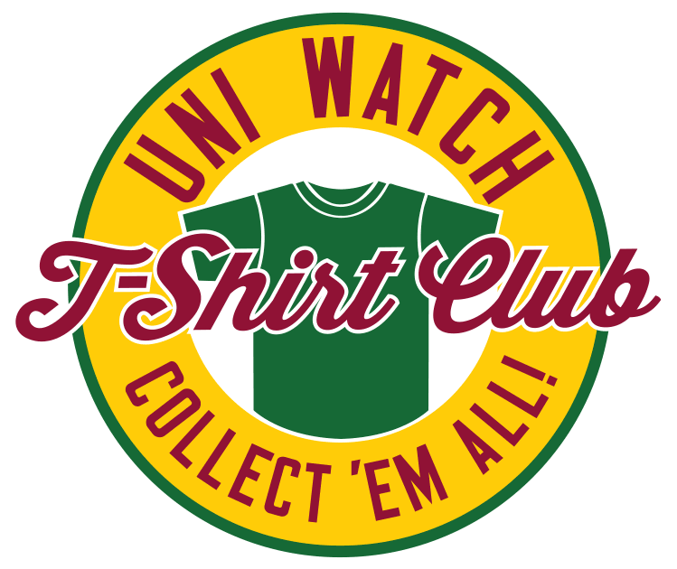
T-Shirt Club reminder: In case you missed it this past week, the Uni Watch T-Shirt Club’s third limited-edition design of 2016 is now available for your consideration.
As you’ll recall, we’re going one sport at a time this year, and we already covered baseball and hockey. Our latest shirt takes us to the hardcourt, as we’re launching two different basketball designs — one showing a home uniform and one showing a road uniform (click to enlarge):
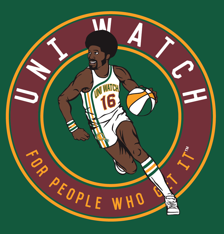
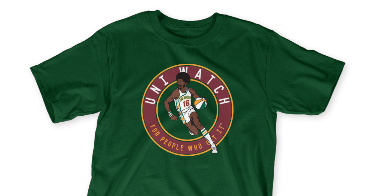
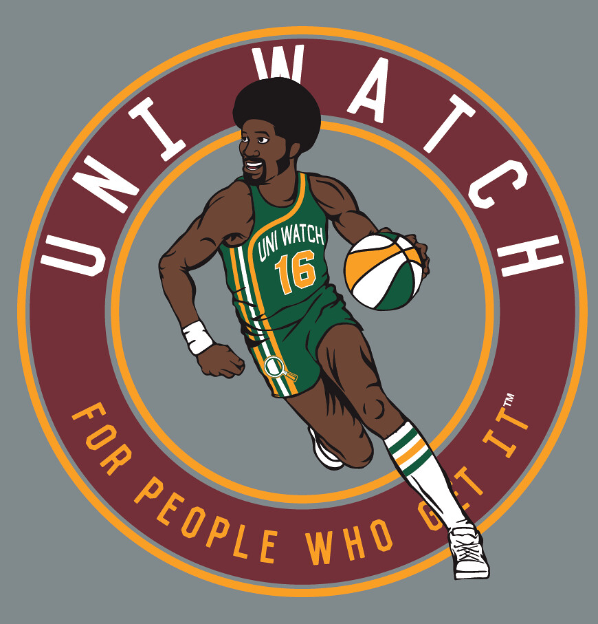
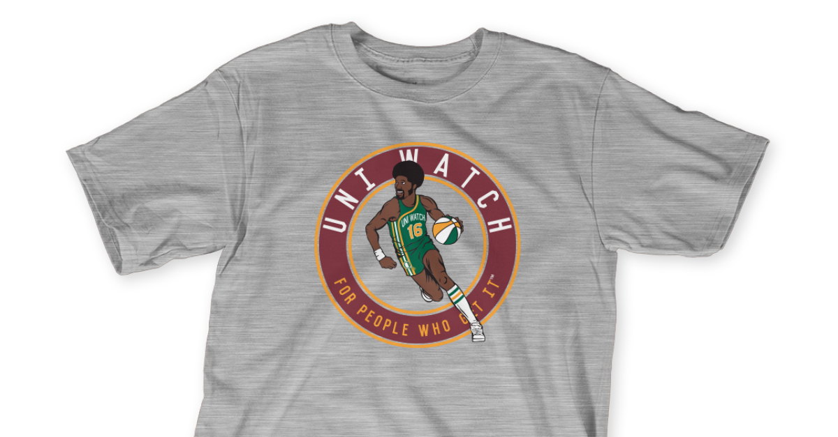
Pretty cool, right? The racing stripe uniform concept looks great in Uni Watch colors, and ditto for the ABA-style ball.
Important: Although green and grey mock-ups are shown above, we’re offering both of these designs in four different shirt colors (green, grey, black, and white), and also in two different styles (short-sleeved and long-sleeved). As usual, they’re available for one week.
Here’s where you can order the home and road designs. You only need to purchase one of them — the home or the road — in order to maintain your 2016 “Collect ’Em All” eligibility (although you’re welcome to purchase both, obviously).
One more time: The home shirt is available here and the road shirt is availble here. Thanks.
.
Friday Flashback reminder: In case you missed it yesterday, with the U.S. Open golf tournament now underway, Paul’s latest Friday Flashback column on ESPN takes a look at the evolution of golf attire over the past century or so. Check it out here.
And while we’re at it, Paul also had an ESPN piece a few days ago about the Sacramento Kings’ new uniform set. That one is available here.
.
Uni Watch News Ticker

Baseball News: “Here’s the cover art work for hip hop artist The Sheriff’s new single ‘I Swing Marucci’,” says Eric Wright. “He’s wearing uniform of Showcase Baseball Academy, and their team name is the Canes. They’ve adapted the colors and word mark of the Miami Hurricanes. That’s a weird-ass baseball jersey tho. Marucci (a bat maker) is an official sponsor of the organization, so I guess in essence, they got great product placement in his song all about them. They’ve also got a whole bunch of MLBers on YouTube talking about the bat as well.” … “I thought there may be some fairly unique uni-elements to this one that you might appreciate,” writes Tim Hayes. “Astros stripes, stirrups with edge trim, team name (Humboldt FOGG), under-rated color combo (Navy, Kelly, Dk. Green) and the Graffiti background.” … The Frederick Keys (a Baltimore Orioles affiliate) are wearing Nickelodeon-inspired “Hey Arnold” shirts. They got the visiting Lynchburg Hillcats to play along too (from John Cannon). … Check out members of the 1887-88 Illini Baseball team sporting neckties (h/t Derek Neal). … This College World Series merchandise has Chicago White Sox flair — CWS w/CWS swag — (from Tyler Maun). … Last night the Lafayette Aviators did the Star Wars jersey thing (with the obligatory auction). From Forster Keenoy. … Pretty cool tequila-sunrise-esque uniform for the Grand Lake Mariners (from Gary Raspberry, Jr.). … Also from Gary, here are the uniforms of their opponents (which we’ve seen and which may be the worst in history): the Irish Hills Leprechauns of the Great Lakes Summer Collegiate League. … I have no context for this photo other than to say, AMERICA! (from Christopher Overholt). … Here’s a cool behind-the-scenes video of the Majestic factory (from Brian Cheung). … Last evening, the St. Louis Cardinals had a Kolton Wong Hawaiian jersey night (h/t Matt Cable). Here’s another look … There are some colors which (IMO) don’t go together well on a tequila sunrise jersey. Those are they (from Robby Burmeister), and the team is Arrowhead High School in Wisconsin. … More Star Wars unis, this time from the Fort Wayne Tin Caps. Almost seems like teams aren’t even trying anymore. … Here’s an up-close look at a Chicago Cubs All Star Game cap (from Brian Callahan). … To honor the Orlando shooting victims, the Tampa Rays wore an “Orlando” patch on their jerseys (from Chris Creamer) and these Orlando Rays caps (which were worn by the Double-A Southern League affiliate from 1999-2003). Here’s more on that. The team will also auction game-worn, signed caps for victims (h/t Josh Claywell). … Here’s another look at the Orlando patch (from Brinke). … The Rays players warmed up in these rainbow shirts too (from Drew). … You know how a team can salvage a good look even with a shitty jersey? With fantastic hosiery (nice spot by Josh Claywell). … “Coastal Carolina have a … Number on Watermark? There’s a new one for me,” says Eric Newhouse. … New jerseys for the State College Spikes. … Matt Harvey may have dropped his desire to wear the blue alternate tops of late, but he was styling in white shoes on the bump last night (good spot by Chief Sums). Matt Edwards asks if that’s the first Met (in a non-All Star Game) since Ed Kranepool to rock white cleats. … “The #CollegeWorldSeries ticket design is fantastic this year!” says Ben Matukewicz. “I’m in love with the new logo.” … Super-good spot here by Niko who asks, “Isn’t it interesting that the (Brooklyn) Cyclones use the old Mets skyline patch?? (with NY).” … A hosiery development we can ALL love: Last night, those Detroit Tigers who sport socks wore new socks with stripes! (many readers/tweeters sent this in). That was Ian Kinsler, here’s Justin Upton. The socks have three full sets of stripes (that’s 3B coach Dave Clark). Here’s a group shot (last two grabs from David Raglin). David also has the story on the striped socks: “The players saw them, liked them and asked (clubhouse manager) Jim Schmakel to order them. That simple.”


NFL/NCAA/Football News: Oops. This cup has a bit of spelling mistake (from Andrew Cosentino). … “I have not seen this before,” says Jon Solomonson. “This is Canarsie HS in Brooklyn. They have what seems to be a NY Jets sponsored ‘Heads Up’ (?) decal on their helmets. The stripe blocks part of the decal, but I would assume it says Heads Up. I cannot find any other NFL sponsored Heads Up decals on other HS helmets. From this article.” … Seems as though former Los Angeles Rams players are upset the team won’t wear classic blue and yellow uniforms (at least not for the upcoming season[s] anyway). … The Jim Harbaugh-wearing-a-local-player’s-jersey as he visits various recruiting locales continues: He wore a John Stockton jersey when he visited Utah. … Here’s another look from Greg Ringer). … Riddell has introduced NFL Alternate Ice helmets, which are “ideal for autographs.” Andrew Lind adds, “Not for on-field use.” … The Orlando Predators, an arena league football team, will wear these special jerseys tonight (h/t Brandon Ashe). … “Looks like Brock Osweiler’s High School uniform was the same template as Broncos” notes Casey McHugh.
Hockey News: A whole bunch of people sent this in: The Pittsburgh Penguins, your 2016 Stanley Cup Champions, have now updated their 50 year anniversary patch to reflect four cups won (this is as we had expected). … The new Toronto Maple Leafs uniforms will be released in a week (they’ll unveil them on Friday, June 24th, which is the first day of the NHL draft). … Here is a badminton racket with an Islanders logo. For some reason, the NHL on NBC thought I’d find that interesting. … Remember those Flyers caps that had “Philadelphia” spelled wrong? Apparently the error has been rectified (from Patrick Cummings).

NBA/Basketball News: Aside from the Cleveland Cavaliers breaking out the black-for-black-sake sleeved jerseys (who wants to bet they wear them again for Game 7 tomorrow night?), the series hasn’t been much to speak of, uni-wise. However, we’ve seen more incorrect logo use for the Cavs: “Never changed primary but ESPN uses C Sword logo” says John Sabol.

Soccer News: FC Basel have officially released their away kit (from Josh Hinton). … This is classy and cool: New Orlando City SC jerseys will pay tribute to shooting victims. … Here’s another look (from Dave Doop).

Grab Bag: OOOOOOhhhh. This is great: Reader Dave Hembree found this website that has fantastic photos and a brief history of most every past and present day stadiums and arenas. He adds, “The most complete site have ever encountered. A rabbit hole galore!” … I have only one thing to say about the pants worn by Billy Horschel at the US Open yesterday: “I’d TOTALLY wear those” (from David Spirino). … OK, based off the title of this article (don’t click yet), “How a college student created one of sport’s most iconic images,”, guess which “iconic image” they’re talking about. OK, click now — it’s probably what you feared (from Brinke). … There’s a cricket in Jim Vilk’s backyard (at first glance, I thought that second emoji, which is a cricket bat and ball, was something else).
.
And that’s all for today. Big thanks to Mike for the rundown of the new CFL unis.
BIG…YUUUUGGGEEEE Special Uni Watch Father’s Day Post tomorrow that you won’t want to miss.
I’ll catch you guys tomorrow, but until then…
Follow me on Twitter @PhilHecken.
Peace.
“Shouldn’t the basketball shirt have an ad on it?”
— Mike Chamernik
.
“Those Rams horns are known globally and for them to bastardize it like this by putting these two stripes is stupid. They should fix those horns because right now, it’s bull—-.” Damn, Fred Dryer is passionate about his Ram horns.
While overall the CFL trended towards simplification (good), the team most in need didn’t – the Calgary Stampeders, which unfortunately means Calgary as a city continues to be plagued by the god-awful cluttered messes – i.e. the Flames as well
Calgary teams need to simplify and drop the black.
-The Stampeders would look really good going retro with their redesign – back to the red and white with no black – like the 1971 Grey Cup unis.
-Same with Flames. Back to the classic red and yellow.
I agree the Stamps should ditch the black, but their new look is a vast improvement over the Reebok years.
Curious: do the Als keep the silver lids as a reminder that they were once the Baltimore
CFL ColtsStallions? They really should go with blue helmets.Ottawa…well, your unis look better than that downtown sinkhole of yours. They’d look a lot better if you bring back the plaid.
Nice to see Winnipeg back in the Bob Cameron era unis…wait…he pretty much wore every uniform the team ever had, right?
As a long time fan of the old Ottawa Rough Riders it’s nice to see the CFL unis get some attention. However they demonstrate what a slippery slope that ads on uniforms really is. Even small patches look horrible and detract from the joy & purpose of team uniforms.
I strongly disagree with the use of the word “iconic” to describe the abomination that is Alouettes uniform. Remains one of the ugliest in pro sports! It just screams: ‘we don’t know what our identity should be’..a confusion of colors and rectangular shapes. Uugh!!
The Detroit Tigers’ new socks look like the Chicago Bears’ socks: 3 white-trimmed orange stripes on navy.
Some pleasant surprises with new CFL uniforms:
-Blue Bombers return to modern version of classic royal blue and gold uniform.
-Roughriders wearing just green and white, with the black and silver trim ditched. Did not think I would see a return to just green and white on a present day uniform version with the present logo. I now look forward to the day when it will be throwback to have the silver pants and the old wraparound version of their logo on the helmet.
-Some of the new Adidas striping looks modern and good on the field.
Some disappointment:
-Argonauts and Eskimos having the striping stop halfway down the leg. Distracting and does not look good on the field. The uniforms feature old school striping (which is good). The stripes on the pants should run the entire length of the leg.
-Redblacks – the hashtag on the pants has to go. We can’t have this happening.
-The Alouettes were the only team to not change a thing. Their uniform is in dire need of a redesign. They missed their chance. Could have changed the logo and adopted a look that was a modern version of their late 1970s uniforms.
-The Lions did have great uniforms. This radical redesign is still a shock to my system. Especially that road uniform with barely any black in it. I will give it a chance.
Agree, agree, agree…
That hashtag has got to go…along with the name Redblacks (huh?). What are we? A Kiwi rugby team??
And bring back the plaid, that was a great idea. Too bad they rarely wore it…
Eskimos have gone in a good direction too. Less is more. Works in music & graphic design.
The Redblacks name is actually different in French, it’s Rouge et Noir, (Red and Black) which is a nod to several of the University teams in Quebec (example: Laval Rouge et Or) and their attempt to try and tap into the huge football interest that exists in Quebec.
How about this…
Since there is a ‘Skins Watch on Fridays due to the large number of articles, how about a Star Wars Night section so those of us can just scroll right by it?
Classy move by the Rays to wear the Orlando patch and O-Rays caps. I always liked the Rays original uniforms and color scheme.
Agree – would be awesome to have a section just for the star wars stuff.
It’s not a question of not trying on Star Wars night. It’s that Star Wars, in controlling its trademark, gives the teams the graphics to work with. Left to their own devices, teams might take a disapproved liberty, like giving Yoda an orange light saber from the dark side. So it’s Star Wars insisting on uniformity.
Now if you want my Uni Watching opinion, I find breast cancer and ugly Xmas sweater jerseys to be more interesting than Star Wars, and holy cow that’s an indictment of Star Wars Night jerseys.
Picard says: “There are FOUR cups!!!”.
Just a Heads Up: This link includes a complete view of the sticker that appears on the back of the Canarsie HS player’s helmet.
link
It looks like the Dallas Cowboys are the only team on the Color Rash chart twice. AND they are listed as all white in one instance, and all blue in the other. Dear Lord, please no! the white looks okay; but all navy? UGH!
Thanks for the kind words. A couple of thoughts:
1. I don’t mean to say that the Alouettes are perfect or that they didn’t look better in the 1970s (they might have). But they’ve had this look for just about 20 years, they’ve won 3 Grey Cups in that time and appeared in 8, and they’ve maintained a consistent look while the rest of the league has constantly changed and changed again. That’s my definition of iconic.
2. The Stampeders – yeah its probably not a coincidence that they’re under common ownership with the Flames. Not a “less is more” organization.
3. I didn’t comment on the ads. I get that ads on uniforms are a non-starter on Uni-Watch. This is a minor league and the economics reflect it. The team salary cap is $5.1m (which doesn’t get you half of an NFL player) and the minimum salary is $50k. If a railroad or a hardware store is paying good money for patches on the jerseys, and for ads on the field, I don’t think anyone begrudges that. This isn’t major league greed.
Are the Alouettes on the same Uni Watch plane as the New England Patriots? Think about it: there are some maddening design flaws that I personally would tweak easily, and that helmet logo is hit or miss, but due to incredible success, no changes.
I would put the Als on the same Uni Watch plane as the Denver Broncos. Distinctive style, some quirky elements, but now iconic in part because of success.
I hear you on the Patriots, there are design flaws but there’s nothing distinctive in their uniform set that has made them untouchable.
Would I change the look of the Alouettes?
Probably not the jerseys. I’ll even forgive the wordmark above the front numbers (on the Alouettes only). That distinctive look they have had works for them and them alone.
The helmet is a different story. Never have been overly fond of the current logo but could live with it if there was more contrast. The logo bleeds into the helmet. Either change the helmet colour, outline the logo with white or go with a previous or different logo.
Am I the only one thinking, “Why the f#&! Woukd Detroit wear red?”
No surprises on the Browns as mono orange was slated from the beginning. Maybe that’s why they didn’t wear it last year, they were saving it for the color rash this year.
Giants wearing red will be interesting to say the least, maybe they will make the NY decal chrome red with a white outline.
Don’t know how I feel about the Saints wearing white, possibly white decal on the helmet?
Eagles wearing black isn’t a surprise. Maybe they will make the wings black with a white outline?
Tampa Bay wearing black is a little odd, don’t know what to make of that one.
There are red jerseys in their history, 1948 and 1950.
My first reaction was that the BC Lions’ helmet is pretty much a rip-off of the old USFL Michigan Panthers.
Will the Tigers wear the striped socks at home? They haven’t worn orange at home in decades.
Lions in red is just another blow to a team that I thought couldn’t be any more down.
Kolten Wong was conveniently recalled to St Louis just in time for KWHJN. He has been optioned to AAA a couple of weeks ago.
Shows the risk in setting up these promotions months in advance, they were just able to fulfill this one but there have of course been examples of promotion nights featuring traded or sent down players.
Scrolled down here to note this.
I’d be interested if there’s someone out there who’s compiled all such incidents of players no longer being on the active roster.
Maybe this is the reason for the Redblacks not going with plaid: link