I’ve been trying to mix things up a bit with my weekly Friday Flashback columns on ESPN. Last week, for example, I looked at boxing — a sport I rarely write about — by examining Muhammad Ali’s ring apparel.
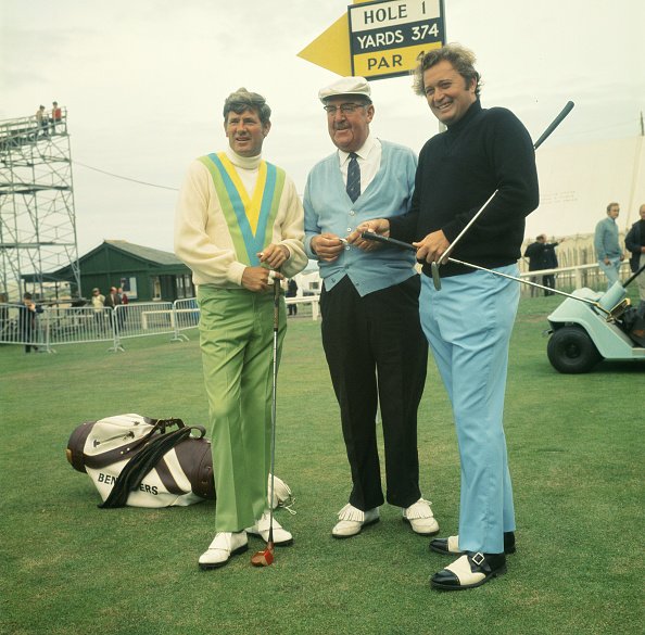
This week I’m looking at another sport that rarely gets the Uni Watch treatment: golf. With the U.S. Open now underway, I interviewed the USGA’s official historian. We discussed various aspects of golf apparel history, including early Scottish knickers and waistcoats; the evolution of golf headwear; the rise of advertising and endorsements; and the crazy styles of the 1960s and ’70s (nicely exemplified by Doug Sanders, at left in the photo shown above, who was known as “the Peacock of the Fairways”). Check it out here.
T-Shirt Club reminder: In case you missed it earlier this week, the Uni Watch T-Shirt Club’s third limited-edition design of 2016 is now available for your consideration.
As you’ll recall, we’re going one sport at a time this year, and we already covered baseball and hockey. Our latest shirt takes us to the hardcourt, as we’re launching two different basketball designs — one showing a home uniform and one showing a road uniform (click to enlarge):
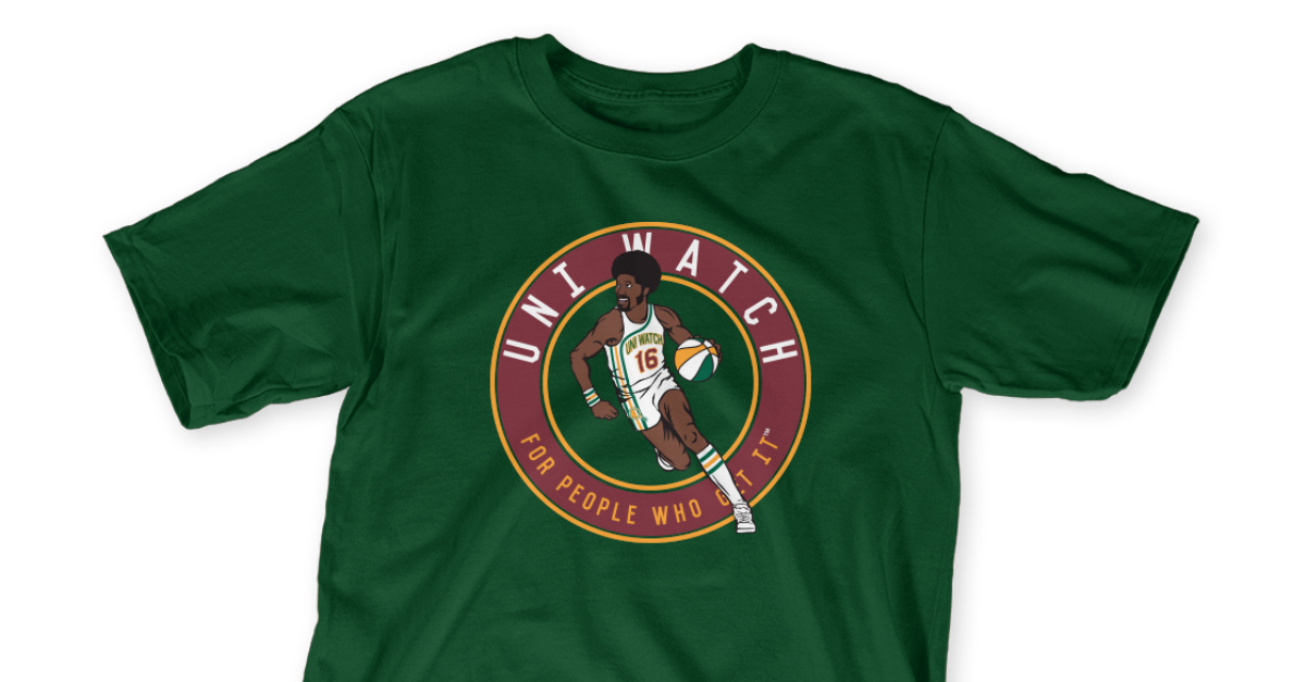
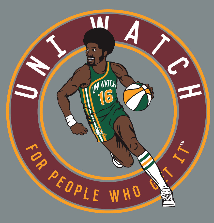
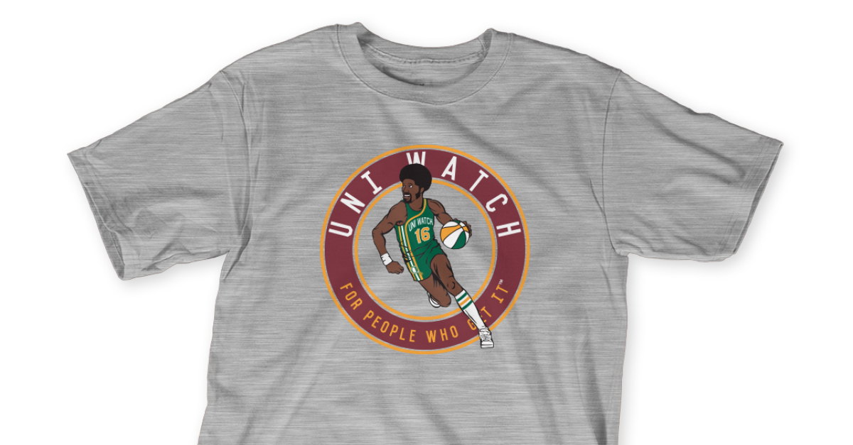
Pretty cool, right? I really love seeing that racing stripe uniform concept done up in Uni Watch colors, and ditto for the ABA-style ball.
Important: Although green and grey mock-ups are shown above, we’re offering both of these designs in four different shirt colors (green, grey, black, and white), and also in two different styles (short-sleeved and long-sleeved). As usual, they’re available for one week.
Here’s where you can order the home and road designs. You only need to purchase one of them — the home or the road — in order to maintain your 2016 “Collect ’Em All” eligibility (although you’re welcome to purchase both, obviously).
As always, big, big thanks to my Teespring partner, Bryan Molloy, for his great work on these. I’m very happy with the way they turned out.
Also! After I posted about the T-shirts on Twitter earlier this week, reader DW Jones posted a good question: “Does the basketball player have a name?” I hadn’t thought of that, but it’s a fun question. So here’s what we’ll do: I’ll give a free shirt to whoever comes up with the best name for the player. Post your suggestions in today’s comments.
One more time: The home shirt is available here and the road shirt is availble here. Thanks.

Click to enlarge
[Editor’s Note: Next we have a guest piece from Alex Sinclair, who’s going to tell us about the liveries at this year’s 24 Hours of Le Mans, which kicks off tomorrow. Enjoy. ”” PL]
The 2016 24 Hours of Le Mans
By Alex Sinclair
The 24 Hours of Le Mans is a race unlike any other. It is the longest-running endurance race, dating back to 1923, and makes up one-third of the Triple Crown of Motorsport, along with the Indy 500 and the Monaco Grand Prix. It is held annually on the 8.5-mile Circuit de la Sarthe in western France each June. Every car in the race aims to run for the full 24 hours, stopping only for pitstops and driver shifts. The challenge of finishing it as a competitor is mirrored by the challenge of watching it in its entirety as a fan.
Here’s a look at some of the curious livery elements on display this weekend:
1. All of the top class cars are running the same colors. All six LMP1 Hybrids — Porsche, Audi, and Toyota all have two cars each ”“- are all using black-white-red liveries for the entire World Endurance Championship. This is somewhat disappointing for anyone who follows sports and understands the importance of contrast.
2. For any first-timers out there who are wondering what it says on the Porsches, you need to look at their promotional graphics in order to understand it. They have, arguably, the most beautiful car in the class, and they ruin it with what looks like half a redacted magazine ad.
3. Toyota gets some slack for their black-white-red livery for one reason: They’ve designed a paint scheme that makes the car look fast. The sharp angles and contrasting color blocks work well on a car that’s the curviest of its type. However, they had a blue base last year, and while this is a nicer livery in a vacuum, it would have been really great to see something other than black-white-red.
4. The two Rebellion R-One AERs contain a lot of detail that may not show up on TV or at speed, so get a look at a still image if possible. On the flip side, they get docked some points for running two identical paint jobs after running individual red and white cars for all of last year.
5. RGR Sport’s Nissan-Ligier is by far the most interesting car on the grid. Every time you look at the car, you notice something extra. The team’s name comes from founder/driver Ricardo Gonzalez, whose Mexican heritage is the primary theme of this car’s look. Its uses Mexican national colors — a deep red base enhanced with green-and-white accents. Its primary sponsor is also notable, because it’s a car promoting a race that said car will be competing in later this year (6 hours of Mexico City, which will take place in September), plus there’s a big Arkansas State University logo on the engine cover (the college is opening a campus in Santiago de Querétaro). Then, hidden right beneath the nose is a small Speedy Gonzalez illustration. It sounds like a mixed bag, but it really works.
6. The Panis Barthez Nissan-Ligier is No. 23 for this race, which is fine, but it should belong to the No. 25 Algarve Pro Nissan-Ligier instead. The reasoning for this is simple: Algarve Pro are a semi-works Nissan team and carry a fully Nissan-branded car, while the Panis Barthez car is run by former professional soccer goalkeeper Fabien Barthez. The No. 23 is often requested by Nissan for major competitions due to how it sounds in their native Japanese — “2-3” is pronounced “Ni-San”.
7. Every year, the race organizers set aside one spot on the entry list for a possible experimental entry to run in the race. They call this the “Garage 56”³ entry. Previous honorees include the DeltaWing and the ZEOD, but this year it’s a bit more special. Quadruple amputee Frédéric Sausset will be competing in an LMP2-spec custom-creation. He lost all four limbs to a viral infection but will be allowed to drive using an ingenious arm attachment for steering and a throttle and brake that can be controlled through his thighs. Sausset will literally be winched in and out of the car for his stints in this race, yet the other drivers on his team will be able to hop in and operate the car as normal. Motorsport has caused too many debilitating injuries since its inception, so it’s nice when you see the community coming together to reverse an injured driver’s fortunes.
8. For the 50th anniversary of Ford’s 1966 Le Mans win, they have returned with an updated version of the ’60s classic Ford GT40 (named for being just 40 inches high, and at times requiring a ceiling bubble to accommodate taller drivers). The new Ford GT (taller now) won’t be competing for an overall win, but rather for a class win in GTE Pro. This is important because GTE cars must be based on current road-going sportscars, yet the earliest possible date one could purchase a Ford GT would be at some point in 2017, because — get this — Ford has not produced any road-going GTs. They were somehow granted a waiver on this very crucial aspect of the regulations because the organizers wanted to see them back in the big race. In their attempt to re-create their 1966 podium lockout, they have entered four cars with near-identical liveries, though they bear no resemblance to any of their four previous Le Mans-winning efforts — especially not the iconic Gulf Oil-sponsored car that won the race back-to-back in 1968 and 1969 — because Ford’s biggest sponsor in 2016 is Castrol, which would have never agreed to the team running a car in rival colors. Instead, we get four rather patriotic-looking GTs with some different-colored mirrors and windshield strips to tell them apart.
9. Every car in the race has one number-board on each door and one on the hood. These are color-coded for the vehicle competition class: LMP1 is red, LMP2 is blue, GTE Pro is green, and GTE Am is orange. As a general rule, you only race cars in your own class (with LMP1 being the quickest and thus racing for the overall win), and you let drivers in faster classes pass by as safely as possible. In effect, there are four simultaneous races occurring together on the same track. This is the beauty of multi-class endurance racing for fans, because the faster cars effectively have to deal with traffic on the circuit and need to navigate among them at high speed. When two fast cars racing each other encounter traffic together, that’s where the fun is. The number-boards provide context to the racing, because the two prototype classes feature similar-looking cars, and the two GTE classes are nearly identical (AM cars are the same just at least one-year old). Fans use them as indicators of meaningful passes compared to basic traffic.
Unfortunately, this means spending a lot of time looking at one design element that has been driving me insane. You see, the teams all use slightly different typefaces for the number-boards despite these regulations:
8.1.3 Race numbers 8.1.3.1 ”“ They are allocated by the Promoter for the whole season. They must be produced and affixed by each competitor on the race number backgrounds described above and must respect the following rules:- Height: 21 cm- Thickness: 4 cm- Colour: white- Font: Helvetica Neue Bold Condensed.
It’s right there in the rulebook, and it’s not enforced at all. There are some teams in LMP2 who use some derivative of Gill Sans, while the Chevrolet team don’t even try and hide their shame in using Impact, though it’s nothing compared to the privateer Larbre Corvette which boasts an outline stroke and God knows what font.
However, my biggest problem lies with Porsche. The numbers they use on their LMP1 919s don’t match what they put on their GTE 911s. Look at the bottom of the “1” on each car. It’s one thing to break the rules for aesthetics’ sake, but at least do it consistently. I get that this may seem like nitpicky unimportant semantics to most people, but that’s what Uni Watch is all about, right?
10. Anyone watching the race this weekend should download the Dunlop Andy Blackmore Spotter Guide. It’s a beautifully organized document with illustrations of every car in the race, complete with driver ratings, class designations, and circuit layout. The race has 60 cars and 180 drivers on a track over twice the length of the longest circuit on the Formula 1 calendar. In three pages, Mr. Blackmore’s Spotter Guide can put a first-timer up there with a 20-year veteran in terms of need-to-know knowledge. Aside from good coffee and live pictures, it’s the only thing you need to fully enjoy the race.
A bloody shame: Big thanks to the many of you who posted kind thoughts yesterday about my surgery. Not only did it go well, but I’m happy to report that we ended up with the best-case scenario: As the old Dizzy Dean joke goes, “They examined my head, and they found nothing!” Well, it wasn’t my head, but they still found nothing, and that was the best possible news. I’m a little sore and worn out, but otherwise I’m fine, and this episode, which had been hovering over my life like a dark cloud for most of this year, is now over.
One of the many forms I filled out at the hospital was a consent form for receiving a blood transfusion, if one had been necessary (which, as it turned out, it wasn’t). And that, along with some current events, leads me to something I want to talk about today.
As I’ve mentioned many times over the years, I donate blood every two months (that’s as often as they’ll let you do it), something I began doing after the Sept. 11 attacks back in 2001. Each time I do so, I have to fill out a form that poses various questions about my health status, my recent travel history, and more. One of the questions that male donors must answer is, “Have you had sex with another man since 1977, even once?”
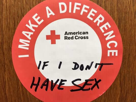
If you answer yes, you are permanently ineligible to donate. That’s based on an antiquated FDA policy that judged gay and bisexual men to be health risks because their blood could be tainted by HIV. The FDA relaxed the policy somewhat last year — gay men are now allowed to donate if they haven’t been sexually active in the past year (which is still a de facto lifetime ban if you’re sexually active, meaning gay men can’t even donate blood to their family members or even their husbands, which is absurd). Some jurisdictions have adopted the new FDA policy but others, including New York, are still using the old policy — which is why I have to answer that question every time I donate.
It pisses me off every time. Both versions of the FDA policy are ridiculous in our modern world, because (a) HIV is not restricted to gay or bisexual men, and (b) the blood supply is now routinely screened for HIV. No matter how I answer that line on the questionnaire, the blood I donate is tested for HIV (and for several other diseases) before it can be used in a hospital. If the test came back positive, they would notify me and discard my blood, so the whole issue is moot. I’ve discussed this with the staff at the blood center where I donate, and they’re even more pissed off about it than I am, because the policy forces them to turn away lots of qualified donors.
Those people being turned away are denied the chance to help their communities, as I help mine, by donating. More importantly, this policy costs lives, because it limits the size of the blood supply. I assure you, if I had needed a transfusion yesterday, I wouldn’t have cared whether the donor had been gay, straight, bi, or other. If you needed a transfusion, you wouldn’t care either. (Or if you did care, you’d be caring for all the wrong reasons, not for reasons that have any scientific or medical basis.)
The FDA policy has come under renewed scrutiny in the wake of last weekend’s mass shooting at a gay club in Orlando, because gay men who’ve wanted to donate blood in response to the massacre have been unable to do so.
If the Orlando shooting leads to a change in the FDA policy, that would be one small positive outgrowth from this horrible event. But the reality is that the policy has been indefensible for years, and it shouldn’t have taken a mass slaughter to make that clear. The policy may have made sense decades ago, but countless health experts have stated that there’s no longer any need for it. The only rationales for maintaining it are the politics of exclusion, the politics of ignorance, and the politics of fear, all of which are unacceptable.
There are currently several online petitions urging that the policy be changed, although I have no idea which one, if any, is the “best” or most “official” petition (or if online petitions have any effect on anything anyway). In any case, I’m doing my part here to add my voice to this issue: The policy needs to change, and I hope it does.
The Ticker
By Mike Chamernik

Baseball News: It’s common knowledge around here that the Padres nearly moved to Washington before the 1974 season. A prototype uniform was made in anticipation of the move, and it turns out that it still exists! The Nationals have it on display in their stadium’s Norfolk Southern Club. More info on the near relocation and the uniform here (from many readers). … A Maryland brewery has released a lemon-drop-flavored beer named Puck Face, a play off of Billy Ripken’s famous 1989 Fleer card (from Steve Hudgin). … Buster Posey showed how he breaks in his caps. Unlike most players, Posey wears a low profile 5950 cap with a lower silhouette and pre-bent visor (from Alex). … There are now five active MLB pitchers wearing single-digit uni numbers. Is that the most ever at one time? … The Indianapolis Indians will wear Hulk jerseys on Saturday — that’s the comic book character, not the wrestler or Brazilian soccer player. … Braves call-up Tyrell Jenkins wore stirrups and carried a throwback Braves backpack yesterday (from Britton Thomas). … Some Diamondbacks opponents, including the Dodgers, say that the D-Backs purposely designed their visitor’s dugout bench to be uncomfortable. Players have said it made their legs fall asleep. … Irish-themed jerseys tonight for the Peoria Chiefs (from MrMichael). … As we all know by now, the Yankees are wearing matte batting helmets on the road — or at least the players are, but apparently not the base coaches.

NFL News: Vikings players wore team-themed hard hats during a tour of their new US Bank Stadium (from Barry Brite). … The Falcons have new Home Depot ads on their practice jerseys. Team owner Arthur Blank co-founded the home improvement giant in 1978 (from Mike Nessen).
College Football News: Sportscaster Jim Mullin is holding a bracket to determine the best logo in Canadian college football (from Brendon Chrus).

Hockey News: Ads for the Flyers’ draft caps show “Philadelphia” spelled incorrectly on the side panels (from Allen Thompson). … Minnesota’s women’s team tweeted its first logo. @Andynel88 notes that the “M” logo combined with the “s”-shaped trail of the puck forms a “Ms.”

NBA News: The Pacers unveiled a 50th-anniversary logo, which will be worn next season as a patch. Indiana joined the NBA in 1976 after nine seasons in the ABA (from Steve Jacobson). … The Patriots’ Tom Brady wore Stephen Curry’s much-maligned new Under Armour shoes while watching last night’s game. He had “Straight [fire emoji]” written on them, like what Curry does. … The Cavs have changed their logo and uniforms many times since they joined the league in 1970 (from @holycalamity).

Soccer News: U.S. men’s team midfielder Michael Bradley wore a rainbow captain’s armband last night in support of the Orlando shooting victims (from @kipvatican). … The colors and number font of Ecuador’s goalkeeper jersey look a lot like what Oregon football wears (from Brad Beutler). … A Germany fan wore a jersey that had “Homer Simpson” as the NOB to yesterday’s match against Poland. … Liverpool unveiled a new black away kit.

Grab Bag: Here’s a neat old “Sporting Life” jigsaw puzzle. … Here’s what several top golfers are wearing for this weekend’s U.S. Open (from Drew Stiling). … Here’s what it would look like if all three Kansas City pro teams — the Chiefs, Royals, and Sporting KC — all wore the same colors. The Chiefs in light blue don’t look too bad (from Phil Chapman).
Why would a golfer wear a Canucks prototype jersey during a tournament?
My vote for the player’s name is ‘Maurice Lukas’.
Paul,
1) The Cavs uniform and logo link takes you to the Forbes Home page, not sure that’s correct….
2) Really, Really dig the Canadian College Football Logos! That’s my distraction for the day!
Fixed. Here’s the proper link:
link
2) Really, Really dig the Canadian College Football Logos! That’s my distraction for the day!
Hey, where’s Nipissing U.? And I hope that’s not pronounced the way it’s spelt. Wait, I just checked: They don’t do football.
3 of those teams in Top Canadian Football logo bracket are part of Canadian junior football and are not school teams: Regina Thunder, Westshore Rebels, Hamilton Hurricanes.
Wrong link for the Cavs’ logo article – it goes to Forbes’ front page. link.
Great work on LeMans coverage Alex! Just an fyi for anyone who wants to get into endurance racing, there are shorter (and more local than France) ones to get into. Sebring’s 12 hour is good spot.
Any motorsports fan will want to see the Steve McQueen movie “Le Mans” as well as the documentary on the film “Steve McQueen, The Man and Le Mans.” The liveries and uniforms alone are awesome.
Steve McQueen’s “LeMans” has some of the best racing (if not the best) cinematography ever captured.
Sebring is an excellent race. This year’s especially! Well worth sitting through the extensive weather delays.
And I totally agree about the ‘Le Mans’ film. No stupid music. Minimal talking. So much car!
Lastly, thanks for the feedback, Alex!
The Chiefs in light blue and yellow look like the Chargers, and they look like the Vikings in indigo and yellow.
It was an interesting choice to use the Royals’ powder blue alternate as the basis for this exercise, when I would say that the royal blue is their primary color.
They look nice, but red isn’t really a good color for a team called the Royals.
Glad to see Tyrell Jenkins keeping his stirrups. He wore them at Triple-A Gwinnett and, from what I can tell, has worn them at every Minor League stop.
Another Braves call-up, Brandon Snyder, wore stirrups in Triple-A, but now wears pajama pants in the bigs.
growing up loving the Price/Daugherty/HOTROD Williams Cavs, the blue and orange will always have a special place in my heart, but i think this current set with is the best..
i do see them changing their look if Lebron is still with the team when Nike takes over
“Does the basketball player have a name?”
Ernie Watcher
Also, shouldn’t there be a sleeveless option for this shirt?
Also, shouldn’t there be a sleeveless option for this shirt?
Right. And the baseball shirt should have come with a button-front option. And the hockey shirt should have had a fight strap. And, and, and…
Shouldn’t the basketball shirt have an ad on it?
Not until next year.
Ah that’s right, after you leave Teespring for Nike.
And have to charge $50 a shirt…
Paul “Dr. P” Irving for the player name.
Because of this?
link
link
Exactly why.
BB player name: Hubie “Key Chains” Grommet
I love the shirt design!
I noticed that the road version doesn’t have stripes on the wristband, but the home version does. Was that intentional? (If so, I’ll get the home version!)
I think the home uniform has more flair (red numbers & letters, an extra color around the “Uni Watch”) in the spirit of giving the hometown fans a bonus.
Yes, intentional. There are a few (very) small distinctions between the two designs. Just wanted to change up a few things.
Paul, thanks for your words regarding the limits on blood donation. That’s something that’s also bothered me for a long time, and I hope the policy continues to get more of the (negative) attention it deserves.
As far as the Padres moving to Washington–Topps even produced baseball cards! No team name, just “washington national league”
Jive “Don’t you dare call him Jeff” Walker…for the win!
Sure sounds like it could be a call from an ABA game.
name suggestion: Hoops McGee
Paul, kudos to you for donating blood regularly. I’m one of those people with a mental block when it comes to blood, which I hate. I’ve tried 3 times to give blood and passed out each time. I passed out 3 times when I went to basic training from giving blood. I once passed out in high school just from reading a very graphic and gruesome story. I passed out watching the movie “Black Hawk Down” (if you’ve seen the movie, you know the scene). I have tried many times to get passed it. I can feel it coming on and there’s nothing I can do about it. I’m able to have blood drawn now without passing out but it’s very embarrassing. So thanks for picking up the slack for me.
I totally get that some people have issues with needles and/or blood, and I totally understand that it can be a mental/emotional block that can override a person’s otherwise good intentions. Sorry you’re afflicted with it, and thanks for the kind words.
How about this for the basketball player’s name…
U.W. “The Aesthetic” Bloggins
Besides Liverpool, does New Balance do a lot of kit work? i don’t remember seeing them before
Pens confirm update to their anniversary logo: link (though Paul is already aware, having retweeted it)
On the original, 3-cup version, the middle cup was a little larger, giving the appearance of being in front of the other two. For the revised 4-cup version, they’re all the same size, in a straight line.
The Friday Flashback is up:
link
Man, that photo of Arnie taking a drag and seemingly not having a care in the world beyond the course in front of him… different times.
Name suggestion: Maxwell “Vertical” Archer
Regarding the Yankees third base coach wearing a matte/glossy helmet: perhaps they have a choice. Joe Espada the third base coach for the Yankees is in both photos. In the first one, his helmet has a matte finish, in the second a glossy finish.
Player name: Chuck Starter, and he’d tell you its pronounced with an emphasis on the first R, “staR-ter”
Bouncy McBasketballface
link
Name: Sweet Lou McAfro
Hey Paul,
Glad your ok. Good rant on the blood donation rules. Had to be said.
Great to see articles on two of my favourite sports today. Golf & LeMans racing. New to golfing, but a long time watcher of racing liveries. The Dunlop spotters guide mentioned is top notch! Anyone who can see the race (I can’t) should download it.
Fowler seems to me to be the golfer trying hardest to make fashion statements on the golf course. Maybe you should do a look at ladies golf attire on the LPGA tour? More variation there, with pants, shorts and skirts in play. They manage to look great and classy at the same time..as opposed to the way women are often portrayed in media.
Loved the article on golf today, Paul! As an avid golfer, I am always intrigued by what pros wear and golf definitely does have rather colorful fashion history. Over the years, some trends look great, others not so much. I also agree that a look at the trends on the Ladies tour would be worth an examination.
Glad you liked, Ty! The reality is that I’m not particularly golf-knowledgeable, so it was great to have access to Mike, the UGSA historian — an excellent resource. It’s really more his article than mine, because he was the one providing all the info. I was just along for the ride (although did enjoy finding the photos afterward — fun research).
Trying to think of name for the basketball player. I know I’ll get a better one, but here’s my best so far:
Ray Sing-Stripes
Going back to your recent post about celebrating milestone seasons vs. anniversaries, the Pacers are celebrating their 50th ‘season’, having started play in 1967-68. It won’t be the 50th anniversary of their first game until the 2017-18 season begins. NBA and NHL seasons that span a calendar year change are able to have both a numerical symmetry that you like and a ‘season’ rather than ‘anniversary’ celebration that I like.
Liverpool’s black away kit is allegedly “reminiscent of the colors of the matchday program (1977 European Cup Final) thousands of fans still cherish to this day.”
All well and good. Except that there was no official programme for that game. It was in Rome and I know because I was there. Italian clubs didn’t usually produce programmes at that time, and this was no different. However a Manchester Football programme shop apparently sold an unofficial programme on the day at the stadium (and I never saw any being sold), and some people believe this was the official programme.
It wasn’t. The whole thing is based on something incorrect.
There have been reprints of it, but to say thousands still cherish it is a tad inventive.
Glad to see a little golf love on UW! I’m going over to Scotland in a couple of weeks and playing some of the Open venues. BTW the golfers next to Sanders are Byron Nelson and Raymond Floyd.
Basketball Player Name: Ulysses Washington.
Nickname: “Got it”
Basketball player’s name:
Anthony “Uni-Brow” Davis
I see what you did there.
Too bad it kind of falls flat on account of the T-shirt player clearly not having a unibrow.
Golf, like many sports has changed a lot with the technology of fabrics/shoes. It used to be more of a fashion statement for the sake of it. Now it’s more of a fashion statement due to branding exercises and showing off the new fabrics that “help” them play.
Unlike most players, Posey wears a low profile 5950 cap with a lower silhouette and pre-bent visor (from Alex).
Once you have found an elusive hat in your size, the battle is only half-won. I have a Houston Oilers snapback I sort of regret buying because of its tall, poofy silhouette. It puts me in mind of the caps worn by the monorail conductors at Disneyworld. By the same token, I had a “Mess With Texas” cap made at a kiosk, whose profile is oddly pyramid-like.
the low profile hats aren’t that elusive any more
link
I would absolutely wear Doug Sanders’ sweater (except that I’m certain that it’s some terribly itchy polyester fabric).
Synthetic sweaters aren’t usually polyester; they’re acrylic. And it’s actually *wool* that’s itchy!
For me pretty much anything that isn’t 100% cotton is some variation or itchy or scratchy.
variation “of”
Player Name:
Hot Shot Stockington
Glad to hear your medical stuff went well Paul. Also, so happy to see that you discussed the blood donation issue. It’s truly disgusting and I’m glad it’s being brought out into the light.
In a uni-note, I like that proposed Washington uniform that the Padres would have changed to better than anything the Nats wear now.
Bubba walks around the golf course in his $500,000 Richard Mille watch. Quite a nice little sponsor there.
Advertiser, not sponsor.
;)
Wow my tweet made the ticker.I like dr.p for the ballers name as well.
The blood ban is one of those things that many people think sounds reasonable but is not. After all gay men are FAR more likely to have HIV, a small amount of HIV infected blood will test negative and enter the blood supply, so the ban makes the blood supply safer & we should do it. Wrong. We deal with risk every day. The amount of risk that comes from gay men donating blood is small. With the ban the odds of getting HIV from a transfusion is around 1 in 10M. Lifting the ban would have a tiny effect; maybe change it to 1 in 9.5M (that’s a guess). If you care about those kind of risks, you should never ride in a car, eat red meat, play sports or go outside in a storm. Meanwhile having less blood in the supply is more likely to cost someone a life, than getting HIV from a gay man’s donated blood. Lift the ban. It may seem sensible but it’s not.
Regarding the Amana patch:
That kind of elongated shield (similar to a squashed U.S. highway sign) was pretty common amongst golfers in the 60s and 70s. I just wonder why the red, white, navy, Columbia blue and gold striping was chosen.
Sample:
link