Click to enlarge
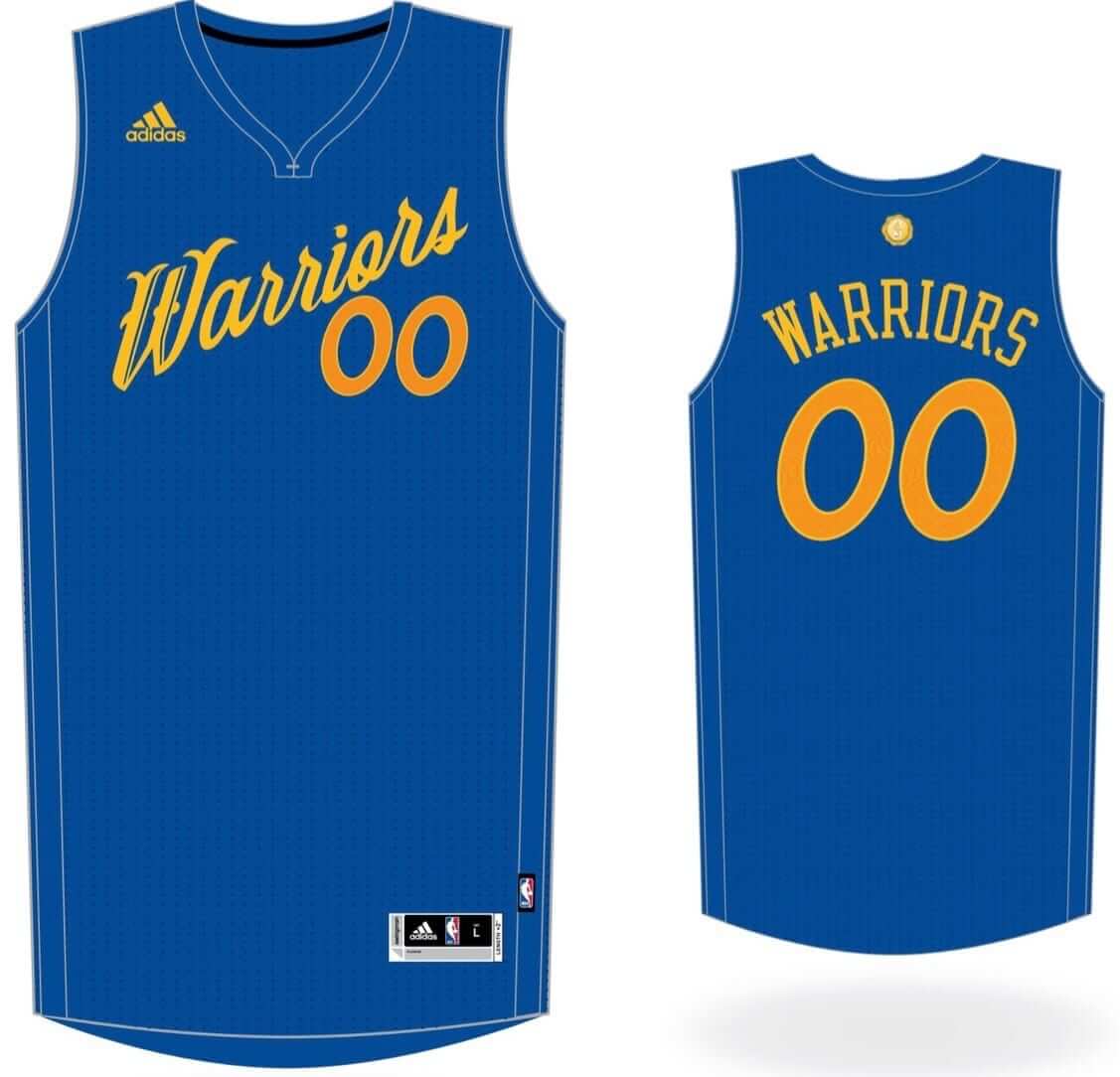
Big news today: For the third consecutive year, I have exclusive details on the NBA’s upcoming Christmas Day uniforms. As you can see from the Warriors design above, the 2016-17 designs are similar to last year’s, but with a greater emphasis on team colors.
You can get the full scoop, and see all of the designs, in this ESPN piece, which was posted this morning. Enjoy.
Baseball T-shirt 2nd chance reminder: We had some requests for the Uni Watch T-Shirt Club’s baseball-themed design (shown at right; click to enlarge) after I wore the tee in last week’s Friday Flashback video. So we’ve made it available again, but without the T-Shirt Club’s jock tag graphic.
The good news is that the lack of the jock tag means the shirt is now a bit less expensive, plus we’ve been able to add a hoodie option; the bad news is that this version of the shirt will not count toward the T-Shirt Club’s “Collect ’em all” status.
Again, the shirt is available here up through tomorrow.
The Ticker
By Paul

Baseball News: Here’s a video that shows, among other things, how the Indians choose their jersey each day. … A Green Bay Packers beat writer wrote something about baseball uniforms. yesterday. In this Q&A session, Vic Ketchman talked a bit about how color TV has affected the NFL and then added: “I think one of the reasons baseball’s popularity declined as the number of color TVs in households increased is due to the fact baseball was a somewhat colorless sport back then. The visiting team wore grey and the home team wore white. The only splash of color was on the hat and the socks, and most of those colors were dark. Everybody laughed at Charles O. Finley when he put his A’s in grasshopper uniforms, but he saw it coming; he was always ahead of the curve.” … In a vaguely related item, both teams in the Delaware state high school championship game wore white jerseys with white pants (from Mike Diodati). … Mike Rosenberg shops at a Giant supermarket in Washington, DC, and was surprised to see them using a sign featuring a San Francisco Giants logo. Looks like someone stuck a sticker on there. … The Angels are giving away an Angels/Ducks hybrid-logo cap (from @grant3young). … Whoa, even if you don’t follow or care about Japanese baseball, you have to see these posters that the Chiba Lotte Marines have created for their games against the Hiroshima Toyo Carp, the Yokohama DeNA BayStars, the Hanshin Tigers, the Tokyo Yakult Swallows, the Chunichi Dragons, and the Yomiuri Giants (all these from Jeremy Brahm). … “Texas A&M pinch-hitter Walker Pennington hit a huge home run in the SEC tournament while wearing a No. 46 NNOB jersey, instead of his usual No. 9,” says Mike Davidson. “The only explanation I found was that he had left his maroon jersey back in College Station, which seems odd, right? Wouldn’t the equipment manager(s) be in charge of uniform transportation? Texas A&M went on to win the SEC Championship game the next day vs Florida, with Pennington back in his normal No. 9.” … The Indians are reportedly scrapping their cream alternate next season but are keeping the red cap. Unclear what, if anything, this means for Wahoo. … Speaking of the Indians, they’ll be wearing these 1976 throwbacks on Saturday (thanks, Phil). … Dodgers OF Carl Crawford was wearing earplugs last night at Wrigley, something he’s done before (from Jason Ricles and Mike Petriello, respectively). … White Sox closer David Robertson, who usually goes high-cuffed, went low-cuffed yesterday as a slump-buster move. That led to the following passage in this article: “Robertson, who routinely wears his pants hiked up to expose his stirrups, runs a foundation with his wife Erin for tornado victims called High Socks for Hope. But after he allowed six runs Saturday, he wanted to mix things up a bit. Robertson said he also wore a different, lighter jersey and shaved his beard in between.” The use of “stirrups” there is erroneous — Robertson wears socks, not stirrups. As for the “lighter jersey,” I guess that means he switched from a Flex Base to a Cool Base..? (From Mike Schindler.) … A Mets fan got an autograph from White Sox P Chris Sale by beating him at rock paper scissors.

NFL News: The Pro Bowl is reportedly moving to Orlando. … Good view of former Browns QB Bernie Kosar’s split-level hand-warmer pockets (from Scott Mason). … Cowboys RB Ezekiel Elliott did a photo shoot wearing the team’s blue jersey with the wrong pants.
College Football News: Tennessee has donated hundreds of jerseys to the Israeli Football League, becoming the IFL’s largest donor (thanks, Phil).

Hockey News: Dainius Zubrus had a Roman numeral IV written near the end of his stick two nights ago. Anyone know what that’s about? (From Paul Wajgel.) … Here’s a shot of Penguins C Evgeni Malkin wearing mismatched gloves (from @NunyaCleorpe). … Here’s the latest in a long series of articles to pose the question, “Is it a jersey or a sweater?” … Here’s a good view of that mid-1970s Flyers Stanley Cup patch that was worn for photo shoots but never made it onto the ice. … CCM made tiny goalie pads for Canadiens G Carey Price’s newborn daughter (from Richard Obrand). … Stephen Peat is the latest in a disturbing run of former NHL enforcers to show serious signs of CTE.

NBA News: Kids these days: Research data indicates that millennials are more okay with uniform advertising than older fans are. … Former SuperSonics fans back in Seattle are practically giddy about the Thunder’s collapse.

College Hoops News: This is pretty cool: The Richmond Spiders will be playing some games in France this summer. “When we travel abroad, we try to design jerseys with ‘Spiders’ in the native language,” explains team spokesman Will Bryan. “We were Las Arañas in Spain in 2008 and Ragni in Italy in 2012. This year, in France, we are Araignées.” … Villanova’s players visited the White House yesterday and presented President Obama with two jerseys. Here’s a close-up of the inscription.

Soccer News: Leicsester City’s new kits, which had previously leaked, have now been officially released. … There’s a false rumor spreading in the UK about the England soccer jerseys being banned in pubs. … England’s Euro 2016 kit has been released (thanks, Phil). … Neymar is the first soccer star to collaborate with the Jordan Brand (from Tim Cross). … In a related item, Neymar was at last night’s Mets game. They gave him a jersey with JrOB but no front number (from @CoachGrapes).

Grab Bag: The Houston Chronicle is inviting readers to vote for their favorite Houston sports uniform. … Here are China’s uniforms for the Rio Olympics (thanks, Phil). … Athletes are supposedly risking big-money endorsement deals to wear TruSox (from Gary Chanko). … A Nevada sheriff may have violated a state ethics code by endorsing a local political candidate while in uniform. … Police personnel at previous Republican National Conventions have worn riot gear, but the police at next month’s RNC in Cleveland will wear their regular uniforms. … Here’s a sensational series of infographics about national flags. Recommended (big thanks to JohnMark Fisher). … Also highly recommended: this faaaascinating article about how Louisville was once the capital of disco ball production. Who knew? Now the Louisville football team just needs to come out with disco ball-themed helmets. … A 22-year-old Australian design student is the winner of a contest to create Hawthorn Hawks’ new Aussie football alternate guernsey (from Gil Griffin). … Latest sport to allow professionals, rather than amateurs, to compete in the Olympics: boxing. … Okay, so I really love meat, but I would never throw slabs of meat at vegans!
Re: Packers.com writer
It’s Vic *Ketchman*.
Thanks — fixed.
Sadly that pic “making the rounds” was because of Flyers Legend Rick McLeish’s passing late on Monday after a battle with multiple medical issues including memengitis, kidney & liver failure per his daughter the last 6 weeks. #RIP
The Bucks’ primary color is green – a Christmas color – and their Christmas jersey is black?!
I mean, there’s a 0.1% chance they’d actually play on Christmas anyway, but barf.
Came here to say just that. Why use a Christmas color when you can use…BLACK!
&*%^#(*&^#@*()#& UGH! Okay, since you guys beat me to the green point, I’ll say this: go cream. That cream with green lettering and numbers would look so perfect. Even go with the stupid blue they’re trying to incorporate. I’d done with this black shit.
The Bucks’ BFBS is bad but the T-Wolves’ are even worse
Proofreading:
-“Here’s a good view of that mid-1970s Flyers Stanely Cup patch” Stanley, as I’ve been reminded once or twice recently
-The tagging around the Villanova item is off
Both fixed.
Anyone know why the Japanese programs include English words for the stadium name and dates? Also, why do the teams use English language logos? Is it tradition?
Probably for similar reasons as they use English badges on their cars: link
Thanks for sharing – after reading the article it makes sense why the same logic would carry over to baseball.
Because it’s impossible to write the English words exactly in Japanese as you’d have to use katakana which would read as su-wa-ro-su instead of Swallows. Foreign players names are in katakana on the scoreboard as well. Although on the scoreboard they don’t use English for the team name.
* Lived in Japan and a fan of the Yakult Swallows *
At first I was thinking the “IV” on Dainius Zubrus’ stick was for 4 more wins until they win the Cup, but I’ve found a few pictures from earlier in the season where he has the same white tape wrapped around his stick. The number is probably just a way to identify the stick since some players have multiple sticks cut to different lengths for different situations.
I wonder why the Clippers Jersey includes LA in front of the team name when all others except the Lakers (which instead says Los Angeles) have only team name
I feel, speculation, that the Clippers are going to be getting new road uniforms or maybe developing them, and this might be a preview of what’s to come. I feel like its a strong possibility since they stopped wearing the red roads with the “LAC + Number” early on in the season. It would make sense, although I don’t like it, that with the emphasis on “LA” they would make the roads read “LA Clippers.”
Last year, Knicks’ jersey read “New York” while Lakers’ read “Lakers.” This year, Knicks’ jersey reads “Knicks” while Lakers’ reads “Los Angeles.” Having “LA” in front of “Clippers” on the jersey looks tacky, IMO, and makes you think that there’s maybe another Clippers in the league (OK Clippers?) the way the NOB sometimes include the first initial if there are multiple players with the same last name.
But yeah, I like Pedro’s theory, which leads me to believe that the Lakers will have a “Los Angeles” jersey in the Nike years.
Question: Aren’t the Pistons supposed to be getting the “new” (reviving old) logo this year? If so why do the shorts have the sublimated D/P logo on the pants of the Christmas jerseys, even though the NOB text matches that new (old) logo? Seems like a dumb combo to me.
As a millennial however, I don’t know where they got their data on uni ads, but my friends are in the no-ad camp.
The “Pistons getting new logo” rumor has been debunked.
That’s unfortunate, but makes at least the design makes a little more sense.
Any idea if they’re just waiting until 2017-18?
Probably, but that’s just an assumption on my part — I have no hard evidence or knowledge.
I’m sure we knew about the Premier League’s link (which either went into effect today or I just noticed today because the league changed its Twitter avatar). What I didn’t know (but others undoubtedly did) is that the PL has now gone back to officially being the PL, dropping Barclays from the name of the of the league upon the expiration of that title sponsorship.
Barclays remains a league sponsor, and references to the BPL remain on the site and in the league’s link. But the PL seems to have generally resumed calling itself the PL. Now if only everyone over here would drop the nonsensical EPL abbreviation …
The dropping BPL will happen soon (it was until the end of the season), so I’m assuming in the next couple of days it’ll go away [aha, it’s gone, new season starts June 1st].
The reference to BPL still refers to British Premier League (yeah, I know, confusing) but other countries have a Premier League as well, so the EPL abbreviation doesnt work because of teams like Cardiff that are in Wales.
But Cardiff, Swansea City, and I think 4 other clubs in Wales are part of the English football association. Wales has its own separate association. English Premier League is way more appropriate than British Premier League, since the Scottish Premier League is a separate entity.
EPL rolls off the tongue easier than PL, in my opinion, so I prefer EPL.
Not only that, but several countries have “Premier Leagues”.
Calling it “EPL” makes sense from that standpoint also, the occasional appearance of Cardiff notwithstanding.
Lee
But honestly, what other league could someone be talking about when they say, “Premiere League?” :-)
The England kit news is nearly 3 months old!
link
… and as wrong then as it is now
RE: Zeke Elliot wearing wrong pants
they need to wear those pants all the time.. the aqua teal pants are terrible and need to go
I believe those are the aqua/teal pants (as opposed to the pure silver they usually wear on the road). The lighting makes them look more blue and less green, which is a good thing.
Personally I’d like them to go back to the silver blue pants and wear them with both home and road.
dang you’re right.. i stand by my “teal pants are terrible and need to go” stance..
Yeah, but do you really want them wearing silver & navy pants with a jersey featuring royal blue?
The Cowboys are a mess, period.
I want them to look like this:
link
and this:
link
oh i agree jeff.. i can’t have them as one of the better unis in the league because of how hodgepodge they are
On the Texas A&M topic, no, equipment managers typically don’t transport uniforms in college baseball and softball. Players are typically responsible for packing their own bags and most programs use checklists that the players fill out and sign to make sure nothing is left.
Another possibility, as happened with the program I work for, is that the player lost the jersey at some point during the season, so they’ve had to put him in a different jersey when that combo is worn. Unlike NFL or other pro leagues, college teams typically can’t get replacements from Nike/UA/adidas during a season and in these days of everyone wearing a custom number font, can’t get a blank jersey properly lettered.
On the Texas A&M topic, no, equipment managers typically don’t transport uniforms in college baseball and softball. Players are typically responsible for packing their own bags and most programs use checklists that the players fill out and sign to make sure nothing is left.
That’s fascinating. Are the players also responsible for laundering their uniforms?
I played soccer at college, and the school washed our uniforms and then set them out for us to pick up. This occasionally caused problems, because some of the shorts were baggier (i.e., in higher demand), and teammates would steal them — even though they had numbers on them, so it was extremely plain at game time who had stolen which shorts.
Also, in the last game of one season, during the conference tournament, a player — who didn’t get much playing time ordinarily — declined the chance to play because he thought his shorts were too short. He switched to lacrosse the following year.
No, they are washed by the managers for the team (that do more than just equipment stuff), then returned to the players’ lockers to be worn/packed.
On the road, managers typically soak and wash the uniforms for Friday and Saturday day games at the team hotel, but leave Saturday night game and Sunday game uniforms for when the team returns home.
Interesting that the Bulls are going with a road uniform look, even though the schedule has not yet been released.
Gotta figure it’s easy enough to see how the schedule looks, and then make white versions as necessary. I’m sure that when retailers place orders so incredibly far in advance, it’s understood that the final design might be a little different.
They’ve also previously played Xmas games as color vs color, so that could very well be planned already.
You guys are right, but they went with “Chicago” on the jersey instead of “Bulls,” and were one of the only teams to do city name vs team name. I like how it looks, but it surprises me from a branding perspective.
Lakers: last year “Lakers”; this year “Los Angeles.”
Knicks: last year “New York”; this year “Knicks.”
Bulls: last year: “Bulls”; this year “Chicago.”
Not sure if there’s any consistency and if the teams have any influence/say over the matter.
Bulls, Blazers and Suns are the only three teams with black name fonts. Wonder if it’ll stay that way if they end up playing at home wearing white/alt colors.
The grey numbers against the black lettering on the Bulls jersey bothers me for some reason. Don’t like it.
Just posted on Sportslogos twitter, Indians to drop cream alts next season but will keep red cap.
link
This is disappointing for me. I always liked the block font and I felt that it was a viable permanent alternative to the script “Indians” they’ve used since the ’90s.
Its also indirectly responsible for the current revival of the red sleeves, cleats, and stirrups worn by the Tribe this season at home. It started with red caps being used in the alt after the original navy “C” caps were designated for away games. It made sense to wear red sleeves and socks with the new caps which led to red cleats being worn as well.
MAJOR bummer, as I absolutely love this look!
Just posted on Sportslogos twitter…
Someone didn’t read today’s Ticker.
I’m disappointed too. That’s my second-favorite Indians uniform of all time. The block script just speaks to Cleveland to me, and while I believe there’s too much cream in MLB, the Indians made it work almost as well as the Giants.
The regular home Indians script unis aren’t my least-favorite in MLB, but they’re close. I’d rank them below the Rays home jerseys.
On the Christmas uniforms… honestly as a group this is a step back from last year’s set as many of these show a complete disregard for proper minimum contrast. Particularly bad instances are Toronto, Charlotte, Orlando, and Minnesota. These will NOT read live or on TV. San Antonio, Chicago, and Portland are troublesome too. Leagues should institute guidelines on minimum contrast on jerseys because this drives me nuts.
Also, does it seem like the shade of … highlighter yellow/green, whatever the abomination the Hawks are wearing… The shade of THAT, on their Christmas uni, is way more green than their official shade?
Agreed. Last years’ were a pleasant surprise and this years’ batch is definitely a downgrade, IMO.
I might be in the minority, but I think the Wolves green-on-black actually looks okay…at least on my monitor.
The Hawks picked their poison last season (for this season) and maybe making it a bit greener could be an improvement, if it is indeed greener. Looking at the other teams’ colors, some of the numbers’ shade are a bit lighter/darker/different than the team names’ shade, or it could just be an optical illusion, I’m not sure.
For the new NBA uniforms, the adidas logo is on the upper left hand side. Is that going to actually be on game jerseys, as with the All-Star Game, or is it just for memorabilia purposes? (I know adidas has their logo on all replicas; my Kobe jersey has that on it, but his game jersey never had an adidas logo on it)
They ended up not being on the jerseys in the Christmas Day games last year like they were in the All-Star (exhibition) Game. I suspect it’ll be the same this year, but not when Swoosh/Jordan takes over. BTW, was yours a Swingman jersey or an Authentic jersey?
link
And any insight as to why Milwaukee has black on a GREEN, CHRISTMAS-COLOR TEAM?
Because REASONS!! Don’t question it, you’ll just get a headache.
+1 Do not bother with logic. There are more enjoyable ways to hurt yourself, e.g., Slurpee brain-freeze.
That bit about Sonics fans sums it up pretty well. As a a Seattle native who now lives in northern California, I can attest that I wanted the Thunder to lose way more than I wanted the Warriors to win. I’m also really hoping Durant jumps ship so I can return to properly rooting for him. I’m still so bitter about the entire thing and I’m not sure I’ll ever feel any better about it.
This occurred to me last time because it was more widely covered; I didn’t realize it until days after this time around, and even then, it was only mentioned in passing but I guess it makes sense. Seattle fans will probably never root for OKC until the league grants them a new or relocated team.
A couple of things on the Christmas uniforms:
1) the spacing between the letters and the word marks is incredibly inconsistent, I’m assuming that will get fixed, am I correct in that?
2) Is it safe to assume the Lakers have a home game on Christmas? Our jerseys are our Sunday Whites (which to the best of my knowledge we’ve never worn on a day other than Sunday when we had a choice), and Christmas is on a Sunday this year. If we weren’t playing on a Sunday, it would make sense for us to use our purple, right?
1) I hope so.
2) Not safe to assume the Lakers will even have a game on Christmas now that Kobe’s retired and there’s no major draw, even if they somehow go almost-undefeated like the Warriors did this season because by then it’ll be too late to schedule a game if there wasn’t one. It’ll be nice for the Laker players to finally spend some time with their family for Christmas.
“If we weren’t playing on a Sunday, it would make sense for us to use our purple, right?” But you JUST said that “Christmas is on a Sunday this year.” Also, white is a Christmas color; Lakers played on a Friday last year and wore white, so I’m guessing it doesn’t matter whether it’s Sunday or whether they’re home or away when it comes to Christmas. Actually, this article says that it’s to be worn on Sundays and Holidays, so I guess Christmas counts.
link
I looked through the NBA Christmas jerseys…as a Timberwolves fan I did not like our proposed jersey. (I say proposed because a bottom feeder team most likely won’t be one of the ten teams even with the young talent.) I don’t mind some of the other teams’ jerseys from the collection. However the Wolves’ is too dark. The green doesn’t look like our green. The shorts could have used the green…especially in the evergreen trees. Oh well. This is the life of Wolves fan.
Can someone explain the Ketchman quote? It doesn’t make sense to me.
How does adding color TV lead to less popularity of a sport? Because viewers could see the color of the uniforms… viewers stopped watching as much? They instead starting watching football more because of the colorful jerseys?
Are there charts that show color TV led to an increase in NFL viewership and a decrease in baseball viewership? I get that less people watch the world series, but that could be because of the rise of cable, DVRs, on demand, watching movies at home etc. I imagine TV ratings as a whole are still very high.
Baseball still has twice the average attendance of the NHL and NBA. So where, besides the World Series viewership, is their evidence that baseball is less popular than ever?
OK good… I was thinking the same thing.
Lee
I don’t think color had that much to do with it, baseball is simply boring as hell on TV.
While I don’t agree with this sentiment – you want boring television, watch an NFL game – it is commonly shared. Apparently by people who think that a bunch of guys standing around holding committee meetings in body armor is Real Action. Anyway, I wonder how much of this perception is due to production choices made in the early days of TV sports and perpetuated to this day. For example, the standard just-off-center outfield view of the pitcher and batter. The foreshortening of that shot, which is the default view for just about every pitch, completely collapses the most interesting dynamic of the game, and also hides from view the fielders and runners who often are in motion between pitches. In the last few years, MASN seemed to be experimenting with using a behind-home-plate view for some pitches with runners on base. As a viewer, I’m much more engaged by this view. It’s like, normal baseball broadcasts simulate the view from one of the worst seats at the ballpark. Behind-home-plate cameras simulate the view from the best seat at the ballpark. I suspect many people who dismiss baseball as boring and admire football as exciting would agree with my opposite view if NFL games were mainly broadcast with cameras behind each endzone zoomed out to show the whole field at all times, like what you see from the cheapest seats in most NFL stadiums.
Vexillology scrolls my nurd better than Scudzo Mouthwash. Seeing the Ivory Coast flag disabuses me of a preconception I had about tricolored flags; that the warmest color was always at the free end. Live and learn.
“Scrolls my nurd”? First time I’ve heard that expression. What does it mean, and where does it come from?
It comes from an old B.C. comic strip. Johnny Hart was a very funny man before he turned into a Christian from Hell. One of the characters was pontificating on a stone age talk show (“The most important thing, is…”) and the host cuts him off (…”SCUDZO!!! The mouthwash that really scrolls your nurd!”).
Was this particular bit from the time period when he was funny or when he was a Christian from Hell?
It came from one of those lovely Fawcett Gold Medal books found on spinner racks of drugstores in the 1960s. Remember, the Peanuts books were Fawcett Crest with the pink-edged pages. Hart waited till the ’80s to become fucked up on Christ.
Thanks!
Huzzah for vexillology! And thanks Mr. L for linking that terrific infographic.
I think those “jerseys” Villanova presented the president are just some kind of print, rather than actual framed jerseys. Doesn’t appear to be any depth around the arm-holes. Kind of a strange way to go with that, since teams almost always give the POTUS an actual jersey.
Please, Atlanta Hawks. Stop the madness.
One thing I dig about the Christmas jerseys is how they’ve incorporated more subtle versions of design components from the regular jerseys: The Rockets’ arm rings, the Blazers’ diagonal stripes, the T-Wolves’ tree patterns, the side panels on the Pels’ jersey etc. That’s really cool, makes them a little bit more than cookie cutter designs and a lot of the time works better than the louder versions from the regular jerseys. I kinda wanna cop that Blazers jersey.
Can anyone explain why, of the 28 teams depicted, only three are portrayed in white? Is that a hint that the association already passed along to Adidas that these teams will be playing on Christmas Day & will be @ home (as Vivek pointed out a few posts above mine, Christmas is on a Sunday this year, which might explain why the Lakers are in white)?
Also, I thought they preferred color v color matchups for the games. Last year, Cavs/Dubs, Pelicans/Heat, & Bulls/Thunder were all-color, and Clippers/Lakers and Spurs/Rockets were color/white (though the Spurs wore white as the visiting team), so why go to the “trouble” of releasing the white uniforms at all?
Interesting but not surprising that “Millennials” are more open to advertising on sports jerseys. Possible reasons?
1. No matter what the change, young people are generally going to be more open to it than older folks.
2. Millennials in America are more likely than older Americans to be fans of European soccer so ads on the uniforms don’t seem like such a radical idea to them.
3. Younger fans are already accustomed to seeing ads all over the place during sporting events so having them added to the uniform may simply seem like the next logical step/no big deal
4. Younger people are more likely in general to associate themselves with brands, for example a 20 year-olds are more likely to buy a t-shirt with the Nike logo than a 50 year-old.
5. Millennials may simply be more open to the idea that if you can make money doing something that doesn’t really hurt anybody, why not?
Millennials may simply be more open to the idea that if you can make money doing something that doesn’t really hurt anybody, why not?
You were doing well until that last bit. Most of what you presented in this list was more or less factual, but the notion that advertising on uniforms (or advertising in general) “doesn’t really hurt anybody” is a v-e-r-y questionable assertion.
who does it hurt?
As a millennial my stance on uniform ads is that they are fine as long as they look good
holding anything to a sacred standard, just doesn’t make sense, it’s honestly just away to tell teams apart… and if ads are okay in the rest of the world they should be okay in America too
and maybe a better answer to your question is that no millennial would know who it hurts
also i think we see so many advertisements that it really wouldn’t make a difference to us
You may think the encroachment of advertising (and other forms of corporate culture) into every nook and cranny of our lives is harmless.
There are some people, however — myself included — who strongly disagree, for reasons I’ve spelled out on this website many, many times.
Paul – I guess you might say I was making the argument for them, I agree that it’s not exactly clear that advertising doesn’t have a negative effect on people…only that younger folks are not likely to see ads as being a big deal.
In other words, your argument is, “People who don’t have a problem with something will not have a problem with that thing.”
You’re not exactly *wrong*, but this is not a particularly strong intellectual position, because it doesn’t get us anywhere or provide any insight. It basically says X = X, but it doesn’t explain why. Still the weakest point on your list.
As to the third point: there’s been advertising in ballparks going back at least 60 years (I would assume 100+ years, but don’t care to Google too much more), so that much shouldn’t make advertising at a game a foreign concept to pretty much anyone alive today. Obviously they’ve gone crazy with it, selling sponsorships/advertisements to parts of the game itself. I seem to recall, at Busch Stadium, a “Long Drive Inning,” where, if a HR was hit during that inning, a pre-registered contestant would win the drawing for a new car/truck sold by the sponsoring auto manufacturer. And I doubt that’s the only such example around the country. That’s pretty much “just the way it is,” and most people don’t seem to bat an eye about it anymore, millennial or otherwise.
Other than that, 1, 2, & 4 are all excellent points. I think I technically fall in to the millennial category (born in ’84), but my parents were always pretty adamant about not purchasing clothing that blatantly advertised one brand or another. I thought it was kind of a lame rule as a kid, but I certainly don’t foresee myself buying t-shirts featuring nothing but a giant Nike, UA, or adidas logo. And to the guy I saw @ work a few years back wearing UA shoes, socks, gym shorts, shirt, and hat… you’re a douche. But it’s all about having the latest & greatest brands on you (why else were Beats headphones so popular? certainly not sound quality!), and pre-teens through twenty-somethings are the likeliest to chase those fads (I’m sure that’s been true going back a decent way through the 1900s); that age group just so happens to be the millennials right now.
” Obviously they’ve gone crazy with it, selling sponsorships/advertisements to parts of the game itself. I seem to recall, at Busch Stadium, a “Long Drive Inning,” where, if a HR was hit during that inning, a pre-registered contestant would win the drawing for a new car/truck sold by the sponsoring auto manufacturer. And I doubt that’s the only such example around the country. That’s pretty much “just the way it is,” and most people don’t seem to bat an eye about it anymore, millennial or otherwise.”
This is the drum I’ve been beating ever since the jersey advertising argument really kicked into gear. The way that every single facet of the game has been broken up into sponsored parts, with announcers reading ad copy over the air or the stadium PA, and garish flashing ads on the jumbotron, people in the stands doing sponsored games and bits during downtimes in games, that’s all way way way more intrusive and detracting from the enjoyment of the game than an advertising patch on a uniform could be.
I know that the toothpaste is out of the tube on all of the broadcast advertising, so it’s not like that by giving up some uniform real estate we’d get some of our psychological real estate back; and I totally agree with wanting to stop corporate encroachment on these activities we love in any form. But honestly some of the reactions to the NBA advertising deal have bordered on hysterical, whereas I literally have never seen one instance of people being bothered by the multitudes of other ways advertising has taken over sports.
I literally have never seen one instance of people being bothered by the multitudes of other ways advertising has taken over sports.
Then you and I must be reading/hearing very different sources. I’ve seen/heard countless critiques of it over the years, most recently by Mets announcer Ron Darling during yesterday’s Mets/Chisox broadcast.
In any event, your argument amounts to accusing critics of uni ads of being hypocrites, or at least inconsistent. Even if that’s accurate (and I don’t think it is), that’s a classic case of indicting the messenger instead of engaging with the message. Even if someone is a hypocrite, that doesn’t mean he/she is wrong.
I never realized how much I needed posters of a pinstriped mech in my life until today.