We all know that one of the problems with button-front jerseys is that sometimes a letter ends up being cut in half as it sits astride the placket, and sometimes those two halves don’t quite align. And we also know there’s the additional problem of “extra” letters suddenly appearing.
But today I want to talk about another problem with button-fronts — something so simple it seems really obvious, but I don’t think we’ve discussed it before. And here it is: If you’re using standardized, roughly equally sized letters, and if you don’t split a letter in half across the placket, you’re sometimes left with a badly lopsided chest insignia that feels unbalanced and uncentered, with the resulting wordmark leaning to one side.
Here’s a really simple example from a vintage jersey I found on eBay (click to enlarge):
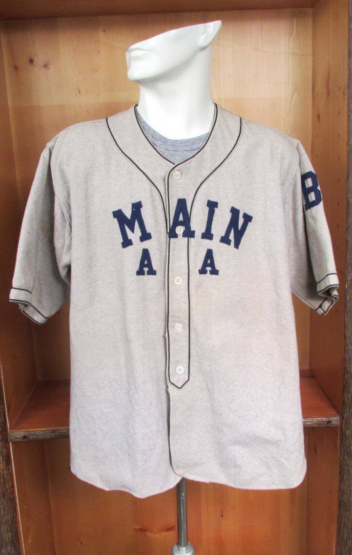
As you can see, they put the “A” in the middle, centered right on the placket. But that meant they had to put two letters on one side of the “A” and only one letter on the other side. They tried to make up for it by adding more space between the “M” and the “A” (which doesn’t look so hot), but the word still feels lopsided and off-center, leaning heavily to one side (which looks even worse).
Obviously, this is a fairly primitive lettering job. Something like that could never happen with a big league jersey, right?
Wrong — as you’ll see in a minute.
Before I get to some specific MLB examples, I want to set the ground rules here. We’re not going to talk about scripts, because it’s easy to manipulate a script so it feels centered. We’re also not going to talk about chest marks that feature letters of multiple sizes and weights — again, it’s easy to manipulate that kind of typography so it feels balanced.
Instead, we’re going to focus on jerseys that, like the eBay example, use standardized, all-caps, radially arched lettering, usually with an even number of letters. The examples I’m about to show you are things we’ve all been looking at for years, and in many cases I suspect we’ve just gotten used to their lopsidedness without thinking much about it. But I warn you — once you start looking for it, you’ll find it. And once you find it, it sticks out like a sore thumb. You can’t unsee it!
Ready? Here we go.
1. Houston Astros, home and alternate jerseys. This one has been bugging me since the day it was unveiled. Take a look at how lopsided this is (click first photo to enlarge):


The “R” is at the midpoint, with three letters on one side of it and two on the other, the insignia is practically sliding off to the player’s right (our left). A mess. They could solve this by rotating everything clockwise and splitting the “T,” but that would cause letter-splitting problems. Another solution, of course, would be to go with a pullover instead of a button-front.
2. Boston Red Sox, road and navy alternate jerseys. Boston’s home jersey is simple, because you have three letters on each side of the placket with a space in between — perfect symmetry. But the jerseys with “Boston” on the chest are trickier (click to enlarge):


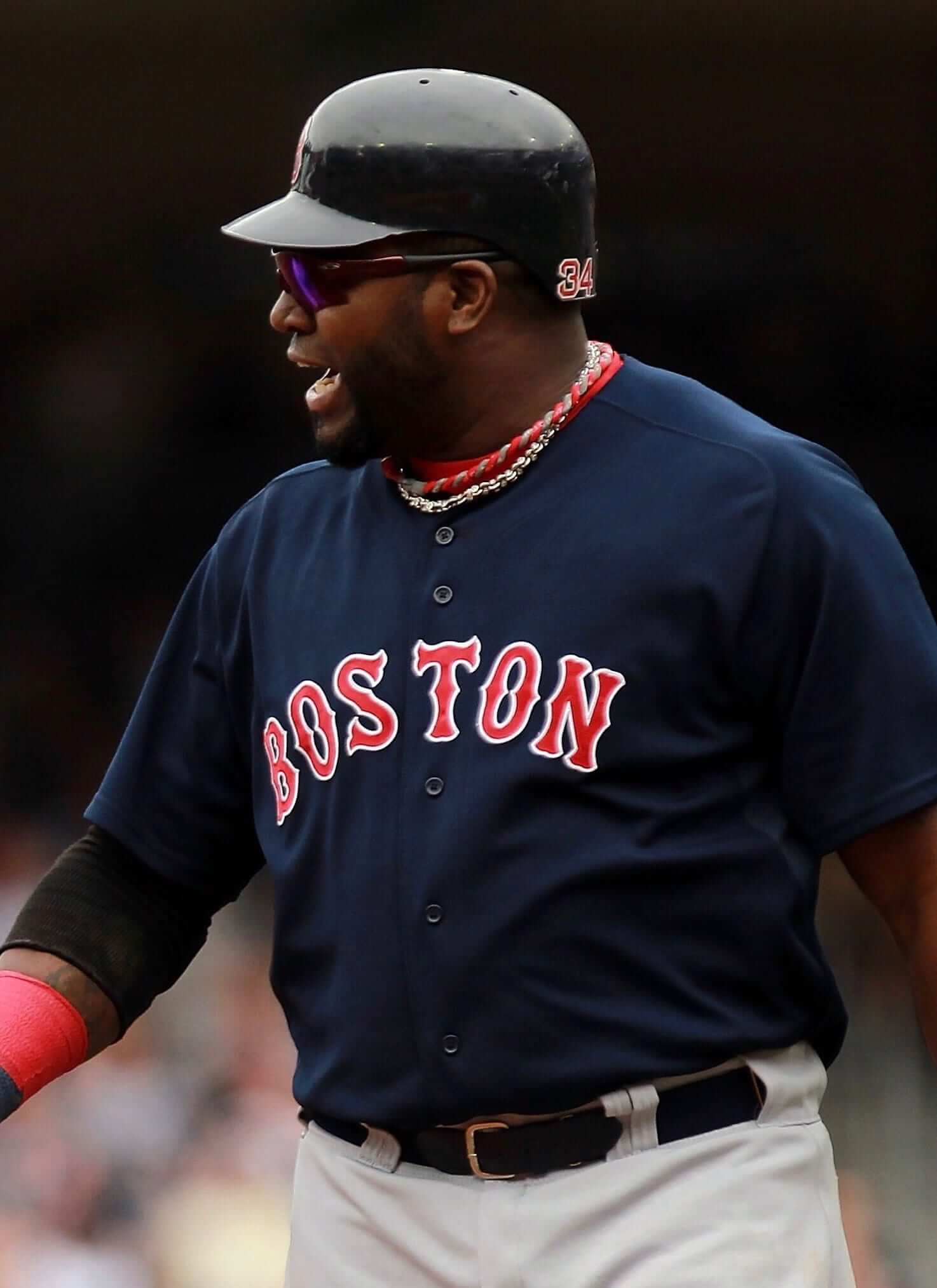
Here we have the “T” centered on the placket with two letters on one side and three on the other. Just like with the Astros, the insignia is weighted too heavily toward the player’s right (our left). The solution, which they’ve opted not to pursue, would be to split the “S.”
(It’s worth noting, incidentally, that the Bosox have sometimes put the “S” in the center, instead of the “T,” which makes the lettering lopsided in the other direction but still doesn’t solve the problem.)
3. San Francisco Giants, home jersey. The Giants’ chest lettering is classic, old-school and beautiful, right? True enough, but it’s also lopsided (click to enlarge):

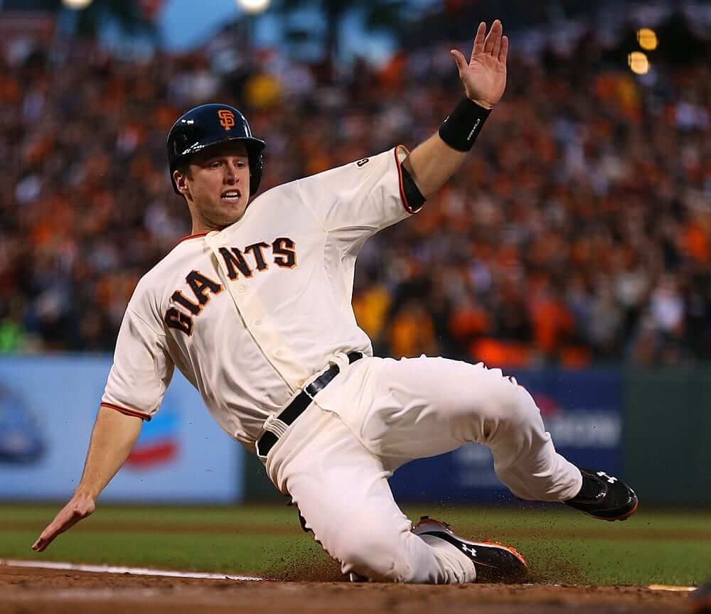

This time the “N” is centered with three letters on one side and two on the other. Granted, one of those three letters on the more heavily weighted side is an “I,” which doesn’t take up much space, but the insignia still leans too hard to that side.
4. New York Yankees, road jersey. I can already hear the howls of disbelief — “The Yankees? There’s a flaw in the Yankees’ uniform?” Sho’ nuf. See for yourself (click to enlarge):

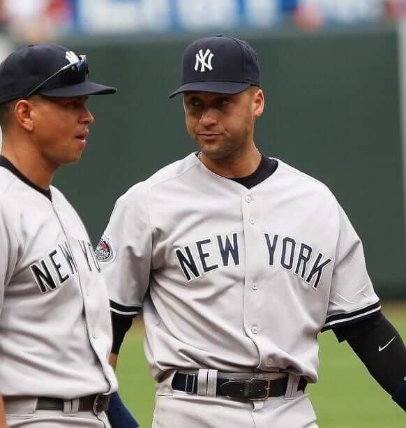


This is a weird one because the lopsidedness is completely avoidable. As you can see, they basically put the blank space in the center, with three letters on one side (“New”) and four on the other (“York”). This one has a much easier solution: Just rotate everything slightly counter-clockwise, and then the only “letter” that you’re splitting in half is the blank space — no problem. Which happens to be exactly what the Mets do (click to enlarge):


That’s much better than the Yanks’ version. So the next time someone tells you the Yankees do everything better than the Mets, don’t just say, “Hel-lo, The Mets are nine games over .500 and in first place, and the Yanks are six games under and in last place!” (although that’s certainly fun to say, so go ahead and say it). Also be sure to say, “The Mets do a waaaay better job of centering their road jersey lettering than the Yankees do!”
Update: It has been pointed out in today’s comments that all of the Yankees photos I showed are from previous years, and that the Yanks have actually fixed this problem for 2016, rotating the lettering a bit counter-clockwise and ending up with something very similar to what the Mets are doing:
Good for them! Problem solved. (But they’re still in last place.)
Now, I know some of you graphic designers and typography geeks out there are saying, “It’s not as simple as just counting how many letters are on each side! You have to account for letterform weight, kerning, negative spacing for nested letterforms,” blah-blah-blah — yeah, I know. That’s why I mentioned the “I” in the Giants example, and I could have mentioned a few other variables with the other teams. But for the most part, these particular examples really are as simple as counting letters on each side of the center point, because almost all of the letters involved are full-width and don’t allow for nesting. Take another look and you’ll see what I mean.
Some of you may also be saying, “Centered, shmentered. Hell, lots of jersey designs are asymmetrical.” True enough. But that jersey, like many other similar jerseys, is designed to be asymmetrical. Radially arched lettering spread across the chest, however, is designed to be centered. And a lot of MLB jerseys are currently failing that very simple test.
There’s a very simple solution to all of this: Go with pullovers. I’m not necessarily saying they should go with pullovers, but it would definitely solve this particular problem. You could also give your pullover a faux button placket, as some college teams are now doing.
Remember my recent point about the difference between a traditionalist and a classicist? This is a great example of how that distinction can play out. The traditionalist will say, “I don’t care if the lettering is off-center, or if they split one of the letters and the two halves don’t line up. Baseball jerseys should be button-front, the end.” But a classicist will say, “I love button-fronts as long as they work. But if the lettering is messed up, then button-fronts aren’t working. We can — and should — do better.”
Discuss.
(My thanks to reader Jeff Schleicher for recently giving me the kick in the pants to explore this topic, which I’d been meaning to get around to for some time.)

Save the date(s): Several important important dates are coming up on the Uni Watch calendar over the next few weeks:
• Tuesday, May 17: This date will mark the 10th anniversary of the very first post on this here website. A full decade, not bad. As always, we will mark the site’s anniversary by celebrating Purple Amnesty Day — the one day of the year when I accept orders for purple-inclusive membership cards. And just like last year, PAD will feature its own T-shirt, which will be available for this one day only.
• Wednesday, May 25: We’re going to have a Uni Watch gathering here in Brooklyn on this date (exact venue still to be determined). Yes, I realize we usually do the gatherings on weekends, not on school nights, but we had to choose this date because we have a special guest who’ll be in town: SportsLogos.net honcho Chris Creamer. Think of it as a summit meeting. More details on this soon.
• Thursday, May 26: I will be a featured guest this evening as part of Talk Show, a live event in which people with unusual jobs are interviewed in front of a live audience. It’s free and fun. This date is also the 17th anniversary of when the very first Uni Watch column was published in The Village Voice, so I’ll be a particularly celebratory mood. (Yes, two different Uni Watch anniversaries in the space of nine days. Confusing, I know.)
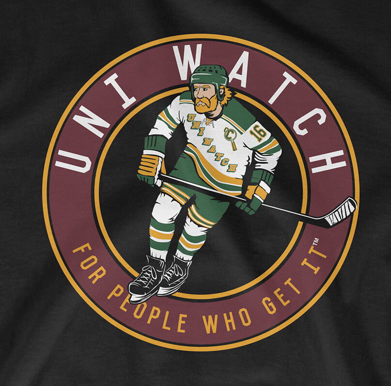
T-Shirt Club ”” LAST CALL: Today is the last day to order the Uni Watch T-Shirt Club’s second release of 2016 — the hockey design — which is available here.
Here’s the base design (which you can click to enlarge), followed by the three shirt color offerings:
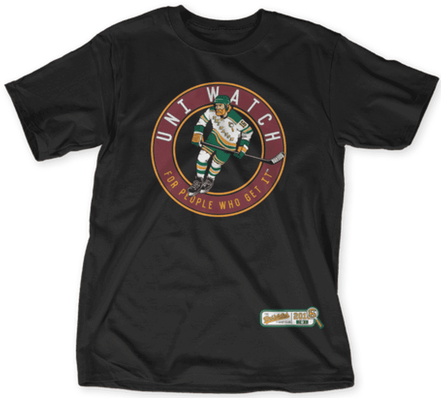
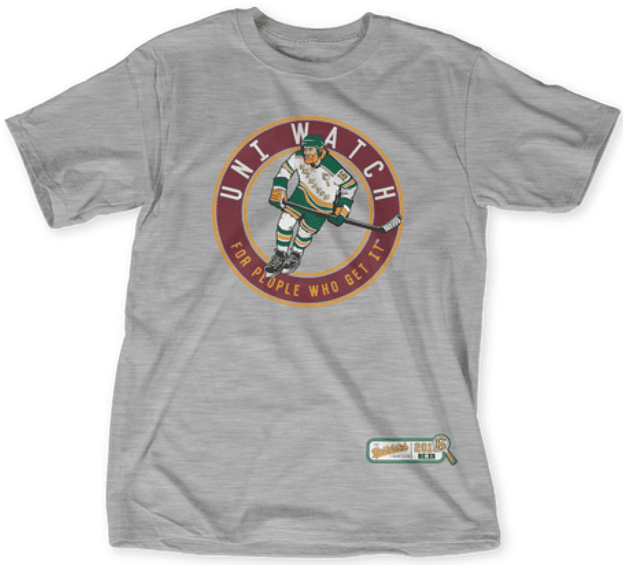
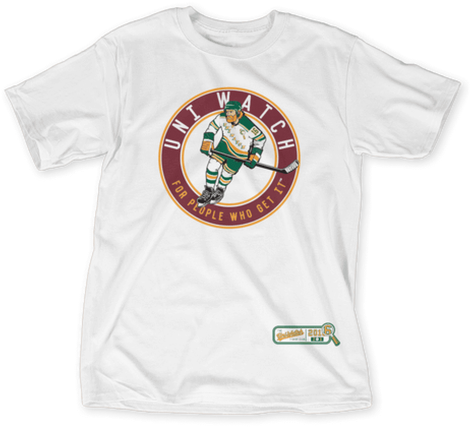
The shirt is available here until 11pm Eastern tonight.
Today is also the next-to-last day for the goalie design that we’re offering for sale as a bonus shirt. Here’s the base design, and the three color options:
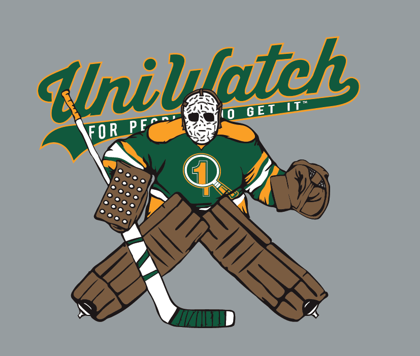
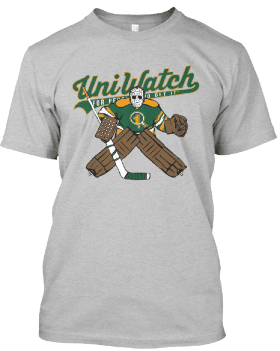
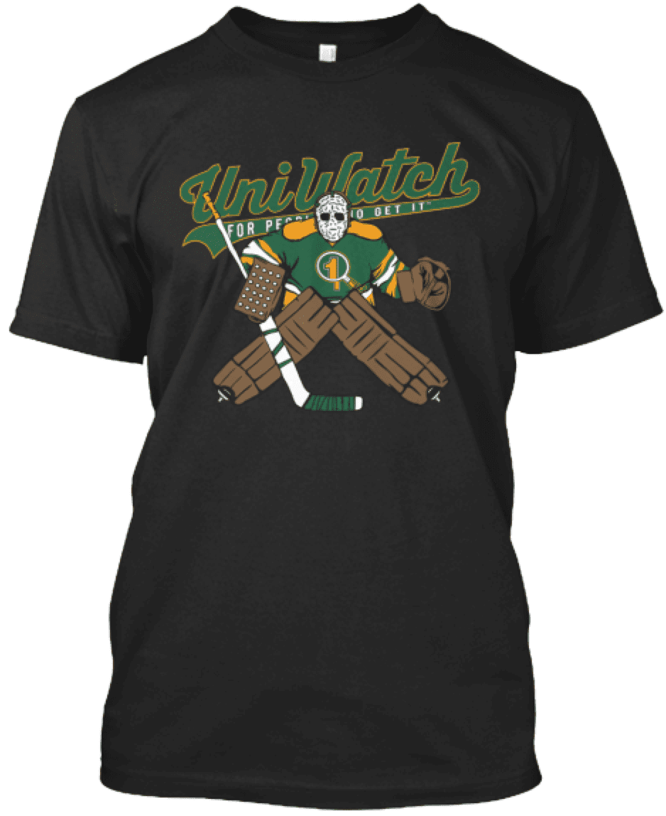
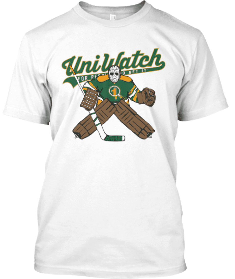
This shirt is not part of the T-Shirt Club, does not have Club’s jock tag graphic, and neither counts toward nor is required for 2016 “Collect ’Em All” eligibility. It’s just a bonus design that we’re offering for those who want it. You can get it here through tomorrow night.
Click to enlarge
Collector’s Corner
By Brinke Guthrie
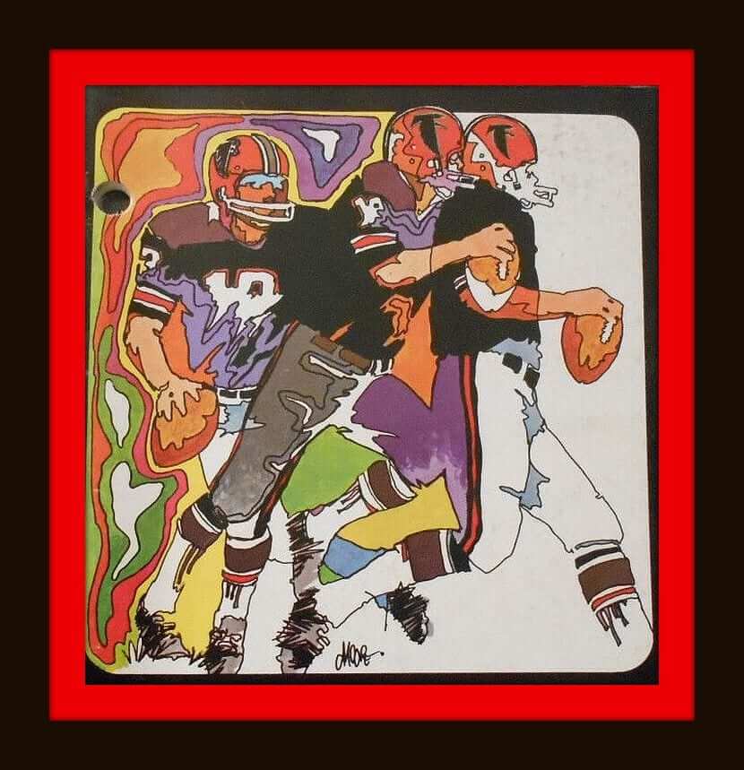
Yes, I know we featured a Falcons media guide less than a month ago, but ya know what? Great graphics are great graphics, and it seems the Falcons did pretty well back in the day. This one is from 1970 and has the requisite far-out groovy Peter Max outline effect.
Okay, on to the rest of this week’s picks:
• Here’s an NBA “Bas-Ket” game. Real Basketball In Miniature!
• Had a Cowboys version of this — a 1971 Green Bay Packers binder. And here’s an early-1960s NFL school binder for the entire league (although the league was a lot smaller at that time).
• Great cover on this 1969 Rayduhz/Oilers program.
• Some nice cover art on this 1970 Packers/Giants pre-season game program, too.
• That same year also brought us this rather cool-looking Saints schedule coin. [Simple rule: Anything with Sir Saint on it is pure gold. ”” PL]
• This vintage 1950s Cleveland Browns wall plaque lets you know “It’s fall again, so call again” with Carling Black Label Beer.
• It looks like you could put a Cincinnati Reds window sticker on your car as far back as the 1940s. Never seen one this old before. [And I’ve never seen that particular version of the Reds’ wishbone-C logo. ”” PL]
• An NFL comic book? Yes sir, from 1969.
• Here’s the Official NFL Touch Football Play and Rule Book, also from 1969.
• Got some 1970s NBA mini basketballs that go with those hoop kits from the early 1970s.
• The blue and yellow really pop on these vintage Rams and Chargers playing cards from 1969.
• And to wrap up, look at the kids’ faces on this 1980 NFL/Sears ad — those guys came to play.
The Ticker
By Mike Chamernik

Baseball News: The Pirates’ Andrew McCutchen wore teammate Starling Marte’s glove last night. Anyone know why? (From @BW628.) … The Braves and Royals will wear “Salute to the Negro Leagues” unis on Sunday (from Phil). … Two Dodgers — Enrique Hernández and Adrián González — now have accents on their NOBs. … SportsNation honored Bartolo Colón’s historic homer with a customized MLB-style logo (from Jorge Cruz). … In a new Geico commercial, Jacob deGrom wears a blank Mets jersey and cap and a pair of pants with the MLB logo covered up (from @mets_stats). … The Modesto Nuts will wear pink tequila sunrise jerseys for Cancer Awareness Night. … Good late-’60s shot of Steve Garvey in his Michigan State uniform. … A San Diego pale ale is styled after the Padres early-’80s uniforms, and it takes its name from Tony Gwynn’s 1994 batting average (from Geoff Lowman). … Speaking of craft beers, a Baltimore brewery named an IPA after Steady Eddie Murray (from Andrew Cosentino). … And more beer! Scott Rogers was at Surly Brewing Co’s beer hall in Minneapolis and found Surly hats in the colors of local sports teams. The brewery’s standard colors are black and red. … Scott Seeger is collecting hats from every team called the Giants. He already has San Francisco, Yomiuri (Japan), and Lotte (Korea), and he’s also going to get a San Jose (Class A) and retro New York Giants cap. Anyone know of any more Giants baseball teams? … Arizona residents can now get charcoal Diamondbacks license plates. … MLB teams will wear “Play Ball” sleeve patches and new BP jerseys this weekend to promote youth baseball and softball. … Two high school notes from Brice Wallace: Bridgeport (W.V.) High has logos on the sides of its helmets, and Bridgeport (Conn.) Central has logos on the backs of its helmets. ”¦ A fan at Coors Field last night wore a Rockies/Avs Frankenjersey. ”¦ Washington State’s shortstop is wearing an interesting mask contraption.

Pro Football News: The Vikings have started to install the turf at their new stadium, and it looks like they’ll once again use their jersey font for the yard markers, which they’ve done before (from Dustin Kalis). … Also, Vikings rookies took portraits with 1990s laser design backgrounds (from Tommy Turner). … Instead of CFL patches, the Montreal Alouettes will wear LCF patches, for Ligue canadienne de football (from 4ccSuperTwinky). … This is a little old, and the sections on the Falcons and Oilers contain some inaccuracies, but if a roundup of one observer’s favorite throwbacks float your boat, there you go (from Eric Wright). ”¦ Steelers teammates DeAngelo Williams and Mike Mitchell talked about the importance of their uniform numbers (from Jerry Wolper).
College Football News: New Iowa State coach Matt Campbell said his team will have new alternates this year (from Kary Klismet). … Reader Johnny V found Crimson Tide sheets in NFL packaging at a Target in Flagstaff, Ariz. … A few people sent this in: Coastal Carolina is now an Under Armour school. … Redditors determined that Washington State has the best logo in college football.

Soccer News: Liverpool has a new home kit (from Moe Kahn). … Here’s Sevilla’s uniforms for the Copa del Rey final. Derek Noll says this is the first time the club has had a jersey advertiser all season. … There’s just a lot going on with Irish soccer uniforms (from George Chilvers). ”¦ Here’s a look at the culture of kit unveilings (from Mark Coale).

Grab Bag: Predators fans got towels at last night’s game, and the upper deck had “Smashville” spelled out (from Tyler Earles). … A Boston Globe writer argued against NBA uniform ads (from Tim Walsh).
… Rickie Fowler’s wardrobe and accessories for this weekend’s Players Championship include some pink. … The U.S. Department of Health and Human Services is running a contest to redesign the modern medical bill (from @MU_UK_Fan). … As branding becomes more informal and creative, especially as unique fonts and lowercase words become more prevalent, innocuous words will look like other words when turned upside-down (from James Gilbert). … Maryland’s new driver’s license design includes the state flag and a blue crab (from Andrew Cosentino). … A new book chronicles pro cycling teams’ attire (from Phil). … Reebok has made new blue-and-white shoes to celebrate 68 years of Israel’s independence (from Phil). … Is this real life? Part 1: The National Park System will become more open to corporate donations that could lead to logo displays and naming rights (from Phil). … Is this real life? Part 2: Budweiser is seeking to produce beer labels with “America” in place of the beer’s name. Also, the brewery applied to include phrases like “E Pluribus Unum,” “from the redwood forest to the Gulf stream waters this land was made for you and me,” and “indivisible since 1776” on its packaging. … Mmmm, I love this logo: a bear with two chain saws! It’s from Bear Slashing (great name, too), a Canadian land-clearing equipment company (from reader twin fifty eight). ”¦ Pinkwashing has now extended to the U.S. mint, which will produce a pink coin to promote breast cancer awareness (from Doug Martin).
My alma mater (Wabash College) is the Little Giants. Does that count?
Re: The Rams and Chargers playing cards – they have to be from the 1970s. The Chargers helmets weren’t used until 1974. I suspect the 1969 copyright date is for the design of the Joker cards.
That seller is also offering some <a href="link cards showing the white helmet, putting the actual deck at 1975 or later. It definitely suggests the seller is not particularly well-versed in NFL helmet history, and has made date assumptions based on a misunderstanding of available data.
Somehow derped the formatting for the Oilers deck, but the link still works.
The Vikings font looks better on the field (because each number ends in “0”)than it does on their jerseys.
Agreed. I don’t care for the font, but it would be MUCH better if they would round the leading edge of all the numbers and put the horns/sails/points on the trailing edge of each number. They would at least nest inside each other and look more symmetrical.
The year: 1984
The band: The Skanks
(Hey it was free photo session)
link
(submitted for its laser content)
I thought it was submitted because it was leaning to one side — seriously!
Two-fer Tuesday!
The Astros text almost reminds me of the arc of a rocket being launched into orbit. Let’s pretend they did that on purpose.
I prefer this. Still wish they’d gone with it last time around.
link
Still unbalanced text, but the star adds much-needed weight on the right side, so it works.
Personally, I’m not persuaded by Paul’s use of this example to illustrate a traditionalist/classicist dichotomy. I don’t see the argument he’s advancing as a case of classicism. Rather, it seems like a case of arbitrary rules absolutism. If this one thing violates this particular rule, then all other aspects of the design must be changed in order to eliminate the violation. There’s nothing classical about that attitude. Classicism looks for harmony and balance in a holistic way. As such, classicism necessarily accepts some compromise on all particular points to achieve the best possible whole.
Concrete example: The French flag is asymmetrical. The Tricoleur does not consist of three equal-width stripes of blue, white, and red. Rather, it uses proportions of 30% blue : 33% white : 37% red so that the stripes appear to be more equal in width than they would be if they were actually equal in width. That’s a classicist’s solution to a design problem. Now, this is not a directly applicable analogy; of the examples above, only the Giants are using uneven letter counts to achieve balanced composition. (The waving away of the smaller I and its effects on the letter spacing is a tell that we’re dealing with arbitrary rules absolutism, not design classicism.) If anything, the Tricoleur points the way to the proper solution to unbalanced jersey lettering. The solution isn’t to radically transform the entire nature of the jersey itself. Rather, the solution is to employ the well understood and long established – ahem, classical – rules of type spacing to create a more convincing illusion of balance. As the Giants do, and as in a different way the shooting-star Astros of old did.
It’s neither “arbitrary” nor “absolutist” to think that the goal of radially arched fixed-size lettering is to be balanced and symmetrical. It is, rather, a self-evident fact.
How do we know this? For starters, look at the *back* of the jersey, where NOB lettering is balanced and symmetrical. When you’re done with that, look at jerseys from the pullover era, when chest lettering was balanced and symmetrical. And so on.
You may not place a particularly high value or priority on balance and symmetry, but they are nonetheless the goals of this type of design. When those goals are not met, the design has failed. You may choose to live with that failure; others may choose to seek a solution. One obvious solution would be a pullover. I’m simply presenting those options.
The French flag is asymmetrical. The Tricoleur does not consist of three equal-width stripes of blue, white, and red. Rather, it uses proportions of 30% blue : 33% white : 37% red so that the stripes appear to be more equal in width than they would be if they were actually equal in width.
Actually, that’s only the naval flag.
That thought crossed my mind too, but the angle isn’t rakish enough to look intentional.
One way to fix this problem: zippers! (Blasphemy, I know…)
Scroll up. Already discussed in two separate threads.
Velcro?
The Alouettes wearing the “LCF” is nothing new. A Google Image Search provides more than adequate examples, but here’s a link to Michael Sam in Montreal’s uniform with “LCF” patch front and center: link.
Another link gone bad due to the site translating an x into a times sign… link.
Alouettes have worn the “LCF” logo on the jersey since at least 2002 Grey Cup, when a new CFL logo was introduced around the time of that game.
The version in today’s ticker is of course the French version of new CFL logo just recently introduced.
Prior Alouettes jersey with the old, pre-2002 CFL logo (helmet logo) did not wear the “LCF”. The old blue jerseys had the “CFL” patch from what I’ve seen. Canadian football fans – please check in and correct if I am wrong on some details.
“[Simple rule: Anything with Sir Saint on it is pure gold. – PL]”
As a Saints fan, I concur wholeheartedly, and I have purchased said coin. Thanks!
Also, I had Bas-Ket back in the day. Cool game, though the levers wore down pretty quickly and the cardboard court bent pretty easily. Wear-and-tear of an 8-year-old kid playing often and not taking care of his stuff.
Agreed, think I owned 3 of those Bas-ket games in my childhood. Simple fun. Got good at making the long shots, but could not make the easy ones.
I must have had one of the earliest Bas-ket games because mine had those same nets but METAL rims. They obviously got cheap after that.
I’m OK with baseball jersey front lettering being off-centered or quirky; baseball uniforms have always had interesting quirks. I think it looks better if the radially-arched lettering (assuming it can’t be properly centered without splitting a letter) cheats to the left, i.e., if the first letter is lower on the jersey than the last letter, which typically sits above the numeral. This sort of mimics the angled scripts, like “Mets,” “Dodgers,” “Washington,” &c., that start low and end high. Of course, it only works well if there’s a numeral there. Still, I’d rather put up with off-centered or uneven wordmarks than see a return to pullover jerseys. It took two decades to bring baseball uniforms back to looking like baseball uniforms; let’s not go there again.
I think one reason we’re suddenly seeing so many of the fake button up jerseys (in college, anyway) is the balanced lettering. Also, when some of these jerseys are created completely by computer (especially Nike) you sometimes see just a wisp of a letter on one side of the jersey split in button ups so it’s completely balanced (though just a smidge of creativity could have eliminated that).
I respectfully disagree,
Bad alignment to me is just plain lazy or worse, a lack of skill and attention to detail. I don’t think that lack of talent is the issue, but perhaps a misunderstanding about what the word “traditional” means in this context.
Would it destroy decades of poor layout and design to make the effort to get the spacing close to balanced? Even the classic button down unis are designed for letter forms to be balanced – honest. No pullovers needed.
The Jack Clark SF Giants of the 80’s did this quite well and the Milwaukee Brewers and NY Meats do restaurant quality work today.
I understand the power of grand old “traditions” and I think it is important to remember that back then they too were trying to establish a high standard based on their skills and available tech at the time.
We should do the same as we keep moving forward rather than sending an awkward message of “Yeah we are lousy at layout, occasionally spelling, quite often the graphics themselves (Detroit “D” jersey/cap drama, jeez!) but it is all good because this honors baseball traditions.
The Jack Clark SF Giants of the 80’s did this quite well…
I assume you’re referring to this:
link
As you can see, they split the “A.” That is certainly one solution to the problem. But it doesn’t always look as good when the jersey is being worn by a moving athlete instead of by a mannequin.
Each team needs a unique solution. When the grey Red Sox jersey said “Bos. Ton.” I thought that was fine because it mimicked the home uniform and divided the word into its component syllables. It wouldn’t work with “Sand. Iego.”
Nothing beat “B. O. STON.” Those were great.
Anything is better than vertical wording on baseball jerseys.
link
Keystone College “Giants” in Pennsylvania
Paul,
Hate to burst your bubble but the Yankees (or Majestic?) tweaked their road jersey lettering this season and I think this bit of news was already submitted as a ticker item last month.
link
Note the “Y” being closer to the center buttons now.
It still technically has more letters on side than the other but, to me, it seems a little less slanted to one side (and with more radial arching as a bonus!) than before.
But thanks for pointing out other uniform examples; I think I can’t un-see this now.
Ah, excellent. I’ll add that to the text.
*Paul’s line above read in the voice of C. Montgomery Burns*
You beat me to it while I was looking for pictures. With the move to FlexBase on the road jerseys the Y is now much more centered and there is more balance to the front of the jersey.
It’s funny to see this post today as this exact thought crossed my mind watching the Yankees play Boston on Sunday night. It was one more thing for me to dislike about those Boston jerseys.
The Yankees’ road uniforms look a bit off this year, and this is why. That change which they have made is a downgrade.
They’ve moved the “YORK” to the left, without moving the “NEW”. This just shrinks the space between the two words, and leaves it appearing to say “NEWYORK” rather than “NEW YORK”.
By contrast, the Mets’ jersey has the “NEW” in the right spot relative to the “YORK”.
On the contrary. The spacing is perfect right now. The previous spacing between the Y and the W was closer to that of a double space.
The Mets and Yankees enjoy an advantage since the split between “New” and “York” falls just left of center, which is the natural position of the placket. Running the letters together looks fine because the viewer reads the placket as space whether it exists or not. A team from Tel Aviv or West Point would also take advantage of this space; not so, however, for Notre Dame, unless we’re talking about the girls’ softball team.
Re: Giants caps
If interested in defunct teams called the Giants, the collector could try to get some caps from old minor league Giants affiliates. Some teams that played as recently as the 80s or 90s could give you a chance of finding a cap: Phoenix, Fresno, Bellingham, Everett, Clinton, Pocatello.
Beyond that, you could go the replica route. Ebbets has items from several former Giants-monikered clubs. This Jersey City one is pretty cool.
link
First, I never really noticed the uneven jersey lettering but now I can’t unsee it! My biggest pet peeve with MLB jerseys is still the off-kilter numbering on the front of some teams. Take the Nats for example:
link
It makes me physically uncomfortable that the numbers and curly W are not on an even plane.
Second, there were a boatload of Negro League teams named the Giants:
link
Teams with a logo on the left (our right) and numbers on the right usually put the “team” above the “player” number. The team is more important than the individual. Sometimes the player numbers creep up over uniform redesigns – the Reds numbers now seem equal with the team logo. But the 60’s vest with the navy inside the Reds logo – the number was lower. (Some of the earlier plain “C” vests were pretty equal. And a bunch of the post 70’s. Which blows my theory so let’s say the Reds suck.) The Indians 60’s vest, the various White Sox unis, the Expos, A’s – all put the number below the team. The Nat’s just put the number WAY below the team logo (which may say something about what management thinks of the players…)
How did the Texas Texases avoid getting pulled into this discussion? The off-center “X” on their jersey drives me mental!
It’s *mostly* centered:
link
The X is more or less at the midpoint (the only reason we need the “more or less” qualifier is that the letter is so large that it extends a bit to one side), with two roughly evenly sized letters on each side of it. Doesn’t strike me as anywhere near as egregious as the examples cited in today’s lede.
Great topic today. I recently had to make this exact decision on the D&J Glove Repair jersey. Due to the I in repair, I just squeezed everything up a bit. In general I don’t mind the lopsided-ness on pro jerseys, unless there was a better solution they didn’t use. Sport-specific uni quirks are OK with me.
I’ve always dug the Boston Braves approach to the slanting issue:
link
My buddy is the brewmaster at Waverly Brewing and they have the Golden Sombrero!
link
Paul – Today’s lead story is the reason i love uni-watch. as a artist/doodler i love to center stuff like names and logos and when i was a kid my mom taught me to count the letters out and half the center letter or space. stuff like this drives me crazy and i love that you have found a home for crazy folks like me.
Canada did pink ribbon quarters for breast cancer awareness a few years back. The big difference being that the quarter was a circulation quarter and ended up in everybody’s hands, not a numismatic collector’s coin that nobody will see.
link
It seems to me if you’re going to do awareness, a circulating coin makes a heck of a lot more sense.
There are a bunch of teams named Los Gigantes in Latin America. If you find a link to a shop that sells Latin American hats, let me know.
In other Pink news, the Pittsburgh Riverhounds of the USL wore pink against the New York Red Bulls’ reserve team Saturday.
However, a Hound attacked a Red Bull after being sent off, and he was released by the team yesterday.
How about bringing back zippered jerseys to help solve the scourge of lopsided chest lettering? This may help placate the traditionalist who doesn’t like pullovers and solve the lettering issue too. Plus they just look really cool.
Alex, you read my mind! Splits the jersey perfectly in half. I wonder why they ever got rid of them. I think there might be a cost issue, but I’ve also heard anecdotal talk that fat guys dislike the way zippers cause puckering down the gut.
If that is the case I would pay money to see Bartolo Colon in a zippered jersey.
Zippers present their own problems. You can’t really split a letter across a zipper — or, well, you can do it, but it doesn’t look good because you end up with a gap where the zipper runs thru the letterform. Here’s what I mean:
link
The Sox uneven lettering has always irked me.
However, I have a “Cooperstown Collection” jersey where it’s..slightly more centered? The S gets split, so if it flaps open you get “BOSSTON”.
Paul – FYI on the San Diego beer, Tony Gwynn himself collaborated with AleSmith on the recipe, but passed away before it was finished. They finished and released the beer in his honor. It was originally meant to be a limited release special, but the beer (and he) is so popular in San Diego that they are brewing it full time and even have a small Tony Gwynn museum in their new brewery/tasting room space.
Looks like KC nailed it with the Nero League jerseys, split-wise and aesthetically …
The mask on the Washington State shortstop looks to be a softball mask, which is pretty common in girls fastpitch. A lot of girls have braces on their teeth and wear them to protect the investment. When I coached a 14 and under team we required our pitchers to wear one.
So if a girl has good teeth and doesn’t need braces, or if she just doesn’t have braces for some other reason (expense, etc.), there’s no need for a mask, because there’s no “investment” to protect?
Don’t get me wrong. The last thing I would want to see is a kid get popped in the mouth and be injured. I was always a proponent of the masks, and encouraged all the girls on my teams to wear one. (It’s really a pretty cheap insurance policy)
Usually it is up to the girl in question, or with younger groups the parents. Parents that had put the money into their daughters teeth didn’t want to see a ball pop them in the mouth. So, to be clear, I should have stated that the parents insisted they wear a mask in order to protect their investment.
Some girls are comfortable with the mask while others are not. As my daughter has moved into older age groups they are not as common. This may be due to a few factors 1) they are better at fundamental plays and see less risk of getting hit in the mouth by a ball and 2) a desire to leave the look of a younger player behind – similar to players that are promoted to the MLB wanting to wear pajama pants. Even in the High School ranks here in Indiana we see the majority of pitchers wearing the mask.
I coach a 10U team. Our league requires pitchers to wear masks. I got this email from the head of our program a couple weeks ago:
Coaches,
FACE MASKS: Pitchers MUST wear them.
If any of your other girls don’t wear them, I would highly suggest they get one.
One of the pitchers we were facing this weekend took a shot straight in the face. It literally knocked her off her feet.
The only thing that saved her was her mask.
I’ve seen rollers to the outfield can take a funny bounce and split lips. I saw a center fielder have his nose broken that way during one of my sons games.
I make ALL of my players wear them at all positions.
If any of you have any doubts, ask the head of our umpires, Ralph. It was his daughter that was pitching against us. .
I’ve long thought that one solution to an unbalanced baseball jersey wordmark is to use an outsized initial letter on the name. It surprises me that skilled professionals don’t spend more time on that sort of detail.
The former New York Giants minor league affiliate the Jersey City Giants.
Instead of pullovers, what about zipper fronts. Hasn’t been done since the 80s and a lot easier to balance text since there is no overlapping fabric. Also have a long history with many, i,e Cubs and braves.
Already discussed. Scroll up a bit.
Also: I strongly suspect we’ll never see zippered jerseys again because they look really funny untucked and would therefore not be as popular at retail. (That’s not a good reason for them not to be worn on the field, of course, but it nonetheless IS part of why they won’t be worn on the field.)
To see what I mean, look at the front shirttails of a standard button-front jersey:
link
Now look at the same area of a zippered jersey:
link
See those two flaps of fabric? On a button-front jersey they overlap; on a zippered jersey they just sit side by side. When you walk, those two side-by-side flaps spread/flair apart, and it looks kinda like a skirt. (I know this because I have some vintage zippered jerseys.) Not a good look.
…and here’s where I don’t understand why there’s so much hate for pullovers from the so-called traditionalists. From a normal fan viewing distance, they basically look the same, and holy crap, they can properly center the lettering. Why is that a bad thing, again?
There is “no problem” with pullover jerseys. Pullover jerseys can solve all the problems with sloppy baseball aesthetics. There’s a reason no other team sport wears button-front shirts. I, for one am sick and tired of seeing baseball played with the players wearing button-front shirts, yes, they’re shirts not jerseys. Being a Mariners fan gives me the “treat” of seeing Felix Hernandez pitch with half of his shirt unbuttoned. Enough already. It’s traditional in baseball to look like crap?
What I find frustrating is the supposition that by subverting a “tradition” I’m initiating a slippery slope to vandalize the Yankee jersey, the Tiger jersey, the Venus De Milo and all we hold near and dear. Pullovers wouldn’t work for some teams; on others they’re fine. Same goes for racing stripes, colored sanitaries, black shoes, white shoes, sansabelts, zippers, vests, pillbox hats, striped socks, what-have-you; there are no “one size fits all” ideas. What looks good on the Padres probably would not work on the Reds.
There’s a reason MLB teams got rid of pullovers and elastic waistbands: they looked like crap.
Roberto Clemente looked like crap? Not in this lifetime, or the last, or the next.
A simple solution, and attractive I believe, would be using a zipper front for all jerseys with an even number of letters and a button front for all with an odd number of letters, like so: Astros – zipper, Rockies – button, etc. Plus I would love some teams to go back to wearing zippered jerseys. Tradition.
I would love some teams to go back to wearing zippered jerseys. Tradition.
There is no “tradition” of teams wearing zippers. Zippered jerseys were a newfangled format that were in vogue with a handful of teams for a relatively short time. That’s all.
I’m not arguing for or against zippers; I’m just saying it is not accurate to describe them as having anything to do with “tradition.” (Similarly, there were plenty of teams that wore pullovers and sansabelt pants for what was, in retrospect, a relatively short amount of time. That was never a “tradition” either. Viewed in historical context, it was a fad.)
Velcro?
Or snaps!
While not perfect, the Jays away jersey cuts through the 2nd O in Toronto. And if you look carefully it seems like the jerseys use Velcro to keep the sides together. The letters don’t always match perfectly but it’s usually pretty good and likely the best solution to centering the name.
Related topic: the disaster of the player names on the Mariners alternate blue jerseys. It is a kerning calamity. Example: One of their starting pitchers is named, apparently, K A R NS.
This just occurred to me. The problem isn’t that the lettering is off centre, the real problem is that the main seam down the front of the jersey is off centre.
Check out that Hunter Pence picture. The edge of the jersey is two inches off his centreline.
The main seam being off centre forces the lettering off centre.
This is why a zippered jersey would work. Or if you could make a buttoned jersey where the edge of the left side of the jersey was down the centreline (and not an inch or two to the player’s right) that would also work.
If that seam was on the centreline, everything else would follow.
(obviously this works for words like Boston and Astros, not Texas)
No no no.
The placket — which is a few inches wide — is centered.
The buttons are centered.
The letters on the placket are centered.
Yes, the far edge of the placket is off-center, and so is the placket’s inner seam. But we’re not talking about that.
You are essentially proposing to change a few centuries’ worth of shirt design. If you move the edge, then you also have to move the buttons. So you’d have off-center buttons. Good luck with that!
But isn’t that exactly what we’re talking about – that the letters are centered not on the placket but on the far edge of the placket?
Look at the Hunter Pence picture again – the letters aren’t centered on the buttons or on the placket, they’re centered on the edge of the placket.
I didn’t mean to suggest that this was a problem that needed fixing. I like the jerseys and lettering the way they are and.
Pence: The “N” is too large to be fully centered on the placket, but it’s close.
Red Sox: The “T” is centered on the placket.
Astros: The “R” is mostly centered on the placket.
Etc.
But that’s not the point. The point is that your solution basically changes our conception of what a shirt is and how it’s constructed.. That’s not necessarily a bad thing, but I do think you’d find a LOT of pushback on that.
A few years ago I made a list of these teams that have ugly unbalanced lettering. Glad to see you address it too. I would rather see teams split a letter than go unbalanced!
Yup, the split letter looks a lot better. The Red Sox road uniforms in the 1980s had all sorts of problems, with some having the BO on the side, and others having the BOS on the side.
The page linked out on that Reebok-Israel piece provides a link to another article in which Reebok is backing off the shoe saying it was made on its shoe design site by “a partner” and they disavow any connection to it.
If I remember my high school Spanish correctly, the added accent marks over Gonzalez & Hernandez are unnecessary and redundant. In Spanish, the accent is always on the next to last syllable anyway unless an accent is added elsewhere (such as Gonzalez has done with Adrián).
Here’s a radical thought: Maybe these players know more about their own last names than you (or I) do.
Little bit late but, In the Dominican winter league. A team is called “los gigantes del cibao” San Francisco de macoris is a state/city of Dominican where the team is located
The old Australian Baseball League from the 1990’s had a team called the Adelaide Giants: link
I’m bothered not by the asymmetry of the Giants jersey, but by the inconsistency of the drop shadow. It’s constant in its direction relative to each letter, but the letters curve around in an arch. The drop shadow should be constant in direction relative to the background.