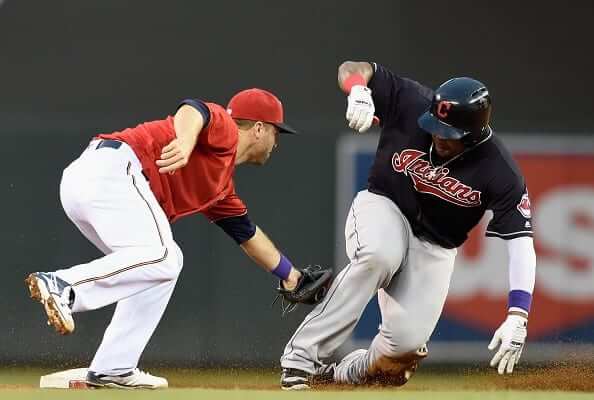
Last night’s Twins/Indians game was Minnesota’s first home date since Prince’s death, and the team’s management declared that it was “Prince Tribute Night,” so most players on the field — not just the Twins but also many of the Indians — wore purple wristbands (see above).
Here are some shots from the game (if you can’t see the slideshow below, click here):
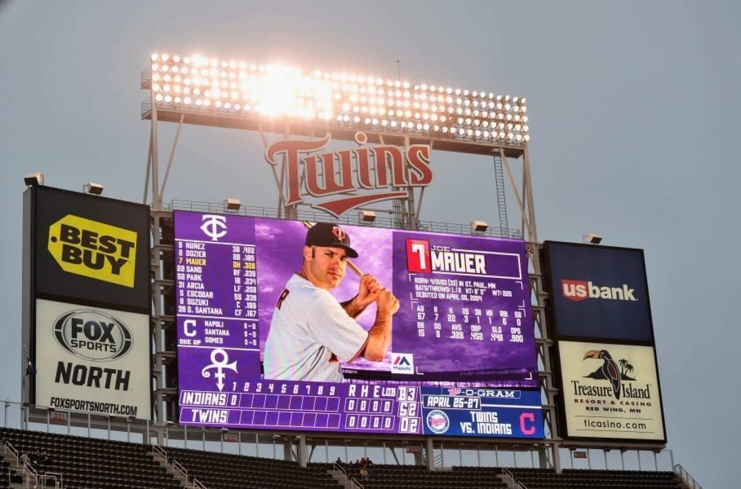
In addition, the Target Field scoreboard had a purple motif:
Also, they released a bunch of doves during a pregame ceremony:
The @Twins honor the life of Prince with releasing doves. Beautiful. pic.twitter.com/IHqip8eSXf
— Dan Edwards (@ImDanEdwards) April 26, 2016
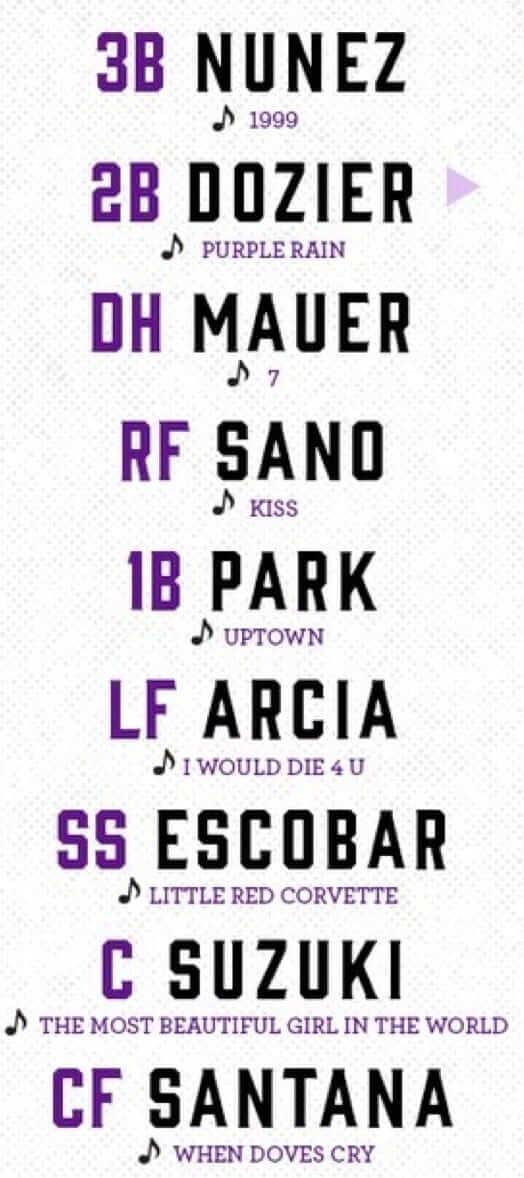
Also-also, each Twins player chose a Prince song for his walk-up music:
This was all very nice — a good one-off tribute to one of the city’s favorite sons. But for some fans it wasn’t enough. Last night I had people telling me the Twins should have worn purple unis, that they should wear a purple armband for the rest of the season, and more. Come on, people — know when to say when.
(My thanks to Mike Chamernik for his assistance with this entry.)

Call for Question Time questions: It’s been nearly two years (!) since we did a round of Question Time, where you get to ask me anything about anything — uniforms, sports, the blog, life, whatever. So let’s get set for a new round.
Here’s how it works: All of you are welcome to submit one (and only one) question to me, about any topic you like. Personal questions are fine, although I reserve the right not to answer ones that I think are too personal. I’ll get to as many of them as I can in a future post.
Send your questions — again, just one per reader, please — here. Thanks.
Collector’s Corner
By Brinke Gurthrie
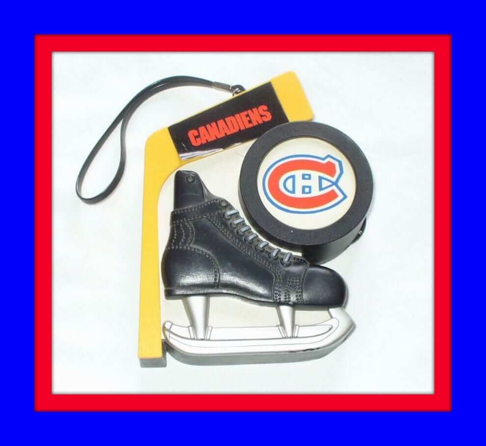
Never seen one of these before, and it’s a great idea: You buy this radio that has a skate, puck, and stick, and then you can customize it with your favorite team’s stickers! The listing doesn’t say if the radio works, but this is still pretty cool.
Now for the rest of the week:
• How about the logos on this 1970s NBA bath towel, eh?
• Boy, did I love media guides growing up. I never failed to nab the Reds and Bengals editions whenever they popped up in the bookstore, and I would write to the various NFL and MLB teams, begging them to send media guides or stickers. The artwork for these guides varied from plain to groovy, too. Check out this great 1967 Chicago Bears guide. Nothing fancy, but when you look at it, you know who it is, right? I also distinctly remember this one from the Dolphins in 1973 — one of my favorites back then. I think I liked it due to the striping.
• See this 1970s Washington Capitals thermal cup? I was always bugged by this logo, and I’ll tell you why: It’s the square that makes the dot on the “I” and the two squares that form the cross of the “T.” Those three squares in sequence always bothered me.
• (Baltimore) Colts fans, show your support for your team (no matter what the city) with this 1970s WCBM booster button.
• This 1967 NHL drinking glass includes logos from that season’s league expansion.
• Nice artwork on this late-1960s St. Louis (football) Cardinals poster.
• This 1967 L.A. Rams signed team football hasn’t aged too well — it sorta looks like a big piece of Lemonhead candy — but look how they lettered that sucker.
• “You will never see another one” — I love the melodrama of some of these eBay listings. This late-1960s or early-’70s Philadelphia Eagles desk set almost looks DIY to me (which means the “You’ll never see another one” claim would be true!), but who knows.
• This 1969 Converse ad says these sneakers are “the closest thing to spikes.” So why wouldn’t you just buy conventional spikes instead, if you’re playing Little League? In any case, when you’re “Out to Beat the World,” you want the Lou Brock L.T. (that Lateral Traction).
• If “Hockey Is Your Game,” then you’ll want this 1970s Islanders T-shirt.
• This listing says: “American Men, Shape Up With Supp-hose.” There’s Johnny U., for some reason — can’t really see a connection to him, though. Willie Mays is on there, too.
• Here’s a 1970s-’80s L.A. Dodgers seat cushion.
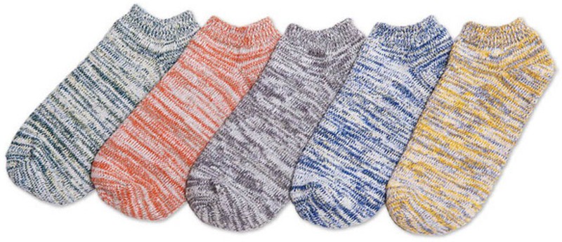
Uni Watch sock discount: Our friends at American Trench are offering a special deal for Uni Watch readers on their summer footies (shown at right; click to enlarge). For any pair of socks or combo pack in this product line, use the checkout code FOOTIEMAY to get $3 off. As always with American Trench, the socks are made in the USA and the shipping is free.
As I’ve said many times, I believe strongly in American Trench and am proud to have them as an advertiser on the site. I’m wearing a pair of their socks right now, in fact — really! When I call them out for special attention like this, it’s not because they paid me extra or anything like that. It’s because I genuinely believe in the company and the product. Please consider them for your sock needs. Thanks.
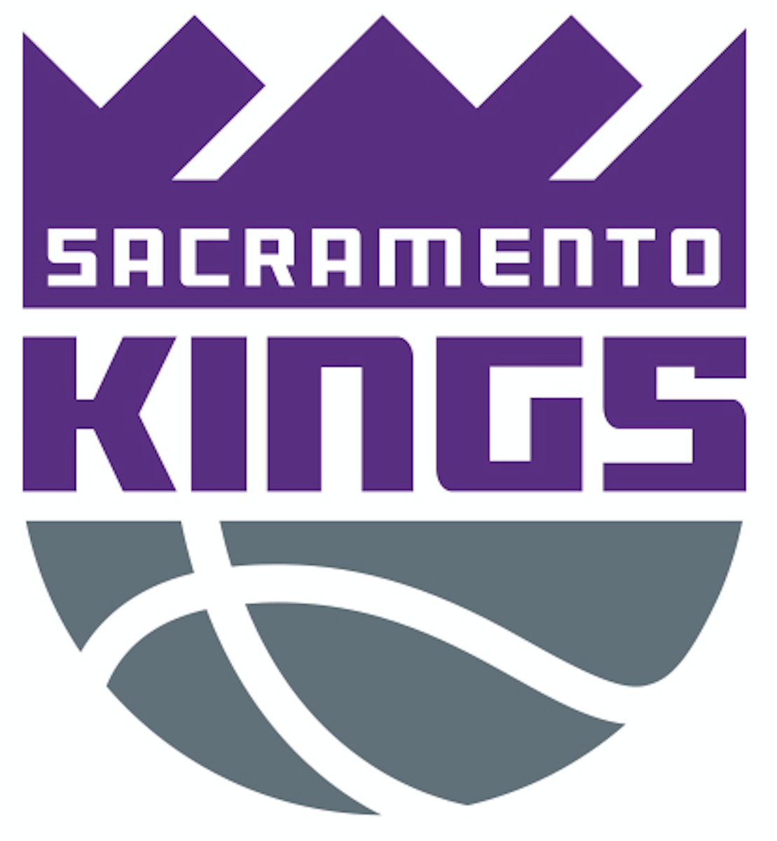
Kings for a day: The Sacramento Kings unveiled a new logo set today. I have all the details in this ESPN piece. We’ll discuss the logos in greater detail here on the blog tomorrow.
The Ticker
By Mike Chamernik

Baseball News: The Navy is set to dump its blue-and-gray camos. That’s bad news for the Padres, who based their new alts off of them (from Denver Gregg). … Also regarding the Padres, things can get ugly when they mix-and-match uniform elements. That’s Derek Norris wearing his normal home catching equipment with the home fauxbacks (from Russ Havens). … Bryce Harper took a selfie behind an unsuspecting fan wearing his jersey (from Matt Shevin). … “The Jays dugout always has this wide-open storage box on the bench and I finally decided to sit right in front of my paused TV screen and try to figure it out,” says Marc Bauche. From what he can decipher, Marc says the upper bin looks like it has, among other items, bandages, Aleve/Tylenol/Advil, electrolytes, and ammonia in it. The lower bin has eye wash, nail clippers, lip balm, allergy medication, and eye black. … Busted! A fan at yesterday’s Blue Jays game used Scotch tape to adhere his hat brim sticker. If you’re going to do that, loop the tape so it’s double-sided and place it under the sticker. … I pretty much needed binoculars to look at my computer screen for this, but White Sox manager Robin Ventura wore stirrups last night (from @simon_shargot). .. It’s interesting that the Diamondbacks have mapped out which uniforms they’ll be wearing for the rest of the week (see the lower middle area of the page). It’s even more interesting that the uni schedule lists them as having a game on April 31 (from Ed Kendrick).

Pro Football News: The CFL will unveil its new Adidas jerseys on May 12 (a few readers sent that in). … The CFL’s Winnipeg Blue Bombers have a new royal blue facemask (from Patrick Thomas). … The Ravens say that the Maryland flag will not be part of their Color Rush unis, meaning a “leak” from a few weeks ago wasn’t a leak at all — just someone’s concept.

Hockey News: More evidence is piling up that the Penguins are switching back to their old logo with the black-and-Pittsburgh-Gold color scheme. … NBCSN showed a mix of current and outdated Blues jerseys in one of the commercial bumpers last night. The Blues changed jerseys in 2014. … You still have a few hours left to vote for the best international hockey jersey: the championship round is France vs. Latvia. The full bracket can be seen here (from John Muir).

NBA News: Check out these retro Pistons earrings made from trading cards (from David Firestone). … A Nuggets blogger argues that his team needs a new logo.

Soccer News: Here are the kits for Toledo United, a first-year team in the Premier League of America (from Peter Schinkai). … Tottenham Hotspur wore special edition home shirts last night in support of the AIA Sharing a Life campaign, which educates 70,000 people in Thailand about how to spot signs of breast cancer (from Neil MacLeod). … New third kit for Portland Timbers 2 (from Patrick Thomas).

Grab Bag: TaylorMade Golf will have PGA Tour players wear a modified logo this week to promote iron sales. … The U.S. rowing team will wear uniforms made in America by Boathouse Sports (from Phil). … Maryland lacrosse wore 1975 throwbacks over the weekend. The Terps won the national title that year (from Matt Shevin). … Eric Wright is not a fan of the lacrosse unis for Sparta (N.J.) High School. … Emerson College’s president is telling students that the school’s new logo isn’t really that bad, but that looks like it might be a losing argument (from Jordan Mayblum). … This week at the North America qualifying event, the Tennis Canada junior teams will wear a Bruno Agostinelli memorial patch. He played for Canada’s Davis Cup team, and he died in a motorcycle crash in Toronto in March (from Alex DeMuth).
The D-BACHS not only have more uniforms than any team in the league, their months have more days too.
Ha!
I was reading the post on the Pirates wearing their throwbacks and have a question: It always seems to be an issue here when there are some inaccuracies or the players wear their pants pajama style. My question is are we supposed to see these as throwbacks or historical recreations? The nitpicking almost makes it feel like we are finding faults in a Civil War re-enactment instead of a team wearing a throwback uniform.
I’m not sure that there’s much of a difference between a throwback and a “historical re-enactment” in the context of sports uniforms. The idea is that the team is wearing the uniform from a previous year. In the case of football or basketball, uniform styles and equipment have changed a bit and we generally accept the inaccuracies that result from it (facemasks, shorter sleeves, longer shorts, etc). With baseball… things haven’t really changed that much, so we tend to expect a higher level of accuracy.
I think there are certain aspects of the uniform that we should expect total accuracy. I don’t feel like deducting points because players don’t wear uniforms the same way should be one of them. I have no problem with the addition of striped socks or if they are wearing a more modern version of a pillbox cap. As much as we don’t like it here, merchandise does have a factor in it and no one is going to buy an actual pillbox cap. I am not referring to the material the uniforms are made from, I would never expect them to keep it to that level of accuracy, but I don’t see them as re-enactments.
As much as we don’t like it here, merchandise does have a factor in it and no one is going to buy an actual pillbox cap.
Yes, duh, we know merchandising has “a factor in it.” That doesn’t make it acceptable for the merchandising tail to wag the on-field dog. That arrangement happens to suck. Sometimes it sucks because it leads to a parade of unnecessary uniforms that never should have existed in the first place, and sometimes — as in the case currently under discussion — it sucks because it leads to design compromises that ruin a throwback. And when something sucks, it’s perfectly reasonable to say, “Hey, that sucks.”
and no one is going to buy an actual pillbox cap
If I were a Pirates fan, I would totally want a true pillbox cap.
“duh”? Really?
I think there are plenty of examples where you can say something works or it doesn’t work, or in your words, sucks or doesn’t suck. I however don’t expect a 100% recreation of a uniform, just as long as they hit the big points that stood out and made that uniform great or unique. If there is a new twist or modification that works with today’s style, then so be it.
I will say that some of these throwbacks look ridiculous, primarily the negro league throwbacks that are baggy and don’t look at all comfortable to play in. Are they “historically accurate”? Yes, I suppose they are more than a lot of others. Does it make sense? No.
First off, what the Pirates wore in the 1970s and ’80s is “a modern version of a pillbox cap.” Second, in point of anecdotal fact, actual pillbox caps do sell. Pirates were among the teams I liked to see play in Washington – good odds of a Nats win, even when the Nats were at their worst – and I’d always see a few visiting fans in pillbox Pirates caps. Also, back in the day, Bucs pillbox caps were by far the most popular cap among boys my age, in both Philly and the upper Midwest, and one of the only on-field-style caps boys sought out back in the days when on-field merchandise was rare. Bucs pillbox was the only team cap I really ever saw boys my age wear as a fashion statement, rather than team loyalty statement, before the ’91 White Sox cap.
As for Pittsburgh’s new slouch-style caps, who would want that as a thing to wear? It’s just a regular 5950 that doesn’t fit right and looks funny, like a factory sewing accident or a child’s Civil War souvenir hat. It looks actively uncomfortable.
You haven’t really asked a question, Todd — you’ve made a statement.
That said, I agree that there’s a line to be drawn between (a) a throwback that gets the spirit of the design right and (b) nitpicking. But I also think we each draw that line in a different place — what’s nitpicky to you might be a perfectly reasonable standard to someone else.
I suspect there are some things most of us can agree on. For example, I don’t think many people (or perhaps ANY people) expect throwbacks to be true to the original uniform’s fabric. We accept that a 1940s throwback will be made of polyester with tackle twill graphics — not flannel with felt. That seems like a reasonable concession to modernity.
But for many of us (myself included), going with pajama pants takes a lot of the fun out of a throwback. That style of wearing a uniform simply didn’t exist back when the original uniforms were worn. Do I think a player should be *required* to go high-cuffed when wearing a throwback? Personally, no — the player should wear the uniform in the way that makes him most comfortable, so he can perform at his best. But that doesn’t mean I can’t be disappointed by his choice, nor does it mean I can’t express that disappointment.
there is certainly a question in my post. Are we to treat them as throwbacks, as in modern players wearing a modern style of a retro look or are we to take them as a re-enactment of the original uniforms?
Seems like a distinction without a difference, Todd.
see my post above referring to the negro league throwbacks. If you ask me, They look silly. They are baggy and look like a pain in the ass to play baseball in. But they hit the notes for being accurate in a historic means. I don’t care to see that from baseball players. I want to see them wearing a style that will allow them to play to the best of their ability.
How much does this get into the “equipment vs. uniform” question?
I don’t think there’s ever the expectation equipment will be used in a “throwback” sense. You won’t see guys wearing 1930’s catcher’s gear and going without batting helmets anytime soon.
But I think there’s a feeling, here, that pants are a part of the uniform, and a throwback uniform should look how it did when it originated. But maybe others feel different and see pants as equipment.
I, personally, always preferred to go high-cuffed* when I played. It was just more comfortable to me. I tried long pants and I didn’t like the feel, not to mention that if I wore them as long as the guys sometimes do now, I’d have been afraid of tripping myself.
But I also see the throwbacks with the sleeves that go beyond the elbows and say to myself, “That would really annoy me to have a sleeve flopping around my elbow as I was trying to throw. I could see that effecting my game negatively.”
Ultimately, the goal is to win the game, right? So if a guy thinks he’ll play better in pajama pants, or is more comfortable, or whatever, I guess we should let him wear them. But yeah, I don’t necessarily get why a guy would see pajama pants as better for his performance, so I don’t know if I totally get why a guy would feel that way.
* – I didn’t go stirruped, however. Bad experience with the first pair I was given. I was one of the last to get a uniform for the first team I played for who had them. The only stirrups left by the time I got to that box were so old and used that the part that goes under the foot had hardened and bunched up. Wearing them would have felt like having a big lump under the arch of my foot. Kind of like when you get sick after you go to a restaurant the first time, that turned me off to stirrups for good.
I think there’s a feeling, here, that pants are a part of the uniform…
Wait a minute — is there anyone, anywhere, who thinks pants are NOT part of the uniform? Seriously?
I know we’ve blurred a lot of lines over the years, and I also know there are people who think something doesn’t matter or doesn’t count if it isn’t available for sale. But come on!
Hey, pants are available for sale. I was rather proud I was able to find these authentic beauties for Halloween and had them tailored up to make ’em look darn good. link
A shame they don’t wear the stripes anymore.
I’m not saying *I* think pants aren’t part of the uniform. It’s not like you can take the field in different-colored pants than the rest of your teammates. But maybe others do. Varying length, whether or not you use stirrups, whether you go with solid socks or striped socks. When there’s that much variation, the pants aren’t necessarily uniform in the dictionary sense.
I’m not saying it’s a tremendously palatable thought, but I think it needs to be considered.
Also, Happy Birthday Comrade Marshall
That hockey skate radio is pretty cool. And I love the fact that the Montreal manufacturers totally sticker-diss the Maple Leafs.
I would guess that the manufacturer couldn’t get the rights to use the Leafs logo from then-owner Harold Ballard.
Newsflash to that Denver fan. Stan Kroenke will only do what is financially beneficial to him, he doesn’t give a damn about his fans.
Hey I’m surprised (and glad) you aren’t calling your “Question Time” an “AMA session” (Ask Me Anything) like people do all the time now.
Wait, what? Is AMA a thing outside of reddit?
I’ve seen it on Twitter and Facebook…it’s disgusting.
“disgusting”?
How so?
Lee
I just don’t see the need to change the uniforms. Bulls, Celtics, Lakers, to me are the standards, and they’ve changed little over the years (discounting the Laker’s Sunday whites, the Celtics’ I don’t know what they are grays..)
Regarding the Lou Brock ad, I would guess the idea was to promote the shoes as working just as well as metal spikes, which have long been illegal in Little League and other youth leagues (with today’s youth sports insanity things may have changed, but back in my day you could not wear metal spikes until age 13).
Right. Also, not every parent was able to, or inclined to, buy a kid a special pair of shoes just to play baseball, when one good pair of sneakers would get you through all the activities of an entire summer before you outgrew them. I played years of Little League in the 60s and hardly anyone wore cleats.
Funny, I played through the 70’s and while everyone wore cleats, no one wore baseball pants for practice. (Except me – catching BP was awful while wearing jeans.) Now every kid wears baseball pants for practice.
Russ, I played in the 1970s as well. My son and daughter play today.
Let me just say that everything has changed. Not just spikes and pants but everything. Every kid has their own helmet and bat. Every kid has cleats. There are kids (7 years old) that desperately want to be catchers and have their own gear and try to use the fact they have gear to force the coach to let them be catcher. Every kid has batting gloves – or perhaps both batting gloves and fielding gloves, I’m not sure.
My kids don’t have batting gloves or their own bats or helmets, because I’m the worst dad in the world (so I’m told). But mostly because I want them to practice hitting and catching, not spending their game screwing around with their gear.
In the 1980s in Philly and Minnesota, pants and socks were for game day only. Jeans for practice. Batting gloves were an affectation that every kid wanted but few had. I don’t remember a kid before high school owning his own helmet. I don’t recall owning a bat of my own, since the team always had a good supply of bats and just enough helmets to go around. (Also, right as I was reaching the level where it made sense to own a bat, youth ball was switching from wood to metal, and I was getting out of the game anyway.)
Cleats, cup, glove. That was pretty much it for the equipment kids brought to games.
Coaching first graders in Chicago in 1999, most kids had batting gloves, a few had their own bats, but none brought their own helmets. Not even the really talented kid with the crazily obsessed parents. And most kids wore their baseball pants to practice, something I don’t recall noticing as unusual at the time. (I was more focused on things like getting them to remember which hand goes on top on the bat.)
The ad even points out that they’re good for baseball and all-around activity.
I was always bugged by this logo, and I’ll tell you why: It’s the square that makes the dot on the “I” and the two squares that form the cross of the “T.” Those three squares in sequence always bothered me.
A friend of mine used to say, “Who are the Capilals?” I don’t know; it seems the prevailing condition of the Caps’ original logo was that it resemble the Capital Centre insignia. Since the letters lean left, they probably should have made the hockey stick the bottom half of the “C”. If you have OCD, you shouldn’t waste too much time on their symbol.
I personally don’t have an issue with the Capitals’ original logo, but I think I can see where Brinke is coming from.
In most typefaces, the cross stroke of the lower-case t will be at the x-height. On this logo, though, the cross is even with the dot of the i, which is above the x-height. However, because the t itself is unusually large – nearly three times as tall as the l – it doesn’t bother me as much.
Now, the Caps’ current logo, with the stunted i whose dot doesn’t cross the x-height… that bugs me a bit. That, and the bland “WASHINGTON” font.
Noticed that Bryce Harper was wearing a cap with a certain dreaded NFL team in his selfie. Clearly a clown move, bro…
Would a Capitals’ or Wizards’ hat have caused less heartburn? I’m not a Bryce Harper fan by any stretch, but I happen to have my ‘Skins hat on today.
I thought it was cool he was supporting a local team. Way cooler than a guy like Lebron wearing a Yankees hat while playing in Cleveland.
Penguins and Brewers – could 2017 be the year of pro teams ditching metallic gold for yellow?
Good point. 2017: The death of Vegas gold.
For the guy with brim sticker on top of his cap, double sided tape would work best… It would lay flat…
How about he just not be a douche and take the sticker off before he wears the cap.
“Come on, people – know when to say when.”
This could be a statement for our society in general. Something is usually special because of the rarity in it, not because it is different. If the Twins wore purple all season long, would that not be the new normal and no longer a tribute? We get caught up in this consumer attitude that we always need more of anything special. This has spilled into sports and now most uniform tributes seem pointless because there are so many of them. Lite blue, pink, purple, camo, stars and stripes, gold lettering…kind of goes against the definition of “uniform.”
I better stop now before I write a thesis on contemporary American consumerist attitudes…
It wouldn’t be “the new normal,” but it would be a year-long tribute, which are becoming more common. Nonetheless, tributes getting bigger and longer is kind of a thing now. Call it “tribute creep,” I guess. It’s not enough to do a moment of silence; you have to have a patch. It’s not enough to do a patch; you have to have a dugout/bullpen decal, and base logos, and a special ball. It’s not enough to do it for a day or a week; you have to do it for the rest of the year (or, for some late NFL owners, into perpetuity). Paul’s spoken to this before.
In an age where so much of culture is disposable, I suppose more and more has to be done for something or someone to be “remembered.” But, the problem is that a lot of the tributes feel rather disposable in the end, too.
As to all the “special” uniforms, I find these kind of counterintuitive in a way. We live in an economy of attention, right? It’s increasingly difficult to be heard or understood among the din. I suppose special uniforms are a way to get people’s attention, but I also think people reach a point of fatigue eventually.
Even with alts and regular throwbacks and whatnot, it’s gotten pretty crazy. Look at your average Brewers crowd now: You have three sets of colors that are worn regularly (navy and metallic gold, navy and yellow and blue and yellow) before you even get to the specialty items. Look in a Brewers crowd and you see a hodgepodge of colors and logos.
I suppose the club doesn’t mind because they’ll take the money, no matter what colors the fans buy. But part of what’s great about sports is coming together as a community. And part of good marketing, especially when you’re dealing with a lot of competing interests, is having a strong, easily identifiable, cohesive brand. Are you really coming together as a community if everyone’s wearing different colors? And having three different sets of colors and logos really a strong, cohesive brand? Or just a hackneyed one?
What’s the “strongest” brand in baseball? You guessed it, the one that’s been the most consistent — the Yankees’. Yes, winning has had a lot to do with it, but also, they haven’t messed with the pinstripes and it’s worked for them. There’s no doubting you’re looking at a Yankee uniform when you see it.
I dunno. I keep thinking we’re going to see a swing back away from the alts and whatnot at some point. It’d be a radical, strong statement for a team to make — “This is our brand, and part of our brand is that we don’t feel the need to mess with such foolishness.” But we don’t seem to. It doesn’t seem to make sense to me.
There are definitely two camps in the baseball world. On one hand you have the teams that have kept their look the same and for the last 25 years have been almost unchanged (Yankees/Dodgers/Mariners/Tigers/Braves/Red Sox) and then you have the other end of the spectrum where I can’t tell you what their main uniform is (Diamondbacks/Milwaukee/Rays/Padres/As).
But to the point of the everlasting tribute, is the purple armband tribute less of a tribute today compared to what it would have meant 50 years ago?
How come the Braves and Red Sox, who wear numerous alts of various colors, are considered unchanged?
Fifty years ago, a simple black armband or ribbon would have been as far as a tribute would have gone. Maybe a scoreboard note on the Twins-O-Gram and/or a moment of silence.
Now, purple accessories, graphics, special walk-up songs, etc. The level of tribute now, for a pop artist, is beyond what the level of tribute would have been for a team owner or U.S. president once upon a time.
Seconded. Paul’s comments about “ratcheting” have not gone unheeded. We as a culture experience spasms of equating quantity with quality. “If I like baseball uniforms a lot, it follows that I would like a lot of baseball uniforms.” Do your part, and say no.
Twins should have worn their home whites for the Prince tribute. First, their current navy script with red outline looks purple. Could have turned that bug into a feature for a day. Second, all the purple accessories would have had more visual impact against a white uni than against a red jersey.
Agreed. The purple with the red uni is not a good look at all.
And miss an opportunity to jam their “special” new red unis down our throats again? Gahhh, I hate them.
A plain red shirt with an insignia on the left breast? Not original, perhaps, but link. The more I see the jersey, and the Twins playing baseball, the less I am able to think of that jersey in any other terms.
As an occasionally worn alt, the Red Shirt jersey isn’t the worst thing ever. But as an everyday jersey, it’s pretty bad. The best thing in its favor is that the Twins’ regular home whites and road grays are disasters, too, so it’s not like they’re a good-looking team that’s dressing down.
The very minute the announced that those red jerseys were only to be worn on Fridays, I literally laughed out loud. I knew that there would be no way for them to resist wearing them constantly. Which is fine. Just don’t pretend they are going to be for a certain day of the week only, and then immediately wear them on your very first Monday home game, Prince night etc…
F’ing Twins…
Maybe it’s a reference to Little Red Corvette?
Always with the auto references, David! ;)
And the red alt cap is the Twins version of a raspberry beret?
On the Diamondbacks info, there’s two #39s.
The Sacramento Kings have just unveiled a new logo set. I have all the details in this ESPN piece:
link
Paul,
“The inclusion of both Nike and adidas on the project is unusual…”
Did the Kings have adidas and Nike collaborate on the design, or did they have adidas verify the design could be done now and Nike verify it can be done next year?
Nike and adidas are vendors performing a service for a client so wouldn’t they adhere to the wishes of the Kings?
I’m not privy to all the particulars, John. But I think your supposition is reasonable.
Sacramento isn’t a big market or a dynastic franchise, but if they can get Nike to agree to replicate an adidas product doesn’t that show even the Lifestyle Manufacturers can be put on a leash?
The Kings do not have to “get Nike to agree” to anything. The Kings are the client; Nike is the vendor. Nike cannot impose a design on the Kings, or on any other pro team.
I would assume that Rare Designs handled the details of the logo, and the primary reason Adidas and Nike were involved at all was to ensure proper color-matching for their respective fabrics. I’m sure they don’t want an issue like there was with the Eagles when they switched to Nike’s modern stuff.
Ticker typo alert in Baseball section: “A fan at yesterday’s Blue Jays game used Scotch tape to adhere his hat brim sticker. If you’re going to do that, loop the tape so it’s double-sided and place it under the sticker.”
This should read as follows: “A fan at yesterday’s Blue Jays game used Scotch tape to adhere his hat brim sticker. If you’re going to do that, stop, spend significant time reflecting on how, why, & when your life went so tragically awry, and pledge to yourself, your nation, and your god that you will try with every ounce of your being to be a better person going forward.”
I assume everyone has seen the Key & Peele sketch where they one-up each other’s hat “sticker-ness”?
link
Paul, is the “you can buy the Kings’ new stuff now” statement at the end of your ESPN piece a boilerplate addition your editor(s) requested after the fact? I’ve been noticing lately that more and more teams are pushing fans to buy merch with redesign press releases. I know ESPN and the blog are different places you write with different voices, but still caught me off guard.
I think the Hawks were the first time I was actually annoyed by this practice. At the end of their press release they basically said “be a real fan and buy our stuff”: link
That’s the first time I can remember a team being shameless about it, anyway.
Nobody asked me to include it.
I usually prefer not to include such info. I did it in this case for two reasons:
1) I don’t like it when a news story ends with a quote, so I wanted to add another bit of info at the end that wasn’t quote-driven.
2) I’ve learned that if I don’t include something like that in an ESPN story, I’ll get tons of emails/tweets asking me, “Where can I buy it?!”
There’s something about the new Kings logo that’s unsettling. The extra-large white gaps that were thin lines in the previous version are grabbing my eye and not letting it go. Instead of making the logo look like a crown (in the old version), it looks like a slanted skyline to me now, or maybe a mountain range. Weirdly unsettling.
I’m pretty sure that’s the point. It’s meant to reflect a crown while hinting at the Sierra Nevada.
I’m sure the thicker white lines are to ensure that the logo scales down properly for all applications.
Totally overlooked by people saying the Purple wristbands look bad with the Red jerseys, and by your piece, is that the team wore Red and Blue, which combine together to make purple on the color wheel. Could have been coincidence, but I find it hard to believe they accidentally chose the two colors that make purple.
I read a news article about how Cherios got chastised for posting a simple “rest in piece” tweet where the “i” was dotted with a cherio. How was that any different than the tweets that the Twins and Wild put out with their logos in purple? It’s not okay to thinly veil marketing with a tribute in order to sell cereal, but it’s okay if you’re selling tickets?
Don’t get me wrong, I think all three companies had their hearts in the right place… And all are based in Minnesota. It’s just interesting that the general public sets different standards for sports teams than for other corporations.
I think this speaks to something I’ve been talking about for years, name that sports teams are perceived as (and, in fact, ARE) more than just business entities. They are also civic entities.
That Emerson logo looks more like a logo for a cancer research foundation.
I’ll come right out and say I love the new Kings’ iconography. Especially the lion+crown symbols which I confess I was picking as the new Detroit Lions helmet sticker (minus the basketball). We’re stingy with our praise here, but well played.
Happy Birthday, Robert Marshall!
Love the new Kings look*. I will always have a special place in my heart for the Kansas City Kings, but I no longer pine for them to return. Sacramento has been the best** and longest stop in the Royals/Kings’ wandering history, so I hope they stick around and keep this look for a long time.
*I’d love it even more if there weren’t going to be ads on the jerseys, but what ya gonna do…
**OK, their lone title came way back in the Rochester days, but the fan support has been unmatched since settling in California. And they’ve had some pretty good seasons in the 2000s
Talk about a fauxback.
In 1975, Maryland Lacrosse had white helmets and red shorts.
They got it backwards.
aw, no ‘Raspberry Beret’ walk-up? That’s my favorite!