Click to enlarge
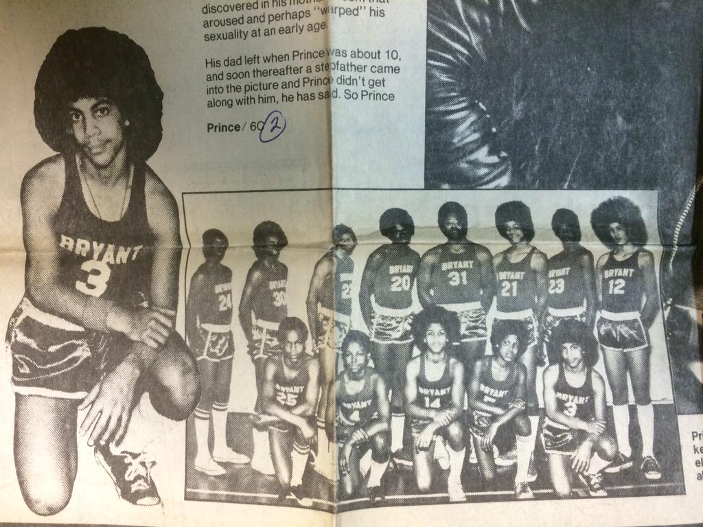
Who’s that in the 1972 Bryant Junior High hoops uni? None other than Prince Rogers Nelson, who played a bit of basketball while growing up in Minnesota before becoming a world-changing musical figure and then passing away yesterday at the age of 57.
The news of Prince’s death had barely begun circulating when the Fresno Grizzlies announced that they’d be memorializing him by wearing purple uniforms. And sure enough, that’s what they did:
Other teams paid tribute to Prince on social media, and at least one — Minnesota United FC — used uni-centric imagery:
Fitting that it's raining in Minneapolis today. pic.twitter.com/s5KFurDhHi
— Minnesota Twins (@Twins) April 21, 2016
#Vikings issue response to news of Prince's death.
READ: https://t.co/7DtrKzqvyq pic.twitter.com/gGqrtJpn8P
— Minnesota Vikings (@Vikings) April 21, 2016
#RIP Prince, a Minnesota legend. pic.twitter.com/7GL6BXsn1D
— Minnesota United FC (@MNUnitedFC) April 21, 2016
Other notes:
• The last time Prince attended a sporting event was just last month, at a Thunder/Warriors game in Oakland:
• Prince’s half-brother played college hoops for a team that wore untucked jerseys:
And here is Prince's half-brother, Duane Nelson, front row, second from right (2nd of 2).
This is '78-79 team photo. pic.twitter.com/Is8TLBKcNw— Milwaukee Panthers (@MKEPanthers) April 21, 2016
Lots of people asked yesterday if I disliked Prince’s music because of his signature color. And the answer, of course, is no — musical genius transcends chromatic tastes.
Many people also asked if I’ll be honoring Prince by extending our annual Purple Amnesty Day — the one day of the year when I accept orders for purple-inclusive Uni Watch membership cards, which normally takes place on the website’s anniversary (May 17). And the answer there is also no. The whole point of Purple Amnesty Day is that it’s just one day, once a year, and it’s tied to the site’s history, not to outside events. I mourn Prince’s death as much as anyone, but we won’t be changing that protocol.
Anyway: Sad news. RIP.

Friday Flashback: With the Pirates having recently debuted their 1979 throwbacks, my latest Friday Flashback piece on ESPN takes a closer look at the Buccos’ mix-and-match set from that era (including the pinstripes-over-gold option, shown above, which happens to be my favorite of the nine possible combos). Check it out here.
And speaking of the Pirates”¦: A reader who prefers to remain nameless recently had an interaction with a Pirates staffer, which he describes like so:
[The staffer] said the Pirates were designing a potential new look for 2017, although it might not come out until ’18. [The staffer] said they have a design team who then shows it to management, then to MLB, and then Clint Hurdle and a group of players (can’t remember if Clint was the second or last step).
I can confirm that this reader is trustworthy so I believe his account. Of course, the info from the Pirates staffer could be wrong, and a lot of best-laid plans end up getting scrapped anyway. But it’s interesting to hear that the Pirates might have a new look in the works.
Gromm•It update: For those who’ve been wondering (which is probably nobody, but hey, just in case), the reason I haven’t been posting any Gromm•It updates lately is that the project is done. It was really fun, but I could tell early on that it would probably run its course in the span of a couple of months, and that’s exactly what happened.
Thanks for all the feedback (and my apologies to those who were skeeved out along the way). This was the first purely visual project I’ve ever done, so it was very interesting to flex a different set of creative muscles.
The full project remains available here.
The Ticker
By Paul

’Skins Watch: “Colorado Public Radio did a pretty lengthy panel discussion on the issue of Indian mascots, talking with a principal of a school that’s debating changing its team name, the student body secretary who’s been heavily involved in it, and a member of the Northern Arapahoe tribe,” says Tyler Maun. “That discussion was spurred/enhanced by a decision from a panel convened by the governor to encourage schools to stop using Native American mascots.”

Baseball News: A pitch from Pirates starter Jeff Locke ended up in the ump’s pocket the other night (from Chris Flinn). ”¦ The band Ween is promoting an upcoming show in Philadelphia with a Phanatic-themed graphic.(from Alex Carlson). ”¦ The Cardinals are auctioning off a bunch of Blues-themed BP jerseys (from Jacob Bischoff). ”¦ LSU is retiring Eddy Furniss’s No. 36. ”¦ Pink unis on May 7 for the Salt Lake Bees. ”¦ The Columbus Clippers let fans vote on which jersey they should wear last night. Here’s the winner”¦ The Red Sox wore Earth Day patches yesterday. According to Bill Henderson’s guide, they had previously worn that patch in 2008 and ’09, but not since then. ”¦ “Atlanta-based sports design agency Hartwell Studio Works has created a pretend baseball league, complete with very thoughtfully designed logos and uniforms for each quirky team, plus news stories and even 3D ballpark renderings,” says Charles Noerenberg. “They even made a championship logo for the league champ! Really fun and stuff, a lot to dive into.” ”¦ Brutal G.I. Joe jerseys for the Indianapolis Indians. ”¦ No helmet logo, raised or otherwise, for Dodgers C Yasmani Grandal. ”¦ In this clip from the Mariners’ first TATC game in 1998 (the one that served as the model for the MLB-wide TATC program in ’99), you can see the M’s outfielders were wearing their caps backwards (from Matt Steinmetz). ”¦ Picture-perfect striped stirrups for Penn State pitcher Eli Habholz (from Ben Beck). ”¦ Orioles OF Joey Rickard hit a ball through Blue Jays 3B Josh Donaldson’s glove last night (from Chris Flinn). ”¦ Former Chisox player Ralph Garr, talking about Bill Veeck and the infamous shorts: “It was very, very interesting. Mr. Veeck was very good to me. But there was no doubt there were a lot of crazy things going on. And as far as those shorts, I played just as hard as I did in long pants.’’ ”¦ The Mariners are doing a Jewish Community Night promotion that will include a giveaway T-shirt that says “Seattle Mariners” in Hebrew (from John Przebieglec.) ”¦ Someone in the Cubs dugout was wearing the wrong cap last night. ”¦ When we say, “color vs. color,” we’re usually talking about the jerseys, but here’s a case of where it involves the pants! ”¦ The Dodgers wore their “Los Angeles” road greys for the first time this season. They had worn the “Dodgers” script for their previous road games.

NFL News: Giants uni number news — and more pointless Color Rash speculation based on that “leaked” cheat sheet of questionable legitimacy — here. ”¦ No Color Rash in 2016 for Washington. ”¦ Here’s a look at the evolution of the football helmet over the years (from Dave Rakowski). ”¦ White whale alert: Broncos historian Tom Jacobsen recently acquired over two dozen game photos that show the team’s blue helmet logo from early 1962. Longtime readers will recall that the color of that logo was once a hotly disputed topic, and photos showing the blue logo remain rare. You can see a few of Tom’s newly found pics here. ”¦ Peyton Manning and Dale Earnhardt Jr. exchanged jerseys (from David Firestone). ”¦ Here are some renderings of a proposed new stadium for the Chargers (from Andrew Cosentino).
College Football News: Some Arkansas players have been wearing white helmet stripes during spring practice. It’s so coaches can see where their heads are pointed (from Stephen Boyd). ”¦ There are stretchy jerseys, and then there are really stretchy jerseys (from @synoptico). ”¦ Here’s North Dakota State’s FCS championship ring (from Josh Johnson). ”¦ Utah’s spring game will feature mono-red vs. mono-white (from @BBgunn42). ”¦ Possible new helmet for UCF (from UCF_Banneret).

Hockey News: Had drinks last night with Anthony Zych, the guy who designed all those great Blue Jackets posters this past season. He just moved to the NYC area and began working for the Devils. Smart fella — sounds like he has some cool stuff in mind for the Devils. ”¦ Scott Lederer notes that the Flyers have two different versions of their Ed Snider memorial patch — the outline color changes depending on which jersey it’s worn with. This isn’t unprecedented — there have been other memorial patches that have come in multiple versions, depending on which jersey they’ve been worn with — but it shows an impressive attention to detail on the Flyers’ part — and on Scott’s!

NBA News: NBA commish Adam Silver now says next season’s All-Star Game will have to be moved from Charlotte if North Carolina’s anti-LGBT law remains in effect. He had previously hedged on that question. Curt Schilling could not be reached for comment. ”¦ The Warriors are trademarking their trolley logo, which seems like something they would’ve done a long time ago, no? ”¦ The Texas Legends — that’s the Mavs’ D-League affiliate — have taken jersey sponsorship advertising to a whole new level (from @TheJRodTX). ”¦ Pretty cool Grizzlies soda display. Using the Crush cases for the eyes was a particularly nice touch (from Jason Cimon). ”¦ Here’s a day in the life of the Raptors’ equipment staff (thanks, Phil).

Soccer News: Tottenham’s new home kit may have leaked (from John Muir). ”¦ “My six-year-old was watching Napoli play the other day and noticed their socks,” says Christopher Hunt. “They have a white sock underneath the blue. Sure enough, without any encouragement from me, he sported that same look at his game last night. Makes a dad feel good.” ”¦ New uniforms for Tormenta FC.

Grab Bag: I’ve written several times about the role of the critic in cultural discussions. That topic has come up quite a bit over the past month or so in the movie world, as Batman v. Superman got consistently negative reviews but has nonetheless done extremely well at the box office. A piece in Variety suggests that this is basically a comeuppance for critics, but here’s a good rejoinder from a movie critic who explains that making or breaking a film’s commercial fortunes isn’t the critic’s job or concern. Recommended. ”¦ Cricket padding is getting more colorful. ”¦ Happy Passover to all who are observing.
How long have the Cubs been wearing a logo on the left thigh of their pants? Admittedly I don’t watch them too much, but I saw it last night.
Here, you can look it up yourself:
link
Almost 20 years and I’ve never noticed it. You really do uni-learn something new every day.
Thanks Paul!
two typos
– first link in Skins Watch
– Broncos 1962 helmet was orange
I meant blue helmet LOGO.
Now fixed.
Proofreading: “(from Chris Flinn.” No end paren.
Fixed.
I think that reeeelly stretchy jersey is actually a reeeeally stretchy undershirt.
I was thinking the same thing, but since the colors match pretty well it takes a while to figure it out.
Generally speaking I am not a big fan of Prince’s music, but I like him as a person. I don’t know overly much about him, but what I think I know, I like.
I am a trained musician and have played nearly every genre of music in my many years. I understand he was a musical genius to some degree, but can’t give an opinion since I haven’t listened to much of his stuff.
Sorry to see him go though.
I have similar mixed feelings about Prince’s music in that my appreciation isn’t necessarily correlated with enjoyment. Granted, even Prince’s lesser songs exhibit a level of compositional genius on a par with Duke Ellington. Prince is easily one of the handful of most talented musical artists in American history – it’s hard to think of anyone who’s even plausibly his equal beyond Ellington and Foster. But despite having almost all of Prince’s music through about 1998, I almost never put Prince songs onto playlists I actively listen to. Then yesterday afternoon and evening I streamed Minnesota Public Radio’s broadcast of much of Prince’s catalog in chronological order, and I was blown away. One of the most powerful bits of radio listening I’ve ever done. His music really rewards concentrated listening.
A lot of jazz and blues (and post-1900 classical) is like that for me: I don’t necessarily enjoy listening to more than a song or two at a time, unless I can take a really deep dive and devote close attention to it over several hours.
The Broncos picture link is a 404. :(
You sure about that? Appears to be working fine.
Here’s the link — try it from here:
link
Weird. I was able to get to it by taking the number off the end and causing a different error code, which gave me a link to the main page and then view it from there… and after doing that, the link works for me.
no probs for me.
Not sure if this is news or not for this site but MLB recently changed the “grand slam” to a “papa slam.”
link
“As part of the activation of the sponsorship deal through MLB.com, MLB social channels, MLB Network and MLB.TV, there will be live look-ins of games when the bases are loaded. The deal will see Papa John’s promoting across all media channels of MLB.”
link
WHORES!
Perhaps a Papa Slam could be when the bases are loaded and the batter pops up weakly to end the inning.
Call me “Walter Chapstick”.
I don’t get why people would think you wouldn’t like Prince because he liked purple, I always thought you just didn’t like purple in the sports world. Though even with that I think your stance has lightened a smidge.
I dislike purple in most design applications (cars, houses, clothing, yoga mats, etc.), not just in sports.
grape jelly?
That’s not design — that’s a natural color. As I have explained many, many times over the years, I actually think purple in nature is quite nice (violets, eggplants, etc.). But purple as a design element always feels like the diva of colors — tacky, loud, etc.
We’ve been thru all of this a jillion times. Let’s please move on. Thanks.
I dislike purple in most design applications (cars, houses, clothing, yoga mats, etc.), not just in sports.
Man I could just see someone moving in next to you if you lived in my town. We have a purple Victorian house with pink accent pieces, and they drove (for a while) a plum colored 1st gen Saturn. This was right by the D-1/2 high school that is purple/yellow.
Wasn’t the Cowboys Color Rash game from this past season their Thanksgiving Day game against Carolina?
link.
Their Thanksgiving Day beatdown against Carolina, to be precise.
;-)
The Friday Flashback is up:
link
The links at the bottom aren’t working.
Is that Gator basketball and NBA Andy DeClerque’s kid playing in the. Rockledge-Merritt Isl. baseball game?
What is this in response to? Don’t see any reference to MI/Rockledge baseball game.
In the Baseball News section, when reference is made to a color on color pants matchup near the bottom of the section. the link is –
link
Sorta surprised the Pirates would be considering an overhaul. I really like their current look. Hope this doesn’t mean a return of the ketchup bottle red.
I concur. Their current set is really strong, and they’ve even been wearing the back alt (which I dig, just overused) less this season.
Hey Paul, I’ve also been meaning to ask — when are you going to have another edition of Question Time? It’s one of my favorite segments and it feels like it’s been a while.
Thanks for the poke, Mike — I’ll put out a call for questions soon.
I’m a Prince fan, but not a mega-fan. Of all the fitting accolades and praise that will come his way (“genius”, “virtuoso”, “pan-sexual trickster-god”), the role I appreciated most was “provocateur”. As an artist, I especially loved his embracing of the ridiculous (brocaded assless toreador suit, anyone?), since the spark of creativity resides within the unexpected and contrary. I like to imagine his affinity for the accursed hue had less to do with the heraldic association with royalty, and more to do with the pan-racial expression, “It doesn’t matter if you’re black, white or purple.”
Paul, just an FYI: I’m getting a 403 Forbidden message when I click on the last three links in the ESPN article, the ones that show the Pirates previous three throwback looks.
Thanks. Will get them fixed.
Whatever the Pirates have in mind, I hope it includes changing the number font. The lettering is great, though…don’t mess with that.
There was a time when I could tell you my favorite bumblebee combo. Now I don’t think I can. They’re all good.
For years students at Strasburg High east of Denver have called themselves the “Indians” on the football field and the volleyball court. But recently names like that have drawn criticism nationwide and some in the school community wanted to know if the nickname is offensive to Indians who used to live in Colorado. Now the school has formed a partnership with the Northern Arapaho, who have blessed the use of the name “Indians,” helped the school reimagine its logo and will send tribal leaders to visit Strasburg Friday.
The best of all possible outcomes. Why do such situations usually get presented as a contest where one side has to win and one side has to lose?
Also of note is that Batman v. Superman despite making a lot of money, is still making less than what the studio had hoped for.
The role of the critic has become caricatured, in an era when anyone with a blog gets to say, “Your favorite thing is stupid, and you’re an idiot for liking it”. I would hope the sort of critics people pay attention to are those who are knowledgeable and do plenty of research, and can create a literate backdrop for the film/music/book/program in discussion.
That Holiday Baseball League thing was just weird. like, why only seven teams? That’s an odd number! And the Rushmore team’s jerseys are hideous
But the Commanders four-president mascot logos are something the Nats should do. The Nats already have very good caricatures of the four main Rushmore racing presidents and way too many alternate unis. So the team should pick one of its clown suits and pair it with caps that have racing prexy faces on them. One face per cap, players and coaches can wear whichever one they want.
Pitchers: Washington
Infielders: Lincoln
Outfielders: Jefferson
Coaches: Roosevelt
Rotate that on a game-by-game basis.
Swap outfielders and coaches, and I’m on board. Teddy = big stick.
Nebraska v. Nicholls State, logo twins!
link
Another notable aspect of that link: they kinda-sorta predicted the future of MLB pants, at least for link.
I wonder how long it took for Nike’s lawyers to send a letter to the Penn State athletic department about their pitcher wearing three-striped stirrups?
Sometimes Three Stripes are just link.
Strange how for a long time nobody could find a color pic of the Broncos logo. Now these great color shots vs Titans are available.
Didnt Prince do some uni art a while back here ? College or NFL football.
Like Rickos work.
And not having ever seen those Titans unis before, I think they’re really tasteful and pleasing.
It seems to me that the Dodgers script LA roads are now the alts. They rarely wore them last season. Wondering who makes the call on the road trips? The starting pitcher?
Alternate road uniforms almost make sense, to the degree that you need to have them cleaned less often. Which is the reason they’re grey in the first place. But I sure wish they’d excise the silly “LA” patch on the sleeve.
Just a thought on the Batman v. Superman piece and critics. The article posted in the ticker was written on 3/27, two days after the movie opened well. It was not written after it set records for Sunday BO decrease. It was not written after the film had shorter legs than an ant. It was not written after the movie had second, third, and fourth week box office returns that were literally half of comparable films, like the second Avengers, Iron Man 3, and The Dark Knight. All that we learned is that superhero movies have teflon opening day grosses, because the fan boys will show up regardless. But over the life of the film, the crap reviews have been echoed by the public at large and its crippled the financial returns. This was a movie that need to make $1 billion to be profitable, and it looks like it’ll stall at $900 million.
Since Paul brought up the role of the critic, I felt like I had to leave this classic quote:
“Critics are like eunuchs in a harem; they know how it’s done, they’ve seen it done every day, but they’re unable to do it themselves.”
― Brendan Behan
anybody else see the best part of the M’s and Royals clip? The advertisement for Office Depot on the outfield wall where Jay Buhner had his fielding error said something about a new location on Jupiter.
Re: Texas Legends.
It looks like the team is wearing a different color every night. So much for brand identity!
Kind of reminds you when FUBU reimagined Harlem Globetrotters tops a few years ago.