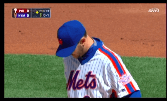
The Mets debuted their 1986 Sunday throwbacks yesterday. By happy coincidence, Matt Fratboy was pitching. He usually prefers to wear the blue softball tops, and the team usually obliges him, but the new Sunday throwback protocol took precedence over that. Memo Mets management: Can we please arrange for all of his subsequent home starts to take place on Sundays, just to cut down on the blue alts? Thanks.
A few notable things about the throwbacks:
• The Mets’ standard blue home cap has had an orange squatchee since 1995. Back in ’86, however, the squatchee was blue, and they got that detail right on the throwback:

I’m told that Mets radio broadcasters Howie Rose and Josh Lewin, both of whom definitely Get Itâ„¢, discussed this detail at length during the bottom of the 5th inning (“It was like a half-inning of uni-geekspeak awesome,” says reader Lawrence Comeau), although I wasn’t listening at the time.
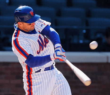
• In another period-appropriate headwear detail, the throwback caps had grey undervisors:

• Yet another headwear detail: The Mets have used raised orange helmet squatchees for their past few years. They’re little adhesive domes supplied by Pro Helmet Decals. But the helmet squatchees were nowhere to be seen yesterday:

That means equipment manager Kevin Kierst — or some kid on his staff — must have removed all of the helmet squatchees just for the throwback game (and will presumably restore them for tonight’s game against the Marlins). Good attention to detail!
• The MLB Style Guide shows the throwbacks being worn with high-cuffed pants and stirrups (and yes, they depicted the stirrups backwards, but that’s another issue). I was skeptical about the player actually following this guideline, and it turns out I was right: Most of the Mets were pajama-pantsed, and even the handful of high-cuffers wore solid stockings, not stirrups. Bummer.
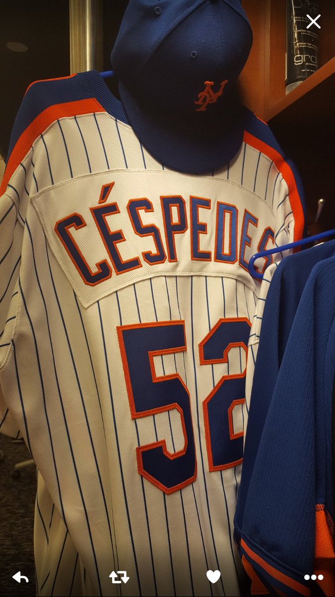
• The ’86 Mets wore non-pinstriped nameplates over their pinstriped jerseys — a terrible look, but of course they had to do it that way for the throwbacks:

The other interesting thing there is that they included the accent on Yoenis Céspedes’s NOB (and, presumably, on Bartolo Colón’s NOB as well). I’m pretty sure no MLB player had worn an accent on his NOB in 1986. Tildes, yes, but not accents. I’m not saying they shouldn’t have included the accents on the throwbacks for that reason, but I wonder if it’s something they even thought about. Also, it’s interesting to see how the accent made the nameplate itself much thicker, with lots of white space across the top.
Of course, you could quibble with certain details — it would’ve been nice, for example, if the MLB logo hadn’t been on the cap, jersey, and pants. Overall, though, they appear to have gotten this one right.
Looking forward to next Sunday, when the Pirates’ bumblebee throwbacks will make their debut.
(My thanks to Mets Police blogger Shannon Shark for one of the screen shots used in this post.)

Photo by the Tugboat Captain; click to enlarge
Family affair: Generally speaking, a day with the Lukasas (or the Lukae, as we like to call ourselves) is no day at the beach. But yesterday it was — literally. My mom just turned 92 (!), so we took her out to lunch at a nice French restaurant and then went for a stroll along the shore of Long Island Sound. That’s her on the left, with my brother Roy in the middle.
For most of Mom’s recent birthdays, she’s been a bit wistful — maybe feeling the loss of my father, or the loss of various friends who she’s outlived, or just the accumulation of aches and pains that come with age. But yesterday was different — she was uncharacteristically chipper about her age. “I’m already looking ahead to 93,” she said. Her own mother lived to be 97, and I think there’s a strong chance Mom could beat that number. Amazing lady.
The Ticker
By Paul
I was busy with my family all day yesterday and didn’t get around to dealing with the Ticker until late at night. I was pretty pooped, so more things than usual didn’t make the cut (sorry about that), and I included a few things without fully researching them (ditto). Thanks for understanding.

Baseball News: Herbert Hoover is the Nats’ new racing president (from Tommy Turner). ”¦ Ken Burns’s new film about Jackie Robinson premieres tonight on PBS. ”¦ Wow — mono-gold uniforms with purple trim for James Madison (from Daren Stoltzfus). ”¦ Cream unis yesterday for UNC (from Christopher Newbury). ”¦ Throwbacks with Northwestern-striped stirrups yesterday for Indiana (from Craig McKean). ”¦ Not sure which Nats player this is, but he seemed to have a cup holder on his balaclava. ”¦ The Mariners wore their Sunday creams yesterday, and that uni looks even better with striped socks and striped stirrups. ”¦ Meanwhile, in that same game, check out the socks worn by A’s OF Khris Davis. Never seen that combination of logo and striping on an MLB player before. ”¦ Speaking of the A’s, Josh Reddick appeared to be wearing his Spider-Man costume under his jersey. ”¦ After Red Sox 3B Pablo Sandoval popped his belt during a swing on Saturday, a Blue Jays fan taunted him yesterday with an XXXXXXXXXL belt. ”¦ I’m not sure what Nebraska’s softball team was wearing yesterday, but it appeared to involved pink lettering on a pink jersey (from Matthew Daley). ”¦ It’s a little hard to see, but a Harrisburg Senators player had the MLB logo on his pants yesterday (good spot by @213MFS). ”¦ Giant hen’s head logo on the jersey for Delaware. ”¦ The Rockford Rivets have created a bobblehead set for hometown heroes Cheap Trick (from @HOVG).

![]()
Pro and College Football News: This is pretty great: Gene Sanny, whose custom-painted electric football figurines have previously been featured on the site, has now designed trading cards for his electric football players. Very cool. … Is Clarendon coming back to UCLA football? Shmaybe (thanks, Phil).

NBA News: The Wizards and Hornets went red vs. purple yesterday (from Robert Kahn). ”¦ The Spurs wore black at home last night, so the Warriors wore white on the road.

College Hoops News: The U. of Kentucky is suing a small distiller because — get this — the school wants to protect its supposedly exclusive rights to the word “Kentucky.” The university says it’s mostly concerned with protecting the sale of T-shirts and caps connected with the school’s basketball team. Douchebags.

Soccer News: In the 1970s, Leeds United players had uni numbers on their socks (from @KohlenSchaufler). … “I’ve recently run a set of articles on what I feel is the best-looking league season, the 1990-91 Italian Serie A,” says Denis Hurley. “Here is a recap.”

Grab Bag: In minor league hockey news, the Albany Devils went G.I. Joke yesterday. … Reader Aaron Dana collects beautiful old sports patches and posts them on Instagram and Tumblr. He also does some awesome sports-themed artwork. Great, great stuff and highly recommended. ”¦ There’s a new book about Japanese uniforms from all walks of life (thanks, Brinke). ”¦ Here’s your latest chance to vote on the NASCAR paint scheme of the past weekend. ”¦ What’s even better-looking than a color-on-color lacrosse match? A color-on-color lacrosse match in the snow (from Matt Shevin).
The A’s socks are made by Stance, the official supplier to the NBA. Strange, because Twin City Knitting generally supplies socks and stirrups to MLB clubs.
link
Congrats and many happy returns for Mama Lukas!
Mama Lukas Huzzah!
Paul, you have Alabama throwbacks in the Baseball News section but that is Indiana Hoosiers baseball in the link.
D’oh. Fixed.
The only players on the 1986 Mets that could have or might have needed an accent on their jerseys were Sid Fernandez and Keith Hernandez. But Fernandez was born in Hawaii and Hernandez in San Francisco. Considering they were born in the US, I’d figure that they would more likely spell their name without the accent. So the 86 Mets might not have needed to think about accents on name plates.
Apart from his nickname “Mex,” Keith Hernandez is 100% gringo-ized.
Happy birthday to your mom. Probably would make a great article about all the things she has seen in her lifetime.
JMU! JMU!
That’s what the ballplayers at James Madison should be shouting… through megaphones! ……since those unis look more like cheerleader costumes.
(Yes, I’m a JMU alum)
Colleges and universities should have some right to protect their “brands” from trademark infringement. But I suspect that, as schools define their brand more precisely (specific Pantone colors, logos, wordmarks, etc.) they will narrow their ability to claim infringement.
So if this distillery were to use a bright blue and white label, with block letters, to identify itself, UK might have an issue. Just calling themselves “Kentucky”… not so much.
Well said, DJ.
You would think so, DJ. Unfortunately, the opposite is true. Instead of defining brands more precisely, universities are now using the technique of extremely aggressive prosecution as a way to expand the value of any marks they might own.
Ultimately, this works to the detriment of everyone, including the schools themselves. And as the linked article states, it is almost always the “little guy”, the small businesses that can’t afford the $400-$500 an hour for an IP attorney, that’s the target.
Led by Duke University (always near the top of the “trademark bullies” listings) it’s a greedy shameful behavior that would probably, and justifiably, be decried, if the various alumni became aware of it.
The style guide link in the Mets piece doesn’t work. Looks like some extra text got caught in the link.
Fixed.
The Leeds United numbers weren’t actually on the socks. They were tags that were not attached to the socks. They are top 10 on this list of coolest items of sportswear ever – link
The tags were attached to an elastic that would help to hold up the sock. I still have a pair from my club team in the early 80s.
Props to the Mets for getting the squatchee right. But the gray underbrim is problematic. The underbrim is supposed to be a functional part of the uniform, not an element subject to team or personal aesthetics. Dark green was originally believed, based on superstition and hunches, to be better for the eyes than just continuing the brim top’s fabric underneath. Then, some little bit of actual scientific study was supposedly done indicating that gray was actually more functionally appropriate. Then supposedly more study was done indicating that black was superior to gray. Since this is a matter of pure function – objectively better or worse performance for players – then changing to an outdated underbrim color is bad design. It is the equivalent of insisting that a game played with 1913 throwbacks be conducted with only a single ball that would grow progressively dirtier and harder for batters to see over the course of the game. More authentic, yes. But to the detriment of the game and player performance.
Unless, that is, the color of the underbrim has no objectively measurable effects on player comfort and performance, and the whole progression from green to black has just been so much superstition and hokum. Which is probably the case. But that’s not what baseball collectively claims to believe. So within the context of what baseball believes to be true, switching to period-color underbrims is a mistake.
I’m scratching my head trying to remember if the Mets wore a gray underbrim in ’86. My own fuzzy memory doesn’t recall seeing them on any team before 1990ish. But I could be wrong.
I know black is more functional, but I still prefer the classic green. It just looks more basebally.
We’ve been thru this many times before:
link
Funny thing is, if you Google search for 1986 and the name of any Mets player, you’ll mostly find pictures with green underbrims. Though mostly those images appear to be from 1985 and prior seasons, as is typical with Google results for baseball players. So the Mets apparently wore green underbrims in 1985, and had switched to gray by the time of the ’86 postseason. Do we know when the Mets made the switch, and was it team-wide or an option available to players?
It’s not the greatest image, but link, and his underbrim is pretty clearly gray.
Okay doke. I stand corrected. Thanks!
The 1986 Mets wore green underbrims the whole season and NLCS. They switched for game 1 of the World Series to grey.
Hasn’t Calipari ruined the Kentucky, in addition to the Massachusetts & Memphis, names already?
We ALL know of you aversion to the Mets blue tops. However, I never really liked the Mets racing stripe uni era and definitely prefer the blue top over this throwback uniform. At least they ditched the black alts!!!
It looks like the nameplates on the Mets throwbacks, even the link, are bigger than the 1986 originals. That’s pretty disappointing; you’d think they’d be able to keep that tight.
It was pretty glaring. Even my normally not uni-conscious girlfriend mentioned how big the nameplates were.
thanks for sharing the football cards pics :) thought i’d mention that i know i messed up on the Cardinals cards…. forgot to change the template to read NFC instead of AFC…. if anyone’s going to notice that, it’s you guys here :)
The Mets 80’s racing stripes were tacky then. They’re still tacky now.
last year, the Nats used Coolidge as their “visiting President” to promote the 2015 White House Christmas Ornament. It doesn’t seem to be the case for 2016, at least according to the ideas currently being floated.
link
I lied, still has to do with the Christmas Ornament
link
Right. The ornament series celebrates the presidents in numerical sequence, so each year it’s the next president. Hoover succeeded Coolidge, who was the subject of the 2015 ornament. I’m a native Iowan, and once upon a time my dad recorded all the audio tour and exhibit narration for the Herbert Hoover National Historic Site, so I have a little bit of sympathy for Hoover. Nonetheless, it would be insane for the Nats to add Hoover to their racing presidents lineup without some connection to an arbitrary thing like the White House ornaments. There’s simply no arguing that the guy was a monumental failure as president, to the point where it’s not really even funny to add him as a joke. Hoover is the kind of president you include if you have to because you’re including all of them.
It’ll all be fun and games – especially FDR next year – until 2022, when it will be Nixon’s turn. Could be a close contest between what happens first: The Nats add Ike to the racing presidents lineup in 2019, or the Eisenhower Memorial (which began work in 1999) finally opens.
oh man, FDR should be interesting.
I wonder if they are planning to do anything with it being an election year. Have the candidates involved in the races?
Have the candidates involved in the races?
To the best of my knowledge, no. I don’t believe the Nats have previously invited candidates to participate in other events, either, such as first-pitch ceremonies.
On the other hand, candidates do sometimes use mascots to troll their opponents at campaign rallies. So maybe that’s something the Racing Presidents could make fun of?
Confirmed! link
Hopefully this leads to the retirement of the “Vegas gold” Edge jerseys.
Agreed 100%. I loved when all the ‘Burgh’s teams had the same color scheme. That metallic gold rooooned it!
Alt title for today’s entry… Another one where Paul writes in detail about his favorite team, as if the rest of us should care just as much as him…
When Paul’s favorite team gives him a lot of material to write about, when other local readers are able to share what the SNY guys said, and when it’s all free to read, I’d say we’re pretty lucky. Especially when it’s literally the first 86 home Sunday of the year to see this stuff in action.
Paul doesn’t need help in defense, but I’m happy to do so.
Yeah, how dare I post something about my favorite team. On my website. The nerve!
Nobody said you had to care, Jeff. If you’d like to post a comment about *your* favorite team (especially if that team did something uni-notable yesterday, such as debuting the first new throwback of the 2016 MLB season), please feel free.
My stock response to whiners (regarding just about anything) is…
When YOU run you own ________, you can do it however YOU want.
Mazal Tov to Ms. Lukas on her birthday! And kudos to Paul for consistently being a great role model for how to honor one’s mother :)
Khris Davis did the same thing with his socks during the spring
link
Khris Davis is wearing a pair of socks from Stance’s casual MLB Collection: link
You can see in this picture that they are only calf-length and actually worn over longer green socks or tights: link
I’m guessing the equipment guys weren’t thrilled about that.
The University of Kentucky’s athletic department comes off as a complete douchenozzle in its situation with the distiller.
‘Mr. Schlafer, the university athletic official, says the letter was a pro forma entry to negotiations…’. Right, cuz nothing says good faith like threatening to sue before you even talk with the other side.
‘The university has asked a judge to dismiss the case, on the grounds that, as an arm of the state, it has sovereign immunity and cannot be sued.’ Um, I’m not a lawyer, but how fair is that? ‘I can file a civil suit against you but you can’t file one against me.’
I know it shouldn’t, but the whole I’m big/you’re little vibe has gotten under my skin.
Here is Jesse Orosco celebrating the 1986 NLCS victory in a green underbrim.
link
The team wore green for the whole season and NLCS. Then the whole team switched to gray for game 1 of the World Series. It is possible somebody kept their old cap into the WS, but I don’t recall it happening.
That photo has too much shadow under the brim, as it looks black.
Hard to find a clear photo…trust me, it was green. Will look more later.
I thought Cespedes was wearing stirrups on Sunday but on review I was just confusing a white top of his shoe’s tongue as a peek of sani-sock. Which is probably for the best because if they were stirrups he was wearing them terribly
Is like to see the Big Blue Bully go after Kentucky Fried Chicken. That would be interesting!
Umm, *they* actually did (“they” meaning the Commonwealth, not the University). With some undisclosed measure of success, I might add.
link
Not really fair to offer the link without letting on it’s a parody.
But, It’s not a Parody.
With respect to the Mets’ 1986 uniforms, I’m glad they got the belt tunnels right. It is likely the most frequently fudged detail of the throwback trend; they must be expensive and complicated.
Love those electric football trading cards! Although I wonder why the statuesque Cardinals are in the AFC….
Not sure if ticker has picked this up before, but some club hockey teams are going with “Rebirth” unis. I like Indiana’s
link
Okay, I know I’m a homer, but the UNC baseball cream w/Carolina blue (no navy/black trim) uniforms are perhaps the most beautiful baseball uniforms ever created.
More photos here. This…is perfection:
link
One other note on the Mets throwbacks:
The original 86 jerseys featured a 25th anniversary commemorative patch on the left sleeve (1962-1986). This patch remained as is on the throwbacks, and thankfully wasn’t updated to a 55th anniversary.
(apologies if this was listed in the comments section, as I only skimmed through it)
If a throwback includes an anniversary patch, the patch is never updated. It’s always reproduced as it was on the original.
The Nationals player with a pouch in his balaclava is Wilson Ramos.
It’s funny, in the broadcast, Keith and Ron talked about not remembering having the big blue v-neck, but it was definitely there.
Don Meredith had same type of face mask as Mike Phipps last year of his career…
link