For all images, click to enlarge
I’m a sucker for programmatic classification systems — there’s something satisfying about them. That’s a big part of why I like uniforms, and it’s also why I like catalogs, especially vintage salesman sample catalogs from the 1940s ’50s, and ’60s, which tend to have gorgeous graphics and an entertainingly naïve worldview.
I have a fairly large collection of vintage sales catalogs (including lots of uniform catalogs, many of which I’ve written about here on the site), but that collection has been dormant for the past year or two. Not sure why — I just haven’t felt the urge to acquire more of them. But the other day, on a whim, I punched “vintage salesman sample catalog” into eBay’s search field, and the very first thing that came up was a spectacular-looking aluminum siding catalog from 1958. Nobody else bid on it, so I got it for a very reasonable $28. And now that it has arrived in the mail, I’m happy to report that it’s even better than the eBay listing had led me to believe.
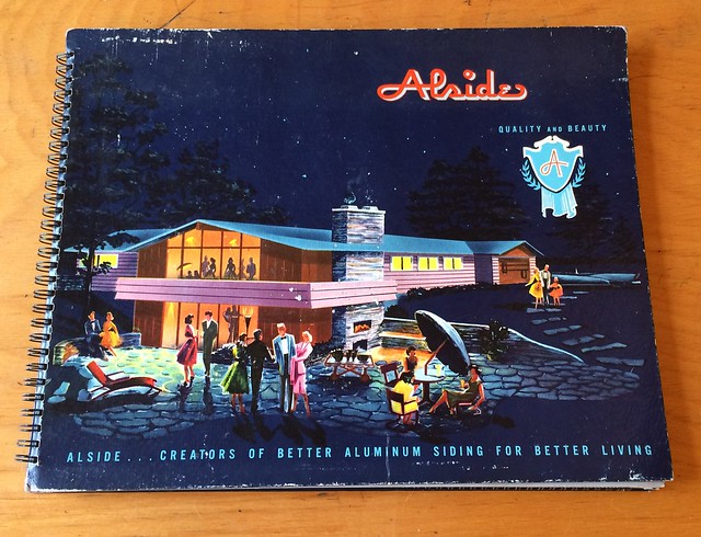
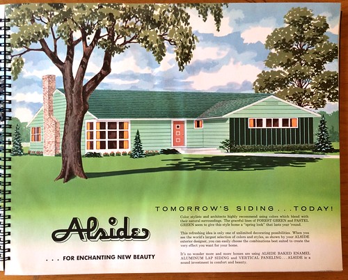
The fun starts with the front cover design (see above), which shows a suitably modern-looking home and also has one of those great mid-century ad slogans: “Alside ”¦ Creators of Better Aluminum Siding for Better Living.”
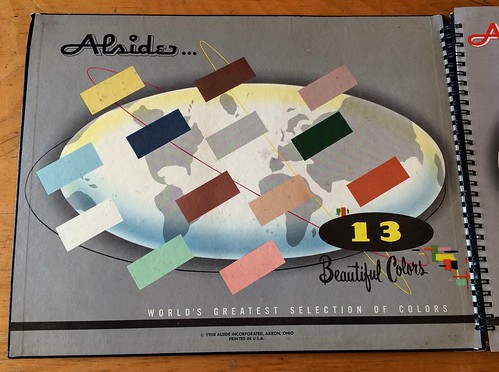
The inside front cover shows the range of color offerings — the classic selection of pastels and earth tones that were popular at the time. I confess I’m a bit disappointed that they’re not described as “decorator colors,” but it’s still a great graphic:
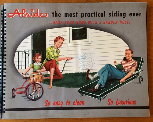
There are so many things about this next page that are just Perfect. The patio lounger, the shoe dangling off of Dad’s foot while Mom happily cleans the house (literally), the tot with the trike, the questionable use of “Luxurious,” and more:
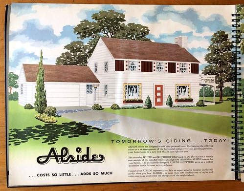
Look how gorgeous your home can be if you use tomorrow’s siding ”¦ today:
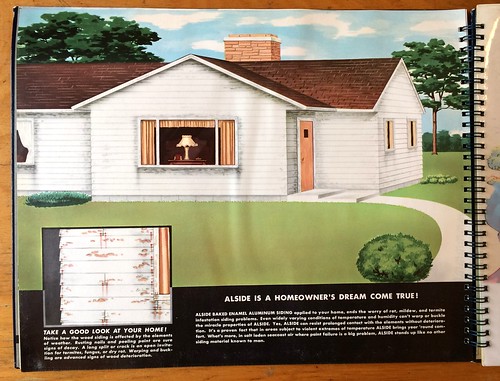
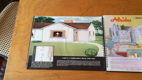
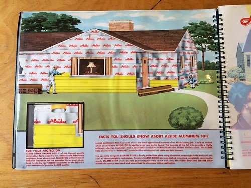
Next comes the best part of the catalog. They present a standard wood-shingled house and then provide two plastic overlays to show how much better the house could look with aluminum siding. Here’s a photo of the plain printed page, followed by a video showing the overlays being positioned over the page, and then photos of each overlay:
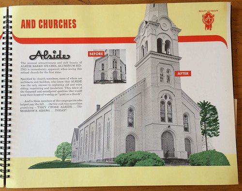
Hey, you know what would really bring your beautiful old church into the modern world? Aluminum siding, that’s what:
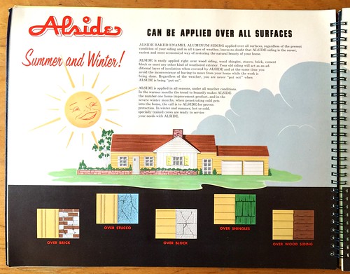
Ah, the smiling sun — a classic. Too bad they didn’t have it wearing sunglasses to boot:
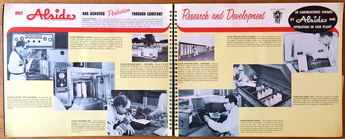
I love this spread showing the company’s R&D team, all of whom are wearing — of course — eyeglasses and white lab coats:
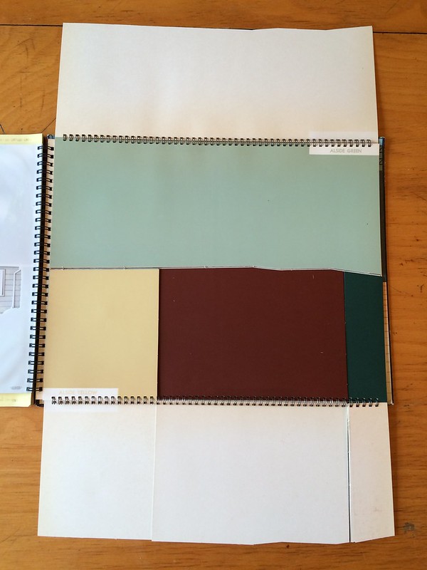
There are no aluminum samples in the catalog, alas, But there are some color swatches printed on cardstock, and they’re presented in this really cool series of flip-out panels:
And hey, just in case you forgot, aluminum comes from bauxite (and goes straight from the mine to the truck):
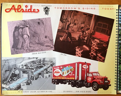
Naturally, everything takes place in a suburban fantasy world where everyone — the workers, the customers, the engineers, the miners — is white. Wheee!
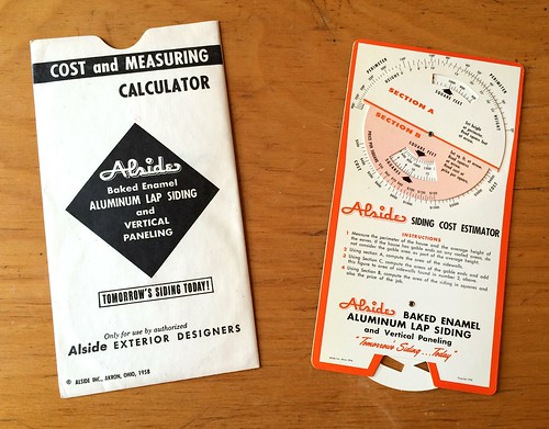
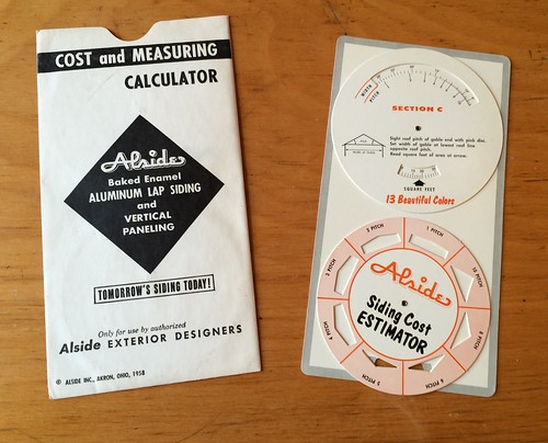
Finally, the catalog also includes a little cost estimator gizmo, complete with several volvelles!:
There’s actually a lot more, but I left out a bunch of pages in order to keep this entry at a (relatively) manageable size. Thanks for indulging me.
Click to enlarge
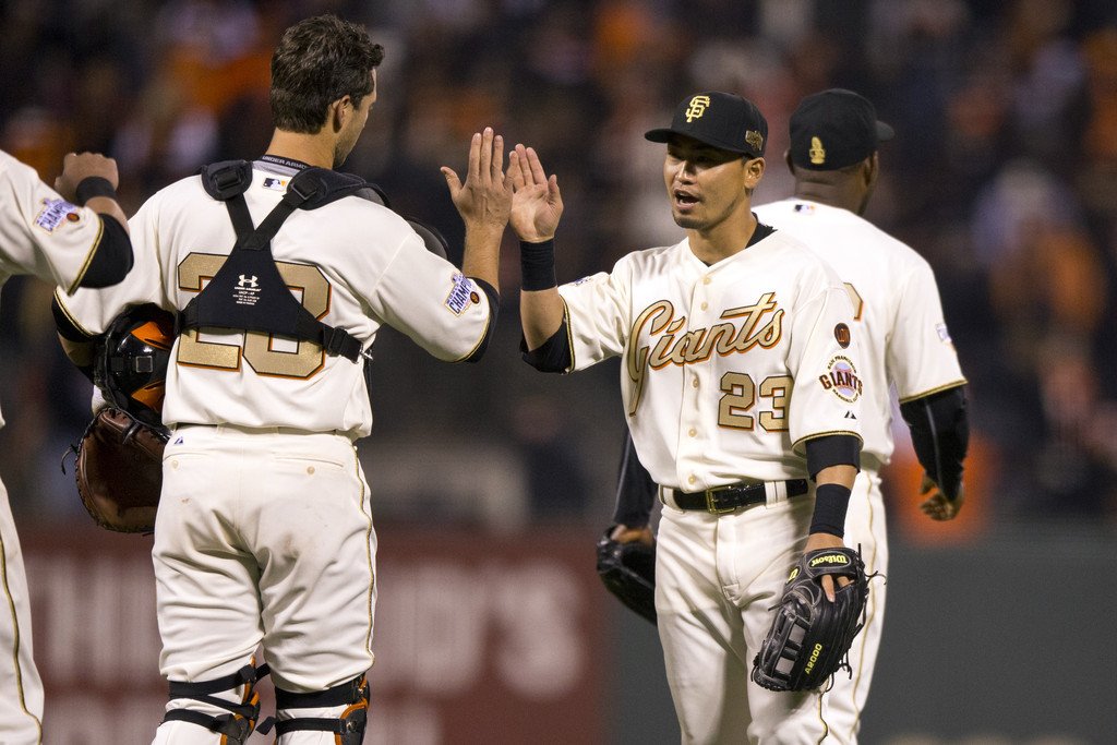
Friday Flashback: With the Royals wearing their gold-trimmed championship uniforms for two games earlier this week, my weekly Friday Flashback column on ESPN takes a look at the history of World Series champs wearing gold to open the season (including the Giants in 2015, shown above), along with other championship attire. Check it out here.
Click to enlarge
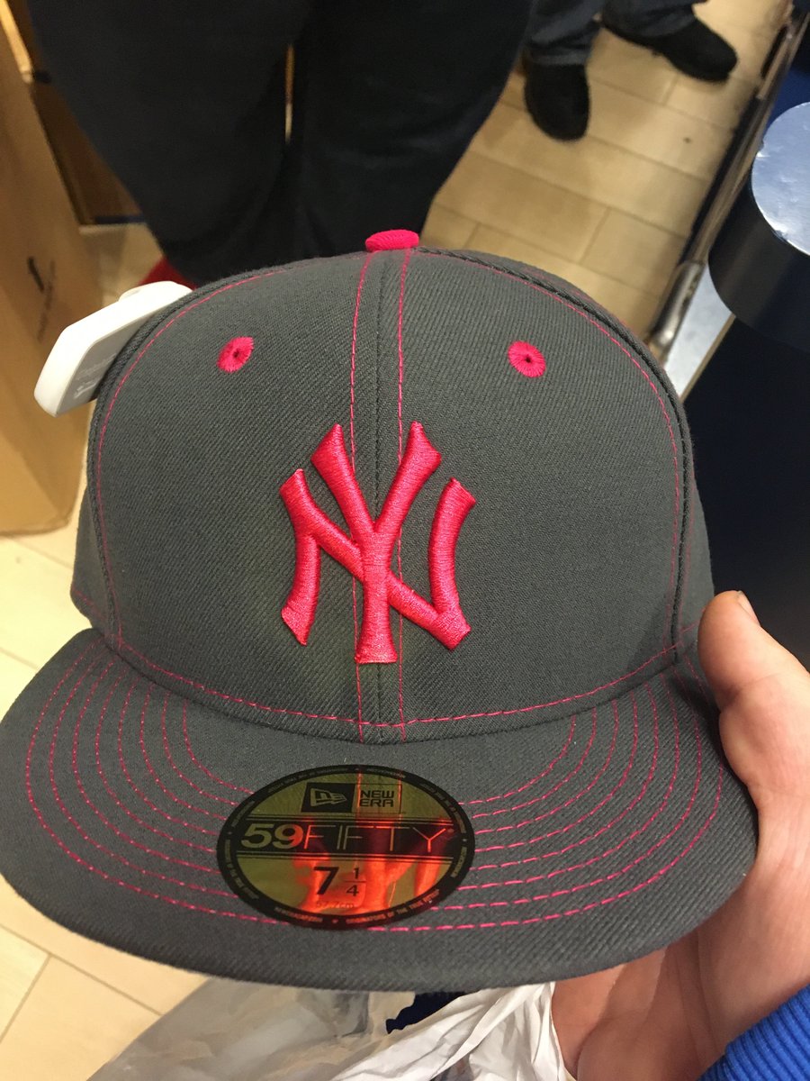
Fortunately, I already have plans for that day: Last week the Giants spilled the beans on the various holiday uniform designs for this season, including the all-new pink jerseys and caps for Mother’s Day. Now we have our first sighting of actual merch (see above), and it matches the mock-ups that the Giants showed. All teams will be wearing this same basic template of a dark-grey cap with a pink logo, pink squatchee, pink-outlined vent holes, and pink top-stitching. Looks like shit, and will look even worse with the pink-lettered jerseys we saw in that Giants mock-up.
That photo came my way yesterday from reader Steven Hom, who writes:
My brother and his friend were in Lids today and saw the Yankees’ Mother’s Day cap. His friend tried to buy it, but when they went to ring it up they were told it’s not for sale, and then it was removed from the shelf. Apparently it’s not supposed to go out till April 18.
Obligatory memo to everyone at MLB who’s reading this: I’m sure you’re annoyed about this leak, but your gripe is with Lids, not with me. If you can’t keep your retail partners in line, that’s not my problem. And just think, if you had shown me the Mother’s Day designs in advance, under an embargo, I would have honored the embargo and not posted this photo when it was sent to me. It’s still not too late for you to inoculate yourself against other leaks instead of playing (and losing) this endless game of Whac a Mole, which I find as tiresome as you probably do. Think about it.
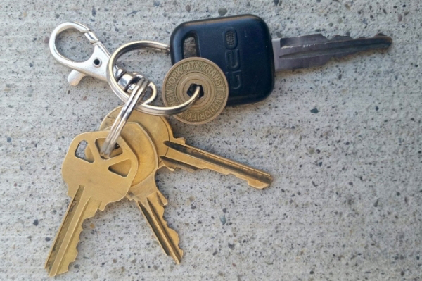
KRC update: The latest installment of Key Ring Chronicles is now available over on McSweeney’s. It involves a New York City subway token. Check it out here.
LAST CALL for the caricature shirt: Today is the last day to order the shirt featuring Larry Torrez’s caricature of me. We’re offering it in a variety of colors and styles — grey, black, white, and a white baseball shirt with green sleeves. We’ve also added women’s sizes. Further details here, or just order it here. Thanks.
The Ticker
By Paul

’Skins Watch: People went totally bananas yesterday when ESPN’s Bomani Jones wore one of those great “Caucasians” T-shirts on Mike and Mike. He initially had the front of the T-shirt fully exposed and then, at ESPN’s request, partially covered it up by partially zipping up his hoodie. ”¦ The Indians postponed Monday’s home opener due to nasty weather, but anti-Wahoo protesters showed up anyway (from Sam Selker). ”¦ The Washington Post, which has long editorialized against the ’Skins name, is also calling for the Indians to drop Chief Wahoo (thanks, Phil).

Baseball News: Two odd things about this Chris Sale bobble that the White Sox will be giving away this season: (1) The team no longer wears that pants design. (2) Why show him in a road uni to begin with? I don’t pay much attention to bobbles, but don’t the usually show the player in a home or alternate uni? (From Jay Danbom.) ”¦ NYC Mayor Bill de Blasio signed the city’s smokeless tobacco ban at ticketed sporting events into law on Wednesday. Because of the timing of when he signed the bill, this means dipping was legal at the Yankees’ home opener on Tuesday but not for their second game on Wednesday night. ”¦ Speaking of the Yankee Stadium, you might be seeing some fans there who are dressed “inappropriately” (from Chris Weber). ”¦ The Syracuse Chiefs’ home opener was snowed out, so they’ll have a new “home” opener on the road — in an empty stadium! Bizarre (from Rick DiRubbo). ”¦ With April 15 fast approaching, UCLA’s baseball team will wear Jackie Robinson throwbacks. The uni includes a new edition of Jackie Robinson cleats, and I’m told that Adidas will be giving those cleats to the MLB players who have endorsement deals with the company. Not clear yet if they’ll be worn in MLB games, however. ”¦ Lots of special occasion jerseys this season for the Delmarva Shorebirds (from Chris Cruz). ”¦ Great shot of a Hollywood Stars player sliding in shorts. ”¦ Unusual dot pattern at the bottom of Francisco Lindor’s sannies. Looks like they’re Trusox (from Brandon Bush). ”¦ The Jackson Generals have a new logo commemorating their 10th season being affiliated with the Mariners (from @thA_Pandabear). ”¦ Here’s a new one: The Nats have set up a pin-trading station at their ballpark (from John Muir). ”¦ Yesterday I showed a mock-up of NASCAR driver Brandon Jones’s Texas Rangers-themed firesuit. Now I have photos. ”¦ Bit of a glitch on Astros P Mike Fiers’s NOB yesterday, as the outlining on the “F” was filling in some of the negative space. It hasn’t been like that in the past (good spot by Christian Ruzich and Eric Bostick). ”¦ The Mets received their N.L. championship rings in a private ceremony yesterday. ”¦ Granted, the Diamondbacks’ new uniforms are pretty unusual, but Cubs broadcaster Len Kasper seems to think they have the ability to bend the laws of mathematics, which seems like a bit much (from Dylan Goforth). ”¦ Speaking of the D-backs: When they unveiled their new set last December, the throwback uni that they put on their mannequin didn’t have the MLB logo on the back belt loop. I asked the team’s PR staff about this, and they said (I’m paraphrasing here), “Good catch — we used last season’s pants for the mannequin. But we’ll have new pants, with the logo, for 2016.” That has turned out not to be true. ”¦ Coupla more things about the D-backs last night: They’re wearing their patches on the undershirts, and at least some of the players’ caps had grey underbrims, although I’m told that some others had black (from Matt Abbott and Tom Denne, respectively). ”¦ Another change to the Phillies’ script this year: You know how the it can sometimes look like the team’s name is “Philllies“? That’s no longer possible this year (from Mike Paolucci). ”¦ Here’s a soda display of the Cubs’ logo. ”¦ Two Long Island high schools, Babylon and Southampton, paired up for a pretty hideous uni match-up yesterday (from Vince Alongi). ”¦ The Mets script behind home plate has been blue in recent years, but it looks like they’re changing it to orange.
College Football News: A Maryland judge has ruled that the NCAA cannot be dropped from a wrongful-death lawsuit being brought by the parents of a Frostburg State player who died from football-related head injuries in 2011. The Illinois-based helmet maker Kranos Corp. is also named in the suit. ”¦ Here’s a good view of the memorial decal that Utah State has been wearing during spring scrimmages for longtime team physician John Worley. It hasn’t yet been decided whether it will be worn in the fall.

Hockey News: A pair of “celebrity dachsunds” (uh-huh) donned Canadiens and Maple Leafs jerseys for a game of street hockey. ”¦ Harley-Davidson jerseys tomorrow for the Tulsa Oilers (from @UtahDust). ”¦ The Grand Rapids Griffins are putting a giant decal of their playoff logo on the outside of their arena.

NBA News: Over 200 Nike-contracted athletes across many sports will celebrate Kobe Bryant’s career by wearing black and gold footwear next Wednesday. Golfer Rory McIlroy already got a head start on that (second link from Douglas Ford).

College and High School Hoops News: The basketball team at Shenendehowa High School in upstate New York has a new logo based on one of the team’s players.

Grab Bag: New soccer kits for the Seattle Reign (from Yellow Away Kit). … Some really nice Pinewood Derby designs on display here (from Carl Schneeman). ”¦ Here’s something I didn’t know: The UCLA volleyball team used to wear old Bruins basketball jerseys. They’ll be doing that again tomorrow (from Chris Cruz). ”¦ Also from Chris: “At Saturday’s Georgetown lacrosse games, people donating non-Georgetown college T-shirts can exchange them for Georgetown apparel, including game-used lacrosse uniforms. They use a point system and it is notable that more points are given for Big East, Big Ten, ACC, and Ivy League schools (which seems to cover all current/former rivals or perceived rivals) than for other schools.” ”¦ Amateur golfer Bryson DeChambeau wearing the SMU logo on his hat at the Masters. ”¦ Buried within this story about the DC Metro is the news that the Metro uniform is “getting a new neon yellow add-on” for increased visibility. ”¦ Here’s an article on the Suzuki Motors “S” logo. ”¦ Here’s what Rickie Fowler is wearing at the Masters (from John Furstenthal). ”¦ More Masters: Keegan Bradley is wearing Michael Jordan-themed shoes (from Patrick O’Neill). ”¦ The Giants were apparently giving away phantom World Series press pins in the press box yesterday. ”¦ The U.S. Navy has started issuing its “Dixie Cup” hats to female enlistees, part of a program to make the uniforms more gender-neutral. ”¦ Butwin was an old manufacturer of varsity jackets, and I’ve often mentioned their awesome tag design. Until now, though, I’d never seen tag design on a matchbook cover. There’s another version here. ”¦ Faaaascinating slideshow of photos from an old New Deal photography project, including some by the great Walker Evans. The negatives had holes punched through them to indicate that they were not to be used, but they’re all still in the Library of Congress, and now they’re being collected in a new book. The hole punches transform the photos in some surprisingly effective ways — recommended (big thanks to John Vahey). ”¦ More “what they’re wearing at the Masters” coverage here (from Randy McCallum). ”¦ As you may recall, the original logo for the 2020 Tokyo Olympics was scrapped amidst accusations that it had plagiarized another design. The process to choose a replacement logo has now been narrowed down to four finalists.
Link didn’t populate in College Football News section.
UTAH CFB link isnt there to click on.
Fixed. Here’s the proper link:
link
That ShenBA logo!
Other hideous things to point out on Long Island baseball photo: soccer goal in right field?? Brown infield turf.
I don’t think this is the first time Chris Sale has been the subject of a bobble head giveaway. If so, it makes sense to create some variety for collectors.
Yup—they’ve already produced Sale bobbles in the home pinstripes and black alternate.
The Key Ring Chronicles have been excellent. Keep ’em coming!
Thanks, man. Unfortunately, I don’t control the scheduling of them — McSweeney’s does. If I had my way, they’d roll out a lot more frequently. But I like to think they’re worth the wait.
This entry made me smile. I’ve had an NYC subway token on my keyring my entire adult life, but it’s an older one with the cut out “Y” rather than the pentagon.
Decades?
link
Oooh, good one — I stand corrected! Will adjust text.
Re: Chris Sale
Maybe they have already done bobbles of him in white and alts already, so they wanted to do the road next.
Beautiful catalog
All I could think while reading this post was “meeetal” as in the Simpsons episode where Bart meets a former western star who shows him that all merchandise was made of metal to which Bart answers “meetal” as if he is learning the word
I would like to read a post on the history of Paul and MLB. Seems like a lot going on there!
Less than you might think, actually. Not a whole lot to tell.
Alside was up to their armpits in “O-Meter” tech! Weather-O-Meter, Color-O-Meter… I only wish they’d completed the set with a Humid-O-Meter, a Thick-O-Meter and an Exposure-O-Meter. Their “hot and cold chamber” looks like the temperamental freezer Aunt Bee had on the back porch.
I like the pics of the “Exposure Farms.” Where I grew up, Sherwin Williams had a single-floor, ivy-covered brick building on a decent sized tract of land that had an exposure farm. What an awesome name!
I’m pretty sure Cubs broadcaster Len Kasper was just kidding when he tweeted that the D-Backs will wear 9 different uni combos. He retweeted a few people who asked him to check his math and who said they got the joke. He was just poking fun at how they have too many uniforms. I don’t think the he believes “they have the ability to bend the laws of mathematics” like was written. Learn to identify a joke.
I don’t think the he believes “they have the ability to bend the laws of mathematics” like was written. Learn to identify a joke.
I’ll let the irony of those two sentences speak for itself.
Awesome aluminum siding post; love the Cost & Measuring calculator. It reminded me of something from Tin Men.
Should the Indians retire Chief Wahoo? Yes. But, I think Dolan is handling the situation well. He’s mediating both sides pretty effectively, in my opinion. He’s demoting it step by step because people are offended by it and it’s the right thing to do, but he’s also respecting the people who grew up with and (for whatever reason) love that image.
Soon enough, it will be gone, but for now, I appreciate that he’s not pulling a Snyder and digging in his heels harder as more people take issue, which is what seems to be the American Wayâ„¢ for some people as of late.
Saying that someone is behaving more admirably than Daniel Snyder seems like the very definition of damning with faint praise.
A more apt contrast might be to compare Paul Dolan’s policy to the way college admins have changed their nicknames and mascots. Supporters and detractors alike have valid positions. Drunk fans in war paint are outliers who do not represent rank & file Indians fans.
I personally don’t have a problem with Wahoo, but I understand why people would. If people want to wear him, fine, if they don’t,they don’t have to. Live and let live. People obviously like him, or they wouldn’t sell any Wahoo merchandise, and it would go away. Let the market decide. For the record, I don’t have a problem with “Caucasians” either. But to be offended by one and not the other is intellectually dishonest.
to be offended by one and not the other is intellectually dishonest.
You realize one is parody and commentary, while the other one isn’t, right?
Sigh.
So, it’s ok to mock some people based on the color of their skin, but not others? Minstrel shows were comedy too. All I’m saying is, either it’s ok for everyone,or it’s not ok for anyone. That’s all.
You have no idea here, Jon.
Like, none.
It’s almost time for the Mets’ home opener, so I’m going to let someone else pick up the baton here instead of letting this spoil my day. Have a good one.
Geez, I wasn’t trying to ruin your day, Paul. Enjoy the game!
It’s getting beyond sports teams. There’s an effort going on by a state senator from Seattle to rename “offensive” state names.
link
From the article “Removing the names is only a step toward easing the nation’s burden of racial prejudice.” Sigh.
You mean they’re not planning on going door to door with a bottle of liquid paper (I avoided using the inflammatory brand name Wite-Out) and remove the names from all the physical maps that were printed in the past? That’s an outrage!
I’m a born and bred Connecticut guy. Connecticut is an old Algonquin word which means, I believe, “Road Work Ahead”.
Perhaps a state senator from Seattle can go about removing all references to Bill Cosby from my collection of 1980s’ People magazines.
Also, I’d much rather see Philllies than Phi llies with a giant white block in the gap. Ick.
I grew up in Cuyahoga Falls, Ohio, home of Alside’s suitably space-age HQ building: link
We’d drive past it frequently on the “back way” to Blossom Music Center or the dearly departed Richfield Coliseum.
Ooooh, nice!
Hey, check out that building rendered as a cake! (scroll down to 1940s)
link
As a former seller and installer of aluminum carports this brought back a lot of memories, not all of them good ones. If you’ve ever installed aluminum sheets in a Houston summer you know what I mean.
And that Yankees Mothers Day cap is are beyond terrible. They need to ask themselves “Would Lou Gehrig wear this?” If the answer is no then they shouldn’t wear it either.
I meant to also note that I had a similar ‘cost estimate’ tool for my carport installs. It was more of a square slide rule-looking thing but the idea was the same.
The Flashback is up:
link
Love the 50’s architecture on that house on the cover!
You know, this Bonanza is not an accurate depiction of the West. link
Thanks for showing that cool siding catalog. Fun stuff.
I’m digging today’s catalog look-see.
Question: The color sample panels appear to be oddly cut. Is there some kind of overlay that makes sense of the shapes and sizes of the color panels?
Francisco Lindor is wearing a pair of Tru Sox anklet/quarter socks over his sanitary hose.
Re bobbles: I have more than 50 baseball bobbleheads from various teams in my office and the vast majority are in home/alt unis. The exceptions are:
– Rick Monday in a baby blue Cubs uniform and holding a US flag, which specifically commemorates Monday saving a flag from being burned while he was on the Cubs and playing at Dodger Stadium.
– Various Brewers in baby blue sansa belt unis from the 1970s/80s.
– Jason Bay in an NL jersey and gray pants which specifically commemorates his appearance in the Home Run Derby.
Love the Depression-era photos and had a chuckle at the headline: A Hole Punched Through History — I can just imagine some jerk being punched over the years!
The Phillies finally came to their senses and fixed the occasional “Phillies.” Not as bad though as the years the Red Sox road jersey seemed to read, “B O STON.”
I think the Texas Rangers firesuit is the ONE TIME I would EVER say it probably would have been better to go with pajama pants…
Got Al Hrabosky bobblehead from last year in road gray, love it…
Phillies’ starting lineup being introduced for Opening Day at Citi Field. All players wearing hoodies OVER their jerseys.
Never seen that before for a starting lineup showcase.
Mets’ starting lineup just wearing their regular uniforms during intros.
Didn’t see in yesterday’s comments-
During the Giants home opener Willie Mays was wearing a regular Giants hat rather than his usual old BP hat and, for only the second time in memory at Pac Bell/SBC/AT&T Park, they had a pattern mowed into the outfield grass. Hopefully the huge SF is only for the opening series.
In case anyone is wondering the only other time was for the 2007 All-Star Game.
I was in SF last month and took a tour of ATTSBCPacBell Park. The field had just been resodded and the guide made a point of mentioning that the Giants don’t mow patterns into the grass but were planning on doing it for the opening series.
The Georgetown lacrosse shirt-swap seems to be turning in to an official annual thing, they started it last year: link
How many other instances of teams trading out other teams gear have there been? Seems like it would be a perfect mid-summer baseball giveaway gimmick.
I feel like I’d almost prefer 3L Phillies to that new patch with the giant white space where the extra L would have been. Trim away the white and I think they made a successful change.
Link from ESPN’s Zach Lowe about how the Nets almost changed their name to the “Swamp Dragons.” Pretty outrageous uniform they had mocked up!
link
When I first saw that image of the Chris Sale bobblehead, it got my hopes up that the team was switching back to the ‘correct’ pants with the two-tone piping that matches the jersey. Alas, not so.
It might sound crazy, but ever since the Sox tweaked the road grays (also replacing the diamond sleeve patch with the primary logo) I’ve felt a certain distance from the team. I guess I really liked that uniform the way it was…
I’m guessing the pants with the simple trim are cheaper. Changing them made no sense from a design standpoint.
On the St. Louis Post-Dispatch website, an opening day lineups quiz revealed an image of former Cardinal 2B Delino DeShields wearing the navy blue “bird on bat” hat with the road gray uniform, apparently while playing the Giants in San Francisco.
To my knowledge, that particular hat had only been worn at home on Sundays, but apparently I’m wrong.
Can anyone clarify?
link
It used to be worn on the road on Sundays as well, but they consciously chose to stop doing that because packing 25+coaches extra hats was taking up too much space, or so the story went.
It was so funny to open this page and see the Alside catalog this morning. You see, Alside was the family business on my mom’s side, started by my great uncle Jerome (Jerry) Kaufman. He had figured out a way to streamline the process of creating and installing aluminum siding right as the industry took off. Several generations of my family have been involved with the company. Even though it was sold around the early 1990s, Jerry’s youngest brother, Donald, and Donald’s son Craig, operated the company.
I had the honor of spending three summers with a shirt and tie in the mail room learning how a business operated. I was like Michael J. Fox in “The Secret of My Success” with the mail cart, etc., but without the other transgressions!
The building is located in Cuyahoga Falls, Ohio, and it is something out of a “Mad Men” time capsule. The design is very modern for its time and the furniture and inner design are the retro look that is now so hip. Walking through there was always so interesting with the various colored-glazed brick hallways, the staircase to the executive floor that looked like it was floating, the wood paneling…the whole deal was a hoot.
The company was very aware of the growing industry and put its feel for design and the future that America was envisioning at that point after WWII. As a result, several brochures and other print collateral from there was always very colorful, unique, and engaging. My grandmother kept a few of them that I remember from my youth.
Anyway, my family is no longer associated with the company, but the business is still in our hearts. There’s several Alside warehouses throughout the country and I am always proud of what my great uncle started when I have seen the trucks in various cities.
Thanks, Paul, for the fun trip down memory lane!
Great story, Adam. So cool that a Uni Watch reader has a connection to this catalog!
Regarding the two Long Island high schools, while those unis are pretty hideous, what’s more offensive is they are playing on a carpet infield. I know more and more schools are going to synthetic turf to same money but, I never realized dirt was so expensive.
Zach Lowe is on espn.com actually talking about designs and logos, not just sellimg siding and trying to sell 30 dollar tee shirts with his face on them… you should check it out.
Whoa, man, calm down there. This is Uni-watch afterall, actually covering “athletic aesthetics” is waaaaay too mainstream nowadays; everyone does it!
Here at Uni-watch you’re not just getting the alternative to bland, in depth discussion on amateur and professional sports uniforms, you’re getting only the cutting-edge in contrarian journalism featuring 1) a whiny liberal agenda that advocates bitching about team mascots/names that we don’t even root for, 2) RUN-ON SENTENCES YAY!, 3) Grommets! Who doesn’t love punching holes in everything even if it doesn’t serve a purpose?! NOBODY!
Hey man, don’t forget to support the cause. Become a true Uni-watch fan and sport the merch, for limited time only if you buy 3 of our 30 dollar shirts you’ll get your own Paul Lukas action figure by Hasbro! He comes with 3 unique phrases like, “REDSKINS ARE THE OBSESSION, SYNDER’S PLOTTING THE OPRESSION” and “Can you not disagree so much, it’s making my asthma act up.”
Those Adidas Jackie Robinson cleats seem the like the definition of douchebaggery. The company didn’t even exist for the bulk of his career.
Couldn’t take someone bashing your article? Poor Paul, someone didn’t like your article and like fox news you took the comment off.
My first-ever call-out on Uni Watch; my mom will be so proud!