Click to enlarge
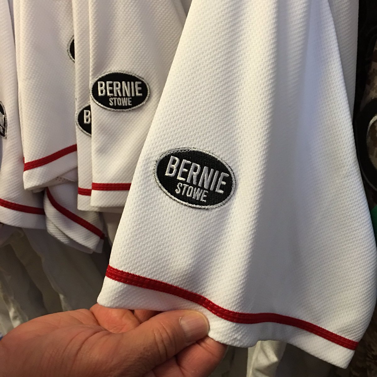
It was reported several weeks ago that the Reds would be adding a memorial patch for longtime clubhouse manager Bernie Stowe, who passed away in February. Yesterday they revealed the patch design (see above).
The patch matches the design of a sign that the team posted at its spring training complex after Stowe’s death:
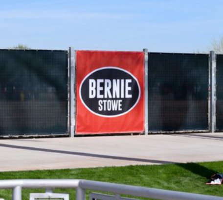
Interestingly, the patch/sign design is actually a modification of a design that first appeared on T-shirts that Reds players wore in the days following Stowe’s passing:
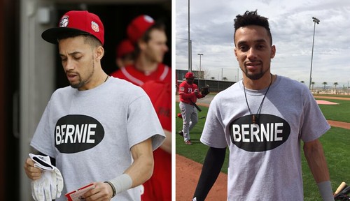
As you can see, it’s the same oval, the same font, but the smaller “Stowe” lettering appears to have been added to the sign and patch almost as an afterthought.
Memorial patches often just have the person’s first name or nickname, so there was nothing unusual about the simple “Bernie” design. Why was Stowe’s surname added to it? My strong hunch: The Reds wanted to avoid any potential confusion about the “Bernie” graphic being connected with — or even being a reminder of — Democratic presidential candidate Bernie Sanders.
I could have asked the Reds about this, but I opted not to. The last week of spring training is a super-busy time, plus teams tend not to give straight answers about anything that’s even vaguely political. But I did ask a few people who I thought might have some insights, and they basically said my hunch was probably on the money.
I don’t mean to suggest that there’s anything pernicious or partisan in what the Reds did. On the contrary, it’s completely understandable, and I’m sure they would’ve done the same thing if Stowe’s first name had been Donald, or Hillary. I just think it’s interesting. And it’s even more interesting because Sanders’s campaign branding is based almost entirely on his first name. You never see a “Sanders” button or bumper sticker; it’s always “Bernie.” That’s very unusual for a high-level male political candidate — men usually campaign on their surnames (Jeb Bush was a recent exception, but of course he was using his first name to distinguish himself from his brother and father), while first-name campaigns have largely been the province of female candidates. These aren’t iron-clad rules — I’m sure you could find exceptions on both sides of the gender line — but they’re definitely trends I’ve observed over the years. It seems to reflect our culture’s tendency to associate men with strength and gravitas and women with the warm fuzzies. Sanders’s campaign identity has scrambled this deck a bit.
It all reminds me of how tennis players were referred to on TV when I was growing up. If you were watching televised coverage of the men’s draw, it was all “Borg,” “McEnroe,” “Lendl,” and “Connors.” But on the women’s side, the broadcasters routinely referred to “Chrissie,” “Martina,” “Steffi,” and “Tracy.” Even as a kid, this annoyed me — in part because it sent the subliminal message that the women’s game was squishier and less important, but also because the first-name references made coverage of the women’s game sound like a big happy slumber party that I wasn’t invited to. (Of course, women’s tennis has been dominated for nearly two decades now by the Williams sisters, who are referred to by their first names in order to distinguish them from each other, but that’s a separate issue.)
Anyway: RIP, Bernie Stowe.
Click to enlarge
Collector’s Corner
By Brinke Guthrie
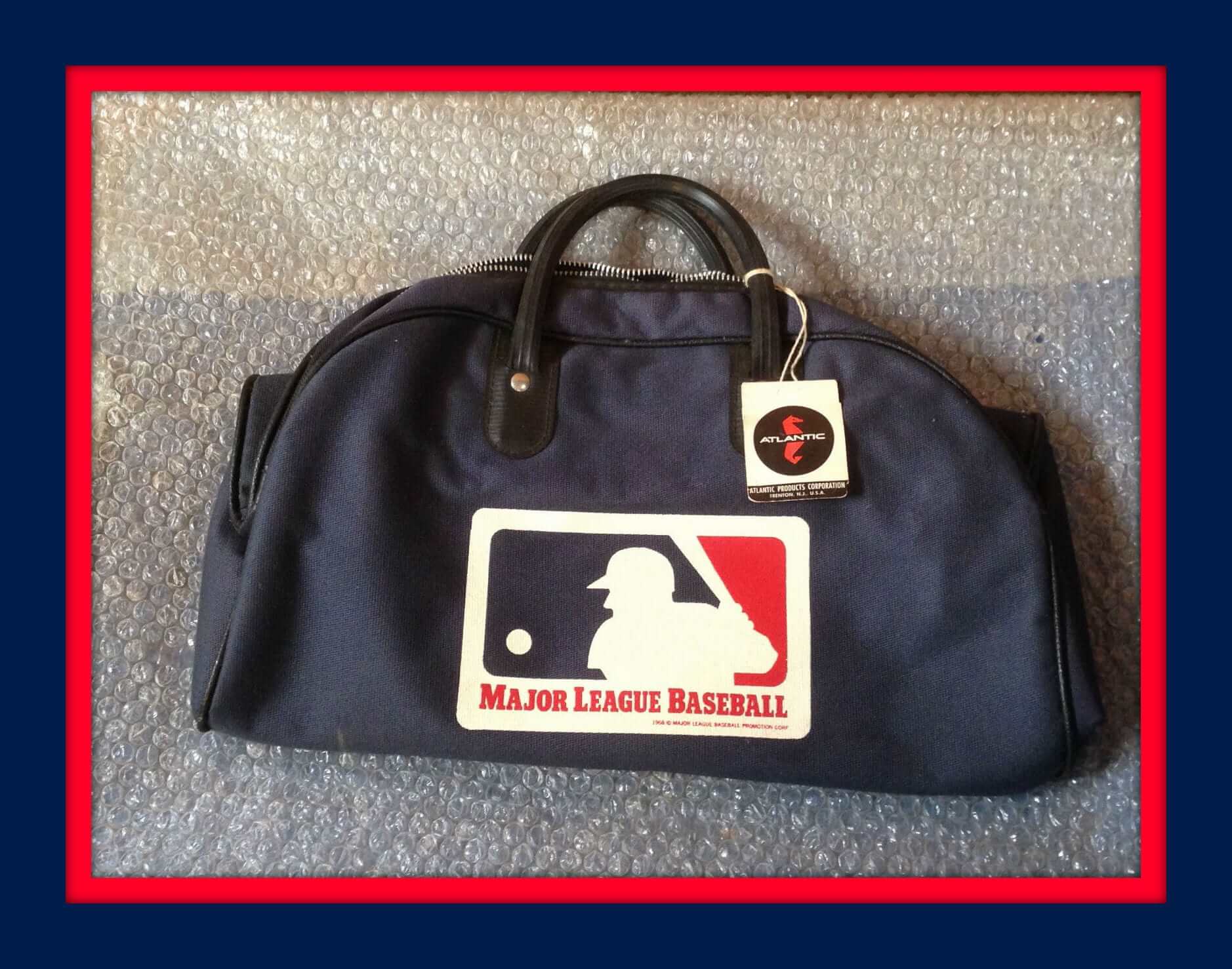
Almost time for Opening Day, so how about this nifty 1968 MLB gym bag from the Atlantic Products Company of Trenton, N.J. The listing says it’s a little out of shape, but aren’t we all.
Now on to the rest of the week:
• Here’s a Reds World Series poster from The Cincinnati Post — maybe 1970 (vs. the Orioles) for this one?
• If you’re an A’s fan, you’ll want to check out this 1990s-era Oakland Athletics varsity jacket from DeLong. Had a Reds version of this one, and it was fantastic. Leather sleeves and trim, all logos embroidered, and quilted lining. And here’s one more varsity jacket if you’re a Dodgers fan.
• Luv Ya Blue! My sixth grade football team was called the Oilers, and we all used the silver helmet version of this decal, but I’ve never seen a powder blue helmet before. (I always figured our coach wrote to the Oilers and said, “Can you send me like 50 of your decals and we’ll name ourselves the Oilers?”)
• Just chew, baby: How about this Oakland Raiders gumball machine. The listing says “1970s-1980s” — I’d almost think later than that due to the Raiders font. Yes? No?
• It appears there was a generic line of sneakers promoted by the NBA as their “Official Athletic Footwear.” Here’s a box with some great artwork on the lid. And here’s another box from that era — the Keds that Pistol Pete is wearing sure look like Adidas, do they not? (Here he’s down to two stripes. Also got a Pistol Pullout Poster.)
• Here’s a Bills T-shirt that says “One Buffalo” on the front. Looks like a marketing slogan from a couple seasons back.
• Check out this Bernie Brewer Bank from Sentry Foods, circa 1999. Great design.
• Great cover art on this 1972 Rockets/Bullets game program.
• I can’t imagine there would be too many fans in Miami that would need a Dolphins winter scarf to wear to the game, but you never know.
• The listing says this NFL pennant is for Buchanan Scotch. (Monday nights 6 p.m.!) All I see are puppies.
• Here’s a “20 Ans” (years) promo seat cushion for the Les Expos de Montreal, so that puts it at 1989, no?

Click to enlarge
Name game: We often talk about how various teams style names like McNair or LaRussa or deGrom on a jersey, but jerseys aren’t the only place where such questions come into play. Case in point: I live on DeGraw St. Or at least that’s how I style it — solid, with a capital “G.” There are other ways: Degraw, De graw, De Graw. I don’t necessarily expect my city’s municipal signmakers to agree with my version, but I do wish they could at least be consistent regarding their version.
Click to enlarge
Frying pan tee now available: My thanks to everyone who offered feedback last week on the logo with Larry Torrez’s caricature of me. We made a few tweaks to the design, which is now final (click to enlarge):
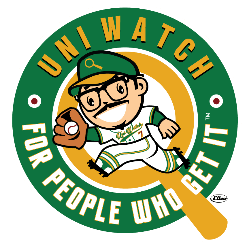
I know a bunch of you are gonna say that the red dots that we’ve added to the white dots are supposed to look like grommets, but they’re not. We just wanted to add a bit of visual interest to the white dots and also add a little more maroon to the design.
I’m happy to announce that this design is now available as a limited-edition T-shirt, in a variety of colors and styles — grey, black, white, and a white baseball shirt with green sleeves:
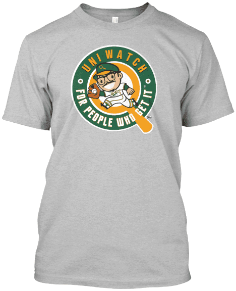
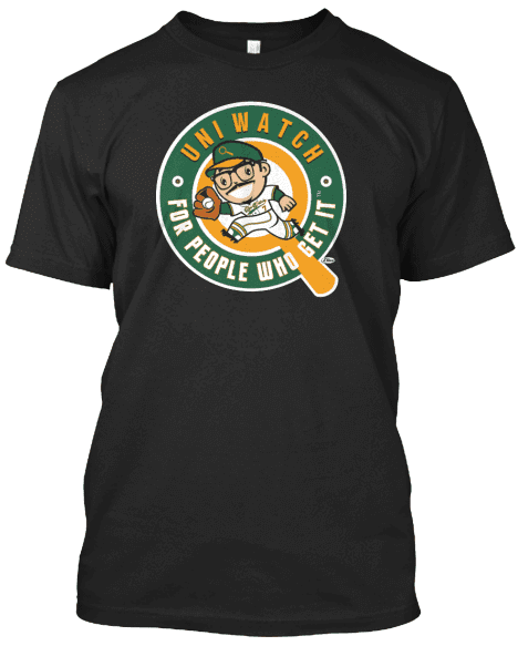
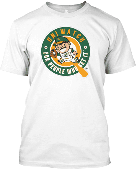
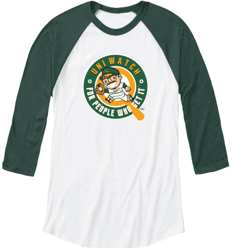
The shirt is available now through next Friday, April 8. Profits will be split between Larry and myself. It is not part of the T-Shirt Club and does not have to be purchased in order to maintain this year’s “Collect ’Em All” eligibility. (Speaking of the T-Shirt Club: New design soon, promise.)
The Ticker
By Mike Chamernik

Baseball News: Which player will have the best-selling jersey by the end of the year? (From Phil.) … The Orioles installed another Eutaw Street home run medallion, this one for a Chris Davis homer from last year. The O’s place a new marker for every home run that leaves the stadium and reaches the street. This site maps the medallions and shows video for every homer (from Andrew Cosentino). … We saw that the Chattanooga Lookouts unveiled new uniforms last week, but here’s a good side-by-side comparison with the old (on the left of each shot) and the new (from Mark Paczewski, via Phil). … Red Sox DH David Ortiz took a ride on a personalized golf cart yesterday. Also, he was honored with Dominican Republic flag bases (from Phil). … The Cincinnati Fire Department’s Station 3 firehouse is a few blocks away from the Great American Ballpark. The station’s logo incorporated a fireman version of Mr. Redlegs (from Patrick O’Neill). … The USS Hartford submarine has a partnership with the Hartford Yard Goats minor league team. “Once top enlisted submariners on the boat achieve certain levels of competence, they get to wear a specially designed Yard Goats cap around the boat,” the article reads (from John Muir). … The Expos mixed and matched their home and road unis in this 1973 spring training shot. Maybe an intrasquad scrimmage?

Pro and College News: New Titan DeMarco Murray will continue to wear No. 29. … 49ers kicker Phil Dawson will change his uni number from 9 to 4. He wore No. 4 in college and with the Browns for more than a decade. … Here’s a look at the new NFL Draft caps (from Clinton Dybul). … Auburn is the latest school to use the Riddell SpeedFlex helmet, easy to spot thanks to its distinctive cutout panel on the crown. … After the NFL threatened earlier this month not to have a Super Bowl in Atlanta due to the Georgia state legislature’s passage of a bill that had been widely denounced as anti-gay, the governor announced yesterday that he will veto the bill.

Hockey News: The Blue Jackets’ Boone Jenner got hit in the face with a puck during last night’s game against the Caps. He changed jerseys and masks after the bloody aftermath. Also, it seems that one of the teeth he lost is permanently embedded into the Verizon Center ice (from @OlegKvasha). … A Blues original prototype jersey from 1966 has turned up. The full story is here (from Mark Richter and Sam Chandler). … Pete Woychick Photoshopped a Easter Eggs with the colors and stripes of the Original Six teams. I like the slight pastel tinge. Anyone want to try and dye those eggs for real? … Newly released emails show that the NHL has been lying about concussions. One email shows that commissioner Gary Bettman speculated about banning fights due to fighters like Rick Rypien and Wade Belak committing suicide, apparently due to concussion-related depression.

NBA News: Lots of WNBA news: The league will replace home whites with secondary color uniforms, effectively making every game color vs. color. The full set of jerseys can be seen here. Also, this will be the league’s 20th season so all the teams will have a 20th season logo on their back necklines. The logos will also be on the basketballs. As that last link shows, the three teams that have been with the league since the beginning ”” the New York Liberty, Phoenix Mercury, and Los Angeles Sparks ”” will all have 20th-season patches on their uniforms. … On Friday, Under Armour will release Giants- and Athletics-colored Stephen Curry shoes (from Brinke). … Here’s a collection of NBA logos reimagined as superhero logos. … Here’s a good story about the guy who played Thunder, the Warriors’ old mascot character.

College & High School Hoops News: Here’s a neat look at how this year’s and next year’s Final Four logos were developed. … How far out of control is the NCAA’s branding obsession? This far: They even put their logo on the scissors teams use to cut down the nets (from E Ofcharsky, via Phil). … Glenn Stern sent in a few items. First, his wife played basketball for Brownsboro (Texas) High from 1989-1991, and her team wore untucked blue-and-gold Marquette-esque uniforms (as you can see in the shot on the right, the opposing team was also untucked). During warm-ups the players wore candy-striped pants, a little like what Indiana has. “I know a lot of high schools copy one college, but pretty cool to see two references in one team, especially to such unique looks,” Glenn says. Also, he sent in his wife’s youth basketball all-star shirt from the early 1980s.

Soccer News: The USMNT wears purple-on-red practice shirts (from Derek Lilleskov). … A player wore a three-digit jersey number in this weekend’s Deportivo Toluca vs. Carolina Railhawks friendly (from @sixball3000). … FC Barcelona doesn’t have kit advertiser for 2016-17 yet, so the club will sell kits without any advertising on them (from Anthony Emerson). … “I found your bit about math symbols on jerseys highly entertaining,” says Markus Kamp, referring to yesterday’s post. “The custom Sounders jerseys [my wife and I] used to announce our wedding weren’t the first time we’d done something like that. I had this jersey custom-lettered to announce my then-fiancee’s first pregnancy back in 2012.”

Grab Bag: An architect and golf fan made a 3,000-block Lego replica of the Masters Tournament leaderboard (from @TheBigJamesG). … New state tourism logo for Rhode Island. … A local police chief in Texas wants to put a Bible verse on his officers’ uniforms (from Phil). … Here’s a photo history of the Navy Goat (from John Muir). … UAB is reportedly switching to Under Armour.
Paul, The Auburn speed flex link sends you to a twitter post about the Montreal Expos (never would associate the two but I’m thinking about some way to…)
The Blue Oilers decal also gets the helmet into a reasonable/realistic shape. Still no ear hole though.
Interesting comment about tennis. Summerall/Enberg used last names calling women’s tennis. Tony Trabert/Bud Collins used first names for some of the women.
in the words of Flynn Rider “Frying pans…who knew right”
link
…you have an incomplete sentence:
The last week of spring training is a super-busy time, plus teams tend not to give straight answers about anything that’s even vaguely
Not just an incomplete sentence — an incomplete paragraph. Not sure how that happened. Now fixed. Thank you!
The Liberty, Mercury, and Sparks are the three that have been with the WNBA since the beginning without relocating. The club currently in San Antonio was also a founding franchise but was located in Utah through the 2002 season.
I thought of Harry Truman and DDE as early examples of presidential campaigns using first names/nicknames. Truman used the Eubie Blake song “I’m Just Wild About Harry” and “I Like Ike” buttons can probably still be found.
Also, Jeb is not Bush’s first name, it’s a nickname taken from the initials of his given name, John Ellis Bush.
“Jeb” may not be Jeb’s given name, but it absolutely is his de facto first name. It’s the name he calls himself, it’s the name he uses professionally (both in business and in politics), etc.
I have a friend named Elijah. Nobody calls him that, though — he’s Eli. That’s what his parents call him, that’s what he calls himself, etc. “Eli” is not his nickname; it’s his de facto first name.
“Ike” was a nickname; “Jeb” is a first name. Not a given name, not the name on his birth certificate, but still a first name.
Also Ted Cruz. Ted is a nickname for his middle name, but it’s what he calls himself as a given name. If Rafael Edward Cruz wins his party’s nomination, watch for a general switch in his campaign branding from Cruz to Ted – his campaign is already laying the groundwork for that by minimizing the use of his Cruz logo in favor of his “trusTED” logo. And regardless of what we call the candidate at the top of the ticket, the whole ticket in each party will be known by their last names. So had things turned out differently, we may still have been talking about Jeb! in October, but we’d refer to the ticket as Bush-Fischer, not Jeb-Deb.
A few candidates have made frequent use of their first names or equivalents. In 1988, I recall a lot of “Mike” campaign lit for Dukakis. Lincoln was popularly known as Abe – Honest Abe, Old Abe, Black Abe, and so forth, depending on what one thought of him. Calvin Coolidge became president by succession when Warren Harding died, so by the time he ran for a term of his own he was already popularly known as Cal.
Or there’s this example, albeit of the negative campaigning variety:
link
Calling Sanders “Bernie” is much warmer to me, makes more appealing to a lot of people. Calling people by their last name can feel distant and Sanders just feels like a cold name to say. I like that their campaign pushes him as “Bernie”. It feels like you are voting for your buddy.
which is why I have started to refer to him as Sanders when talking about him. I need to take emotion out of my voting preferences.
Is it “Bernie” or “Buhnie” or “Boinie”?
Not the full set of WNBA jerseys; it’s missing Dallas and Seattle.
Dallas just relocated from Tulsa. They haven’t revealed any of their uniform designs yet.
Correct. And Seattle has switched from the forest/dark red/gold to classic Seattle Basketball Green/Gold.
On the Bernie Stowe patch, often times teams will do initials as well. I think they smartly opted not to use his initials for the memorial patch.
I thought the Timberwolves had a point guard in the GOP race…
I would absolutely vote Tyus Stones.
Well for the Lookouts you can really see their former partner team (Dodgers) in the old jerseys. Glad to see them try to create their own identity.
I love the “Uni-Watch Approved” logo on the t-shirt ad. When you want quality look for Paul’s head. Paul does not put his face on anything that is not Uni-Watch Approved.
Glad you like!
Also: Note the use of “officially,” which we discussed a few weeks ago. Fun!
It’s not just approved, it’s “officially approved.” An important detail.
Only available in men’s sizes?
Let me check, Elena — stand by.
Update: Elena, we should have women’s sizes available later today. Thanks for asking!
Ordered mine in gray. What I like best is that anyone wearing one I connect with. Cool.
The Bernie patch is especially amusing since its the Reds. Imagine, the REDS having a patch for the SOCIALIST candidate. (Not getting political, I like Bernie)
What’s also kind of funny about adding “Stowe” to the Bernie sticker is that Bernie Sanders is from Vermont, and Stowe, Vermont is a pretty popular ski resort / vacation town and fairly well-known in New England. So the logo still has a very Vermont-y vibe.
Without explicitly mentioning it, you’ve hit upon one of the oddest color-assignment migrations of the past few generations: red used to be associated with the left (socialists), but today — at least in America — it’s associated with the right (the Republican party, “red states,” etc.).
Right. The story I heard is this: it used to be that blue was for the incumbent party and red was for the challenger. For the Bush/Gore 2000 election, the Democrats were the incumbents and had blue, giving Bush and the GOP red for that run. Then the news coverage went insane, and the colors got cemented as they are now.
“Then the news coverage went insane”…
Eeyup, pretty much sums up the present state of American network news.
I found that association puzzling, at first, but I used a mnemonic to memorize it: RED is the first 2 and-a-half letters of REPUBLICAN.
Always heard that was the reason for the team’s “Redlegs” resurgence in the 50’s–the desire to distance the team from anything that smacked of Communism in that era. Not sure if it’s true, but it’s certainly logical.
Completely true. One of the many sad consequences of McCarthyism.
Charlie McCarthy?
Different McCarthy. Not as bright.
I’m a little embarrassed to point this out, because it may just be a figment of my twisted imagination…
But taking into account that the dots now consist of two concentric circles, with maroon in the middle, and also taking into account where they are located on the shirts, don’t they kind of look like…nipples?
Hadn’t thought about the positioning.
However:
link
Point taken.
Ah, yes…the lovely teespring company – where I can buy shirts wide enough to use as drapes for my living room windows but I can’t buy a shirt long enough to cover my belly button.
Paul, if you have a specific request or issue regarding Teespring’s product, please feel free to contact me directly and we’ll see what we can do for you. Thanks.
Thank you, sir. I’ll email you soon.
The Hartford Yard Goats’ relationship with USS Hartford: Now that is how a sports team “supports the troops.” An example to keep in mind the next time a team forces the fit young men of military age in its employ who’ve chosen not to serve to dress up in soldier camo and claims to be “supporting the troops.”
The link for the SpeedFlex helmet goes to the 1973 expos unis.
Fixed.
Here’s the proper link, so you don’t have to scroll back up:
link
The issue with capital letters in the middle of names is more than just a fashion statement, it is a claim to a heritage. My own surname is Italian and without the capital “G”, my name not only loses its actual meaning it also deprives my family of a title granted upon it by the Pope himself in the 15th century for service to the Papal States. I am enormously proud of my family history, especially because of the struggles they faced in Italy and settling in North America in the last century and its ability to thrive against the odds. I am proud and glad to see that athletes of Hispanic, Asian and African heritages are finally being recognized for their contributions to sports, but Ethnic Europeans seem to get mostly scorn for daring to express their own pride. Our ancestors suffered a lot as well, my grandfather was investigated for Italian “sympathies” at the beginning of the Second World War merely because he didn’t Anglify his name and he served his new country in the Great War with distinction.
I am proud and glad to see that athletes of Hispanic, Asian and African heritages are finally being recognized for their contributions to sports, but Ethnic Europeans seem to get mostly scorn for daring to express their own pride.
I must have missed all of the scorn heaped upon Jacob deGrom, Matt den Dekker, and Travis d’Arnaud when the Mets acknowledged those players’ ethnic European heritage by putting lowercase letters on their NOBs.
I’m an out-of-the-closet German-American.
Brooklyn’s “De Kalb”/”DeKalb”/”Dekalb” Avenue gets the same treatment(s).
This is going back to last week, but I never saw an answer: Why did the NC State unitards have blue trim instead of black?
Good question. I’ve never gotten a good answer for that!
Via a quick Google search, this pic looks like black trim:
link
But in all the others it looks blue.
That pic looks to be from a game against Temple, but so does this one where the trim is more clearly blue:
link
The thing that amuses me about that street signage is that the overhead “Degraw” is in the classic Highway Gothic type E(M) typeface, while the smaller street-level “De Graw” sign is in the now-depreciated Clearview.
Incidentally, the online map services I tried all use “Degraw”, and Google’s Street View shows that corner’s street-level sign as “DEGRAW” in Highway Gothic type B as of September 2014, which means it was only fairly recently changed to Clearview (amusing considering the FHWA revoked its interim approval status just this past January).
On the Mr. Redlegs fire station logo… it’s amusing that the one thing they didn’t add color to was his eyes.
Mr. Redlegs will never stop looking psychotic to me so long as he has those white irises. Fill them in, just make them larger pupils, and the creepy factor would go down considerably!
My favorite thing about Mr. Redlegs: One collar point always turned up!
link
Amusingly, the irises were filled in on two of those images, and it definitely makes him look friendlier and less creepy!
Also, he throws Right; Bats left.
Todd Random did a nice case study/history of Mr. Red a couple of years ago. A good read.
link
I guess none of us are exactly surprised by the news that the “National Communists Against Athletes” (as the Boz coined them) are even branding net-cutting scissors, with the actual laborers getting 0% of the cut (NPI).
Seriously, how is the NCAA not considered organized crime? It’s time for Congress/DOJ to abolish it.
I haven’t read this, but it’s supposed to be good:
link
Read it and it’s outstanding!
I live on William St. It’s so small there are only 2 houses directly across the street from each other, yet the sign on one corner says “William St.”, the other corner says “Williams St.”
The Bernie logo is very similar to the Genesee Beer logo. link
Mmmm… I’ve only had their cream ale (only thing I’ve found in stores locally), which I bought on a whim once because my mom mentioned my grandpa used to drink it back in the day.
Rumor going around that Joe Skiba tweeted something about a new Giants uniform..for this season. I would have to assume he was talking about Color Rash?
link
When i started in journalism school, i was told to watch out for the male last name / female first name usage. The way it was explained by a professor, it leads you to project familiarity towards the woman when it isnt warranted and detatchment toward the man.
One place it has def taken hold is in the wrestling world, where women often only have a first name and men, very often foreign bad guys, only have their last name.
Craziest NOB lettering cut I’ve ever seen, on this 1972 Bob Watson Astros jersey: link
Congratulations to the Orioles for acknowledging players other than Orioles have hit homeruns onto Eutaw Street. The freakin’ Giants only recognize a “splash hit” into McCovey Cove if a Giant hits it.
Campaigning & names reminds me of how, more so in ’08 than ’12, many people (I’m going to make a pretty broad assumption and say they were opposed to his candidacy) went out of their way to mention Obama’s middle name, Hussein.
But “W.” had a totally different justification/connotation.
Really great to see that original Blues jersey. My dad was the Ticket manager for the Blues from 69 to about 71 or so and he had a cardigan style sweater with a Script “Blues” on the lower left front …that I’ve never seen anywhere else but there. It was a white/cream colored sweater with blue piping and yellow buttons, and yellow and blue stripes around the upper arms. I still have it somewhere…I’ll try to find it and post a pic. Wondering if anyone else has every seen something like it.
The US Soccer anthem jacket (white with light silver-gray sleeves) looks quite nice. Had the home jerseys kept this motif, they would probably look better than the ones they actually wear.
I can accept adds on WNBA jerseys, but they should allow only the team/city name in the script above the number on the front. Some teams do and that makes sense for a classic basketball jersey. It is important to have the team/city name on a basketball jersey to promote their brands, especially in WNBA where all teams are not exactly household names. This is not soccer.
Can’t wait for that EquiTrust at Draft Kings game! A bit disappointing.
It’s especially bad when the league has taken away the individualism of the uniforms by having every team in the exact same design, with the exact same number font, with the colors and team logo being the only identifying marks; marginalizing the team logo just makes it that much worse.
There’s a street in my town (Bridgeport CT) called Goldenrod Ave. The last time they changed the street signs, they read “Golden Rod Ave”. I grind my teeth every time I drive past it.
A good number of memorial patches use numbers (for players) or initials for those in the front office (GSH on Bears jerseys, WCF on Lions, etc) or just a single name (Dave patch with Mariners). Could also be they didn’t want initials on a memorial patch of BS, didn’t like just plain “Bernie” due to the political association you mentioned and went with FN/LN. Which is just perfect.
October 9 was a Tuesday in 1973, which is the only year I could find that matched the description of “early 1970s”. The Reds won the NL West and coverage on that day would have covered the NLCS Game 3 against the Mets. The Reds would lose the NLCS in 5 games.
I’m surprised that the WNBA didn’t do the “20th” anniversary patches in 2017; similar to what the NBA did to commemorate its “50th” season in 1996-97.
The 1996-97 season actually was the 51st for what is known as the NBA (includes the BAA from 1946 to 1949).