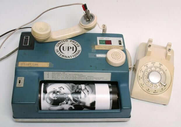
It’s been more than a year (!) since our last roundup of old wire service photos. We’re going to a try a new format this time around: Instead of making you click on each photo, I’m running the photos here on the page, although you’ll still have to click on them to see full-size versions.
All of these are from the awesome BSmile, who not only found these images but also cleaned them up so they could be showcased in all their glory. Here we go:
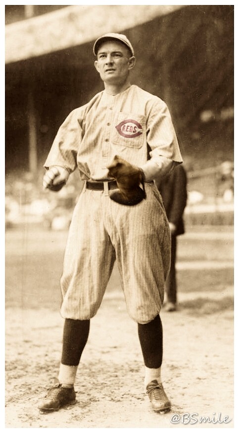
• Dressed to the Nines doesn’t show the 1916 or ’17 Reds wearing chest pockets, but Bill McKechnie, who played for Cincy during those seasons, appears to have had a pocket on his jersey:
• It was old-timers’ day in Philadelphia in 1933, as a bunch of former MLBers got together. That’s Chief Bender towering over everyone else at far left. Interestingly, the record books say he was 6’2″, so most of the others must have been under six feet — people really were smaller back then:

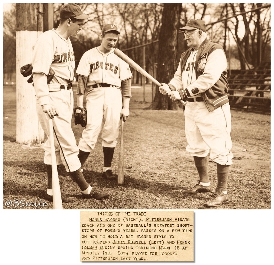
• Honus Wagner was in that last photo, and here he is again, this time wearing an absolutely awesome-looking Pirates jacket:
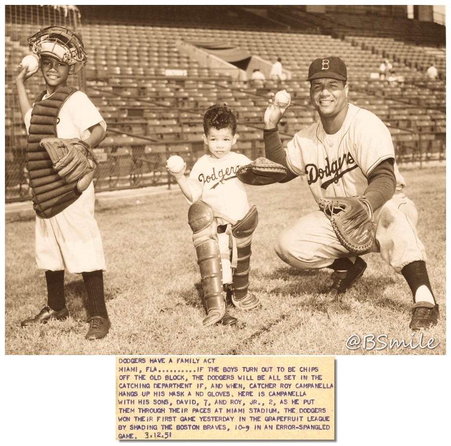
• Love this 1951 shot of Dodgers backstop Roy Campanella posing with his sons. Those shinguards are just a wee bit too big, eh?
• Here’s another family shot, this time of Chinese-American ballplayer William “Buck” Lai, who played for several minor league teams and had interest from the Phillies and Giants but never made it to the bigs. Interesting that he wore his uniform for a shot that appears to have been taken outside his house. Not sure what team that was for, but note the American flag on his chest — presumably to show support for America’s war effort in 1917:
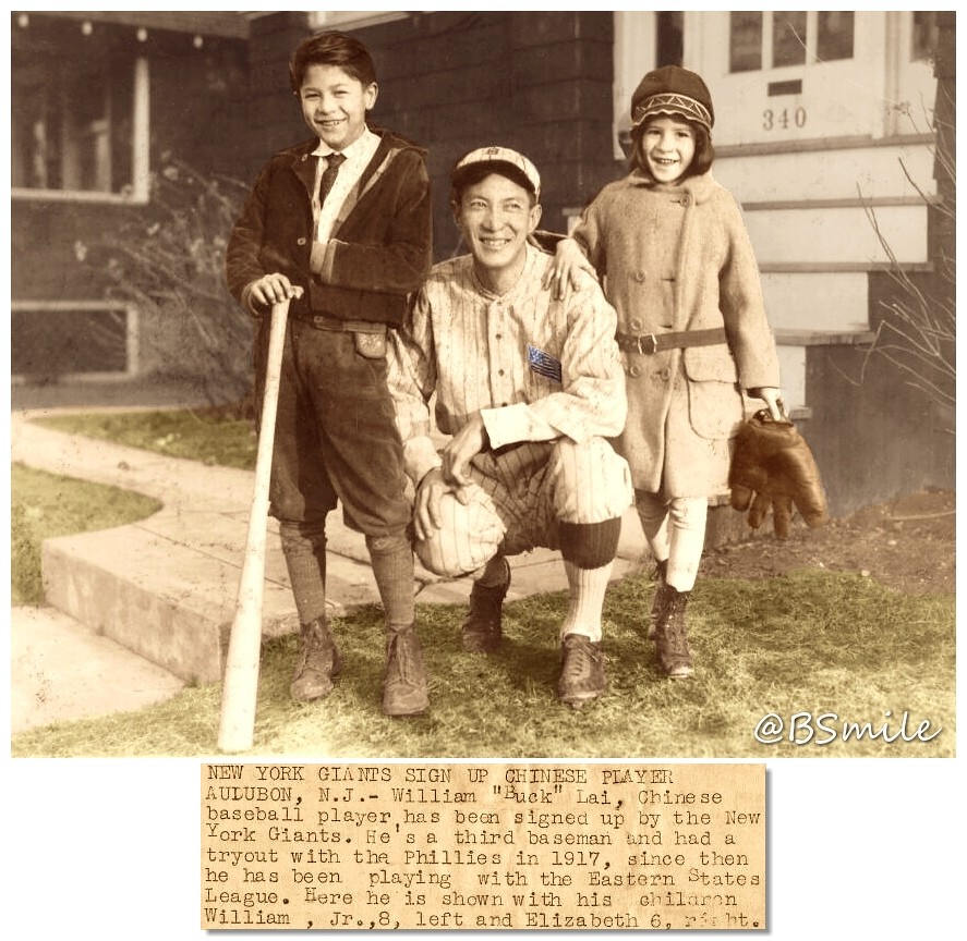
• Yet another family shot, this time of a father-and-son batboy combo for the 1942 Montreal Royals:

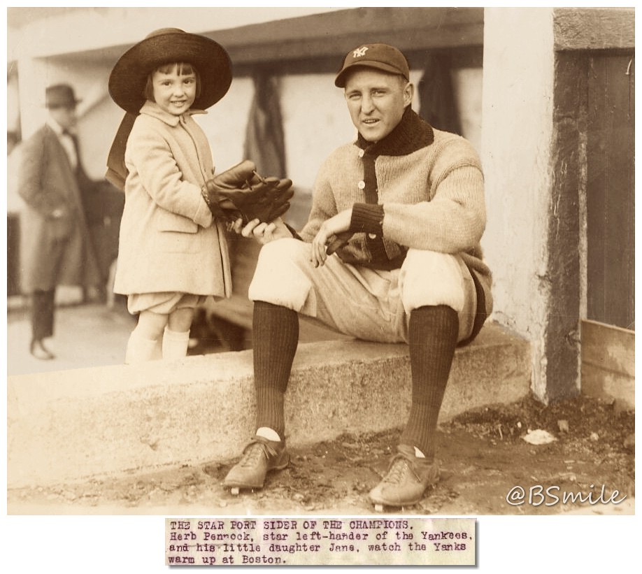
• One last family affair, although in this case I’d say Yankees pitcher Herb Pennock’s sweater looks even better than his daughter:
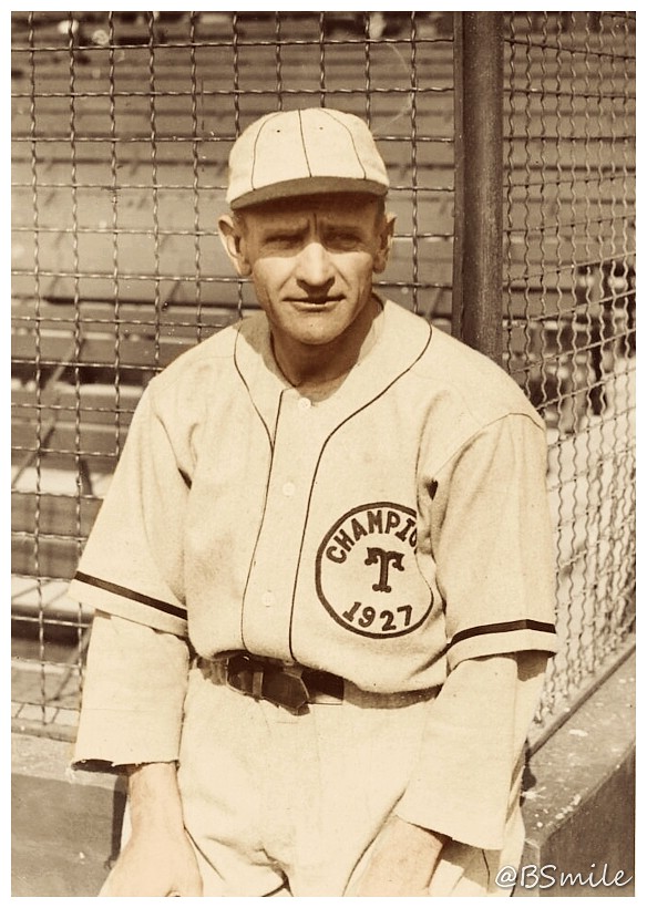
• We all know that championship jerseys have been worn at the major league level by the Giants, Indians, and Cardinals, but minor league teams have also gotten in on the act. Case in point: the 1928 Toledo Mud Hens, who celebrated their 1927 title on their jerseys, as modeled here by player-manager Casey Stengel:
• So much to like in this colorized women’s basketball shot. The “WE” on the jersey stands for Western Electric, which was a big telecom company at the time:

• Here’s Hack Wilson, who still holds the all-time single-season RBI record (accomplished in a 154-game season, no less) clowning around with Hollywood starlets Arline Judge (famous for marrying and divorcing seven times) and Rochelle Hudson:

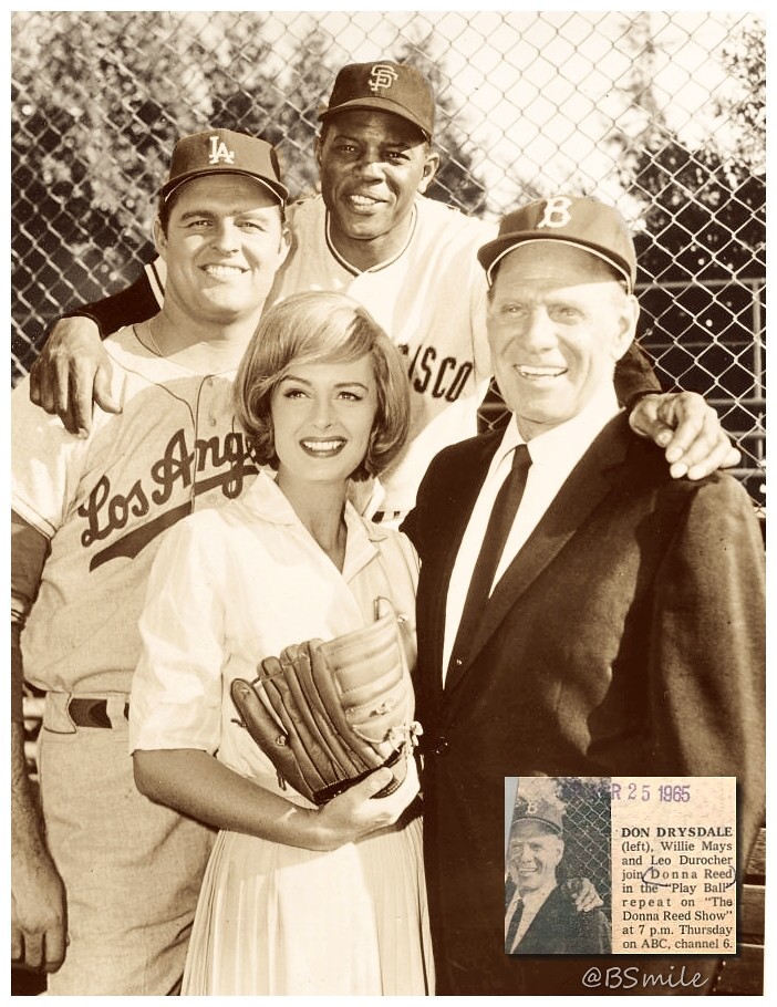
• Speaking of starlets, here’s Donna Reed with Don Drysdale, Willie Mays, and Leo Durocher:
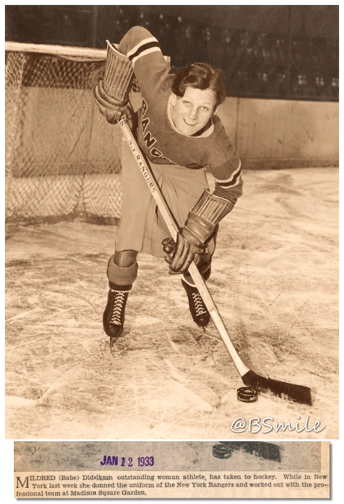
• Babe Didrikson is widely considered the greatest female athlete who ever lived. She dabbled in just about every sport, including hockey:
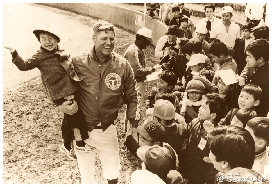
• The Saitama Seibu Lions — that’s a Japanese baseball team — were called the Taiheiyo Club Lions during the mid-1970s. Here’s former MLB slugger Frank Howard wearing one of their jackets during a 1974 goodwill tour of Japan:
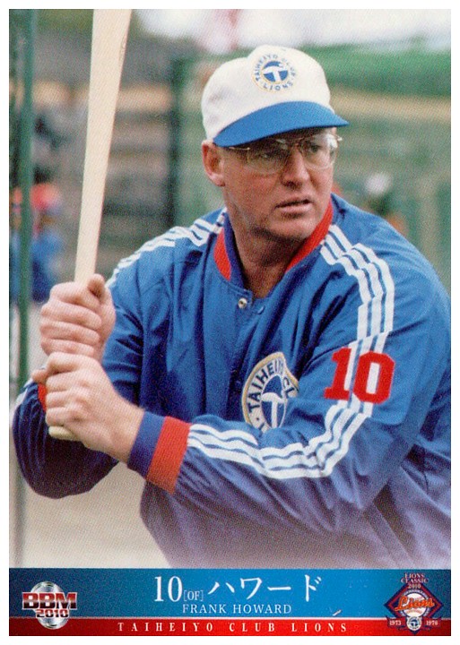
As a bonus, here’s a color shot of Howard in that same jacket:
(Big thanks to BSmile for sharing these great shots. Thanks also to whoever sent me the wire machine photo at the top of the page several months back. I no longer recall who it was, but I’ll gladly give proper credit if someone wants to refresh my memory.)
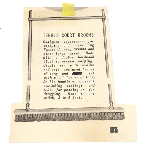
PermaRec update: My latest featured letter from the Hoge Brush Company files looks at a very specific kind of brush (shown above). Get the full story over on Permanent Record.
Also: My previous PermaRec entry examined the topic of letterhead designs featuring renderings of manufacturing plants. That prompted a comment from reader Will S, who brings the news that Columbia University’s library has a collection of over 1,300 letters written on stationery designs featuring architectural vignettes. Fantastic stuff ”” check it out here.

Vice squad: Right before New Year’s I was contacted by a reporter from Vice Sports, who wanted to write a profile of me. He checked out as a capable writer and a decent-seeming guy, so I agreed. He came out to NYC in January and we spent a day together watching football at Uni Watch HQ, plus he interviewed Phil and some of my past and current editors.
I’m told that the profile will be running today. I have no idea what will be in it. Link coming soon. Here it is.
The Ticker
By Mike Chamernik

Baseball News: In case you missed it: The Braves will wear a “Dewsy” patch on their left sleeve to honor long time coach Bobby Dews. … The Yankees will continue to wear an “8” patch for Yogi Berra this season. … Brewers players shared their thoughts on their new pseudo-retro alternate jerseys and caps (from Phil). … A wine company is selling MLB-branded bottles of wine (from Rich Paloma). … The West Michigan Whitecaps will wear emoji jerseys for Social Media Night in June (from Brinke). … Navy will wear its new cream jerseys this weekend in the Freedom Classic. … Twins pitcher J.R. Graham wore some top-notch stirrups yesterday (from @GFGartland). … The Mets use uni numbers to designate parking spots at their spring training complex (from John English). … Unclear which year this is from, but during a Milwaukee Braves throwback game, Andruw Jones and Chipper Jones’ socks didn’t match (from Jonathon Binet). … Yesterday we mentioned that Arkansas wore gray at home. Turns out the team’s laundry wasn’t ready (thanks, Josh Claywell). … The Triple-A Albuquerque Isotopes will wear both Better Call Saul- and Holly Holm-themed jerseys this season (from Phil). … Brewers reliever Will Smith has a glove with a camo pattern on it (from Phil). … The comedy film ¡Three Amigos! came out 30 years ago this year, so the Fresno Grizzlies will wear “30 Amigos” mariachi uniforms in July (from @j_m_chavez1, via Phil). … Cubs players have received shirts that read “In blue, out red” on the back. The slogan is a reminder for players to relax before workouts, not a slight against the Cardinals (officially, at least). Gotta love the fronts of the shirts, too: a meditating Cub wearing a 1970s-era road jersey (from Mike Powers). … A Padres catcher is wearing strobe glasses to improve his reflexes. Stephen Curry has also used the glasses, which have quick-flashing lenses, to sharpen his handles. … Here’s a good video piece on the Twins’ team curator. Clyde Doepner has been a Twins fan since 1961, their first year in Minnesota. Over the years he has amassed more than 7,000 items of memorabilia (from Mike Menner). ”¦ We already knew that Mets OF Yoenis Cespedes had added an accent to his NOB this season, but Tyler Kepner was visiting Mets camp and reports that Bartolo Colon also has a new accent, over the second “o.” No photo yet.

Hockey News: The Canadiens celebrated their one millionth Twitter follower by having a bot create custom avatar jerseys with Twitter handles as the NOB. Of course, some of the accounts had offensive names. Something similar happened a little more than a year ago with the Patriots. … The USHL’s Dubuque Fighting Saints will wear 1983 throwbacks on March 4 (from Andrew Timmerman). … Dallas had a hockey team in the 1940s called the Texans, and they had pretty cool uniforms (from Phil). ”¦ New 25th-anniversary logo for the Wheeling Nailers.

NBA News: The Timberwolves and Raptors went blue-vs.-red in Toronto last night. … Also last night, in Indiana, the Pacers wore their Hickory High alts and the Knicks wore their 1950s throwbacks. … Pistons F Reggie Bullock wears a clear protective mask. … Pau Gasol suffered a hand injury earlier this month, so recently he’s been wearing a fingerless glove on the court. … The Bulls revealed the name and logos of their new D-League team. The Windy City Bulls will begin play next season. … The Hornets will have a new multi-panel video board hanging above their court next year. … A Redditor has quite an impressive jersey collection. Must be a big Chris Webber fan. The collection contains a Webber Magic jersey, which never actually existed (Webber was drafted by Orlando but then traded to the Warriors). … NBA players have had to wear some ugly uniforms when playing pro ball overseas. … The Santa Cruz Warriors of the D-League will wear these jerseys on Friday night. … A few years ago Charles Barkley said some disparaging things about the women of San Antonio. A hot dog restaurant in the city honored him with a mural.

College Hoops News: A UNC alum argues that the Tar Heels aren’t as “cool” as they once were, citing the new black unis as evidence. Carolina superfan James Gilbert says he couldn’t disagree more. … The Western Michigan women’s team wore Kalamazoo Strong warm-up shirts in response to the killings that occurred there over the weekend (from Phil). … Maryland players have state flag-patterned shoes (from Johnny Carroll).

Soccer News: New jerseys for the L.A. Galaxy (from Phil). … New uniforms for the USL’s Richmond Kickers (from Phil). … Multiple players wear triple-digit jersey numbers for Cruz Azul, a Mexican club (from Daniel Germano). … This is unconfirmed, but the U.S. might have a new black jersey for World Cup Qualifiers and the Copa America Centenario (from Andrew Rader). ”¦ The top scorer in a German Bundesliga season receives an unusual trophy: a miniature cannon (from Graham Clayton).

Grab Bag: The Malaysian government has made a certain T-shirt illegal. The yellow shirts say “Bersih 4,” the name of an antigovernment demonstration. Bersih means “clean” in Malay, and protestors are calling for a clean government.
Cruz Azul isn’t the only Mexican club to wear triple-digits; Toluca did it earlier this year….. Why?
Hi Josh,
Just to clear a little bit this triple number thing in Mexico’s soccer. From what I remember, when Monterrey (the City) reached its 400 anniversary, a player from the Monterrey FC used the number 400; when Chivas Guadalajara reach its 100 anniversary, Adolfo Bautista used the number 100. Both granted with special permission from the league for the ocassion. On March 5, Club America will honor Cuauhtemoc Blanco and he will use the number 100 in the game. Also as a special permit to do it.
Now, for Cruz Azul, that game was a Cup game so they tend to also use players from the inferior divisions to play and assign them numbers that won’t be confused in any way with the first division players.Toluca must’ve used the same. That should be the reason. (in fact Club America had already someone registered with the number and then changed it to 110 link)
Bottom line, even though they could use any number from 1 to 99, they shit out and use whatever number they want in Mexico’s league…
Hope you find it useful
That’s my understanding as well Carlos.
It’s players from their youth academy that are called up that wear the triple digit numbers.
Case in point that I was answering below (but mobile version has nor “reply” button
This is Leon’s first team
link
You’ll see there is no number 4
This is Leon’s U-20 team
link
You’ll see number 4 there along with other 2 digit players. Yet, most of them use triple digits.
When someone is called up, he stays with the same number he had and these only change after the football year ends and everybody is registered for the new season.
That wire photo of Donna Reed is cool because Drysdale wears an “LA” cap, Durocher wears a Brooklyn “B” cap.
Dated 1965, I think the photo was taken the same year that Herman Munster was a Dodgers non-roster invitee to Spring Training.
There were people other than Donna in that shot?! Didn’t notice.
You just know Leo had his hand on Donna’s ass.
The Dodgers were involved in several television shows in the 60’s and very early 70’s.
Beverly Hillbillies (Durocher scouted Jethro).
Mr. Ed (the horse was somehow a good hitter).
Brady Bunch (Wes Parker showed up to give advice).
That’s just the tip of the iceberg:
link
Herman is my fave!
link
Someone mocked up a Topps card:
link
You will note in none of these will you find the actual MANAGER of the team, Walter Alston – even O’Malley did guest shots for Petes Sake! Apparently, you would never see the words, “Walt Alston” and “Personality” anywhere near each other..
That SABR article is interesting, but the author draws the wrong conclusions about what happened in the 70’s. TV gave us more realistic shows like All in the Family, MASH and so forth. Also, there were really no big stars on the Dodgers, and when they started getting good again, it was the MANAGER who was the superstar. You would see guys like Sutton and Garvey on game shows and talk shows all over.
That wine maker is also selling Collegiate wines. Kansas schools only. Intended for Alumni only, I’m sure.
Disappointing that all they seem to be doing is etching bottles with logos full of identical (presumably super-plonky) wine. There’s so much you could do matching wine variety and source to the spirit of each team! Red and white Burgundy for the Red Sox and White Sox, obviously. Zinfandel for the A’s, California Chard for the Giants, California bubbly for the Dodgers, a South Coast Cab Franc for the Angels, Virginia Cab Franc for the Nats, Finger Lakes Riesling for the Mets, a Marquette red for the Twins, and so forth. Plus a few wild cards, like tequila for the Padres, bourbon finished in a port barrel for the Reds, and of course a growler of beer for the Brewers.
Frank Howard actually played a single game for the Lions in 1974. link
Yeah, you can tell by the number 10 on the jacket that he was a player.
Frank Howard’s stint with the Lions was interesting (and sad). In spring training he was blasting titanic home runs all over the place, but had a minor injury (his knee, I think) that just kept getting worse. There was pressure from the press to play him on Opening Day, and he played but his knee flared up again and he went on the DL for several months and was eventually released, costing the team a bundle.
It’s too bad he didn’t stick around until link and a white shirt / magenta pants combo at home and all-magenta on the road. Must be seen to be believed!
The USHL’s Dubuque Fighting Saints will wear 1983 throwbacks on March 4 (from Andrew Timmerman).
Yikes! Upside-down “N” alert!! Try slipping that by someone who specs type for a living.
Can’t believe that even the USA is going BFBS. I mean, come on, the primary color isn’t red, white, or blue. Disappointing.
I honestly prefer the 2015 Germany-style black and neon green over the supposed black with red and blue. There’s a sort of aesthetic integrity to a uniform that’s completely non-team-colors, whereas jamming dominant black alongside team colors just feels cheap and manipulative.
Love the new crest, though.
I disagree on the crest. Would’ve been much better to keep the centennial crest.
The “new” crest is too much USA basketball futuristic look.
link
Agree 100% on the top though. Horrid.
Youth players in Mexico require to have their own number. With under 20, under 17, under 15 and under 13 teams for each club, there are a lot of players. So all youth teams normally have triple digits and double digits are left for the top team. However, there are cases when the top squad requires to promote a player for a game (normally the cup games) and this players has to use his regular number, therefore the 3 digit. Works both ways, if a top squad player is nursing an injury and has to play with the under 20 team, he uses his number since no one else in the club has it
The Vice story is up:
link
Terrific article and well deserved!
That’s a really nice read! Kudos to David Zarley. It was fun to get a little peak inside the center of the Uni-verse!
The LA Rams have been posting photos and images on Twitter/Facebook that feature the Rams wearing their classic LA colors. This includles photos or football players around town in yellow and royal blue Rams uniforms, and highlight videos which show the Rams in yellow and royal blue colors. It seems to me that the team is ready to revert to its classic LA branding. Paul, can you see what you can find on this? I see a lot of foreshadowing.
Like, I’m saying that almost anything they post features the team entirely in non-St. Louis colors.
On the flipside of that, the team’s official website has a background image featuring 2 Hall of Fame players wearing the royal & yellow uniforms with a filter on it that makes them look like they’re navy & gold. I wouldn’t read too much into anything yet.
RE: Yankees wearing Yogi’s number – is it still a patch if it’s just a numeral? Bob Sheppard & George Steinbrenner definitely got patches. Players usually get the black armband and/or numeral (Mickey got both)
I do believe that it will the unencumbered digit. That gets reserved for Yankee HOFs. It’s simple, beautiful – very ‘Yankee’
The mismatched socks do not constitute the biggest difference between Chipper Jones’s and Andruw Jones’s Milwaukee Braves uniforms. Chipper’s jersey is missing the front number, while Andruw’s jersey has it.
On the uniform memorial for Yogi Berra: it is too bad that the Mets are doing nothing for a pennant-winning manager of theirs. They should wear a black armband as they did in 1976 for Casey Stengel, seen link in this shot of Teddy Martinez.
We should remember that that band was actually in honour of both Stengel and Joan Payson. Which is all the more reason for the Mets to repeat it, as a current band could be in honor of both Yogi and Nelson Doubleday.
That piece on Brewers player reaction to the new alternate unis is a terrific argument for giving players the #2 spot behind fans on the list of People Whose Opinions Teams Shouldn’t Ask About Uniforms. I mean, I agree with the players, who mostly expressed a cautious positive view of the new jersey and cap. But their reasoning ranged from none to jock-stereotype nonsense.
On the other hand, if positive player response leads the Brewers to move toward navy and athletic gold across their uniforms, fine by me.
I’m going to say it: Isn’t “Windy City Bulls” just a bit lazy? Even recognizing that they play in greater Chicagoland, 25 miles from the United Center?
Actually, is a emblematic of a very good trend: the naming of a D-League after the parent club. This follows the Westchester Knicks and the new Long Island Nets. And, before that, the Warriors and Spurs changed the nicknames of their D-League teams to their own.
It seems that NBA teams are slowly realising that a D-Leauge team should not have its own identity. The appeal to fans of a D-League team is based entirely on its being an extension of the parent club; so that team’s identity should strongly mirror that of the parent club. (I wish more of baseball’s minor league teams would accept this view.)
But a D-Leauge team can pull out elements from parent club’s history, as the Westchester Knicks do with their 80s wordmark. This is why I hold out some hope that the Long Island Nets might incorporate something from the Nets’ classic uniforms into their look and wind up looking better than the parent club. (Well, except for the presence of an advert on the uniform.)
MLB teams do not own their minor league affiliates tho
I’d love to see the Westchester Golden Apples return in name – that’d be more interesting to me than “D-League Knicks”.
Whether or not “Bulls” is a good nickname for the D-League team is neither here nor there.
the “Windy City” part is terrible. Hoffman Estates, Illinois is, was and never will be known as the Windy City.
anyway, I’m kinda surprised they didn’t just repurpose link for the team.
Would love to see the Honus Wagner picture colorized. Seems like the Pirates’ caps have a different colored bill, possible red, than the main cap body. Probably some red in the jacket stripes but that is indeed one heckuva jacket.
The Vice article is a great read, but I do have to ask: do you have other kind of hats? It seemsto me you are sporting a hat most of the time and it’s always the same one. Nothing wrong with that, but now I’m curious
I have three hats that I’ve been wearing in cold or cold-ish weather for years. They’re pretty much the only headwear I wear (aside from my bike helmet). This isn’t so much a matter of policy as it is “It works, it ain’t broke, no need to fix it.”
I tend to get very bad hat-head. So once the hat is on, it usually stays on.
Thanks
Paul, really neat article about you. It was well-written, and importantly, treated you and what you do with respect. Congratulations on the coverage, and thanks for sharing!
One of the stories that Clyde Doepner doesn’t include in the video about being the Twins’ curator: When he found the file of letters from presidents/vice presidents to the Senators’ Griffith family–which were in the piles of stuff to be thrown out–he carried it back to Calvin saying, “Are you sure you want to get rid of this? It’s history.” Calvin’s reply was to the effect of: Look, I told you it’s all going out. Don’t be bringing it back in here.
Once again, Bruce Menard has raised the bar on presenting vintage photos! Many thanks for sharing.
Thanks Jerry!!
Thanks for running the wire photos inline instead of behind links.
Bartolo Colon Spring Training Uniform with Accent in Name:
link
If that image doesn’t work it came from this page: link
My goodness. The way the woman present themselves in those 1960’s photos, absolutely stunning! Gorgeous!
Nice article on Vice Sports!
Paul, feel blessed that you are able to get “bad” hat hair.. :)
I just might root for Mexico if that US Soccer jersey is legit. If that crest is real, it’s a definite upgrade over the current logo, though I would prefer the centennial crest.
Don’t worry, you’ll have all the South American teams to root for too.
ESPN SportsNation shared this photo via Facebook to highlight the fan’s reaction to Steph Curry’s 3, but doesn’t it look like Curry is wearing ankle weights? Or are they some sort of brace?
Guess I should include the image:
link
Did we already know about this detail? The Brewers are wearing plain white pants, no side piping, with their new contempretro navy jerseys:
link
Turns out the Brewers are removing the piping from *all* of their pants this season.
Wait, what? That thick navy-gold-navy piping is the best part of the Brewers uniforms!
Not anymore.
Yay – wire service! And a great previously unknown picture of Casey! However, by 1928 he was finished as a player, as he appeared in only a few games in ’27 as a pinch hitter, one of which he hit a HR to win an important game.
Now, if someone could only come up with a picture of Casey together with The Babe. It seems odd that two of the more camera friendly personalities of the game, who played in 4 WS against each other, and were generally part of the baseball scene – especially in New York – of the time, never were snapped together at some point.
That is…without question…the most requested Babe Ruth photo I get asked for!If I dig one up you know it’ll end up here.
Re: picture of Dallas Texans. Is the negative space between the E and X supposed to form a star? (as in lone star)