Shaw, Carrasco, Otero, Soto and Thatcher working through mound sessions this morning: pic.twitter.com/QEJGvfWZoe
— Jordan Bastian (@MLBastian) February 23, 2016
Yesterday’s Ticker had a shot of Indians pitcher Corey Kluber going high-cuffed with striped socks during a spring training workout. As you can see in the video above, his teammate Bryan Shaw has also been wearing the striped hose, and so have several other Cleveland players.
A lot of people apparently inquired about this, because the team issued the following tweet early this morning:
We've heard a lot from you about these socks (modeled here by @Lindor12BC). Good news: they'll be around all season! pic.twitter.com/WcFX6W4JNE
— Cleveland Indians (@Indians) February 24, 2016
As you all know, I love striped socks (not as much as I love striped stirrups, but still), so I’m happy about the team adding the striped hose to its wardrobe. But you can see the problem in the photo the team used for that tweet: They’re still allowing non-striped socks and letting the players choose whichever ones they prefer, which will lead to a visual hodgepodge. Sigh.
This is the latest example of a phenomenon we’ve seen before: Baseball hosiery is now treated more like equipment (like wristbands, batting gloves, etc.) than like a part of the uniform. It’s a disappointing trend for those of us who care about lower-leg aesthetics, and a bad development for a sport that has teams called the Red Sox and White Sox.
Meanwhile, here’s a question: When and how did “His/their sock game is strong” become a catchphrase — not just in sports, but seemingly everywhere? I’m assuming this is some pop-cultural reference that I totally missed because I don’t watch the right TV shows or some such, so fill me in. Thanks.
Confederate flag follow-ups: A few follow-ups to yesterday’s look at football teams that have worn the Confederate battle flag on their helmets or jerseys (some of which appeared in yesterday’s comments, so my apologies for those who already saw some of this):
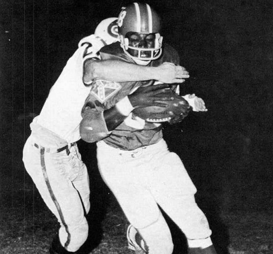
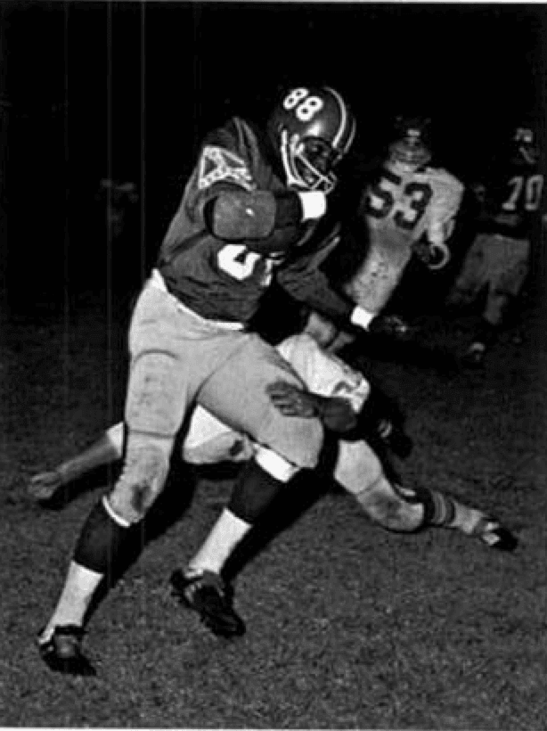
• I asked if the late-’60s football team at the University of Texas at Arlington, which wore Confederate flag sleeve patches, included any black players. There was at least one in 1967: wide receiver Jimmy Thomas. Here are two shots of him wearing the flag patch (click to enlarge):
• There’s a high school in Austin, Minnesota, of all places, whose teams are called the Rebels. They currently have a cartoon rebel logo, but for a long time they wore the Confederate flag:

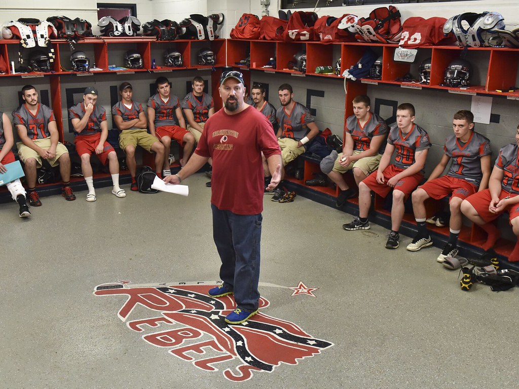
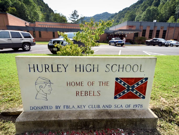
• Hurley High School in Virginia also has the Confederate flag on its football helmets — and just about everywhere else (further info here; click to enlarge):


(Big thanks to Christopher Jones, Zach Gouge, and Justin for their contributions.)

Click to enlarge
PermaRec update: So here’s a question: Do the illustrations of factories commonly found on old letterhead designs actually show the factories of the companies in question, or are they just stock illustrations? Find out the answer, at least for the example shown above, in this Permanent Record investigation.
The Ticker
By Paul

Baseball News: Old habits die hard: Dusty Baker, now skippering the Nationals, still likes to have a toothpick in his mouth. Turns out he does it instead of dip (from William Yurasko). ”¦ Speaking of the Nats: Washington DC mayor Muriel Bowser, traveling in Cuba to explore economic and cultural opportunities, presented a Cuban official with a “Castro” Nats jersey. That’s presumably for Raul or Fidel, because there’s no Castro on the Nats’ roster (from John Muir). ”¦ Oooh, gotta love this old shot of a ballclub from Lake Minnehaha, Minnesota. Now we just need to get one of those jerseys for Nelson Muntz (from Jeff Barak). ”¦ Marlins skipper Don Mattingly’s facial hair ban is earning him some formidable enemies. ”¦ The Cubs are once again awarding gold cap stars during spring training to the outstanding player of the day. ”¦ The Mets are the latest team to schedule a Pride Night promotion to support the LGBT community and combat bullying. To my knowledge, they are not planning rainbow-accented uniforms. ”¦ The Fresno Grizzlies will be reprising their Fresno Taco alternate look for Tuesday home games this season (from Harrison Huntley). ”¦ For reasons that aren’t clear, at least to me, Arkansas wore grey at home yesterday. Also, note the batter’s pitcture-perfect stirrups (from Matt Snyder). ”¦ The Great Lakes Loons are selling some pretty wacky socks (from Alex Dewitt). ”¦ A mother lode of early baseball memorabilia has been found in a Vancouver attic. Use the “Photos” link below the headline to see more pics (from Mitch Hendriks). ”¦ Davis Jaye spotted someone wearing this Tigers/Michigan mash-up T-shirt. It’s available here. ”¦ Very nice Northwestern-striped stirrups for Eastern Michigan (from Cory Fisher).

NFL News: Ooh, check out this set of embossed NFL team logo medallions (from Jim Dornberger). ”¦ I had already reported that the Lions might have a uniform change in the offing for 2017. Here’s more info on that, including the word that they definitely won’t have a throwback in 2016. ”¦ Todd Radom has written a good piece on how TV and Roy Rogers paved the way for NFL helmet logos.

Hockey News: The guy who came up with the idea of putting a “Stop” sign on the back of youth hockey players’ jerseys, as a way of cutting down on hits from behind, has died (from John Muir). ”¦ Pink in the rink promotion fort the South Carolina Stingrays (thanks, Phil). ”¦ Toledo Walleye staff members wore Kalamazoo Wings shirts and jerseys when the two teams faced off last Sunday night, as a gesture of support in the wake of the latest mass shooting (from Phil). ”¦ As if the Hartford Whalers didn’t already have enough going for them, here’s something I didn’t know: They had history’s coolest gift shop entrance! ”¦ This article about the Bruins’ poor record at home begins like so: “They resist radical notions, like staying in a hotel the night before a home game, or wearing road uniforms at TD Garden.” ”¦ Popular prank in the NHL: hiding a rookie’s helmet and making him go helmetless during pregame warm-ups. ”¦ The World Cup of Hockey uniforms, due to be released a week from today, will apparently include Adidas stripes (thanks, Phil).

NBA News: Big, big article on Stance Socks (thanks, Phil). ”¦ The Lakers have created a pretty cool interactive page that breaks down ever jersey Kobe Bryant has worn in his NBA career, including All-Star designs, throwbacks, Noche Latina, Olympics, and more. I’ll leave it to others to figure out if they got anything wrong or missed anything, but the overall page design is really good.

College and High School Hoops News: Quite a study in contrasts last night in Waco, as Kansas wore throwbacks and Baylor wore neon yellow. ”¦ Westview High School in Indiana has a long tradition of vertically striped socks!

Soccer News: The leading French soccer magazine, France Football, is currently running a poll to choose the most “mythical” kit in the history of Ligue 1 (from Bernd Wilms). ”¦ The Tacoma Stars will be wearing special jerseys this Friday to raise funds for a cancer-stricken local fan (from David Eaton). ”¦ Juventus midfielder Paul Pogba has the Batman logo shaved into his head (from Tim Cross). ”¦ Clint Dempsey of the Seattle Sounders ripped off his CONCACAF patch in protest after a teammate was issued a yellow card (from Michael Orr).

Grab Bag: Buried within this article about NOLA Brewing in New Orleans: “Besides a devotion to putting this city on the map as a craft beer destination, the team at NOLA Brewing are deeply passionate about music, and it’s not uncommon to catch them at a funk show still wearing their brewery uniforms.” ”¦ There’s been a settlement in a trademark case about the Red Wing Pottery logo. ”¦ Many of Michigan’s sports teams borrow the football team’s winged helmet design — even the swimming team (from Tony Bruno). ”¦ Female midshipmen (which sounds like a contradiction in terms, but that’s the proper lingo) will now wear trousers, instead of skirts, for their graduation from the Naval Academy. ”¦ The Ohio State gymnastics team is letting fans vote on which leotard the team should wear for this Saturday’s meet (from @rdubs007). ”¦ Students at Australian high school can now wear uniforms designed either for boys or for girls, regardless of their gender. ”¦ Kudos to Nike founder Phil Knight (bet you never thought I’d be writing those words), who’s donating $400 million to Stanford. The money is earmarked to attract graduate students to fight issues like poverty and climate change. Good for him.
Wouldn’t grommets be a type of tubular rivet?
No.
The functional part of a rivet is the rivet itself. The hole in the middle is incidental.
The functional part of a grommet is the hole in the middle. The metal is incidental, only there to create the hole.
Metallica link doesn’t work
Weird. Definitely worked yesterday. I’ll remove it from the Ticker.
Just go to the “Store” tab on the site. the featured item is the “NFL”/”MET” logo.
Ha ha! Nelson Muntz… good one, PL.
The Yankees will continue to wear Berra’s No. 8 on the sleeve of their uniforms this season.
link
I will hold them to the simple tribute. Anything to avoid a repeat of 2010, when the Bombers’ jerseys looked like a roadside memorial to a traffic accident.
RE: Red Wing logo kerfuffle…..
No mention of the hockey team or the shoe company, who I was think the article may be about.
RE: Rivet letter…
There were no 12/16 rivets in 1949. Only 6/8 or 3/4.
Paul, your sock game is on fleek.
(I can tell I am getting older because I actually am mad there’s a term called “on fleek”, but anyways)
You can tell you are getting older when you have ask what the hell “on fleek” means in the first place. I had to ask my nephew that months ago after hearing it. Re the sock thing, it’s a weird thing: my teenage boys are both more concerned with their socks (they only wear shorts, even in winter) than anything else. Even if they don’t match their outfits (which they generally don’t) they love strange/colorful/whimsical/crazy socks. Odd.
The phrase “on fleek” reminds me of “hoopy frood”.
“Stop trying to make ‘fetch’ happen.”
“Female midshipmen (which sounds like a contradiction in terms, but that’s the proper lingo) may now wear trousers, instead of skirts, for their graduation from the Naval Academy.”
This is in fact incorrect: they are being *required* to wear trousers.
Right you are. Text now adjusted.
Good to see the Rebels coach stomping all over the Battle Flag. Way to show unintentional disrespect for something many view as a symbol of disrespect. Like a double-reverse-metadisrespect.
Socks matter – I wear suits to work every day but the socks always match the dress shirt (rarely white) and/or tie. After all, “God is in the details.” (Ludwig Mies van der Rohe)
And the flag on the sign is upside down. Properly displayed, stars on CSA battleflag have point at the top. Another sign of PC disrespect of an un-PC symbol. I love it when I see white supremacists marching with the flag upside down; as if further evidence of their ignorance was needed.
As a middle school teacher, I can assure you that you haven’t missed anything on TV in reference to “game is strong”. It’s just a saying used by kids primarily on social media. It really can reference anything (socks, shoes, hair, eyebrows, etc.) and is usually accompanied by a selfie.
This is part of the problem with modern trends with kids: They’re happening without even hitting mainstream media first, leaving all of us grown-ups in the lurch. Whether or not that’s intentional is hard to say, but it’s mildly troubling because there might be stuff that’s not as harmless that bubbles up before any of us ever know. Part of it is probably because I have no idea how Snapchat works and don’t feel the need to ever find out, as it seems to be one of the preferred communication methods for people under 20 now. But it leaves me confused on the whole, and I’m only 33.
All I know is that we live in a world where #DamnDaniel became a thing. I’ve seen it. I kinda get it, but I don’t see how it went so viral. Same thing with “WHAT ARE THOSE?!?” The fact we’re just trying to figure out the lingo, much less have a feel for what will or won’t be popular, tells me that there’s a bigger generational gap now than perhaps us older folks even understand.
Isn’t is a Star Wars thing? Yoda and Darth Vader used to say things like “the Force is strong in this one” and now we have a more generalized “[thing] is strong in [person]”.
That still doesn’t explain the term “sock game.”
As in, “Get ya game on”? I’ve heard people talk about “playas” (players), “haters”, and “gamers” in trash-talk lingo, and using the form in a metaphorical sense, such as “He tried to start a flame war, but his troll game is weak”. Helpful?
You guys are overthinking this. It’s simply another example of a sports phrase creeping into everyday conversation as a cliché buzz phrase, which I generally dislike.
Think of it like this:
In the 1980s, one might have said something to the effect of, “Larry Bird’s midrange game is strong.” Young people insert mundane personal traits or items into the phrase in place of midrange in order to describe whatever that is as, more or less, “good.”
Paul, slang doesn’t have rules, and seldom has a definitive origin.
“[X] Game strong” Doesn’t mean anything more than that you’ve got an impressive collection of some material item or impressive abundance of some talent that others find appealing.
So, yeah, it could be “Shoe game strong”, “watch game strong” or “blog game strong” (in your case). They all are the same basic thing: a boast.
Not at all a Star Wars thing. It also has absolutely NOTHING to do with socks. “_____ game is strong” or “_____ is on point” or “____ is on fleek” is basically a new way to say “_____ is awesome.” So “Your sock game is strong” means “your socks are cool.” “Your hair is on point” means “Your hair is looking good today,” and so on. Source: I’m 21 and in college.
Exactly. It goes more or less hand-in-hand with the overabundance of the word “gear”. Kids have taken on an a lifestyle image without actually taking on the lifestyle. The world is replete with kids in baseball caps and shorts who play no sports, kids in sagging pants and skater shoes who don’t own skateboards, and (my personal least favorite) suburban kids wearing timberlands and sagging their pants who have absolutely zero connection to urban anything.
Did anyone else notice that coach standing on the Confederate Flag was also wearing a ‘skins shirt? Double wammy.
I was going to say the same thing. Whole buncha racism!
My first thought while scrolling through this post…only came to the comments to make sure someone else had already mentioned it…I knew I wouldn’t be disappointed!
I believe the “Ha Ha” jerseys are from a new book about the history of black baseball in Minnesota. The photo shown in the ticker is of a Minneapolis team — “Minnehaha Lake” isn’t a city, but refers to the intersection of Minnehaha Avenue and Lake Street.
link
Posted this yesterday, but it was late, so I thought I’d take another shot.
Okay, the cap Bautista’s wearing here: link…
I thought it was the same hat as this: link….
But the cap Bautista’s wearing appears to have baby blue trim around the maple leaf. Am I seeing something that isn’t there?
Your links are gorked but I know what you’re talking about.
There’s nothing there but artifacts of alternating dark blue and white lines.
link
I think the better question is why they’ve introduced a new hat in an entirely new shade of blue that doesn’t match anything else in their uniform set.
link
The Lions modifying their color scheme would be a mistake. The Honolulu blue and silver combo is unique and looks great. Lose the black, sure, but otherwise leave it alone.
Just wait…that “Lions alternate” will be GFGS. I’m going to call it now.
Which is what it should be, seeing how it’s a prominent team color, and it saves us from seeing them in mono-blue for the color rush thing.
I think I’d rather see them in mono-white with the numbers turned blue and a silver outline.
A road uniform featuring grey jerseys and white pants would look spiffy, league rules be damned.
Yea well this ain’t your NCAA
Won’t be GFGS. It’ll be GFNIS (gray for Nike icompetence’s sake) because they can’t make silver uniforms.
Re: Corey Kluber’s socks. Lest we forget, the Indians wore some of the spiffiest stirrups of all in the late ’70s and early ’80s. I’m not sure their striped hose were meant to accessorize the “caveman” uniforms or if they were handed down from an earlier era, but they were offered in navy and scarlet versions.
Paul, I know the lack of uniformity chagrins you, but I prefer to see the glass as half-full. We appear to be entering a sock renaissance, and I wouldn’t want players to be hamstrung by uninspired team-issue. Even the “blood-soaked” Diamondbacks trousers reflect this trend, in the sense that folks are beginning to be bored by plain details around the ankle/calf area.
Your point about the D-backs’ ankle/calf area is something I hadn’t considered. Those uniforms are atrocious, but your point is valid and interesting to think about.
Surprised they did not hand Castro a Pirates’ jersey.
The distinction between equipment and uniform is an interesting one, and I’ve really been thinking about this a lot this morning. I would define “the uniform” as the basic set of visible clothing all players wear on the field to play the game (cap, undershirt/sleeves, jersey, pants, socks, shoes, etc.) while “equipment” would be items worn or not worn at various times that assist the player in playing the game (fielding glove, batting gloves, shin guards, elbow guards, sunglasses, etc.). I think there’s also a third category, but I’m not sure what to call it. The third category consists of things like hoodies, warm-up shirts, do-rags, sweat bands, and the like. Of these items in the third category, sweat bands are the only ones that players and coaches don’t all wear identically.
Not to send us down a rabbit hole, but do you guys agree? What would you call the third category? Are there things I’m missing?
What would you call the third category? Are there things I’m missing?
“Licensed Team Apparel” would be my stab, and it would include the Floyd R. Turbo hats and knit caps/toques I’ve seen players wear on the field in cold weather.
“Uniquipment” — a topic I addressed in 2014:
link
How and why has Stance gotten so much coverage? It’s really gotten out of hand.
They found a market area — socks — that everyone has a vested interest in (everyone wears socks), but had little attention paid to it and was prime for an adjustment in terms of quality and branding.
Everyone wears socks. You can wear plain socks. Or you can have one of three colors of high-quality team-branded socks so you can take your fandom to another level while showing your individualism.
I mean, we’re borderline obsessive about socks here. Today’s column was about socks. I guess I’m just not as surprised about it as you are.
Same for TruSox. Found a market and tapped into it.
“Coverage” and “ubiquity amongst its core demo” aren’t the same. I don’t think those socks are selling nearly as much as you guys seem to think they are.
Todd Radom’s article about the NFL’s adoption of logos was very interesting. I hadn’t realized that in the 1958 NFL championship game the Colts had helmet logos, but the Giants helmets did not.
This reminded me of a picture book about the “greatest game ever played.” In it, both the Colts and Giants are illustrated with helmet logos. link
That is a minor flaw compared to “The Magic Hockey Stick,” where NHL players are illustrated wearing SHORT SLEEVE shirts. link
I wish kid’s books were more accurate!
link
Yep, someone said it earlier, re: minnehaha lake jerseys, it definitely is for the intersection. There is no Minnehaha lake in MN but there is plenty of things named for the intersection.
re: Lions redesign…go with the throwback uniforms and slap a logo on the helmet. done. see here: link
Ew.
I’m with you, The Jeff. One of the Lions’ problems is the lion, itself. The original insignia was a blob, the new version an unsatisfying tweak which fails to address the original’s anonymity. They ought to make it more heraldic and rampant (maybe add a crown) so the silhouette approach holds together better. The throwbacks actually aren’t bad but I really want to see white on the socks and shoe details.
I like the “new”, detailed lion. Maybe they could either make it bigger/huge like the Bills’ logo. Or do a Half-body version ala the jags prototype.
link
In re: the “game is strong” question, I’ve always thought it was a reference to kung fu movies.
link
Not even remotely close. It’s just another urban slang term. Ya’ll are overthinking this to a comical degree.
Ooh, check out this set of embossed NFL team logo medallions (from Jim Dornberger)
Interestingly, the template of this medallion was used for NFL trucker hats I used to sell at a kiosk in Hampton Beach, New Hampshire. I still have a Tampa Bay one. The Saints were my favorite team, but the company making the hats couldn’t figure out the ochre hue New Orleans used (shoulda tried Pantone Matching System, in retrospect), so the Saints’ hats came with an incorrect orange brim.
It was used on belt buckles and all sort of stuff.
link
I’m kinda wondering why the Raiders one is silver, while the other 27 teams are gold.
I’d like to point out that being from Austin, MN, we most certainly DO NOT clam the Southland Rebels as being from Austin. It’s actually a Hodge-podge of rural communities in SE Minnesota that combine to form schools. We have a lot of those here in rural Minnesota. It was always bizarre to me, as well, as a resident of this area to see the Confederate Flag on their uniforms. Minnesota was the first state in the Union to volunteers units during the Civil War…a better name might have been the Volunteers!
Also, Minnesota is the last of the loyal states to retain the Confederate battle flags captured by its state’s troops during the Civil War. Every decade or so, Virginia asks/sues to get its captured battle flags back, and Minnesota’s response has always been on the order of, “Come and take them, if you can.” Proportionately, no state shed more blood than Minnesota to put down the Confederate treason. Minnesota’s proud (and loyal) Civil War history is prominently taught in every school district in the state. A Confederate-emblazoned “Rebels” nickname anywhere in the state is morally, culturally, and historically comparable to a high school in Palm Beach calling itself the Schutzstaffels, or a college anywhere in America styling itself the Soviets. It’s just baffling that anyone in Minnesota ever thought that iconography was appropriate for a public school.
For accuracy’s sake, the State of Minnesota is also defying a U.S. Army request for the flag to be returned to IT, as a 1905 Congressional resolution and executive order arguably requires. Which one might say makes for a situation dripping in irony.
link
Well said arrScott.
Last year the Indians had red socks. Now this year navy? So red socks no more?
Kudos to Paul for his praise of Phil Knight.
Hopefully the $400M donation to Stanford will be put to good use in coming up with solutions for some very serious issues.
Serious question here. What is the emotional reaction and associations a white, non-Southerner has to the Confederate battle flag? I am 48 years old and a white Southerner. I have lived all over, including the West and Upper Midwest. I can understand African-Americans’ reaction to the flag. But my Northern brothers-in-law loved the Dukes of Hazzard back in the day and the General Lee was a big part of that show’s appeal. They didn’t mind the flag as kids. Is the emotional reaction and associations white non-Southerners have today different than it was 20 years ago? From these photos clearly folks in Minnesota (one of the states I have lived in, BTW) didn’t mind it. And Texas (another state in which I have lived) isn’t really Southern the way the rest of the South is. Texans are Texans first, everything else second and the Confederacy did not seem to be something many Texans identified with when I lived there. So I doubt UT-Arlington folks were trying to be provocative back in the day (Ole Miss is a different story). I appreciate any insights the good readers of Uni Watch can share.
I was born in Oregon, and I have lived in the Northwest for my entire life. From my perspective, the Confederate flag is just another historical relic. See the Confederate flag, think mullets, country music and Daisy Duke.
For that matter, when the high schools in Albany, Oregon split in 1970, the new school was built in the south part of town. South Albany High adopted Rebels as its mascot, with red and grey as the school colors. In 1977 we saw South Albany’s marching band perform at Oregon State Band Day. They wore Confederate uniforms with the Confederate flag as a vest.
Thanks. I can understand seeing it as a historical relic, albeit one with very unpleasant associations for many.
I see it as the battle flag of a treasonous movement – a group that formed a military to fight against the United States of America and wanted to/did separate our nation in two.
I don’t understand how anyone can support the use of the confederate flag if they have any sense of patriotism. Oddly enough, many confederate wavers also take great pride in their “patriotism” – ignorance on display.
But my Northern brothers-in-law loved the Dukes of Hazzard back in the day and the General Lee was a big part of that show’s appeal. They didn’t mind the flag as kids.
Well, speaking as a black Southerner, I can tell you that while my brothers and I loved that show as kids my parents always had a level of trepidation about letting us watch it. As an adult, I understand precisely why they did, and wouldn’t allow my kids to watch anything similarly themed (not that such a thing would be produced and played on primetime TV today).
In an episode of “The Walking Dead” this past fall, the mullet-adorned Eugene commented to another character, “Your hair game is strong.”
well that’s stupid. Without social media I doubt a phrase like that catches on. The writers should do their best not to use new slang on the show unless it is something that the group of survivors use within the group.
That phrase predates social media. “[X] Game Strong” is basically the same as “[X] Game Proper”, which was around in the mid 90’s.
Just because you just discovered something doesn’t always mean it’s new. It’s merely new to you.
I’m not saying that Hurley High should be forced to make changes, but those images give me the willies. It looks like a line has been drawn in the sand.
If they did change, the could be the Minutemen. Or the Firehoses.
Piling on. I used to work on Minnehaha and Lake in Minneapolis. Big business corner. There’s Minnehaha Creek, Minnehaha Falls, Minnehaha Park, Minnehaha Avenue (intersects Lake Street) and Minnehaha Parkway (pretty much follows the line of the creek)
Another interesting thing from that Dempsey pic: his MLS logo patch is there under the CONCACAF patch, meaning they’re just sewing those things over standard MLS match jerseys, not making special jerseys with the correct patch.
$400 million to a school with a $22 billion endowment. What a joke.
I don’t think this can so easily be dismissed as a joke. I completely understand the angle that wealthy donors should consider how much more of an impact that kind of gift would have at a smaller college that is more in need of the money.
But Knight is a successful business man. He’s going to make smart investments, so it makes sense to invest in a school with a strong record of academic success. His money may not have as much “bang for the buck”, but it is probably a safer investment.
Ok..so Adidas is going to thoroughly destroy hockey uniforms with their stupid 3 stripes. Its annoying, its ruins the overall aesthetic of the uniforms. NHL is screwed.
Yup. Been doing it to MLS for years, as well as lots of European teams. You should have seen what how the 3 Adidas stripes went with Newcastle’s iconic black and white striped shirts for example (spoiler: not well).
Has anyone noticed that the LA Rams are posting photos and images on social media that focus exclusively on the Rams wearing their classic LA colors? Paul, this is worth checking out.
Golf clap. I really hope they go with that look.
Two things –
The Indians C Logo is terrible looking, the I one was much better (Chief Wahoo aside)
The big thing – so it’s “cool” to support Castro now? The same two who overthrew a pro-US government and allowed an enemy of ours to put nukes on it to face us? Seriously???
Awesome looking basketball game in Indiana right now, Hickory Pacers vs. Knicks old throwbacks. So tight!
@Jake – so then they need to design a better C monogram. But a baseball cap monogram represents the city/state, not the team. The I, however aesthetically pleasing, is not the customary choice. That said, I like the C.