Click to enlarge and see additional players
About five years ago I did an ESPN feature about a mid-1960s minor league baseball team that wore a Confederate battle flag sleeve patch. But I’m not sure I’ve ever seen a college football team that wore the a Confederate flag patch until now.
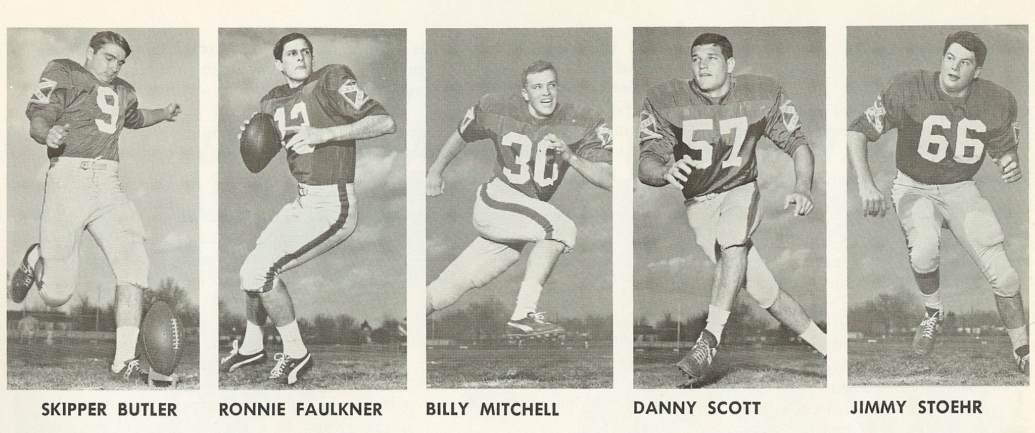
These photos, which were sent my way last week by reader Dennis Jones (who says he found them in a magazine while cleaning out his attic), show the 1968 team from the University of Texas at Arlington, which at the time was called the Rebels. Anyone know if their roster included any black players?
The team name was changed to the Mavericks in 1971 (further info here), and the school’s teams still use that name today.
After I posted the UT-Arlington photos on Twitter, reader Richard Lewis told me that former NFL quarterback Tommy Kramer’s high school — Lee High School in San Antonio — also wore Confederate flag patches. I went looking for a high school photo of Kramer, and sure enough (click to enlarge):
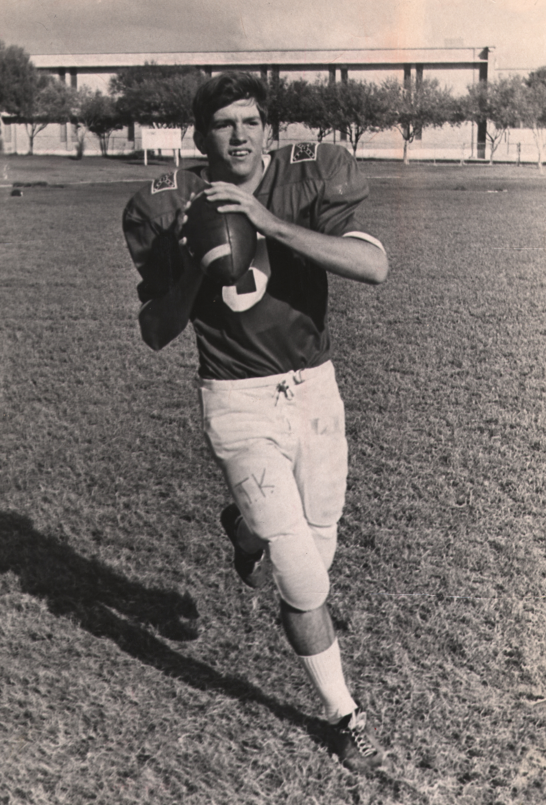
It’s not clear which year that photo is from, but Kramer played high school football from 1969 through 1972, so it’s from somewhere in that range. The team was (and still is) called the Volunteers, but the school itself was named after Confederate Gen. Robert E. Lee, so that presumably explains the patch. Again, it would be interesting to know if the team included any black players.
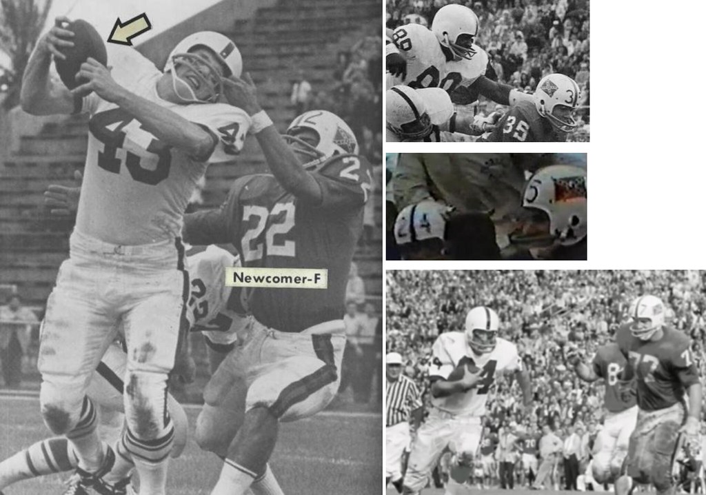
I’m aware of one other instance of a college team wearing the Confederate flag, but not as a patch. When Florida faced Penn State in the 1962 Gator Bowl, the Gators wore the flag on their helmets (click to enlarge):
I don’t mean to suggest that these instances are unique. On the contrary, I’m sure there must have been lots of other teams that wore the Confederate flag at some point during this period. But it’s still powerful to see.
Meanwhile, here’s an odd coincidence: As I was working on this piece, Phil directed me toward this tweet, which shows that the Confederate flag was displayed during pregame ceremonies at the 1976 MLB All-Star Game, which was played in Philadelphia:
'76 @MLB ASG: American flags over time + confederate, English, w/ holders in period military unis @PhilHecken pic.twitter.com/jOM2dChSzC
— Jordan Mayblum (@TownsmanJordan) February 17, 2016
1976 was American’s bicentennial year, of course, and the flag appears to have been part of a larger display of flags from American history. Still, it’s hard to imagine such a thing taking place at a sporting event today, no matter the historical context.
Click to enlarge
Collector’s Corner
By Brinke Guthrie
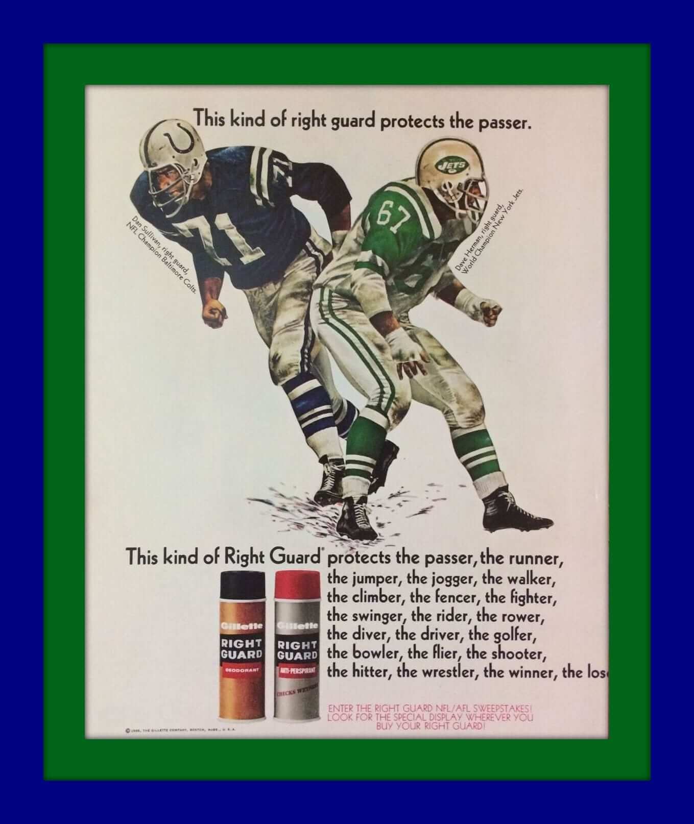
This kind of right guard protects the passer (and the runner, the jumper, the jogger, etc.). Great Right Guard print ad, featuring Dan Sullivan of the “NFL Champion Colts” and Dave Herman of the “World Champion Jets.” So this ad arrived following the Namath-guaranteed win in Super Bowl III. And if you like that, check out this set of vintage NFL player print ads, too.
Now to the rest of the week:
• Check out the artwork on this 1969 Chargers/Patriots game program. They just don’t make ’em quite like this anymore, do they? And before you know it, they’ll totally do away with programs, and you can just preview the game on your smartphone.
• Terrific art on this 1960s San Francisco Giants mini-pennant from Bazooka. Since you obviously can’t get this inside a pack of gum, it had to be a mail-in premium kinda thing.
• Let’s go, Big O! Here’s a 1960s Oscar Robertson basketball strategy game. (Side note: I used to see his Rolls Royce in the Cincinnati suburb of Indian Hill. His license plate simply read, “O.”)
• Before the Colorado Rockies were a baseball team, they were a hockey team. One of my favorite logos ever on this Rockies mug.
• Normally DeLong was spot-on with their logos, but couldn’t they have done a better job with the Bears “C” on the chest? This one is a little more accurate.
• Hey, L.A. Rams fans! Here’s a set of seven “Mint unused” 16 oz. drinking glasses with the cool “L.A. inset” font — and blue facemasks!
• Dave Winfield has some top batting tips for you on this 1970s promo record from Coca-Cola. Now all you need is a record player.
• This 1970 N.Y. Giants gumball helmet from IHOP is still sealed in its package.
• Here’s a “commemorative limited edition decanter” for the 1969 K.C. Chiefs!
• “Sock ’Em, White Sox” with this vintage pocket mirror.
Follow Brinke on Twitter: @brinkeguthrie
Question for you folks: My last two design contests over on ESPN have been for the NHL (Maple Leafs) and NFL (Rams). For our next one, I’d like to do an MLB team.
And that raises a question: Which team should it be? Should we redesign a team that could really use it (the Brewers, say), or a should we tinker with one of the supposedly sacrosanct designs (Dodgers, Yankees)?
Post your suggestions in today’s comments.
The Ticker
By Mike Chamernik

Baseball News: The Diamondbacks wore their new dark gray pants, and here’s another look at their bloody-cuff white pants. … Phenomenal work by Chris Creamer: He created a graph showing every color scheme ever worn in MLB. Definitely worth spending some time with. … New patches for the University of Arizona. … TCU wore throwbacks on Sunday (from Patrick Homa). … New pinstriped gray jerseys for BYU (from Ryan Bernal). … A Sam Houston pitcher wore a batting helmet with a facemask (from Nick Lineback). … Indians P Corey Kluber went high-cuffed with striped socks for yesterday’s workout (from @Believeland1994). … New gray unis for Lebanon Valley College, a D-III team in Pennsylvania. I just learned the team’s nickname is the Dutchmen, and that an angry Dutch Boy is its logo. Fantastic! (From Mike Williams.) … Hawaii softball has throwback jerseys. … Mike Hersh was watching an episode of Agent Carter recently. “From my novice viewpoint I noticed things wrong with the Brooklyn cap in the background,” he says. “One, the show takes place in the late 1940s but that looks like a modern type 5950 hat. Two, displaying a ball cap at the office seems highly unusual for the time period. Three, the hat looks new but Dodgers hadn’t worn a white cap since 1938. Sure feels like the someone in the prop department just wanted to point out that the guy is a New Yorker who’s now living in L.A., historical accuracy be damned.” Good eyes. But maybe it’s like The Simpsons: Whenever you notice something like that, a wizard did it. ”¦ Adam Spangler found this vintage satin baseball jersey at an antiques store in Louisville. He couldn’t find what year it’s from or what team wore it, but he still thinks Paul would enjoy it. [And he’s right! ”” PL] ”¦ New uniforms for the Miami Hurricanes (from Jason Lefkowitz). ”¦ New uniforms for the Japanese women’s team Saitama Astraia (from Jeremy Brahm). … The Mets will wear their new 1986 throwbacks for Sunday home games this season.

NFL News: Chargers LB Manti Te’o proposed that his team wear all-navy at home this season. He even Instagrammed a mock-up of the look (from @BFTB_Chargers). … Kenny Kaplan found two film clips that show endzone lettering “upside-down,” facing the crowd: One of the 1967 ’Skins and one of the 1962 Steelers. “Was this a common practice in the ’60s?” he asks. ”¦ Look at this: A shot from an old Bills/Raiders game in Buffalo shows the Bills’ logo on the chain gang’s line of scrimmage marker. Was that because Buffalo had the ball, or because they were the home team? (Good spot by Peter Rayno.)
College Football News: A designer created some gaudy new helmets for a few SEC schools (from Phil). … New logo for the Army-Navy Game. On a related note: Back in 2011, our own Ricko recalled that Navy backs wore orange helmets with their all-gold jerseys in the 1961 Army-Navy game. While Ricko’s memory is outstandingly accurate, I don’t believe we found photographic proof of the game. Until now: Jim Considine found this photo of the game, and a Google search turned up this shot. So yes, it looks like backs wore the orange helmets, and the rest of the players wore gold.

Hockey News: The Blues will wear St. Louis Cardinals-themed warm-up jerseys on March 29. … Denver and Colorado College faced off at Coors Field on Saturday. Denver wore 1940s-era throwbacks and Colorado wore black alts. “Despite the Pioneers’ 4-1 victory, some DU fans are fuming in response to a couple of uni-related incidents at the game,” says Kary Klismet. “First, Coors Field security removed DU’s popular sideline mascot, ‘Denver Boone,’ from the game. It appears he ran afoul of a stadium rule prohibiting patrons from wearing anything obscuring their faces. He wasn’t granted an exemption because the university doesn’t recognize him as an official mascot. In contrast, CC’s official mascot, ‘Prowler,’ was allowed to remain on the field. Additionally, ‘Mega-Boone,’ a large banner DU fans unfurl to celebrate victories, went missing during Saturday night’s game.” … The Peoria Rivermen will wear Star Wars jerseys on Saturday. … This page allows fans to create and share a design for Blackhawks goalie Scott Darling’s equipment (from Kyle Martinek).

NBA News: The Bucks wore their black alts at home last night, so the Lakers wore gold on the road. The game was played on the Bucks’ alternate court, too (from @Carleeezy). … Remember when George Karl coached a game while wearing a Nuggets jersey in 2005? Clippers coach Doc Rivers says he wants to coach a game in uniform. The big news there is that someone actually wants to wear that crummy Clippers design (from Connor Boots). ”¦ Larry Nance Jr. is wearing JrOB with the Lakers, although he didn’t have the “Jr.” on the jersey at his introductory press conference. Also: Last night his “Jr.” didn’t have the period at the end.

College Hoops News: Virginia Tech G Seth Allen injured his eye Saturday versus Florida State, so he wore bandages both above and under his left eye. “Brutal!” says Andrew Cosentino. … A few people sent this in: A poster for the ACC Tournament in Washington D.C. shows another dome-shaped building that is not the Capitol. … Weber State has its logo on its ice packs, or maybe it’s on the tape that’s wrapping the packs (from Sean L). … Florida State’s women’s team wore pink last night. The Seminoles faced Notre Dame, which wore gray unis with pink accents (from Phil). … An Ohio high school girls’ team has ads on the backs of its warmups (from Chris Andrews).

Soccer News: Our guy Wafflebored created his own 1979 Vancouver Whitecaps jersey. … Houston Dynamo players have been wearing black bibs during the preseason. The bibs have devices in them that track player movement (from Ed Å»elaski).

Grab Bag: People who wear colorful socks have been found to be more interesting and successful than their peers. … Jeff Flynn has a 1959 pennant that shows Pittsburgh’s three major sports teams on it. … A small cheerleader apparel start-up is challenging the industry’s larger manufacturers (from Phil). … The U.S. Navy has been using the drop shadow block font on ships for decades, but Brian Codagnone found a photo of the USS Enterprise from WWII displaying a number in the McAuliffe font. … The British Olympic Association has issued a bunch of rules for its athletes, including “Thou shalt not cover up the Adidas logo” (from Phil).
Proofreading: “This 1970 N.Y. Giants gumball helmet from IHOP is still sealed it its package.” in its
“Tho shalt not cover up the Adidas logo” Thou
Fixed.
MLB redesign: Padres.
Ownership has already said this year’s uni is a one-year only “commemorative” get up, so let’s see what people think they will wear next year. See how many people think they’ll keep blue and “sunshine yellow” and how many think they’ll go full time brown, as they should…
Seconded.
If the Padres have been moved and seconded, I call the question and vote aye.
Otherwise, I’d propose thinking less about particular teams and more about categories of teams. For example, pretty much everyone agrees that there are too many red and blue teams. (Though just about everyone agrees that his favorite red and blue team should keep its colors, and other teams need to change.) So how about a design contest to change a currently red and blue team to other colors?
I agree with the red and blue concept. I think it’s a great idea that will produce a bevy of different design concepts, and addresses a problem that baseball (and other sports) are facing, which is turning a team into a brand that will represent a geographical area in a way that sells maximum swag. Red, blue, black, white, and grey are the easiest colors to mass market, especially in the USA. This is why you see lots of teams adopting a red and/or blue color scheme, black, white, or grey alts, and an unremarkable font/city initials logo. Anyone who likes Cleveland can justifiably wear an Indians hat if it’s adorned with a generic “C for Cleveland” logo.
With a team like the Padres or Brewers, I think there is a specific look that most people want to see return, and thus much of the concepts will hinge on that look (the return of the nostalgic logo, color scheme, word mark, etc).
With “untouchables” like the Yankees and Dodgers, design concepts are just spitting in the wind. We will never see anything like them (at least not for a few generations to come), and the team identities don’t exactly give us much to work with, anyway.
However, a red and blue redesign contest touches on both of the above issues. Many (or most) untouchable team identities are red and blue, as are some of the teams that are desperately in need of a redesign.
The rules: 1- You must redesign a team that uses red and/or blue as its primary color/s, and/or a neutral color as its compliment (red/blue, red/white, red/black, red/gold, red/silver…) 2- You must redesign said team without using red or blue as more than a tertiary color (similar to the way red is not part of the Dodgers official color scheme, it is only used for jersey-front numbers, or the way the Rays non-throwback design uses yellow only as a logo accent) 3- Allowances can be made for unique variations on red or blue, i.e. a primarily teal or baby blue team with no red, or a pink team.
I don’t care HOW the Padres are redesigned, so long as it’s a return to BROWN and YELLOW, as God intended. Throwback to one of the many 70’s designs, mix and match elements, I don’t care, just give me BROWN AND YELLOW!!!
-Jet
I am not a Padres fan. But the only uniform they wore that I really liked was the brown and orange with no yellow. That was a great look.
I concur.
Great story, @Wafflebored! I loved that same Whitecap jersey, though I preferred the white, which I had in an Admiral replica. I have an uncle in Burnaby and I used to go to a store called North American Sports and they used to sell replicas from all over the world. During high school, I would wear some jersey pretty much every day. I went to one game st Empire and recall alternating sides shouting White! Caps!
Original Edmonton Drillers supporter myself. Why am I not surprised that us old-school NASL fans congregate here?
So much this^^^^! What wouldn’t I give for a Tea Men, Strikers, or Rowdies jumper??
The tag on the green satin baseball jersey intrigues me. Dave Cook was a big local sporting goods concern into the 1980s. Originally Dave Cook and link were in business link, but at one point they split.
If anything, the Chargers should bring back the gold pants and a lighter shade of blue for the jerseys.
Yes. Wearing Gold pants with White jerseys and helmets would be a huge improvement over the depressing Navy pants with White jerseys and helmets also. The All White unis are Ok if paired against most teams.
MLB redesign: It might be an interesting contest to see what people think might have happened if the Dodgers, the Giants, the Braves, and/or the Athletics had done a complete rebrand when they moved.
Great idea. So many of the teams listed by other commenters have already been redesigned, sometimes multiple times, in just the last couple of decades. Let’s move on already. It would be interesting to see some takes on those teams who stayed true to their basic look. Especially in the context of the running debate here about “do franchises or the cities own the name/logo/records.”
I would say the Brewers are kind of a waste for a design contest.
…everyone here already knows what they need to look like again. :)
Please not the hacky ball-in-glove stuff again.
Well, I’m not a fan of the team, so I really don’t care in the end. However, it would be eleventy billion times better than the generic crap they’ve been trotting out for the last 16 or so years.
How is their current look generic? Sure, the wordmark looks like it belongs on a beer can… isn’t that whole the fracking point of it? They’re the Brewers, they’re named for people who make beer.
The old ball & glove is the pinnacle of generic baseball logos. It’s literally a baseball in a glove. You can’t get any more generic than that. It says Baseball Team, and nothing else. Yeah, the hidden M/B is really clever… it’s so clever that most people don’t even see it.
The current primary Brewers unis and marks are the opposite of “generic.” The Brewers unis and marks of the much-beloved royal-and-blue era are the epitome of “generic.” Including the ball-in-glove logo, which is nicely whimsical, but which says nothing at all about the team’s name or identity, and nothing at all about the team’s location and home. A high school of the time, ordering out of a catalog at the last minute and with the lowest possible budget, could easily have wound up wearing uniforms that look exactly like the old Brewers. That is what “generic” means in this context. Off-the-shelf. Lacking in specificity or particularity.
Please, can we please stop using the word “generic” as a synonym for “uniform design that I don’t think looks pretty”? link. If we want to say that we don’t think a uniform looks pretty, let’s just say “that’s an ugly uniform.” Let’s save “generic” for when we find a uniform to be, as the dictionary says, “lacking specificity or general.”
As for redesign, it is pretty obvious what the Brewers need to do. That is, modify the Todd Radom “Motre Bame” unis so the script rises from left to right (like a normal baseball script, or like a classic beer can logo), fancy up the jersey M and the B somehow, normalize the colors to navy and athletic gold, and then put the MB logo on the cap because screw it that’s what the fans want. Oh, and plain block numbers. Done.
“Royal-and-gold era.” Derp.
If the ball-in-glove’s gonna return, let it be to the jersey sleeve, and only to the sleeve. It is, and always was, just too outsized for the cap–seemed to take over the whole front panel. For the Brewers’ cap, I’d recommend the plain, but dignified, Roman capital “M” that Hank Aaron last sported as a player.
I’d like that. Dark navy cap, old gold M. Have to be careful not to look too much like what Jim Harbaugh wears on his head, though. Slim that M up.
I’m the rare guy that actually likes the current Brewers “standard” set (the white top, the gray top and the original navy alternate that just says ‘Brewers’ like the home white and road gray). I’ve explained briefly before, but will reiterate:
1. The ball-and-glove logo is kind of cool, but I’m still bothered by the fact it uses lowercase letters. A team represented by lowercase letters feels like a team that’s meek and easily defeated (as the Brewers have been through too much of their history). Heck, just think about typography:
lowercase text looks diminutive
ALL CAPS LOOKS LIKE YOU’RE SCREAMING AND MAKING A BOLD STATEMENT
I’d rather root for a bold team.
2. The royal and yellow stand out, but also feel like the colors of Lego blocks — very plasticky and 80’s, kind of dated. Navy is more of a “grown up” color, as is a realistic gold rather than the yellow. Again, I’d rather root for a team that feels more grown up and mature than one that looks plasticky.
“A team represented by lowercase letters feels like a team that’s meek and easily defeated”
And yet, the ball-and-glove is the only Brewers logo that reached the World Series.
Sorry, Dan, but I couldn’t disagree more. Sure, navy and gold are good colors, refined and grown-up; so much so that too many teams fall back on it. If you want an identity for your team, you should push aside any “me-too” iconography. I kind of agree with you on the caps, but that philosophy would disqualify script titles. Anyway, there are simply too many teams to limit them all to just one type of lettering.
Suffice it to say the Brewers have stumbled across a bunch of good ideas, having tried so many. Getting all of them on one set of uniforms is the challenge.
Yep. They should be in Seattle Pilots uniforms they rebranded in 1970 when the Used Car Salesman (Selig) stole them from Seattle.
No, leave the Brewers alone. They are Uni-Watch’s most convenient punching bag.
Fix the Diamondbacks. That’s my suggestion for the design contest.
+1
Paul
In this article is a reference to the removing of the Confederate Flag from the UTA campus in 1968 and there were black students on campus.
link
Dennis Jones
Everybody knows what Milwaukee should be if they were to remodel, so maybe Arizona , Seattle, and or Tampa bay
RE: Seth Allen.
I was at a Hokie Club event after the game where the whole team met in the Merryman center for pictures/signatures. He came in about about a half hour after the rest of the team, assuming because he was getting stitched up. Seeing it up close, he definitely got popped pretty good! Don’t have a really good picture, though.
I feel like an idiot now for submitting that green/yellow satin jersey for the ticker and calling it a warm-up. Honestly, it never occurred to me that it would be anything other than that, and I think it’s the first time I’ve ever considered a vintage baseball jersey being anything other than wool. Now that I have considered it, though, here’s an awesome write-up I just found on the history of satin baseball unis:
link
FYI, Uni Watch also covered satin baseball uniforms link.
Atlanta Braves should be the Topic of the Design Contest.
Agreed…with the move to the new home, and all.
As a born Atlantan, I’m vetoing that. That design (leaving aside minor details) has been the Braves’ uniform on/off since the 1940s. That is one of the precious few, lingering things in all of Atlanta that indicates any respect for history, or reflects any inclination whatsoever to preserve it. “Ditching the unfashionable or time-honored for the purposes of marketing and $$$” is a pretty fair capsule of the city’s history–start to finish, world without end. So don’t let’s contemplate the inevitable crass makeover before we have to.
MLB redesign: Nationals or Rockies or Twins. Both sets seem dated. Lots of potential for redesign.
Rebrand the Yankees. :-P
For the redesign I think the Marlins in the NL, and the Rangers in the AL.
Marlins should go back to the teal, now with black & orange, looks like to much going on.
Probably in the minority but I feel like the Rangers were never special and just blah. Blue to Red to Blue as primary colors, could be better.
I’ll second the Marlins.
Their latest set has always felt like a transitional one. I’d love to see them ditch the black and try that aqua blue as a primary color.
Maybe I’m in the minority, but I always liked the ’93 Marlins uniforms. And the more black intruded over the years, the less attractive it got. C’mon, Miami: do it for Orestes Destrade!
I’m with you: I liked those unis at the time, and looking back they strike me as some of the best of that decade. That look was both very much of its time but classic and lasting. If they were still wearing it today, it wouldn’t look like a dated 1990s design.
Maybe I was too busy averting my eyes to notice until yesterday that the bloody pants of the Dbacks is only bloody on the back half. Also after with another commenter about the unfinished piping possibly being even more concerning. Overall, a garish design.
* “agree with” not “after with”
Creamer’s graph shows just how truly overused red & navy are in baseball, that’s for sure.
For a contest, why not the Braves? They seem like an obvious target. They’re a navy & red team, they’ve looked the same for an extended time period… and other things
My bias says we should redesign the Cubs, just because there’s such a wide range of possibilities and I want to see what people come up with.
My head says we should redesign the Diamondbacks, because of the terrible job that they did redesigning themselves.
For a redesign, for me, the Diamondbacks are still the prime candidate. They’ve never gotten it right, and the “D-Backs” on the jerseys is both unfortunate and just lame. None of their designs are ‘clean’.
I see some people asking for the Rockies, but I like that they’ve not changed. There’s nothing too outlandish about their uniforms, and that’s okay. They’re not as plain as the Astros redesign (which should’ve gone back to the Joe Morgan era flying star), but still recognizable as Colorado.
I don’t need all the bells and whistles and sublimated graphics. If someone wanted to look to a modern team to model themselves on, I think the Giants are the team.
If a Diamondbacks player wants to go high-cuffed will the blood stain be gone?
Or will it be raised to the back of the upper leg?
Yes. From link back in December:
“[T]eam president and CEO Derrick Hall said players who prefer to go [high-cuffed] will be permitted to continue doing so, but only the longer, full-length pants will have the snakeskin pattern.”
Redesign contest:
Would love to see one of the classics like the Yankees, just because the controversy would add another layer of intrigue.
Other than that, the Mariners could really use some help. And I know I’m in the minority, but I really don’t like the Blue Jays look and think it would make for a great contest.
Perhaps a contest with a hypothetical problem to solve would yield interesting results. Something along the lines of, “What if the Blue Jays and Mariners were expansion teams in 1955, instead of 1977?” or “Make the Jaguars and Panthers original 1960 AFL teams”.
My candidate of a more traditional contest would be to redo the Nationals, since they’re the most recent joiners of the navy+red club.
This should include the caveat “no stealing from Charlotte Hornets or Jacksonville Sharks/Express.”
Can we still borrow from the Jacksonville Bulls? :P
My favorite unused insignia is the Oakland Invaders’ thunderbolt-in-a-fist. Inspired and inspiring! I’ve used it on every conceivable uniform.
Here’s a few more: Redesign the Bucs, Seahawks, Panthers, Jags, Titans and Texans as 1983 USFL teams. Another: Redo the CFL as 1970s-era NFL teams. Yet another: the post-1979 NBA expansion teams rendered as ABA squads. The more I hear from you guys, the better the concepts get!
Good eyes. But maybe it’s like The Simpsons: Whenever you notice something like that, a wizard did it.
I’m sorry, but what does that mean? Not to dwell on the inaccuracies, and just to roll with the director’s vision? Or accept the reality that the universe represented is just a work of fiction?
It’s from an episode of the show. The phrase is just an easy way to explain continuity errors.
link
Right you are! Thanks for reminding me of something I’ve forgotten I’d seen;)
I was going to use another pertinent Simpsons quote in that spot (“I hope someone got fired for that blunder”) but without any context it sounds pretty mean haha.
Or accept the reality that the universe represented is just a work of fiction?
Yeah, that. The show doesn’t take place on our Earth, but an alternate version of it. Ace Ventura: Pet Detective is still a decent movie, regardless of it’s version of NFL history being completely wrong.
I didn’t notice the white Brooklyn cap on Agent Carter, but I did see a blue one in a different episode and I wondered about that as well. It definitely looked like a new 5950 cap to me.
“Whenever you notice something like that, an intern did it.”
Dave Herman lives in the town I grew up in. Would see him around all the time, wearing the Super Bowl III ring. Very nice guy.
I’d want to see an Angels redesign. Seems like they change their name, uniforms and colors every decade or so, so they’re overdue.
I’d be okay with this, especially if they got rid of the red on red softball tops. I know they want to be red in contrast to the dodger’s blue, but c’mon, that’s overkill.
I was always a fan of the Nolan Ryan / Bobby Grich era Angel’s uniforms.
Angels need to go back to the LA on the hat with the Halo on it.
Redesign the Rockies with the caveat that purple cannot be used.
That just wouldn’t be fair.
That’s crazy talk. As a Rockies fan since day 1, I love the purple, black, and silver color scheme. I’m not a fan of softball tops on baseball teams, so I’d ditch the purple tops and black alts, but their basic home/away set is terrific.
The only thing that might benefit from a change is the letter font, but you leave our colors alone!
I could be wrong, but weren’t the Rox already the subject of one of our contests? Shouldn’t we disqualify teams that were already done?
I’d stipulate that purple should be used, and black be banned.
I’d go with purple, orange, yellow, and crimson… like the Rockies sky at dusk.
The Braves would be an interesting candidate for a makeover. A chance to minimize the troubling Native imagery, and to update the script (which they have been using, with only slight variations, since 1946)
(link; link; link)
See my thoughts above. I’d really prefer we picked a city that WASN’T notorious for wanton “makeovers,” and didn’t focus on one of the rare things it’s succeeded thus far in preserving.
Could always do the D-Backs to see what people can come up with to counter what the gave us
I second the Rockies and Nats for redesign contest…but, I’d like to see what people would come up with the Yankees, Dodgers and Cardinals.
I am fine with the Nats look for the most part. But I agree about the Rockies. They are just boring.
Yeah, the Nats have not-great uniforms, but they have in their lockers the makings of a great uniform set. A couple of minor tweaks to details and a clearing-out of silly alt elements and the Nats would have some of the best unis in baseball, using jerseys and caps they already wear.
Can we do logo contest for the new University of North Dakota Fighting Hawks logo? They just signed a contract with a designer but it would be interesting to see what we could come up with.
Splendid! You get my vote!
What did Te’o’s girlfriend think of the all blue get-up?
Not a fan of monochromia unless the helmet matches. The Jets’ white helmet over mono-green looks stupid, as did the Washington dark red over all-white and the Texans blue over mono-red.
Monochrome looks like shit. Always.
Yes, I’d like to see Brewers redesigns.
I don’t think those photos of UT-Arlington players are from 1968, but rather 1967. It appears that UT-Arlington’s link link as a sleeve patch, though some link included in the 1969 yearbook of the ’68 team (including the one of Skipper Butler featured above) showed the players in the old uniforms.
The 1967 UT-Arlington Football team, though, did include link, end Jimmy Thomas, from link. Photos of him in uniform from the link can be seen link and link.
It appears the uniform change was part of a larger debate on campus about the place of Confederate imagery, and while still prominent in the link, that imagery is tones down significantly from previous years.
UTA’s Special Collections library contains an entire collection of materials devoted to the controversy: link
That NY Jets-Colts illustration in the Right Guard ad is awesome. The Jets’ sleeve is how it was in the glory days. Love the white shoe laces, too.
Agreed. That’s what the Jets’ sleeves should look like now, damnit!
“Kenny Kaplan found two film clips that show endzone lettering “upside-down,” facing the crowd: One of the 1967 ’Skins and one of the 1962 Steelers. “Was this a common practice in the ’60s?” he asks.”
I couldn’t find a pic, but I definitely remember “PATRIOTS” being not only upside-down, but BEHIND the end zones in 70s-era Schaefer Stadium.
I’m reading on the internet today that the Lions are next up for a redesign (and might be volunteering to be a Nike project). Sounds like rich ground for a contest.
Ugh. Let’s hope not. The Lions are wearing their 2nd best uniforms of all time (behind the early 1980’s uniforms with the silver numbers). The last thing they need is to become a Nike project and end up with something that resembles the Browns or Jaguars.
Juneteenth
As clever as I sometimes feel when I get an obscure reference in the title of a post, I enjoy it even more when its a reference I’ve never heard of and it leads me down an internet hole and I learn a bunch of stuff. Thanks for leading me into a history lesson!
De nada. Didn’t mean to provide a history lesson, but glad it worked out that way!
Coaches wearing jerseys? This might be the ONLY acceptable reason for a jersey to have sleeves on it.
Only time I want a coach wearing a jersey is if they’re a player coach. When was the last time we had that? Pete Rose as player-manager? Dave Cowens?
I would go Padres, though Alternatively I might suggest the Braves or Indians
Regarding redesign… put the effort where it is needed. Don’t mess with the sacred!
Poppycockery! It is the role of designers to wonder. Everything we do is for an alternate earth, anyway.
The Padres are the perfect team for a makeover. Since they are clearly incapable of coming up with a decent design themselves.
Please, someone come up with a decent Padres look that features brown as their primary color. I have always been a fan of the brown and orange uni they wore just before switching to blue. But I realize their fan base loves the “Taco Bell” look with the brown and mustard yellow. Either one is still preferable to what’ they’ve trotted out in the last several decades.
And let’s ditch the camo league wide please.
Is that orange on the Royals MLB color chart?
There is a high school football team in southern Minnesota – the Southland Rebels. Until about 8-10 years ago, they had a Confederate Flag on their helmets. They took it off, and now have a cartoon rebel, kind of like UNLV now. Thought that was a little strange for Minnesota! Here’s a link to a newspaper article about them, with some pictures, and a high school football helmet site that has a good look at what the helmet looked like:
link
link
Slate story on the supposedly cutthroat and glittery world of cheerleader uniforms: link
Already in today’s Ticker!
Here’s one for the ticker: SB Nation typically does an excellent job with logo design for their respective team sections, in many cases (I’m looking at the Diamondbacks here) their team blog logos are better than the official team logo.
Except one: link As a Mariners’ fan I can sympathize with the downtrodden fella in the logo, but why on earth is a sad player riding the bench their blog header? Shouldn’t the blog have some kind of morale building slant to it? Those poor M’s can’t catch a break.
D’oh! Scanned right by that.
How about a redesign of the Expos?
Why would you want to redesign a team that doesn’t exist?
link.
I hope Montreal gets a team again. And when it does, I hope they’re not called the Expos. The new team deserves a new name.
Here’s an article on the use of Confederate symbols by Savanna High School in Anaheim, CA all the way up until 2009.
link
It seems the last use of the rebel flag in an uncontroversial sense was when “The Dukes of Hazzard” was a TV show.
That was not without controversy at the time.
Nonsense. There may have been a smidgen of controversy here & there about it, but for the most part the Confederate flag atop the General Lee notably LACKED in controversy. If anything, Confederate imagery in pop culture was ubiquitous at the time: Burt Reynolds’s “Smokey” movies raking ’em in at the box office, Southern rock ruling the FM airwaves, etc.
Hell, as late as 1986 Tom Petty of all people was still employing the Confederate flag as a concert backdrop, and only then were people starting to question the wisdom of his doing so:
link
I vote redesign the Diamondbacks. Their looks have gone from ’90’s meh, to ok, to completely asinine. Maybe picks some colors and stay with it?
Redesign: There’s too much red and blue and not enough green, yellow, orange, purple, brown, etc. in MLB. Given that these colors are limited to such “gear” as helmets, hats, undershirts, and chest protectors, baseball can be visually unstimulating at times. Hold a redesign contest with the stipulation that the team’s primary primary color must be changed (and not to the other most common primary primary color).
Blue teams on the chopping block: Brewers, Rays, or Padres
Red teams that I wouldn’t mind being redone: D’backs, Nats, & Angels
As for the notion of a redesign of a classic, if it wouldn’t prove too overwhelming in terms of quantity of submissions, what if you just solicit redesigns for any teams you feel shouldn’t be touched, just a sort of free-for-all?
MLB redesigns: Cobb County Braves and Arlington Rangers.
Up for auction is a New Orleans Saints helmet and cleats worn by Charlton Heston in the movie “Number One.”
If you look at the two stills from the movie, I noticed Charlton cut off the sleeves of his jersey, completely removing the stripes.
link
Someone else look at this, please.
Okay, the cap Batista’s wearing here: link
I thought it was the same hat as this: link
But the cap Batista’s wearing appears to have baby blue trim around the maple leaf. Am I seeing something that isn’t there?
*Bautista*. Stupid autocorrect.
MLB Redesign: The White Sox.
They have been inching back into older designs lately, especially with this years spring training unis. Its only a matter of time before a full time change is made, in my opinion.
Upside-down end zone lettering? In the late 60s the Bills had sideways lettering.
Here’s a pic from the Rockpile when the Jets were in town.
link
Here’s a series of screenshots showing what the Bills’ end zone looked like.
link
It wasn’t unusual for the Bills to paint the end zones with the other team’s names. Here are two from 1970 (left, against the Patriots) and 1971 (Cowboys). The Bills has bison-shaped logos in their end zone. The opponents had stars.
link
Of course, the team in the early 1970s who went all-out for their opponents was the Kansas City Chiefs, who painted the helmets at midfield (Miami at KC)
link