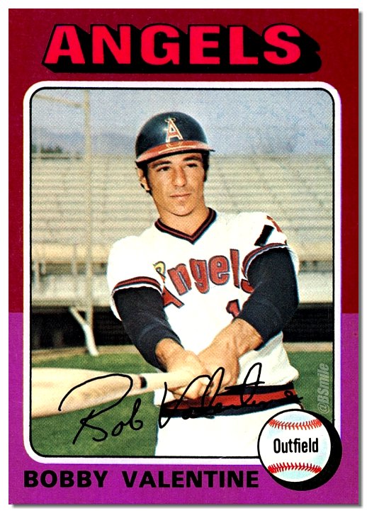
Yesterday was Valentine’s Day, and longtime Uni Watch contributor/pal BSmile marked the occasion by tweeting some old baseball cards of players named Valentine, including the 1975 Bobby Valentine card shown above.
At first my eye was drawn to what appears to be a strip of tape across the helmet brim — presumably an NOB (name on brim). But then I noticed the black strip on Valentine’s left sleeve.
I had no memory of the Angels wearing a memorial strip, so I went to Dressed to the Nines and looked up Hall of Fame curator Tom Shieber’s list of uniform memorials. Sure enough, there it was (click to enlarge):

The black strip was worn during spring training of 1974 for Bruce Heinbechner, a minor league pitcher who was killed in a car crash that spring (further details here). I wondered if the photos for any other Angels cards in the 1975 Topps set had been taken during spring of ’74 and might also show the black strip. I figured maybe two or three of them would, but the number turned out to be a lot higher than that (if you can’t see the slideshow below, click here):
I found a dozen 1975 Angels cards that show the black strip, plus Valentine’s card brings the total to 13. There’s a decent chance that the photos for those cards were all shot on the same day in March of ’74. Very efficient on Topps’s part, if not particularly creative.
I happened to be collecting baseball cards in 1975 (I was 11 at the time), and I have no memory of seeing the black strips. I guess my uni radar wasn’t very finely attuned at that age.
It’s interesting that the strip was always positioned diagonally. Also interesting that they held to the then-sacrosanct protocol of putting the memorial on the left sleeve, even though they already had a team logo patch there. Would’ve been a lot more convenient to put it on the right sleeve, which was blank.
All this, just because BSmile posted that Bobby Valentine card! I love it when something random leads down a rabbit hole like that.
Finally, if you’re wondering how I found all of those 1975 cards, I went to Check Out My Cards and searched on “Topps 1975 Angels.” It’s the best resource I know of for finding old sports cards.
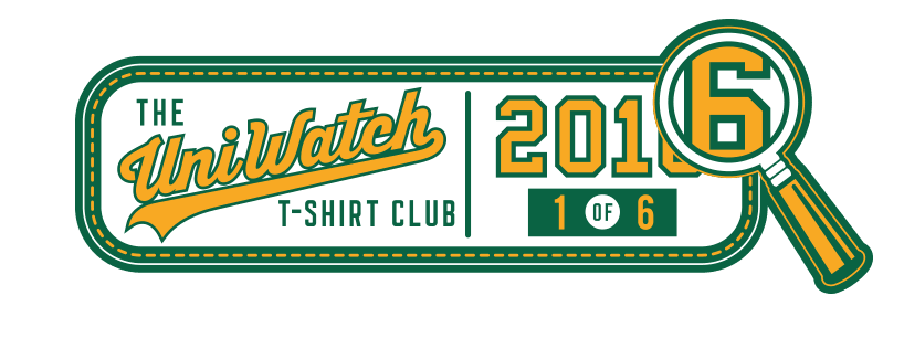
T-Shirt Club reminder: In case you missed it last week, the first Uni Watch T-Shirt Club design of 2016 is now available for ordering. Here’s the design, including a close-up of the jock tag graphic (for all of these, you can click to enlarge):
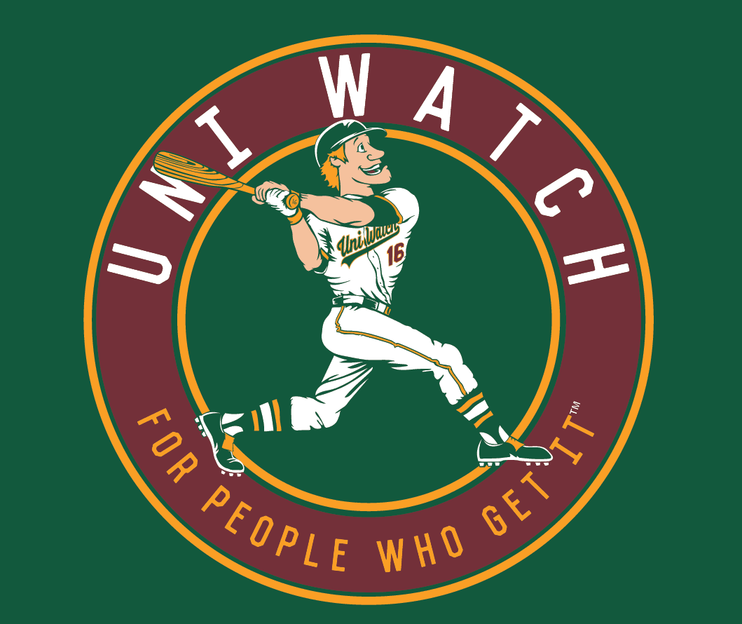
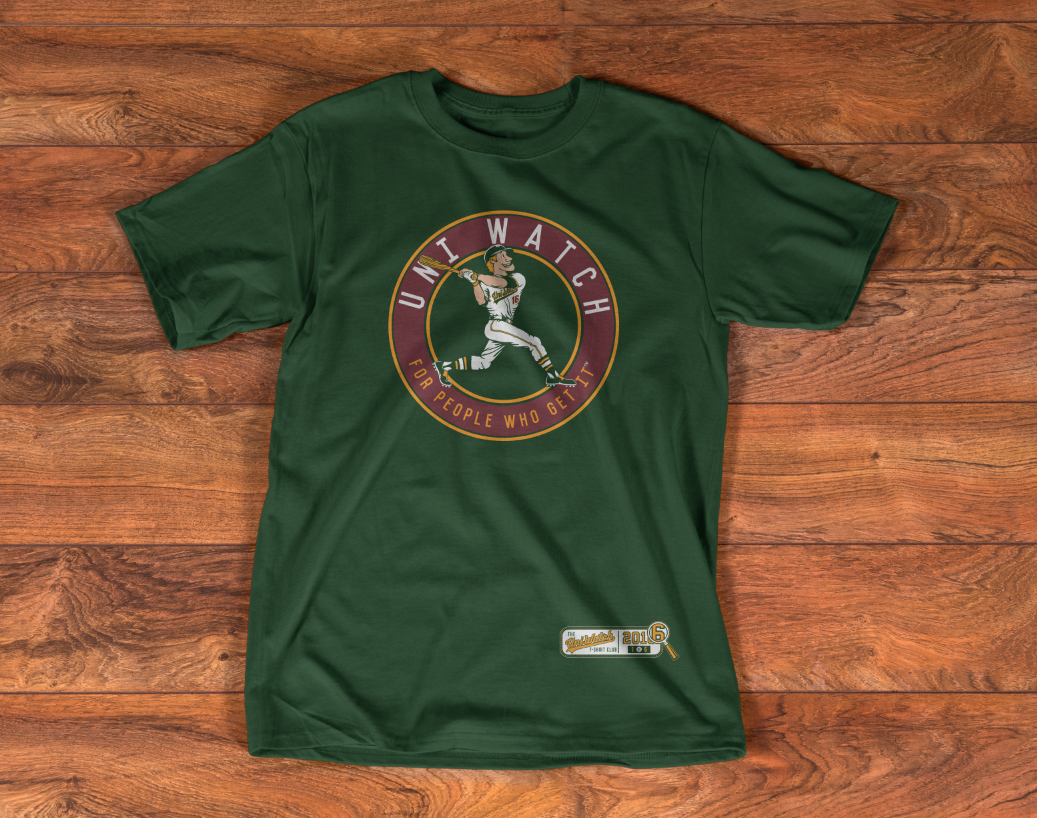
The Uni Watch ballplayer shown on the shirt is intended to evoke a time when sports graphics and mascots were built around fun, not ferocity. And as you can see, he totally Gets Itâ„¢ when it comes to wearing his uniform, with lots of old-school details like a flapless batting helmet, one batting glove, picture-perfect stirrups, and more.
The shirt is available here. For further info on how the T-Shirt Club will work this year, click here. Thanks for your consideration.
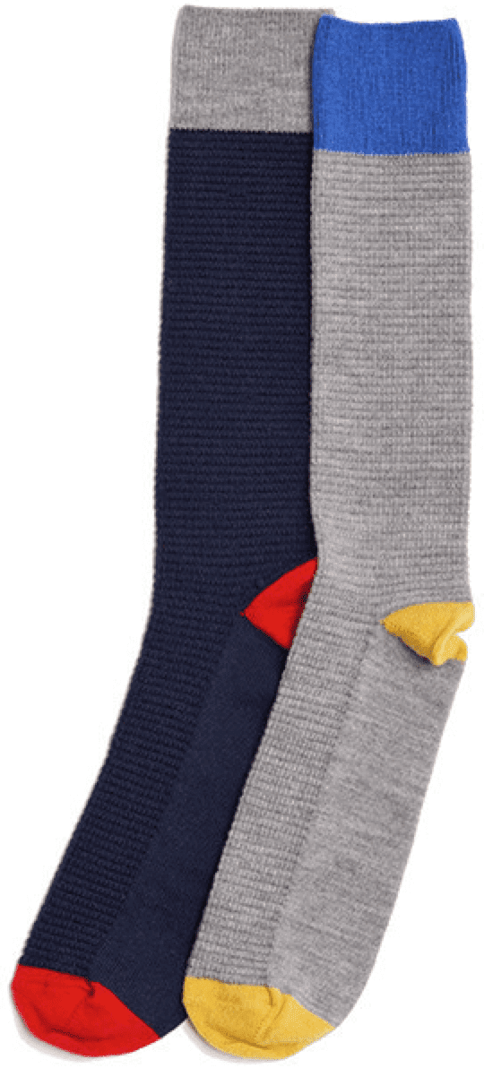
Special sock discount offers: Longtime Uni Watch advertiser American Trench (whose socks I’m wearing at this very moment!) is offering a series of special deals for Uni Watch readers:
• For the company’s excellent marino wool waffle-knit socks (shown at right), get $8 off by using the discount code UNIWAFFLE.
• For these random plait socks, get $4 off with the code UNIRANDOM.
• And for these very nice (and very warm) rugby-striped socks, get $8 with the code UNIWOOLSILK.
As always, all American Trench product is made in the USA, and shipping is free. I’m a big believer in this product line and hope you’ll give it your consideration. Thanks.
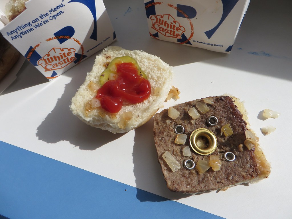
Click to enlarge
Gromm•It update: Almost from the first day of this project, there was one foodstuff that I knew I wanted to include. Now I’ve finally gotten around to it. Full details, including info you might not know about the holes in White Castle burgers, over on Gromm•It.
The Ticker
By Paul

Baseball News: You can hear our own Phil Hecken and Jim Vilk talking about Indians uniforms in the latest installment of Sully’s Baseball Podcast. ”¦ Oooh, dig this old Canadian team wearing McNeil tartan plaid! (Nice find by @TweedTweets, appropriately.) ”¦ Tequila sunrise-ish alts for South Carolina softball (from Charley Beans). ”¦ I love striped stirrups but hate two-in-ones, which means I’m conflicted abut Sul Ross State. ”¦ Bill Murray wore Cubs pants at Pebble Beach yesterday (thanks, Brinke). ”¦ Dan Cichalski found all of the uniform errors in a recent Sports Illustrated illustration.

Hockey News: 1990s throwbacks two nights ago for the Manitoba Moose (from Wade Heidt). ”¦ Lots of gripes about the NHL’s new website, even from former NHL players (thanks, Brinke). ”¦ Further proof that Senators D Dion Phaneuf is still using his old Maple Leafs gloves: His old uni number, 3, is peeking through the spray paint job (from Mike Engle). ”¦ Rangers D Dylan McIlrath ended up with a torn jersey after a fight last night. That game, incidentally, was at MSG — the Rangers wore white at home.

NBA News: I was busy yesterday and didn’t see any of the NBA All-Star Game, but here are photos and highlights. What did everyone think of the Kia advertising patch? ”¦ Meanwhile, here’s the logo for next year’s All-Star Game. ”¦ Here’s a columnist’s thoughts about the possibility of NBA ad patches (from Rick, who didn’t give his last name).

College Hoops News: Fascinating story about the guy who was the main “sneaker pimp” for Nike and Adidas (from Tommy Turner). ”¦ Pink unis yesterday for several women’s teams, including Notre Dame, Georgia Tech, Cal, and Auburn. ”¦ “The Albany Times Union has a slideshow of excerpts of the Union College yearbook from 1916,” says Benjamin Engle. “The basketball jerseys are especially interesting. I assume ‘BBT’ stands for ‘Basket Ball Team.'”

Soccer News: New secondary jersey for the New York Red Bulls (thanks, Phil). ”¦ New kit for Orlando City FC (from Andrew Nicol). ”¦ “Designfootball.com is a site for soccer kit news and comments, and where users can upload fantasy kit designs,” reports Denis Hurley. “They have recently launched a weekly podcast featuring a variety of contributors.”

Grab Bag: The Church of England’s new logo for Queen Elizabeth II’s 90th birthday was designed by a 10-year-old. ”¦ Here’s a list of 10 companies that fell in love with their own logo changes. ”¦ One observer’s opinion: Box art on video games doesn’t matter. ”¦ The Coast Guard is going with some throwback paint schemes (from Jake Pataterson). ”¦ NASCAR driver AJ Allmendinger will have a sticker on his on his car for Daytona week honoring longtime Reds clubhouse manager Bernie Stowe, who passed away last week (from Patrick O’Neill).
White Castle…I thought you were above that Paul.
link
Paul doesn’t need defending, but what does “above that” mean? You like what you like, you don’t what you don’t! Regardless, White Castle’s meat patties are perforated, so even somebody who prefers grommets over White Castle should see that it’s a match made in heaven.
First of all, White Castles rock. Secondly, I noticed on the Grommit site someone said you should have mustard only on a WC burger, not ketchup. Perhaps they are thinking of Crysal burgers (a chain in the south). The burgers are really identical to White Castles, but are served automatically with mustard instead of ketchup.
Bless White Castles for selling them at Safeway here on the West Coast.
White Castle > Krystal
Ah…ok.
Boy those Red Bulls jerseys…..
And by the way Paul, Vandy had some pretty good pink unis vs Kentucky last night.
No Düsseldorf mustard!?! I cannot fathom a slider without that elixir of the gods!
If those are the NBA ads on the jerseys for the future, I’m fine with that. THOSE are tasteful to me unlike the WNBA & D-LEAGUE. I f you’re going to have them at least them be small like that.
I think it’s worth remembering that one reason yesterday’s ad patches didn’t look particularly jarring is that they appeared on a pair of unfamiliar uniforms. Nobody had even seen (or ever will see) those two uniforms without the Kia patches. The patches weren’t added to the designs — they were part of the designs.
It’s a very different thing, visually speaking, when you put an ad patch on, say, a Celtics or Lakers uniform.
I’m sure it’s possible to make jersey ads look good, even on a Lakers jersey. But that’s not really the issue, is it? Why does a multi-billion dollar league need even more money? Does human greed really know no bounds?
Amen.
Shouldn’t the brand being sold be the team? If a company wants so badly to be associated with a team and to have ‘visibility’ connected to a sports team, then go buy the team. Isn’t it enough that stadiums & arenas are named based on who ponies up the most money, entrances and seating areas are ‘named’, advertising signs abound anywhere the camera may aim (including the backdrop for all press conferences), every timeout/call to the bullpen/substitution of any kind is sponsored by a company? Not even touching on the amount of money it costs to get a team’s cable network or go to an actual game (parking, tickets, food & drink)… How much money do they need to make? Does every single aspect of major league professional sports need to be monetized?
“Does human greed really know no bounds?
~~~~
You haven’t been paying much attention to the human race, have you?
Proofreading:
“I found 1975 Angels cards that show the black strip” 11 more?
There are tagging issues with the last two NBA items.
Fixed.
Found the Vaccaro story interesting. Disappointed that the article let him off so easy as he definitely was part of the problem. The NCAA is a separate issue from Vaccaro’s Nike and adidas sneaker pimping. Those companies, and Under Armour now, made huge money off those deals as did coaches. Schools primarily got free unis which helped with the athletic budget. As for the NCAA, it gives this clean image but it is as corrupt as any organization could be. Why aren’t coaches punished when they commit violations for example? Maybe a three year ban and hefty fine. Why is it wrong to allow players to have a stipend? Job rules and workout schedules preclude most work opportunities. After class hours have a cost most these athletes can’t afford. How about assistance post eligibility to complete a degree? Why keep a kid out who may not have the high school education and put him in a remedial program prior to participation in like the summer? There are many other areas that could be talked about as well such as likenesses of athletes mentioned in the article. Most of these issues happen at the FBS level schools and gets less at lower divisions though it still can exist.
There’s a book that’s totally worth reading; Vacarro is in it along with a guy named Rob Strasser; “Swoosh: the unauthorized story of Nike and the men who played there.” Essential reading.
link
If the NBA wants to have Kia as a jersey sponsor, that is fine. The individual team needs to get a portion of the money and should have the option to have their own jersey sponsors where they get 100% of the profits. Also, a question for Paul. I’m a big soccer fan and was watching a game on Saturday . One of the teams had JD as a kit designer and I’d never seen JD before. I know u aren’t a big soccer fan but I was wondering if u had ever seen JD or had heard of it.
Never heard of JD.
If it was an English game, it was JD Sports. They’re a chain of stores similar to Sports Authority or Dick’s.
It was. Thanks
You must be talking about Bournemouth. They are the only club of which I am aware that uses JD kits.
“As JD continues to expand its profile instore and online it has also seen further investment in its football offering including Exclusive Retail Partnerships with the Scottish, Welsh & Irish Football Associations. AFC Bournemouth, however, will be the first club to feature the JD brand as its kit supplier.”
link
I bought the 1975 Topps set a few years ago. The Nolan Ryan card, being one of the pricier cards in the set, was one of the first I checked out when it arrived, and I was briefly distraught because I though someone defaced his left sleeve with black magic marker. I found out about that memorial patch in the minutes that followed.
I’ve had that same Nolan Ryan card for about 27 years (albeit not in very good condition), and I’ve always noticed the black stripe, but never thought much of it. I just thought it was some sort of random airbrushing. Another long-standing Uni-Mystery solved! This also brings me to a question for Paul: Have you ever done a story on airbrushing on old baseball cards (particularly really bad airbrush jobs!), and if not, is it something you would consider for this site?
Never done it. Would consider it.
I saved an image of the one where Merv Rettenmund was traded to the Reds..worst cap airbrush ever. But then they added:
TRADED!!
across the bottom. The Topps Brand of Dishonor ™.
The NHL’s new website looks like every other website that has gone “mobile-friendly” in the last 6-12 months. Lots of needlessly big photos (er, video stills) taking up space when all you need is a line of text to take you to the article where you should see the proper photos, or in the present case – videos. Photo essays are so 2010.
I bet someday websites will be entirely text-free so we’ll have maximum ease-of-use on our “smart devices”. Browsing the web will be like a McDonald’s cashier using a pictographic ordering screen.
Another problem with the redesign is that old dates did not carry over. Every single upload is tagged with a January 2016 date at the earliest. Makes it confusing when you’re looking for a Department of Player Safety video and wondering how, as an example, Michael Grabner committed an infraction last December with the Islanders. (Spoiler alert, he was a Maple Leaf on that date.)
Anybody else surprised that they used photos from March of 1974 to produce 1975 baseball cards? Seems like a very long lead time even for the 1970s. A lot of card photos from the 70s were taken in NY, at Shea or Yankee Stadium, when clubs visited NY. The Yankees played at Shea during renovations in 1974 and 1975 so a large number of photos were taken at Shea those years.
It’s true that Shea and Yankee Stadiums were used for a lot of Topps shots, but spring training was also a common staging ground. Think of all the cards that showed players wearing windbreakers (instead of undershirts) beneath their jerseys.
Yes, Tom Seaver used to wear the windbreaker…he didn’t do it only at spring training either!
link
seem to recall Candlestick being the background for a lot of them, too.
BTW Paul, since you welcome typo spotting, please ctrl+f “form Mike Engle” (sic) to fix it. You meant to say “from” in the Ticker.
Fixed.
Thanks for providing the slideshow of Angels cards.
I found it interesting how many players ended up as Yankees within a couple of three years. Ed Figueroa, Mickey Rivers and Denny Doyle.
Denny Doyle was not a Yankee; his brother Brian was.
I did my part against uni ads. Put a #nouniads on the Pistons post of the All-Star game. So I tried.
That Manitoba Moose at Chicago Wolves match up was pretty damn good looking. I’ve really liked those Chicago home sweaters. Red and yellow not overdone to look like a skating Golden Arches ad.
The Wolves wear maroon, not red.
Thanks for the memories Paul – the Topps ’75 mini-set was the first that I collected (I was born in 1969) and as a 5-6 year old growing up in CA, Nolan Ryan was one of the first players I remember following. As a baseball geek at a very young age, I probably looked at that card 2-3 times a week and I distinctly remember seeing that patch on his sleeve. Of course I didn’t put 2 & 2 together and realize it was a number of other Angels cards that year.
Proofreading: “merino” wool, not “marino” wool in the sock section
Love those socks, wish my wallet agreed :(
Ketchup on a White Castle!?!?! For shame!
You realize that White Castle actually SERVES the burgers with ketchup, right?
They don’t in the Chicago area. Maybe it’s a regional thing?
It’s definitely a regional thing. You come here, you don’t get mayo or what qualifies as mustard (that yellow shit) on a burger. It’s ketchup and ketchup only in the NY metro area. And I’m referring to all fast food joints (sadly, I have much past experience in this area) — and I’ve noticed that anywhere else I’ve traveled, there are other *condiments* that are served on burgers (either including or besides ketchup). Here though…ketchup is king.
Interesting! Definitely comes with ketchup here in NYC, and in Ohio. Not sure where else I’ve had Castles….
Chicago just doesn’t like ketchup.
I put ketchup on my chili dog last night just because Chicago says I can’t.
Getting closer…last week it was “Orlando FC” and now it’s “Orlando City FC.”
The actual name is “Orlando City SC.”
I hate it, too. The “FC” thing is the worst and “SC” isn’t much better. Combining one of them with the pretentious “City” is doubleplusungood, but that’s the name.