Good morning! Okay, so the game kinda sucked, but that’s the way it goes sometimes. I watched it at a friend-of-a-friend’s Supe50 party and, like most people, spent a good chunk of the game eating and drinking (and then had to scurry home after the final gun and write the text that you’re reading now), so I’m not claiming that the following rundown is anything close to comprehensive. But here are a few observations:
• With the Broncos’ victory, white-clad teams have now won five consecutive Super Bowls, and 11 of the last 12.
• Several Broncos players, including Supe50 MVP Von Miller, wore plain white socks, with no blue section or orange stripe.
• Broncos wideout Bennie Fowler played the entire game with an untucked orange undershirt.
• One of the Broncos defensive players — I didn’t catch who it was, sorry — had a blank nose bumper, instead of having the team’s wordmark like everyone else.
• Cam Newton usually wears eye-catching shoes for pregame warm-ups, and yesterday was no exception:
Cam Newton Pre Game MVP Gold cleats. @PhilHecken pic.twitter.com/GrcHpDKuzQ
— Tim Sievers (@T_Sievers7) February 7, 2016
• Here’s one of the best Frankenjerseys ever:
@PhilHecken So is this guy happy or sad with the outcome tonight? #coNFLicted pic.twitter.com/oKOXU1RyNA
— Jorge Pa âš¾ï¸ (@nycjorge) February 8, 2016
• With the postseason now completed, reader Conrad Burry has finished his circular playoff bracket:
Congrats to the @Broncos, the #SB50 champs! Here's my final 2016 NFL Playoffs circle bracket (cc @UniWatch): pic.twitter.com/2JQ0O0dnK5
— Conrad Burry (@conradburry) February 8, 2016
• Finally, it’s worth noting that the host of the party I attended had his TV perched on an upside-down milk crate, and the crate was covered with something very special — a set of ABA team logo curtains (click to enlarge):

And that’s it for our 2015-16 NFL season (and for Monday Morning Uni Watch). Thankfully, all the gold crap can go back to its regular colors now. See you in September!
(My thanks to Phil for his contributions to this section.)

Click to enlarge
Supe50 DIY Project: Reader Pete Garofalo made himself a nifty shirt for yesterday’s game. I’ll let him explain:
I didn’t have a rooting interest in this year’s Super Bowl, but I was reminded of the Panthers mantra of “Keep Pounding,” inspired by the late Sam Mills. I wasn’t able to find anything I liked with that slogan, so I took matters into my own hands and made my own “Keep Pounding” shirt.
The process was relatively simple: bought an inexpensive black T-shirt and some iron-on transfers. I looked for a logo that would not be terribly difficult to trim down and eventually found one I liked that came out really well. Next, I printed up the “Keep Pounding” in Futura Heavy (a font I really like, and that I think some team really needs to adopt) and sandwiched the logo between the two words, much like the North Carolina basketball jersey format.
On the back, I went with a contrasting nameplate for Sam Mills’s last name (I always liked the 1980 US Men’s Hockey Team and how the nameplate contrasted with the jersey), and then finally printed his No. 51, again using the Futura Heavy font [click to enlarge]:
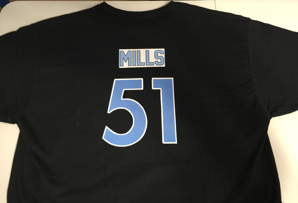
I trimmed the numbers I trimmed with a scissors. Fortunately, the 5 and 1 were relatively easy numerals to trim down.
I think it came out fairly well, honoring a player who overcame a lot just to get his opportunity and now is the soul of one of the best franchises in the league. I was proud to represent Sam Mills, and what he represents to the Panthers franchise.

Jew gonna finish that?: Whenever I’m having breakfast in New Jersey, as was the case on Saturday, I tend to get a side order of pork roll (also known as Taylor ham), the state’s delicious deli meat.
Pork roll tends to curl and pucker when it’s heated, so short-order cooks will often cut slits in the slices, which helps keep the meat flat. But the cook at the diner I visited on Saturday took the extra step of cutting his slits in a decorative pattern — which happened to be vaguely swastika-ish (click to enlarge):
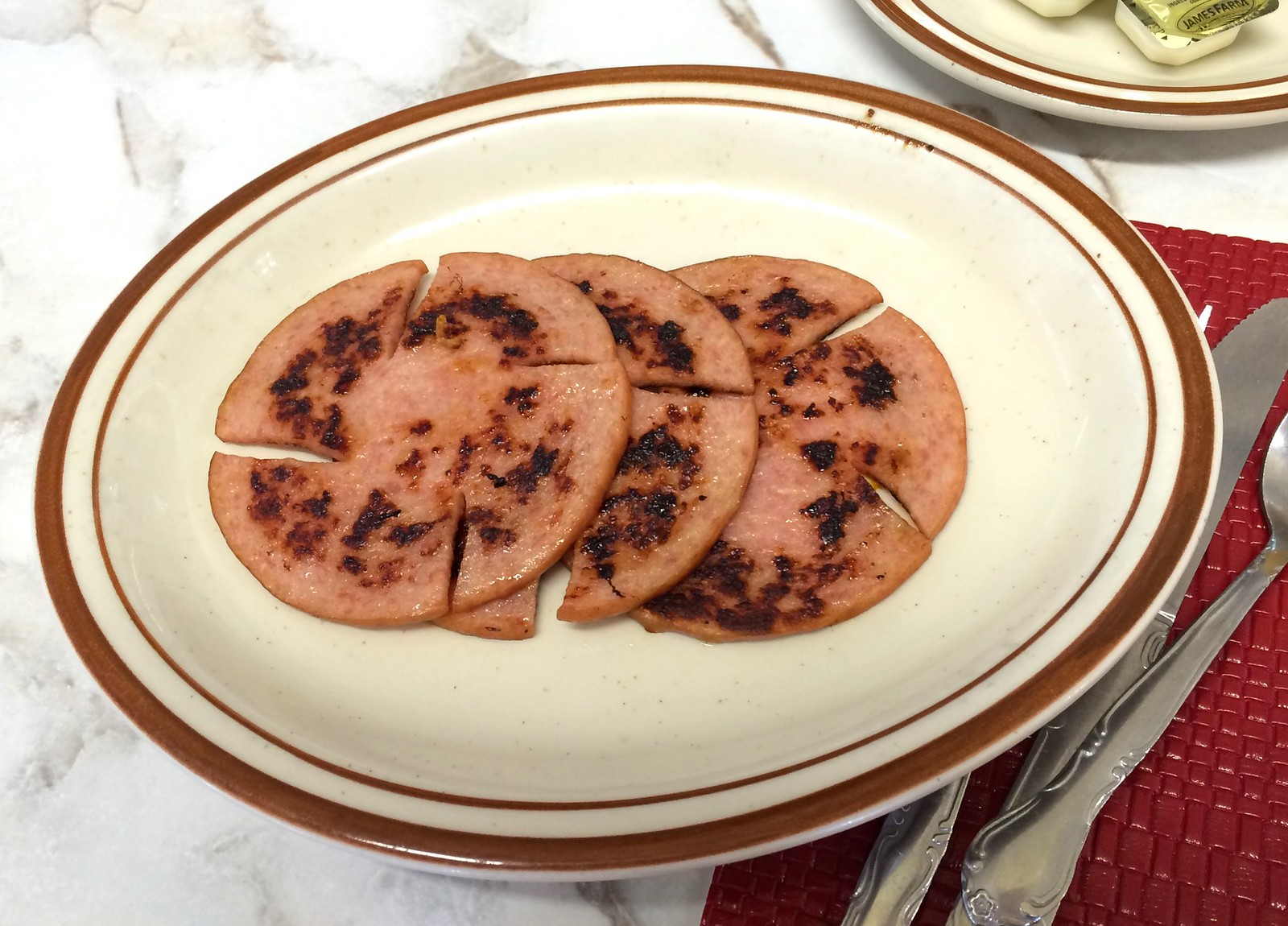
To be clear: I wasn’t offended, and I don’t think the cook (who later came out to ask if we enjoyed our food and seemed like a very nice guy) is a neo-Nazi. I just think it’s interesting.
The Ticker
By Paul

Baseball News: There’s something called the Ted Williams Museum & Hitters Hall of Fame down in St. Petersburg. They recently inducted former MLB pitcher Billy Wagner and for some reason created a display for him featuring what appears to be a No. 36 Mets jersey. “Of course, he wore No. 13 throughout his MLB career,” notes Eric Trager. ”¦ West Texas A&M has a cap that they only use when they’re going for a sweep.

NFL News: Someone redesigned all 32 NFL team logos (from Craig Markus). ”¦ The Supe50 Store in downtown San Francisco includes a special “VIP boutique,” which — well, here’s the key passage from this story: “For starters, it takes a buy-in to get into the [VIP boutique]. Unless you have a receipt that shows $300 worth of purchases in the main store, you don’t get access. Once you’ve made sufficient purchases, however, you are granted the precious opportunity to — buy even more stuff from the NFL. Some of the highlights include handmade Swarovski crystal-encrusted clutches ($3,500), a lamb skin commemorative New Era Super Bowl baseball cap ($2,500) and NFL-branded letterman jackets ($999.99)” (from Brinke). ”¦ Josh Harris pointed out something I’d forgotten: “The logo for Super Bowl XXXVI, which took place in January of 2002, was changed after the 9/11 attacks. The original logo was New Orleans-inspired, while the revised logo was a red, white, and blue map of America.” ”¦ What if NFL teams were rock bands? (From Carl Schultz.) ”¦ Brian Crago’s supermarket in Chicago had a rather outdated Super Bowl display. “It’s clearly from Super Bowl XLII, which was held in Arizona on February 3, 2008,” says Brian. “It’s crazy that the store has hung onto the display for so long! For the record, though, Marcus Stroud looks great in the previous version of the Jaguars uniform!” ”¦ David Staples’s daughter, Natalie, made a Panthers cake for yesterday’s game. ”¦ Here’s a great look at the midfield logo from the first Super Bowl.
College Football News: At one point UNC players wore “Carolina” jerseys for PR shots. This design wasn’t worn for games (from James Gilbert). ”¦ Ever heard of the 1954 movie I Love Melvin? Me neither, but it apparently featured an amazing dance routine featuring actors decked out as college football players (from Greg Mays):

Basketball News: The Hawks once again mixed and matched their jerseys and shorts last night. … Brutal game last night in Boston, as the Kings wore purple and the Celtics wore grey sleeves. … The Heat once again wore their white throwbacks. … Not sure which team this is, but check out the watermelon-style uniforms (from Ryan Wozniak).

Soccer News: Just one soccer item today: Barca went mono-gold against Levante, as their regular blue shorts would have clashed (from Tim Cross).

Grab Bag: Question: Does a famous athlete ultimately represent his team or his sportswear company? Here’s a really good article that addresses that question, and also looks at other aspects of the relationships between athletes and the companies they endorse (from Keenan Soto).
Did anyone notice the gray squares on the lower back of some Denver players? (no pic)
It was the bottom of a base-layer type shirt that was being worn by Denver players, both active and inactive.
In north Jersey, it’s always Taylor Ham (brand name), south Jersey is generic Pork Roll.
Deelish by any name.
Yep. Travathan’s gray square was particularly conspicuous.
Looks like an untucked base layer shirt:
link
That’s exactly what it is. Saw it all year in college football. Nike makes a base layer shirt called the Hypercool.
There was one particular moment – either an extra point or a huddle – where several of the players were together and it was very obvious on most/all of them.
Interesting not only that the Denver and Carolina ABA teams were both represented on the drapery, but that their positioning ended up being appropriate.
First thing I thought when I saw the pork roll was pinwheel or something. But that’s just me.
I thought “sand dollar”
I’ll admit I haven’t been playing close attention all year, but when did the NFL start allowing Vampire teeth on mouthguards?
I’ve never noticed those either. My wife wanted to know why they all had pacifiers. Or kids had a few that made the exact same effect.
Ronnie Hillman for the Broncos had it at the beginning of the season. link
Packers linebacker Nick Barnett wore something like that link, although it wasn’t the full pacifier-version.
Paul did a piece on it not long ago (or maybe he put it in the ticker). Bronco’s RB Ronnie Hillman has worn it all year.
Proofreading: “(from Greg Mays:” no end paren
There’s a bit of tagging visible below the ABA picture.
Searching for the “watermelon-style uniforms”: “Timothé Luwawu-Cabarrot is a French professional basketball player who plays for Mega Leks.” Mega Leks wore the watermelons against Cibona in what seems to be a Serbian League game.
Fixed.
Redesigned NFL logos….
The Bills and Pats are the only ones that are remotely better (imho). Anything is better than flying Elvis though.
I do like the way he displayed them on both dark and white backgrounds though. Points for that.
I liked the Titans and Broncos…
I liked the one for the Chiefs, though I’d guess their fans wouldn’t especially appreciate the arrow pointing down.
I liked the Bills one, a lot.
I agree… in fact I think the Bills design is the only one acceptable.
Yeah. Nice exercise, I suppose, but the majority of those are pretty brutal. The one that jumped out at me is the Colts; the reason a horseshoe is usually depicted with the opening up is so it can hold the good luck. tip it over and the good luck falls out.
Usually, pork roll – nobody south of I-195 says Taylor ham, nobody north of it should… 😂 – is slit to make a radius. Never seen the pseudoswastika. Looks like it worked, but a simple single cut is equally effective.
The best NFL redesign was the Bucs. That should be on a helmet like yesterday.
I personally enjoyed the Titans and Broncos, but I thought the head-on panther/jaguar/ram ones needed some more work.
“Pseudoswastika” – great word. And perfect here. On the one hand, the pork roll slices lack the most important shape element of a swastika, and if anything looks like a pinwheel or a boat propeller. On the other hand, if a political party adopted exactly that shape in either black and white or black and red as an emblem, everybody would instantly recognize it as a fascist symbol.
I think the reason for the angled cut of the pork-roll slice is that it gives you a longer cut to make it lie flatter on the grill.
So did anybody else find it odd that the caps were that funky digi-camo grey? It looked (to me) awkward with the gold heat applied patches
Not a fan. A plain black or gray would have been so much better. Then again, I haven’t liked the champion hats for a long time.
I’m puzzled that the midfield logo from the first Super Bowl(which is great) wasn’t incorporated into the 50 logo.
Also, neither logo for either conference were displayed on the field.
Blank nose bumper was CB Aqib Talib
link
Yep. I tweeted Phil about it, but couldn’t get a good enough picture last night to send to him.
Apparently he’s done it before this season:
link
link
But then he had the logo against the Jets, though this is from 2014.
link
The pork roll cuts reminded me of the fireman’s symbol. Maybe the cook is a member of the local volunteer FD.
link
I agree. I thought “fireman’s cross”, not “swastika”.
The “fireman’s badge” is a typical way to cut pork roll as well (the pac-man is also popular). But with the true fireman’s cut the cuts would come from the center of the circle. In Paul’s version they’re off-center, producing a swine-stika.
I’m very surprised that no one has yet pointed out that the text of “Champions” on Peyton Manning’s post-game cap was upside down:
link
Adding some data, the Six Nations Rugby tournament kicked off this weekend with some colorful games. France wore their new alternate against Italy’s blue with the Italian flag collar. Scotland wore navy blue shirts with a tartan down the sides against England’s usual white. Best looking game was Wales against Ireland. Red against Green though I don’t care much for the Wales shoulder ring shirts and I usually love shoulder rings.
As for Super Bowl 50, not being around Uni-Watch as long as others, I just noticed this weekend how the Broncos helmet logo is similar to Bill and Ted’s Excellent Adventure Wyld Stallyns logo featured on the back of Ted’s sweatshirt early in the movie. I need to read this site more often!
The Ravens redesign is really good.
All that work to create the Frankenjersey and the N is upside-down
I don’t necessarily think it upside down. It just isn’t the correct font.
It’s very uncommon for the lower-right corner of an N to have a serif when the upper-left does not. Gotta be upside-down.
Yes. Look at the NFL logo, for example. :-)
Anyone know why Aqib Talib wears red gloves?
Red?
link
This Wagner number 36 mystery us eating at me.
Here are the Mets that wore number 36 during Wags’ tenure with the Mets (courtesy of MBTN.net):
Henry Owens: 07/07/2006-07/15/2006
Kelly Stinnett: 09/06/2006 -09/27/2006
Chip Ambres: 07/20/2007-07/24/2007
Willie Collazo: 09/05/2007-09/30/2007
Darren O’Day: 04/09/2009-04/18/2009
Ken Takahashi: 05/02/2009-10/04/2009
So it’s not a case of a mistaken ‘Wagner.’ The only rationale I can think of is that it’s a jersey used during one of his rehab assignments while with New York: (one appearance in 2008 with the Binghamton Mets, and five appearances with the St. Lucie Mets and two with the Gulf Coast Mets in 2009), but that wouldn’t explain the MLB logo on the rear collar.
Maybe Wagner tailored his jerseys a certain way (a quick Google image search shows he did always seem to have some extra room in the sleeves), so the Mets equipment staff sent one of his MLB jerseys on rehab with him and he wore it with his minor league assignment number on it? A lot of the Mets affiliate jerseys were very similar back them, black dropshadow on the font/names/numbers included.
Is it a coaches jersey for a different Wagner?
I don’t think so. MTBN is exhaustive for coaches as well. But here are the coaches during Wagner’s tenure:
Willie Randolph
Manny Acta
Sandy Alomar, Jr.
Guy Conti
Rick Down
Jerry Manuel
Rick Peterson
Rickey Henderson
Howard Johnson
Tom Nieto
Luis Aguayo
Sandy Alomar, Sr.
Ken Okerkfell
Dan Warthern
Luis Alicea
Randy Niemann
Razor Shines
One of the best things about Super Bowl 50 was not having to listen to (or watch) the insufferable Joe Buck.
You missed the pregame; there was a segment with all six of the living Super Bowl play-by-play men (the others being Jack Whitaker, Al Michaels, Greg Gumbel, Dick Enberg, and Jim Nantz).
“Oh my!”
Is Buck still trying to grow that ridiculous beard?
Is there any other kind?
Malil jackson lost his supe50 patch at some point. You can see it here link
The watermelon uniforms belong to KK Mega Basket (known as “Mega Leks” due to a sponsorship deal), based in Zagreb and playing in the Croatian Basketball League. The team in white is Cibona Zagreb, which as far as I can tell is the dominant team in Croatian professional basketball. I’m not sure of that: I’m really not up on Croatian professional basketball.
Mega Leks is based in Belgrade, not Zagreb. And the league is called the Adriatic League. Apologies for the errors.
Not up on my Adriatic basketball.
I didn’t notice the swastika in the pork roll. I guess if you stretch your imagination you could find it but sometime people see what they want to see. Weird.
The best part of the Super Bowl being over is that we don’t have to see Paul and Phil write “Supe50.” The moniker has been universally panned and bemoaned on this site, yet the skippers still seem to believe it’s clever.
Let’s hope this term is quietly retired and not added to official Uni Watch glossary.
Such a strange sense of entitlement to feel that the writers on this site must adhere to your preferences and complaints, especially when it comes to such petty things as word choice and nicknames.
What have you provided to this site, besides your viewership, that allows you to dictate how these two individuals refer to Supe50? I’m sure they’ve put less thought and attention into this abbreviation, than you have put into the effort of being bothered and complaining about it.
Actually, it hasn’t been universally panned — a few people said they liked it, and a few-plus people said they didn’t. I’m fairly certain most readers don’t care one way or the other.
To be clear: I do not think “Supe50” is clever. I just got sick of typing “Super Bowl” over and over and over and over again. So I came up with a simple shorthand/slang term. (Seriously, is it worse than “the big game,” which everyone uses?) I’ve been using “Supe” for years, although this was the first time I appended a number to it, because this year’s edition of the game is such a Big Event In NFL History and all.
Seriously, Dave, I’m sorry you didn’t like it — I wasn’t trying to be clever or make a statement. Of all the things on the site, I’m genuinely surprised that anyone would take issue with this particular item. Live and learn!
I’m not a fan of it but it was unique to this site. however, I’d prefer SB50 instead.
I do hope I never see “NC2A” again though! Please.
I know of many old football movies but was not aware of I Love Melvin. First thing that comes to mind is Ohio State Michigan.
Sunday The Fortune Cookie was on. I had not seen it and dvred it. It featured Cleveland Browns and Vikings from 1965-66 but in b&w. Jack Lemmon and Walter Mathau
What’s the status on the Rams redesign contest? I thought we’d see them before the season ended.
I noticed it was ORANGE Gatorade that got dumped on Kubiak. I wonder if there was any other color/flavor on the Denver sidelines.
link
Probably none of this:
link
Yeah, I’ve seen a whitish looking Gatorade in the store. They could have drunk that. You’d think orange Gatorade would be bad luck if orange jerseys are. Apparently not though as the Broncs pull off the upset win!
I don’t see how this Denver win doesn’t again confirm the curse of the orange jerseys.
Losing in orange may have done that. Winning in white? Not so much.
I agree with 1434. This sets up a strange jersey superstition. They rarely lose in orange and it is not unlucky during the regular season or playoffs and always choose that color at home except for occasional alternate blue. They demonstrated that they consider orange unlucky for the Super Bowl by choosing white. I am certain the Broncos will again choose white if they are home team in a future SB. If the Broncos make it back to SB in an odd numbered NFC home designation, I’ll bet we see that team choose white to force the Broncos to wear orange.
On the I Love Melvin bit, could you imagine the field day feminists/SJWs/activists would have with that being made today? A woman being used as an actual object!
This Cam Newton guy on the Carolina Panthers – the only football player wearing shoulder stripes that go completely around his shoulders. Look under his armpits – the stripes meet! No player’s stripes have connected under their armpits in like thirty years.
Someone needs to give an award to his tailor – or his mom – whoever fixed his stripes. Maybe someday ALL players stripes will connect. We can only hope…
Good spot! However, it looks like Steve Smith and Stephen Davis both had connecting stripes during their time with the Panthers.
Is it just me, or does that pork roll stuff look like bologna?
Not uni-related, but found at the Getty Images site that Aaron Reed linked above….
This shot of Peyton on the video board is disturbing. Looks like something out of a bad 1950s Japanese horror flick.
link
The Mets Wagner 36 jersey isn’t for Billy Wagner. I found other examples on eBay, dated 2000, when Billy was still an Astro.
link
link
Must be Paul Wagner, whom the Mets signed as a free agent from the Pirates in the off season. While he never appeared in a regular season game, he did sign with them. Probably a spring training jersey.
link