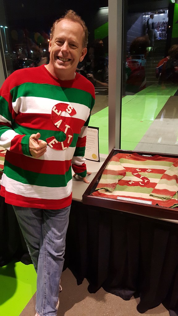
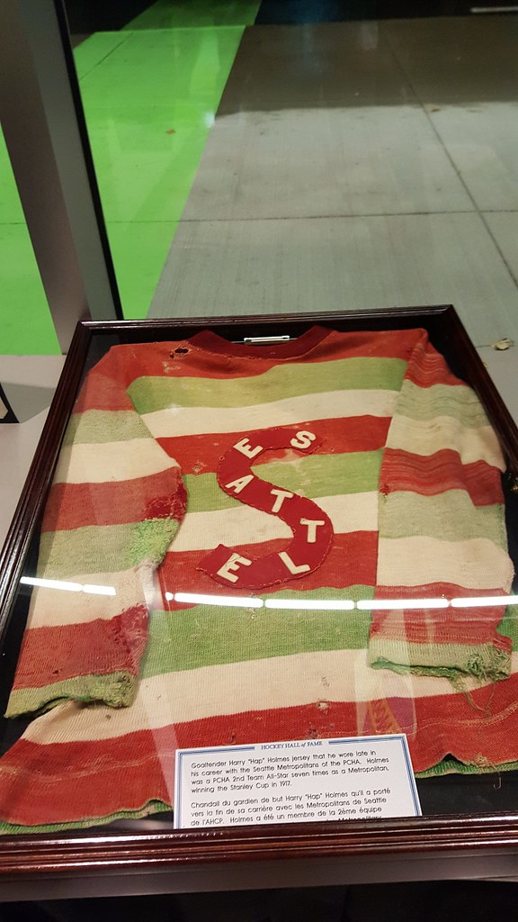
As most of you are probably aware, on Saturday night the WHL’s Seattle Thunderbirds commemorated the old Seattle Metropolitans’ 1917 Stanley Cup championship by wearing Metropolitans throwbacks. Uni Watch reader Markus Kamp was at the game and reports that the Hockey Hall of Fame had several artifacts on hand, including Metropolitans goalie Hap Holmes’s original 1917 jersey, which made for a nice side-by-side comparison with the Ebbets Field Flannels reproduction that Markus wore for the occasion (see above).
Here’s a close-up of the Holmes jersey:
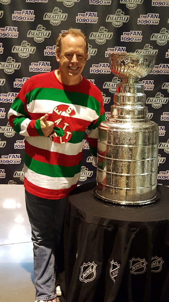
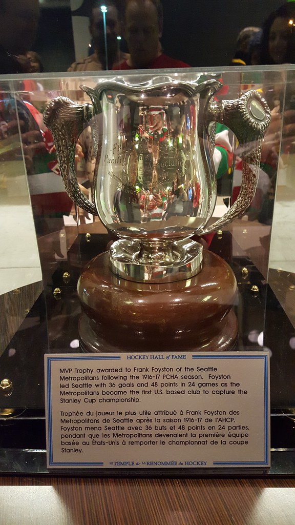

Very cool stuff — my thanks to Markus for sharing it.
Click to enlarge
Collector’s Corner
By Brinke Guthrie
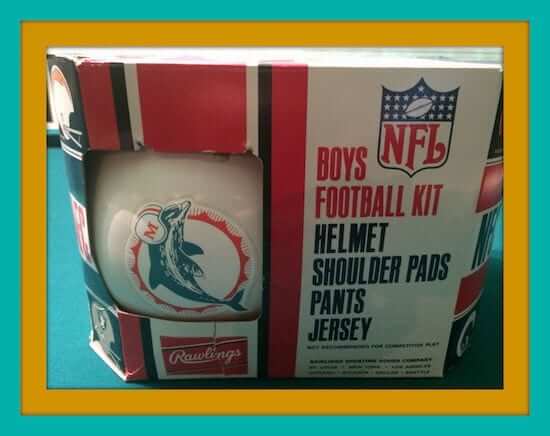
Dolphins fans, put this one under the tree for your little Fins Fan: a 1970s Miami Dolphins uniform set from Sears. Helmet, jersey, pants, and pads, all made by Rawlings.
Now on to the rest of the week:
• Is it a coincidence that the “76” on this 1976 Dodgers Yearbook cover looks a lot like the Union 76 logo that long had exposure in Dodger Stadium?
Really nice art on this “Steve Sabol: Guts and Glory of Football” poster. The late Steve Sabol, along with his father Ed, was the co-creator of NFL Films.
• This 1970s San Francisco 49ers helmet plaque from Riddell is in good shape.
• Wear this pair of 1970s Golden State Warriors “Extra Absorbent” wristbands and you will shoot just like Steph Curry. Or not, probably. But it can’t hurt!
• Cheer for your Detroit Lions with this 1960s “Go with the Lions” megaphone.
• Stillers fans will wake up on time with this 1970s alarm clock made by Lafayette.
• Join the Pittsburgh Penguins “K-Team” with this bumper sticker from KDKA Radio 1020.
• Not sure what a “Flexi-Mat” is for, but this 1960s version features the NFL Eastern and Western Conference team logos.
• How about this 1970s Indiana Pacers basketball bank, c/o your local Indiana National Bank!
• Could be Mike Curtis on this vintage Baltimore Colts poster. Always liked the fact that a linebacker wore No. 32. And here’s Curtis and the famous photo of “How to unscrew Roman Gabriel’s head!”
Follow Brinke on Twitter: @brinkeguthrie
T-Shirt Club prize reminder: Remember, if you ordered all 12 T-Shirt Club designs, you need to send me proof in order to qualify for the “Collect ’Em All” prize, which is an embroidered patch of the logo shown at right. (I was notified yesterday that the patches are done and are now being shipped to me. I’ll share a photo once I receive them.) Here’s what you need to do:
1. Either (a) take a photo of all 12 shirts or (b) take screen shots of the 12 “Your order has been received” emails that you received from Teespring.
2. Send the photo or the screen shots to TshirtClubProof@gmail.com (not to the regular Uni Watch address, please).
3. Be sure to include your shipping address, so I know where to mail your patch.
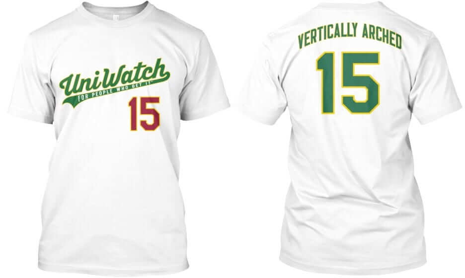
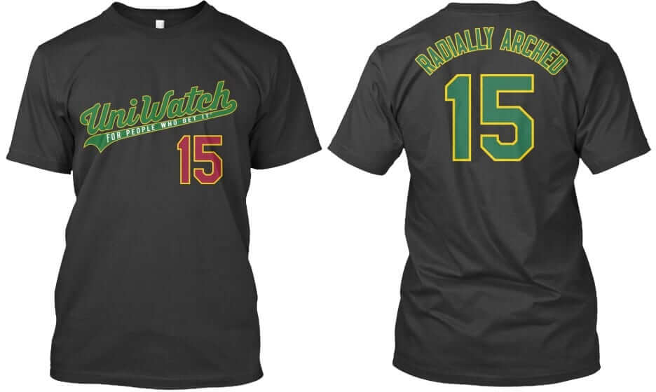
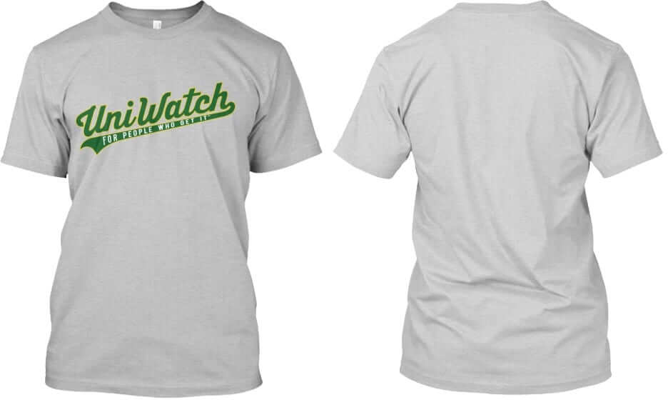
Again, each of these three designs ”” “Vertically Arched,” “Radially Arched,” and the plain script with nothing on the back ”” is available in all three colors shown (white, black, and grey). In addition, each design and color is available in three formats (short-sleeved, long-sleeved, and sweatshirt). Plus the plain script design is also available as a hoodie with pockets.
These shirts are available here and will deliver in time for Christmas.
Tequila sunrise update: Last Friday I told you that emails with tracking numbers for the tequila sunrise reprints were about to go out. While those emails were never sent, I’m told that the shirts themselves shipped late last week and should therefore be arriving shortly.
If you’re thinking, “If they can’t even send a fucking email, why should I believe that they’ve shipped the shirts?,” well, I don’t blame you. If you’re angry, I don’t blame you for that either — I’m pretty pissed off myself. Just to clarify, Teespring has been very good about responding to my inquiries, answering my questions, etc. But the information they’ve been getting from the sublimation printer that made these shirts — information that they’ve been passing along to me — has been poor. This is the first sublimated shirt Teespring has ever done, and the vendor they chose for the job clearly has not been a good one. That’s the problem here. I realize that doesn’t really change anything from your end — you just want your shirt — but I want you to understand where the root of the problem is.
Obviously, we’re hoping that the reprinted shirts are better than the first round. But if you have any issues with your reprint, you’ll still be able to get a refund.
My apologies for the hassle, and my thanks for your patience.
By Paul

Baseball News: Reprinted from yesterday’s comments: Good video on the New Jersey factory that makes most of the presidential campaign baseball caps (from R. Scott Rogers). ”¦ Longtime Chicago punk band Naked Raygun — whose best album, 1985’s Throb Throb, has aged pretty well — is selling this Chisox-style T-shirt (from Eriq Jaffe).

NFL News: A reader who prefers to remain nameless notes that the Steelers’ sleeve striping looks a lot worse than Iowa’s. “Looks like a certain corporate logo is getting in the way of the Steelers’ stripe,” he says. “I would almost rather see it right in the middle of the gold part of the stripe so that they could fit the entire uniform element in, like they used to do when Starter made the jerseys.” ”¦ NFL socks don’t usually have makers’ marks, but here’s a shot from last night’s Washington/Dallas game that shows two Cowboys players’ hosiery — one with Nike logo creep and one with Under Armour (from Bartt Gevens and Phil). ”¦ In that same game, ESPN misspelled Washington’s team name (from Chris Flinn).
College Football News: Mississippi State is inviting fans to vote on which pants the team should wear for the Department Store Bowl. Here are the options and the ballot. Voting is open until 12:45 Eastern today (from Andrew Piper). ”¦ The University of Mayland’s president, Wallace D. Loh, is recommending that Byrd Stadium’s name be changed to Maryland Stadium due to concerns over current stadium namesake Curley Byrd having been a racist and segregationist (from Andrew Cosentino). ”¦ Check it out: Future MLB star Frank “The Big Hurt” Thomas in an Auburn football uni (from Eric Wright). ”¦ Also from Eric: All four remaining teams in the D3 playoffs have purple as a team color.

Hockey News: Here’s a rare sight: a goalie who wears the “A.” That’s Andy Iles, who’s currently with the Atlanta Gladiators, although that photo is from his days with Cornell. While we’re at it, Rangers G Henrik Lundqvist wore the “A” in an All-Star Game and at an exhibition game in Sweden (all this from Mike Engle). ”¦ Of course, if you go way back, Canadiens G Bill Durnan wore the “C”!

NBA News: Lebron James is the latest athlete to have his own typeface (from Conrad Burry.) ”¦ The Mavs wore their green throwbacks last night.

College Hoops News: Check out this 1977 shot of South Dakota and South Dakota State players competing against the Cuban national team in Havana. “Note the boxing mural, scoreboard format, bunting, small scorer’s table(s), and the uniforms look pretty good too,” says Pete Woychick. ”¦ Pearl Harbor Day jerseys yesterday for Oklahoma (from Devon Kuckenbecker). ”¦ Ditto for Villanova, which wore these jerseys and this patch.

Grab Bag: MLS’s new match ball for 2016 has been released (from @wdw_ben). … With women now approved for all U.S. military combat roles, female soldiers will be getting custom combat gear (thanks, Brinke).
I believe the “1970’s” Dolphins kit looks more like one from the late-80’s/90’s (check the M on the Dolphin’s helmet). This would make sense, because as a kid, I had the exact same set in Seahawks colors and markings and I was not around in 70’s!
Early 70s- look at the photos in the auction (someone just bought it, too)—it shows the Bears with the white wishbone C, the eagles with a white helmet and green wings.
I like that it says “Boys Football Kit”. “Kit” being the peculiar word for a kid’s American football uniform.
I think it’s appropriate in this context because it’s not just a uniform. It includes a helmet and shoulder pads, which makes it a collection of related things like a tool kit or a model kit.
Now don’t get started on the sexist and grammatical issues presented by “boys”.
Hmmm, the close up of the helmet stripes (in the actual listing) shows 2 thin orange/coral strips in the center. Weird.
link
Soooo,…. I wonder what happened to all the LEFT sides of all those helmets/facemasks used in helmet plaques???!
I hope they used them to make right side plaques rather than dispose of them.
Obvious troll is obvious.
The NFL used them for the plaques that they sold in Australia.
The “flexi-mat” features a Lions logo that’s new to me.
I never knew the Colts logo had an “old-timey” helmet, but it did indeed at one time. Interesting.
I think a Flexi-Mat must be the precursor to the stadium cushion??
Both of the Division III soccer champions (Amherst men, Williams women) wear purple. And Amherst beat purple-wearing Loras College in the Paul Lukas Cup, a/k/a the 2015 Division III men’s soccer championship game.
Nice to see my Loras Duhawks mentioned! I’m bummed they couldn’t win the championship but still a heckuva run.
“Loras Duhawks” sounds like a character in a George RR Martin novel.
Sorry, Brinke, but I have to disagree with your assessment on that ’76 on the Dodgers program. It looks nothing like the old link to me. The only thing they have in common are the digits 7 and 6.
* are that both contain the digits 7 and 6.
Just want to be clear on that.
Agree 100%. I don’t even think the distinction here is terribly subtle, they’re plainly different. It’s always amazing to me the difference between people who do and don’t have an eye for this sort of thing.
Those thick letters were kind of a style at the time; you see a lot of Bicentennial stuff with either the fat sans-serif numbers or the thin, rounded-serif numbers that sort of look like hand-drawn typewriter digits.
That “fat” sans-serif lettering style was common at the time. You see a lot of Bicentennial stuff with either thick, modernist lettering or thin, round-serif lettering that sort of resembles hand-drawn typewriter characters. (The latter I supposed meant to look like colonial-era printing.)
I always find it interesting when people have a go-to pose for photographs. I wonder how they came to the conclusion that it was going to be their pose of choice. Did they practice it in the mirror? Have someone take multiple photographs and pick their favorite? Experiment over time until they found that one they prefer?
Hah! That’s usually NOT my go-to pose; I was just way overexcited to finally touch The Cup. Better than meeting any rockstar, and I’ve met many.
Thumbs up and a nice smile > duck face and “What do I do with my fingers?”
If you’re gonna have a go-to pose, this one’s not bad at all.
I’m not saying it’s bad. I just find the concept of people looking similar in multiple photographs to be fascinating.
Oh, I didn’t take it as a criticism. I find it fascinating too and, when it comes to myself, highly amusing!
Actually, Andy Iles just got traded from the Atlanta Gladistors to the Brampton Beast. That’s the Habs ECHL affiliate, hence why I came across the picture in the first place.
And yes of course as a Habs fan I know of Bill Durnan! Aside from being known as ambidextrous (he wore two trappers with exteriors hard enough to pass as crude blockers), his shenanigans of taking long skates and chats to talk with the refs and effectively give his team free timeouts inspired the NHL to rule that captains can’t serve as goalies.
So what about Roberto Luongo as Canucks captain before Henrik Sedin? Teams can vote a goalie as captain, but goalies cannot serve as captain. So one A would take all the ceremonial face offs, one A was the designated referee contact, and then there was another A as an alternate. Thus, no captain duties on the ice for Luongo. For whatever it was worth, he had a C on his mask, and his jersey had a C on it for the team photo.
Was Paul Byrd a known racist? Or was he just University President during segregation?
Harry Clifton “Curley” Byrd ran for governor of Maryland on a segregationist platform.
The university’s independent student paper link outlining how Boyd’s commitment to segregation went way beyond lip service to then-current law.
Boyd worked hard to keep black students out of the school even after the Supreme Court ruled that states had to make some kind of higher education available to all. Whether that means the stadium should be renamed, they don’t take a position on. But seems pretty clear the man was on the wrong side.
and a special tip o’ the hat to…
Lee Corso – integrating the Merryland football program and the ACC
Not just ACC, but first integrated State U. football team south of the Mason-Dixon Line, actually. Puts the recent ill-informed foofaraw about their 1961 throwback unis being disrespectful into perspective.
Noticed NFL took full advantage of a Dec. 7 game in Washington to extend ‘Salute To Service’ psy-op.
Next year starts with 15th anniversary of 9/11 plus 75th anniversary of Pearl Harbor along with even more enhanced Jade Helm security procedures at games. 2016 will be big for NFL and military.
I think we finally found new Washington name – Hail To the Redksins!
Like how close-captioning turned Nik Stauskas to Sauce Castillo.
“Wear this pair of 1970s Golden State Warriors ‘Extra Absorbent’ wristbands and you will shoot just like Steph Curry. Or not, probably. But it can’t hurt!”
Or maybe Rick Barry. Provided you make free throws underhand. (Which, come to think of it, worked spectacularly well for #24.)
I played middle linebacker in high school and wore #32 in homage to Mike Curtis, who at that time was wrestling in the WWF as “Iron Mike Sharpe” and owned a farm not far from where I went to school
Curtis and Sharpe were definitely not the same guy. Sharpe was the son of a famous Canadian wrestler, and was several years younger than Curtis.
I was told Sharpe == Curtis by a stagehand at a Capital Centre WWF show in 1983. No blood that night (no TV).
I noticed the MNF logo last night also included a Frank Gifford #16 memorial “decal” as they went to commercials last night. I hadn’t seen that before. I didn’t get a screnshot. :^\
They’ve been doing that all year with Tirico intoning, “The legacy of Monday Night Football.”
I assumed as much. Hadn’t noticed though.
Damn straight Throb Throb aged well. Things that are ahead of their time usually do.
Really, the whole NR catalog has aged well. Although I’d place “All Rise” a little bit higher on my list than “Throb Throb”, but just barely.
When I first heard Throb Throb in ’88 (Junior year) I wasn’t ready for it. Took me a bit to figure out how great it was.
I can’t find that shirt on their site. Where can one be scored?
I don’t know if it’s available online anywhere – I’ve seen a couple variants of this shirt, but I remember hearing that MLB issued a cease-and-desist on selling them. That being said, they were selling them at their shows over this past weekend (at least, at the Chicago show I was at), maybe they were just trying to unload unsold stock or something.
Nice that an original Metropolitans sweater still exists. I’m hoping one day a Vancouver Millionaires one turns up in a attic or something – none currently known to have survived.
You’d think the realtors out there would all have them bvy now.
They had another one there too from (I believe) the 1920s…a turtleneck version! Sadly, I neglected to photograph it.
I wonder who owns the Seattle Metropolitans trademark. If the NHL expanded to Seattle, could they be called that or would they pick something else?
Really good question. A quick search of the Googles produced this answer…a CANADIAN! *mock gasp* link
I’d be willing to bet if/when Seattle gets an NHL team, there would be some sort of “name the team” vote like the Sounders did. Oddly, the Metropolitans’ history isn’t that well known locally, even among hockey fans. Seattle history has included other cool names as well, though; Ironmen, Bombers, Totems, and even Thunderbirds are decent options.
The good: we will finally have a D3 title game that won’t be Mt. Union vs Wisc Whitewater.
The bad: another purple dominated viewing.
Is it in Minneapolis? *runs*
So the Seattle Thunderbirds play in the ShoWare Center…where the Tacoma Stars play indoor soccer. Off the top of my head I can’t think of another arena/stadium that is home to two different teams with two different city names. And the arena is in Kent (nothing unusual for a suburb to use the larger city name…just threw that in there). Anyone?
Not talking about regional/state names, just city names.
So the Seattle Thunderbirds play in the ShoWare Center…where the Tacoma Stars play indoor soccer. Off the top of my head I can’t think of another arena/stadium that is home to two different teams with two different city names.
Just down the road from me, the Brooklyn Nets and New York Islanders play in the same building.
In 1941-42, the New York Rangers and Brooklyn Americans both played in Madison Square Garden.
I imagine there are other examples….
Well, Brooklyn being part of New York makes that a stretch of an example for me. Tacoma and Seattle are completely separate municipalities separated by thirty some miles.
What I thought exactly. And Jacob below, a city in the name and its city’s state in the other name are not inconsistent with each other.
Barclay’s-Brooklyn Nets and New York Islanders
The Cedar Park center in Cedar Park, Texas hosts the Austin Toros and Texas Stars
Just city names. That DQs the Cedar Park Center.
Brooklyn’s a borough of NYC. Yes, it is an entity unto itself, but I wouldn’t consider it as separate as Seattle and Tacoma.
True enough.
Closest I can think of is the Meadowlands, where the New Jersey and Devils Nets used to play across the street from where the New York Giants and Jets played.
The funny thing then was that the “New Jersey” arena was to the east, closer to Manhattan than the “New York” stadium.
Milwaukee Brewers and Green Bay packers did up until the mid 90s
To repeat:
Not talking about regional/state names, just city names.
Assuming that makers marks on jerseys are here to stay, what is the preferable placement? As a fan I suppose I’d want it on the front as to not disrupt any striping patterns. As a manufacturer what gets the most eyes on the logo?
On the front, which is why they put it there.
The NFL makes them stick to the sleeves because they don’t want to share the front-of-jersey real estate.
Anyone notice that the Mavericks’ throwbacks were altered to conform to current NBA rules on the placement of the number vs. the wordmark? The curve of the wordmark cannot break the plane of the tops of the numerals anymore.
(Of course, if that’s a green-sticker-on-QB-helmet observation, then carry on …)
That escaped my attention, but I did notice they used the plain octagonal numbers instead of the curvy University font the early Mavs utilized. The rule you cited is a wonky one. What made the NBA cook up a ticky-tack regulation such at that? I know college and high school have persnickety rules like no vertical wordmarks, a la the Cincinnati Royals.
I loved the Naked Raygun reference, and the shirt is cool, too.
Seeing the Seattle Metropolitans jersey made me realize that despite the fact that red and green go well together, the “Christmas factor” means that very few sports teams or even corporate logos will use them together.
I remember the New Jersey Devils used to be red and green before changing the green to black. I am I missing any? I can’t think of any current examples among major-league teams or major NCAA schools. I guess the current Minnesota Wild comes closest?
I was a rabid Baltimore Colts fan and agonized over the poster I believe was from 1971 (I own 3 of them) wishing it was Mad Dog. I concluded it is #34 who was a running back named Tom Nowatzke. Obviously the image is of a linebacker or such. So in the end I think the artist just picked a random number. Thanks for posting – great memories!!