

Click photos to enlarge
Good day for NFL throwbacks yesterday, as the Bears wore their Monsters of the Midway uniforms (my kingdom for more sock stripes) and the Rams wore their Greatest Show on Turf outfits (plus they had throwback cheerleaders). Both teams lost, but they looked great.
In other developments from around the league yesterday:
• The Saints went mono-black.
• In a move that’s becoming a trend, the Chiefs once again went white over white with red-topped socks. Not a bad look, but it’s a shame that they seem to have shelved their awesome red pants.
• Speaking of disappointing trends, the Titans once again went mono-blue. I’ve lost track of how many times they’ve done that this season, but it’s way too many. (Of course, even once would be too many, but you get the idea.)
• The Seahawks wore white over grey. Wish they’d do that more often.
• The Browns and Bengals were almost mirror images. Mirror awful images, natch.
• Only one team wore white at home: the Dolphins.
• Maybe this has been going on for years, but it was new to me: Some Bills fans wore Buffalo chicken wing hats.
• Michigan coach Jim Harbaugh joined his brother John on the Ravens sideline and even wore Ravens sideline apparel.
• Bengals cornerback Pacman Jones, who wears No. 24, wore No. 15 on his helmet. A memorial shout-out to former teammate Chris Henry, perhaps..?
• Pretty funny to contrast the stadium-arrival apparel worn by Panthers quarterback Cam Newton (note the footwear) and Titans tight end Delanie Walker.
(My thanks to all contributors, including Mike Chamernik, Brinke Guthrie, Dough Smith, and of course Phil.)
Uni Watch holiday tradition No. 1: As longtime readers are aware, one of the most highly anticipated days of the year here at Uni Watch HQ is the annual arrival of a package from reader Elena Elms, who always makes some uni-themed holiday cookies (you can see some of her previous efforts here). This year’s package arrived on Friday, and I think it would be fair to say that Elena was trying to curry a bit of favor with me this time around (click to enlarge):
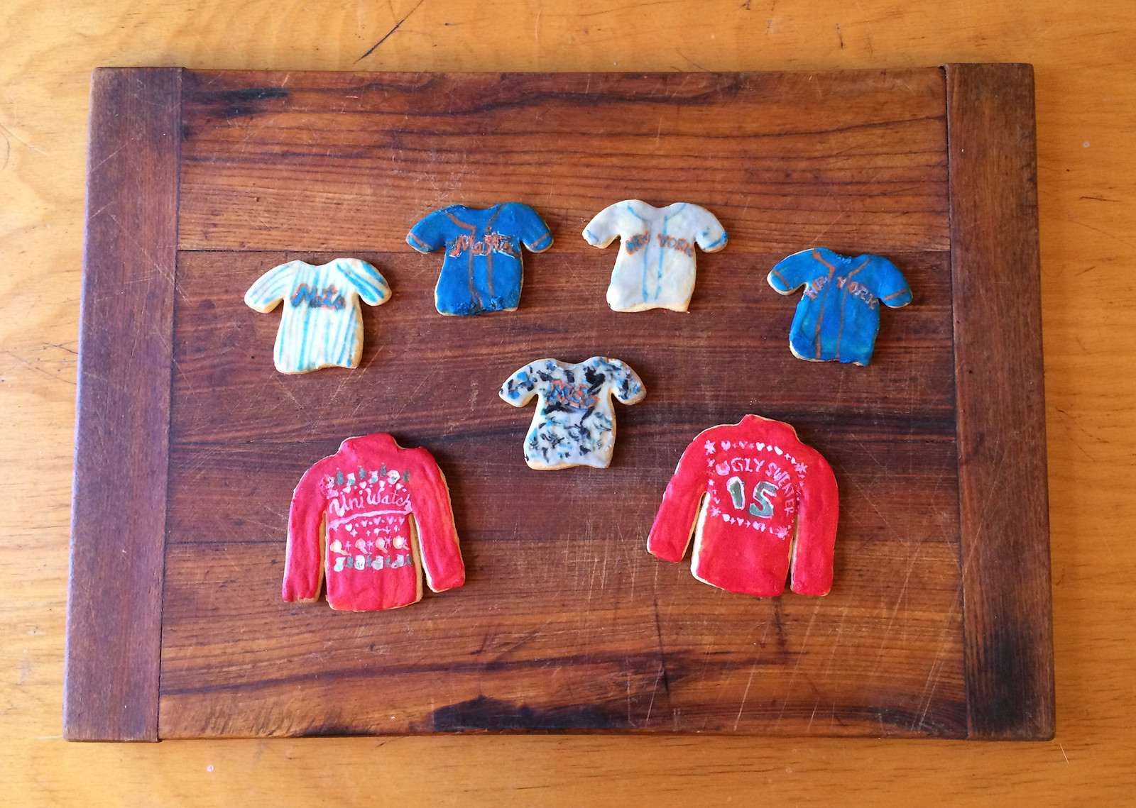
Not gonna lie — I love that she did a pair of cookies based on the Uni Watch T-Shirt Club’s ugly sweater design. I like the Mets cookies too, of course, and I think it’s hilarious that she tried her hand at a G.I. Joke cookie — a tricky endeavor!
I can’t even begin to express how special and wonderful it is that Elena does this every year, and how much fun I have sharing her work with all of you. Please join me in thanking her for her creativity and, especially, her generosity. You’re the best, Elena!
Uni Watch holiday tradition No. 2: I don’t usually repeat recipes that have featured on the site, but each December I make an exception for my favorite holiday preparation, homemade Irish cream. In other words, homemade Bailey’s. In other words, melted ice cream that gets you drunk. It’s super-easy to make, it’ll make you the hero of whatever party you bring it to, and lots of you have told me how much you like it. I made this year’s batch last night (click to enlarge):
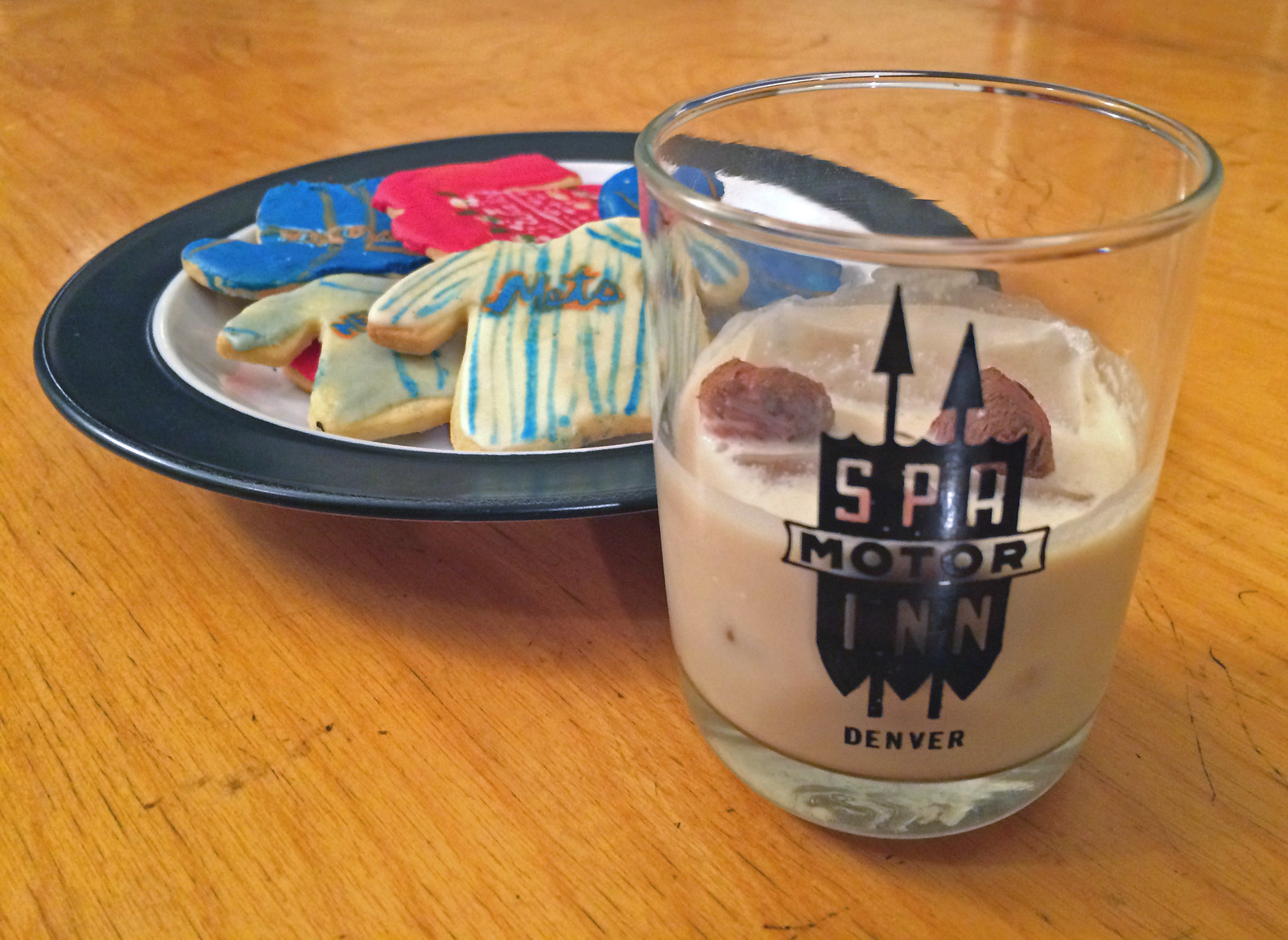
Want to make your own? (Hint: Answer rhymes with “yes.”) Here’s how to do it:
Start with some decent Irish whiskey ”” Bushmills, Jameson, Tullamore Dew, something like that (but not super-high-end stuff, because the nuances will be lost in this preparation). Pour a pint of the whiskey into a large-ish container and mix it with a can of sweetened condensed milk; a pint of heavy whipping cream; a tablespoon of chocolate syrup; a teaspoon of vanilla extract; a teaspoon of instant espresso dissolved in two tablespoons of hot water; and a quarter-teaspoon of almond extract.
Mix well (if the container has a tight lid, you can just shake vigorously), refrigerate, serve over ice (add some hazelnuts if you like, as I did in the photo above), and get ready to become the most popular person in the room. No need to thank me afterward, but you’ll want to do so anyway ”” trust me.
T-Shirt Club prize reminder: Remember, if you ordered all 12 T-Shirt Club designs, you need to send me proof in order to qualify for the “Collect ’Em All” prize, which is an embroidered patch of the logo shown at right. (I was notified yesterday that the patches are done and are now being shipped to me. I’ll share a photo once I receive them.) Here’s what you need to do:
1. Either (a) take a photo of all 12 shirts or (b) take screen shots of the 12 “Your order has been received” emails that you received from Teespring.
2. Send the photo or the screen shots to TshirtClubProof@gmail.com (not to the regular Uni Watch address, please).
3. Be sure to include your shipping address, so I know where to mail your patch.
TIME RUNNING OUT for holiday shirts: Today and tomorrow are the last days to order the three shirts that we’ve launched for the holidays. These are not technically part of the Uni Watch T-Shirt Club (no sleeve patch, no month designation) but are very much in keeping with the spirit of that project. There are three base designs, each of which is available in three colors (black, grey, and white) and three styles (short-sleeved, long-sleeved, and sweatshirt). Here, click to enlarge:
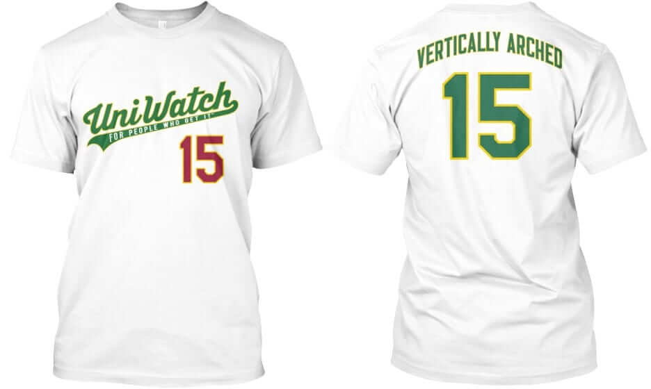
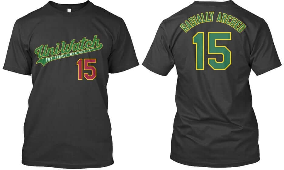
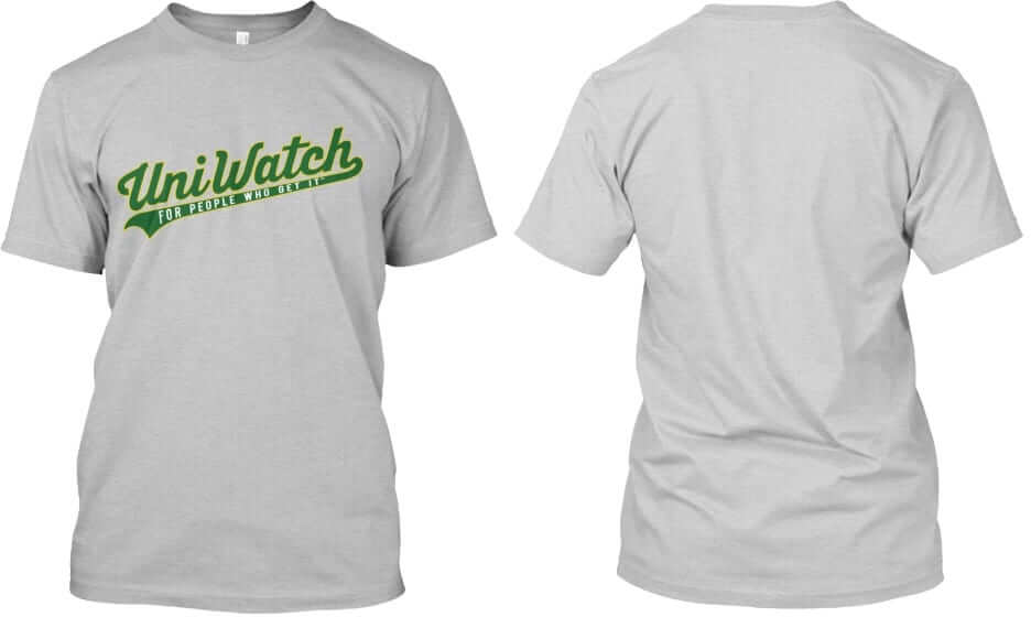
Again, each of these three designs ”” “Vertically Arched,” “Radially Arched,” and the plain script with nothing on the back ”” is available in all three colors shown (white, black, and grey). In addition, each design and color is available in three formats (short-sleeved, long-sleeved, and sweatshirt). Plus the plain script design is also available as a hoodie with pockets.
These shirts are available here, and they’ll deliver in time for Christmas.
The Ticker
By Paul

Baseball News: Unusual NOB for Phillies reliever Jim Kern in 1984. “Oddly, that was Kern’s third home game for the Phils on June 25, 1984, and the first two had been June 10 and 12,” says Jerry Wolper. “So I don’t know why they wouldn’t have given him a proper nameplate by then.” ”¦ New 80th-anniversary patch for the Chunichi Dragons (from John Fitzgerald).

NFL News: Here’s an old shot of Chiefs QB Len Dawson wearing what appears to be an upside-down M, instead of a W, on his NOB (from William Schaeffer). ”¦ Electric football maven Gene Sanny has hand-painted some amazing Chargers player figurines. Click on those thumbnails to see larger versions that showcase Gene’s fantastic attention to detail! ”¦ Here’s a look at old game programs from Steelers/Browns games (from Joe Hredzak).
College Football News: In a welcome and surprising development, the four College Football Playoff teams — all of which are outfitted by Nike — will wear their regular uniforms, at least for the semifinals.

Hockey News: Very nice War on Christmas “Happy Hanukkah” display on the ice last night by the Devils (thanks, Mike). ”¦ Whoa, look at this completely amazing 1929 Bruins championship sweater (awesome find by Will Scheibler). ”¦ The Ducks wore their orange Wild Wing alts last night. ”¦ Xmas sweater unis last night for the Albany Devils.

Basketball News: Here’s something I’d forgotten about the 1999 film American Beauty: It includes a basketball scene with a center-court logo showing a Celtic-turned-Spartan (from the pseudonymous Justice C). ”¦ “I went to watch the Brooklyn Skyrockets take on the New York Court Kings [who play in the new ABA] at St. Joseph’s College on Sunday,” says David Dyte. “New York had a player out of uniform — he wore a generic No. 15 jersey. Also, one of the refs wore a UBC jersey instead of the proper ABA jersey.” ”¦ Bucks PG Michael Carter-Williams has a signature dress shoe (from our own Mike Chamernik). ”¦ San Diego and San Diego State played at Petco Park yesterday, and both teams wore throwbacks. Lots of additional photos here (from Andrew Enright). ”¦ Pistons F Ersan Ilyasova didn’t have the little gold championship tab on his jersey last night.

Soccer News: “The MLS Cup was played Sunday, and Columbus and Portland both had metallic gold letters to mark the occasion,” says Saurel Jean Jr.. “Portland’s were affixed above their crest while Columbus’s were placed in the middle because the star for their previous championship was above the crest. It was really hard to see the Columbus markings unless the light hit them just right.”

Grab Bag: My friends Chris Buccafusco and Penelope Bartlett attended a bar mitzvah over the weekend for a kid named Eric. The yarmulkes for the event were custom-printed with Eric’s name in an ESPN-ish type treatment. ”¦ “At the conclusion of the ill-tempered 1966 World Cup quarterfinal match between England and Argentina, England manager Sir Alf Ramsay tried to stop George Cohen from swapping shirts with Alberto Gonzalez,” says Graham Clayton. ”¦ “I came across these Budweiser-esque singlets at a youth wrestling tournament this weekend and felt the need for the Uni Watch community to see the irony here,” says Taylor Workman. ”¦ Latest classic style guide to be reissued: the British rail graphic standards manual. It even includes guidelines for uniforms! (From Gordon Blau). ”¦ The five New Zealand Super Rugby teams released their 2016 home jerseys last night. ”¦ Happy Hanukkah to all who are observing. Those of you who live in NYC, or are at least familiar with the NYC subway system, will appreciate this stylized menorah (from Joe Werner and Otto Vondrak).

What Paul did last night two nights ago: Spike Lee is what I like to call a “his best since” artist, by which I mean that his cultural relevance (and, for the most part, his ongoing career viability) is rooted almost entirely in what he did a long time ago, not what he’s doing now. Whenever he comes up with a halfway-decent movie these days, it’s inevitably described as “his best since Malcolm X or “his best since Do the Right Thing,” or just “his best in years,” all of which are polite ways of saying, “Dude peaked a few decades ago and has been cranking out mediocre crap since then.” (He’s hardly alone in this category, of course: Bob Dylan, Paul McCartney, Woody Allen, Elvis Costello, Eddie Murphy, lots of novelists, etc. — all are classic “his best since” artists.)
I hadn’t seen one of Lee’s movies in more than 15 years, but I was intrigued by his latest one, Chi-Raq, which examines Chicago gang violence through the lens of the ancient Greek play Lysistrata (and is therefore scripted entirely in verse, some rhyming and some not), so I went to check it out on Saturday night.
It’s a big, sprawling mess of a movie. Much of it is very good, a lot of it is very funny, major chunks of it are fairly silly, and I found one extended scene embarrassingly cringe-inducing. But what comes through the entire time is that this is an artist who is desperate — desperate — to help heal the violence in black America. I found that impulse, and the obvious pain that drives it, to be super-duper-powerful.
I suspect Lee will continue to be a very uneven creative force (“big, sprawling mess” is an apt description of his career, not just this latest movie), but Chi-Raq is good enough to reset the bar. The next time he comes out with a halfway-decent movie, there’s a good chance it will be described as “his best since Chi-Raq,” instead of being measured against his 1980s and ’90s glory days.
The Rams should’ve gone with throwbacks from this Chips episode.
link
Who’s the dish in the white skirt?
Maybe you meant the Seahawks wore white over gray?
Yes, thanks — now fixed.
That’s the first time the Seahawks have won a regular season game wearing white over gray. Probably why they haven’t worn it more. I hope this changes their minds ’cause it’s my favorite road combo.
strongly agree
Proofreading: “The Seahawks wore white of grey”
“and Columbus and Seattle both had metallic gold letters” Portland, not Seattle
Mirror image or negative image?
Yes.
Not really that notable either, as the Bengals and Browns have pretty much always looked a bit too much like each other.
does the homemade Irish cream need to be consumed immediately?
No. It will keep as long as the expiry date on the heavy cream that you use, which means you should have at least a month. (But you’ll finish it way before then, I assure you.)
Why would Columbus & Seattle Have Gold tabs of anything in Sunday’s MLS CUP ’15 Finale yesterday since it was Columbus & Portland? Small typo, I know, but still.
Fixed.
So I’m late to the party, but the traditional placement for the text commemorating the games is under the collar where Columbus had it, the gold star didn’t move it. (as seen here: link and here: link)
The reason Portland’s was by their crest is because they have an awkward V coming out of their collar and it wouldn’t fit there (link).
That’s a good point. If there are three “main” positions on a soccer shirt – left, right and center – then whichever one isn’t being used by the manufacturer’s logo and club logo gets the text. Usually that means putting it in the center, but link. In the Timbers’ case, they were already using all three, so the text was moved above their badge.
I remember seeing those chicken wing hats at the Anchor Bar when I visited there about 6-7 year ago and it looks like they still sell them: link
“He’s hardly alone in this category, of course: Bob Dylan…”
When you say this I think, yeah, best since 2006. Dylan had a trifecta of outstanding albums between 1997 and 2006. Time Out of Mind, Love and Theft, and Modern Times were critically and commercially successful. I consider Time Out of Mind to be one of, if not the best, album of the 1990’s. 2012’s Tempest was pretty good, too. Your mileage may vary, but Dylan can still get after it.
Dylan, much like Lee, reset the bar. For nearly 20 years, any hint of life from him was greeted with “It’s his best since Blood on the Tracks” (which itself was “his best since Blonde on Blonde“). Then he released the very solid Time Out of Mind, which I don’t hold in nearly as high regard as you appear to, although I agree that it’s quite good. Hit or miss since then, at least to me (I realize some folks disagree). He remains one of the most important artists in American history, and a fascinating character study. But that importance is still largely due to what he did half a century ago.
Footnote: Who cares whether this album or that was a “commercial success”? Not relevant to this type of discussion, and just contributes to the false conflation of commercial value with creative/aesthetic value.
Commercially successful- do you mean all those IBM commercials he’s in now?
Wonder what he would’ve said if someone told him in 1965 he’d be doing that 50 years later
“Love and Theft” is my absolute favorite Bob Dylan album. I like it more than Blonde on Blonde, Highway 61 Revisited, or Blood on the Tracks. But “Love and Theft” was almost 15 years ago now, so I guess it’s Dylan’s newest “best since” album.
I think Tempest and Modern Times are really good as well, though both a step or two behind “Love and Theft”.
My favorite seasonal Dylan track:
link
Coincidentally, Spike Lee’s “his best since…” should also be 2006, when Inside Man came out.
Good Morning Paul,
Sorry if I’ve missed any news on the matter in recent weeks, but have you gotten any updates from Teespring on the Tequila Sunrise reprints?
Thanks!
The emails with tracking numbers, which I’d been told would go out by the end of last week, have not gone out. I’m checking.
This whole affair has become something of an embarrassment — I’m angry about it, and I don’t blame you if you’re angry too. We *will* get it straightened out, and I apologize for the way it’s played out so far. Thanks for your patience.
Hey Paul,
No worries at all. Also, full confidence that you’ve been working your ass off to make sure we’re taken care of. The design is well worth the wait!
Adam Jones’ wearing 15 was seemingly for Chris Henry. They were not Bengals teammates, but were teammates and I believe roommates at West Virginia. I remember reading that Henry was a factor in Jones choosing Marvin Lewis and the Bengals after Henry passed. Not sure why he chose this game in particular to do this tribute. Other photos I’ve found so far have him with “24” on his helmet.
I like how Jim Kern’s NOB kerning is a bit off.
Came here to say the same.
Ironically poor kerning on Jim Kern’s Phillies NOB.
I was just trying to decide whether or not that qualifies as “irony” in the strict sense. Leaning towards “yes.”
Absolutely! That the typesetters mis-set the name that’s synonymous with proper setting? That’s Irony gold.
Question on the Irish Cream: when you say a pint of whiskey, do you mean 375 ml like you get when you buy a “pint” bottle at a package store, or a US liquid pint (about 475 ml)?
I mean 16 ounces.
ha!
Fun video from Slate about the one baseball-cap factory in New Jersey that makes hats for most of the presidential campaigns from both parties:
link
The Chiefs haven’t won a game this season while in red pants, but they seem to be on a roll in the white pants. Maybe that could be the reason?
That Cin-Cle game is a good argument against the one-helmet rule.
Glad KC isn’t wearing those red pants. I can’t stand them.
^^^This^^^
^^^Not this^^^
Lee
White over red is far superior to the mono-white. The same thing applies to the Bears, Eagles, and almost every team that insists on wearing a dark helmet with a mono-white uniform.
Agreed. I’ve always preferred the pants to match the helmet on the road for dark-helmeted teams. I also prefer it with light helmeted teams as well. For instance, I don’t think they’ve worn the combo, but the Panthers on the road should be silver-white-silver (rather than white pants) in my opinion.
While I generally agree that helmets should match either shirts or pants, neither the Bears nor the Chiefs (IMHO) look good with the darker pants, despite wearing contrasting socks (a must). Vikes, surprisingly yes (but no purple socks, please) & Eagles, also yes. Who else? Washington (burgundy pants. Anyone else? Not really. I don’t mind the Seahawks (better with the Wolf Gray, but need contrasting socks). Teams even with contrasting socks who don’t look better with dark pants: Texans, Ravens, Rams, Jaguars. Browns (if that entire uniforms wasn’t such a shitshow) should wear orange pants.
A couple teams with white helmets could get away with colored pants, again, as long as there is not same-colored sock: Buffalo, NYJ, Miama, maybe Arizona. Definitely not Indy or San Diego (they should go to gold pants), and Tennessee should wear the light blue pants with the white shirts.
Just my $.02. YMMV
^^ THIS ^^
One of the times The and I agree on things. Dark team colored pants on the road ALWAYS!
The contrast between the Bears’ proper shoulder stripes and that truncated nonsense San Francisco uses was striking. I wish Nike would remedy the Niners’ stripes.
If you’d have told me at the start of the season that the Vikings would play the Seahawks, and it would be a good-looking game, I would not have believed you. Maybe it’s a sad commentary on the state of the NFL uniform that two teams on the same field each wearing regular team uniforms with shirts and pants of different colors is remarkable.
Hate the Niners striping. And yes, the Bears looked -fantastic.- Add the C back and there’s your fulltime look. But they will never change, just like the Colts and Pack and Chiefs and Rayduhz.
Always enjoy seeing the cookie jersey designs. Love that Elena went with the long sleeve option on the Christmas shirt.
Thanks! i bought the long-sleeved version for myself.
Yeah. The ugly sweater cookies were a great idea.
As an Elvis Costello devotee, I was going to wax poetically about how he’s made some really interesting artistic choices in the face of overwhelming disinterest by most rock critics.
But, despite that, I can’t. While I find his choices fascinating, there’s nothing as singularly great as his early albums. National Ransom, Momofuku and The Delivery Man all have some great moments on them, but they are not Armed Forces or This Year’s Model.
I agree that he remains an interesting artist, but it’s been a long time since he was a great artist. (Moreover, he likely wouldn’t have the freedom to be interesting if not for his previous greatness.)
Or to put it another way: If we only went by his last 20 or 25 years’ worth of output, nobody would give a shit. And I say this as a *huge* fan.
Also see: Joe Jackson.
I think it’s difficult to use examples of musical artists like Dylan, Costello, Jackson, etc. in comparison to the movies’ Spike Lee, since they are complicated by fundamental changes in the industry. Particularly in regards to long-playing, multi-cut albums, changes in the delivery of musical content has correspondingly changed the whole nature of the music biz.
Talking with Jackson Browne as they stood in a line, when my wife asked if he was “working on a new album,” Browne graciously explained that the music business doesn’t quite “work the same way” anymore.
Which, especially when considered in terms of great albums, is a shame.
Disagree. For one thing, the movie biz has endured its own fundamental changes (indeed, Chi-raq was financed by Amazon!). More importantly, great work is great work, regardless of format. And middling work is middling work, regardless of format.
Moreover, all the musicians under discussion here are wealthy enough to self-finance their own projects if they so choose (and all have substantial enough fan bases to crowd-fund projects if they’re too cheap to do it themselves). Yes, the industry has changed, but they’re all big enough to work on their own terms. The real thing that’s changed — or at least the change most relevant to this discussion — is the quality of their work, which in each case has declined from its long-ago peak. Hence the “his best since” tag.
The “his best since” thing seems to be somewhat inherent in the human condition. Everybody peaks sometime; only a few artists in history have sustained genius-level mastery across many decades of work. Some do their best work at the start of their career and rarely again equal their early output (Elvis Costello, Albert Einstein), others don’t produce their best work until later in their careers (Claude Monet, Thelonious Monk). The fact that we experience time in only one direction means that the two cases – early successes versus late bloomers – seem different to us. But it’s the same phenomenon: Everyone’s best work comes sometime. If it comes early in their career, their subsequent work feels like a letdown. Whereas if someone is doing good work now but will someday do great work, the future greatness we can’t see doesn’t dim the present goodness by comparison. It’s more than a little unfair to expect anybody to maintain the quality of their best work over several decades; it’s equivalent to demanding, “Why aren’t you Isaac Newton or William Shakespeare?”
Plus, early great work sometimes ossifies in the critical memory. For example, Annie Hall and Manhattan were great films. But they were also particular, distinctive works, and Allen’s later work has been judged somewhat unfairly by comparison. Crimes and Misdemeanors is every bit as great a film as anything Allen has written and directed, but because it’s great in a different way from Allen’s early great work, it receives less recognition than it deserves. If almost any other director working in 1989 had made Crimes and Misdemeanors, it would be regarded as that director’s best work. But it wasn’t Annie Hall or Manhattan, so instead it’s regarded as more of a lesser, late highlight. A number of artists have seen their best late work receive less appreciation than deserved simply because it differed from their early masterpieces.
Some do their best work at the start of their career and rarely again equal their early output (Elvis Costello, Albert Einstein), others don’t produce their best work until later in their careers (Claude Monet, Thelonious Monk).
While some people like Monk’s late-period work and some don’t (I fall into the former category), I don’t think *anyone* is of the opinion that Monk peaked late. Good band, but he was no longer writing new material. His legacy is based entirely on his Blue Note and Riverside recordings.
I was thinking of Monk in terms of his absolute age. The Blue Note recordings started when Monk was an age at which many early jazz greats were already dead, and his Riverside years came as he turned forty. Though some of his best compositions have roots in work from his mid-twenties. Morgan Freeman might have been a less ambiguous example of an artist whose later work is generally considered greater than his earlier work.
Haven’t seen the chicken wing hats before, as funny as cheese heads, looks like a father and son combo?, with the son going double fisted.
So while watching the Bills/Texans game yesterday, I noticed that Brian Hoyer’s Speedflex “cutout” or whatever looked like it had been painted over.
link
Is that normal? Does that in any way affect the intended performance of that model helmet?
Sorry, bad url.
link
Oy vay. Last time, promise.
link
The Bears should adopt a modified version of their throwback full time (same could be said for the rams, though the choir’s already saying that). The Bears primary uni just looks dated, with the weird uni number font, superfluous outlines around everything (why do the orange jersey stripes need white outlines??). I would adopt the uni/pants as is, and add the wishbone C, without white outline, to the helmet, keeping the grey facemark, and retire the navy pants.
You definitely don’t have to live in New York, or even in the same time zone, to appreciate the subway map menorah.
Paul- “Yes, the industry has changed, but they’re all big enough to work on their own terms.”
That’s part of the fundamental shift. Artists handle far more of their own creation, (and production, promotion, sales, etc.) with less industry direction and support.
Nick Lowe described it as a shift from a desire for greatness in the music business, driven by highly competitive (even greedy) industry folks, to the explosion of the “very good”–self created music. Am I pro music business, longing for the days of “Hitsville”? No, but I do think a lot of the music that came out of those times was better because of the process, not despite it.
Agree with you that the movie industry is changing, too, but not in the same ways, or to the same extent, as music.
Artists [now] handle far more of their own creation, (and production, promotion, sales, etc.) with less industry direction and support [than they used to].
Only at the corporate level, a system that was a bloated, wasteful bureaucracy and should have died a lot sooner than it did. Did that system produce and nurture a few geniuses? Yup. It also produced oceans and oceans of unlistenable crap, pretended to champion art while actually championing commerce, got in bed with and largely co-opted the sector of the media that was supposedly covering it, and ruined most of what it touched. Good riddance.
Meanwhile, on the indie scene (which I’ve been connected to in various capacities for about 30 years), musicians have ALWAYS been handling their own careers, booking their own tours, releasing their own records, designing their own gig posters, driving their own vans across the country, etc. These are musicians who’ve been deemed by the bloated corporate system to be insufficiently commercial, insufficiently televisual, insufficiently sexy, insufficiently youthful, or just plain insufficient. So they said, “Fuck that” and handled everything themselves. DIY, baby.
Indie-ville has produced its own share of geniuses, no corporate bullshit required. To be fair, indie-ville has also produced its own share of unlistenable crap, but at least that crap has been, for the most part, the result of sincere but failed attempts at producing art, not calculated and successful attempts at producing lowest-common-denominator product. The notion that you need Clive Davis or Walter Yetnikoff to give the world great music is, and always has been, nonsense.
I think that the ratio of genius to unlistenable crap, given the essential nature of human creativity, is pretty consistent across the corporate/indie spectrum, and is for the most part independent of commercial success.
But most popular music is a collaborative process. Rick Hall and the FAME Studios house musicians were helping create recordings of genius for a number of artists long before Jerry Wexler tapped them as a kind of corporate cream-and-clear for Aretha Franklin, and the result took her from struggling artist to megastar. Just listening to any of the exhaustive outtake collections of “Blonde on Blond” or “Sgt. Peppers” and hundreds of other examples demonstrate that someone other than the artist alone had a hand in separating the wheat from the chaff and shaping the final product, not to mention selling it after the fact.
“Calculated and successful attempts at producing lowest-common-denominator product” is, and always has been, just what it is, and that kind of corporate bullshit is as evident in Justin Beiber’s mom-produced YouTube genesis as his latest big budget album. Conversely, Frank Zappa and Captain Beefheart didn’t considerably compromise their vision despite being on Warner Bros. records in the heyday of the record “studio system”.
To create art, and at the same time to create enough of a business around it that you can survive, let alone flourish, has always been a tough assignment for the artist, established or otherwise. Having to do it on your own only makes it tougher.
Great article & interview here with a high school football player who’s old jersey wound up front-and-center in the new Justin Bieber video: link
The thing I’ll miss most this holiday season is what had come to be known in my family as “Uni Watch Bailey’s.” A new health issue precludes even small amounts of alcohol for me, so I’m unfortunately out of the Paul Lukas cocktail business.
I agree about Titans mono-blue.. Too many times.
Unfortunately nothing was said about the great old(er) school matchup look of the week prior against The Raiders.
For anyone that hasn’t tried Paul’s famous Irish Cream recipe…DO IT! I first tried it 3 years ago, and it’s a holiday mainstay now.
The only downside is that it’s so good, it’s really easy to get plastered without realizing you are doing so.
After seeing the photo in your link to Browns vs. Bengals I completely understood why the Browns updated their uniforms, and why CLEVELAND is on the shirt and the pant stripe turns into BROWNS. But then I had an epiphany and realized it wouldn’t matter if NIKE didn’t make the Browns switch to a different shade of orange and darken the brown and they had just kept their near-perfect “old” set.
I like the Rams throwbacks but I can do either those or the current set. I just wish the current set would lose the white pants and bring the gold back.
I’ve never been a fan of the Bears throwbacks.i think it’s the lack of white on the jersey and the gray facemasks. Gray facemasks NEVER look good if you have no gray in your regular colors.
And the Chiefs still look terrible in the white on white look. They look a thousand times better in white over red. Unfortunately they have been winning so I guess it’ll stay around. Ugh!
Also nice to see the Redskins are staying current by still having the Salute to Troops under the goal posts. I don’t know if that’s because today is December 7th or if they’re just behind on this like they are on everyone else (maybe it was mentioned, I haven’t read the entry for today yet). And they also really need to burn those yellow pants and go back to the Gibbs era white over burgundy again.
Really Interesting to note from the Rutgers press conference introducing Chris Ash as their new head football coach. On the table in front of Ash were two scarlet helmets with the white block R. Also, there is a short introduction video of coach Ash on scarletknights.com where they only show a few highlights of the team wearing the past, Greg Schiano era uniforms. Might this signal an end of the chrome helmet costumes Rutgers has been wearing the past few season? Their uniform sets from 2001-2011 certainly are more in line with the rest of the Big 10 conference.
I hope not! The current set would look great with a few tweaks but even without them it looks a million times better than the Schiano era uniforms. Those were way too plain. They looked like practice uniforms. So, yeah, in that regard they fit in perfectly with the boring B1G.
Concerning the NIke “uniform unveiling”
1. no major change from last year
2. every team except Clemson has a matte helmet
3. this link is better for non-mobile browsers:
link