
Click to enlarge
Happy post-Thanksgiving, everyone. I was traveling all of last week (more on that later) and am just settling back in. Please join me in thanking Phil for keeping the site running while I was away. You’re the best, buddy — I’m grateful beyond words. Big thanks also to longtime reader/neighbor/pal Marty Buccafusco, who fed Uni Watch mascots Tucker and Caitlin for several days — including Thanksgiving — while I was away.
Now then: Brutal game in Santa Clara yesterday, as the 49ers wore their BFBS alts while hosting the always-ugly Cardinals. The Niners even had black-clad cheerleaders. Additional photos here and here, if you dare. The one silver lining is that this is the last we’ll see of the Niners’ alts until next year.
• The Texans went mono-navy.
• I’ve said it before and I’ll keep saying it: I really like the Vikings in white over purple. If only they’d get some contrasting socks, that would be one of the league’s better looks.
• Giants wideout Odell Beckham Jr. wore Charlie Brown- and Snoopy-themed cleats for pregame warm-ups. Here’s a close-up.
• With Rams wideout Steadman Bailey hospitalized following a shooting, teammate Kenny Britt wore Bailey’s initials on numbers on his waistband towel.
• Man, that’s one doozy of a knee brace on Bills quarterback Tyrod Taylor.
• The chaotic state of NFL socks is nicely shown by this trio of Jets — high whites, low whites, and mid-leg whites.
• Now that the weather is getting cold, we’ll be seeing more fractured helmet decals. That’s Patriots defensive lineman Chandler Jones. His teammate
Malcolm Brown had a different kind of decal malfunction in that same game.
• I realize this is nothing new, but it’s still funny to see Colts running back Frank Gore’s “knee” pads.
• I’m sure this isn’t new either, but it’s interesting to see how the Riddell SpeedFlex helmet wreaks havoc with the Steelers’ helmet numbers.
• Bengals linebacker Vontaze Burfict arrived at the stadium wearing a Chicago Bulls jacket.
• Speaking of pregame attire, I don’t think you have to hate purple as much as I do to think that Saints quarterback Drew Brees might want to think twice about his sartorial choices.
• In this increasingly digital world, it’s interesting to see that the guy handling the down marker still charts the game with a pencil.
• Damn, it’s so nice to watch a game in the snow. That photo doesn’t really capture how pretty that game was — or at least it was at first. But as the snow accumulated, NBC began digitally changing the yard markers and hashmarks from white to black. Not a good look.
Finally, let’s give thanks for G.I. Joevember being over and teams being able to wear their regular uniforms — no pink, no camouflage — for the rest of the season.
(My thanks to all contributors, including Jeffrey Bovitz, Kyle Clauss, Curtis Galvin, Mike King, Jeff Moulden, Jeffrey Sak, and of course Phil.)

ITEM! Holiday Gift Guide: My annual Uni Watch Holiday Gift Guide will be up today on ESPN — check it out here. My thanks to everyone who provided suggestions for items to include.
Holiday T-shirt reminder: In case you missed it in the lead-up to Thanksgiving, we’ve launched three new shirt designs for the holidays. These are not technically part of the Uni Watch T-Shirt Club (no sleeve patch, no month designation) but are very much in keeping with the spirit of that project. There are three base designs, each of which is available in three colors (black, grey, and white) and three styles (short-sleeved, long-sleeved, and sweatshirt). Here, click to enlarge:
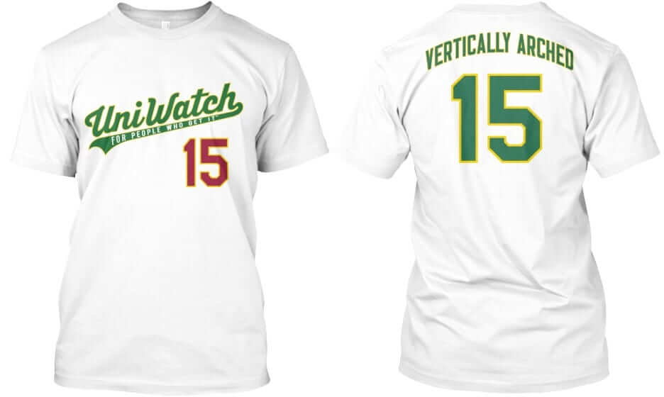
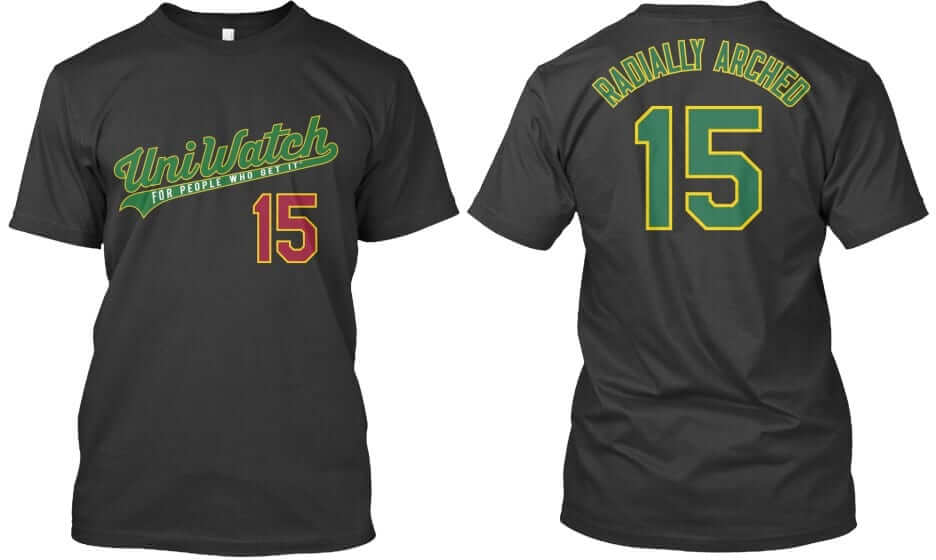
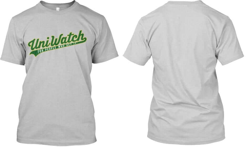
Again, each of these three designs — “Vertically Arched,” “Radially Arched,” and the plain script with nothing on the back — is available in all three colors shown (white, black, and grey). In addition, each design and color is available in three formats (short-sleeved, long-sleeved, and sweatshirt). Plus the plain script design is also available as a hoodie with pockets.
These shirts are available here up through next Tuesday, Dec. 9, and they’ll deliver in time for Christmas.
The Ticker
By Paul

Baseball News: The Padres will unveil new uniforms tomorrow — not sure what time of day or night. Chris Creamer reported on the details over the weekend (scroll down a bit). I’ve seen the designs and can confirm that everything he reported is mostly accurate, although his description of “bowtie” wordmarks is a mischaracterization, and he’s leaving out a navy road alternate jsersey that will also be part of the set. In addition, a team source tells me that “CEO Mike Dee recently revealed at an staff meeting that our new uniforms for the 2016 season will include a specific ‘All-Star jersey,’ instead of just the patch that host teams historically wear.” That’s news to me, and I’ve been unable to confirm it. We’ll find out for sure tomorrow. ”¦ Meanwhile, the Diamondbacks will unveil their own new set on Thursday evening. That one’s gonna provoke a lot of reaction — trust me.

NFL News: Lions CB Darius Slay is pissed off because he won’t get to wear a Color Rash uni this Thursday night. Well, he’ll get his chance next year (thanks, Phil). ”¦ “I made a helmet tree back in 1995,” says Marty Hick. “The tree has undergone a hiatus here and there, and also a makeover or two. I grew tired of teams changing their designs, thus wrecking my tree. So this year? I’ve pulled out helmets from years past. Some might call it hodgepodge; I call it smorgasbord. The NFL shield/angel/star was drawn in ’95.”
College Football News: Kansas’s blood-clot look was not a hit with at least one observer (thanks, Phil). ”¦ Nike is pushing a new cold-weather glove — neon, of course. ”¦ Here’s the jersey patch for this weekend’s ACC championship game. Too bad about the corporate douchebaggery.

Hockey News: Here’s an article on snapback caps for defunct NHL teams. ”¦ G.I. Joke uniforms for the Boston Pride, which is one of the teams in that new women’s league. Disappointing to see that they’re hopping on the same trend as the men’s teams.

NBA News: Lots of chatter yesterday about Kobe Bryant’s retirement, but the real Lakers news — at least from a Uni Watch standpoint — is that they hosted the Pacers, who wore their Hoosiers-based Hickory throwbacks. Hickory shooting shirts, too. Odd that they chose to debut this design on the road, no? Check that, they debuted them at home earlier this month. Still, interesting that they’re wearing them on the road as well as at home. Lots of additional photos here.

College Hoops News: Several people tweeted at me last night to say that Michigan State’s jerseys “looked like practice shirts” and that the green tones of the jerseys didn’t match the green of the shorts. You can kinda/sorta seen the color mismatch in this photo, but it doesn’t look so bad to me. Ditto for this video clip. Am I missing something?

Grab Bag: Yesterday marked six weeks since I broke my arm (again) in a(nother) bike accident. My busted flipper isn’t quite 100% yet, but it’s getting there, and yesterday I felt like it was in good enough shape for me to get back on the bike. (I had joined a gym for a month and then was on the road for a week.) So I rode up to Prospect Park and did my usual three laps around the park loop. If you’ve never injured your arm, you might be surprised — as I was three years ago — by how much strain is put on your arms by cycling. There’s a lot of torque involved, especially when you’re going uphill. After yesterday’s ride, my arm was a little sore, but it was nothing I couldn’t handle. I’ll now be resuming my daily cycling routine, which makes me very happy. ”¦ What kind of idiot would get his little kid a Marlboro F1 jacket? (From David Firestone, who also awarded his third annual NASCAR paint scheme awards.) ”¦ I was in a bar the other day and noticed that Miller High Life now comes in a variety of retro package designs. This has apparently been going on for more than a year, but it was news to me. ”¦ Faaaascinating article about an intellectual property dispute in Utah over “dirty” sodas. ”¦ Interesting look at the design process for the poster for the new David Mamet/Al Pacino play on Broadway.
Click to enlarge

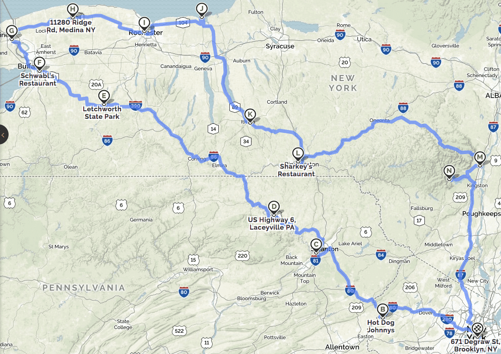
What Paul did last night week: The Tugboat Captain and I just got back from eight days on the road — from the Saturday before Thanksgiving to the Saturday after. As you can see from the map above (which shows an approximation of our journey, although there were lots of details and side trips, and the northernmost parts of the trip were actually right against the lakeshore), we traced a clockwise, vaguely amoeboid 1150-mile route that began through northern New Jersey and eastern Pennsylvania and then kicked into high gear in western New York, including a stop at Niagara Falls (which the Captain had never visited and I hadn’t seen since I was nine).
There was lots of fun along the way, including lots of waterfalls aside from the ones at Niagara; the odd pizza scene in Old Forge, Pa.; grumpy border-crossing agents; an overpriced Niagara hotel room with a somewhat unsatisfying view of the falls; lots of purloined fruit; a wonderful old-school bowling alley where we enjoyed drinking and chatting with the owner even though only one of us was able to bowl (hint: not the one who recently broke his arm); meeting the Captain’s brother and sister-in-law; a lovely Thanksgiving featuring a very delicious spatchcocked turkey that was cooked in a smoker; a visit to an amazing slate sculpture site that was so great I didn’t even mind that it was raining; lots of barroom encounters with entertaining characters; some odd meals, including a breakfast featuring two kinds of hot dogs and a dessert consisting of ice cream and onion rings (the latter at a place with the best slogan ever: “Where Quality Predominates”); a surprising number of photographs of bagged ice; an even more surprising amount of pounds gained in a very short time; and the rechristening of Lake Ontario as Lake Inferior.
I hope to be able to tell you more about all of this (or at least a good chunk of it) tomorrow. For now, here’s a panoramic shot of Niagara Falls, taken last Tuesday morning from the Canadian side. Those are the American falls on the left and the Canadian falls — also known as Horseshoe Falls — on the right (click to enlarge):

Hi Paul,
The Pacers actually debuted their Hoosiers uniforms at home on Nov. 6, against the Heat. Great look, anyway.
Thank you for the great work on this website !
Text now adjusted — thanks.
The jacket mentioned in the ticker is a Formula One jacket, not NASCAR – note the Ferrari logo.
Fixed. Thanks.
Love that panoramic shot of Niagara Falls, sweet!
Since the Hickory uniforms are paying homage to a fictional team from a movie (yeah, yeah, it’s all about the spirit of small-town Indiana basketball, but Hickory is a Hollywood invention), wearing those uniforms in LA seems appropriate.
I grew up about 8 miles from the Falls. The lower Niagara River is still, for me, the most beautiful place on Earth. And the Niagara Escarpment view of Toronto, sitting like Oz on the far shore of Ontario, is one of my favorite things in the world. The photo of Niagara brightened my morning. Thanks!
Since the Hickory uniforms are paying homage to a fictional team from a movie (yeah, yeah, it’s all about the spirit of small-town Indiana basketball, but Hickory is a Hollywood invention), wearing those uniforms in LA seems appropriate.
Excellent point. I’ll buy that!
I’m very curious to hear about your experience in Old Forge, Pa., the self-proclaimed Pizza Capital of the World. It’s always interesting to get a non-native’s perspective. I also broke my elbow while cycling a few years ago, and I am happy to hear you are making a quick recovery and are back in the saddle.
I dunno, watching the Sunday Night game last night, I thought the black numbers that NBC used looked kinda cool, and were certainly helpful. They didn’t really need to do the hashmarks, but I thought the numbers and yardlines in black over the snow were a nice touch. I really found it cool how consistent they kept it with changing camera angles, though I suppose it is the same technology as the blue and yellow lines, which have gotten more and more consistent and accurate over the years.
I didn’t like it. It looked cluttered to me, and I wasn’t having a hard time tracking where the ball was before they started adding the numbers.
I felt like the whole thing smacked of “we’ll do it because we can” rather than fixing a real problem.
Anyways.
Lee
I’d agree it wasn’t necessary, but I’m not sure how it becomes “cluttered”. Those markings would be there in normal conditions. White marks on green field or black marks on white field… what’s the difference?
I liked the superimposed field markings too. Hashmarks were superfluous, but I thought the numbers were done so well that they didn’t look hokey.
It’s probably a good thing for us that the Lions weren’t part of the color rush this year. I’d bet good money that they’ll end up in mono-black, since the league seems to prefer using accent colors instead of being logical with this whole thing.
I was looking forward to a Detroit/Green Bay color rash. Gold Packers vs. Blue Lions would’ve worked for me, as would Green Packers vs. Silver Lions.
No. I hope the Packers never give into these gimmicks. Traditional…and keep it that way.
Welcome back Paul! Looks like your trip took you right through Rochester, NY. Did you actually stop at any places in or around the Flower City, or were you just passing through? Depending on what day you were in ROC, we may have had a chance encounter and not even realized it (I was travelling for part of the holiday weekend myself)! Would be interested to hear more details about the western NY portion of your trip.
Rochester stops included the High Falls, Don’s Original, the Genesee Brewery, a breakfast joint whose name I can’t recall, Parkview Bowling, a motel whose name I can’t recall, and a very large Wegman’s. All in the space of about 16 hours!
My sister has lived in Rochester over 30 years now, and considering she went to school in Geneseo, and my brother in law went to RIT, I have been familiar with the area longer than that! I remember when Don’s Original was in a different location and was Don and Bob’s. I bet the breakfast place was a place called Charlie Brown’s.
Nope, not Charlie Brown’s.
I’m thinking that this “very large Wegmans” would have been their flagship store on Monroe Ave. (Rt. 31) in the town of Pittsford (although they do have some other large stores). If so, there is a uni-notable tie-in here: Champion Athletic had its beginnings many years ago in roughly the same spot where the Pittsford Wegmans store now stands.
A spatchcock is an historical term for a culled immature male chicken, but increasingly denotes a preparation technique.
Really surprised I’ve never seen Clemson fans refer to South Carolina as the Spatchcocks.
Meanwhile, the Diamondbacks will unveil their own new set on Thursday evening. That one’s gonna provoke a lot of reaction – trust me.
I know you can’t give details (and I don’t want you to), but on a scale of:
* These make the Atlanta Hawks unis looks like classics
* These are very Hawks-ish
* The Hawks are way worse
…how would you rate them?
I’d say pretty Hawks-ish.
The problem with that answer is that Jimmer LOVES the Hawks.
He will NOT love these.
So…. they’re about to become my favorite team. Nice.
I’ll agree that the black numbers/lines/hashmarks weren’t the best look but I did find them helpful and not distracting on the snow. Also wondered if anyone else thought Belechick was wearing TWO toboggans. Maybe the one was just folded funny but several times looked like a second one. Didn’t bother trying to get a screen cap like I should have I guess. Must also say that I’m glad the whining, yelling, Brady lost. Act like you’ve been there…you have!
Those Michigan State jerseys do look a little off. The color appears to be a little different, but I think the cut of the jersey is what is causing them to look funny to me. We’ve grown used to jerseys with wide shoulders and these appear to be a much thinner cut up there, shown by how close Valentine’s name is to the edge.
Paul, having seen the new Padres design, what do you think? Will Padres like what we see on Tuesday?
I’m a bit relieved to read the rumored new Padres “Bow-tie” script is mischaracterization. I was a big hatter of the their old road SanDiegO script from years ago, and the idea of finally getting a new Brown jersey but having PaDreS on it was not sitting well. Fingers-crossed, knock-on wood, etc.
Sorry, no more hints on this one! We’ll all see for ourselves tomorrow.
Awwwhh (30-yr old pouting like a child now)
As a Padres fan starting in 1969, and a former Padres fan once the brown was dropped, I am excited to hear of this!
-Jet
I wish the Padres would pick a color scheme they could stick with long-term. They’ve changed their colors way too often.
Those defunct NHL caps are nice… with the exception of my California Golden Seals!! A BLACK cap?! They never had black in their color scheme! And the author is gushing over that look? Ugh…
-Jet
I’m torn on the 49ers. On the one hand, the overall look seems much uglier to me than any of the Color Rash unis so far. On the other hand, at least the Niners have contrasting socks, and that goes a long way for me, so in that regard San Fran’s BFBS alts are kind of better than the Color Rash unis. Still not entirely sure where I stand on this one.
So the Padres will stop dressing like the Dodgers do, and start dressing like the Brewers should. At least they’ll apparently look like the Padres once a week at home, assuming they have a brown alt cap to go with the brown jersey.
From Paul’s hints, I suspect the D-Backs can go one of two ways: Either they’ll be loud and camo-filled militaristic, in which case I’ll hate it; or they’ll be just plain loud like a modern college gridiron uni or a Nike-era NFL uniform, in which case I’ll probably like it. Baseball needs a few teams to push the envelope. Say what you will about some of the worse unis of the 1970s, but that decade also featured some of the best uniforms of all time. You don’t get the good innovations without at least as many abject failures. The sport has been playing it a bit too safe of late.
I’m torn on the 49ers. On the one hand, the overall look seems much uglier to me than any of the Color Rash unis so far. On the other hand, at least the Niners have contrasting socks, and that goes a long way for me, so in that regard San Fran’s BFBS alts are kind of better than the Color Rash unis. Still not entirely sure where I stand on this one.
Seems like an artificial metric. Why compare the Niners alt to Color Rash? Why not just compare it to, you know, a good design? The Niners alt sucked before we even knew about Color Rash, and it still sucks now.
Oh, absolutely. But critical thought doesn’t have to stop at the borders of “good” or “bad.” Even ugly comes in different kinds and degrees. Also, context matters. The Niners BFBS seems to spring from the same NFL uni-geist as Color Rash, so I think a comparison on the merits is entirely reasonable. I suspect that a black Color Rash uni for any team would have black socks, so all in all I have to conclude that the Color Rash unis are, in principle, worse than the 49ers BFBS alt. Even if, in terms of mere aesthetic preference, I think several Color Rash unis to date have been less ugly than San Fran’s fiasco.
Bottom line: To say that one thing is better than another is not to say that either of them is good.
On a good note, with the Niners going for the mono-black now, it likely means that the Color R(u/a)sh uniforms will probably be mono-gold, which is a much better and more logical look for them.
What the NFL (and I) want is a team that looks like a Brunckhorst’s truck. The Saints and Niners are closest in color. I’m distressed by the 49ers taking ham-fisted swings at alleged improvements when their basic livery is so strong.
A better solution might be redo of the Falcons in black and scarlet with gold trim.
Baseball needs a few teams to push the envelope.
Indeed. Go nuts, Arizona, as long as I can read the numbers.
When it comes to the expansion teams I have a different set of standards. It would be silly to suggest they *have* to look like an early to mid 20th century team when they weren’t around then.
You can read the fucking numbers Jim. That’s not the problem with this set.
No, they don’t have to look like a classic uni from the 1950’s (or even my favorite year, 1969), but they don’t need to …
oh fuck it, you’ll see it when you see it.
Jersey numbers you can read: Good.
Jersey numbers you can read from space: Bad.
The advance negativity on the D-Backs has me really intrigued, because their promotional material so far hasn’t hinted at radical new additions of color. And with a palette of just black, dark red, and tan, I have a hard time imagining how they could even approach Hawks or Buccaneers territory. The muted colors would seem likely to mute even the most, um, adventurous uniforms. So have the D-Backs found a way to transcend the inherent limitations of their color scheme? Or are they introducing ugly new colors to their unis that don’t appear in their logo? Looking forward to finding out.
Well, shit. This has me nervous.
My guess is that the snake theme will be prominent. Perhaps even an actual link pattern.
The Holiday Gift Guide is up:
link
The only thing I don’t like about the Vikings are the matte helmets and black facemasks that look out of place. Otherwise, they’re awesome uniforms.
Hi Paul,
Using a pencil is likely the best choice in that situation. They are probably using “Rite in the Rain” paper, which is kind of waxy. If you write on it with pencil, it will not smear. They do have “Rite in the Rain” pens, but if you hold them horizontal to inverted, they may not write well. Thus, a blunt #2 pencil is the best choice because it will operate in any weather scenario. Also, a mechanical pencil’s point can be fine enough to tear the paper, even the good stuff.
I’m a biologist who takes lots of field notes in terrible weather, so I’ve ran the gamut on good and bad ways to take notes.
Sincerely,
Burt,
Furthermore, I’ve seen people record data digitally on iPads, field computers, etc. I’ve seen someone lose a week’s worth of data, but paper never fails…
I didn’t get to read yesterday’s entry, so I am just now seeing yesterday’s ticker item about the painted-on “SF” cap logo on Stu Miller’s 1958 baseball card.
link
All of the Giants in that set whose cap logos are visible are shown with that logo.
link
Topps made a few assumptions, figuring that the Giants would be using a cap logo similar to that of the San Francisco Seals. This was a reasonable guess, as the flared serifs in that logo resembled those of the Giants’ “NY” cap logo.
Cooperstown Ball Cap Company actually produced this cap for sale.
link
Topps also made a guess about the Dodgers’ “LA” logo. They came pretty close, even though they didn’t get it exactly right.
link
Something similar happened in 1953 link. Which is kinda funny because when the Braves moved they simply link of the displaced Brewers, which was itself a modified link. That’s one Topps might have seen coming.
And don’t forget link, created for Willie Mays to wear at a press conference in October of 57.
I didn’t smoke my turkey (believe me, I wanted to and it was a great day to be out too), but I did spatchcock it, and it was done in 90mins (14lbs). I went all out and made the stuffing from scratch and everything. Unfortunately I did go store bought with my pie crust since the two I had prepped shrank when they cooked
I went to Niagara for the first time this past summer, was thoroughly unimpressed by the American side, the Canadian side was much nicer. Border guards (Americans) are definitely grumpy. I don’t understand why when re-entering the country they ask American citizens where they’re going. Um, home?
On that picture of the Vikings purple over white… is Adrian Peterson wearing ear buds? I swear there is one dangling near the 2 on his chest.
Couple of reactions:
-As far as the superimposed black yard-markers in the snow go, I actually liked them. I thought the idea was pretty practical. Granted being that I’m a Pats fan and they were in the game, I didn’t really look at them from an aesthetic POV, just appreciated being able to see clearly through the snow.
-You have me very curious to see the new D’Backs set.
-Surprised you didn’t point out the obvious corporate reason for Beckham’s cleats, namely that the Giants play in Metlife Stadium (I know they were on the road yesterday, but still) who use the Peanuts characters as corporate mascots, including at the stadium itself.
-Sounds like you had a great Thanksgiving trip Paul. The panorama of the falls is gorgeous.
Paul,
It looks like you drove on 104 right through my hometown of Lockport NY. What was your stop in Medina?
Didn’t actually stop in Medina. Just dragged the map route there because it was defaulting to the Thruway, which we didn’t take.
You know, the Steelers (and any other team) wouldn’t (likely) have had problems with the numbers on their helmets if they didn’t consistently lead with the front of their helmets on a tackle.
Did you really go on Route 6 through PA? Looks like 80 to 380 to 6 to 220 to 86 (the old Route 17) to 380 up to Rochester. You might have passed through a few places i know well…
Yes. I love US-6 thru PA. Have driven it several times.
I grew up in one of the towns on the Susquehanna – next time you’re looking for good eats along route 6, let me know and I can point you to better places!
Navy has link for the Army game.
JEERS to the niners for that shit show of BFBS
JEERs to whoever dressed Brees. +5 points he he dressed himself inexpensively by buying off the rack at JCP. -500 points if someone is advising him to wear that and scammed him out of money for that ensemble
MAJOR CHEERS X Infinity for Marty Hicks’ helmet tree!
CHEERS to the white long sleeve HICKORY warm-up shirt
JEERS to the Boston Pride and their scrambled egg uniforms