For all photos, click to enlarge
[Editor’s note: Paul’s still on vacation, but he left this column for today. Phil will be back tomorrow with the usual assortment of Saturday stuff. Hope everyone had a great Thanksgiving.]
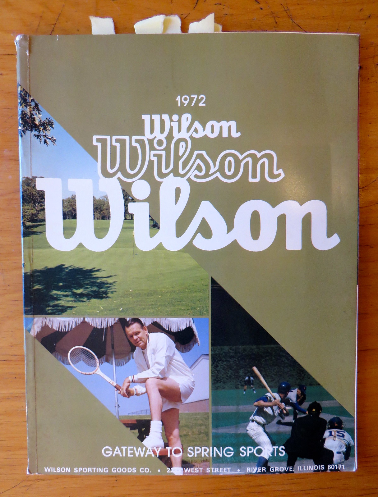
My friend David Brown recently sent me this 1972 Wilson catalog. Let’s take a look at some of its more interesting items, shall we?
My knowledge of golf is approximately zero, so I don’t know if club heads are always this good-looking, but I really like the stripe patterns on these wood clubs:
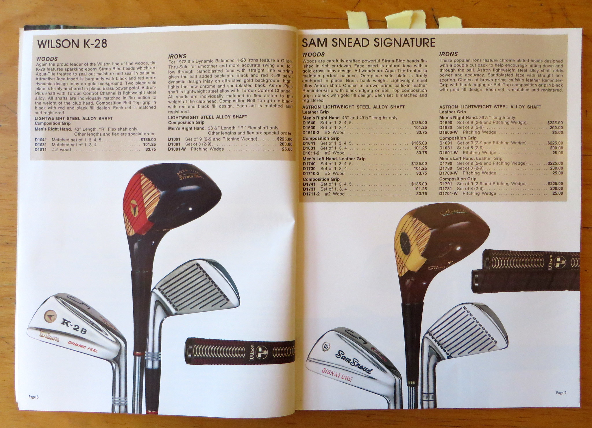
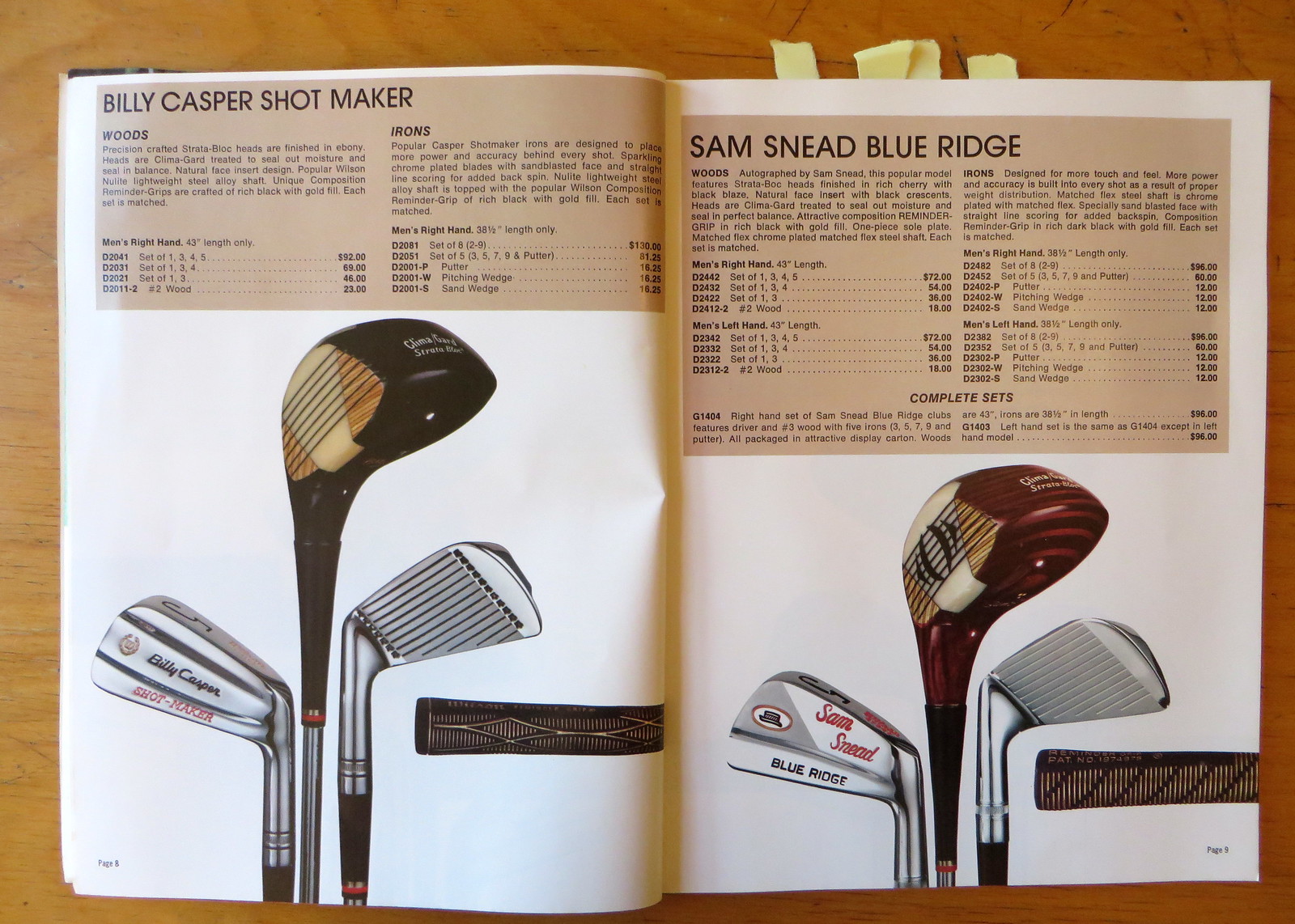
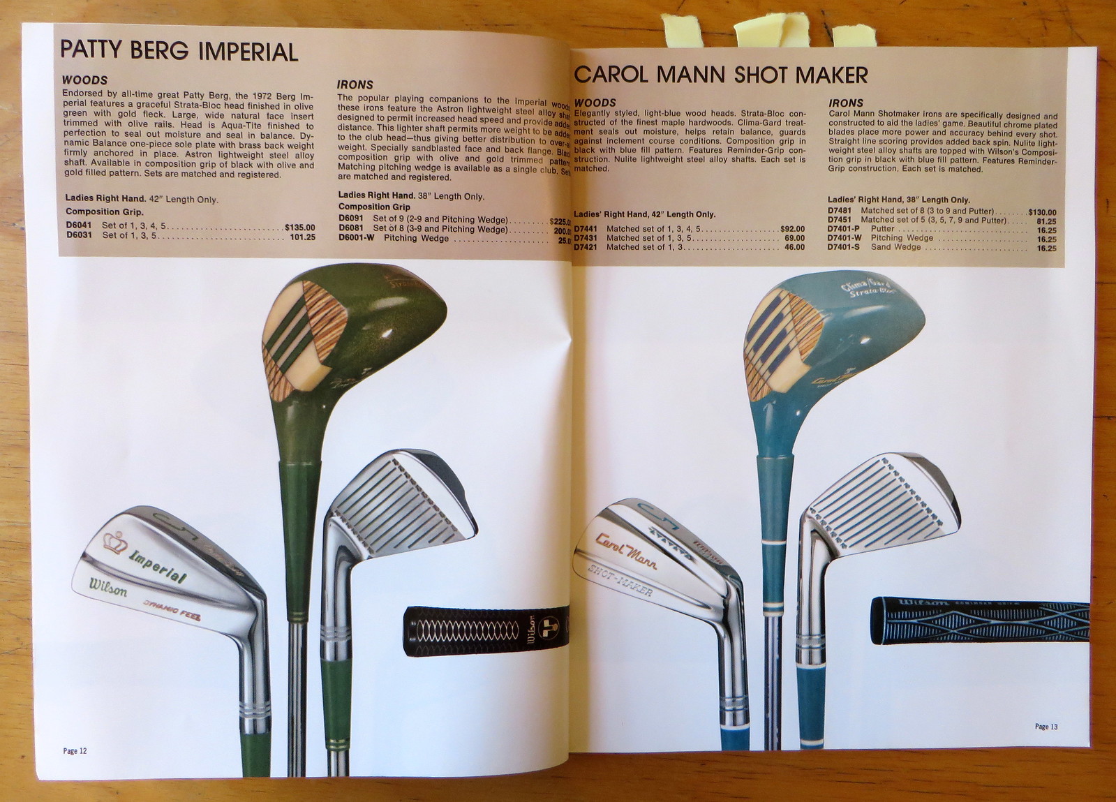
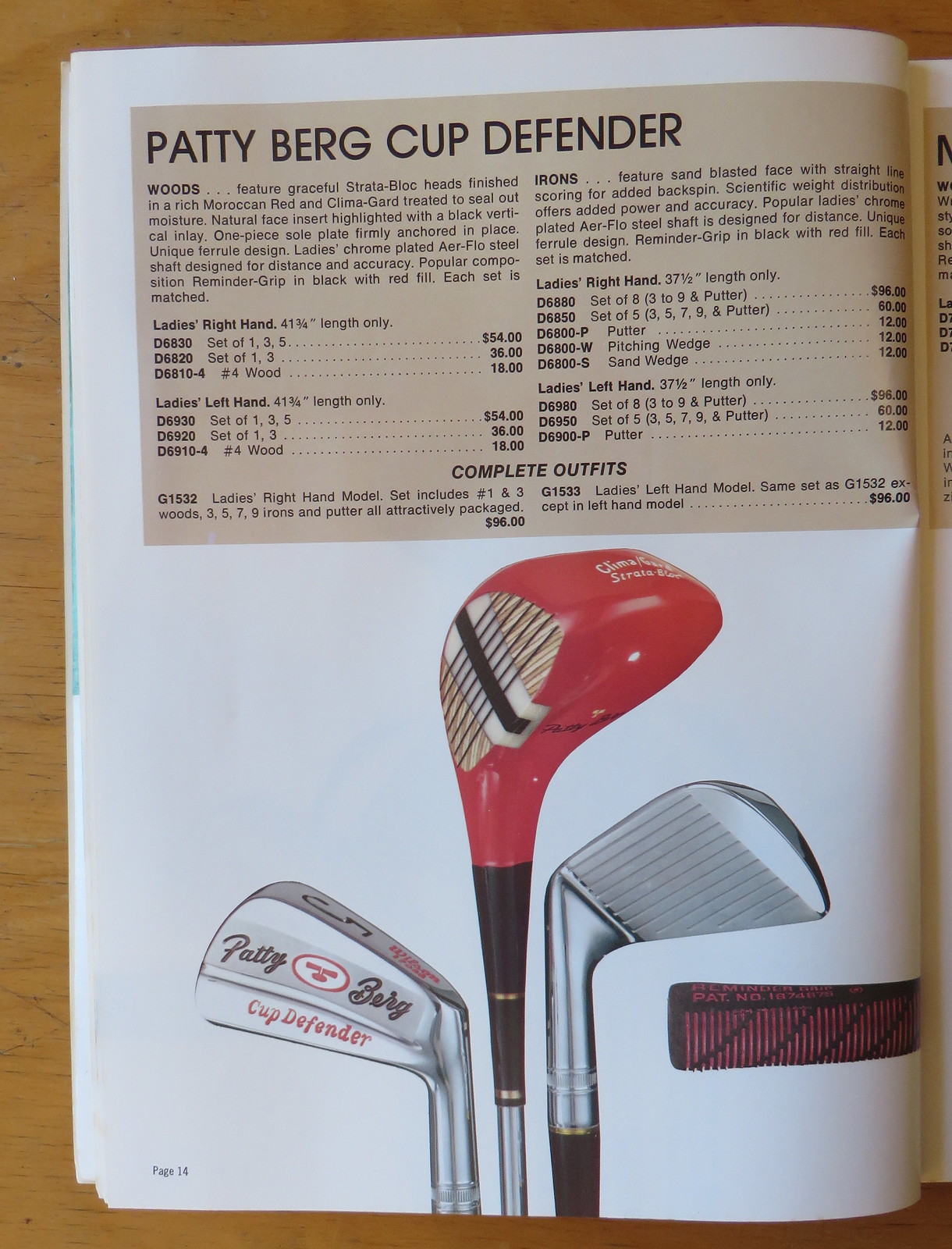
Nice, right? Those stripe patterns on the club heads actually remind me of bowling, not golf.
Moving on to baseball, here’s something really interesting: Wilson apparently offered flapless batting helmets and catcher’s helmets that could be fitted with snap-on earflap attachments (see item A5432):
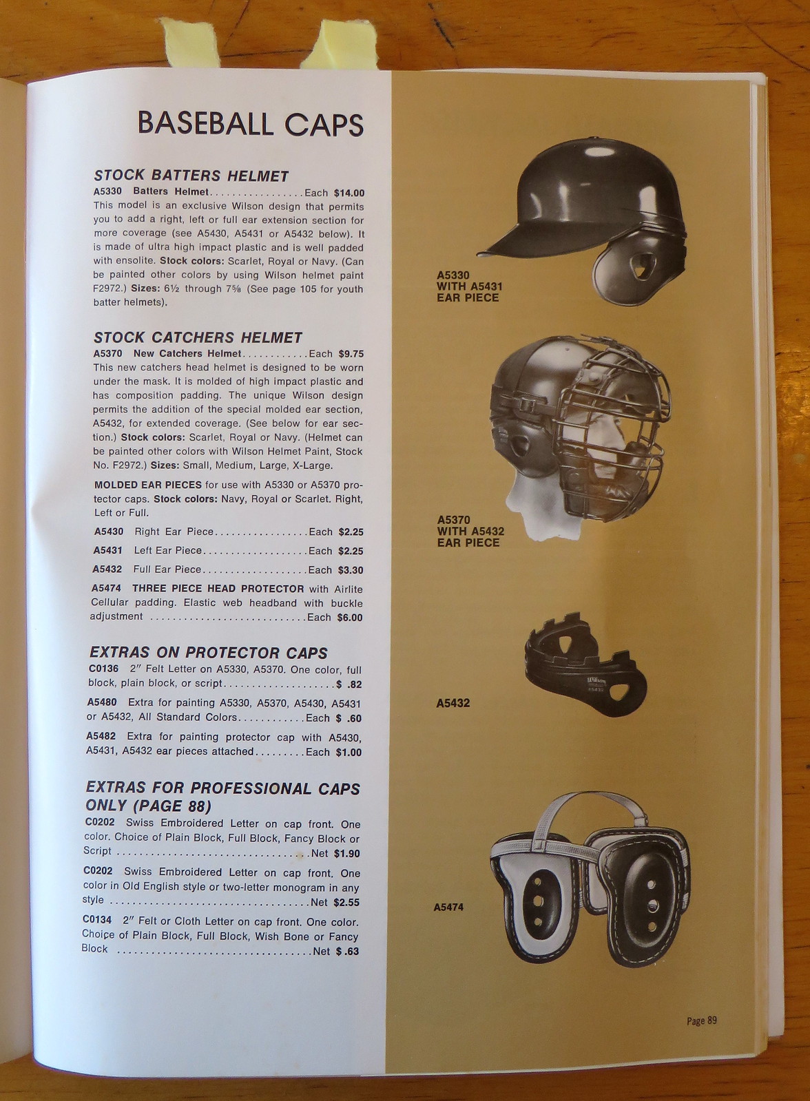
I’ve never seen that before. Guess it didn’t catch on. The same could be said for this next item — a “chest and rib protector” for youth players (top item on the page):

The year of this catalog — 1972 — is also the first year I played Little League. Glad nobody made me wear one of those rib protectors.
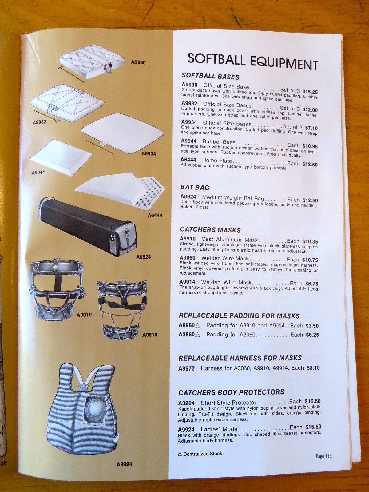
Speaking of torso protection, check out this catcher’s chest protector for female players, with “cup shaped fiber breast protectors” built in (bottom of page):
My favorite part of any uniform catalog is always the hosiery section. Too bad this one isn’t in color, but it’s still fun to see all the stripe patterns on offer:

Note that the small, low-rise stirrup at bottom-left is described as a “Stretch Nylon Target Sock.” I’ve seen these short “target socks” in other catalogs but didn’t know what they were for, so I asked sporting goods maven Terry Proctor, who said, “It’s an old term from basketball. It’s from back in the day when most basketball teams wore knee-high stirrups. The lower target socks were worn by the star player because they supposedly made him easier to identify on the court.” Fascinating!
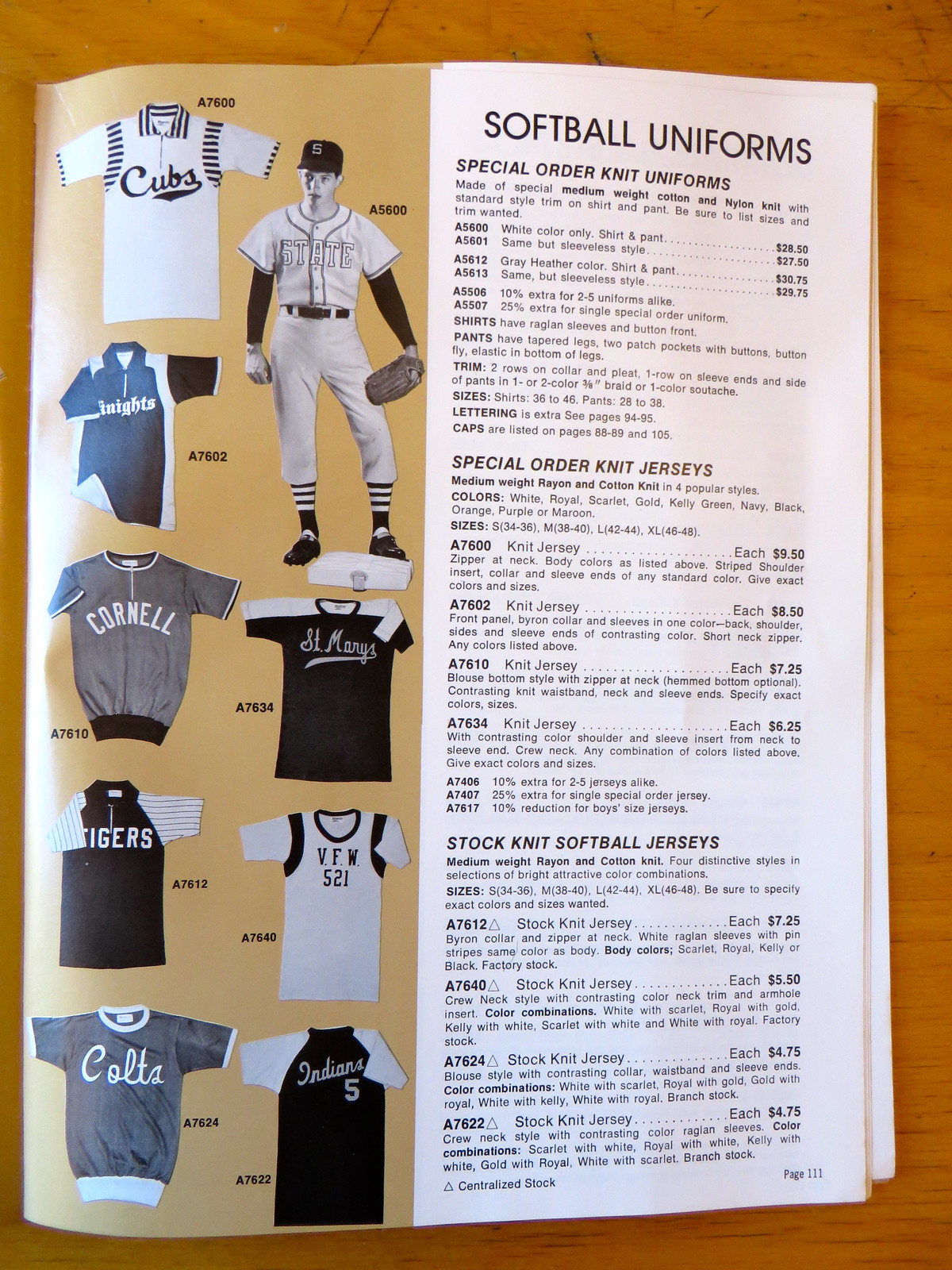
Most of the softball jerseys shown in the catalog look like precisely the sorts of things I’m always looking for on eBay:
And that’s it. Big thanks to David for sending me the catalog — good stuff.
Uni Watch News Ticker
A Mini-Ticker for Friday
By Phil
‘skins Watch:
Wishing you and your family a Happy #Thanksgiving. pic.twitter.com/qI3U7hbGhK
— Washington Redskins (@Redskins) November 26, 2015

Baseball News: Looks like the San Diego Padres cap for 2016 has been leaked (h/t Andrew Beccarelli). … “You probably have seen this before, but in 1972 Heywood Hale Broun did a feature on the new style in baseball uniforms. Here is the clip as presented on “Woodie’s World” on ESPN Classic,” writes Ferdinand Cesarano. “The interesting thing there is that the A’s are shown with no front number, proving that they had that variety that year, alongside the version with the front number. (And we know that this really is 1972, because there is a clip of Mike Epstein, who left the team after the 1972 season.) The loudly-jacketed and mustachioed Broun wraps the report up with some deadpan commentary about the shocking nature of the newer styles.”

NFL/College/Football News: The Cowboys and Panthers wore their color rash unis yesterday. I’ll have a full review tomorrow. … Interesting Full Name On Back of this Florida State jersey. The auction is over, but you can see it’s from 1983 — and it’s a crop top (thanks to Jeff Flynn). … GQ has assembled a slide show of the best beards in football (thanks to Andrew Cosentino). … If you’ve been paying attention to the NFL (and Uni Watch) the past couple weeks, you know the Chiefs have worn white over white with red socks (first time in decades) the past two weeks (a great look, by the way) — Uni Watch isn’t the only place that noticed. The players like the look too. … Last night against Texas, Texas Tech wore throwbacks (h/t Slotter). It was a tremendous looking game (and should be in the TOP 5 of the 5 & 1). … Arizona State will wear actual school colors against Cal on Saturday (from Marc Altieri). … UNC will go blue/white/blue against NC State tomorrow (h/t James Gilbert). … Illinois will go orange/blue/blue against Northwestern tomorrow (h/t Illini Football), at Soldier Field. … Utah will be going black/red/red against Colorado tomorrow (h/t Cody). … Syracuse will be going orange/orange/orange against Boston College tomorrow (h/t Syracuse Football). … New helmet decals for SMU. Not sure if those are what will be worn in-game, but they’re silver. … New uni for MSU? During practice, Sparty had some new jerseys they were breaking out (via Chris Solari). They play at home against Penn State this Saturday, so maybe these are just practice duds. Or maybe not.

Hockey News: Check out these NY Rangers game day posters. Says submitter Adam Schechter, “Seen on Reddit, not a stretch to think these were inspired by the fabulous work of the guy in the Columbus creative department.” … Reader Tom Glanzer created this pretty amazing bubble hockey poster. “I wanted to do something super cool for the local HS hockey team this year. Growing up I spent a lot of time playing the USA vs. Russia bubble hockey game, so this seemed natural. Super Chexx even granted permission and supplied the game image — I had to Photoshop out most of the rod hockey players to put our players in the game, I think it turned out pretty good.”

Basketball News: Sorry, Wrong number: Michael McLaughlin notes the NBA’s area code-based merchandise uses Miami’s secondary area code for the Heat. … “A high school in my area, North Hardin, switched to UA for its boys hoops unis this year — and they’ve got some wild looking shorts,” says Josh Claywell. “Shorts feature many items, from a backboard to hearts to words like toughness, family, battle & grit. Craziest thing I think I’ve ever seen.” … Check out this article on Allen Iverson and the NBA’s Sleeve Revolution. Submitter Ben Cox adds, “An old high school classmate put together this brief article (and more importantly, the excellent infograph accompanying it) for the Wall Street Journal.” … Kevin Durant’s new sneakers honor Prince George’s. Why is the county offended? (from TommyTheCPA). … From the Jim Vilk “I’d Wear That” files: Check out the “short” shorts on UMass Mens hoops (from Jeffrey Seals).

Soccer News: Check out the unusual sleeve piping on mid 1970’s French football shirt: Graham Clayton writes, “While the main colours of the 1973/74 Nantes FC kit were black shorts and yellow shirt and socks, their uniform did have an unusual feature — red, white and blue piping on the ends of the sleeves.” … This might be the most poorly worded headline in a long time.

Grab Bag: This is kinda cool: check out these t-shirts “created entirely from the text of your favorite books” (from Gil Neumann).
Can’t wait for the Padres to explain that the new yellow/blue combo ‘symbolizes the beautiful San Djego sunshine and the deep blue Packfic ocean’ or some similar bullshit.
Such a waste of an opportunity to embrace the classic brown.
It’s in tribute to error.
*and to my multiple typos, natch.
Those Sam Snead clubs were my first set of golf clubs, inherited from a neighbor when I was a teenager circa 1990. Beautiful clubs. I had no idea how old they were! But about the beautiful stripe on the club face: over time, each of my drivers had the little wooden inset piece that makes the stripe fall out during a swing.
I’m dubious of the Padres cap. Seems likely that it represents the correct design and colors, but the apparently flat stitching and the size sticker don’t look right. Wouldn’t be surprised if it’s an accurate counterfeit, rather than a leaked piece of real merchandise.
That Nantes kit with the French tricolour on the cuffs was because they were the reigning champions – St Etienne won the league the following season and had the colours on their collars too: link
In Italy, the champions wear a green/white/red shield known as the Scudetto on their shirts.
“Color Rash” game didn’t look too bad…probably because it was color vs. white. Doesn’t hurt that my Cats thoroughly dismantled the Evil Empire.
The Panthers blue was a bit much – maybe if they had gone with black/white socks it might have worked better. Also I wonder how the seldom worn black pants might work with the blue tops. Or how the blue pants would look with the white jerseys?
Ah, to hell with it – when you’re 11-0, everything looks good!
It would’ve been nice to see the Panthers use the black pants instead. That was the team’s original concept, after all.
I really hope the NFL tweaks this whole color rush thing before next season. I’m totally in support of mandatory color vs color, but they really need to stop effing up the uniforms in the process.
“mandatory”? No.
But certainly more leeway, and teams taking advantage of it.
No need to create whole new one-off costumes, you & I agree on that point.
Lee
The Cowboys’ look was pretty solid; I’d be thrilled if they swapped in their normal silver pants with that jersey & wore that as their regular home option.
As for the Panthers, theirs was very bright, but I suppose it’s just for one game. The leg striping helps to break up the blue a little so it’s not so overwhelming. To that end, I wouldn’t mind seeing black socks. But I’m not exactly a fan of the light color-jersey-over-dark-pants (unless it’s white over black/navy/etc).
Right. Surprised the Panthers have never tried the black pants with the white jerseys.
Hell, I’m surprised the Panthers have never tried the black pants again at all, but Jerry Richardson doesn’t like to drift from the standard set too much.
The CFL introduced their new league logo today, but I’m guessing the post was put together too early to include it.
The bubble hockey poster is great work but it made me feel like I was suffocating while looking at it! :P
Persimmon woods. Back when golf was a man’s game. I miss them.
And, obviously, a woman’s game. My apologies.
From your Paul’s mouth to the 5 and 1, I agree but I am guessing a Mac or American conference game is going to oust Texas Texas Tech : (
Is there a team in any of the 4 major pro leagues that tweaks/changes their uniforms more than the Padres?
Atlanta Hawks, maybe?