
Really fun game last night in Memphis, as the Grizzlies debuted their Memphis Sounds throwbacks. I love it when the old ABA designs get resurrected, and I also like it when teams wear throwbacks from other franchises that played in their city. As a bonus the Grizzlies opted to go with the road version of this design (not sure why, since they’ll obviously be wearing the throwback at home, not on the road), which had the result of creating a very good-looking color-on-color game against the Thunder:
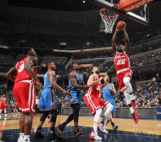
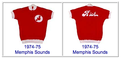
If you look at old Sounds photos, you’ll see that Adidas appears to have done a pretty good job of re-creating the design, at least on the front. Looks like the original NOB script was thicker than the version they used last night, though (click color photo to enlarge):
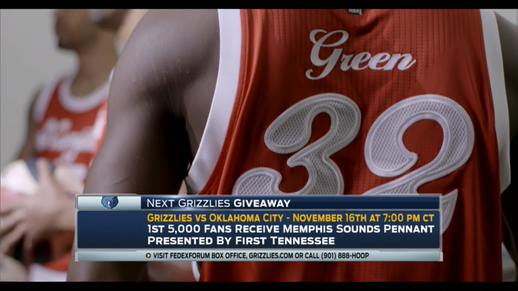
As you can see, it was kinda funny to have the uni numbers rendered in Adidas’s mesh format, which looks very odd on the 1970s font.
One disappointment: They didn’t go the extra mile with throwback warm-up tops. Too bad, because the originals looked great:
Overall, though, you’d have to call this a big success. You can see additional game photos here. The Grizzlies will be wearing these throwbacks four more times this season, and you can find a schedule of those games here.
And there’s more retro fun tonight, as the Warriors will be wearing “The City” throwbacks (the subject of my most recent Friday Flashback piece), and will also be debuting their new throwback court.
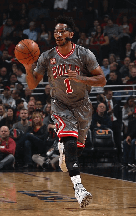
Meanwhile, the NBA had another color-on-color game last night, but it was a stinker, as the Bulls debuted their miserable new sleeved grey alts against the Pacers (click second photo to enlarge):

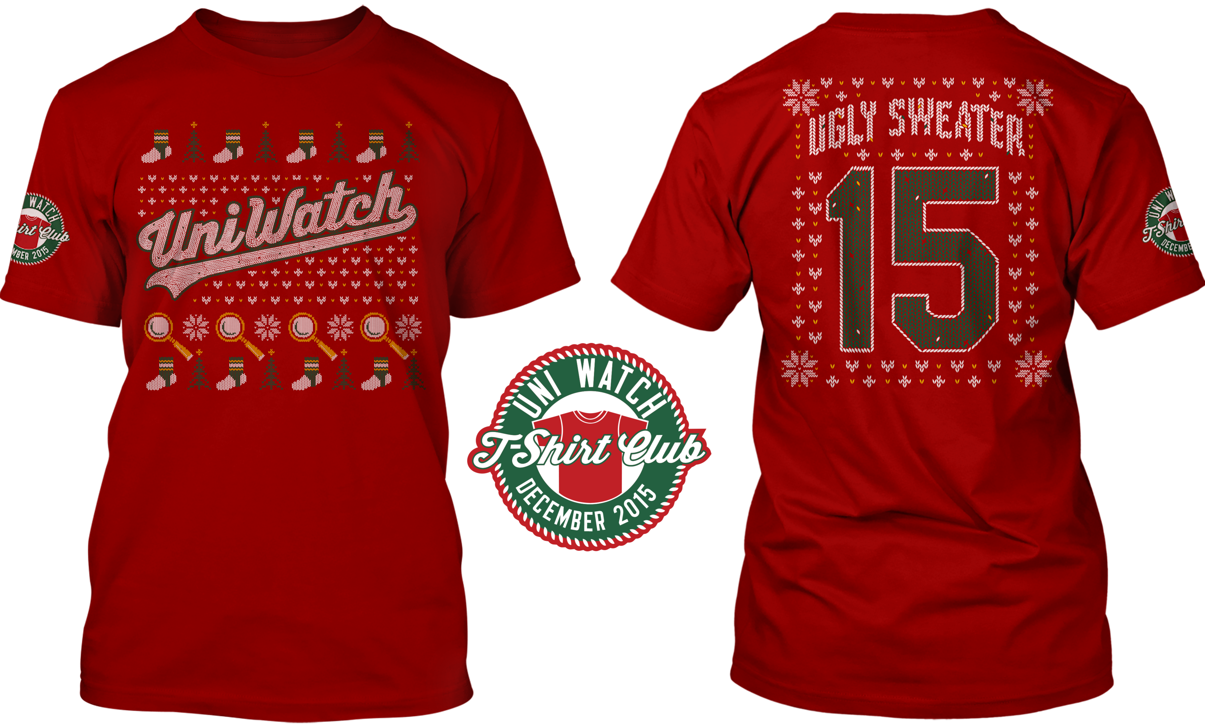
T-Shirt Club reminder ”” LAST CALL: Today is the FINAL DAY to order the Uni Watch T-Shirt Club’s design for the December — the ugly sweater design — which is available here. We’re offering it in three formats: a standard short-sleeve tee (American Apparel or Teespring Premium), a long-sleeve tee, or a sweatshirt. It’s a doozy of a design — dig (click to enlarge):
Again, this is the final day to order this shirt. Get it here. Thanks.
Click to enlarge
Collector’s Corner
By Brinke Guthrie
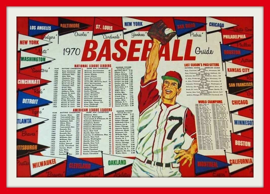
How about this restaurant placemat! It’s a 1970 edition — restaurant unknown, but it shows “AL” and “NL” Leaders, last season’s Pace-Setters, and a list of World Champions. And check out the jersey — not just a vest, but a zippered vest! Probably meant to evoke what the Indians had worn the previous year.
Now here are the rest of our finds for the week:
• Excellent cover art on this 1969 Atlanta Braves scorecard — just 30 cents!
• There’s no Brownies logo anywhere on this pullover made by Colosseum, but I love the script.
• Here’s a 1970s Eagles sweater by Cliff Engle. Can you imagine Buddy Ryan wearing one of these? Yes, you can.
• Never seen anything like the jersey number theme on the cover of this 1970 World Series program. Very cool design!
• Really like the look of this Phillies varsity-style jacket. This one is a little busy-looking, but I like the blue.
• Here’s an “Official” Baseball Card Game by Milton Bradley from 1970. Endorsed by the MLBPA, but as you can see, all the players have blank uniforms except for Reggie, whose cap shows some type A’s-ish logo but not the real A’s logo.
• Loved the 1990s Apex designs. Here’s a clean-looking jacket for the New York Football Giants.
• This 1970s Fran Tarkenton T-shirt also shows (I think) Carl Eller (No. 81), Dave Osborn (No. 41), and Ed Marinaro (No. 49). Not sure about No. 33, though.
• Go Pack Go! Check out the artwork on this 1960s Packers promo piece, from Pabst Blue Ribbon.
• Great cover art on this 1960s NFL electric football game by Gotham.
Follow Brinke on Twitter: @brinkeguthrie

Gift guide signal flare: I’m currently working on my annual Uni Watch Holiday Gift Guide for ESPN. If you know of any cool uni- or logo-related gifts (aside from the obvious team merch like jerseys and caps), do tell. Thanks.
The Ticker
By Mike Chamernik

Baseball News: Hats and jerseys for the Royals’ kids club, which is called the Blue Crew, have yellow brims and sleeves (from Zach Brady). … New uniforms for the Omaha Storm Chasers. Here’s another look (from Seth Kincaid and Mike Vamosi). … A political spin on things from New Hampshire Fisher Cats, who are letting fans vote on whether the team will wear blue donkey or red elephant hats on Opening Day next year.

NFL News: Bengals WR Mohamed Sanu has customized Joker cleats (from Bob Wilzbach). … With his team playing the Packers this weekend, Vikings coach Mike Zimmer set his team up with “Beat Green Bay” T-shirts. … What are these numbers on the ball? According to this article (scroll down to the middle), they are the markings of officials who inspected the ball prior to the game (from reader M. Skuz). … Based on some of the Color Rash promo photos, there had been speculation that the Jaguars might be ditching the two-tone helmets for this Thursday night’s game. But here’s some conclusive evidence that they’ll still have the two-tone helmets. … The No. 10 item in this piece mentions that the Patriots wore mono-blue in 2002 (from David Chisholm). … Virginia’s Park View High School uses the Patriots’ current Flying Elvis logo, but the school throws back to Pat Patriot, too (from Paul Rizzo). … The Steelers held a reunion for their 2005 championship team. Everyone wore a jersey with the Super Bowl XL patch, except for the two current Steelers, Ben Roethlisberger and LS Greg Warren (from Christopher Taylor). … A nameless reader ranked his/her favorite numeral fonts. I only include it because I’m certain it’s just a ploy to get Paul, Phil and the Uni Watch readers upset. … Here’s a cool collection of Steelers/Browns programs (from @redbuppy).
College Football News: Virginia Tech will wear all-black for its final regular season game. … Michigan is an Adidas school, but KR Jourdan Lewis wore Nike socks against Indiana this past weekend (from Scott Lerman). … Rutgers’s helmet logos were all over the place this weekend (from Patrick Karasek). … Dan BonAnno got an email from Notre Dame with a Miami logo at the bottom of it.

Hockey News: A decade-old Islanders prototype jersey turned up on eBay (from Phil). … Cheesecake image aside, neither Ken Purdy nor I have seen this powder blue Blues jersey before. … “Homestar Runner had its Halloween cartoon ‘The House That Gave Sucky Tricks’ and Strong Sad dressed up as Cameron Fyre from Ferris Beuller’s Day Off, complete with Frye’s crooked logo jersey, minus sleeve numbers,” says David Firestone.

Pro Basketball News: The Sixers played the French national anthem before tipoff last night. … Lots of fans and players dislike sleeved jerseys but a Fansided writer thinks they are here to stay (from Phil). … Refs in a Dutch league will wear “Respect” patches on their sleeves. … The jersey Michael Jordan wore during his last regular season Bulls game in 1998 just sold for $173,000.

College Hoops News: Northwestern’s women’s basketball team modified their warmups to show support for Mizzou (from Brinke). … George Washington wore fight song-themed uniforms last night. … Discontinued in 1998, the WuShock logo is back on Wichita State’s shorts (from Phil). ”¦ Last night’s Baylor/Oregon game featured neatly inverted highlighter-themed color schemes.

Grab Bag: A couple racing notes from David Firestone. He examined the STP logo and Brian Vickers’ steering wheel. … New logo for the town of Berkley, Mich. ”¦ The Toledo police department is looking to make some uniform modifications (from Tom Konecny).

What Paul did last night on Saturday: On Saturday afternoon the Tugboat Captain and I headed up to the Bronx, where there were some eateries and watering holes we wanted to explore. One of those spots was an excellent tavern called Glacken’s Bar & Grill, which we liked so much that we ended up settling in for almost the entire afternoon.
At some point the Captain, who’s very good at sneaky photography, pretended to be checking her email on her phone but instead took this absolute stunner of a photo (click to enlarge):
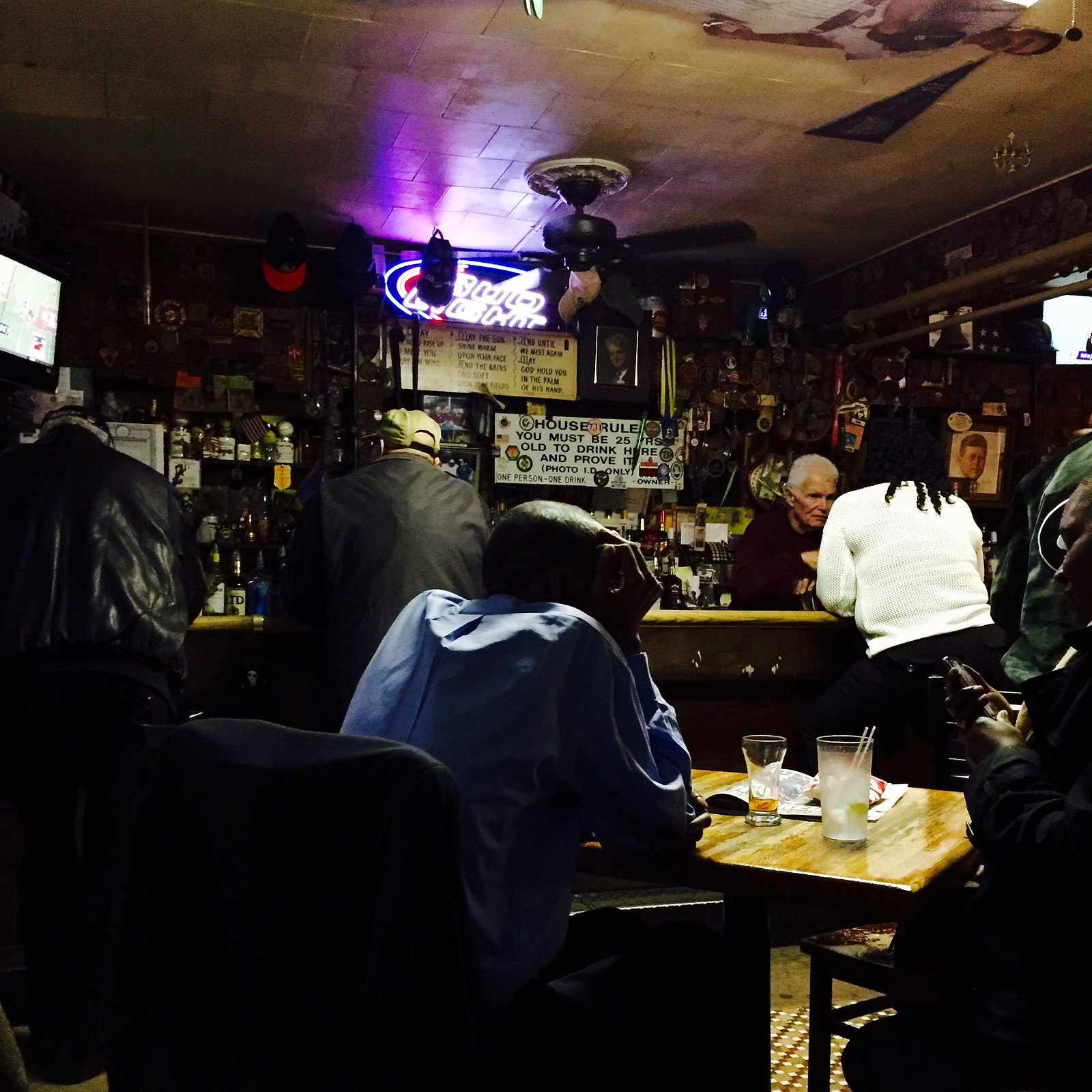
How awesome is that?! Damn.
We also had dinner at a local soul food joint, but Glacken’s was the highlight of our day, and that photo really captures the experience.
An interesting note about the Memphis Sounds jerseys – the original jerseys got re-purposed in the Sounds extremely short-lived move to Baltimore. See the photo at the bottom of this page: link
Proofreading: “This 1970s Fran Tarkenton T-shirt also show (I think)”
“dressed up as Cameron Fyre from Ferris Beuller’s Day Off, complete with Fry’s crooked logo jersey”
Fixed.
Everyone wore a jersey with the Super Bowl XL patch, except for the two current Steelers, Ben Roethlisberger and LS Greg Warren.
That was taken before the game Sunday in the Pitt locker room. The jerseys with the patches were all seen at halftime, while the two without appeared during the game itself. (You can see that Warren, at the top left, is wearing his game pants and socks.)
Which might be why they wore black there, when of course they wore white in XL
Virginia Tech’s black uniforms are this weekend, which is their final regular season home game; they have one more game remaining, the annual rivalry game with Virginia, which is in Charlottesville this year. In that game, they will be wearing throwback uniforms to 1987, outgoing coach Frank Beamer’s first year at the helm. link
I remember the day the Patriots wore mono-navy. It wasn’t often that Favre/Pack came to Foxboro, so it’s memorable. After an overcast day of raking leaves at my grandparents’ house in Worcester, MA, I drove home hearing Gil Santos on the radio mention them. I got home too late to see the game’s end, which was a good thing because the mono navy is an ugly look.
In addition to a red, white and blue ball, Memphis coaching staff should have been wearing plaid coats.
Interesting house rules at Glacken’s; I’ve never been to a place where the minimum drinking age was 25.
Doesn’t sound like it would be legal to refuse to serve people over 21
There is no law that compels the holder of a liquor license to sell alcohol to anyone. It is their choice whether or not to sell to anyone regardless of age.
Can they refuse to sell based on other criteria? Religion, gender, ethnicity?
It’s complex, but in general, federal law prohibits discrimination by most merchants on the basis of race or national origin, gender, and religion. A minority of states also prohibit discrimination on the basis of age. So in most states, a merchant may refuse service on the basis of age, but not on the basis of religion, gender, or ethnicity.
And if you’re thinking “age discrimination,” this isn’t the kind that federal law tends to contemplate. For one thing, this isn’t an employment matter, but setting that aside, you have to be over 40 and the discrimination has to be because you are “too old.” So if you’re 21<x<25 and trying to order a beer, you're not 40, and the pub is saying you're too young. So yeah, the pub is very likely to be able to lawfully do that.
Oh by the way, rental car companies can jack up the rates if you're under 25. It's an insurance algorithm. Same thing. You'd think that there shouldn't be a distinction if you have a full license, but wrong again.
and Glacken’s has a kickin theme song!
link
CHEERS TO THIS!!!
His pouring method was developed 60 years ago by his late father, Mike. It is outrageous and is known from police headquarters to Rikers Island.
A 12-ounce cup is filled with ice and set on the bar. Mr. Glacken then fills a three-ounce shot glass with the liquor of your choice. He dumps it into the cup of ice and with bottle still in hand, he continues the pour, raising the bottle to his ear and pausing for a moment before bringing it down for the top-off.
A typical liter of liquor will produce 30 to 33 drinks in most bars. At Glacken’s Bar and Grill they squeeze 10 drinks from a bottle.
link
That photo at Glacken’s Bar & Grill reminds me of Led Zeppelin’s In Through The Out Door album cover for some reason.
I ordered my Ugly Sweater t-shirt last night. I got the long sleeve version. Can’t wait!
Brinke: #33 in that Vikings shirt would’ve been Brent McClanahan.
link
On the favorite font numbers for NFL jerseys…what team is #5?
Looks like the Chargers.
Yep. Looks like (L-R, top to bottom):
1) Tampa
2) Jax
3) Seattle
4) Miama
5) SD
6) Minnie
7) Daytwah
8) Balto
9) NE
6 is obviously the Vikings. But it still amuses me that the Vikings font is different depending on whether its the first or second digit. The infographic should have used the more interesting first-digit ‘6’
link
Sorry for the crappy link
link
Moderately surprised Paul did not cover blazer con, the men in blazers confereence/convention held in Brooklyn over the weekend.
Many people wearing kits, many wearing blazrrs, many wearing both.
Completely unaware of it.
If you knew about such things, send a link!
Yeah, but BlazerCon was all about the Football… err… Soccer. Not exactly up Paul’s alley. Maybe another Uni Watcher who attended could file a report?
Im meant to write it up at some point.
Thomas Pink actually had a booth at the convention, i believe to apply fans’ patches to their blazers.
Memphis best throwbacks in NBA, love the number font and scripted writing. Brilliant color as well.
Gotta disagree that the Sounds had great-looking warm-up jerseys, though. While the idea – a script “S” with a musical note drawn through it – may have been sound, the execution was shoddy. It winds up just looking like a big blob.
Actually, on further reflection the idea itself wasn’t even too sound, given both the script “S” and music note both were narrow at the top and flared out at the bottom. Then again, it’s in accord with the amateurishness of the entire ABA enterprise, making it charming… in a sense the ABA was the “outsider artist” of the sporting world.
The names on the backs of those ABA uniforms were really a labor of love! How do you suppose they drew/kerned/stitched them? And how many teams have rendered player names as complete words, rather than individual letters? I think of the 1987 Washington Bullets as the only other example.
It does come off as a little bit disappointing they couldn’t match the NOB style better. The ABA originals matched the Sounds’ wordmarks. The closest match I could find so far to what was used on the Grizzlies’ throwbacks is link; although there are some very close similarities, I’m fairly certain that isn’t the actual font used.
Cameron’s Gordie Howe jersey has always been a bit of an oddity to me. The skewed logo, the white V-neck, the extra wide stripes, and the high waist stripe are all well off-spec from a genuine Red Wings sweater.
The Red Wings didn’t switch to V-necks until 1982 (wearing crew necks up until that time), so Gordie never wore one while an active player for Detroit. Plus, the Wings have never used a white collar on their regular red jersey. The only non-red collar featured in a regular-season game was the “antique white” lace-up collar of the 2014 Winter Classic jersey, and that was decades after the movie (the 2009 and 2014 WC jerseys are also the only jerseys the Wings have worn with lace-up collars).
The thick stripes don’t necessarily bother me, as even official replica jerseys had thicker stripes into the mid-90s, when the “semi-pro” jerseys by CCM and Starter sought to more closely replicate the on-ice styles (though to varying degrees of accuracy). The high waist stripe is interesting to note, though, as the Wings only had that raised white stripe on the red jersey in the mid-80s (specifically, 1983-86), right at the time the movie was made.
Finally, I have to give a special shout-out for the NOB. As far as I’m aware, the Red Wings didn’t start wearing NOBs until 1972, a full year after Howe had retired from the team (and then, mainly only on their home white jerseys until 1977). It’s a straight NOB, which was worn by the Wings prior to 1982 when they switched to vertically-arched NOBs.
All in all, it’s an odd piece.
Clearly a non-official jersey. Not entirely uncommon then either – could have been a rec/youth league jersey.
it still looks a hell of a lot better than link in “Summer Rental”.
Am I reading things right and the 2016 Omaha Storm Chasers will have no white uniform jersey? I’m not aware of any other MiLB teams that do not have a white home jersey. If Omaha really has gone to colored shirt at home full time, that may kind of a big deal in the baseball uni-verse.
I wish the Fisher Cats would just go ahead and become the New Hampshire Primaries already. For one thing, that’s an all-time top-ten sports team name. But whatever “controversy” the team was afraid of when it aborted its Primaries rebranding, the team trots out the name and logos often enough that it’s not avoiding any potential heat. And by the sounds of it, year after year the team sells more Primaries merchandise than Fisher Cats merchandise. This is the rare case where I’d be happy for team management to let the tail wag the dog.
Also, can somebody persuade the Nationals to put similar cartoon heads of the racing presidents on caps and make them official on-field alt caps? The blue clown alt jersey would go down a heck of a lot easier below a cartoon Abe or Teddy cap.
that Bulls sleeved alt would look awesome if it didn’t have sleeves and the team was UNLV. otherwise, stop this nonsense.
I was at the Sounds…err Grizzlies game last night.
Pretty cool. They replaced the Griz logo/word mark on the video screens with Sounds logo/word mark. The marquee had the logos “Thunder vs Sound”. The PA announcer announced them as the Memphis sound.
I like this kind of stuff. I hope the Griz get another alternate next year. Maybe the old school Vancouver jersies with a Memphis Grizzlies logo ????
The Packer item in Brooke’s collection today was a bumper sticker/poster that was going around at the time the Packers were driving for the 1967 NFL Championship (the Ice Bowl team).
The Notre Dame/Miami mixup is probably related to the fact that Notre Dame switched licensing agencies from Collegiate Licensing Company (CLC) to Fermata Licensing Partners effective July 1st.
Fermata has been poaching big names from CLC. So far their client list is only Kentucky, Oregon, Georgia, Miami, and (you guessed it) Notre Dame. They have also added Wisconsin effective July 1, 2016, and are apparently looking to expand even further.
I work in licensing for a collegiate merchandising company and I’d be willing to bet that that email was composed by Fermata or with a Fermata template, especially if it is regarding the Shamrock Series game (which it seems to be).
The powder blue Blues jersey is fantastic
Yes. WOW. I wonder if that was to replace the white sweater.
Please, no more shades of blue! The current white sweater is back to being awesome. Don’t mess with it! Thanks.
I saw highlights of that Bulls game. That’s practically unwatchable with the gray against the dark Pacers uniforms. Couldn’t they have worn those against a team that would clash less, like Houston or Boston or someone?
Imagine if the Bulls, Celtics, and Rockets all wore their sleeved GFGS jerseys on the same night. Or don’t imagine it – you’d be better off!
link was unwatchable?
Don’t get me wrong — those uniforms were bad. But unwatchable? Hardly. Is link unwatchable? Of course not. And that’s even less contrast than last night’s game.
That navy is dark enough that it might as well have been black. There wasn’t nearly enough contrast for me. Georgetown’s set isn’t great, but it’s light enough that it doesn’t bother me against a team in dark colors.
Here’s a link to the Memphis Sounds game program and score board
link
Interesting to see that 1970 placemat features a Milwaukee Brewers pennant since the Pilots weren’t officially Milwaukee-bound until April 1970. The artist was only halfway prescient, though, getting the nickname right, but missing on the colors. Hard to imagine the Brewers in red and white.
Red and blue would have been the Brewers colors if Selig had been given enough time for a full re-brand; the blue and gold were obviously Pilots holdovers.
I know, over-used color scheme, but it had an amount of link.
someone over on Reddit redesigned all the NHL teams…with ads on the sweaters!
link
Mr. Lukas,
Can you direct me to a link at which I can view the designs from all of the T-shirt club shirts?
Also, if any reader is willing to part with a misprint of the tequila sunrise shirts, I am interested in taking it off his/her hands. I, for some reason, find the misaligned stripes particularly asthetically pleasing, as if the blemishes add character to the shirt.
All of the previous ones can be seen at the bottom of this page:
link
The October image link on that page appears to be broken.
Working fine for me. Don’t know what else to tell ya.
Home whites not shown, just the new designs.
link
Thanks!
i noticed those rutgers logos all over the place as i watched the Husker game too… it’s a shame these new helmets and where the facemasks are having to be bolted on now are infringing into the area reserved for logos. i hate the look of the newer helmets anyway, but this is just another reason. i actually look closely for players wearing the normal Riddell helmets anymore, because i think it won’t be long before they go the way of the one and 2 bar masks.
Didn’t know how to respond to the comment correctly, but I believe the Sounds font is called “Groovin”
Is it just me or is Hines Ward not in that reunion picture?
There were video messages from Hines and Cowher, both of whom had TV obligations.
Wow at the Steelers 10th picture! Charlie Batch really hasn’t aged will has he? I remember him with the Lions (I’m from Michigan and remember watching him sputter there, I remember the one infographic used during his 2nd season there called “Batch’s burnt cookies.”)
You would age, too, if you had to run for your life behind those awful Lions’ offensive lines.
There’s always been a difference as far as the size and orientation of the wing on the Red Wing crest. In early years before such things were obsessed over, it was often affixed to the sweater as shown in “Bueller”, with the wing rotated down, so that the entire wing would fit in a horizontal band the same width as the wheel. Some time after that, the wing was rotated up to more of a horizontal position, almost entirely above the center line of the wheel, where it is today. So, Cameron’s jersey, while not fundamentally authentic (don’t know that Gordie ever had his name on the back of a Wings sweater), isn’t as bad as it seems.
It finally clicked. The NBA sleeve jerseys look like those things babies wear. They ought to go the extra mile,make them a one piece and put snap buttons in the crotch.
Holy shit! I had no idea that homestarrunner.com was alive and well. They went like 4 years without any new content.
The thing that strikes me as really odd about those gray Bulls alt unis is that they’re almost completely devoid of black — which has always been a team color.
I remember the day the Pats wore mono very clearly. I was 14 at the time, so still too young to go to bars/restaurants to watch non-national Pats games like I do now. Instead I would watch whatever game was on here (usually Giants or Jets) and just wait for the Pats highlights/score updates. I remember being so confused as to why they were in all blue, and not being able to get an answer as to why.
That Islanders prototype jersey isn’t terrible compared to the eventual Edge designs, but it’s still pretty bad. That whole mid-00’s era really is the worst for the Isles look-wise, much worse than the fisherman era IMO.
Knicks wearing these throwbacks tonite:
link
Now that’s what I’m talking about!
The throwbacks caused Walt Frazier to recall wearing a linkas a rookie.
Neither Hines Ward nor Troy Polamalu were there.
I’m also having issues with ordering a Uniwatch t-shirt. Anyone else?
Deadline was 11pm Eastern.
That would be your problem.
I have a hard time believing that Paul actually described that Grizzlies/Thunder eyesore as being “good-looking” and “fun”. Anybody with artistic training would not put those colors together. Yuck.
Well there you go — I don’t have any artistic training. (Also no training in writing, journalism, food, business, or any of the other things I’ve written about. Self-taught all the way.)
But I know what I like.
Thats what a bar should look like.
I’m pretty sure the Reggie Jackson A’s logo in that baseball card game in Collector’s Corner was drawn on by a kid. No way that was part of the original printing.
It also appears that he first wrote “A’s” on the hat, then erased part of it so it just read “A”. If the game truly was released in 1970 as the listing claims, that’s interesting because the A’s switched their hat logo from “A” to “A’s” in 1970. So did the kid have impressive foresight to predict the updated hat? Or did he have a great attention to detail when he realized that the photo was probably actually from 1969 or earlier and need to be changed? Hmm.