
Click to enlarge
Stripe-o-rama yesterday in Pittsburgh, as the Steelers wore their bumblebee throwbacks against the Bengals (additional photos here and here). I know lots of you don’t like the bumblebee design, but I love it — hope they wear it again soon!
In other developments from around the league:
• Another team wearing throwbacks yesterday: the Rams. Always a fun look, but the neck roll, which Nike added for some reason, makes zero sense. Get rid of it!
• The good news is that Pinktober is over; the bad news is that yesterday was the start of G.I. Joevember, so there was lots of camouflage, including captaincy patches, gloves, goalposts, pylons, coaches’ apparel and headsets. There’ll be a lot more of this as the rest of the month unfolds.
• Vikings wideout Charles Johnson had a bit of a pants striping malfunction. (Incidentally, I said it last week and I’ll say it again: I like the Vikes in white over purple [although I’d like them a lot more if they wore contrast socks instead of going with the leotard look]).
• The Browns wore their orange alts for the first time. Fix the jersey stripes and get rid of the big, honking pant-leg wordmarks and you actually have a very nice uniform.
• The Texans went mono-navy. Not a good look.
• Interesting similarities between the Bucs’ pants and the Falcons’ pants.
• There was another game in London this week — the Chiefs “hosted” the Lions — which means there was another round of outlined end zone logos.
• I was really struck by this photo. Why? Ravens cornerback Jimmy Smith was wearing white shoelaces with black cleats. Is it just me, or is that now a fairly uncommon footwear format? Used to be routine, now not so much. I like it — let’s see more of it.
• Only one team wore white at home yesterday — the obvious one.
• Speaking of the Cowboys, wide receiver Terrance Williams was still in the Halloween spirit with one of those vampire mouthguards.
(My thanks to all contributors, including Joey Breeland, Preston Hornsby, Dustin Kalis, and of course Phil.)

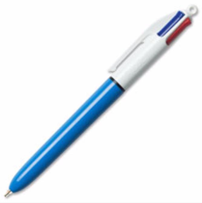
And they say he can’t manage the ’pen: Mets skipper Terry Collins has been brandishing one of those 1970s four-color Bic pens at least since May of 2014 (that’s when the photo shown above is from), but he seemed to be fidgeting with it with extra gusto as last night’s World Series game unfolded. At Uni Watch HQ, where four of us were watching the game — or six if you include Uni Watch mascots Tucker and Caitlin — the pen became an object of increasing fascination as the game went on. What does he use each color for? Does he actually use the rarely employed green option? Would his fidgeting reach the point where he’d start to unscrew the pen and take it apart, just like we did in grade school? (At one point he did!)
And we weren’t the only ones. On Twitter, people were suddenly noticing Collins’s pen, maybe because he was getting more camera time than usual during last night’s game:
And as for my Mets, it was a fun ride. I’m sure people will point to all sorts of reasons why they didn’t win the Series (the entire lineup except Granderson went cold at the plate, shoddy fielding, fickle bullpen, couldn’t stop the Royals’ running game, couldn’t find the putaway pitch, etc.), but the real problem was right there for everyone to see: In five World Series games, they wore four different jerseys. That’s no way to win a championship.

New Hawks unis reaching their potential: When the Hawks unveiled their new uniforms a while back, they threatened that they might mix and match the various elements. Yesterday they made good on that threat, and let’s just say it wasn’t pretty (additional photos here and here). Then they made the mistake of asking what people thought, and that wasn’t pretty either. But hey: Color on color!
IMPORTANT site issue: Some readers are reporting that they’re getting an error message saying, “Your IP Address Has Been Blacklisted” when they try to visit the site. Just to be clear: Nobody has been blacklisted, and the problem goes away if you refresh the page. We’ve been trying to address the problem but haven’t been able to replicate it, so we’re operating blind. If anyone has this problem, please take a scree shot and send it in before refreshing the page — that will be a big help. Thanks.

A good little story: Halloween was on Saturday. Exactly 28 years earlier, on Oct. 31, 1987, I attended the annual Halloween Parade in Greenwich Village for the first time. The parade was first staged in 1974, so by ’87 it was an established New York ritual, but it was still a relatively small affair compared to the huge spectacle it would later become. It was my first year in NYC — I had moved to town about five months earlier — and attending the parade felt like a very New York thing to do, like I was becoming a real New Yorker.
Anyway: On that night in 1987, someone in the parade was handing out tiny little zip-lock baggies, each containing a quarter and a slip of paper that said, “In case of emergency, call this number.” And then it gave the phone number for a hotline for runaway kids. (Cell phones didn’t exist yet and pay phones were still common, so the quarter was to make the phone call.) My friends and I each got one of these baggies.
For whatever reason, the quarter in my baggie had a little hole drilled in it, right through George Washington’s head. I put it on my key ring (see above), thinking it would truly become my “emergency quarter.” Nearly three decades later, that quarter has been around the world with me, and it’s still on my key ring. I like that.
Because of the little divot that’s been taken out of it, it no longer weighs as much as a regular quarter, so I’m not sure it would even work in a pay phone or other coin-operated gadgets. I could find out by trying to use it in my 1960s Coke machine (yes, I have a 1960s Coke machine in my apartment), but I’d rather not know. Sometimes the question is more interesting than the answer.
Footnote: I’m not the only one who viewed the Halloween Parade as an essential New York rite in the late 1980s. A little over a year after I received that quarter, Lou Reed released his New York album, which included the wonderful song “Halloween Parade.” Lou recorded the album over several months in the spring and summer of 1988, and so the ’87 parade — the one where I received the quarter — had likely been his most recent “source material,” so to speak. I like to think that maybe he was right next to me in the crowd that night and I just didn’t realize it.
By Paul

Baseball News: Here’s an old 1960s (or maybe early-’70s?) video clip about what was then the Braves’ new scoreboard (nice find by Will Scheibler). ”¦ The Royals’ “We just won!” caps featured an oversized MLB logo on the underbill. ”¦ Speaking of postgame caps, Mets 3B David Wright apparently swapped his orange-brimmed alt cap for a standard Mets cap when coming out to thank the fans after the game. And he wasn’t the only one>

NFL News: The Cardinals have an unusual run of consecutively uni-numbered wide receivers. ”¦ Here’s another article on the Vikings’ longtime seamstress (from Casey Common). … Here’s a slideshow of this season’s NFL throwbacks.

College Football News: Cool stuff for sale when a former college ref has a yard sale (from James Gilbert). ”¦ Sam Houston State and Texas A&M-Commerce (formerly East Texas State) went mono vs. mono on Saturday (from Chris Mycoskie). ”¦ Western Kentucky is outfitted by Russell Athletic, so what do they do for footwear? This. ”¦ North Dakota went mono-green for the first time in team history on Saturday (from Dan Ullsperger).

Hockey News: The Wichita Thunder wore this Halloween jersey on Saturday night (from Jeff Tasca). ”¦ What do you do if you’re a 1930s Alaskan hockey team sponsored by a seafood market that specializes in king crabs? You pose for your team photo with king crabs! Further info here (awesome find by Will Scheibler).

NBA News: A bunch of Chris LaHaye’s friends dressed up as the Dream Team for Halloween. ”¦ Whoa, check out this shot of the Rochester Royals from their inaugural 1950 season — tons of mismatched lettering and numbering fonts, plus a No. 03 and a No. 09! (Nice find, Phil.) ”¦ Color on color last night in OKC, as the Thunder wore their new orange alts, complete with drop-down NOBs, against the Nuggets.

Soccer News: Paul Pogba reportedly wrote “+5” on his Juventus No. 10 jersey on the advice of a motivation coach (from @TRiCKETTengland).

Grab Bag: I have a 1:30pm appointment with my orthopedist today. If all goes well, he’ll remove the cast from my broken left arm and I’ll be back in business (although I wont have full strength or mobility in my elbow for another few weeks). Looking forward to being fully left-handed again. ”¦ In a related item, I tried to play with my Sunday-afternoon bocce team yesterday. I was able to toss the ball without too much problem, but the cast forced my arm and hand into a position that gave all my balls a wicked hook that I couldn’t control, so I bowed out and let another player take my spot. ”¦ “I have a blog about soccer squad numbers, but occasionally I’ll feature other sports,” says Denis Hurley. “For Saturday’s Rugby World Cup final, I wrote an article looking at the numbering system used in rugby.”
Can’t wait for the “I’M CALLING IT NY STRIP” t-shirts
see paul, the stripe on the Browns pants does exist.. i think it didn’t look like it did before because of how the players wore their jerseys..
Nope, those bumblebee throwbacks are just bad. And they look especially awful when matched up against the modern-looking Bengals uni. Just a bad clash.
Re: the 4-color pen, one of the Cubs announcers told a nice story about those. He uses them to make his notes and such during the game, so he has a bag full of them. Eddie Vedder stopped by the booth one time, and he got all excited about seeing those pens, so the announcer offered him one (or maybe a few). A couple of years later, Vedder visited the booth again, and brought some souvenirs from Pearl Jam’s most recent tour, including the handwritten setlist from the last concert ever at Philadelphia’s Spectrum–written using the pens the announcer had given him!
I’d almost say that the Steelers bumblebees look just as weirdly “modern” as the Bengals uniforms do. I don’t see a generational clash, I just see an ugly uniform. Boxed-in numbers and non-team-color pants are just a bad idea.
Steelers aren’t scheduled to wear these throwbacks again in 2015, and 2016 will be the last season for the set. Hoping 2017 brings the 1967 “Batman” uniforms, which includes a gray face mask. No change in the pants from the current style.
How do you know that 2016 will be the last year? Has that been announced?
It’s true that they can’t switch to another throwback until 2017. But that doesn’t mean they *will* switch to one.
Why can’t the Steelers switch to another throwback until 2017? I’m asking because I seriously don’t know, not to be difficult. Thanks in advance.
Can’t change to another alt/throwback for five years after introducing one.
Because the NFL currently has a rule that teams have to wait 5 years between uniform changes, and, for some stupid reason, that includes alternate and throwback uniforms.
Wellllll….
The timeline is a bit off. The Spectrum shows didn’t happen until a couple months after link.
But he did link.
And hey! Which link?
Dammit. Where’s the edit button?
Timeline not off. Yes, clearly the Spectrum shows HAD to have happened after he got the pen otherwise he couldn’t have written the setlists with it.
User error.
CBS’s Ian Eagle, who called yesterday’s Bengals-Steelers broadcast, said that the Hamburglar would appreciate the Steelers uniforms. I interpreted that as a dig about the uniforms and/or an ad for McDonalds.
It really scares me when such a respected uni expert like Paul defends these bumblebee atrocities. I would have thought these and the Denver AFL striped sock mess would have been a unanimous thumbs down, but apparently not. I couldn’t even watch this game, as appealing a matchup as is was on paper. Really glad the Steelers lost though. Not a Bengals fan at all, but anyone wearing that mess deserves to lose.
If the Stillers were able to actually *throwback* properly (unis with actual sleeves, helmets that aren’t current, non-giant numbers, etc), this would be a fun uni for one time a year. Unfortunately, even the kinda-sorta cool jerseys don’t look very good. As a result, a well-intentioned uni looks like a mess. But those stripes ARE divine, and the socks are the best in the league. It’s just all too much of a bad harkback and playing against the Bengals probably isn’t the way to endear any kind of sentimentality for the uni.
I’m thinking they may retire it at the end of 2016, but that’s not any kind of information anyone has yet. I know there is some “call” for the batman unis, but they only wore those for two seasons, so if they were to bring them “back” they’d be wearing them longer as an alternate than the uni was ever worn (of course, the same could be said for the bumblebees).
Maybe Pitt should just stick to 2 unis, since their throwback options aren’t great to begin with.
It would be a very subtle tweak, but a classic look if they would throw back to their mid-70’s look: Block-font numbers, gray face masks, and no Steeler logo on the jersey. It would also highlight how little they have changed their uniforms over the years. I’m still a huge fan of the previous Steeler alternates that have been rendered extinct by the one-helmet rule. Hoping that rule will someday go away so that the early-60’s Steeler throwbacks can return.
Proofreading: “Yesterday they made good on that thread”
Fixed.
“Sometimes the question is more interesting than the answer.”
… that’s brilliant. Really enjoy your writing!
Thanks, Allan — appreciated.
Apopriate on Steve Ditko’s birthday.
As a Bengals fan, I am always grateful when my team is not the one with the most ridiculous uniforms on the field.
Not quite sure what to think about who will look more ridiculous for the upcoming game on Thursday.
Clearly Cleveland.
I have wondered for some time now. How do helmets decals are aligned so well in each helmet? Do they use some kind of tool to do that or are the equipment guys doing it you hand and are really good at it?
I’ve wondered this myself, especially with big decals that need to align at the back like the Seahawks.
But whenever a team does one of those videos showing them getting the helmets ready for the game, it always looks like they freehand it.
That isn’t a pants stripe malfunction on the Viking player. His people undershirt is sticking out, and it’s covering the top of his towel.
from 1960 – Vikings white over purple the way it should be:
link
I’m partial to a slightly different road uni of theirs.
link
Tough call – proper Northwestern stripes, or proper UCLA stripes?
*LSU stripes
I think the Bumblebee throwbacks are boss. Long live the Bees!!
*Though, I would like the batman throwbacks too
As a fan of the 80’s and 90’s I much prefer the Ram’s throwbacks to their current set. Nike should have made the neckroll white then everyone could look like E.D. link
Me too, except the helmet blue (navy) doesn’t match the jersey blue (royal), and never did. Damn, this site has ruined me.
I don’t hate the November camouflage as much as the October pink. The worst part of the pink is how inescapable it is. You see it on every camera angle in every game. Constantly. Pink stands out. The camouflage is usually visible only in close-up images.
Don’t get me wrong — on principle and in execution, they’re both terrible. And even if you’re going to do something stupid like pink/camo, a month for each is way too long. But for much of November, I can fool myself into forgetting about football players pretending to be soldiers. It’s not smacking me in the face for the entire month like the pink does.
“It’s not smacking me in the face for the entire month like the pink does.”
~~~
Interesting way to put that…
Phrasing aside, camouflage, by definition, is harder to see, so the pink is much more visually annoying.
In my opinion, it’s equally annoying and pathetic seeing the NFL pretend to care about women as it is when the NFL teams with the nation’s military to further push post-9/11 jingoism and militarism.
A person should not believe in an ‘ism,’ he should believe in himself.
I don’t believe in Beatles. I just believe in me.
All we are saying is give peace a chance.
Congrats to the Royals. But I am proud of what the Mets accomplished this year, the “attention span of a fly” media forgets that these guys weren’t even supposed to be playing ball in November. they will be back next year. I just hope they are back in just pin-stripes and road greys,lol.
Serious question, because it is something that bothers me with the Phillies WS win in 2008:
Does the “weren’t even supposed to be here playing ball in November” line cheapen the win for the Royals?
The whole reason for playing the games is to decide “who’s supposed to be there.” So, ummm, no.
Swept the Cubs, beat the Dodgers, beat out the Nationals. SO YES. Don’t be such a noob fan.
Of course not. Any more than winning a Super Bowl after racking up postseason home field advantage with an easier schedule than other teams.
You can only play the teams you play. The Royals’ title isn’t cheapened at all, and neither is your Phillies’.
I was hard pressed to think of any World Series win that could be cheapened. Maybe a sweep over a vastly inferior team would not feel as satisfying. A’s over Giants and Yanks over Mets weren’t cheapened. Then, I remembered ’85.
Nobody should be playing (base)ball in November.
I was curious so I did a quick check and I think the first World Series game in November was Game 5 in 2001 where the season was pushed back thanks to the events of September 11. The next one after that looks like Game 4 in 2009.
Man, this year is really disappointing… the Cubs didn’t make it to the World Series, and Taco Bell hasn’t won the restaurant wars yet…
I did some play-by-play broadcasting during my college days in the ’90s and that’s also when I started covering high school sports for a local newspaper. And the four-color pen is a practical bit of genius that was seemingly made for sports journalist. A broadcaster friend used one and immediately I followed suit.
The different colors help to make things stand out when time is short. For a broadcast, that’s split-second in the middle of a sentence. For deadline print writing, it can save a total of 10 or 15 minutes, which can be an eternity.
I don’t use pens much anymore, mainly because I don’t cover sports anymore and I went digital even before I got out of that business. But if I need a pen, I still want the blue-barrel, 4-color pen. It is a medium ballpoint, while its orange cousin is a finepoint.
Paul, where are you originally from?
Blue Point, Long Island. Why do you ask?
I think you seem like such a “real New Yorker” now, it’s hard to picture you having recently moved to town….
Ah, I see.
My parents are from Brooklyn and my much older brothers had both moved to Brooklyn, so I spent a lot of time in the city while growing up. But I didn’t actually live in the city myself until I was 23 years old, and I felt like a rookie. Definitely a real New Yorker now, though.
When I was in elementary school all the cool kids had the four-colour pen. I recently bought one myself, and have found it is really practical for sketching design ideas where you need some colour to work things out. Fun item.
On another note, I have been one of those people wishing for colour-on-colour, but now that it’s happening more, I don’t really care. Colour vs white does seem to look better.
Finally I love the bumblebees, watched most of the game yesterday just to enjoy that beautiful uni.
FWIW, the Tulsa Shock rebrand event is today. I go to UTA as a grad student, so I’m sure news of it will spread around campus at some point today, I’ll see what I can find out. Event starts in an hour (10am central).
The white laces on black or colored cleats is a popular look in baseball. Looks good in the NFL too.
It’s markedly old school. link do it. I think I remember reading somewhere that the equipment room spends hours swapping out stock black laces from Nike in favor of white. Geez, you’d think a vendor could give a client what they want, but that ship set sail a long ass time ago.
didn’t Penn State switch from white to black laces one year and the fans had nittany kittens over it? I might be wrong.
Oh, and those Alaska guys look about as excited about posing with crabs as the Nuggets guys did posing with those pick axes. Although that one Alaska guy top right seems into it.
The Rochester Royals pic is fascinating, but I do have to take issue with the 1949-50 team being described as their “inaugural” season. They’d joined the BAA in 1948, and had played in the NBL the prior three seasons. The 1949-50 season just happens to be the season when the BAA renamed itself the NBA after absorbing what was left of the NBL.
The Hawks got some positive feedback as well:
link
But would YOU wear that?
Yep.
First time I could say that about a Hawks uni since Dan Roundfield played for them.
Lions defensive lineman Jason Jones wore all-white socks, without a trace of blue.
Looks like the link is still going to the endzone tweet from the line above.
Ah, shit, can’t find the proper tweet now. It’s not a particularly earthshaking item — I’ll just remove it from the text.
Well, Paul … I’d say sorry for your loss, but in full disclosure, as a Cub fan, I wanted the Mets to lose the moment I saw some of them in “NL Champions” t-shirts before the last out was made in the NLCS. With that said, you’ll always have this:
link
I’m not even sure why I made that, but as soon as I saw the original, my mind kept telling me the two team logos were just too darn close the final result of the series to ignore:
link
The story about the quarter is very cool. Thanks for sharing.
Glad you like — thanks!
Yes, cool…
Definitely won’t work in a vending machine due to (lack of) weight. You can always put it in (to see if it registers), then hit the coin return button if it somehow does. Otherwise, it should fall right back down to the REJECT coin return.
Ahem: “I’d rather not know. Sometimes the question is more interesting than the answer.”
As a kid in Australia, I took those 4 color pens to (Australian rules) football games for keeping score in the program. New color for each quarter.
I love the 4-colour pens. I know they scream ‘1970s’ here but they’re still extremely popular in Japan and I try to pick up a handful whenever I’m over there.
Or you could just walk into an Office Depot (in America) and get one (or order them online).
link
You can get them from the Amazon: link
Also still popular with nurses in those hospital units that haven’t completely succumbed to the electronic health record.
Paul, somewhere I forgot you’re a fellow southpaw, so I had downplayed the injury’s effect to your ablity to do ordinary tasks, like turning a big steak with tongs.
Hope you mend before Thanksgiving, aka the food holiday.
Funny you should mention the similarity between the Bucs and Falcons pants designs, because I’ve noticed that the Bucs and Jags have the exact same design, just with their respective colors and logos.
Except that they really don’t.
Was at my 93-year-ols father-in-law’s house yesterday. He has a HORRIBLE old television. I couldn’t tell the teams apart until the first closeup!
(He’s getting a new TV for Christmas.)
history of the 4 colored bic right here
link
Another quality Bic product right here:
link
Hey, that’s Charles Nelson Reilly!
I haven’t had any “Blacklisted” messages but I have had issues with this site loading completely. I get a message saying “Waiting for sync.mathtag.com”…my laptop keeps trying to load it, I can be on this site for 30 minutes and still says waiting for..
I’ve noticed a lot of Ravens wearing the black shoes/white shoelaces this year. Notably Joe Flacco and Steve Smith Sr.
After a quick Google search (you can tell it’s this year b/c the 20th season patch):
link
I was all set to bray about the Broncos registering the big win in the blue/blue/white uniforms, which only seem to have one fan (yours truly) but I couldn’t bring myself to. The foul Nikelace collars are just too unsightly.
Man, the 4-color pen does take me back. One of the earliest memories I have is from when I was 3 and my family was on a vacation trip around the state of Michigan. At one point, when we were staying the night in Sault Ste. Marie, I took off the barrel of one of those pens and just started doodling with all four colors.
Years later, when I was in high school, those giant 8-color and 10-color pens were available. I found them a bit unwieldy, so with some considerable effort, I retrofitted a couple of 4-color pens with different colors from a 10-color pen, applying a dab of color on the pen itself, just above the slider, so I could identify which pen had which colors.
Funny…
we took a family trip to Quebec this past summer and the one souvenir all of my kids had to have was the 4-color pen that said “Quebec” (or maybe it said “Canada” — whatever) on it.
Is the Rams collar thing perhaps a reference to Eric Dickerson? A stretch, I know.
link
If receivers start hogging all the teen numbers shouldnt qbs, punters and kickers get privileges to other numbers I.e. Kosar and Shuler in their collegiate days?
Paul, What is your take on stories like this that suggest that the internet of 5-10 years ago is past, and maintaining a community of loyal readers is no longer viable. That it’s about churning content. Esp as related to Uni Watch? Daily traffic and readership patterns declining?
link
Daily traffic is remarkably steady. Honestly, though, I don’t really care one way or the other. The articles you’re referring to are about business models, but this website isn’t a business, so I don’t concern myself with those issues. As I’ve always done, I just do what makes sense to me and let everyone else get on board or not, as they see fit.
So, not related to today’s content, and too long for Twitter.
Today I was in the mall with my 6 year old son who has recently started to become interested in football. We were looking at Jerseys he might want for Christmas. He found the one he liked and the conversation went like this:
Son: “Can we get it?”
Me: “No, we are looking for ideas for Christmas presents.”
Son: “Why not?”
Me: “Well it’s kinda expensive.”
Son: “How much is it?”
I told him the price (yes the price was ridiculous to me)
Son: “Why is it so much money!?”
Me: “Well, I think you’ll get bored before I get done with my explanation…”
The East Texas State/SHSU color vs color match up was awesome. It would have looked better if East Texas State had on yellow britches to match the yellow hats.
It’s funny how much better the electric red-orange looks on OKC than it did on the original Charlotte Bobcats. Perhaps it’s because the OKC jerseys aren’t shiny like the Bobcats’, or because it’s paired with navy instead of denim blue.
Watched the video about the Braves scoreboard, at the ~4:30 mark, he explains that it would be used to help fans keep the official score and there would be a set of codes published on the scorecard that would refer to specific events, like a trapped ball by an OFer. Never heard of anything like that. Now, I need to go dig through some old scorecards.
The Tequila Sunrise t-shirt is FABULOUS! The look, the feel: two thumbs up, five stars!
I agree that the t-shirt is fabulous (I received mine today), but it would have been much better if they sent me the correct size that I ordered! My order was for a 2XL, the label on the packaging indicated a 2XL, but the t-shirt they sent me was a medium. I already contacted Teespring about this, and hope that they can send me a replacement shirt. As I have bought all the months so far, I do not want my collection to get screwed up by their mistake.
I have a random question/topic… Would there be any interest in doing a redesign of the Team USA Baseball uniforms? I can’t stand the set they’ve had for the last 8-10 years and would love to see what the creative minds at Uni Watch could come up with.
Oh no. G.I. Joevember has infiltrated wrestling. The Lucha Dragons in camo.
As if I needed another reason to hate the all white look for the Colts and wish they brought back the blue pants on the road the pouring rain isn’t helping them any. Thanks hi def TV!!
Paul,
*Technically* an orthopedist is someone who looks after feet (thus the “ped” in the middle). An orthopaedist is someone who takes care of bones in general.
But that is just my high school Latin kicking in!
(I think, like many words nowadays, either is acceptable)
Wow! How did I get here???
Uni-Botch
For Thu Night matchups..