
My Friday Flashback piece on ESPN today takes a look back at all the black drop shadows, black jerseys, black caps, and other black accessories that the Mets wore from 1998 through 2011. It also includes a new interview with Bob Halfacre, the guy who designed most of those black elements. What does he think about the Mets’ recent move away from black? Find out in today’s column. Check it out here.
Meanwhile, in case you missed it yesterday, my annual NBA season preview is now available on ESPN. Check that one out here.

PermaRec update: I’ve often written about people finding messages in bottles. But here’s a new one: a dog that found a message in a bottle! Get the full story over on Permanent Record.
The Ticker
By Paul

’Skins Watch: This past Monday night’s episode of the TV show Minority Report showed a 2019 Washington RedClouds jersey. “According to the show, it’s very rare because that’s the year they changed their name,” says Mike Cooperman. ”¦ Here’s more about the Spokane Indians’ use of the Salish language on their jerseys (from Larry Brunt). ”¦ With voting taking place as we speak on the team that will replace “Fighting Sioux” at the University of North Dakota, some Sioux tribal members are threatening legal action because they were left out of the process (from Chris Bisbee). ”¦ Canada’s newly elected prime minister, Justin Trudeau, has a stylized Haida tattoo, which has led to some discussions about cultural misappropriation (from Mike Styczen).

Baseball News: We noted a while back that Troy Tulowitzki appared to have an MLB hologram sticker on his belt while he was with the Rockies. It disappeared when he moved to the Jays, but now it’s back for the postseason. Never seen any other player wear that on his belt (good spot by Scott Ingram). ”¦ “Our staff at the Worcester Polytechnic Archive was asked to pick one item from the archive to highlight as our favorite for American Archives Month,” says Mike Kemezis. “As happenstance would have it, I stumbled across an old baseball uniform shortly after we were tasked to think of an item. Here the blog post about it.” ”¦ The famous Coney Island parachute jump has been decked out in Mets colors (from the Tugboat Captain). ”¦ Jerry Seinfeld is celebrating the Mets’ pennant with his lucky shoes (thanks, Brinke). ”¦ Ted Taylor found these cool old MLB stickers in a shoebox at his parents’ house.

NFL News: “I went to the Reagan Library on Wednesday, mainly to see the temporary football exhibit there,” says Jay Braiman. It’s a display of about 500 items from the “private” (i.e., not-open-to-the-public) L.A. Sports Museum.” The exhibit includes pro and college jerseys and other memorabilia, and Jay took lots of photos. ”¦ Steelers LB Ryan Shazier wore a neck roll in practice the other day. Not a faux-neck roll on a Nike jersey — a real neck roll (from Brian Cox). ”¦ New BFBS practice jerseys for the Dolphins. When I tweeted that link yesterday, Matt Sayler quipped, “I hope this helps with recruiting” (thanks, Phil). ”¦ Here’s what the Browns will wear this weekend. As always, the mock-up is misleading because the actual lettering on the pants occupies much more of the pant leg than is shown in the illustration. Interesting that they keep choosing to show an inaccurate depiction of the uniform’s worst element. ”¦ Ryder Kouba spotted the Texans’ logo being used by an Egyptian restaurant.

College Football News: An increasing number of college football punters come from Australia. ”¦ Here are this week’s uni combos for Pitt, Miami, USF (ugh, Pinktober), Utah, Washington State, Oregon State, and UNC. ”¦ Arizona State will wear G.I. Joke cleats on Oct. 29 against Oregon. Further info here. ”¦ Have I mentioned that the uniform outfitters have way too much influence these days? ”¦ The weather for Penn State’s 1985 season opener at Maryland was so hot that the ref wore shorts and Joe Paterno didn’t wear a necktie (from William Yurasko). ”¦ Here’s an article about the Wazzou flag that always appears on College Gameday. ”¦ Baylor will wear blackout unis on Nov. 14. ”¦ New homecoming helmet for South Dakota State (from Chris Mangan). ”¦ Maryland wore throwback helmets during practice this week (from Matt Shevin). ”¦ Tennessee might wear their grey alts again (thanks, Phil).

Hockey News: Good view of the Canadiens’ 1929-30 championship sleeve patch here (from Will Scheibler). ”¦ New throwbacks for Ferris State. ”¦ If you scroll through this Twitter feed, you’ll see lots of photos of the Penguins’ Pinktober warm-ups (from Jerry Wolper).

Pro Basketball News: The D-League’s Westchester Knicks, which had used a logo featuring Father Knickerbocker, are apparently switching to a new logo. Ted Levin spotted that during a Rangers hockey telecast. ”¦ Here’s a new one, at least to me: a suede Kobe Bryant jersey (from Stuart Friedel). ”¦ The refs in last night’s Knicks/Celtics preseason game had inconsistent uni number coloring.

College Hoops News: New uniforms for Youngstown State. ”¦ New gold alternate for the school with the nation’s best acronym. ”¦ Miami’s new uniforms have that same shitty Adidas template that we’ve seen for other schools. Additional views here.

Soccer News: ManU midfielder Bastian Schweinsteiger is considering legal action against a Hong Kong company that appears to have used his linkess on a Nazi doll. ”¦The USL’s latest team will be called the Swope Park Rangers.

Grab Bag: I don’t usually get too worked up about merch, but the folks at Streaker Sports sent me some freebies, and I was impressed by the quality — good stuff. No maker’s marks except on the inner collars and inner waistbands, either (which shouldn’t really be noteworthy but, sadly, is). ”¦ Check out these awesome posters showing the Chicago, Rhode Island, and New Jersey styles of hot dogs. No capers, but still really great (big thanks to my pal Emily Gordon). ”¦ Starbucks is adding “minimalist” cups for the holidays. Of course, a truly minimalist design wouldn’t have a big honking Starbucks logo on it (thanks, Brinke). ”¦

What Paul did last night: I’ve been attending the Food Film Festival for many years, and this year’s program featured a night of meat-centric films and accompanying food, so of course I had to see that. Bought my tickets more than a month ago and was fully aware that Game 5 of the NLCS was scheduled to be played on that date. “Eh,” I thought, “the Mets probably won’t make it that far.” Then they made it to the NLCS and I thought, “Well, I already have the FFF tickets, so I’ll just have to miss that game.” But then the Mets wrapped up the series in just four games anyway, so the Tugboat Captain and I were able to attend the FFF without constantly checking the score on our phones.
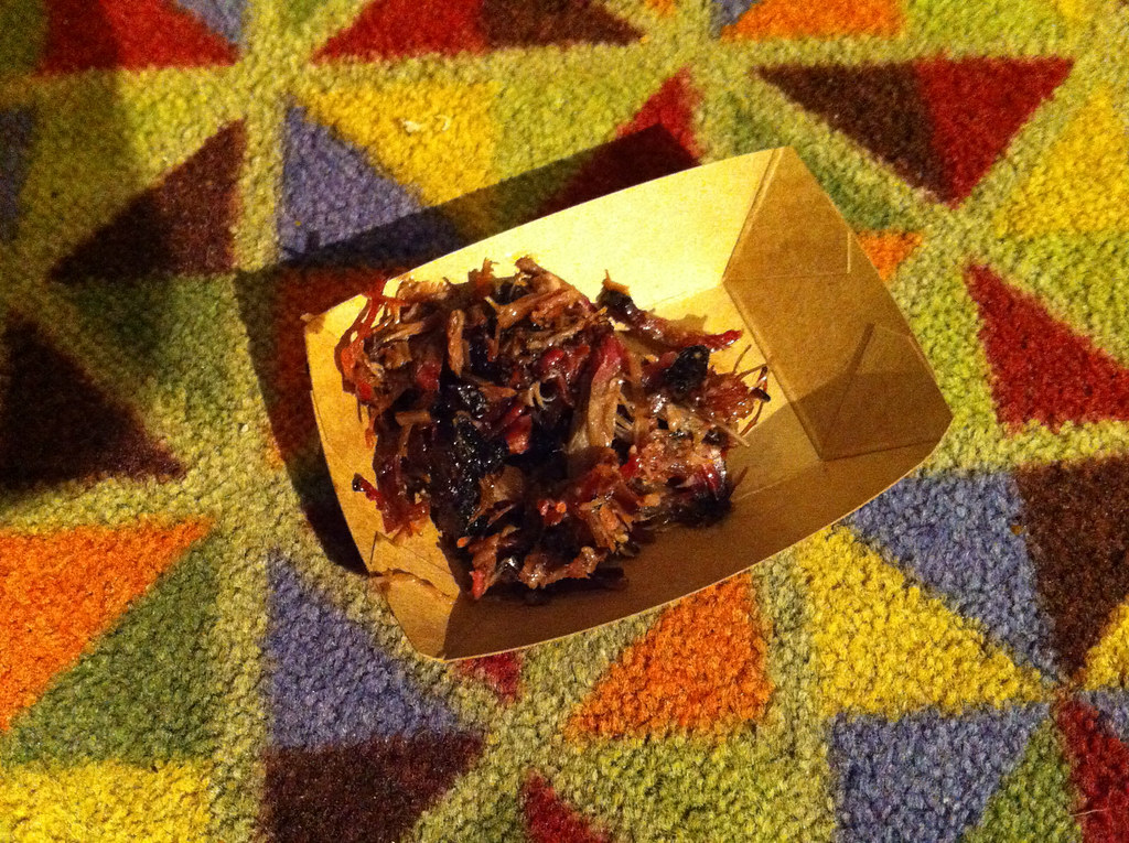
The movies were great, and so was the meat (they serve you what’s being shown on the screen as the movies move along), and then there was an afterparty where we got to eat more meat and hobnob with some of the filmmakers. Naturally, we wore Meats shirts for the occasion, which garnered lots of positive comments. I took some pics, but they almost all came out really poorly. Still, this one shot of barbecued brisket from Black’s BBQ in Texas should give you a hint of how delicious everything was (click to enlarge):
Update: The Captain got this photo, which gives a better sense of the meaty debauchery (click to enlarge):

All in all, a sensational night. Totally would’ve been worth it even if the Mets had been playing.
I thought the best acronym belonged to the Sam Houston Institute of Technology
Nowhere did the link mention what U.N.I. stands for.
Northern Iowa.
Not the Wyoming Institute of Automotive Technology? “Wy-I-Auto…”
The linguist James McCawley used to write about all kinds of off-color things under various pseudonyms, and one was Quang Fuc Dong from the South Hanoi Institute of Technology. His colleagues wrote a festschrift for him called: Studies out in Left Field: Defamatory essays presented to James D. McCawley on his 33rd or 34th birthday.
No, best acronym of all time came out of Canada. During a weekend convention in 2000, right-wing activists met and named their new party the Conservative Reform Alliance Party. By Monday afternoon, the new party’s leaders had renamed the party the Canadian Reform Conservative Alliance. For obvious reasons. But for two glorious days, Canada actually had a major political party that called itself CRAP.
Reagan Library item has incomplete code.
Thanks. Fixed.
I’ve been thinking for years that the Redskins should be working with their local tribes to create something beneficial and educational out of their terrible situation. Well done, Indians.
I still feel uneasy about merchandise and profit being involved, but the Indians are doing it better than the others.
I agree, although this quote struck me:
“I believe we’re the only professional baseball team in the country that has home jerseys in a language other than English,” Andy Billig, co-owner of Brett Sports and Entertainment, told ICTMN.
When I read that, my brain immediately went link, although obviously not directly analogous.
Those Penguin warmups are actually lavender, not pink. A quote from the team’s Email that I have quick access to: “Fans are encouraged to wear purple to the October 22 game in support of Hockey Fights Cancer.”
And isn’t it “hobnob”?
You know, in a funny way, those Mets BFBS alts haven’t aged all that terribly. I’m glad they’re gone, but in a way I prefer them to the current blue alts, which seem garish by comparison somehow (something about the orange headspoon really rubs me the wrong way, like a guy wearing a light tie with a dark shirt). The hybrid cap was an abomination, but I’ll remember the all-black look somewhat fondly, as a symbol of that generation of teams.
All in all, I was so happy to see them celebrating in their road grays, which I think are among the best in the biz.
Headspoon + pinstripes = stupid.
Joltin’ Joe link.
As does link…
…or not. Maybe he hated that jersey.
“Headspoon + pinstripes = stupid.”
~~~
Agreed, but the Mets don’t put a headspoon on their pins. Or are you referring to the practice of pairing the home royal alt with the pin pants?
That’s even worse than having an alt by itself with plain pants. Worse still was their pairing of their camo tops with the pins.
Yes, referring to headspooned, non-pinstriped jersey with pinstriped pants. Neglected to consider the old headspoon-on-pins look, which doesn’t bother me much as a concept (though I don’t love that Seals jersey).
The problem is the mismatched design elements. And while I’m at it, I’ll throw in a jab at the super-extra-stupid headspoon-that-doesn’t-match-the-sleeve-and-pants-trim look that the Giants use: link
Yeah, that one is dumb. Time to get back to the Giants’ link.
Oh, Chance.
You’re close, but not quite.
Here was their best road look.
YES, Phil.
Thought you were going to link to the 1916 plaids…which I would have said YES to as well.
I could have lived with the Mets’ BFBS jerseys if (1) they’d been worn only rarely, e.g., once per week; and (2) more importantly, they hadn’t allowed black to infest and infect the rest of the uniform.
In isolation, the BFBS jersey was not bad-looking, and the three-color Mets script was sharp, not to mention rendered entirely in Mets colors. I could live with Mets-colored graphics on a black canvas. But on all the other jerseys, adding the black drop-shadow to the blue-and-orange lettering pushed the color black into the Mets graphics, and completely ruined the look. Using the two-tone caps with them ruined it even more, and the black socks and undersleeves ruined it even more again. Wearing the worst possible combination — white alts with two-tone caps — in practically every home game for a decade added insult to injury, and doing so while continuing to designate the pinstripes and blue caps as the official “home” uniform added lying to insult and injury.
One of the things about the BFBS Mets uniforms when they were first worn is that the Mets went back to NNOB jerseys. As seen with other teams, the additional shadow layer link.
link I have a black Mets jersey from 1999 and the orange shadow really makes the back numbers pop.
But the letters in a NOB just look cluttered and jumbled with shadows. The Mets should have had the NOBs in one layer only, if they wanted to add them.
Not quite “when they were first worn”; 1998 was the first year of BFBS, with the two-tone caps, and black drop-shadow on the white alts and road greys — but not the pinstripes. 1999 saw the addition of the all-black caps, road BFBS variant, black primary logo variant, black drop-shadow on the pinstripes, and NNOB.
Yeah, this Mets fan kind of liked the black alts, and agrees that they were worn too often. Still, when I think of players such as Edgardo Alfonzo (a big favorite of mine) and Mike Piazza, I picture them in black, and I’m OK with that. It’s nice to have a truly different era in our uniform history while being back to the classic pinstriped look. I wouldn’t mind an occasional throwback game in black, as long as “occasional” is defined as “no more than once or twice a season”.
On the current unis, I do find the home blues cartoonish, but I like the road blues. Wouldn’t mind if they used that set as both home and road alts. Agreed that they should have kept the white stripeless pants for the alts even while getting rid of the snow white tops (and good riddance to them–the home whites should ALWAYS be pinstriped!). The camo with the pinstriped pants is an abomination on top of an abomination.
Hoping they’ll be celebrating a world championship–and doing it in a classic (pinstriped or gray) uni.
As a big “white at home, color on the road” proponent, I too love the blue road uniforms and don’t really care for blue at home. The Cubs were a blue-on-the-road team for a long time, then went back to dull gray full-time in the ’90s, then brought back the blue for both home and road, and now seem to have settled into making blue their primary road uniform but never wearing blue at home, which is how things should be.
Also for the Mets, the silver numbers of the road blues look better than the orange ones on the home blues, and they also match the gray road pants well. I say keep wearing blue on the road, 1984-style.
The road blues aren’t bad, but the road greys are the best-looking uniform in all of baseball. It’s hard to endorse the former when wearing it means they don’t wear the latter.
The Mets have worn many variations of the same uniform; their brand-fu is strong. In fact, the only Met uniforms I disliked were the 1986 road uniforms and the block-lettered road greys that came two years later.
The block-lettered road greys were the worst; they might have looked better without the white outline, but it never made sense to me for the Mets to have the essentially the same road jersey front as the Yankees.
The UND article left some details unclear. The piece cited the Spirit Lake Sioux and Standing Rock Sioux, the opposing factions whose deadlock necessitated the new name search, but names only one Sioux tribe who seeks to vote on the new identity. Did the two factions unite to get in on the election? It’s also surprising the tribe endorsed the invalid “UND” option, since that appears to be the sentiment of traditionalists who wanted to keep the Fighting Sioux nickname.
The thing that’s always bothered me about the situation is that the Standing Rock leadership basically dictated to their constituents along the lines of “We’re not supporting the name, and that’s final”. I’d have liked to see them put it to a vote, like Spirit Lake did.
What happened was the NCAA and the UND entered into an agreement that gave UND the right to maintain the nickname, provided that within a specified period of time they obtained the consent of the Sioux tribes sitused within the State to continue using it. The Spirit Lake Sioux tribe, which exists totally within the boundaries of the State of North Dakota, voted by a wide margin to allow UND to continue using the name. The leaders of the Standing Rock Sioux tribe – only a small portion of whose land mass is located within the State of North Dakota – refused to even allow the tribe to vote on the question.
I’ll admit, based on the reporting, I have an axe to grind with the Standing Rock Sioux. When solicited for a solution, their reaction was intellectually lazy. Yes, I know, Trail of Tears, Wounded Knee, generations of disenfranchisement: I read from that book. But there are better ways to send a message than being childish and obnoxious.
I don’t see anything in the article that’s “intellectually lazy”, “childish” or “obnoxious” – what did they do?
“I have an axe to grind with the Standing Rock Sioux.”
~~~
Interesting choice of idiom there…
My bad; today’s article doesn’t have an account of the SRS decision not to hold a vote. But the Standing Rock Sioux refused to allow the tribe to vote on UND’s nickname.
But how is not holding a referendum “intellectually lazy”, “childish” or “obnoxious”?
And I have read that the leaders have since been re-elected, so if the tribe members don’t mind not having a group vote….
And exactly WTF is wrong with saying “have an axe to grind” in this context?
“And exactly WTF is wrong with saying “have an axe to grind” in this context?”
~~~
Where did I say it was “wrong”? I said it was “interesting”.
Stop fucking reading shit into things. Relax…it’s Friday.Yet the NCAA only requested Florida State obtain permission only from the Florida Seminole tribe and not the Oklahoma Seminole Tribe.
Actually, the university received permission link:
Yesterday, the National Collegiate Athletic Association agreed with the 3,100-member (Seminole Tribe of Florida) and the Seminole Nation of Oklahoma, which had also endorsed the nickname
The Times article also points out that a third tribe had a say in the matter:
The Miccosukee Tribe of Indians of Florida split from the Seminoles in the early 1960’s, setting up a 33-acre reservation on the northern border of Everglades National Park, about 45 miles west of Miami. As an independent tribe with historical links to the Seminoles, the Miccosukee could have endorsed the N.C.A.A. nickname ban and forced Florida State to comply. But they did not want to.
Seems like FSU covered all its bases. UND isn’t being singled out for any special treatment.
Chance, I stand corrected. However in October of 2013, the Oklahoma Seminole Tribe made a statement opposing all Native American nicknames, mascots and imagery, which brings up another interesting topic. Should a school with a Native American nickname have to change their name if a tribe reverses its decision that supported it prior?
That’s a good question.
I personally would prefer something like a long-term lease. Renewable after a given period so the tribe can re-negotiate terms based on changing economics. But I have no idea what the SEC was thinking, if it was more a one way option of the university in perpetuity.
The tribe doesn’t seem to care much about it, since I understand those leaders have since been re-elected.
It would have been nice if UND had been able to properly license the name, but they weren’t.
That some tribal council members subsequently might have been re-elected in no way compels that conclusion, nor does it excuse their lack of political courage in the first instance. Anyway, what’s your source for that information? Here’s a list of current tribal council members:
link
And here’s the minutes from a May 4, 2010 meeting, which by my count shows that 4 of those current members served on the council in that year as well. That’s hardly a resounding percentage.
link
Notably, while the council on that date was deadlocked on whether to proceed with or hold off on voting on the nickname issue (bottom of p. 1), 3 of those 4 voted in favor of proceeding. It’s logical to presume, then, that those same 3 voted in favor of the resolution that favoring the nickname’s retirement that the council passed 10-4 just a month later, the minutes for which for some reason have not been posted on the council’s website:
link
But even assuming that to be the case, that means 70% of the council members who voted that way no longer serve on it. Again, hardly a resounding number.
Probably the most humorous thing about the resolution’s passage, though, is the tribal council president’s explanation for voting to keep the question out of the community’s hands: “there are far more pressing issues” to deal with. I could swear I’ve heard that one somewhere before…
link
Saying “we have far more pressing issues” is not in any way the same as “they” or “you have far more pressing issues.”
The tribes have the right to their own opinion, and they’re own process. Still don’t see anything “intellectually lazy”, “childish” or “obnoxious” about it, other than some people might not approve of their choices.
I’m still not thrilled that the tribes have any binding input at all. The sense of obligation to put any of it in their hands smells like an intellectual relict of the late, unlamented Edward Said. The latter helped popularize the mischievous notion that an ethnicity or small-n “nation” enjoys some manner of ownership rights over its name, folkways, or other attributes–worse, that they can dictate on some level how outsiders may choose to perceive them. So here, UND is swallowing whole some extraordinarily vacuous presumptions.
UND is “swallowing” nothing, except terms set forth by the NCAA. Your gripe, whatever its merits, is with the NCAA, not with UND.
I don’t know what you intend by “small-n “nation”” – these tribes are Federally-recognized entities, after all. Surely they have the right to a small measure of intellectual property?
Paul: I stand corrected, then. Mutatis mutandis, my gripe stands.
Chance: I was trying to use the term “nation” in a broad ethnological sense, without limiting it to ” modern nation-state” or even “Federally-recognized entity.” But sure: I’m not a lawyer, but I gather that the Sioux and other Indian Nations not only can avail themselves of U.S. intellectual-property laws, they might have certain special rights of that kind WITHIN THEIR DESIGNATED AREA OF TRIBAL SOVEREIGNTY. So if UND is on Sioux land, you might be onto something … but I’m pretty sure that they aren’t.
No, the nations have trademark rights within the United States the same way that, say, a Japanese or German corporation can own trademarks and copyrights in this country. And there’s nothing wrong with that.
Ultimately, the tribes involved have been solicited for input; invited to join the discussion. The way one acquits oneself responding to the invitation, or during the discussion, says things about one’s character. I like to think these opportunities to redress grievances bring a chance for native tribes to sit at the table; to reshape society more to their liking. In the case of the SRS, an opportunity was missed. I find that regrettable.
How so?
The SRS didn’t make the decision you wanted them to make. They didn’t make it in the way you wanted them to make. Fine, I get that. But don’t they have that right? Who are we to condescend and tell them they’re wrong?
I thought the Standing Rock Sioux were petulant. I’m eager to feel out tribes and not have them be separate societies in remote enclaves. As I said, it’s an opportunity to reshape society more to their liking. They have intellectual property that the rest of us admire and want permission to use. It’s obnoxious to say, “Get lost, you fucked up, now leave us alone.” If one inserts oneself into an argument, one forfeits the right to say, “I don’t care how you solve this.”
The Canadiens’ patch is pretty curious. First, a correction, it’s from the 1931-32 season. Second, it has the years ’29, ’30, and ’31 represented in such a way as to imply a threepeat, but in fact the Habs only won two consecutive Stanley Cup titles, in 1929-30 and 1930-31. The 1928-29 Canadiens finished first overall, but were knocked off in the semifinals by the eventual champion Bruins.
Maybe it’s an attempt to combine 29/30 and 30/31 using fewer numbers, but you’re right. There’s no way to read that patch except three titles in a row.
I haven’t paid attention to other #teamadidas uniform reveals, so I don’t know about templates, but I actually like that Miami uniform (minus, of course, the stupid slashes through the shorts stripes). Take out the slashes, and it might be the best original Adidas college hoops uniform, which is, of course, saying very little. Adidas doesn’t get credit for the traditional designs for Indiana, UCLA, Michigan, etc.
AFAIC, With the “Cleveland” and the “Browns” subtracted, the Brownies would have a pretty good uniform. I’ll bet the powers that be had their concerns about subtler aspects of the new design, like the orange numbers and the corner snipped from the stripes; so, the big lettering was used as a red herring. Now, the Browns can say, “You don’t like the lettering? Fine, we’ll get rid of it,” and wind up with the uniform they wanted all along.
Doesn’t work that way. They’re stuck with it for at least five years.
And at that point, we’ll be more than ready for (another) full re-design.
The five-year rule applies to pants as well as jerseys? I understand the five-year rule for jerseys since those are sold to consumers, but pants are not. Immediately better (though still not great) if they lose the pants wordmark. (Yes, I get the tail wagging the dog here with merchandise driving the on-field product)
It applies to the uniform, period.
Are teams limited to the number of pants they could wear? The Browns could add a new pants style and just never wear the old.
Does the oft-heard complaint that the numbers are hard to read have any traction? Do we have to wait five years for white numbers?
Looks like we’ll be treated to a color vs. color game at the dome, as Syracuse already announced they’re going orange-blue-orange (via link)
Love that a guy named Brian Cox sent in a neck-related NFL item link
Typo- Jerey Seinfeld?
Thanks. Fixed.
That Oregon State video is the absolute worst.
Might have been mentioned already, but during the Royals-Blue Jays blowout a few days ago, #9 Cliff Pennington was brought in to pitch. With #6 Marcus Stroman having pitched in another game, is this the first time two single-digit pitchers have appeared in the same post-season series?
Hi Paul. Just a “Skins-Watch” oriented note. There was a story on the local news here in the KC area saying a Native American group (sorry, didn’t catch their name) is attending this weekend’s KC Chiefs game to demonstrate against fans wearing headdresses. They didn’t say they whether the group had any issues with the name, arrowhead logo, etc., but I thought I’d pass it along.
– Also, I love those Ferris State throwbacks!
With Pitt very its light gold jerseys tomorrow and Syracuse in its home blue jerseys, it will be a color-vs-color match-up in the Carrier Dome.
link
Today’s Friday Flashback is up:
link
Nice piece. Kinda shocking that the designer himself agrees his changes weren’t necessary and made the uniform harder to read. I do like the imagery of “City of Shadows”, though, for a team that was creating a new design from scratch.
Also want to point out that I love the link logo.
This past Monday night’s episode of the TV show Minority Report showed a 2019 Washington RedClouds jersey. “According to the show, it’s very rare because that’s the year they changed their name,” says Mike Cooperman
The Washington Post has screencap pictures link – glimpse of a jersey and awful “Inaugural Season” logo.
I had previously wished they’d designed a new Nationals cap logo, but now seeing that I’m not so sure.
Isn’t Minority Report trying to present a realistic vision of the near future? If so, then they shouldn’t change the Nationals cap logo. The curly W is going precisely nowhere, at least not before the Nats play in a different ballpark. Nats Nation is well and truly stuck with the curly W, Bud Selig’s personal gift to Washington fans.
I was told by a pal over at MLB that it was actually the Washington politicians who wore throwback caps to the announcement, but whatever.
Still, Minority Report is set in 2065. That’s at least two ballparks from now. ;)
Looks like those cool MLB stickers were a baseball card product (and not just Topps inserts). Grand Slam Baseball Stickers by Fleer 1969-1976 – link. Old news to many I am sure, but I wasn’t aware of these.
I had link on my school notebook – love the 70s!
Oh, my bad. 8 year run was the cloth patch stickers. The whole package was from 1977-1979. Which, by the way, confuses me because of the Astros shooting star logo.
Cue the Wah-Wah guitar licks! Sooo groovy!
link
No more Father Knickerbocker? C’mon, the new Ben Franklin logo for the 76ers is a bit of imitation and should be the kind of reinforcement that Westchester Knicks are doing something right.
I’m surprised you didn’t mention last night was the first (technically) color on color Thursday NFL game, as the Seahawks wore their grey alts in that schelacking of the 49ers
I don’t consider the Seahawks’ grey to be a color.
Last night’s Appalachian State-Georgia Southern game was black-vs.-white done right, better than Ohio State-Penn State last week. The white helmets on Ga. Southern were a surprise to me (I’ve only remembered them wearing purple helmets), but the numbers on those helmets are a look that Penn State should bring back.
link doesn’t look like suede to me.
Is it made out of a chamois?
Jimbo! Haven’t seen you here in a while. Don’t be such a stranger!
Heh. Haven’t had a tremendous amount of free time lately. The schedule has finally lightened up a bit for me.
Pro and con from the uniform perspective last night:
Pro: Seattle (Blue/Grey/Grey) versus SF (“Normal” Gold/Red/Gold)
Con: UCLA (All BFBS, extremely ugly look) versus Cal (Only OK look of Blue/white/blue)
Those hot dog posters are cool – the NJ one is being bought as soon as I finish typing this! It will be a gift for the guy who leads our New Jersey Hot Dog Tour. A tour, which by the way, you always have an open invitation to join – this year’s tour is on September 24.
“e pluribum doggem,unim stomacho”
I want a poster of a KC or West Virginia hot dog:
link
Better yet, one from a town that allows ketchup.