
By Phil Hecken
The wait is finally over, kids. THE Ohio State University, your defending National Champions, your number one ranked team in the nation, your winners of eight total national titles, with a beautiful stadium that seats 104,944 crazed fans — went Black For Black Sake yesterday. Clearly, this is a team that needs to impress recruits and move merchandise. Because no one would ever want to attend, commit to or watch a game played by OSU without the benefit of another alternate uniform.
Last weekend, Oregon jumped the shark. This week, it was the venerable Ohio State University.
I was busy watching the Mets/Cubs game for most of last evening, but I caught the final quarter or so of the OSU/Penn State game. Even though I knew OSU was going BFBS, I was still shocked when I flipped over to the game — and I didn’t recognize Ohio State. Black helmets, black jerseys and black pants. Just…not them.
It’s one thing for Oregon (who invented it) or any of the myriad of other NCAAFB teams who don’t have the cachet of OSU to engage in the uniform chicanery. I get it (I don’t like it but I get it). Who’s next? Alabama? Penn State? Michigan? These teams don’t need gimmicks (especially not to attract fans and recruits). OSU doesn’t either. But they have succumbed to the lure of Nike and a few extra buck(eye)s from alternate jersey sales. But I guess we shouldn’t be surprised. Nike has turned half of their other teams into walking swooshie billboards and imposed their uniform machinations on teams of lesser standing. But not OSU. Until yesterday.
That being said — taking the uniform for what it was — it was not a bad looking game nor was it even a bad looking uniform. As far as a pure uniform goes, the stripes all matched, the numbers were big (if not the most legible, but not bad) — in short, it looked like a uniform should. But not for Ohio State. The Scarlet and Gray are just that. Not Scarlet & Gray & Black.
We’ve reached a dark and scary place in uniform watching when the men from Columbus go BFBS. And it wasn’t even Hallowe’en.
Here’s my SMUW comrade Terry Duroncelet with the rest of the SMUW:
Sunday Morning Uni Watch
By Terry Duroncelet
From Friday:
• Someone needs to tell Nike to fix the 1’s in their Dade font. How have they gone this long without issuing a new spec for the numeral? I can’t imagine that even the high-rollers at Swoosh looked at the 1’s side-by-side with the rest of the numbers and thought “Yeah, that’s good enough. No need for any fine-tuning”. But there it is! In all of its thick glory! Guess it fits their status quo of being thick-headed. Credit to John Furstenthal for those pics.
From Saturday:
• Does Nebraska just not want to wear the red pants anymore? Also note the Air Force decal on the back of Jalen Myrick’s (#5) helmet. Minnesota wore decals of a the 5 U.S. military branches on their helmets against Nebraska. Here’s what the other decals looked like.
• Miami wore mono-green against Virginia Tech. Eh, not my favorite look (at least not without green helmets).
• Curtis Galvin spotted Jameis Winston in the yet-to-be-worn black jersey during the Florida State/Louisville game.
• North Carolina added pink accents to their field over the weekend. They also painted their 22-yard marker Carolina Blue in memory of Charlie Justice, who passed away 12 years ago to the date on Saturday.
• Christian Berumen notes that K-State coach Bill Snyder is wearing a jacket or windbreaker with the Alamo Bowl logo on it.
• The Spartans/Wolverines tilt looked very traditional. How the game ended wasn’t.
• Baylor wore black jerseys with grey helmets and pants. It’s not a bad look in a vacuum, but it by no means says “Baylor football”.
• Ole Miss wore their light-blue helmets once again against Memphis. Well, they’re definitely feelin’ blue, that’s for sure.
• Colorado wore all-silver for Homecoming (couldn’t find an actual gameday photo).
• Bowling Green got a head-start on G.I. Joevember by wearing these decals. Geez, digital camo and flag desecration? They’re batting 1000.
• As you may have seen, South Carolina wore black this past Saturday, but if you look closer, they also had some garnet chrome(ish) decals on the helmets.
• Gross non-color vs. non-color matchup between Florida International (white) and Middle Tennessee State (grey). Here’s a closer look. Credit to Wayne Koehler for these pics.
• Washington… in school colors?? Oregon… in school colors????? WHAT?????? ?????????????????????????????????? Also, is it just me, or does that shade of green look like a color sample for The Hulk’s costume?
• And we can’t neglect to mention the… outfit — to say the least — that Ohio State wore against Penn State over the weekend. Rather than tear asunder the powers that-be for thinking this was a good idea, I want to take a moment to reflect. Reflect on how I felt when the Lakers graced our optics with the first iteration of their BFBS togs (pre-sleeves) two years ago. Those were dark times indeed. Quite literally, I may add. I think a good chunk of us see what the “Joneses” of the uni-verse are doing, and say “no, not my team. They would never do something as gratuitous as that. My team knows better.” … and yet, time and time again, we see the symbols of a city’s pride that a great deal of us bleed for become “Just another team”. And you sit there, hoping that this is all part of some elaborate hoax, along the lines of Kony2012, but then they take the field, court, pitch, or what have you, and your worst fears are realized. The marring of the proud uniform traditions of UCLA, the San Francisco 49ers, and now The Ohio State Buckeyes, is more than anything, a metaphor for life. A constant reminder, that nothing in this world is guaranteed. Ironic, as so many of us delve into the world of sports as our escape from our usual outside distractions. But isn’t that part of our reality? The very fact that we can never really escape our problems? Sometimes, our only real option is to confront them head-on. You can either stand up for what you believe in and come out on top, or you could crash and burn. In the case of tOSU, the latter happened. That will happen sometimes. And when that happens, all you can do is learn from this experience, pick up the pieces, and move on. Just like every team that has faced defeat over the weekend. Whether Ohio State learns what they’ve done to their visual legacy is an unwarranted act that should never be committed again is up to them. And that’s part of life, too. People learn at different rates. One person doesn’t learn the same way as the other. Maybe Ohio State won’t wear the all-black again. Maybe they’ll make it the permanent home uniform. Whatever happens, the lesson we can all take from last night, is that nothing in life is guaranteed. Nothing is invincible. Or to sum it up in less words, Ohio State looked dumb as hell last night. They didn’t even bother to make the BFBS leaves green! And we won’t even get into the name blunder.
That does it for Week 7. Have a good day, everyone.
Thanks, TJ. OK, now on to the rest of your SMUW…


NCAA Uni Tracking
Back again today with our new feature: NCAA Uniform Tracking.
Once again, I’m pleased to welcome our 4 NCAA trackers, tallying the uniforms worn by the Power 5 conferences.
We’ve go Rex Henry (tracking the ACC & SEC), Dennis Bolt (tracking the PAC-12), Kyle Acker (tracking the Big XII) and Joey Artigue (tracking the B1G).
We’ll start with Joey & the B1G today:

B1G
Joey will be establishing a separate website for B1G tracking, but for now, you can follow him on Twitter.
Rex is up next today:

ACC
More Here.

SEC
And now, here’s Dennis with the PAC-12:

PAC-12
More here.
Here is your link to the 2015-16 Duck Tracker.
And finally, here is Kyle with the Big XII:

Big XII
And that’s all for today — thanks Joey, Rex, Dennis and Kyle!

Joe Ringham’s 5 & 1
We’re on to week 7 in the NCAA, and we had a bunch of good (and bad) games to choose from for our new 5 & 1 decider Joe Ringham. Joe’s a good guy, but he’s rooting for the wrong baseball team…just sayin’ ;-).
Here’s Joe:
Good Sunday, everyone! What a weekend this was. Lots of good looking conference match-ups, some teams busting out new costumes, and even some tightly contested games. So, who made the list? Let’s get to it.
5) Bucknell at Army — A little off radar with this, but the simplicity of both looks are what get this one here. The Black Knights always look sharp in their gold/black/gold, and it looks quite nice against the black/white/orange of Bucknell
4) Oregon State at Washington State — This game just popped to me. I love how the orange/white/orange of the Beavers looked against the crimson/crimson/silver of Wazzu. Both teams may not be among the leaders in the Pac-12 North, but it was a game that didn’t look too bad.
3) Iowa at Northwestern — Iowa always looks good, but the ‘Cats looked equally as good here, throwing back to their 1996 Rose Bowl team. A nice, clean, simple look.
2) Michigan State at Michigan — This has always been one of my favorite match-ups. Love how the green/white/white of the Spartans always look against the maize and blue of Michigan and it always makes for great visuals. And then there was that amazing ending…
1) Southern Cal at Notre Dame — Two traditional uniforms, on center stage in prime-time. A worthy number one this week.
And, finally…
+1) Penn State at Ohio State — Some may not like this… but I thought the Buckeyes looked atrocious in the black costume. If they stick with their simple and classic look, this one would be worthy of the good side of the list. Instead, it’s here on this side.
Enjoy the week… and Go Cubs!
Thanks, Joe! Remember, the tip-line email (UW5and1@gmail.com) is back for any games you want Joe take a look at. Pictures of the game/games you want are very much suggested.
T-Shirt Club reminder: In case you missed it earlier this week, the Uni Watch T-Shirt Club’s latest offering — the amazing tequila sunrise design — is available for ordering for a few more days. The design and production issues on this one were fairly complex, so we decided to have some samples made — so much better than just having a mock-up. Check it out (click to enlarge):
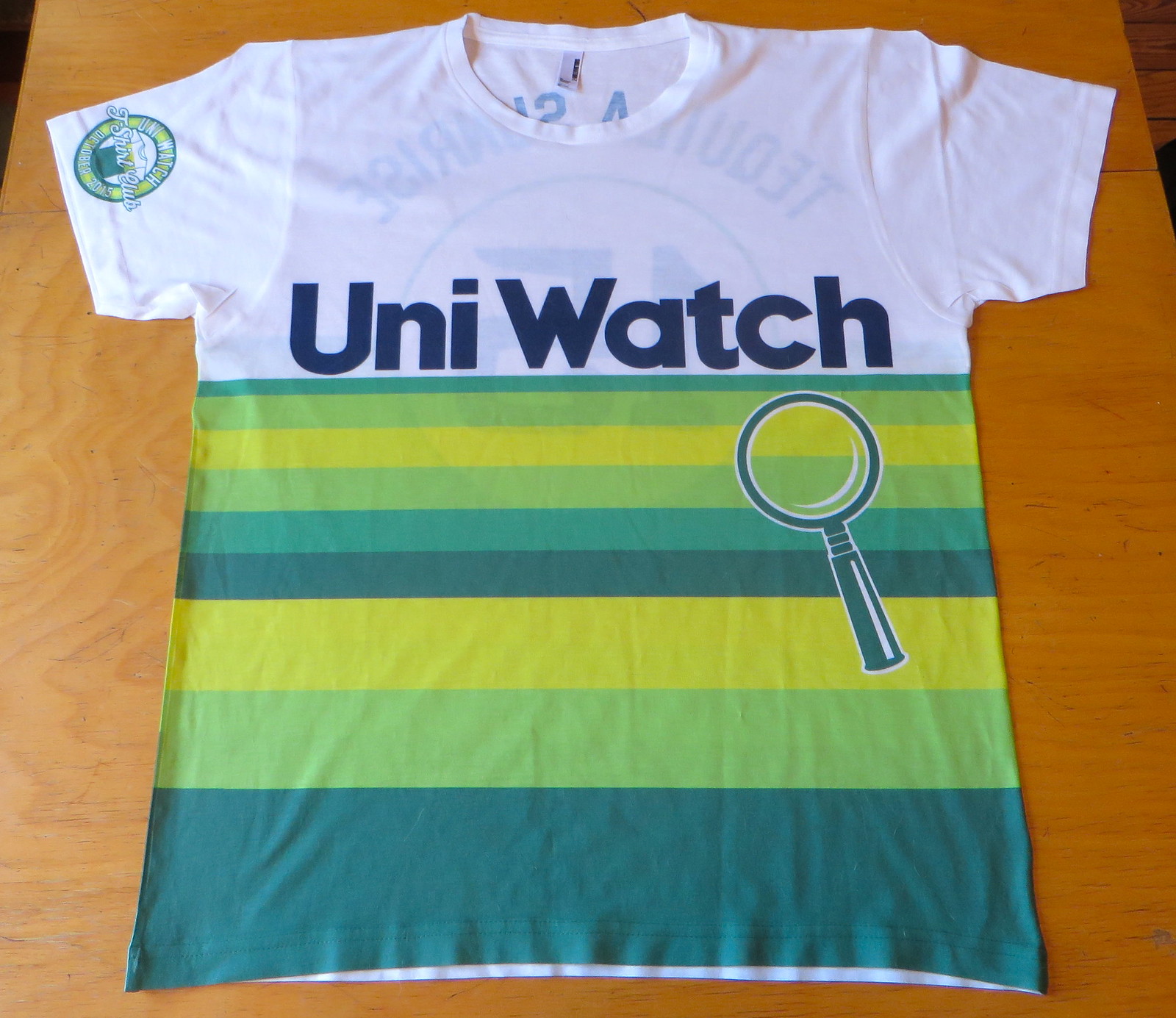
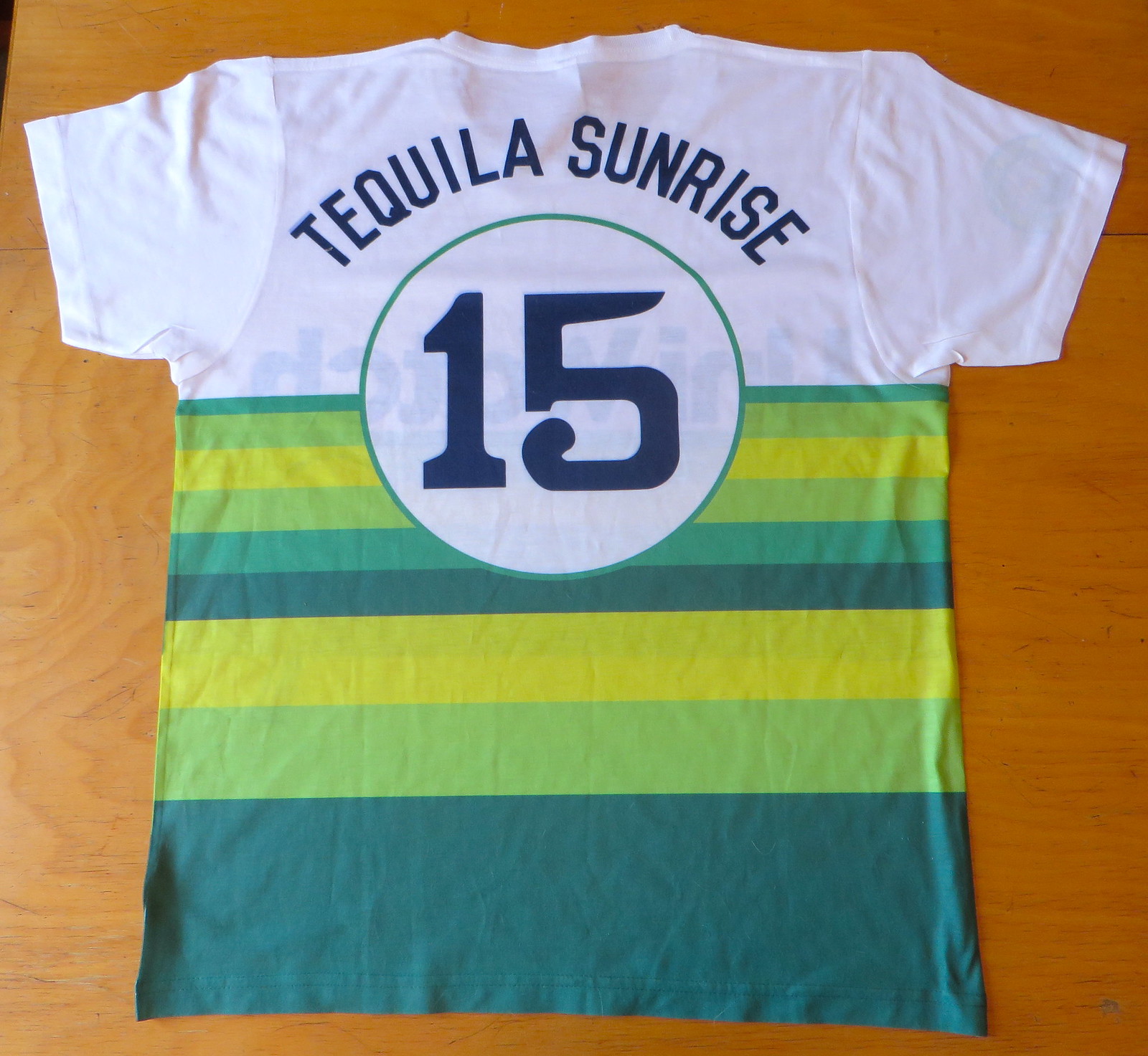
Not bad, right? Additional details here, or you can just order it here.

DESIGN CONTEST REMINDER!
Last Saturday, in combination with Uni Watcher Daniel Secord, I announced a new design contest — one that really is probably the craziest design contests ever — an ambulance. It’s actually pretty simple (although the execution may be tricky), and there are prizes!
If you missed it, please read the entry here for all the rules, downloads, graphics, deadlines, etc.
I’ve only received THREE total entries so far — a ridiculously low number — so it’s time for you designers to step it up! I know you can do this one some justice (and there are prizes!). There is still about a week and a half until the deadline, so you’ve still got some time.
Hope we can get our designers (and non-designers alike) to really give this one a shot.
Uni Watch News Ticker:

Baseball News: Not unsurprisingly, the Toronto Blue Jays again wore their blue softball tops in yesterday’s game against the Royals (who were in their home whites again). Oh, and — the Blue Jays lost again in their softball tops. … Last night, there was a Henry Rowengartner jersey sighting at Citi Field (h/t Tom). … Also at Citi, as expected, the New York Matt Harveys Mets wore their blue alternates, thereby “forcing” the Cubs to wear their road grays for the first time this post-season. Unlike the Blue Jays, the Mets won in their alternate tops. … It was pretty freakin’ cold in NY last night too. … So cold, some fans needed to wear gloves (h/t RFV). … Interesting set of MLB logo concepts here (from Erick Mock).

NFL News: Today, the Minnesota Vikings will honor the 15 men that had a role in all 4 Super Bowls. To my knowledge, there haven’t been any announcements of throwback uniforms, although that would most certainly be a pleasant surprise.

College/High School/Other Football News: “Was at Wiley Hollingswoth Stadium — home of the Hubbertville (Ala.) High School Lions,” writes Dustin Semore. “Their field had something I’ve never seen before. Where most hash marks are: they had their numbers. Where the numbers are supposed to be — they put ‘hash’ marks there. Was an interesting look.” … They no longer play football at Hofstra (my one-day alma mater), but there was an old Hofstra helmet on eBay (via Jeff Israel). … “They’re 8! And they have NOB! I’m 50, I’ve never had NOB!” exclaims Kenn Tomasch. … Because THE Ohio State University wore new black helmets last night, that meant the equipment staff had to apply all new merit stickers — 1,998 of them, to be precise. … And former Buckeye players are jealous the current crop got to wear the BFBS unis. … Check out this beautiful 1956 Air Force vs. Western State program found in Idaho Springs (from Bobby GINdal). … This is kinda interesting: the College Game Day graphic has a font similar to that used by Michigan State (good spot by GenerationInk).

Hockey News: On Friday night, the Anaheim Ducks broke out their new unis (which I’m kind of digging — anyone else?). Here’s a bit more on that. … Looks like Hershey Bears goalie Justin Peters is wearing his Capitals pants (h/t MachO Man).

College Hoops News: On Friday, Auburn revealed their new basketball uniforms for the 2015-16 season. Clint Richardson wrote about it. … “Because uniforms are fashion and fashion invites discussion,” here is a critique of Duke’s hoops uniforms. … Here’s a look at all the Notre Dame hoops unis for 2015-16 (via Warren Junium). … Here’s a look at Purdue’s 2015-16 unis, with sweatback treatment (h/t Cole Guingrich). … New uniforms for Alabama-Huntsville (from Clint Richardson). … Duke has changed their ACC underline from black to white (from Daron Vaught).

Grab Bag: There is a new sport out there called fowling. No, it’s not basketball-related. It combines football and bowling (from Chris Flinn). … During the Rugby World Cup, multiple Springboks wearing different colored boots during QF. (RSA v. WAL) Screengrab by C.B. Schmelter. … The V.League in Japan started the Women’s league this weekend. Here are the teams’ uniforms on one page (thanks to Pacific Rim Correspondent Jeremy Brahm).
And that’s all for today folks! Thanks, as always, to TJ, Joe, Rex, Dennis, Joey & Kyle, and anyone who submitted for the ticker. Everyone have a great Sunday — enjoy the league where they play for pay, and the Mets/Cubs game tonight. #LGM! You guys have a great week and I’ll catch you next Saturday.
Follow me on Twitter @PhilHecken.
Peace.
“Mets in pins are iconic, these blue tops and hats with the orange brim are awful!”
— Charles Ryals
Well, at least the Buckeyes black uniforms looked better than the 49ers black uniforms, so they have that going for them, which is nice.
Better than the Eagels’ black unis, too.
Thats like saying that drinking 1/4 of a cup of barf is better than drinking 1/3 of a cup.
Sure: “better”.
Lee
Comment of the Year selection committe, we have a contender.
Is that the right image for the Big 10 uniform tracker? OSU in normal uniform, Penn State in blue? Is that last week?
No — it’s not. Right now that’s a placeholder. Joey sent me his tracker via google drive but I never got the needed access to it; I asked him to send me this week (and all future weeks) as attachments, and I’ll post the correct one as soon as I have it.
Did I miss a Braxton “Miler” mention?
Michigan did a monochrome uniform against Penn State recently that also had some stupid numbers.
I keep hoping that Penn State’s been wearing alternate uniforms since 2011 and will go back to the contrasting trim. Oh for the days when that was my biggest concern about the football program…
It’s there, last sentence of TJ’s rant thing.
Regarding UW/UO in school colors…that shade of green isn’t school colors, not that it surprises me, being Nikegon and all. And they didn’t have any yellow accents to speak of. And Washington? Black accents? Not a school color. And don’t get me started on those irritating numbers.
What are Oregon’s official colors? Aren’t they just “green and yellow”? Meaning that, basically, they can wear whatever shade of green they want?
The Jeff,
If you were a hockey goalie your name would be Dominik Sawchuk-Roy-Dryden-Hall. Nothing gets past you.
Need proof here is the style guide for the Oregon Duckeroos.
link
They do seem to dip into the complementary colors a lot.
Quite liberal use of the complementary color palette.
I find it interesting that Oregon considers shades of pink, brown and orage to be “complimentary” to Green and Yellow…
But what about silver,and black and whatever else they wear? At least OSU has Black in their colour scheme. And to answer the end of the piece, Go Mets!
Was at the UW-UO game in a mixed rooting section. Comments from left “Why are they wearing gold” and from my right “isn’t Oregon team colors black” A sure sign of the apocalypse.
I thought UW wore gold and purple (with their classic helmets) because they were trying to look like the Husky teams of the 80s that regularly rubbed Oregon’s duckbill in the astroturf.
Bowling Green: they’re batting 1.000.
Pretty sure that Bucknell is wearing a blue helmet, not black.
Buck bell wears navy IIRC.
Bucknell wears navy. I don’t know what Buck bell wears. And autocorrect before I’ve had my morning coffee is stupid.
Glad to see my alma mater in the 5&1, then sad to see them mentioned as black, white and orange. I guess I never realized how dark Bucknell’s navy blue is until now. Anyway, to quote our spirit song – ‘Ray for the orange and the blue!
I think if Ohio state could mix and match the black uni with other colors it would look better
I’m with you, wear the regular pants and helmets, and it wouldn’t have been so jarring.
USC’s metallic helmet and mask should have disqualified them from the #1 spot
Why? They look good.
Sure, if you are 16 and like shiny metal objects
Well, I’m 34 and like heavy metal… but regardless of that… I think that, much like the New York Giants, the metallic USC helmets do a better job of color matching the rest of the uniform, while the standard non-metallic helmets tend to look too dark.
That is shiny metal objects NOT shiny heavy metal : )
I think we may need a new label, Chrome For Chrome Sake
The metallic shell does do a better job of depicting USC’s cardinal color. The chrome face mask takes it too far.
If memory serves me, Notre Dame and USC normally wear the same face mask: gray with gold flake baked into the plastic. On the Notre Dame helmets, when the light hits it just right, proximity to their gold helmet makes the mask look gold. In similar conditions, it makes SC’s mask look like a ceramic beige, which sort of reminds me of ancient armor for some strange reason.
In any event, the regular masks are much much better than the chrome ones for SC.
USC & ND’s GRAY facemasks should’ve disqualified them. USC looked better without the gray mask & Navy looked 10,000 times better against ND last week with their navy colored mask.
Also those ugly matte pants all the gold wearing team have now should drop this game. Makes no sense for ND to finally go with a shinier helmet and lose the shiny gold pants. But I guess the shiny pants are .0000000000000073200000527943528 ounces heavier than the flatter turd gold & had to go.
I agree with The Jeff, I like the chrome USC helmets. What I don’t like is how different Notre Dame’s helmet and pants are. The helmet is so bright and shiny, and the pants are so drab and dull. I know that it is possible to make shiny metallic pants; just look at the Dallas Cowboys’ regular pants.
The pants better match the University’s official gold color. The helmets are intended to evoke the Golden Dome. The current look is very old school — look at pictures of Ara Parseghian’s teams to see the vibe they seem to be going for.
I’ve tried and tried, but I cannot find it my heart to dislike Notre Dame’s uniforms. I think they look great! I find the pants color to be sublime.
Lee
Well obviously the Blue Jays luck has run out with the blue alternates.
Normally I don’t like the chrome kids but I do like USC’s. And I didn’t hate Wake Forest’s gold chrome. While I prefer traditional gold (49ers, Saints, U-Dub), I liked WF’s helmets more than I thought I would.
I really am bothered by the NFL gear with the partial stripe down the back
The Mets’ blue tops and orange brimmed caps seem more tolerable when they are winning playoff games wearing them.
As mentioned above – Michigan has frequently used alternate uniforms (if not BFBS.)
Is it BFBS if one of the school colors is actually black? Black has been more or less the third color for OSU as far back as the late 1960’s.
All that said, and as a OSU alum, I don’t like it. But also it is not the end of the world or even particularly bothersome as a one-off. It’s really more of a continuum. No-tradition places like Oregon and Baylor wearing goofy things more or less every weekend. Major traditional powers doing so once a year. That’s the new reality and not such a bad one I think.
Also as mentioned above, I think that a black jersey with the normal helmet and pants would look pretty good. Gray numbers outlined in red for that probably would be best.
It’s still BFBS. I could almost buy it as just the team’s 3rd color if they’d only gone with black jerseys… but swapping out the silver helmet and pants turns it into something more. This late in the trend it’s really just kinda pathetic. They aren’t cutting edge, they’re lagging behind. If they wanted to wear black, they should’ve done it 10 years ago. If they’re trying to be hip now, they should be wearing mono-gray with a matte helmet, and that would actually be a team color and look better.
“It’s still BFBS.”
~~~
Planets must be out of alignment again, since I find myself agreeing with THE and almost everything he’s said today.
This is ABSOLUTELY BFBS. Black is NOT a school color, even if they use black as a slight accent on their unis. If the Lions wore a black jersey (as they sadly have done) would you say they went BFBS? Of course. But they use black as an accent now. Same with the 49ers — they have black on their helmet, so they’re not going BFBS?
The OSU have absolutely just crossed the BFBS threshold now. Your colors are scarlet & gray (despite having slight black accents).
I dont know why so many say black is a school color. I see that argument on some OSU boards. Ohio State is scarlet and gray.
As the Jeff said and I said they were late to the party for black. I guess they are waiting for 57 other teams to wear all gray before they finally do that. I said before they should have gone to all gray.
But I think the blacks were better looking than I expected.
Planets must be out of alignment again, since I find myself agreeing with THE and almost everything he’s said today.
Don’t worry Phil, I just went and shaved off my goatee, so we should be returning to our proper universes soon enough.
“Black is NOT a school color”
Um.
link
That said, it’s still kind of gross.
Um.
It’s NOT a school color. It may appear as an accent on the uniform, which is not the same thing. I don’t care if it appears in that color palette…if it appears on the uniform it has to appear there.
From that same link:
White is also shown there — are you saying that white is a school color? Of course not. But they have a white jersey (and some white accents) so it has to appear there.
But neither black nor white are school colors.
Even THE osu football traditions site says as much:
Ohio State’s costumes alast night are most definitely BFBS. No question.
Lee
I thought the Buckeyes looked almost exactly like another OSU – Oregon State – with red substituted for orange.
hey,
Has anybody compiled interbrand standings? How do UA schools fare against Nike, Addidias etc?
I couldn’t think of a more monumental waste of time. Since what the teams are wearing account for literally nothing towards a team’s win-loss record, what would the point be?
It might contribute to the makers marketing department’s ego, but seriously, who else would give a shit?
Lee
Sitting here wondering if my Jets are ever going to wear Green this season, but half content with the fact i only have to see “Nike Wardrobe Malfunction Green” on the Jets Sleeves. Silver Linings and that.
Uhhh, when the sun hit it right, their shoulder stripes don’t even match.
That hunter green they use looks awful in the daylight, as far as I’m concerned.
But I too was wondering if the Jets have become a ‘white at home’ team. I know in recent seasons they have worn white at home early in the season, but this seems particularly late.
Lee
Long time Buckeye fan here. A Buckeye uniform historian too. I was against the Buckeyes wearing black mostly because 114 teams have already done it. That being said I thought the unis looked good. Black and red go together great. The helmets looked good.
Now if only Ohio State would wear some real throwbacks. Not the faux throwbacks and how about wearing all gray.
I feel like costumes must be taken in context. What Ohio State wore was an embarrassment to “Ohio State”.
Viewed in a vacuum, maybe for some team (Div II or III, arena?) they might work on some level.
For Ohio State though? Complete failure.
Lee
Ohio State wore black helmets from 1934-1940.
I heard Gene SMith the AD say Ohio State tweaked the proposed Nike black. Said they added more scarlet to the numbers and changed the pants stripes. I imagine nike had some hard to read dark numbers.
I’d love to see Nike’s original proposal, just to see if the team’s feedback actually improved it or not.
The concept of “adding more scarlet” to the numbers doesn’t really make any sense to me. If the numbers are scarlet, then they’re scarlet. You can’t really add anything to that. Were the original numbers black with scarlet outlines? Gray with scarlet outlines? Also, I’ve now said scarlet so many times that it’s starting to look like it isn’t a real word.
I was thinking the same thing. I would love to see nikes proposed black. As for numbers I am guessing the numbers may not have been so much scarlet but the usual hard as heck to read numbers nike likes to use especially on black jerseys. So maybe that is why Gene Smith they added more scarlet to the numbers. Could have been black as you said.
Regarding Nebraska not wearing red pants, the players like the all-white look so it appears they will stay with it.
link
I’m OK with tOSU wearing what they did last night. It may not be an official school color but they’ve had black in the logos and uniforms for decades. Sure it would’ve looked better if they used their regular pants and regular helmet stickers. But as far as the black goes I was fine with it.
Of course as I’ve long said black is my favorite “color” so I’ve never hated the BFBS trend as much as I dislike the GFGS or Stormtrooper (sorry, I like that term & will keep using it) looks. I’ll also take the black over pink/cammo/stars & stripes any day.
I couldn’t agree more. Ohio State looked exactly like they deserve to look this weekend: Like complete shit. I’m personally kind of thrilled to see all of the OSU alums and boosters embrace the ugliness: Turns out that OSU’s rivals aren’t the only ones who think OSU is a crappy school and an embarrassment as a football program:p. Many OSU fans agree and actively embrace their school looking like crap. Not like a bad football team, but literally like excrement. I agree, pro-black OSU fans, your team finally looks exactly like it should! Congrats!
You forgot:
Defending National Champion, Undefeated, and Number One Ranked, Buckeyes.
Today’s Bengals-Bills game looks like amess, holy cow.
Both teams in leotards, and obviously the Bills blue jersey was never designed to go with their blue pants.
You’d think that a company like Nike would take the whole package into account before foisting basic design mistakes on their clients.
Lee
You do realize that both of those uniforms were actually created by Reebok, right? The Bengals have the option of wearing orange socks, and they chose not to. The Bills probably should have white socks with stripes instead of blue, but that isn’t Nike’s fault.
That jerk who posted on how much he loved Duke’s mono-black would not let anyone comment. He’s a pussy who doesn’t tolerate dissent. Let him move to North Korea.
???
Link?
WTF with West Virginia’s number font? I guess teams are inventing fonts now just for the sake of uniqueness? I swear they make Tampa Bay’s look good! Image from link.
Yup, every Jets uniform today had the Wrong Green on the Sleeves. Lions looked particularly awful today, as thier jerseys looked like a futuristic quilt.
Nike just cant seem to use the right fabrics that stay a single color after washing, and what their trying to do with different panels everywhere and the stupid Nikelace, NFL teams look like theyre going out on the field in mashed up cutting room floor scraps.
Aesthetically, each piece of the black OSU uniform was fine (even though the jersey would have been way better with white numbers), and OSU gets extra points for the rare combo of matching stripes on the helmets, jerseys and pants). Collectively, it looks like all dark monochrome uniforms, like an underfunded high-school team. Just an awful combination.
Silver numbers might have worked too and kept in the spirit of a flashy alternate.
Re: ugly uniforms. Don’t let Michigan off the hook as a tradition that hadn’t gone to the dark side. Recall a couple of games v. nNotre a Dame where they had shoulder stripes, etc. everything except BFBS. They even had bright yellow numbers in the Outback Bowl (Jadaveon Clowney hit game)
“…everything except BFBS”
~~~
That was kind of my point, though. I never said Michigan (or even Alabama, for one pro-combat game in 2010 — I think) didn’t have alternate unis. But they were always IN SCHOOL COLORS.
OSU had, until yesterday, always worn scarlet and gray (or white, for the jersey). Never BFBS. They probably could have gone GFGS and gotten away with it, because at least that is a school color.
Mets surprised me and stayed with blue alt jersey…I think they are trying to get in the Cubs heads a bit and it seems to be working. It could also be part superstition, as they won game one in blue. In Chicago, they will have the option to wear the traditional gray or the blue road alt. It is not out of the realm of possibility if they stay hot, they go blue for the whole NLCS. The blue wars could possibly continue into the WS no matter who gets there.
I’m surprised too, but I think it’s more of a “don’t fuck with a streak” (they’re 2-0 in the home blue alts, 0-1 in the pins) than it is to get into the Cubs’ heads. Or it could be a bit of both. But they have a habit of wearing a winning uni (not always, but sometimes) when it’s on a good streak. Classic example was their 10 game home winning streak in April — never wore the blue tops once.
But it could be to fuck with the Cubs too. Which is fine.
I think it now WILL be about the streak. I am betting they wear blue alts on the road too…until they lose. As the Cubs have no blue home alt, they can’t prevent the Mets from doing so. I know you despise the blue alts, but I don’t mind them, especially if they win. I don’t want to jinx them…but am wondering if they would/could play every post season game in blue alts.
If they Mets only had one alt (like the Blue Jays), I’d agree with you, but the home alt and the road alt are (obviously) two different beasts. And they’re 2-1 in the grays, so I think they’ll wear gray on the road, at least for the first game. If they drop that, we may see the blue roadies.
At this point, with the WS two games away, they can wear the goddam camos and as long as they win, I’ll take it.
But as long as Harvey isn’t on the bump, I say they go gray for game 3.
Every game from here on that is…they were not all blue vs. LA.
the home alt and the road alt are (obviously) two different beasts.
To us they are…to a superstitious owner, GM, manager, and/or veteran player, blue might be blue – home or road. The fascinating thing here is their decisions will inform us as to how they think. Nobody can stop them from wearing what they want during the NLCS. I say they stay blue until they lose. Then the WS becomes another possible chess game.
Comment about the Alabama high school football field… those hashmarks where the numbers would normally be are used for substitution purposes. They’re positioned nine yards from the sidelines. To be eligible to participate in the next play, an incoming substitute must come in as far as those markings. Otherwise, a sub could step right off the sideline and be in the play.
The nine-yard marks are approximately the top of the field numbers on an NCAA-marked field.
If you ever catch an NCAA game being played on an NFL field, you will see a extra pair of hashmarks between the numbers and the sideline. The numbers on NFL fields are placed much closer to the middle of the field. The extra pair of markings are placed where the NCAA numbers are normally located.
Penn State vs….some team in black that rented out Ohio Stadium for a day should be ridiculed, but I wouldn’t &1 them. WVU/Baylor and FIU/MTSU should have shared that designation instead. UG. LEE.
Speaking of the Jets, while I’m neither a fan nor a hater of the team, there really is no team that needs a makeover more than they do. The name “Jets” should be sleek and modern, not old and crusty. They’ll never win a Super Bowl until they let go of the Joe Namath game.
It would be one thing to continue a winning tradition. It’s quite another to refuse to cut ties with a losing tradition.
As a Jets fan I have to disagree.
First, the Jets’ current uniform (notwithstanding Nike’s inability to manufacture the correct shade of green and the team’s inexplicable insistence on wearing white socks with the white pants) is an excellent design; clean, unpretentious and uncluttered without being plain or boring. There’s nothing “old and crusty” about it. It is a football uniform. Which is more than can be said for the clown suits worn on many NFL fields these days.
Second, the uniform is not what’s preventing the Jets from winning a Super Bowl. Nor is the not “let[ting] go of the Joe Namath game,” whatever that means. The Jets will win a Super Bowl when they have the personnel to compete with, and be among, the best teams in the NFL, including (but not limited to) a franchise quarterback.
Third, the current uniform does not represent a “losing tradition.” They changed the uniform in 1978 and made the playoffs 5 times in 20 years. They changed it back in 1998 and have made the playoffs 7 times in 17 years. They’ve had 9 winning seasons, 3 8-8 seasons, and 5 losing seasons in that time.
Fourth, and this is kind of important, New York teams all have very conservative, “traditional” uniform designs, and to the extent they’ve deviated from them over the years they’ve all reverted back, often amid intense backlash and controversy (see: fisherman, Gorton’s). As long as the Giants are around, the Jets are not going to take the field in a clown suit.
I still say Washington State should go back to the silver helmets with the script “Cougars”